


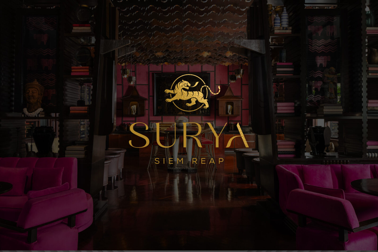
Surya Siem Reap is a luxury hospitality brand shaped by the profound architectural legacy of Angkor Wat and expressed through a modern, refined design philosophy. The brand draws deeply from the spiritual and artistic traditions that define Cambodia’s cultural landscape, grounding its identity in the sacred geometry, symbolic motifs, and masterful stone carvings that characterize the ancient temple. These visual and conceptual foundations allow Surya Siem Reap to honor centuries of history while presenting a contemporary aesthetic tailored to today’s discerning travelers. Each curve, line, and proportion within the logotype echoes the intricacy of Angkor Wat’s reliefs—meticulously carved details that symbolize renewal, eternity, and grace. Through this balance of authenticity and elevated sophistication, the brand achieves a visual narrative that feels both culturally rooted and luxuriously timeless.
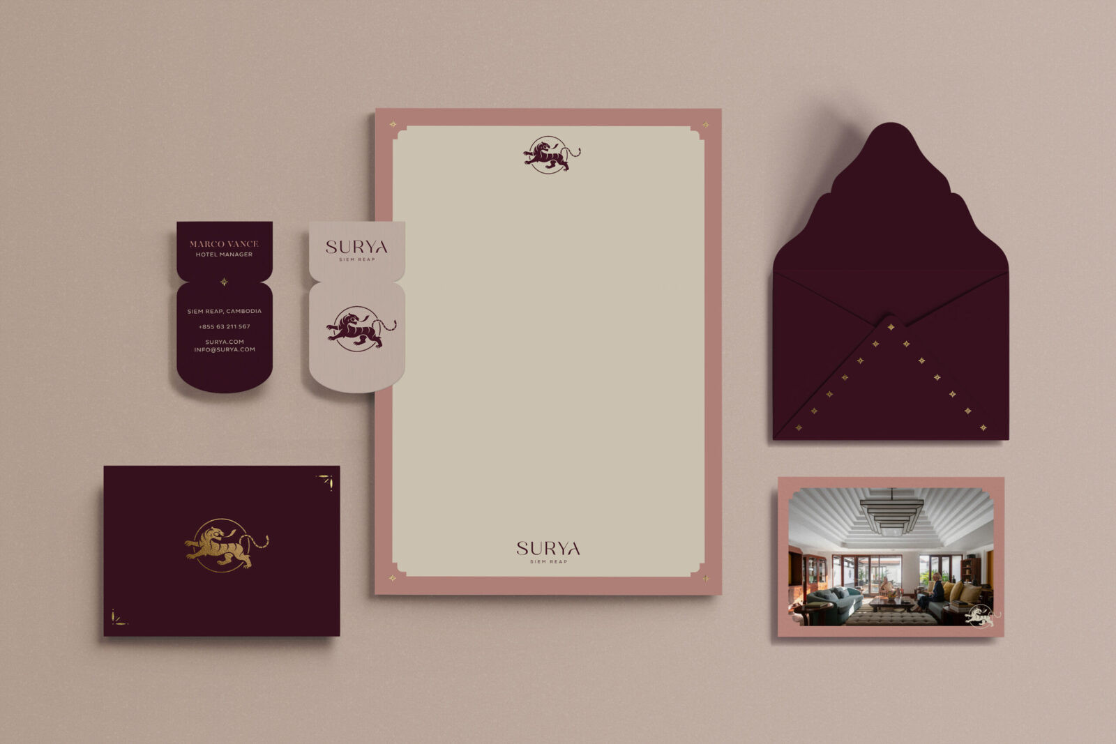
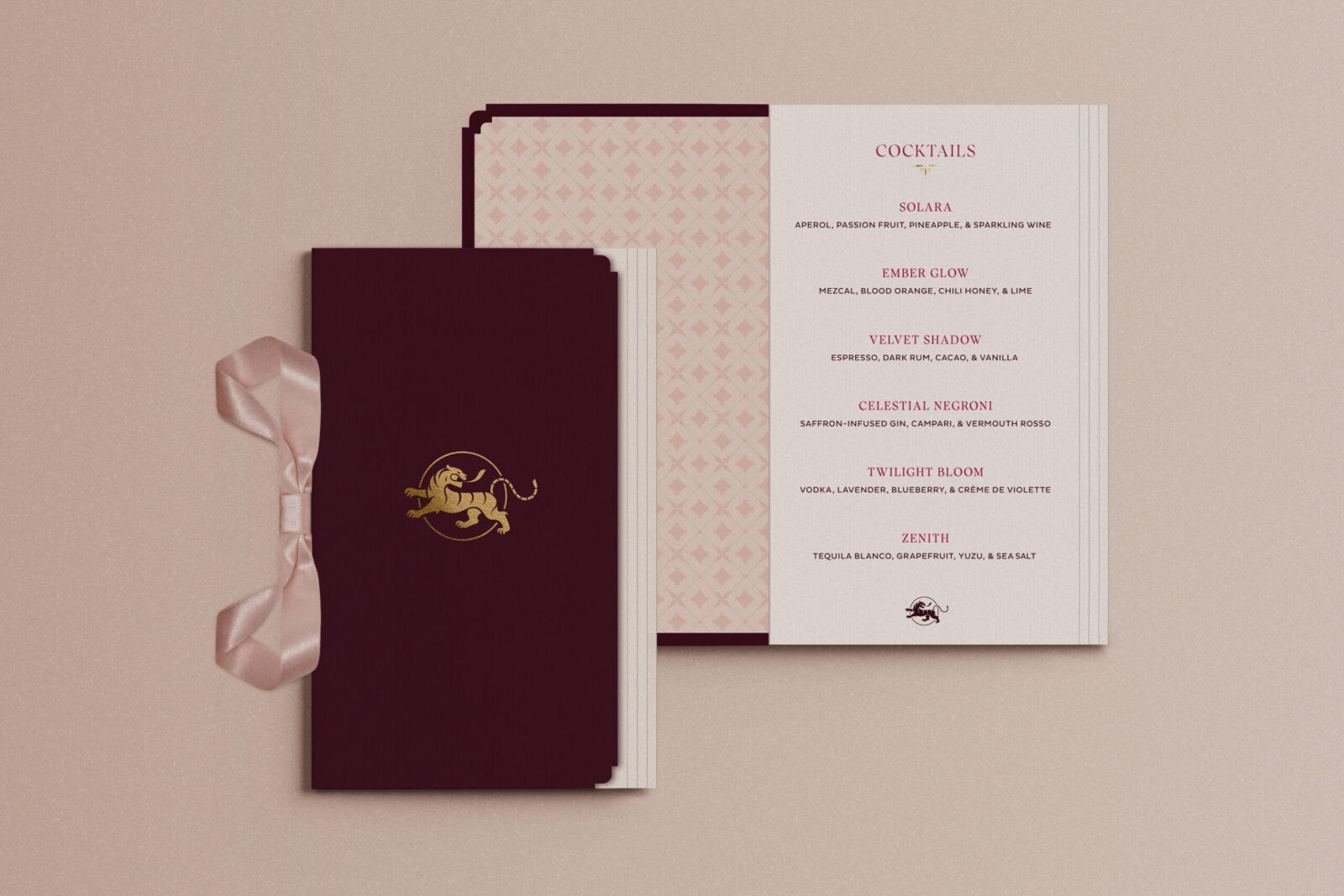
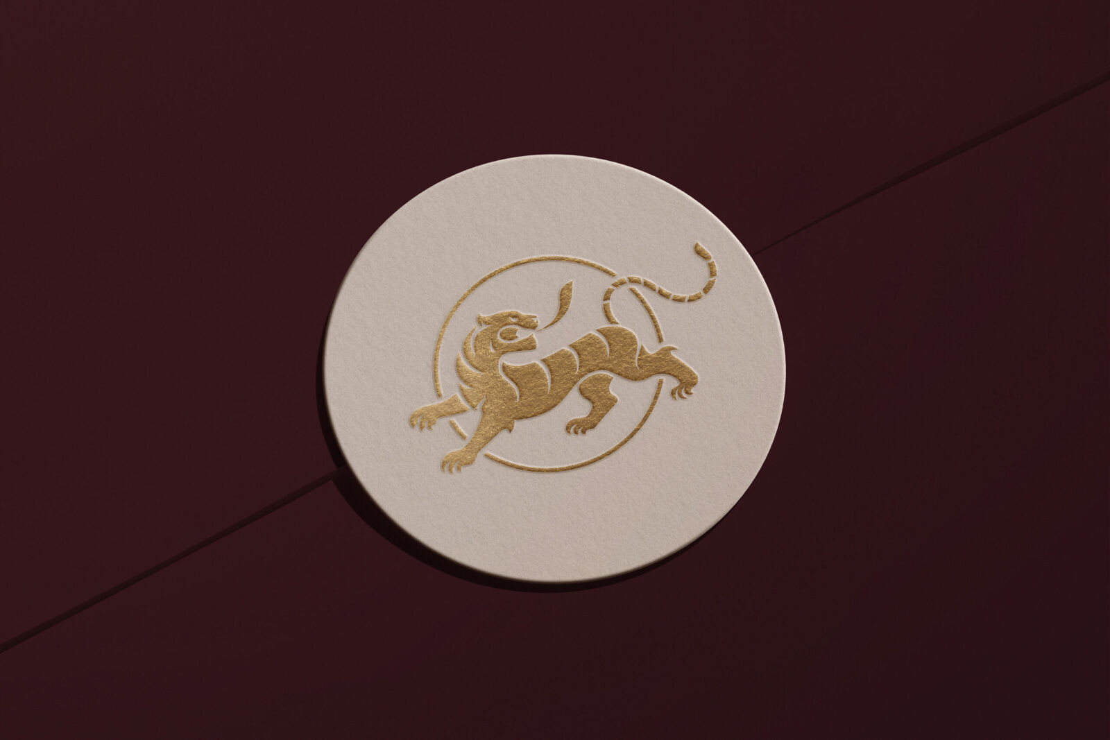
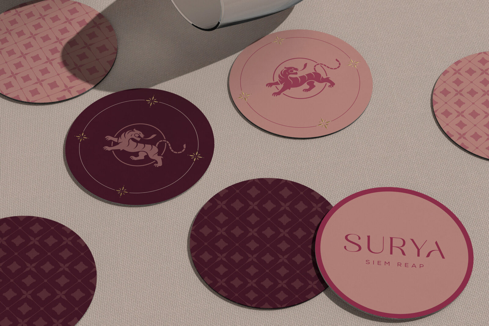
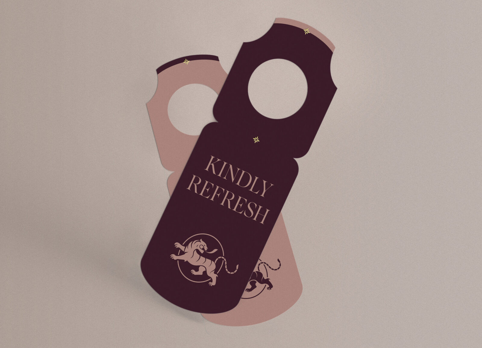
Central to Surya Siem Reap’s identity is its emblem, a powerful representation of symbolism and storytelling. At its center stands the Indochinese tiger, a revered icon in Cambodian heritage and a symbol of protection, vitality, and the untamed spirit of the region’s natural landscape. The tiger’s rendering draws inspiration from traditional Khmer painting, incorporating fluid linework and expressive detailing that celebrate the country’s artistic traditions. Surrounding the tiger is a radiant sun, an element chosen for both its cultural significance and its celestial relationship with Angkor Wat. The temple is famously aligned with the rising sun, a phenomenon where light perfectly meets the central tower—a moment of harmony between architecture, time, and the cosmos. By framing the tiger within this luminous form, the emblem embodies power, heritage, and cosmic balance, reinforcing the hotel’s deep connection to place, history, and spiritual symbolism.
The visual identity extends this cultural reverence through a design system defined by elegance, intention, and clarity. Fine detailing and balanced forms create a sense of serenity reminiscent of temple corridors and ancient stone surfaces, grounding the brand in the quiet beauty of Khmer architecture. This atmosphere is further enriched by a warm, muted, earth-tone color palette inspired by the natural hues that shape Siem Reap’s landscape and heritage. Soft taupes and warm greige tones establish a calm and grounding foundation, while dusty terracotta notes introduce warmth and a subtle handcrafted richness. A deep plum accent adds depth, drama, and a sense of refined luxury—anchoring the palette with a bold yet sophisticated contrast. Every touchpoint, from signage and stationery to menus, follows this cohesive visual language. The result is an immersive brand experience that conveys quiet grandeur and thoughtful craftsmanship at every moment of interaction.
Surya Siem Reap ultimately speaks to travelers who seek more than luxury—they seek meaning, depth, and authenticity. The final identity presents the hotel as a sanctuary shaped by heritage and elevated through design, offering an experience rooted in culture, artistry, and timeless sophistication. It positions Surya Siem Reap not merely as a place to stay, but as a destination where history and modernity meet in perfect harmony.

CREDIT
- Agency/Creative: Alola Marketing
- Article Title: Alola Marketing Develops a Culturally Rooted Luxury Brand Identity for Surya Siem Reap
- Organisation/Entity: Agency
- Project Status: Non Published
- Agency/Creative Country: United States of America
- Agency/Creative City: Santa Monica
- Project Deliverables: Brand Design, Brand Identity, Brand Mark, Branding
- Industry: Hospitality
- Keywords: WBDS Agency Design Awards 2025/26 , Hotel Design, Luxury, Siem Reap, Cambodia
-
Credits:
Principal: Ping Alldredge
Senior Designer: Sal Camacho


