


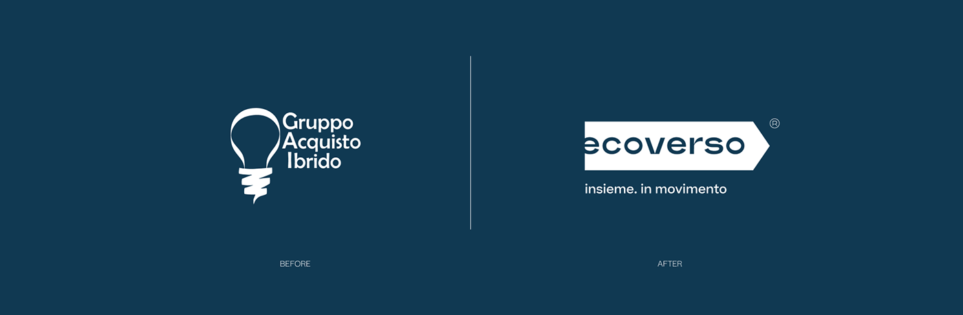
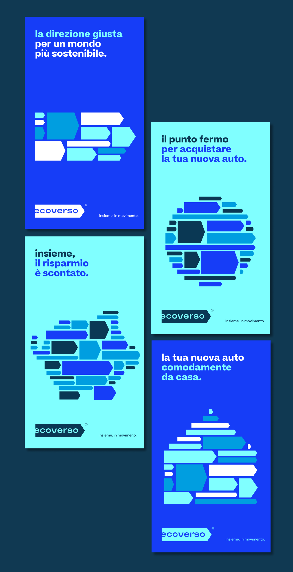
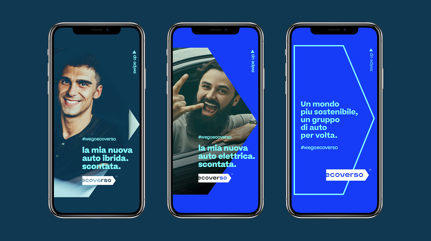
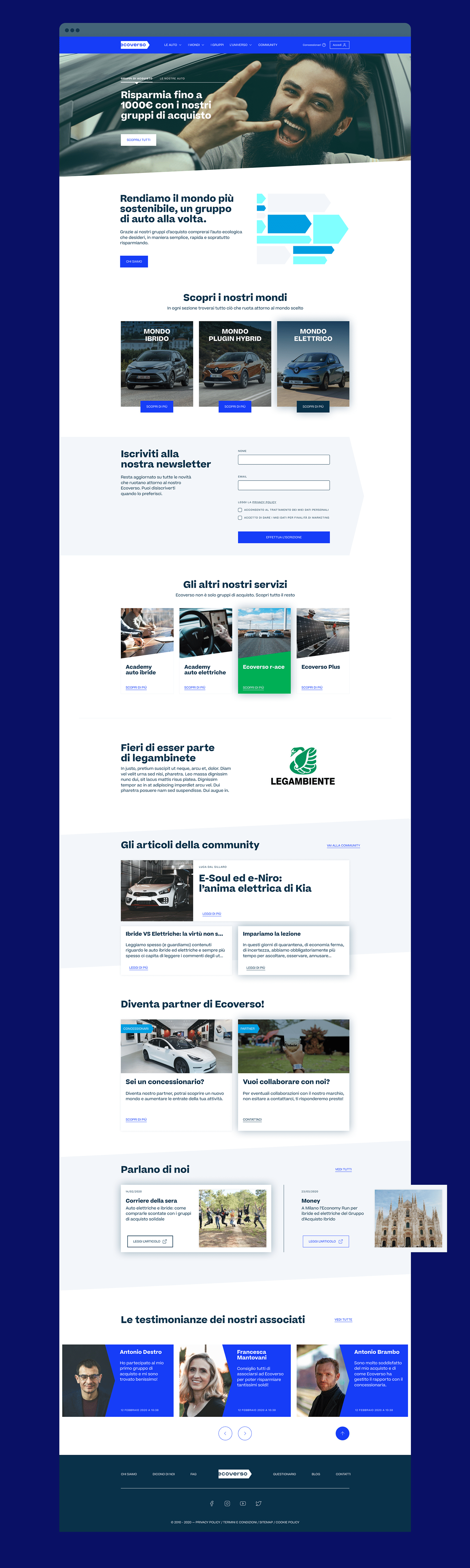
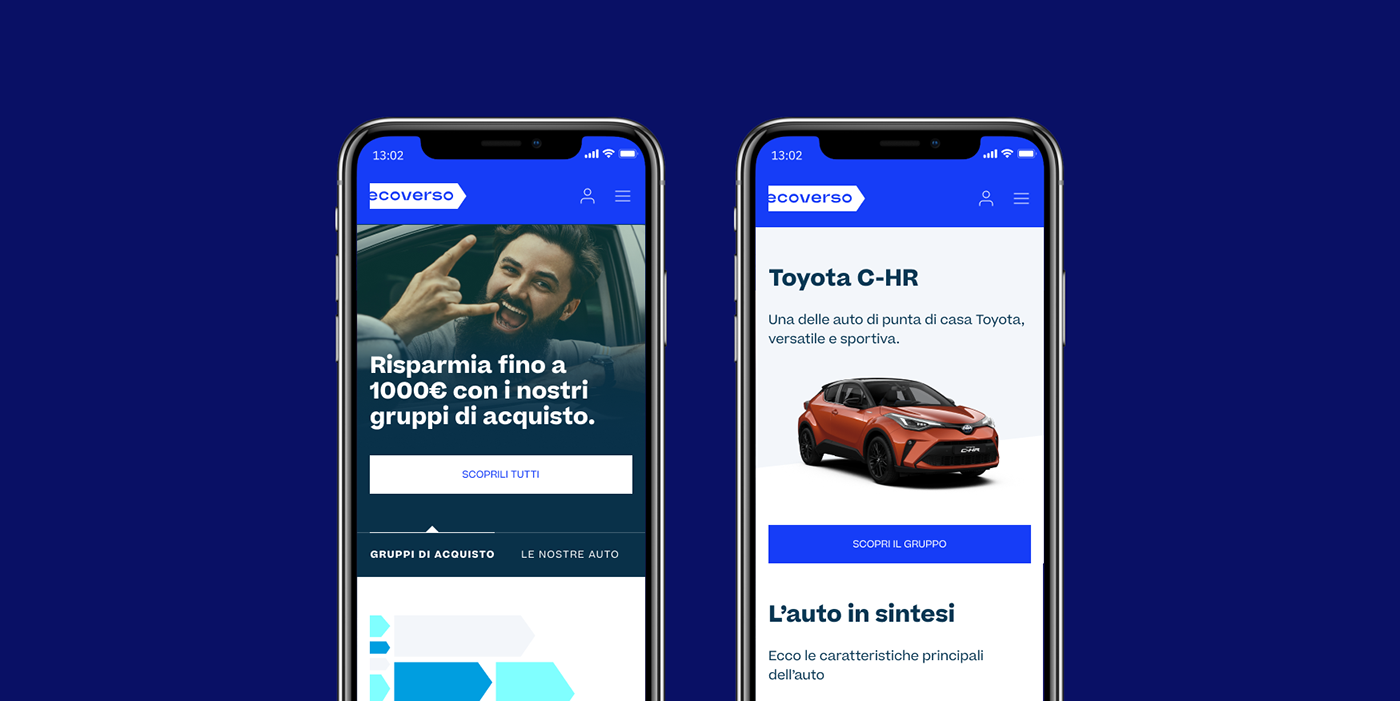
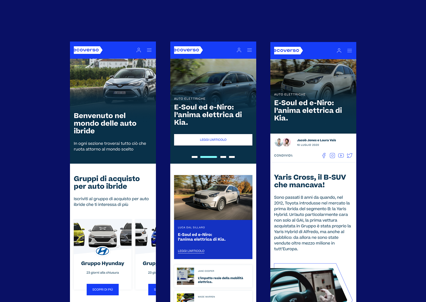
Ecoverso promotes sustainable mobility through the creation and coordination of purchasing groups for vehicles with low environmental impact with the aim of obtaining strong discounts otherwise not achievable. Ecoverso makes the world more sustainable one group of cars at time. Thanks to Ecoverso you will buy ecological cars in a simple and fast way, saving your money.
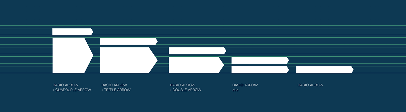
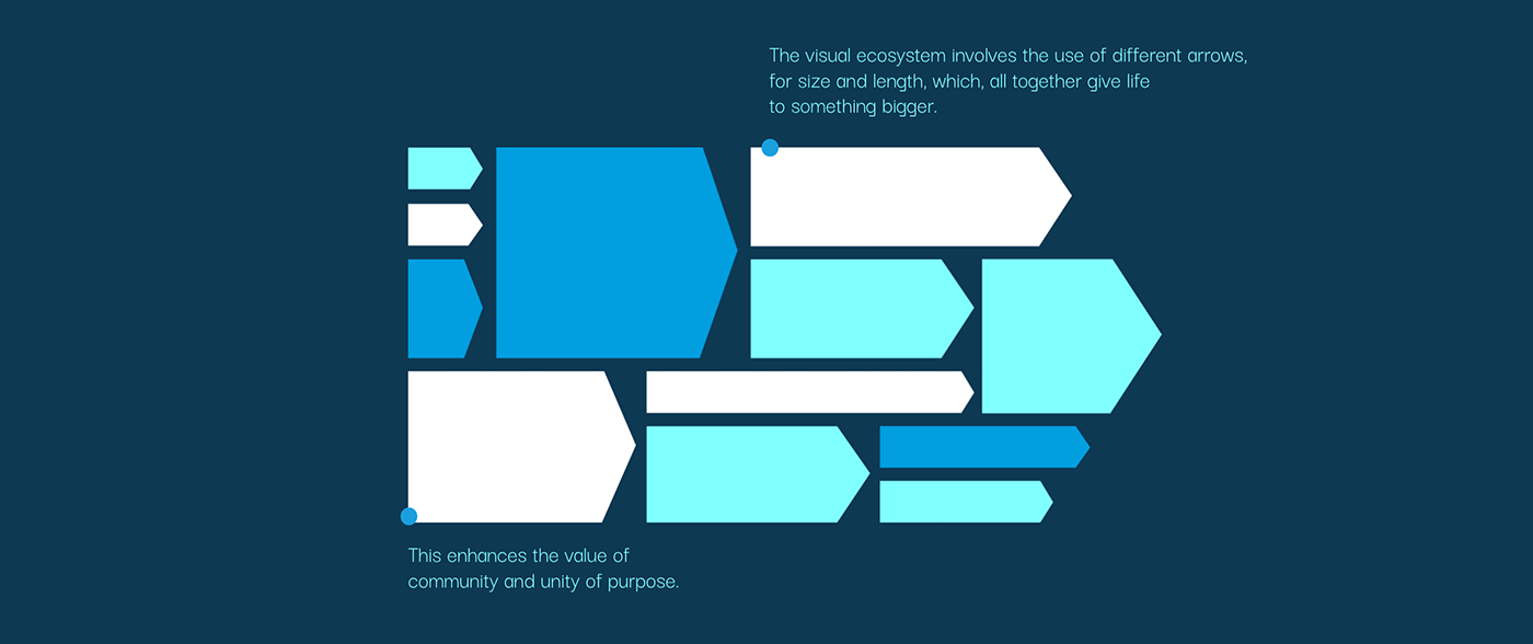
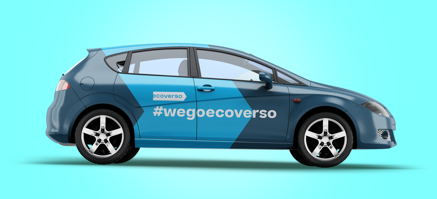
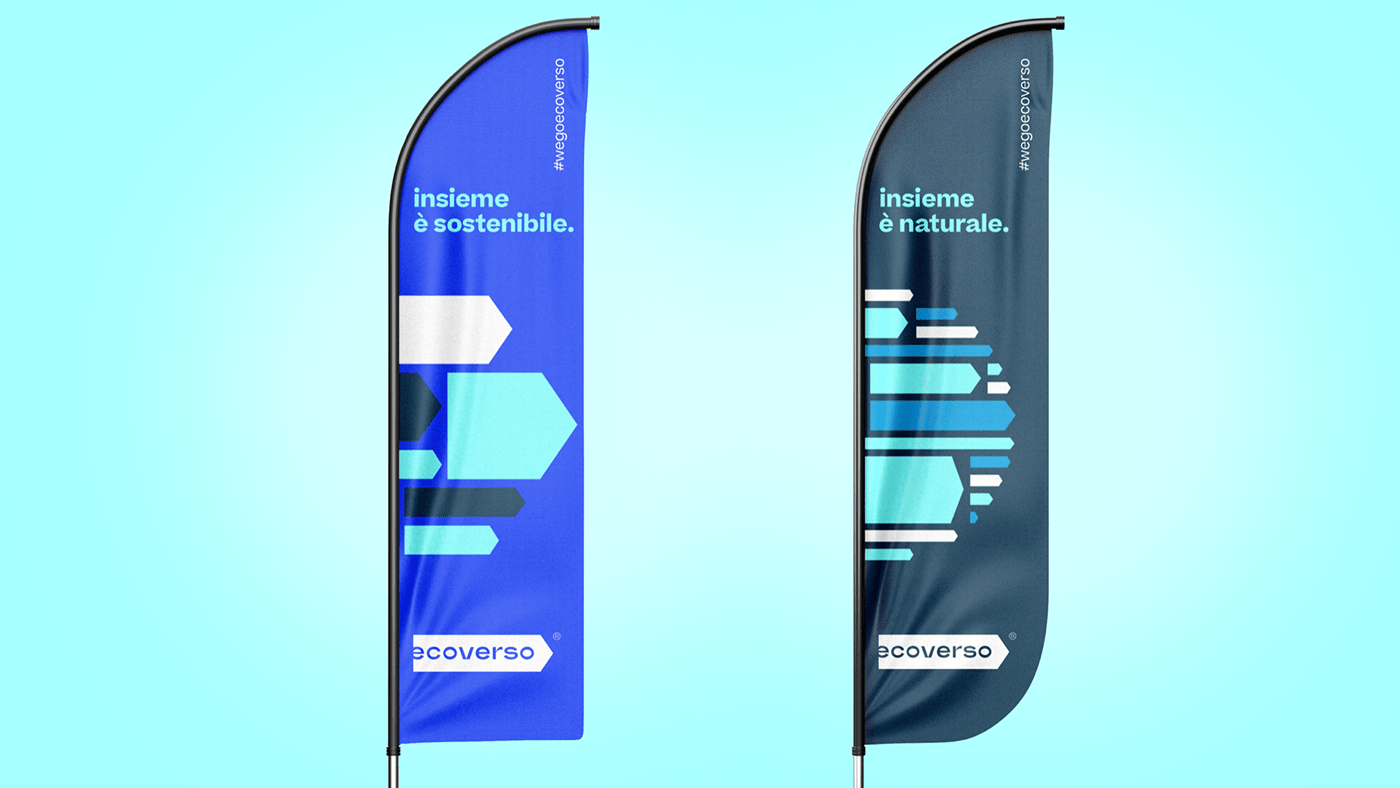
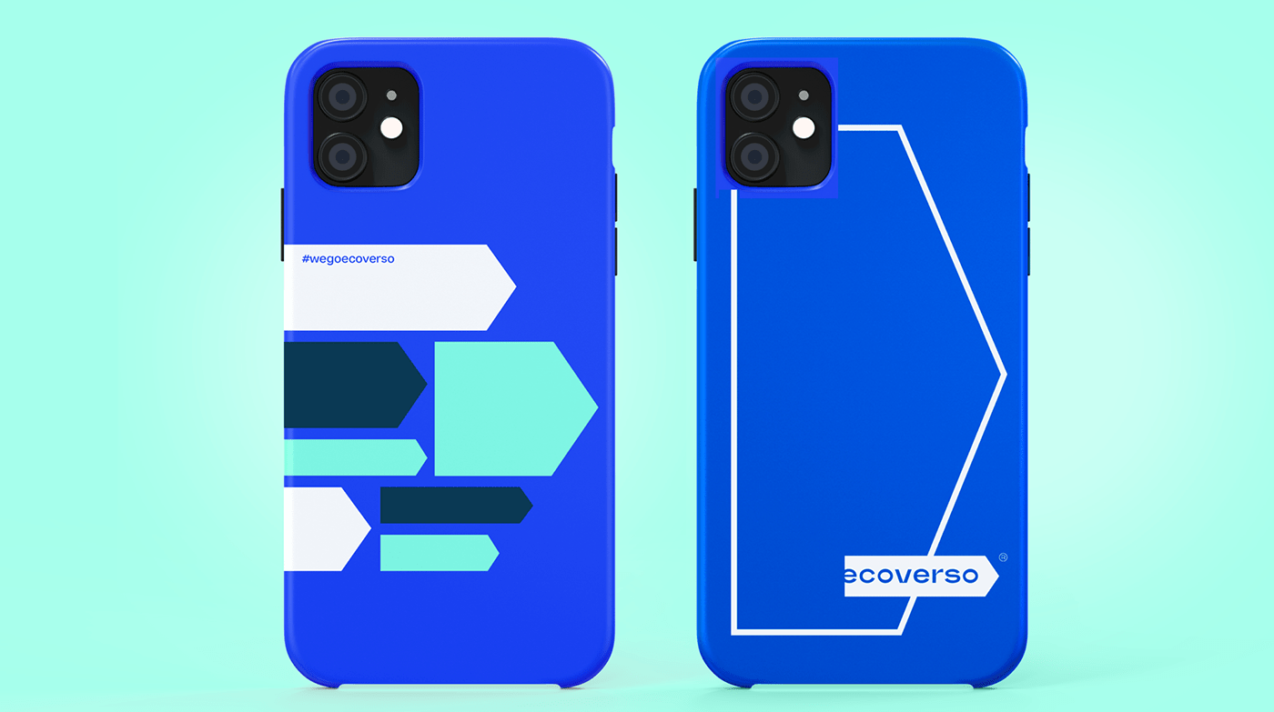
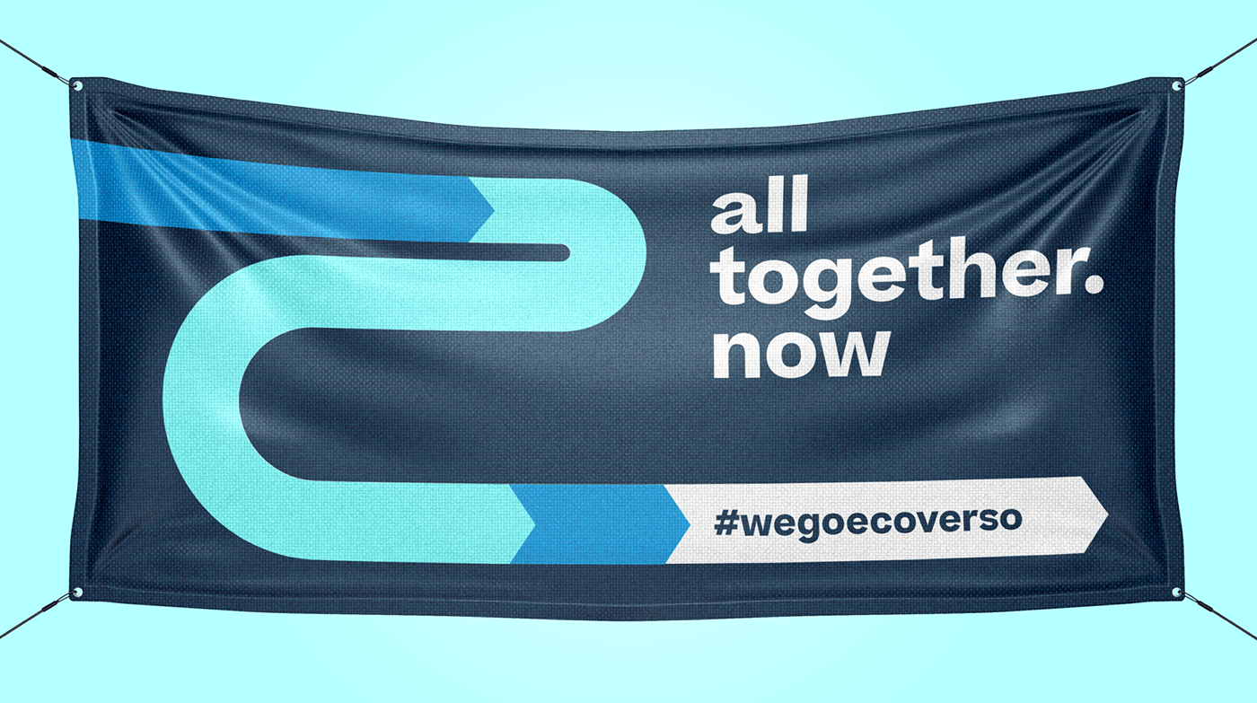
We designed a new brand identity based on the three Ecoverso pillars: sustainable mobility, aggregation and savings. The visual system uses the arrow as a recognition symbol for Ecoverso values. Many arrows give life to complex graphic elements giving back dynamism.

CREDIT
- Agency/Creative: onlab
- Article Title: All Together is More Sustainable, Ecoverso Branding and UX/UI Design by onlab
- Organisation/Entity: Agency, Published Commercial Design
- Project Type: Identity
- Agency/Creative Country: Italy
- Market Region: Europe
- Project Deliverables: Brand Architecture, Brand Design, Brand Guidelines, Brand Identity, Brand Naming, Brand Redesign, Branding, Graphic Design, Identity System, Rebranding, Tone of Voice
- Industry: Transport
- Keywords: Cars, electric, group, hybrid, rebranding, saving, ecology, together.
FEEDBACK
Relevance: Solution/idea in relation to brand, product or service
Implementation: Attention, detailing and finishing of final solution
Presentation: Text, visualisation and quality of the presentation


