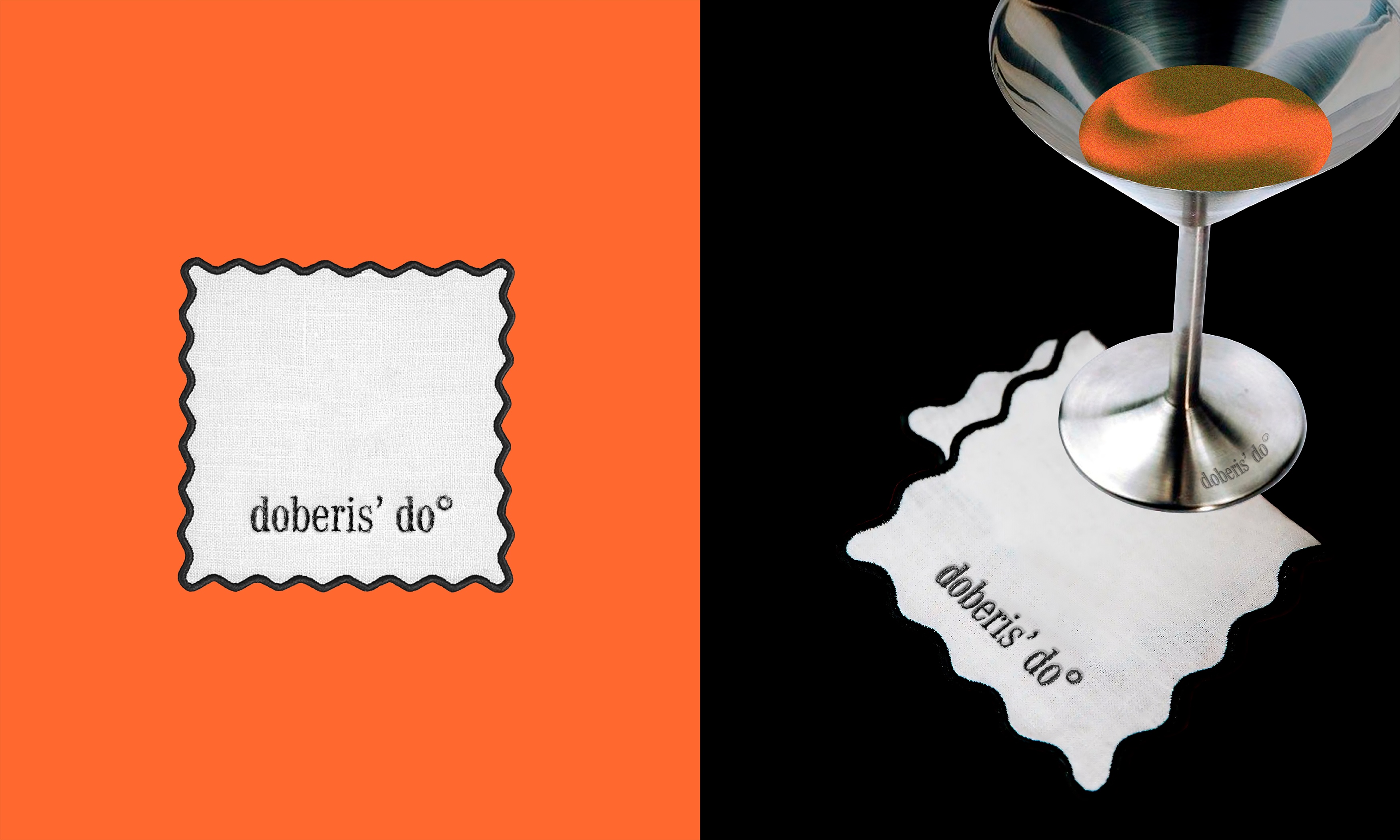
Doberis’ Do is a concept restaurant where anyone, sitting at a round table with a white tablecloth, will be able to connect with nature and taste what grows at arm’s length, but first they must get to it…
The name translates as “get to”, which carries the main idea of the restaurant.
This brand is created for those who are constantly hungry for new experiences and are ready to go anywhere in the world to try what nature can give in its wildest form.
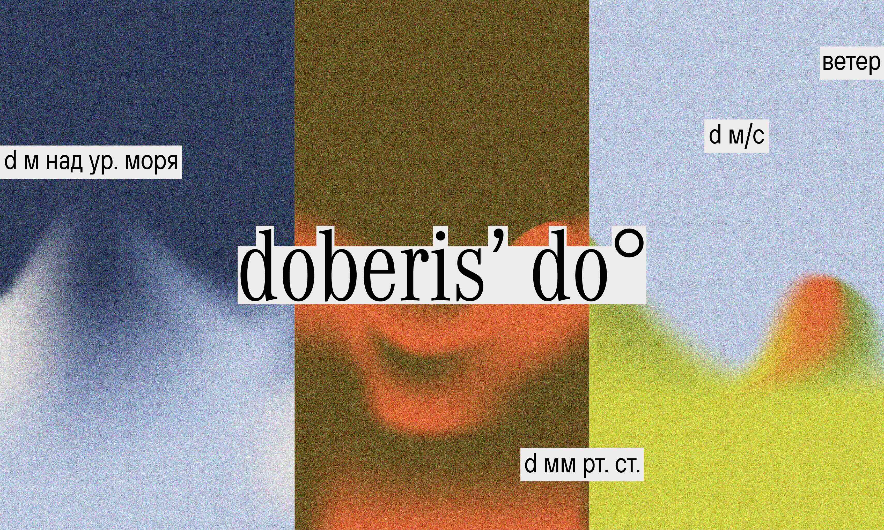
The design of Doberis’ Do embodies the very essence of the brand, its illusory, inclusive, airy and inviolable, thereby conveying its naturalness and the liveliness of the products it provides.
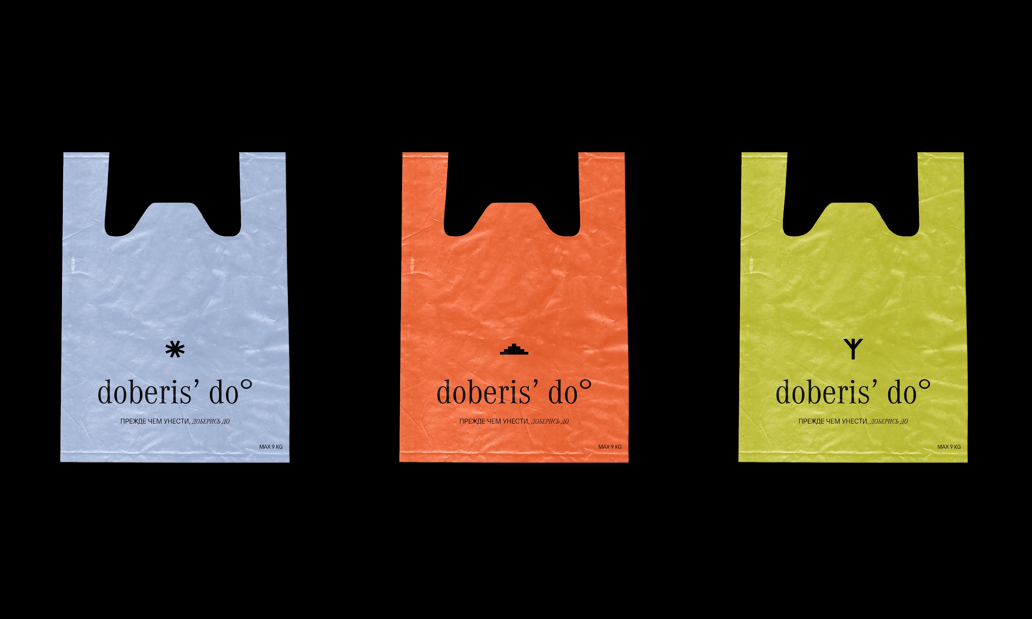
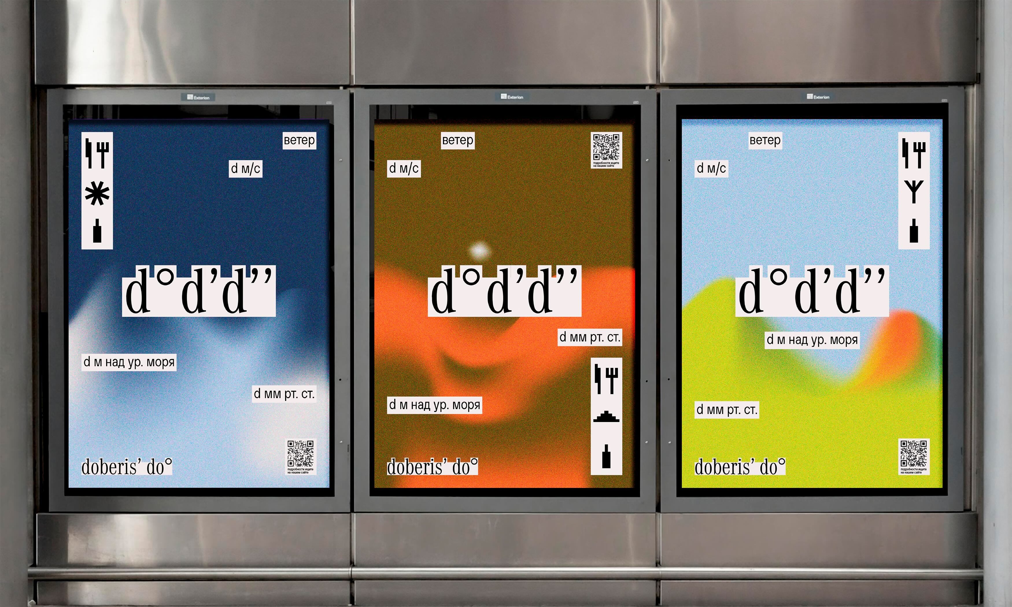
The main element of the Doberis’ Do design are three types of pixel gradients, which become collective images of three earthly elements, which indicates the scale of the project and the way it is distributed. Bright colors were chosen as the color palette, variably illustrating the three natural elements.
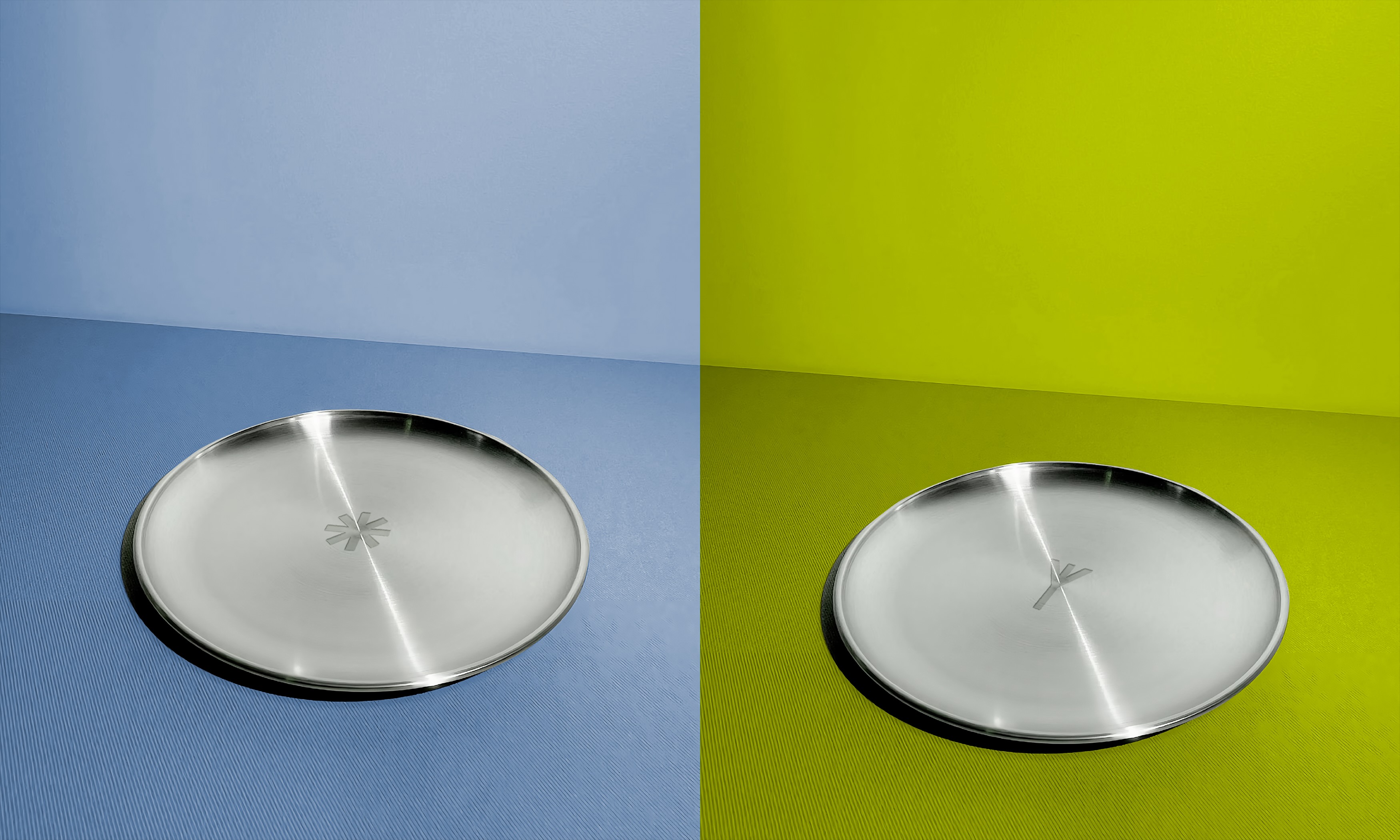
One of the main Doberis’ Do design metaphors is double-meaning symbols. Symbols with double meanings have been selected as identification marks for each of the three elements. Snowflake is a plate, dune is a cloche, spikelet is a glass.
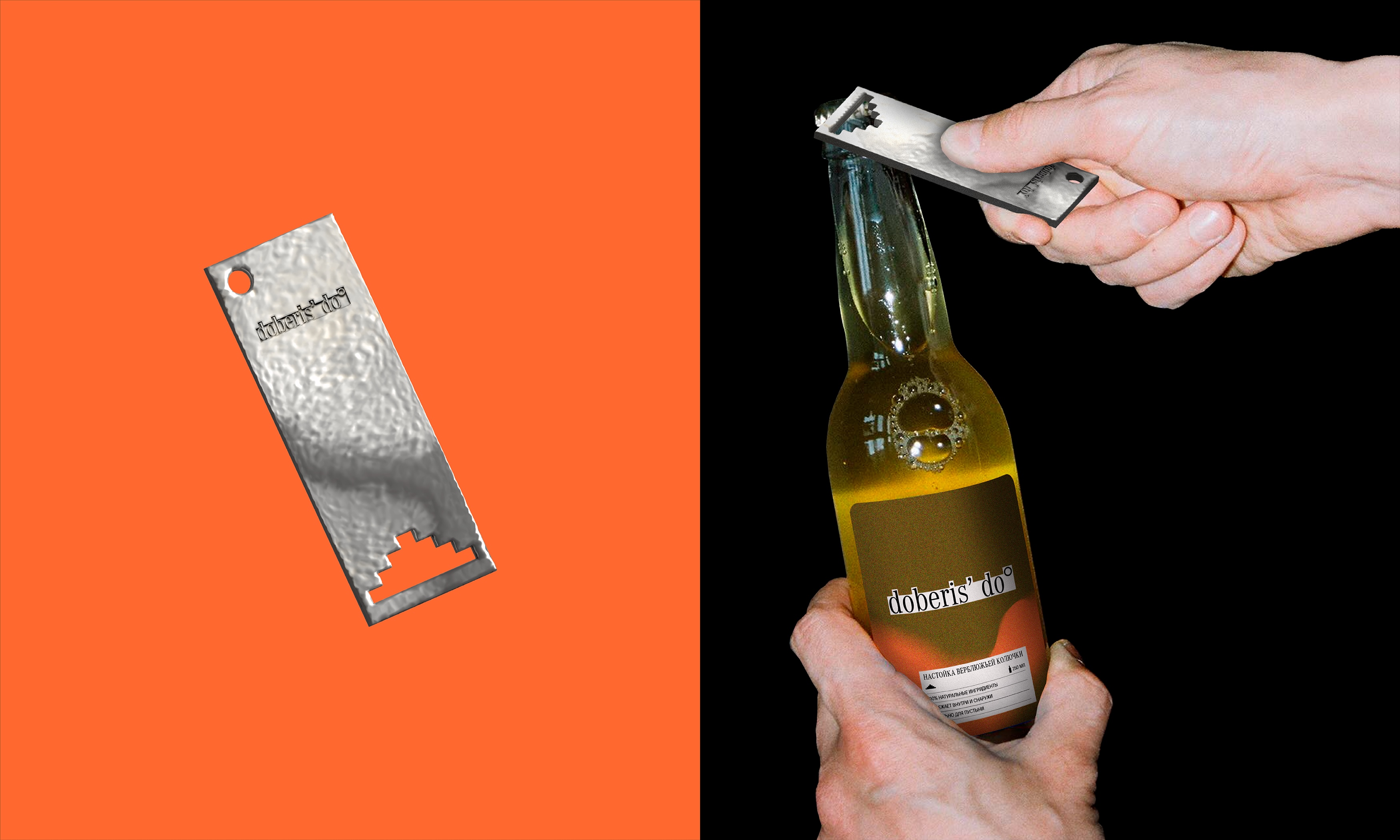
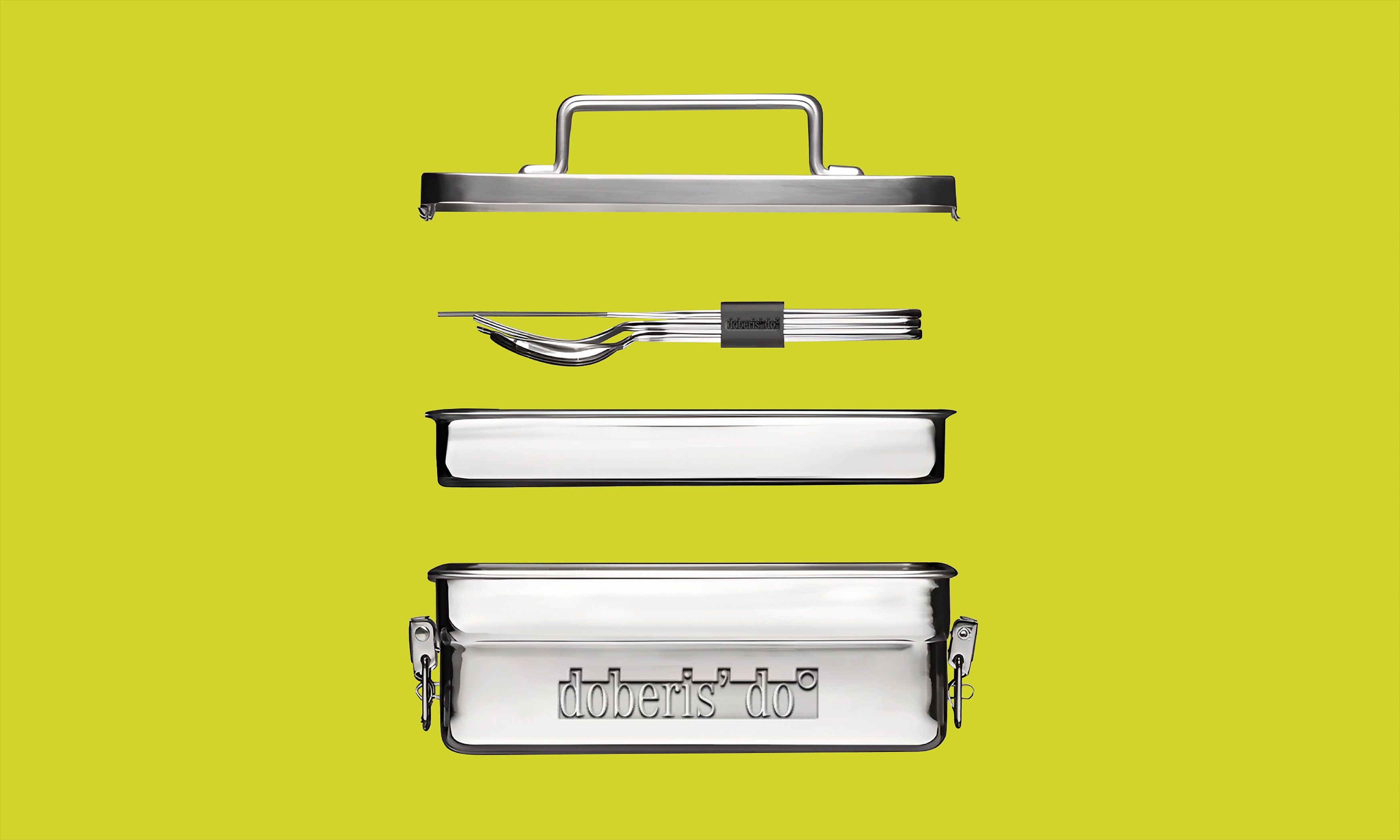
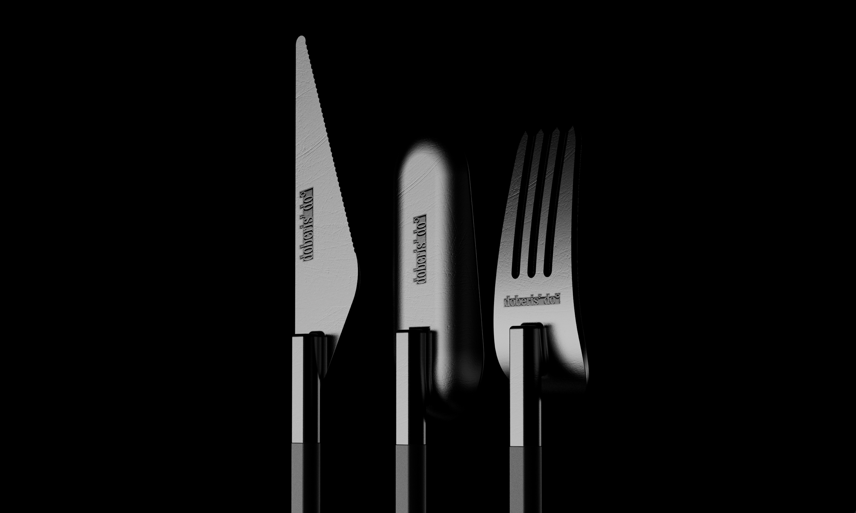
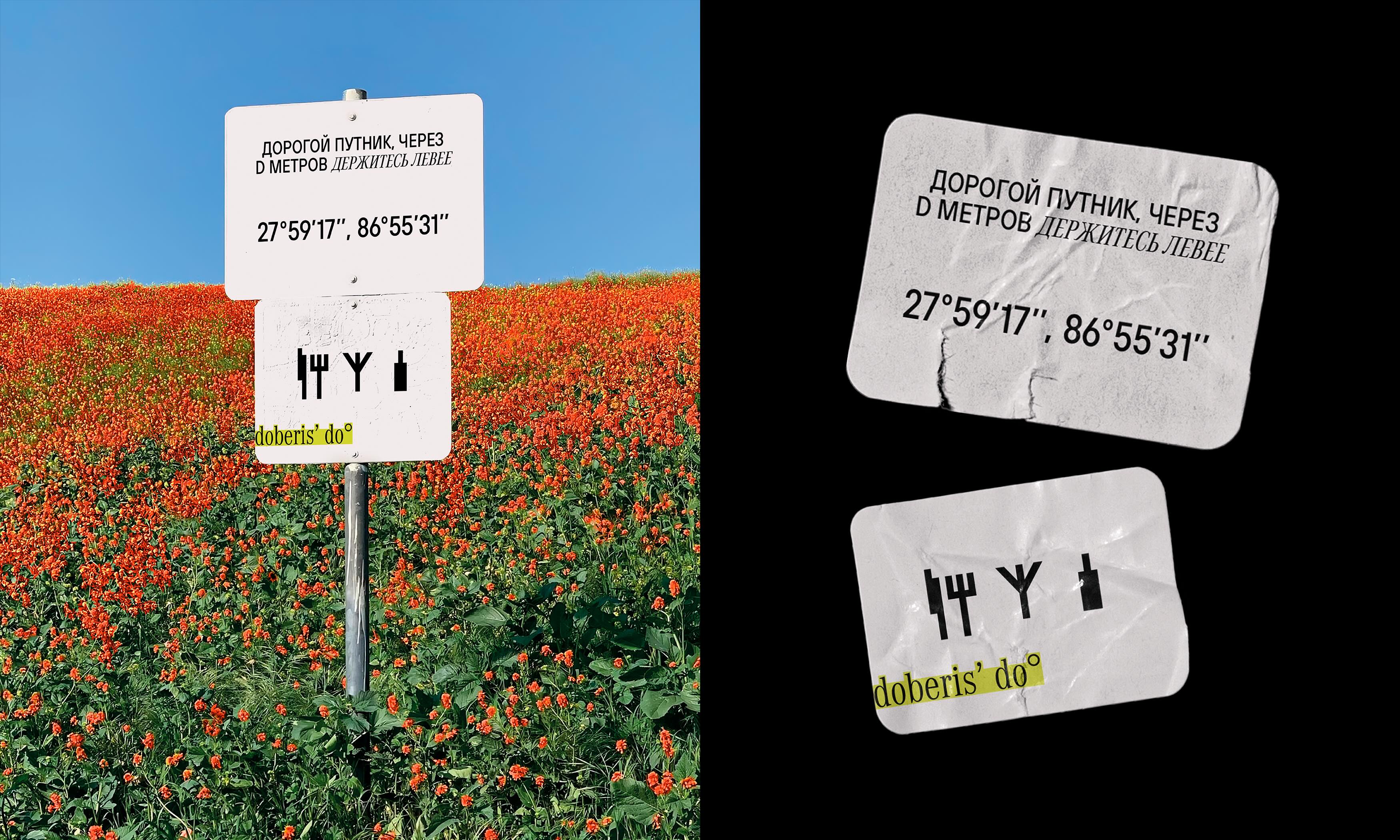
Metal tableware, which is used in the visual language of the brand, refers to the hiking aesthetics, since it is assumed that a person gets to the place where his table is located by himself. But at the same time, the restaurant remains a fairly secular place that is suitable for true connoisseurs of fine cuisine.
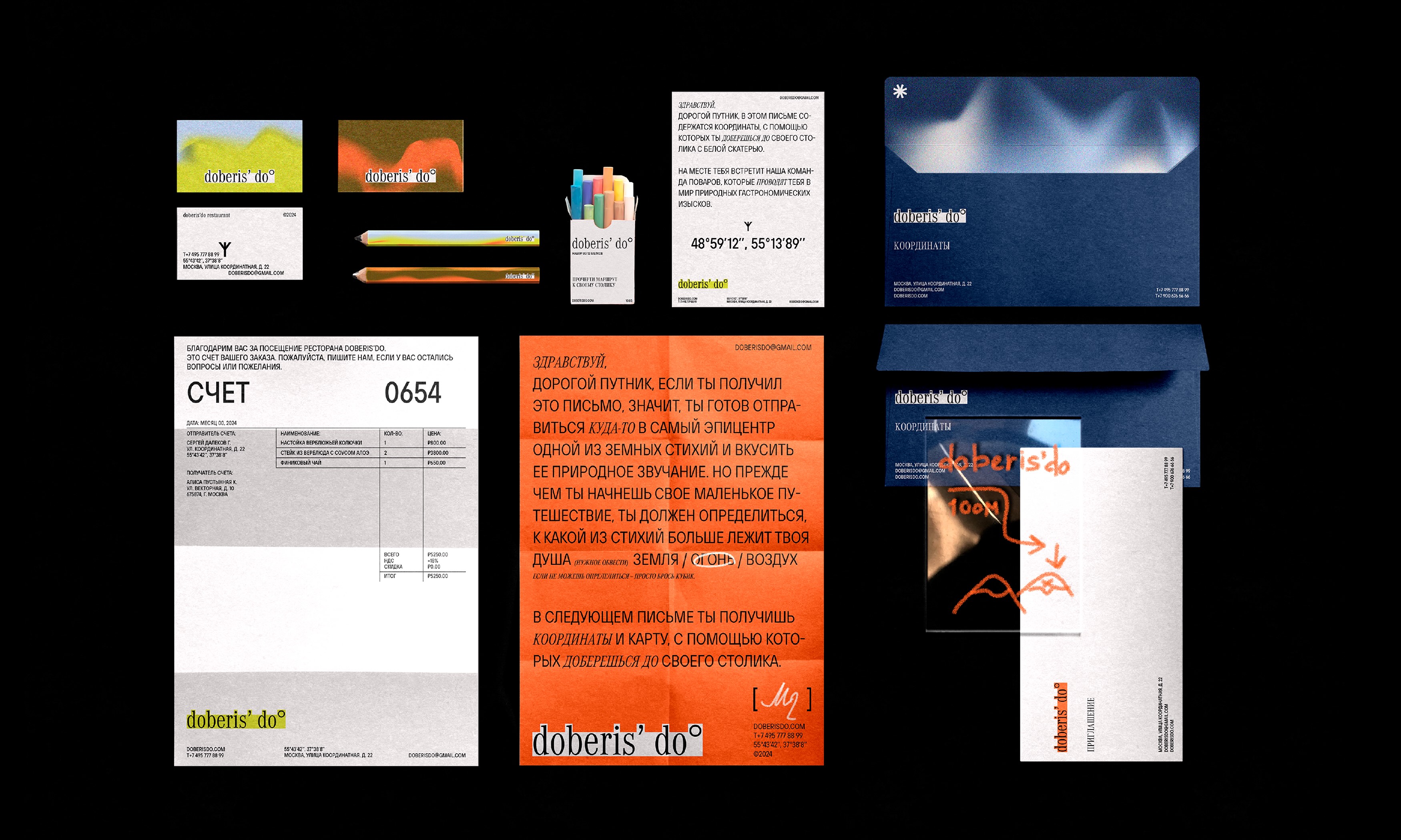
To become a customer of Doberis’ Do restaurant, a person must receive a personal letter, which will indicate the coordinates of the location of his table, taking into account the preferences of the client, his territorial characteristics and the level of remoteness.
The Doberis’ Do restaurant menu is a network of several dishes and drinks that are characteristic of the area where the table is located at a given time, that is, it corresponds to the coordinates defined in your letter. For example, being far away in the desert, you can taste grilled cactus, wash it down with aloe cream soup and date mousse, and also enjoy a tincture of camel thorn or date wine and tea with baobab leaves.
CREDIT
- Agency/Creative: Alisa Shchepoteva
- Article Title: Alisa Shchepoteva’s Student Concept for Doberis’ Do Restaurant Branding Embraces Nature with Bold Visual Metaphors
- Organisation/Entity: Student
- Project Type: Identity
- Project Status: Published
- Agency/Creative Country: Russia
- Agency/Creative City: Moscow
- Market Region: Europe
- Project Deliverables: 2D Design, Brand Design, Brand Identity, Design, Identity System
- Industry: Entertainment
- Keywords: table, restaurant, nature, menu, merch
-
Credits:
Student: Alisa Shchepoteva


