


This packaging and logo were designed for the Bürküt brand in Türkiye.
Packaging:
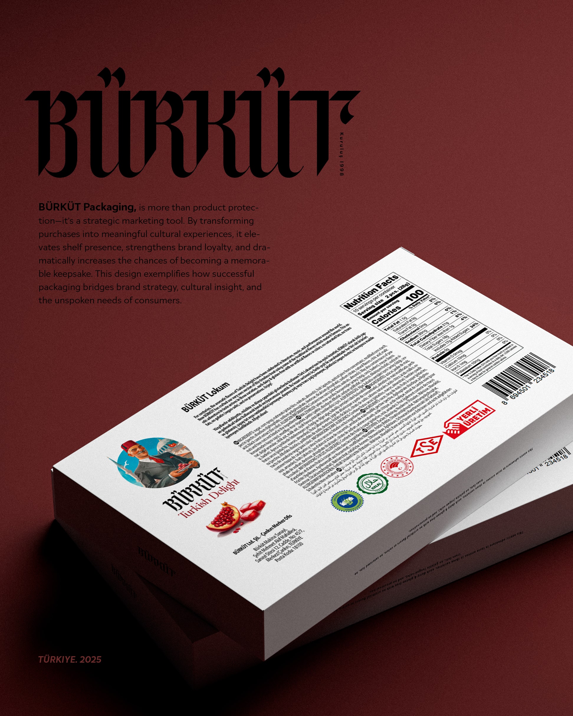
In the packaging design for Bürküt Lokum, the primary challenge was to go beyond the purely protective function and transform the packaging into a part of the consumer’s cultural experience. To create an emotional connection, a reverse path from the common minimalism was chosen—focusing instead on visual richness and storytelling to craft distinction and authenticity, so that the product becomes not just a consumable good, but a cultural keepsake.
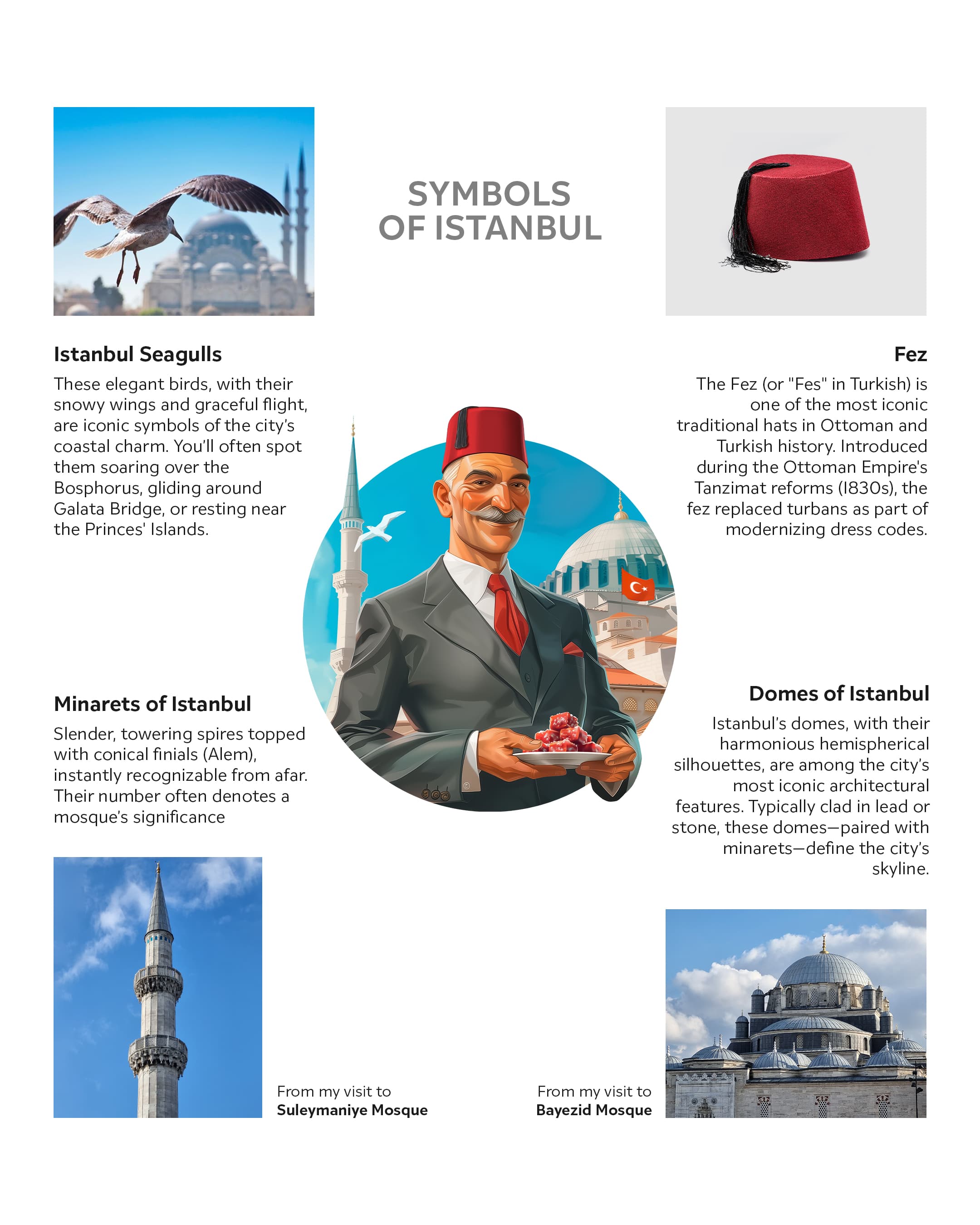
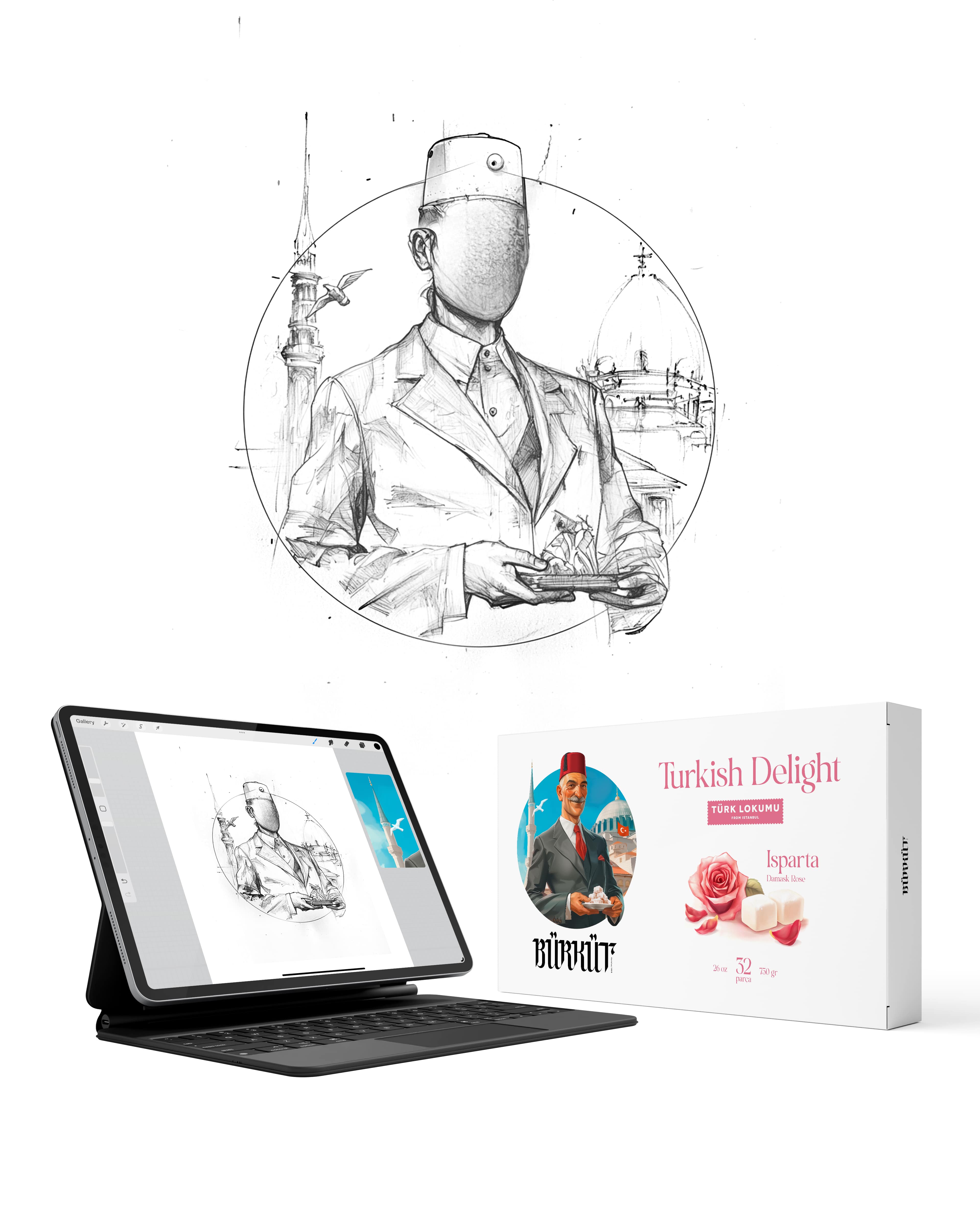
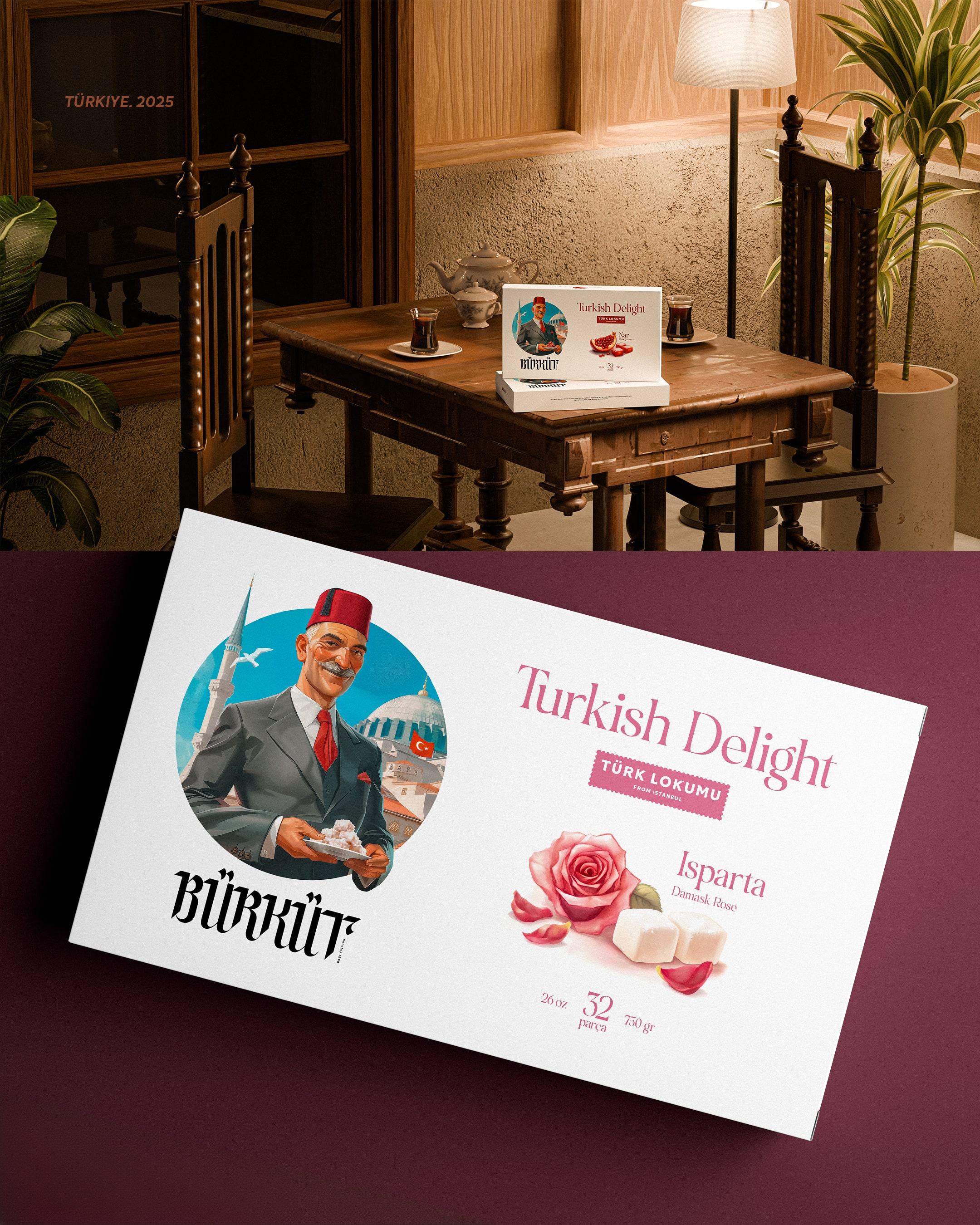
To achieve this, the visual structure of the packaging was divided into two complementary sections: the Narrative Panel and the Clarity Panel. In the Narrative Panel, instead of merely displaying the product, a complete tableau of Turkish identity was depicted. This illustration, blending cultural archetypes and symbolic motifs, creates a visual story that evokes a sense of nostalgia and authenticity, elevating the product to the role of a cultural ambassador for Turkey.
Once the initial attention is captured, the Clarity Panel focuses on clarity and ease of decision-making. Key information, from the brand name to flavors, is presented clearly and digestibly using a powerful visual hierarchy and custom icons for each flavor, making the selection process quick and enjoyable for the buyer. This balance between rich storytelling and clear communication is at the heart of this design’s success.
Ultimately, Bürküt’s packaging is more than a product protector—it’s a strategic marketing tool that helps the product stand out on the shelf by transforming the purchase into a meaningful cultural experience, reinforcing brand loyalty, and greatly increasing the chance of becoming a memorable souvenir. This design illustrates how successful packaging bridges brand strategy, cultural insight, and the unspoken needs of the consumer.
Logotype:
After the linguistic reforms of the Atatürk era and the replacement of the Arabic script with the Latin alphabet, the Turkish language experienced a visual rupture. The continuity and artistic spirit of Ottoman scripts gave way to the orderly structure of Latin letters. The Bürküt project is an attempt to breathe the soul of traditional calligraphy into the body of modern Turkish letters.
In the design of the Bürküt logotype, the main goal was to recreate the sense of continuity and the fluid rhythm of traditional scripts within the Latin alphabet’s structure. Drawing inspiration from the interconnected forms of classical calligraphy, the letters were crafted to be modern while still carrying the rich heritage of the past. This approach was not merely imitation but a deliberate interpretation that, through the creation of ligatures and the incorporation of delicate calligraphic details in elements like the curve of the final “t” and the dotted letter “ü,” imbued the letters with a unique identity.
The Bürküt logotype is the result of this process: a contemporary and legible visual identity that pays homage to Turkey’s rich calligraphic history. This design demonstrates how one can bridge tradition and modernity, creating a work that is both meaningful in the present and deeply rooted in cultural heritage.
CREDIT
- Agency/Creative: Ali Rahmani
- Article Title: Ali Rahmani Elevates Bürküt Lokum into a Cultural Experience Through Rich Packaging
- Organisation/Entity: Freelance
- Project Type: Packaging
- Project Status: Published
- Agency/Creative Country: Canada
- Agency/Creative City: Toronto
- Market Region: Asia, Middle East
- Project Deliverables: Brand Identity, Character Design, Graphic Design, Illustration, Packaging Design
- Format: Box
- Industry: Food/Beverage
- Keywords: Turkish Delight / Lokumu / Packaging
-
Credits:
Graphic Designer: Ali Rahmani


