


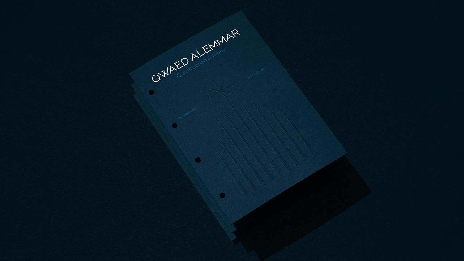
Qwaed Alemmar
A Saudi contracting company that is distinguished by its ability to implement all stages of the project, starting from construction and building to final finishing with world-class and distinctive quality. The company aspires to be one of the best companies in the Kingdom of Saudi Arabia by 2030.
This project aims to create a distinctive brand that expresses the company’s luxury, strength, innovation and cohesion.
The Goal
Our goal was to create a distinctive and strong brand that reflects elegance and innovation, capable of leading in a constantly evolving market such as the Saudi market.
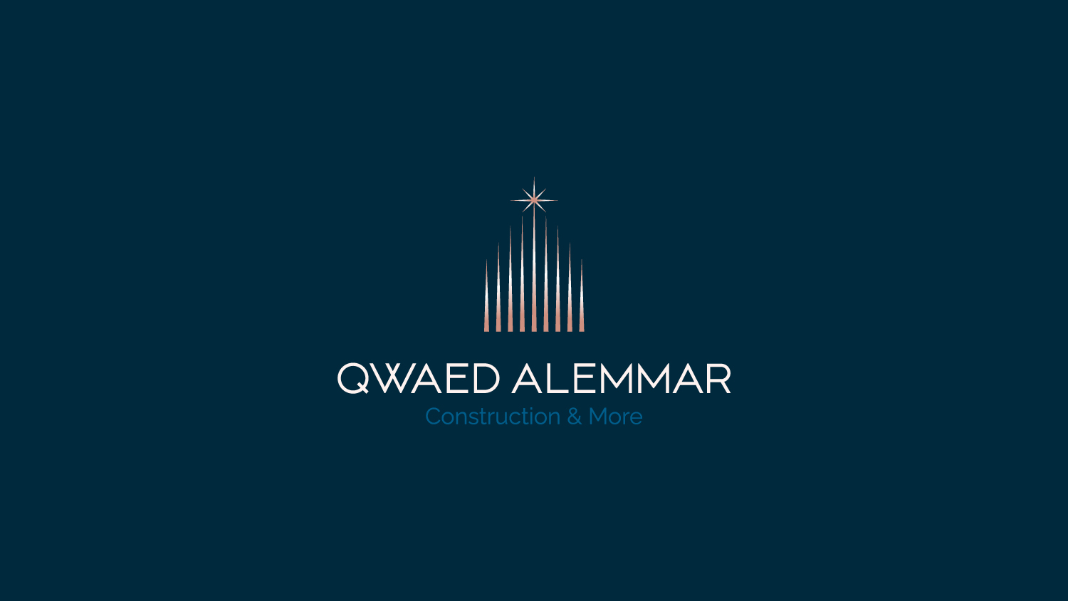
The Logo
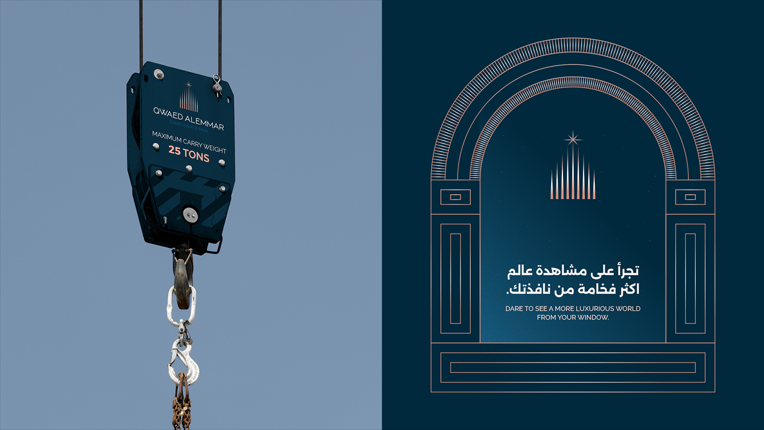
The bright star symbolizes excellence and leadership in the field of contracting.
The towering lines symbolize modern towers characterized by a modern architectural design, reflecting our strength and creativity in planning and implementation.
The word mark symbolizes modernity and clarity, which reflects the professionalism and seriousness of the construction rules, while the weight is medium to thick, suggesting confidence and stability.
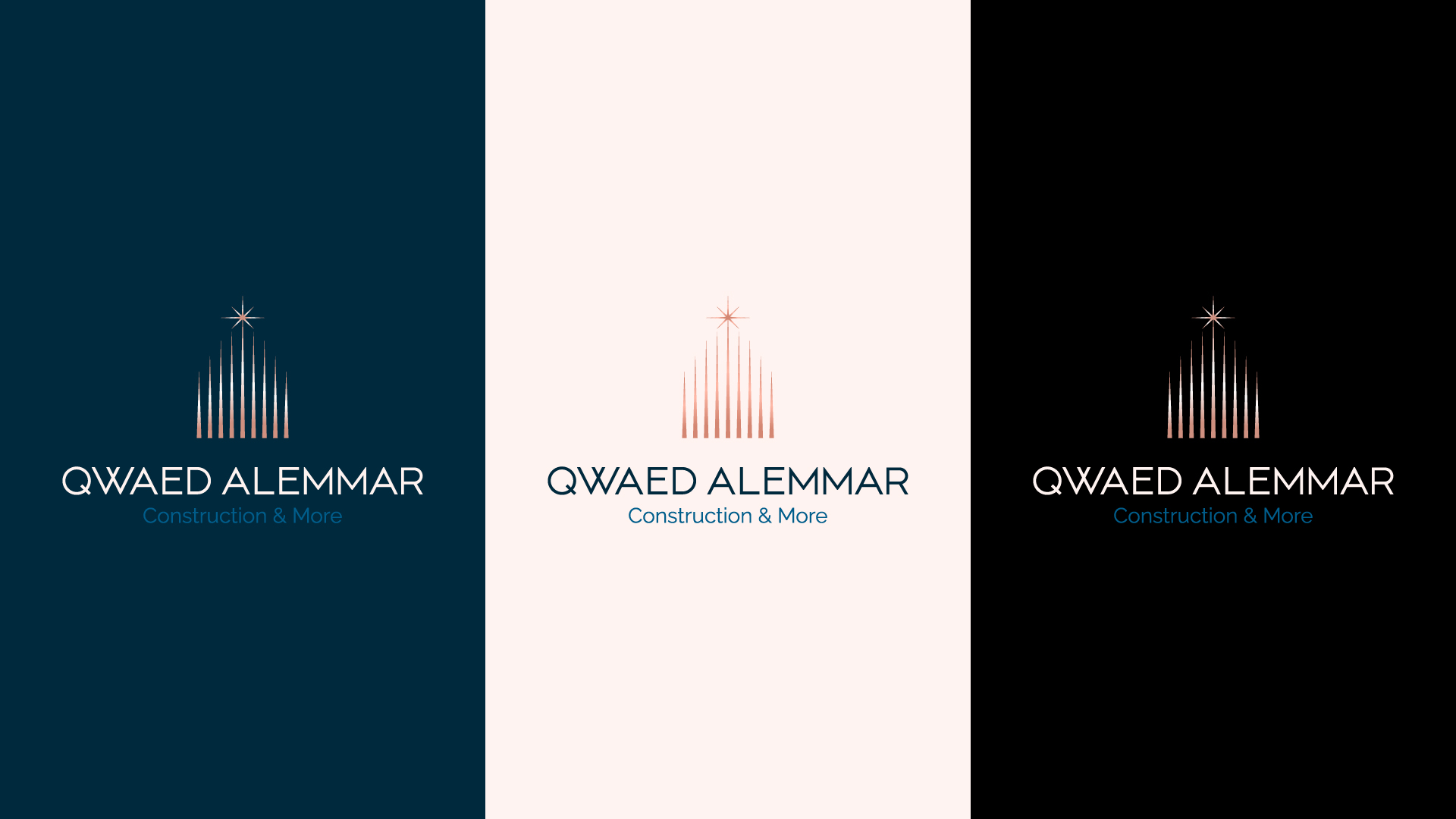
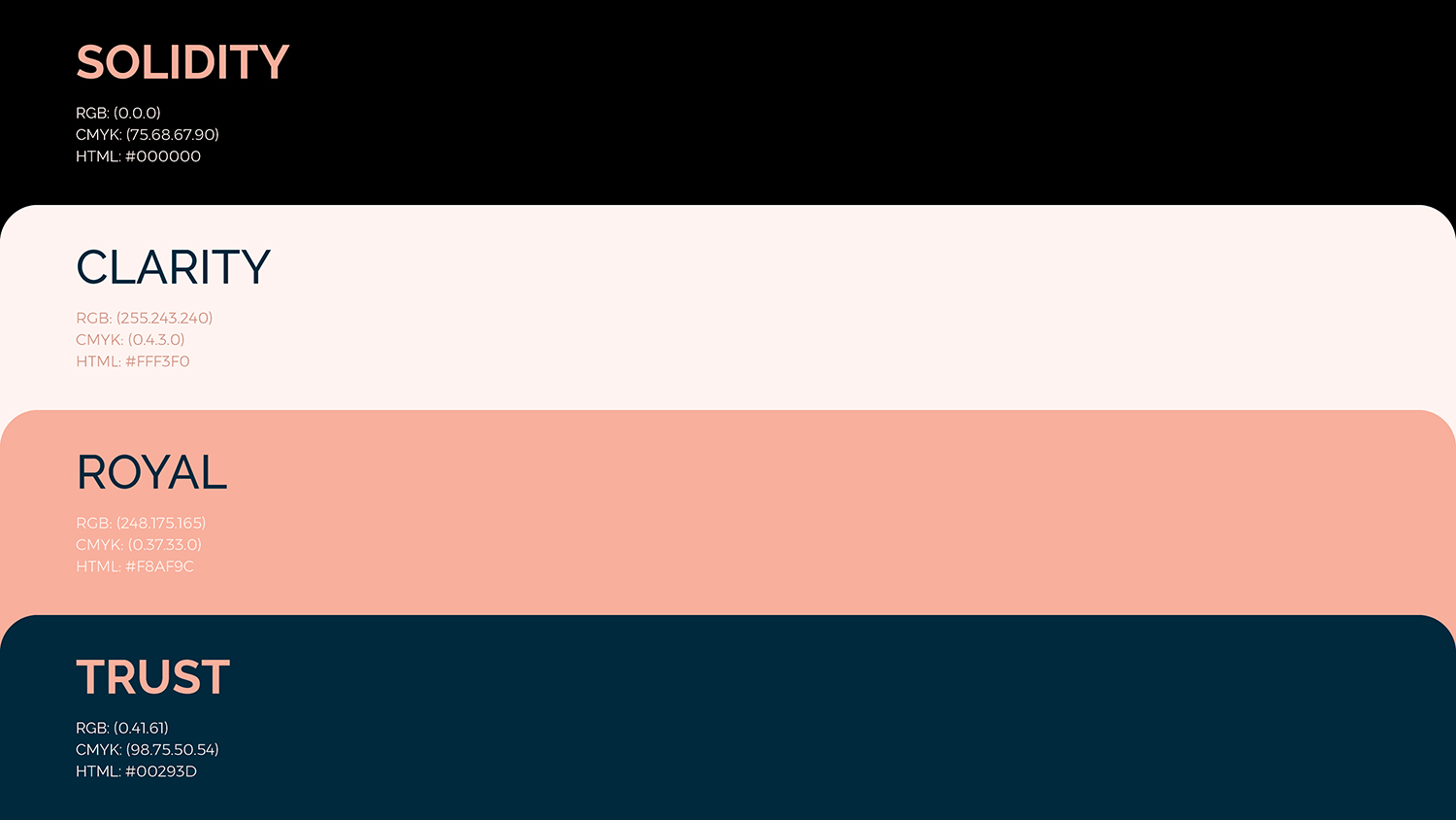
Color Strategy
The combination of these colors creates a sense of balance and harmony.
Dark blue (TRUST) is an essential element that reflects confidence and seriousness, while pink (ROYAL) adds a touch of luxury and sophistication, and light color (CLARITY) creates a sense of openness and spaciousness.
Strategic Challenges
During the strategic immersion, we conducted a focused understanding process that allowed us to identify the keywords that best represent the brand’s personality. At the core of the identity, we highlighted four key attributes that the brand’s branding aims to convey: elegance, strength, innovation and modernity.
These concepts form the foundation on which the brand’s entire communication is built. In addition, we identified secondary attributes that complement and enrich the visual identity: creativity, distinctiveness and authenticity.
These elements were carefully combined to ensure that the brand not only stands out for its elegance and innovation but also conveys a sense of confidence, creativity and sophistication.
The challenge was also the need for a homogeneous brand that works on unified communication at all times to effectively utilize physical touch points such as offices, construction sites and meeting places. It was necessary to work on a brand that could adapt to different and multiple environments, ensuring consistency in all different environments and times.
The strength and distinction of visual communication in different environments was a big challenge that we worked to achieve.
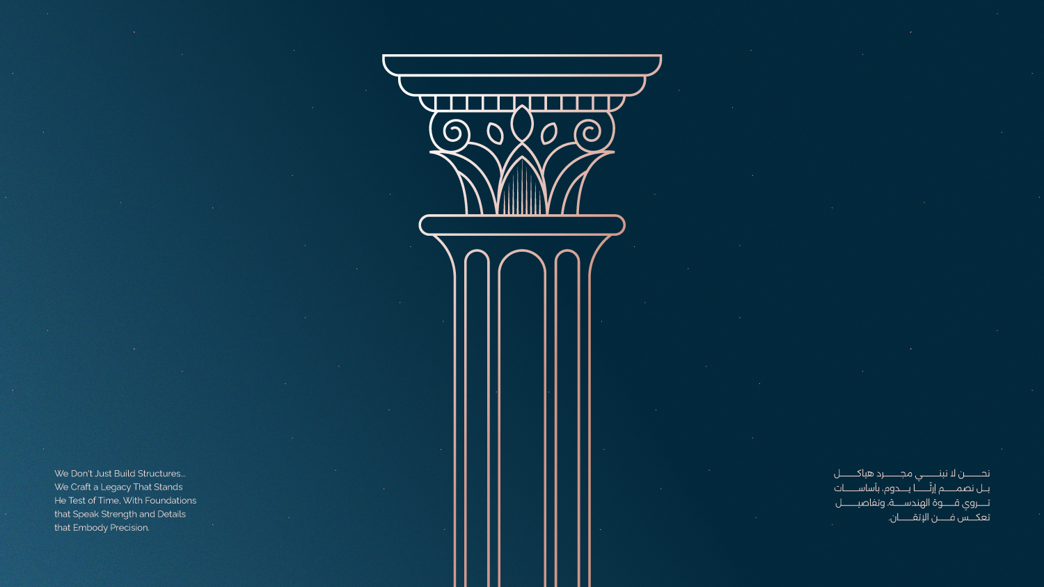
The illustration based on line art, with a strong emphasis on architectural and structural elements. There’s a clear use of symmetry and balance, with elements repeated in a regular, harmonious way.
Element Analysis
Arches
These appear frequently, suggesting ideas of continuity, expansion, or even containment. Arches can represent entrances, or even passageways, or windows, reflecting a focus on architectural spaces.
Columns
Columns act as vertical support elements, reinforcing a sense of stability and strength. They also add a classical to the brand identity.
Star
The star appears as a top element, adding a touch of hope, positivity, or even inspiration. It can also symbolize energy and creativity.
Decorative Details: Some simple decorative details are present, but they don’t overpower the overall design. These details add a touch of elegance and refinement.
Visual Message
The illustrations convey a message about the ability to build and construct ” form construction to key ” ,while highlighting distinctive architectural elements. There’s a focus on continuity and development, with a touch of positivity and hope.
the Design Concept Can Be Described As
– Architectural: Focusing on architectural elements and spaces.
– Linear: Relying on lines to form elements and details.
– Symmetrical: Achieving visual balance through the repetition of elements.
-Positive: Using elements like the star to add a touch of hope and positivity.
CREDIT
- Agency/Creative: Ali Attia
- Article Title: Ali Attia Elevates Qwaed Alemmar with a Strategic Identity Merging Elegance and Architectural Precision
- Organisation/Entity: Freelance
- Project Type: Identity
- Project Status: Published
- Agency/Creative Country: Saudi Arabia
- Agency/Creative City: Ali Attia
- Market Region: Middle East
- Project Deliverables: Art Direction, Brand Design, Brand Guidelines, Brand Identity, Illustration, Logo Design, Motion Graphics
- Industry: Real Estate
- Keywords: #construction #real estate #interior design #luxury #Saudi #brand identity #Logo Design #ILLUSTRATION #designer #creative
-
Credits:
Ali: Ali Attia


