Brand Overview
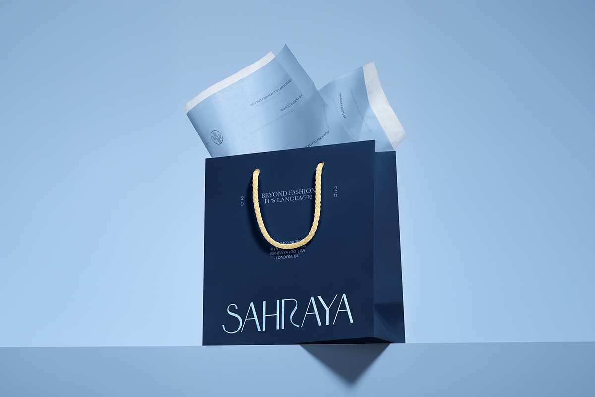
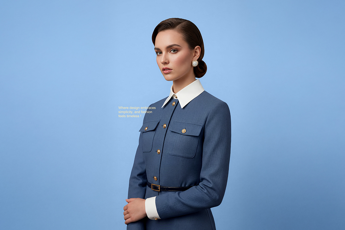
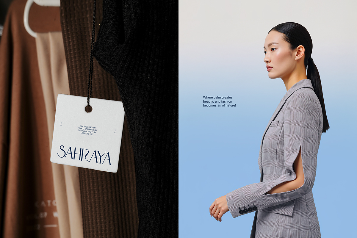
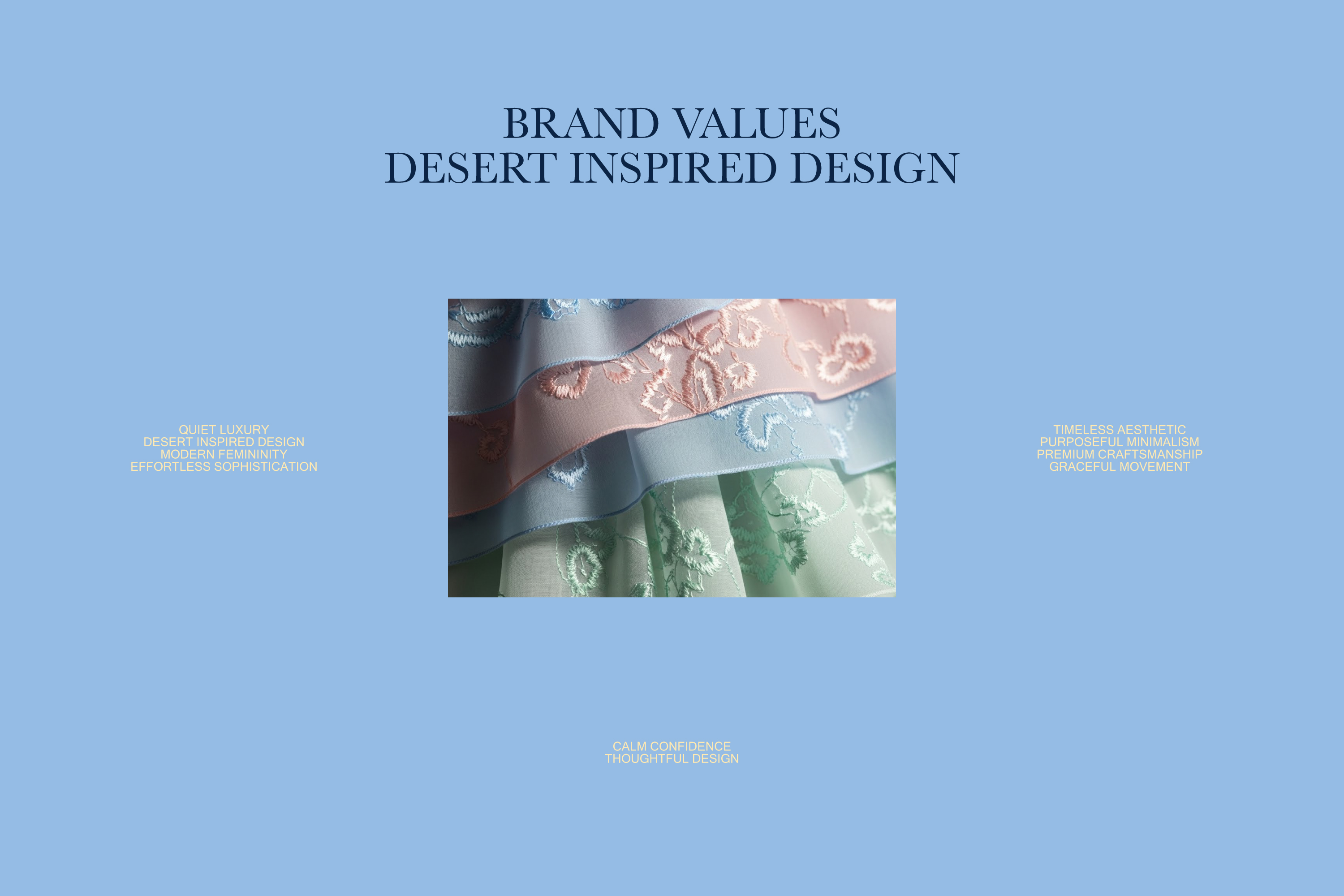
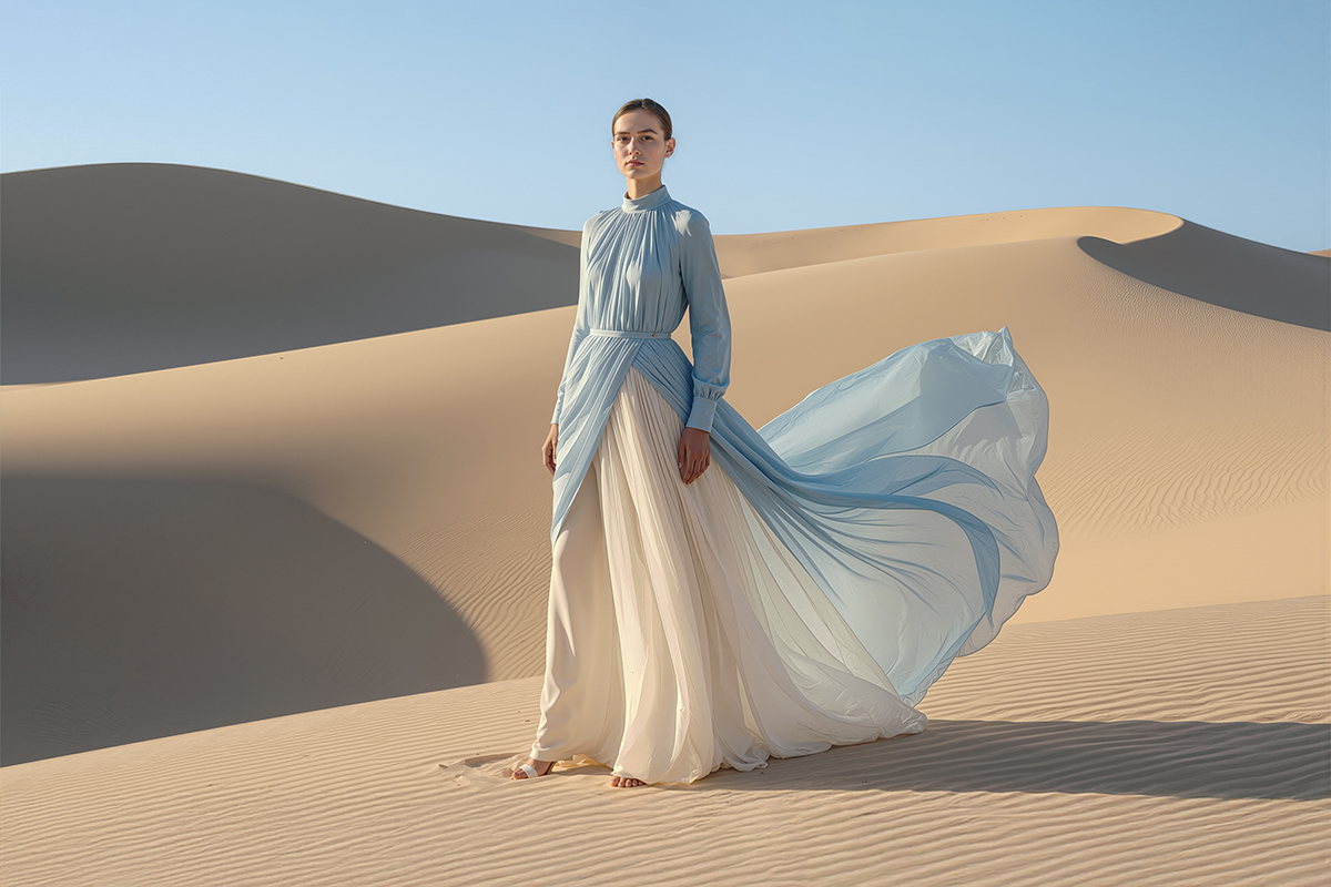
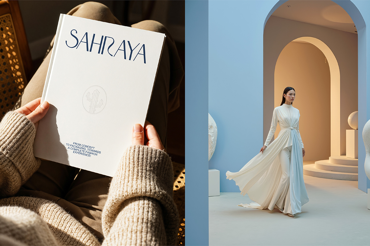
SAHRAYA is a luxury fashion brand inspired by the quiet beauty of desert landscapes and the elegance of modern femininity. The brand blends soft silhouettes, refined craftsmanship, and timeless design to create pieces that feel both effortless and sophisticated. Rooted in minimalism and balance, SAHRAYA focuses on premium fabrics, delicate details, and graceful movement. Each design reflects a sense of calm confidence, celebrating individuality through subtle luxury rather than excess. SAHRAYA’s visual and design language is clean, airy, and refined, expressing a contemporary yet timeless identity that resonates with women who value elegance, quality, and thoughtful design.
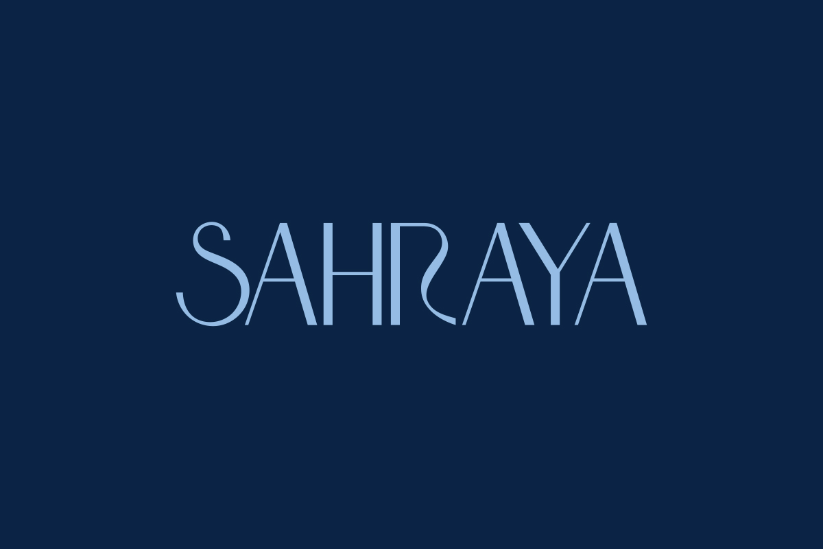
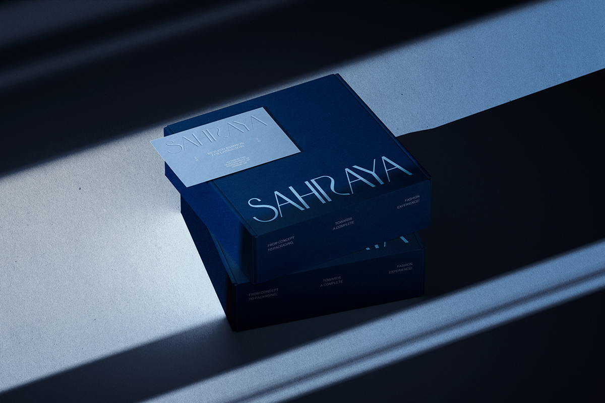
The SAHRAYA logotype is designed to embody femininity, fluidity, and quiet elegance.
Its soft curves are inspired by the natural movement of fabric, reflecting the way couture
flows around the female form. The typography balances strength and delicacy, creating
a refined visual rhythm that feels graceful and timeless.
My Role as a Brand Designer
As the brand designer behind SAHRAYA, my role was to shape a clear and cohesive identity that translates the brand’s vision into a complete, meaningful experience.
I approached the process by aligning strategy, aesthetics, and emotion ensuring that every visual element reflects the brand’s values of calm confidence, refined simplicity, and quiet luxury.
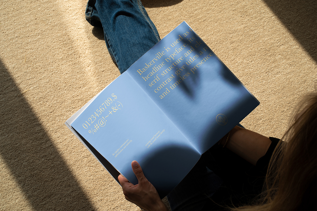
From defining the visual language to curating the color palette, typography, and overall tone, my focus was on creating an identity that feels timeless, intentional, and deeply connected to the modern woman.
The result is a brand system that goes beyond visuals, supporting a consistent and elegant experience across fashion, packaging, and storytelling.
Abstract Illustrations
& Brand Icon:
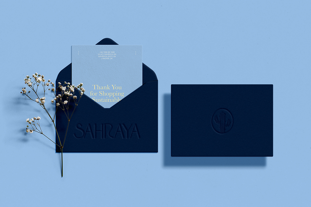
The brand icon is a flexible visual element that embodies the brand’s identity and spirit. It can be used as a standalone mark or as a foundation for creating innovative visual applications. The icon is designed in a way that allows it to be deconstructed, enlarged, or repeated to generate abstract patterns that can be applied across various visual touchpoints.
The icon is utilized in creative spaces such as: Backgrounds – Patterns – Packaging – Marketing Materials – Digital content While always maintaining visual consistency, original proportions, and approved color palettes, ensuring a strong and cohesive brand presence across all applications.
Design Challenge
SAHRAYA is a fashion design brand that believes style is more than appearance,
it is a language of identity, elegance, and restraint.
The challenge was to create a visual system that reflects timeless sophistication while remaining contemporary and minimal. Every design decision needed to balance clarity with luxury, and simplicity with depth.
The Focus Was On:
• Translating the brand’s philosophy into a refined visual tone
• Creating a cohesive color palette that feels calm, confident, and enduring
• Exploring materials, textures, and finishes that elevate the tactile experience
• Ensuring consistency across branding elements while allowing flexibility for future growth
The goal was not to follow trends, but to build a visual presence that feels enduring, where fashion goes beyond clothing and becomes a quiet statement.
CREDIT
- Agency/Creative: Ali Attia
- Article Title: Ali Attia Designs a Timeless Luxury Brand Identity for Sahraya Fashion
- Organisation/Entity: Freelance
- Project Type: Identity
- Project Status: Published
- Agency/Creative Country: Egypt
- Agency/Creative City: Ali Attia
- Market Region: Europe
- Project Deliverables: 2D Design, Art Direction, Brand Design, Brand Guidelines, Brand Identity, Branding, Graphic Design, Typography
- Industry: Fashion
- Keywords: fashion design Logo Design branding ArtDirection Graphic Designer graphic design identity brand identity Social Media
-
Credits:
Branding: Ali Attia


