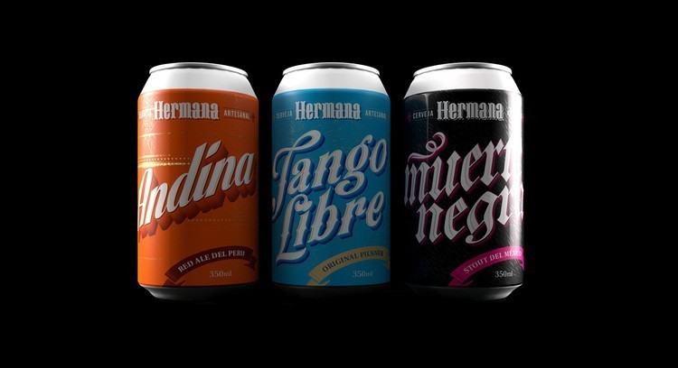
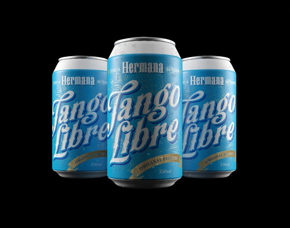
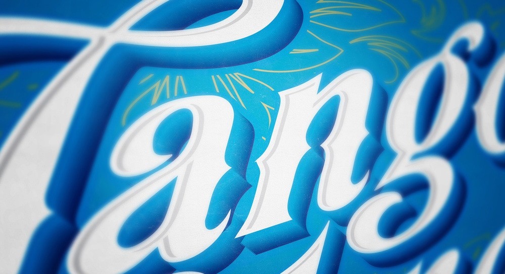
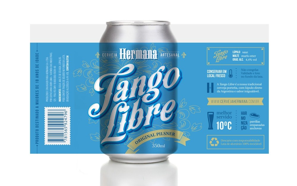
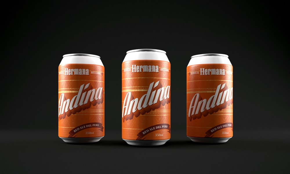
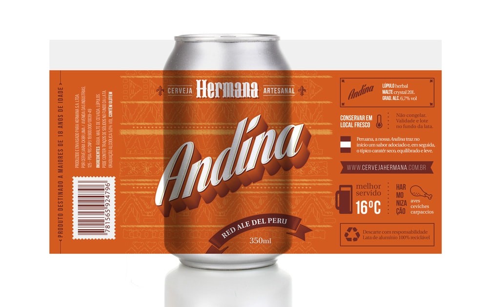
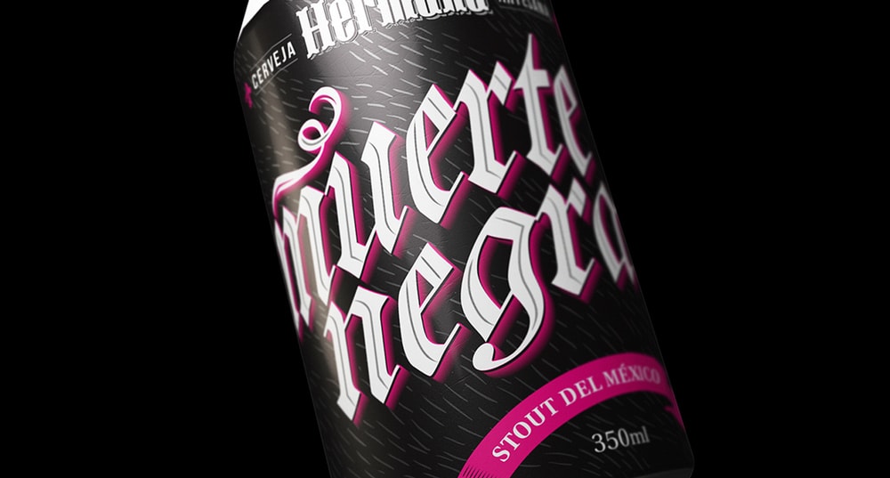
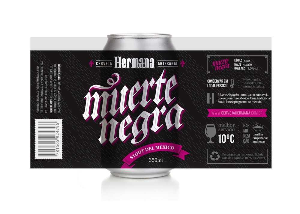
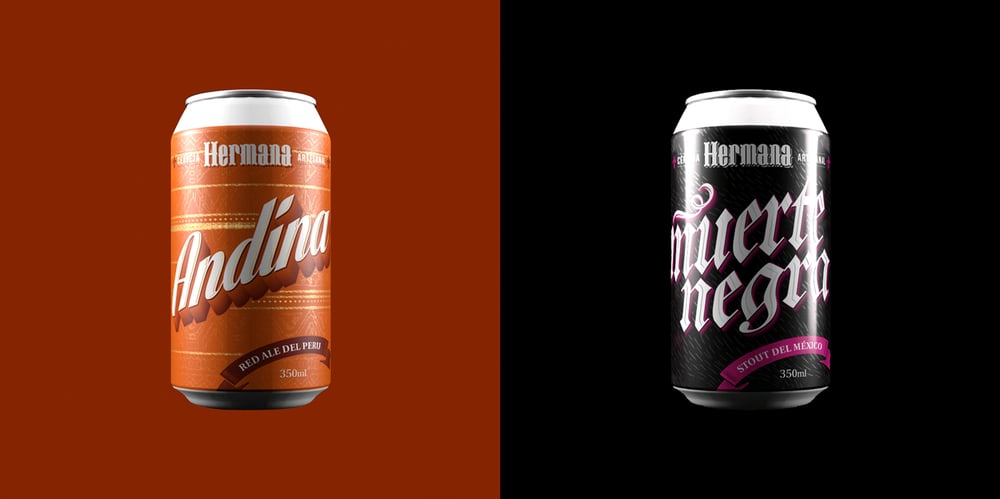
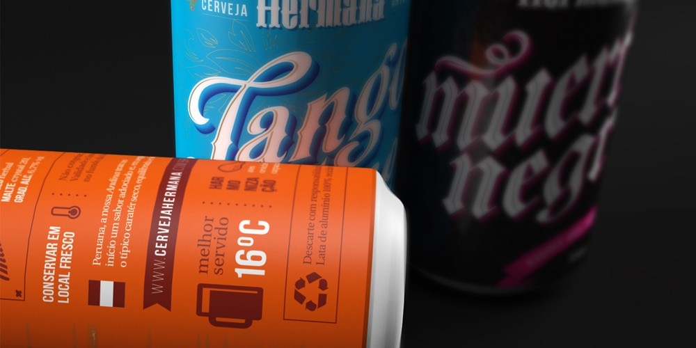
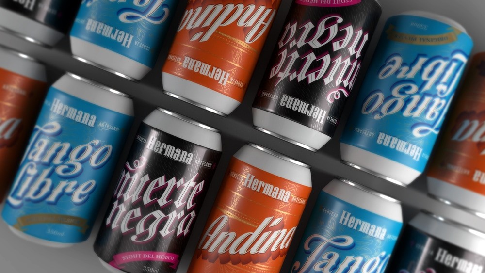
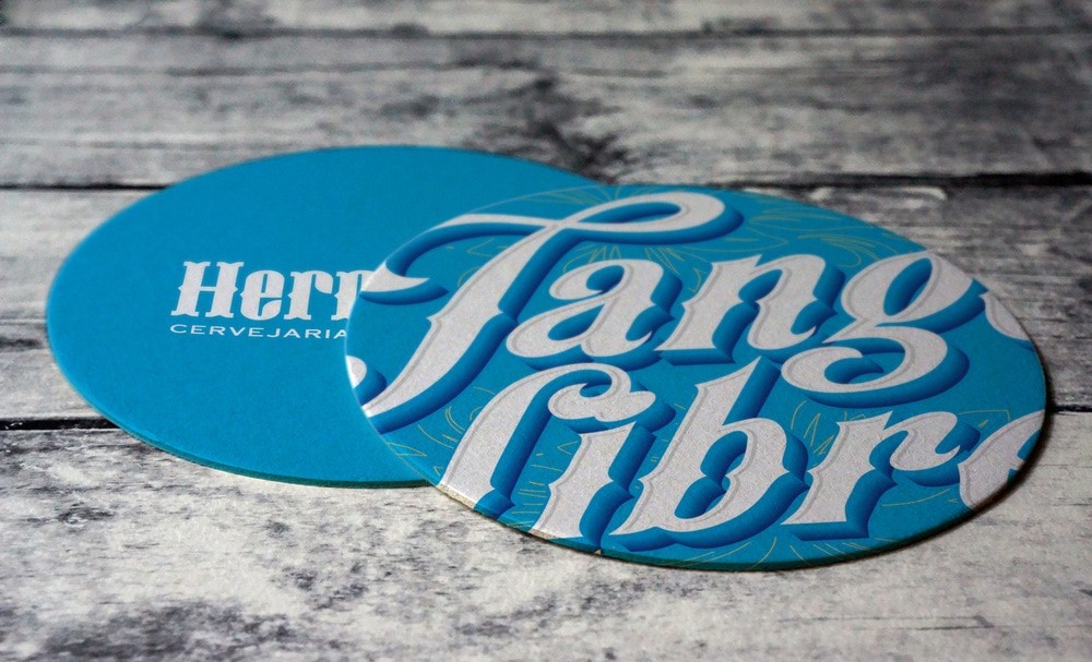
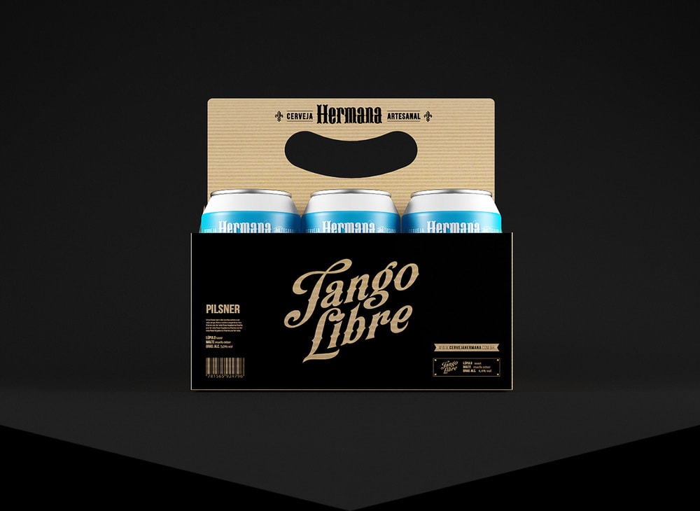
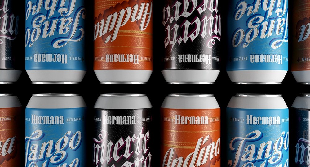
“Hermana is a craft beer inspired by the rich local art from different countries in america. The brand name suggests that we can all be brothers, celebrating it next to a mug of beer. The package design was directed to a creative direction using typographic elements with lot of weight and originality, differing among themselves through artistic styles and color palette. The typography of the logo has been specially designed from scratch to make the single brand. Each beer refers to a bit of your country, from its visual appeal to your taste. If Hermana could speak a war cry, it would be “all for the beer.” ”

CREDIT
- Agency/Creative: Alexandre Fontes and Renata Venturini
- Article Title: Alexandre Fontes and Renata Venturini – Hermana Craft Beer
- Project Type: Packaging
- Format: Can
- Substrate: Metal
FEEDBACK
Relevance: Solution/idea in relation to brand, product or service
Implementation: Attention, detailing and finishing of final solution
Presentation: Text, visualisation and quality of the presentation


