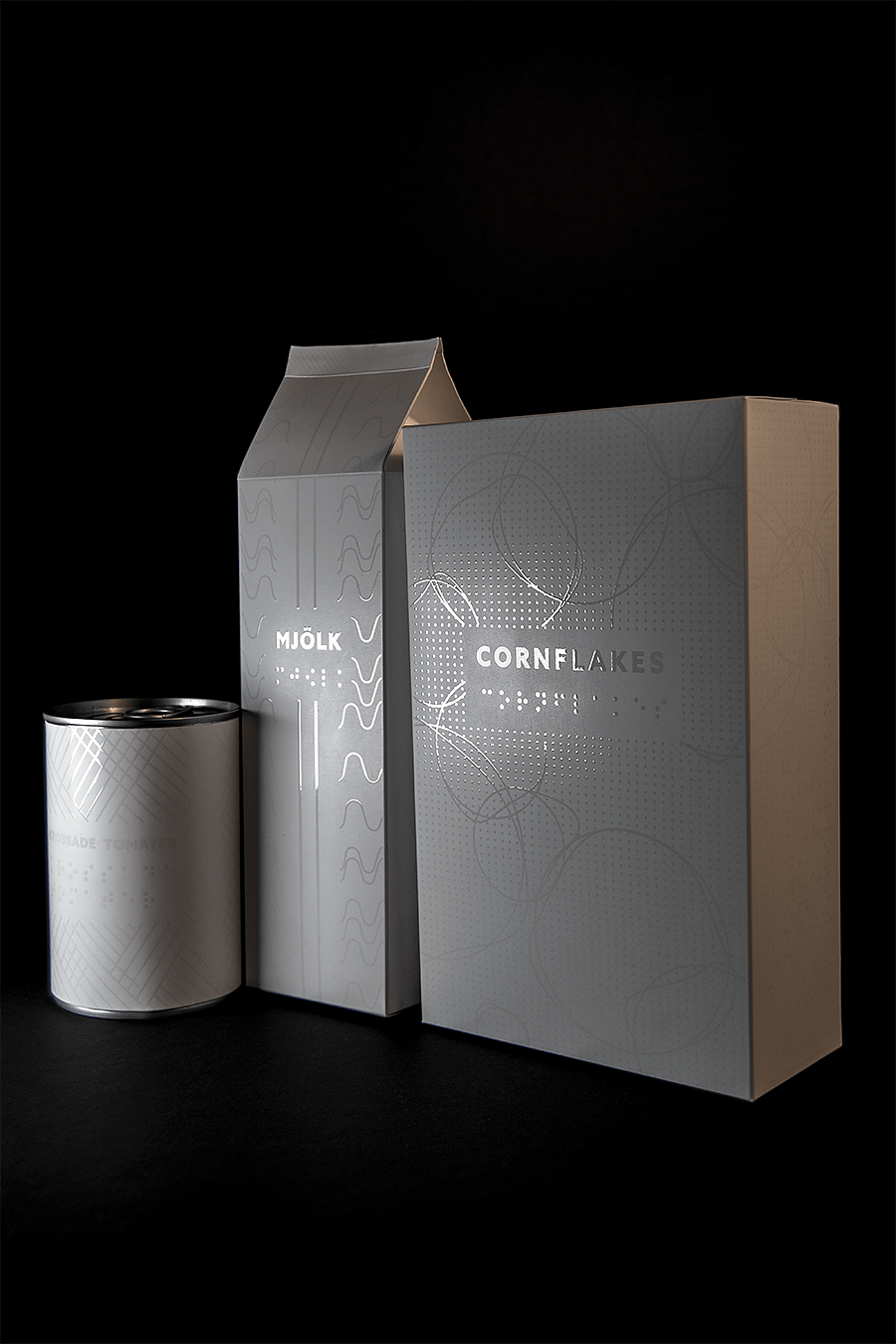
“In my graduation project at Forsbergs School of graphic design and advertisement, I asked myself if it’s possible to make an aesthetically appealing packaging design for the visually impaired. Is it possible to give the sightless same experiences as people with vision?
I started the project by getting to know my audience through interviews and trying myself what it’s like to be blind. The choice of packages became groceries since it was clear in my research that there is an extreme lack of information written in Braille on these kinds of packages.
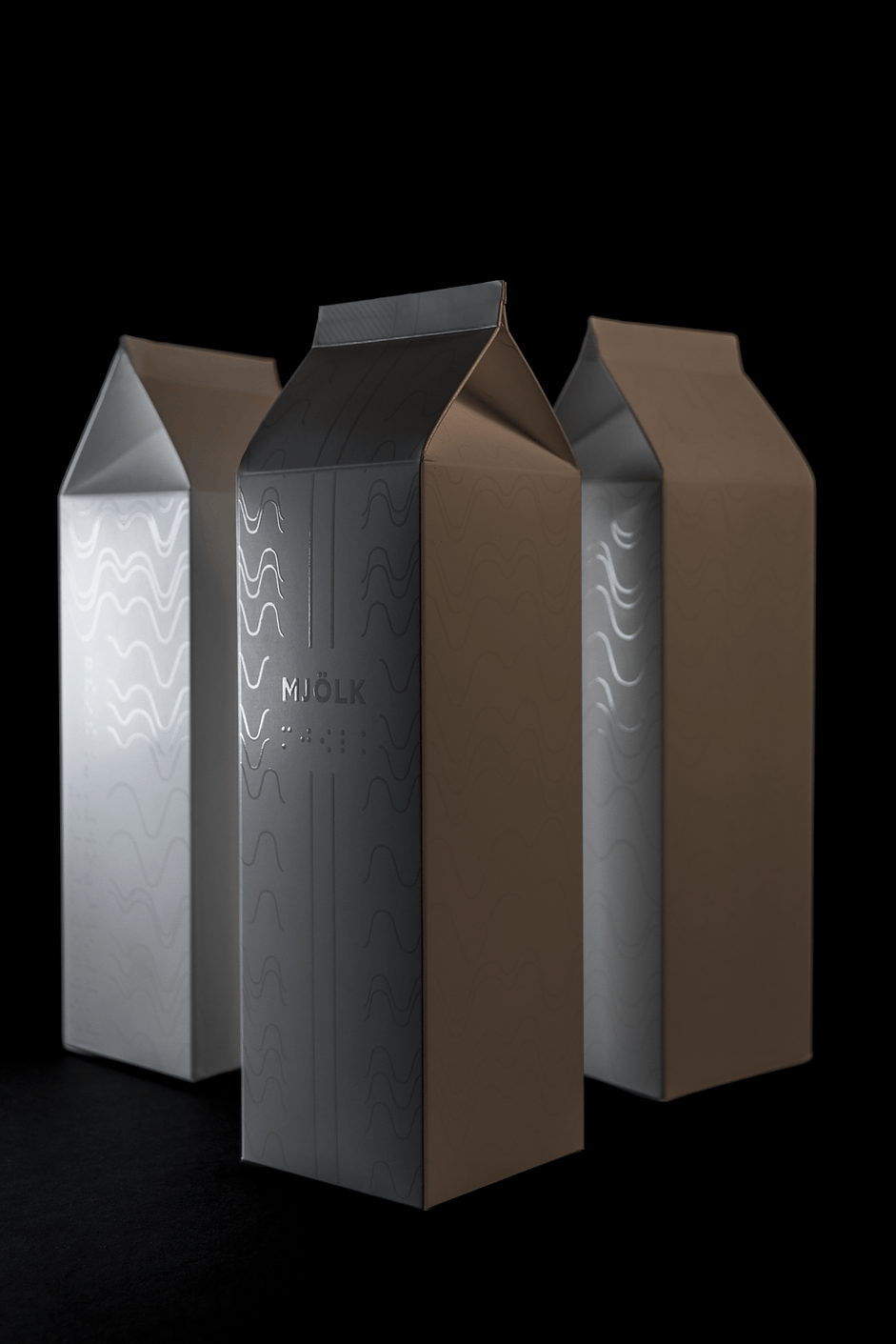
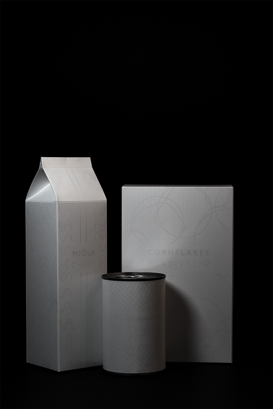
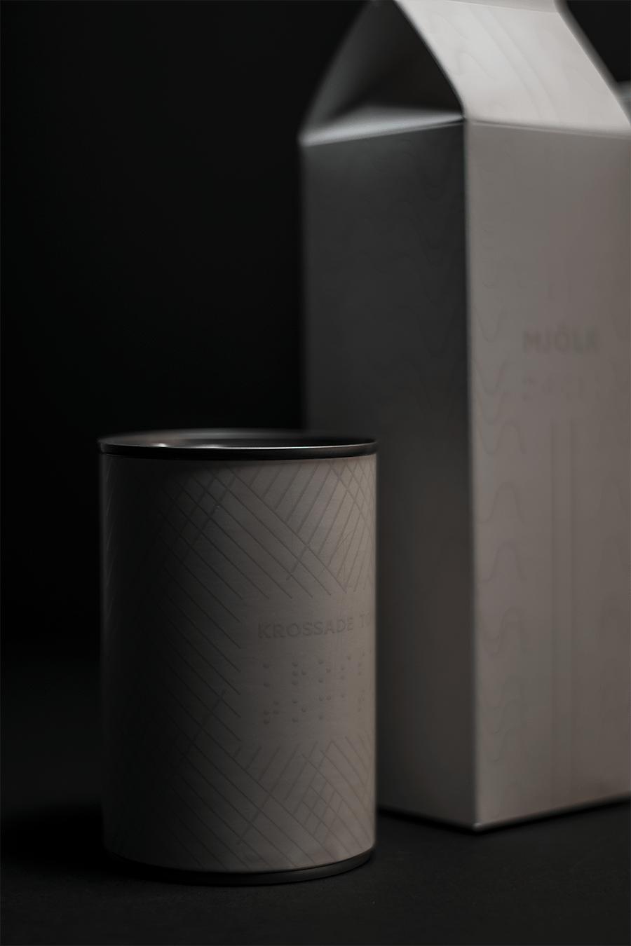
At the school’s graduation exhibition, the result was a small room, transformed into a supermarket showing the three packages I designed – milk, cornflakes and canned tomatoes.
The packages were dynamically designed with a focus on feeling the aesthetical designs, but also informed about content and how to open the packages.
One person at a time was invited to the grocery store and after I closed the door and the person was left alone in the shop, the lights were turned off after twenty seconds. Well inside, the person got to touch the packages in total darkness to the sound of cash registers beeping and similar supermarket background sounds.
The response became great and many appreciated the idea. My goal with this project is to arouse discussion and pave the way for innovative thinking about how packaging design can appeal to more senses than sight.”


CREDIT
- Agency/Creative: Alexandra Burling
- Article Title: Alexandra Burling – Color me blind Packaging design for the sightless (Student)
- Project Type: Packaging
- Format: Box, Tube
- Substrate: Pulp Board, Pulp Carton


