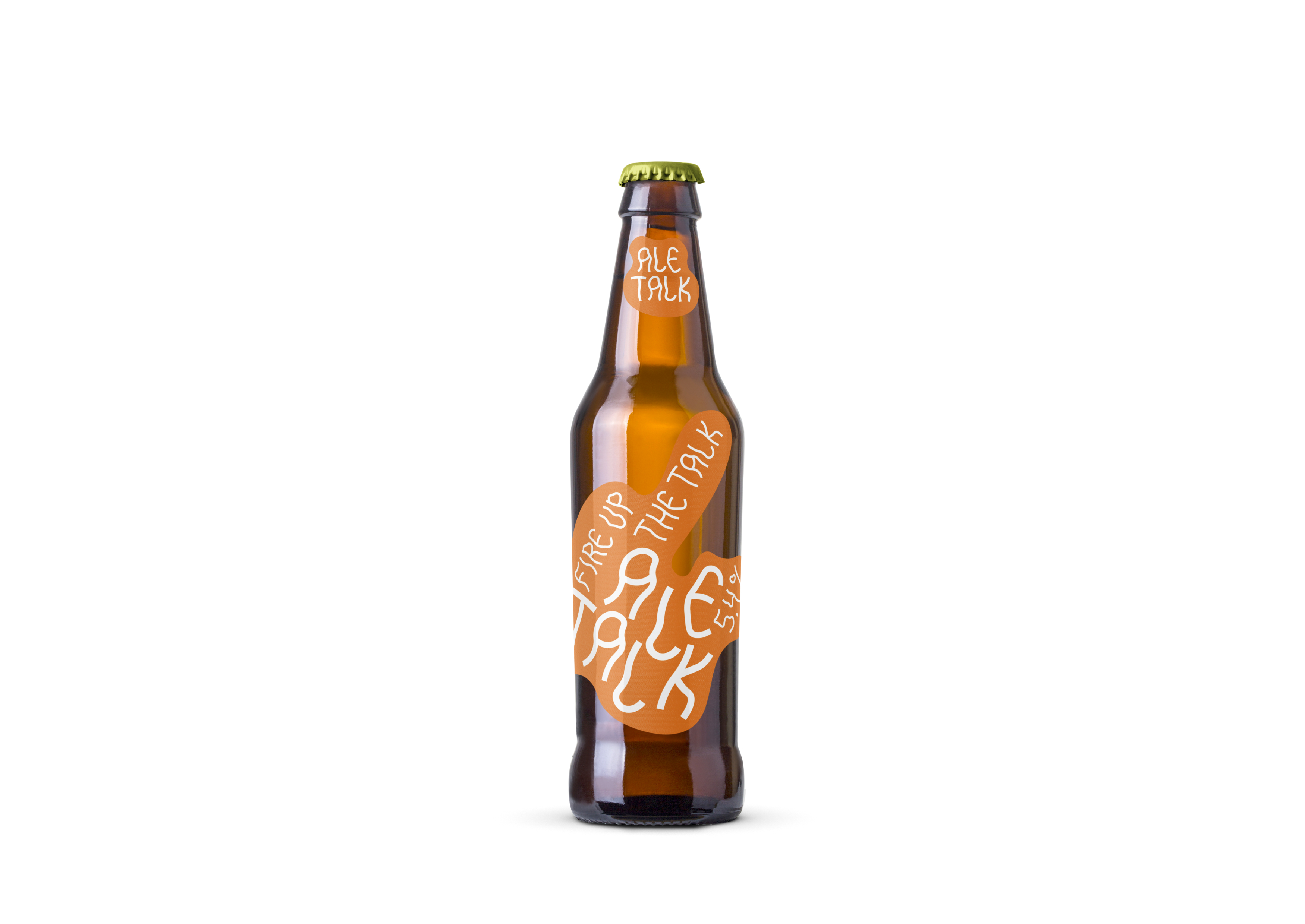
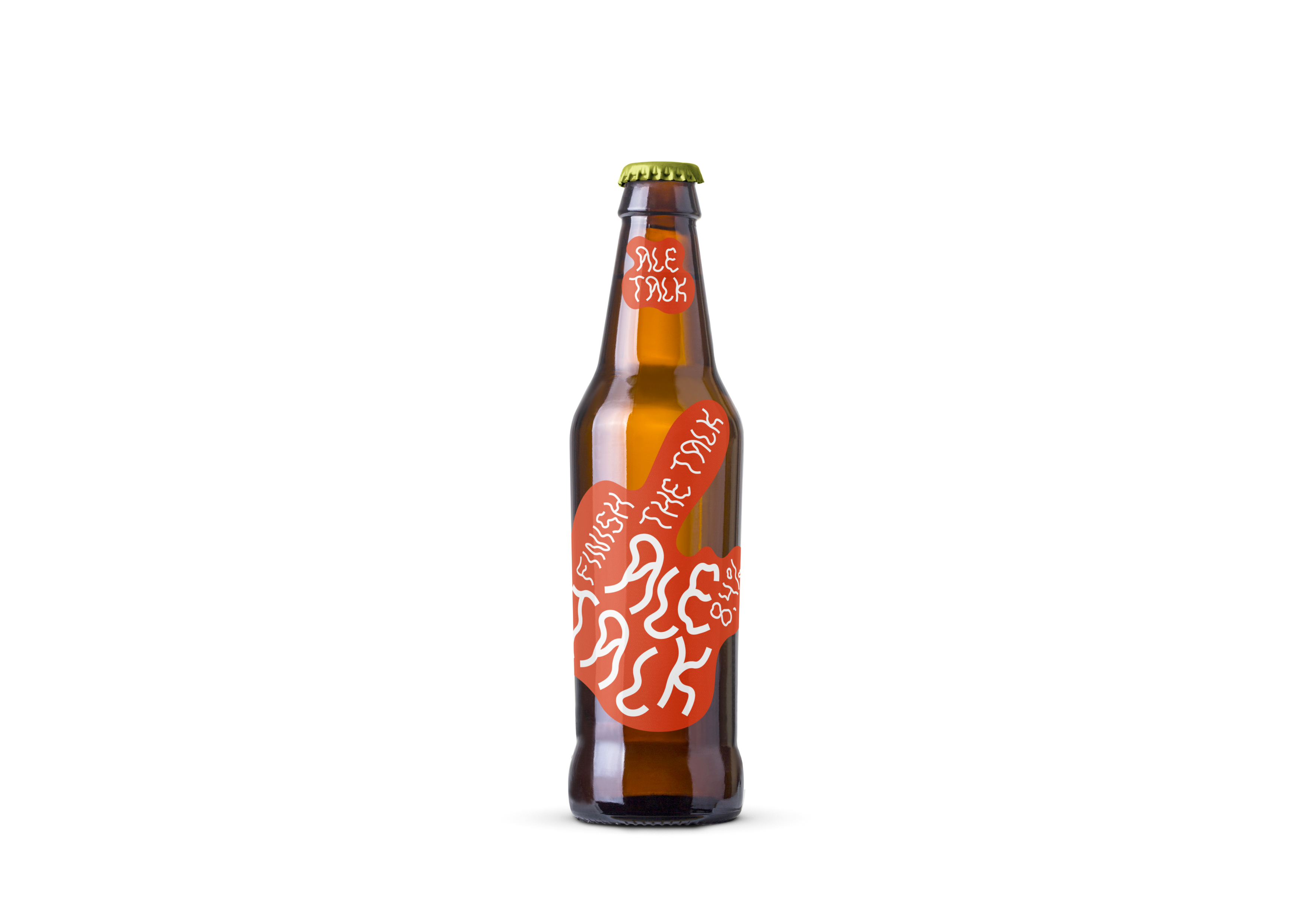
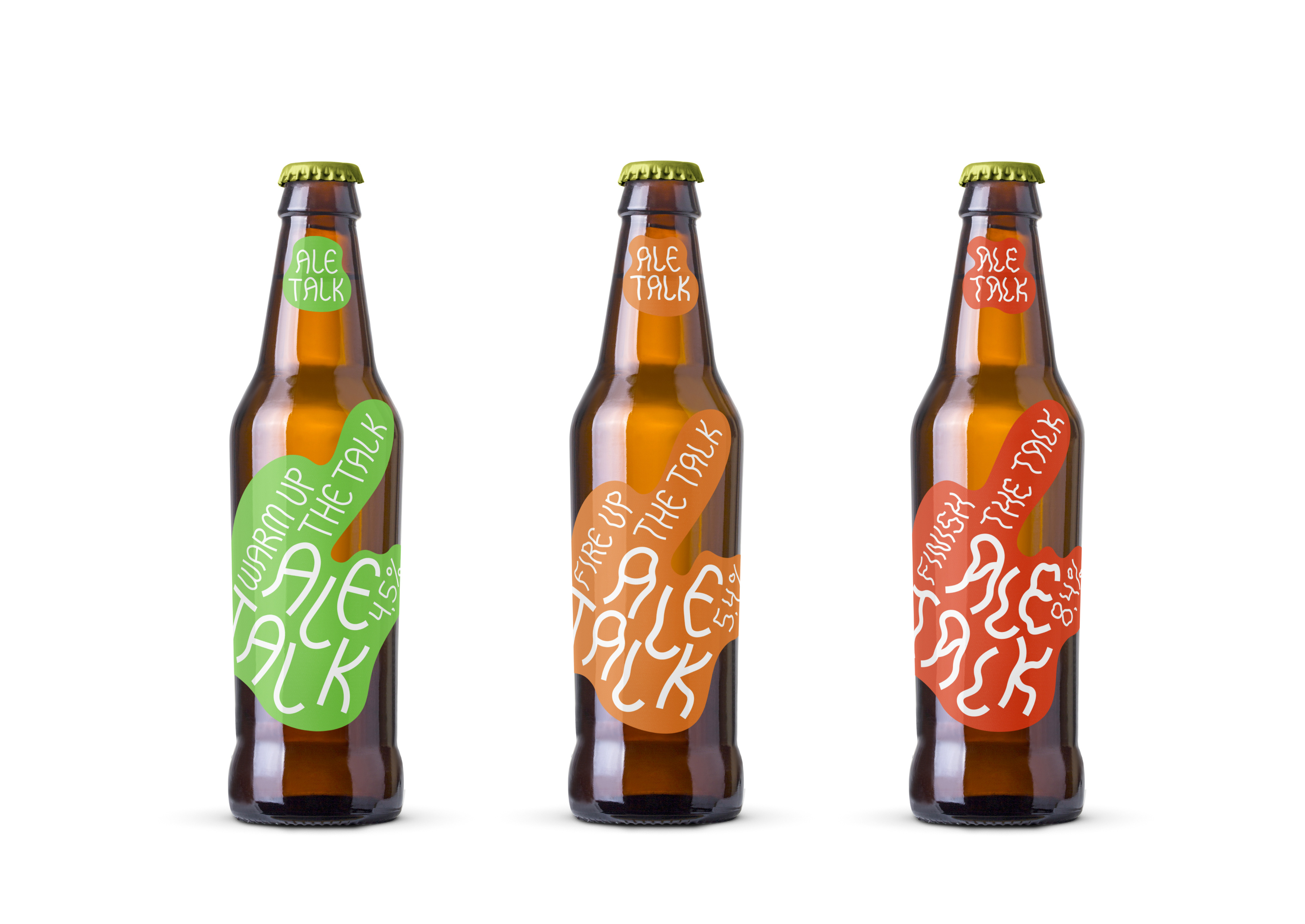
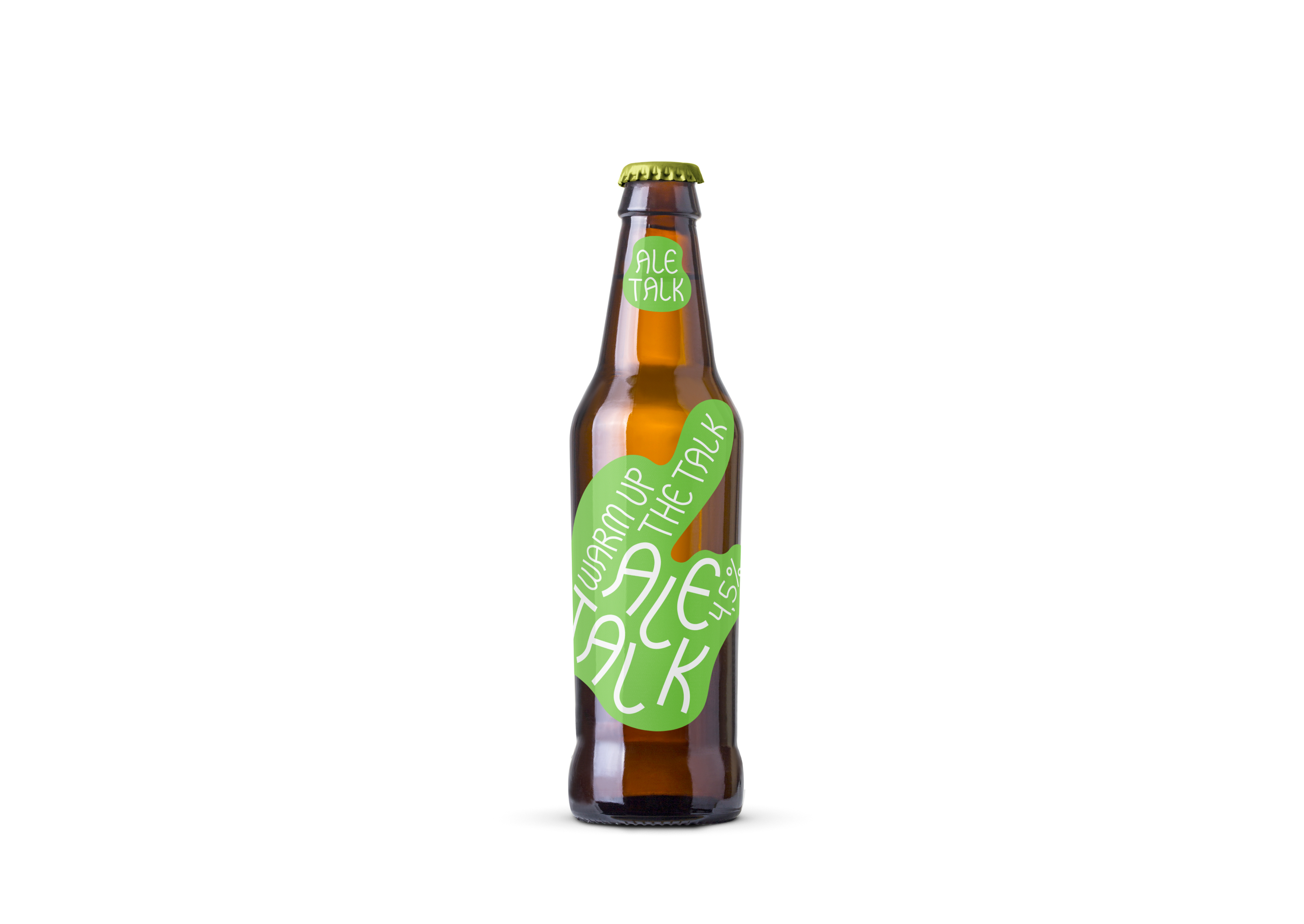
The new Ale Talk brand will tell to especially doubting people about the drink appropriate to their condition with the help of a unique display font created specifically for the brand. The higher the degree, the more vague the font is, “heady” in its outlines with the user. An additional signal to the consumer is the color — from calm and relaxing green (4.5%) and perky orange (5.4%) to explosive red (8.4%). Thanks to the original label design solution, Ale Talk line allows you to successfully increase degrees without risking to stay out of the conversation or round it too much on yourself.


CREDIT
- Agency/Creative: Dmitry Moistsrapishvili
- Article Title: Ale Talk Beer Concept
- Organisation/Entity: Student, Non Published Concept Design
- Project Type: Packaging
- Agency/Creative Country: Russia
- Market Region: Europe
- Project Deliverables: Brand Architecture, Brand Identity, Brand Naming, Branding, Graphic Design, Packaging Design, Research
- Format: Bottle
- Substrate: Glass Bottle
FEEDBACK
Relevance: Solution/idea in relation to brand, product or service
Implementation: Attention, detailing and finishing of final solution
Presentation: Text, visualisation and quality of the presentation


