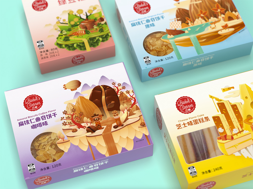
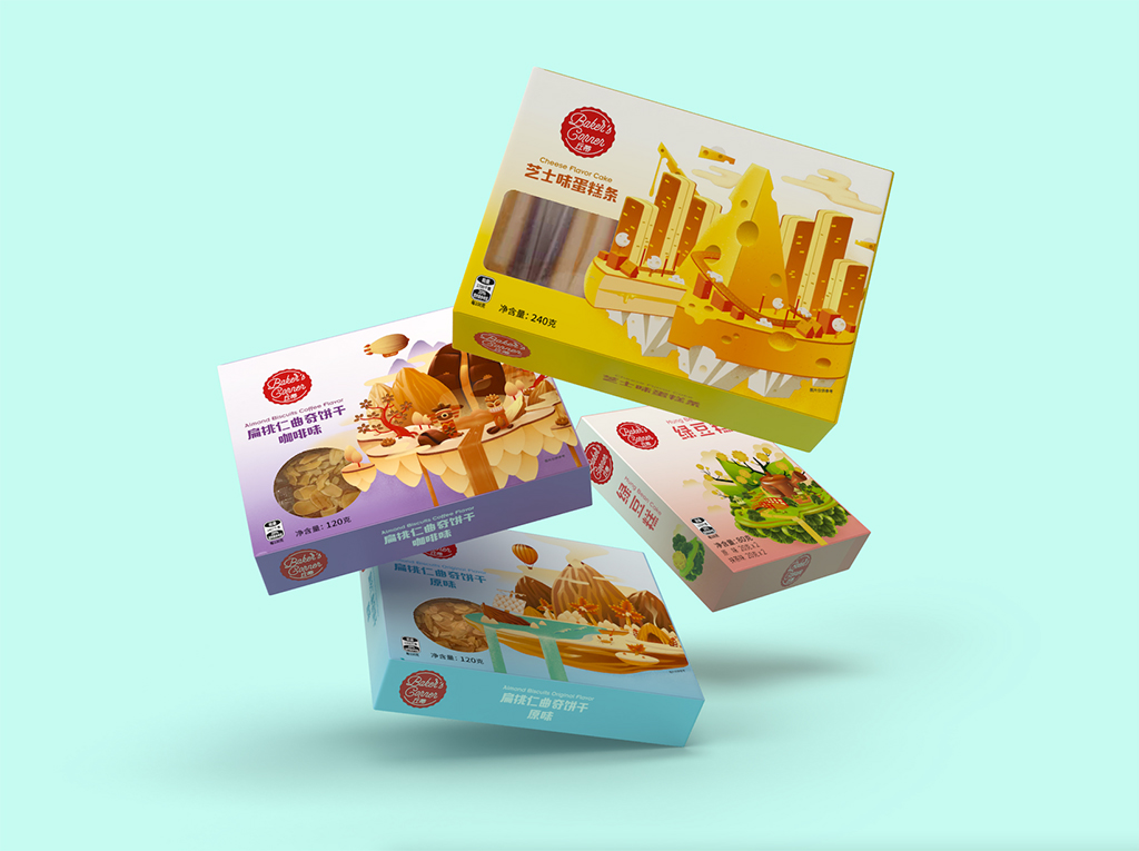
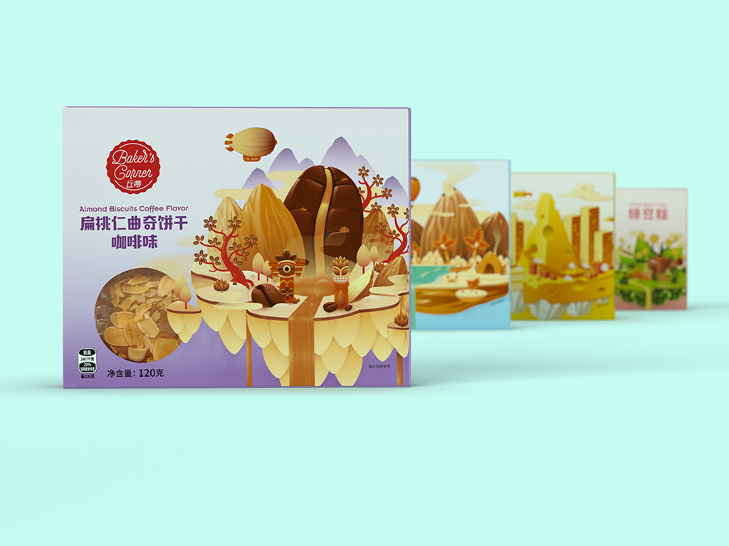
Aldi China came to Motor Brand Design with a new, premium, baked-delights range that kneaded a brand identity and pack design (and yes, that pun was intended). Our Creatives had a lot of fun designing this range. After ideating and conceptualising they brought to life Bakers Corner, a brand that goes against the wholegrain and disrupts the market, aimed towards a younger audience. From almond balloons to cheese spaceships, the designs encapsulate the essence of the adventure-seeking daydreamer, the multi-generational target market.
Our brief; develop a modern brand that captures the essence and spirit of younger generations and their self-expressive, adventure-seeking character. The brandmark captures the traditional Chinese colour palette of red and white and uses scripted typography as a way to subtly illustrate the hand-crafted, baked goods range.
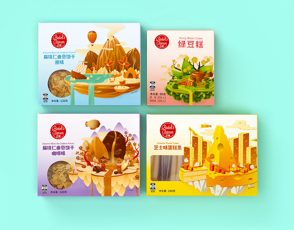
The pack designs were visualised with intent and were tailored to reflect the intricate products, packed full of flavour. Four wacky, wild, and wonderful islands take the consumer on a visual flavour journey, allowing them to drift off into a daydream, visions of a utopian wonderland.
This snacking range has a vibrant colour palette, with the contrasting colours reflecting the sweet and savoury nature of each variant as well as the distinct variant colour palette allowing for range navigation. Extensive research was conducted when illustrating the ‘Green Bean Cake’. Our Creatives wanted to pay tribute to the traditional Chinese elements surrounding the history of matcha green tea and meticulously visualised an island designed almost entirely of the delicate and intricate details of the tea while simultaneously reflecting the authentic flavours found within the product. The typography used is a friendly sans-serif letterform that further compliments and ties together the modern look and feel while being approachable in appearance. Pass us the fork!


CREDIT
- Agency/Creative: Motor Brand Design
- Article Title: Aldi China Baker’s Corner, Premium Packaging Range Design by Motor Brand Design
- Organisation/Entity: Agency
- Project Type: Packaging
- Project Status: Published
- Agency/Creative Country: China
- Agency/Creative City: St Kilda
- Market Region: Asia
- Project Deliverables: Art Direction, Brand Creation, Brand Identity, Brand World
- Format: Box
- Substrate: Pulp Board
- Industry: Retail
- Keywords: WBDS Agency Design Awards 2021/22
- Keywords: Packaging Design, FMCG, Brand Rejuvenation, Brand Identity
-
Credits:
CEO/Founder: Warren Spence


