


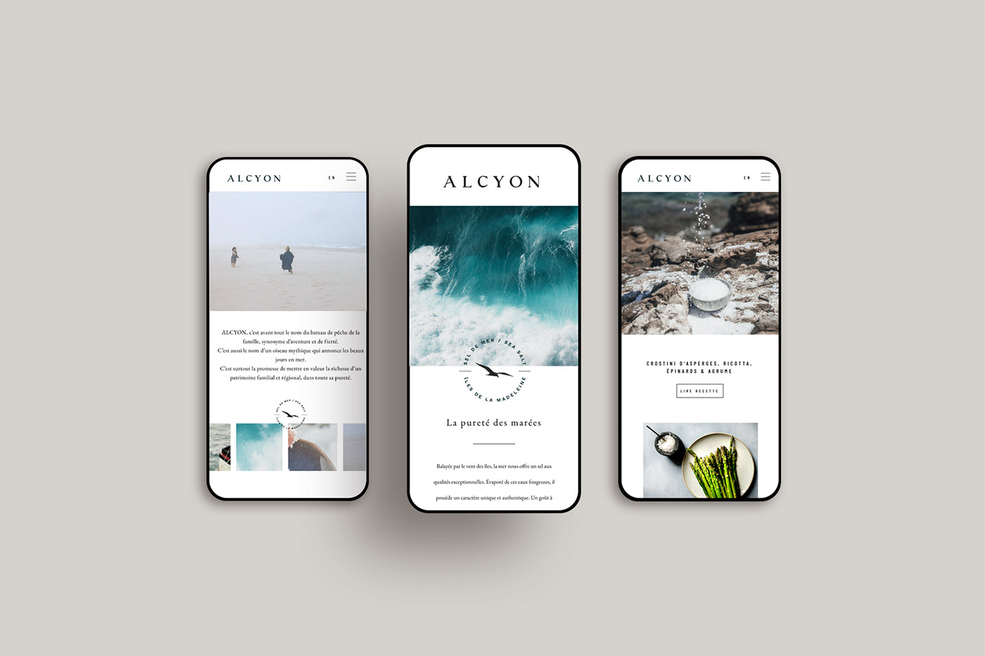
Alcyon sea salt comes from the crystal-clear waters surrounding the Magdalen Islands, where the St. Lawrence River meets the Atlantic. And it comes from the dream of one local family, who wanted to honour the sea and the community they love by creating a pure and simple salt that tastes like home. A family with deep roots in les Îles-de-la-Madeleine community.
Inspired by their beautiful archipelago, the Arseneau family wanted to create something that would celebrate the place they love. And so they set themselves a challenge: to craft a natural, quality sea salt that combines sustainable methods and superior taste: creating the first (and only) sea salt from this mythical location in Quebec, Canada.
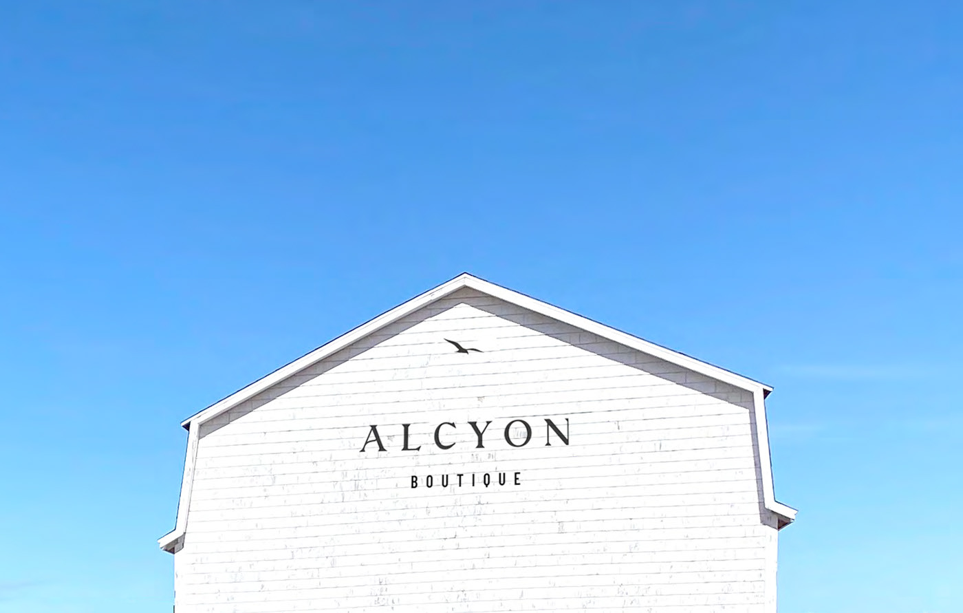
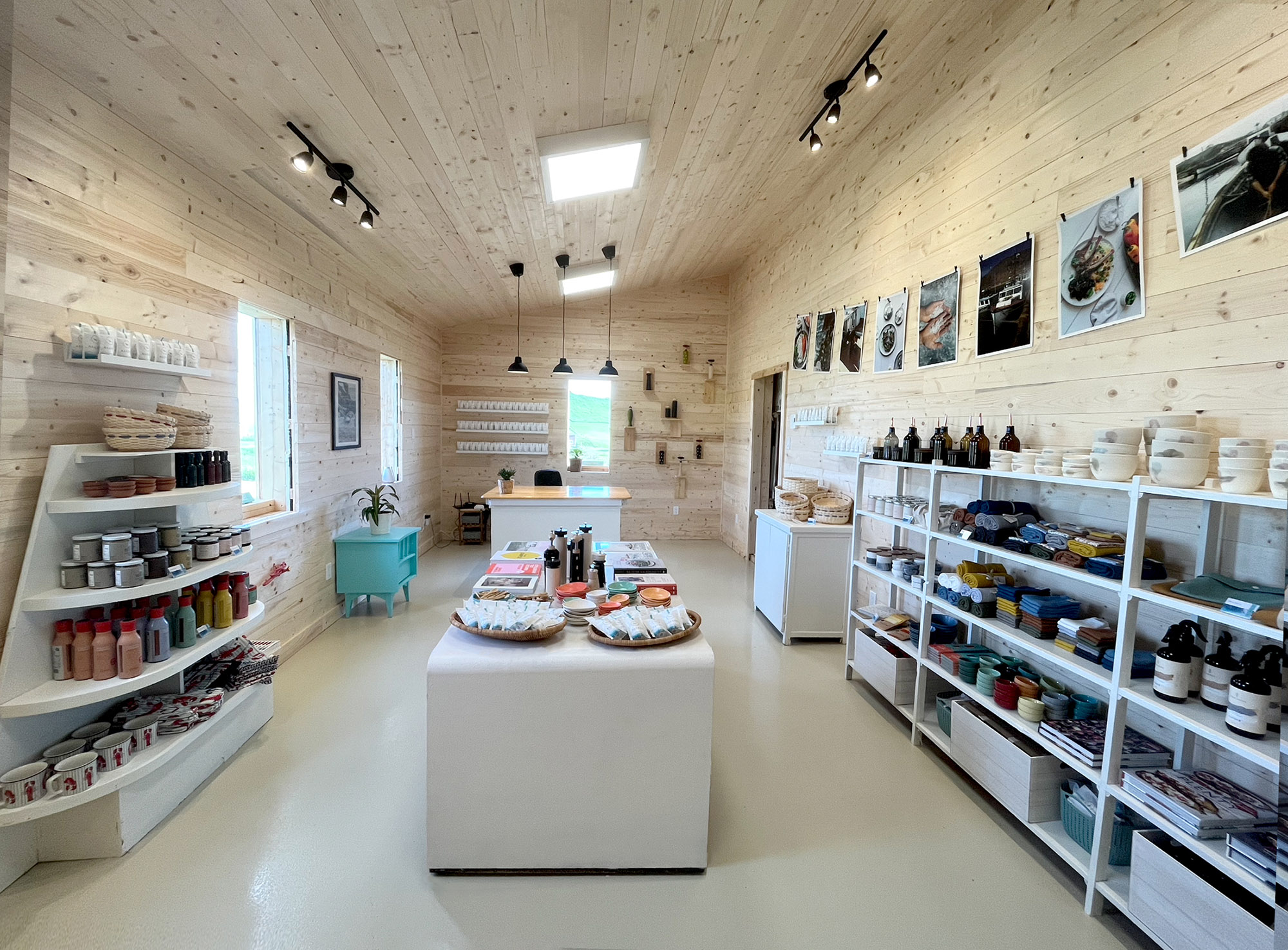
The brand identity was created to reflect this inspiring family story, unique geographical setting, and the superior quality of the salt itself.
We wanted to evoke a strong sense of connection to the natural elements from which the salt is sourced and to the Arseneau family story, while maintaining a curated and elevated aesthetic that reflects the product: quality, purity and authenticity.
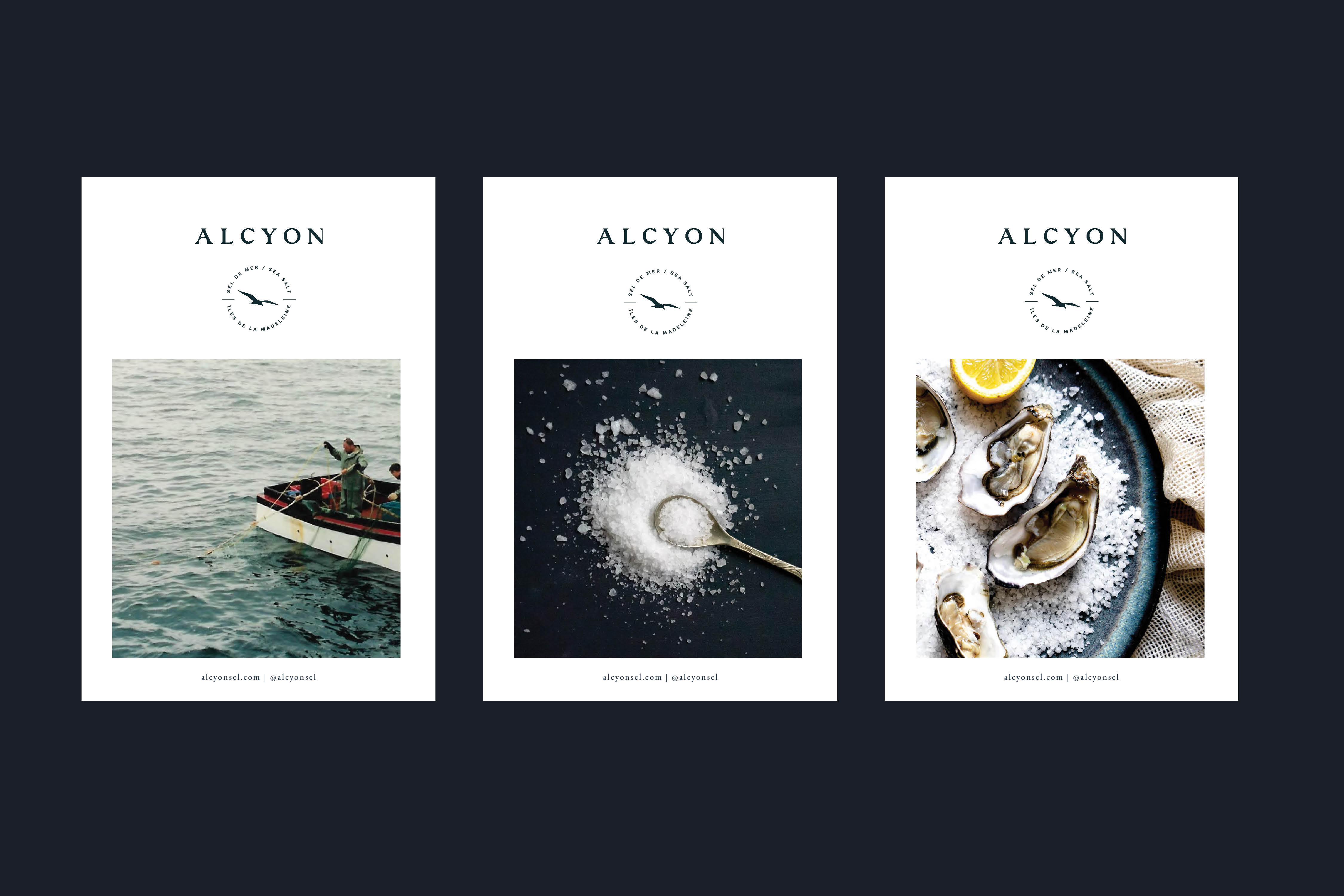
Alcyon was named after the Arseneau fishing boat, paying tribute to generations of a family’s history tied to the sea. It’s also inspired by the name of a mythical bird believed to signal good weather and calm seas.
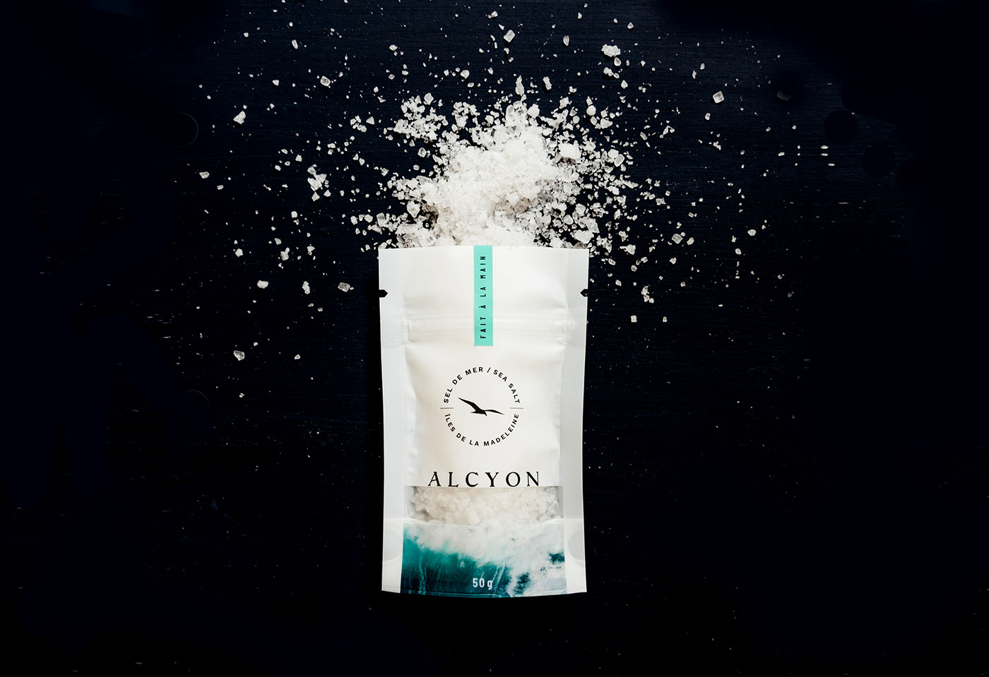
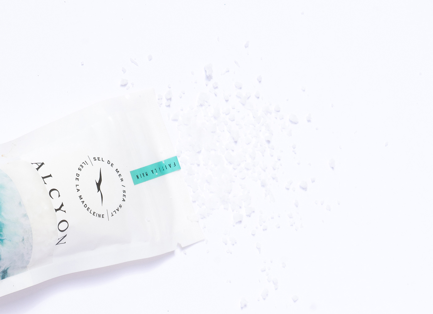
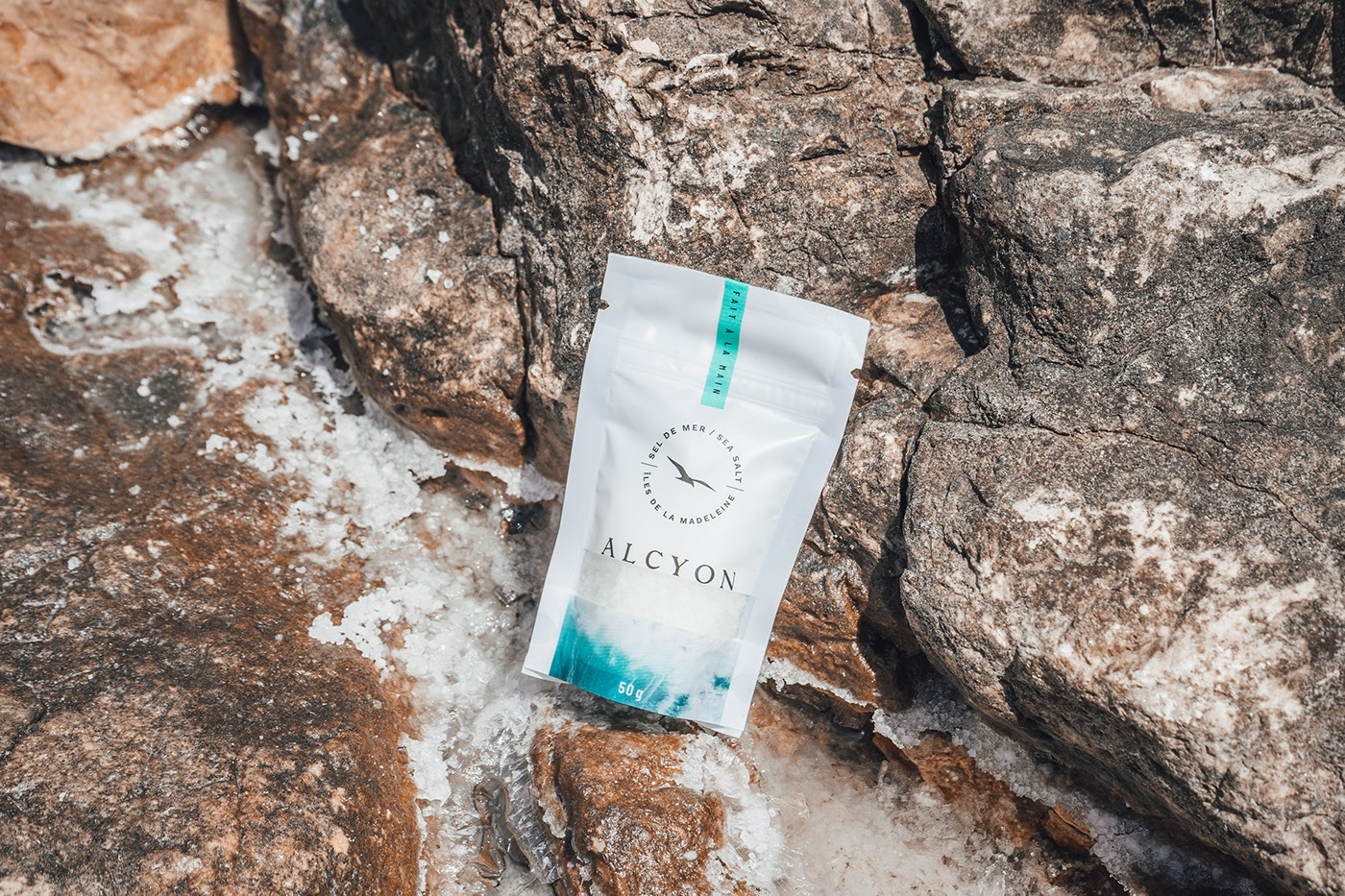
The packaging design plays off of the pure and simple idea of sea and salt: the salt comes from the sea, and a die-cut allowed us to showcase the salt itself, perfectly integrating the actual product within the sea-foam on the front of the packaging.
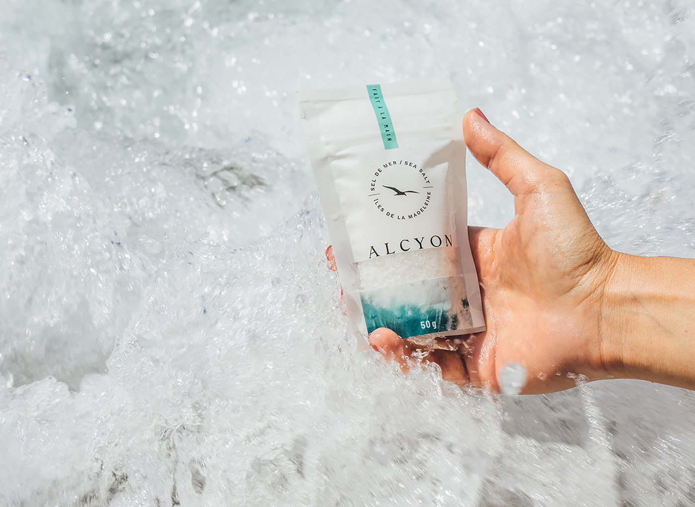
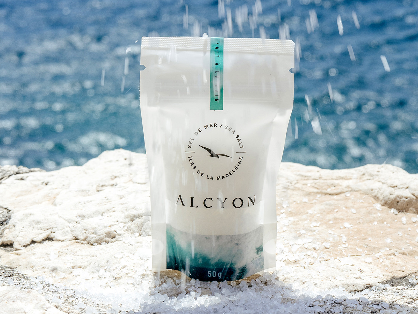
Our photographic approach mixes vintage family photos with custom product photography in both outdoor and indoor settings, while keeping an editorial feel by combining lifestyle and food photography. The typography is likewise a mix of serif and contrasting sans-serif typefaces, exaggerated kerning and generous line spacing to evoke a feeling of freshness and airiness into our messaging and storytelling.
We wanted the identity to evoke an authentic, refined, timeless yet modern aesthetic that connects the past with the present, and maintains an emotional connection with both the product and the unique heritage from which it was created.
CREDIT
- Agency/Creative: Alex Nereuta
- Article Title: Alcyon Sea Salt Brand Identity and Packaging
- Organisation/Entity: Freelance
- Project Type: Identity
- Project Status: Published
- Agency/Creative Country: Canada
- Agency/Creative City: Montreal
- Market Region: North America
- Project Deliverables: Art Direction, Brand Creation, Brand Design, Brand Identity, Brand Mark, Brand Naming, Brand Tone of Voice, Branding, Creative Direction, Food Photography, Food Styling, Graphic Design, Logo Design, Packaging Design, Photography, Web Design
- Industry: Food/Beverage
- Keywords: Sea salt brand identity and packaging
-
Credits:
Creative Direction, Design: Alexandra Nereuta


