


Introduction
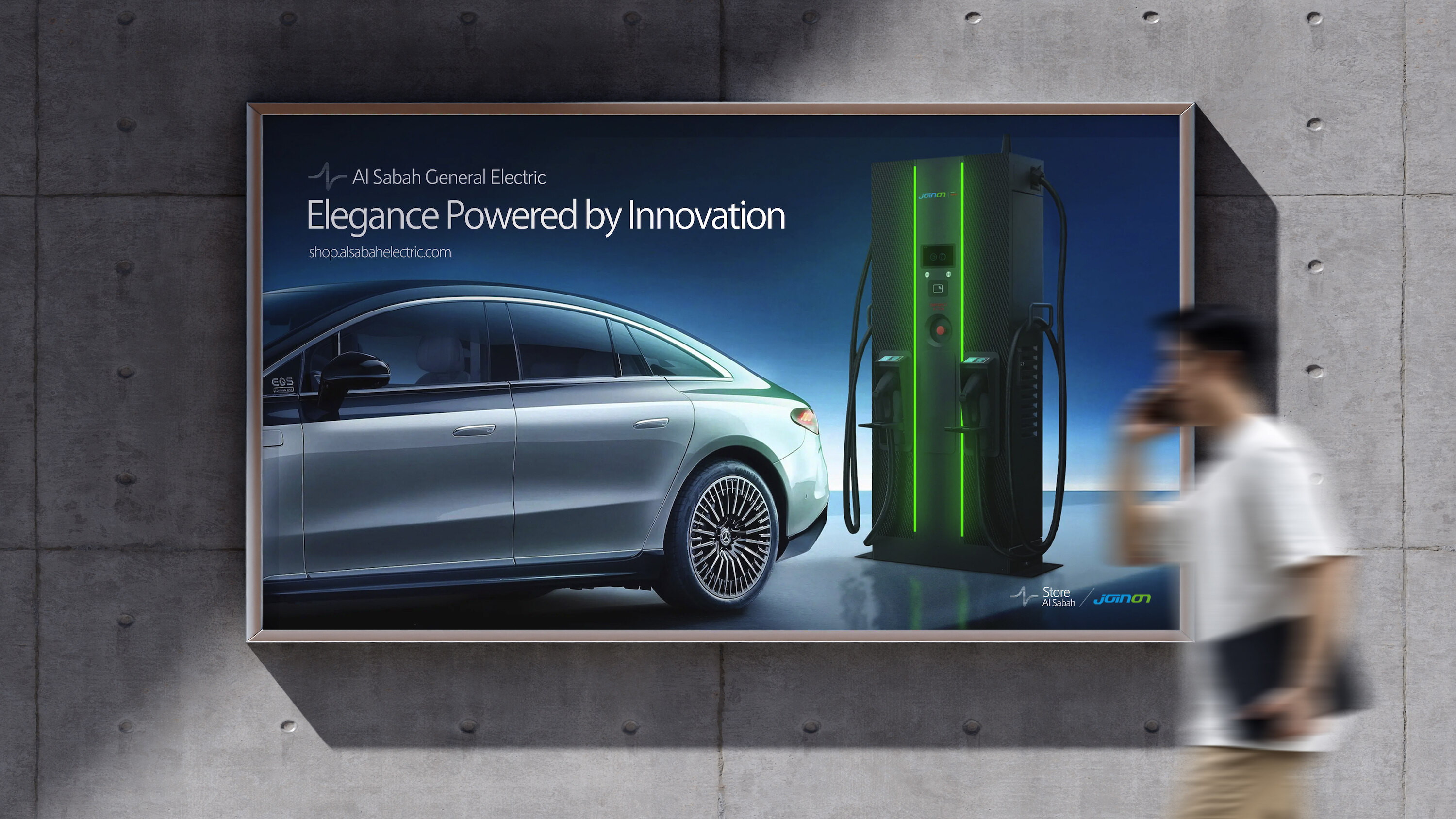
In the realm of electrical and lighting solutions, legacy often overshadows reinvention. But Al Sabah General Electric saw an opportunity where others saw routine. With 40 years of market dominance in Kuwait, the brand had become a pillar of reliability. However, as the industry modernized and visual narratives evolved, Al Sabah realized the need to break convention and reposition itself for the next generation. That transformation began with a single, powerful idea: the logo isn’t just a mark, it’s a message.
This is the story of how Erahaus helped Al Sabah illuminate its past, present, and future with a redesigned identity that carries four decades of expertise in every line.
Project Context
Founded in 1983, Al Sabah General Electric became synonymous with electrical excellence in Kuwait. The brand served as a trusted source for industrial lighting, domestic solutions, and nationwide electrical distribution. As it approached its 40-year milestone, the brand recognized a dissonance between its technical innovation and its aging visual identity.
The logo, once fitting in the analog world, struggled to hold meaning in an era dominated by minimalist brands, responsive design, and symbolic storytelling. The stakeholders agreed: a bold redesign was not just a cosmetic upgrade; it was a strategic necessity.
Strategic Challenge
The challenge was to create a visual identity that honored Al Sabah’s established legacy while signaling a new chapter of innovation. The original symbol, a lightning bolt within a circle, had become outdated and visually rigid. It lacked the flexibility to live across modern mediums, from mobile screens to environmental branding.
Another challenge lay in trust. The logo had long symbolized stability for clients across industrial and governmental sectors. A complete overhaul would risk alienating stakeholders. Therefore, the redesign needed to be a shift, not a rupture, retaining core elements while introducing layers of modernity, symbolism, and function.
Additionally, the redesign needed to reflect: The 40th anniversary milestone, Technical evolution and Kuwait 2035 Vision
Erahaus approached the task with one mantra: a little shift in perspective, a big change in meaning.
Design Strategy & Concept
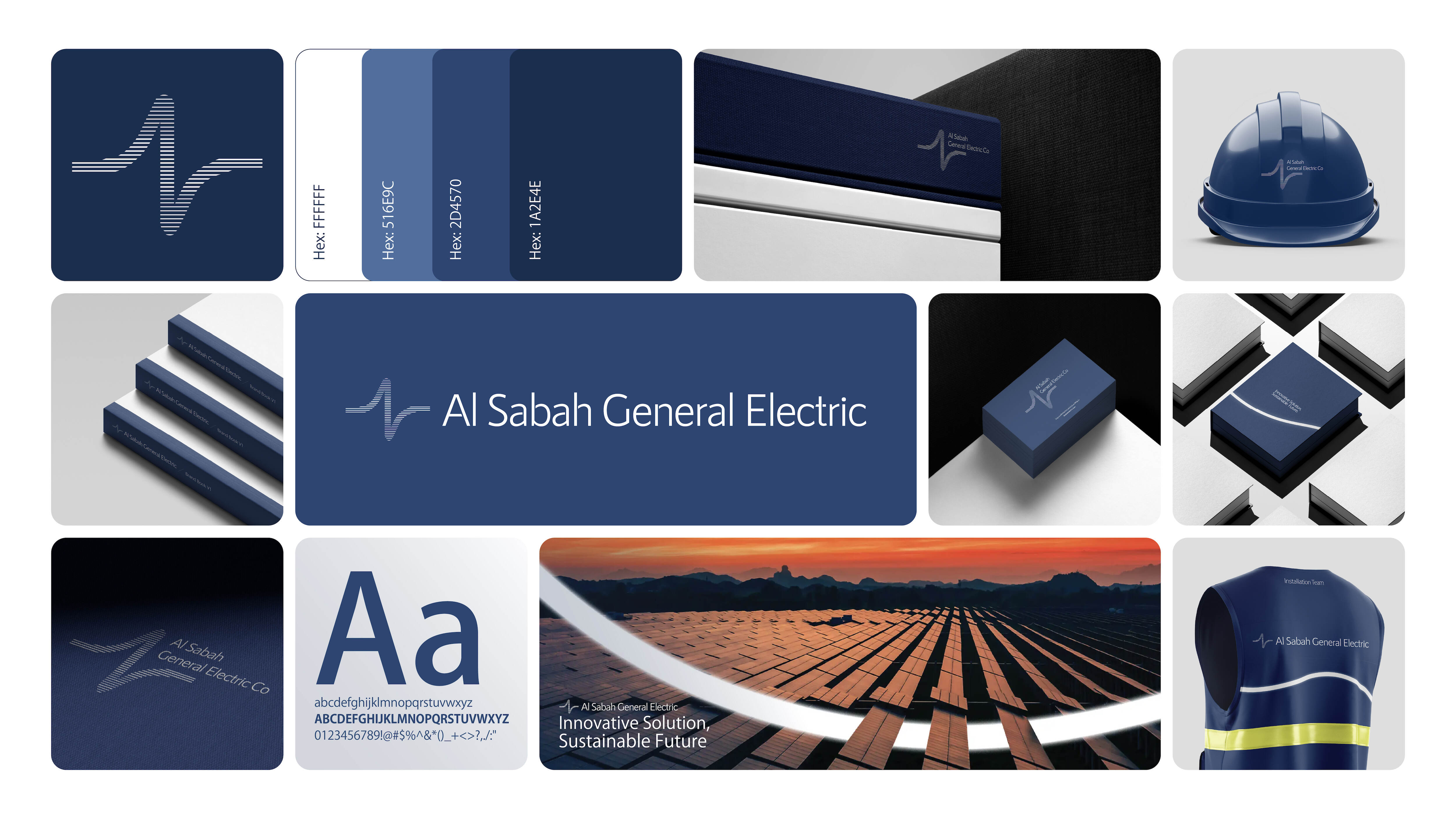
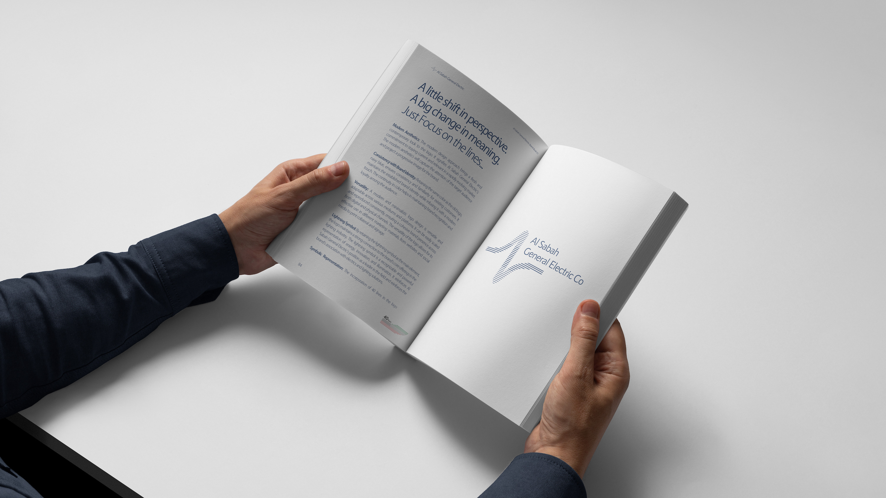
We began by auditing the existing identity. The original logo’s lightning-bolt form hinted at energy and continuity. This symbol was retained as the thematic core but was re-engineered with a fresh visual metaphor: lines.
Lines that curve, expand, and pulse became the vehicle to express energy, longevity, and vision. Forty dynamic lines were used to form the new emblem, each representing one year of continuous service. Instead of being confined within a circle, the energy now flows freely, representing Al Sabah’s evolution and adaptability.
The updated logotype featured a more modern typographic treatment using a sans-serif typeface that is both technical and human. The new emblem integrates motion and direction without being overly literal.
Color remained essential. The navy blue of the old logo, a tone of trust, was preserved to maintain consistency, while refined gradients were introduced to support graphics for digital and print.
Design Execution
Logo Evolution:The new logo is a reimagined energy flow. Its 40 lines not only symbolize the years of activity but evoke a sense of movement, energy flowing forward. The curves are intentional, modern, and uniquely identifiable.
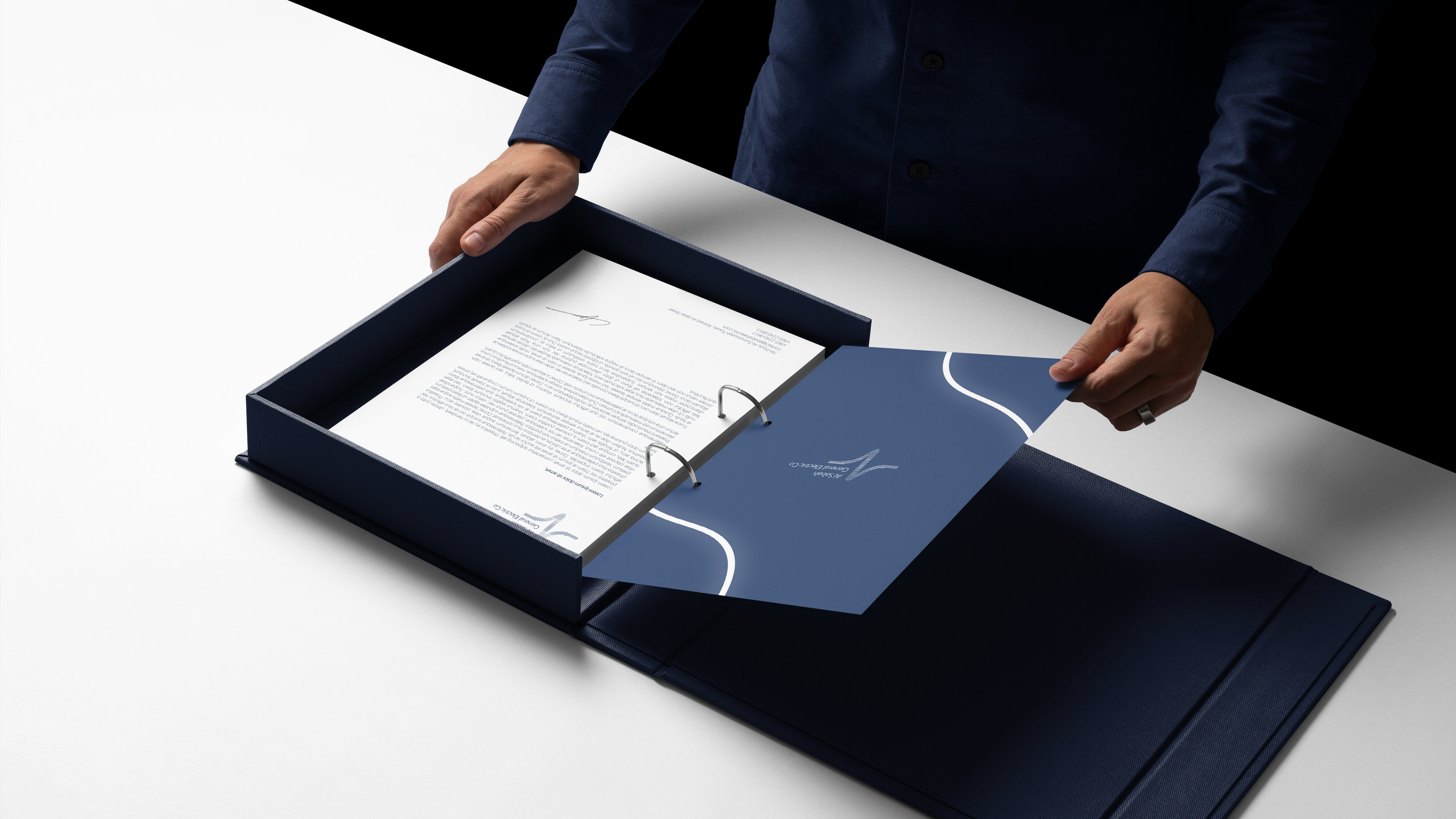
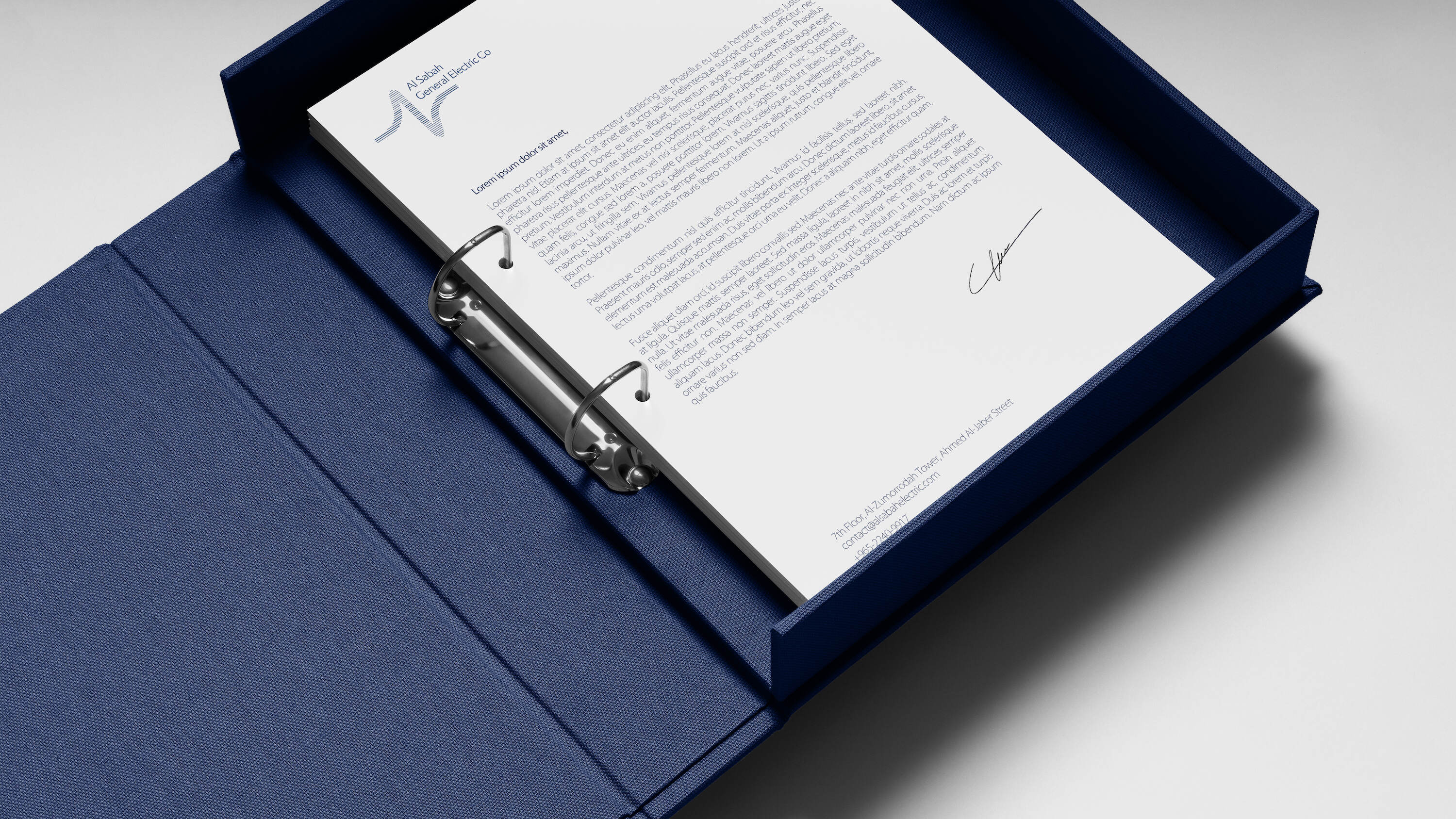
Typography: The typography for the identity was carefully selected to accompany the emblem. We focused on precision, legibility, and digital responsiveness. The chosen fonts allow the identity to scale seamlessly from large-format signage to mobile UI.
Symbol Refinement: The iconic lightning bolt was abstracted and embedded into the overall form rather than isolated. This subtle integration strengthens brand recall and emotional connection without overt repetition.
Symbolism & Interpretation
Each of the 40 lines in the logo is more than aesthetic, it’s a symbolic timestamp. The thicker midline, representing the transition between decades, speaks to the company’s pivotal point of transformation.
The upward curve symbolizes growth, while the consistent flow denotes reliability. From an aerial perspective, the design suggests flowing energy lines for a company that powers life through light and energy.
The design also resonates with Kuwait’s national ambitions. It aligns with Vision 2035 by presenting Al Sabah as an adaptive, forward-facing player ready to meet new infrastructure, sustainability, and digital transformation goals.
Conclusion
The Al Sabah General Electric rebrand is a testament to the power of visual identity in energizing legacy. Through refined symbolism, contextual awareness, and purposeful design, Erahaus succeeded in not just refreshing a logo but redefining a brand.
By honoring the past and illuminating the future, the new identity encapsulates Al Sabah’s evolution from a trusted supplier to a modern leader in the Gulf’s energy and lighting market. It’s more than a logo. It’s the pulse of progress.
CREDIT
- Agency/Creative: Erahaus
- Article Title: Al Sabah General Electric Rebrand: A Strategic Shift in Identity
- Organisation/Entity: Agency
- Project Type: Identity
- Project Status: Published
- Agency/Creative Country: United Arab Emirates
- Agency/Creative City: Dubai
- Market Region: Middle East
- Project Deliverables: Advertising, Brand Guidelines, Brand Identity, Brand Redesign, Branding, Design, Logo Design, Web Design
- Industry: Retail
- Keywords: Al Sabah General Electric, Electrical branding, Energy sector design, Rebranding, Middle East design, Logo symbolism, Arabic visual identity, Anniversary branding, Minimalist logo design, Brand transformation
-
Credits:
Creative and Art Director: Emad Rahimi
Graphic Designer: Fatima Rahmani
Web Designer: Amir Eghbali


