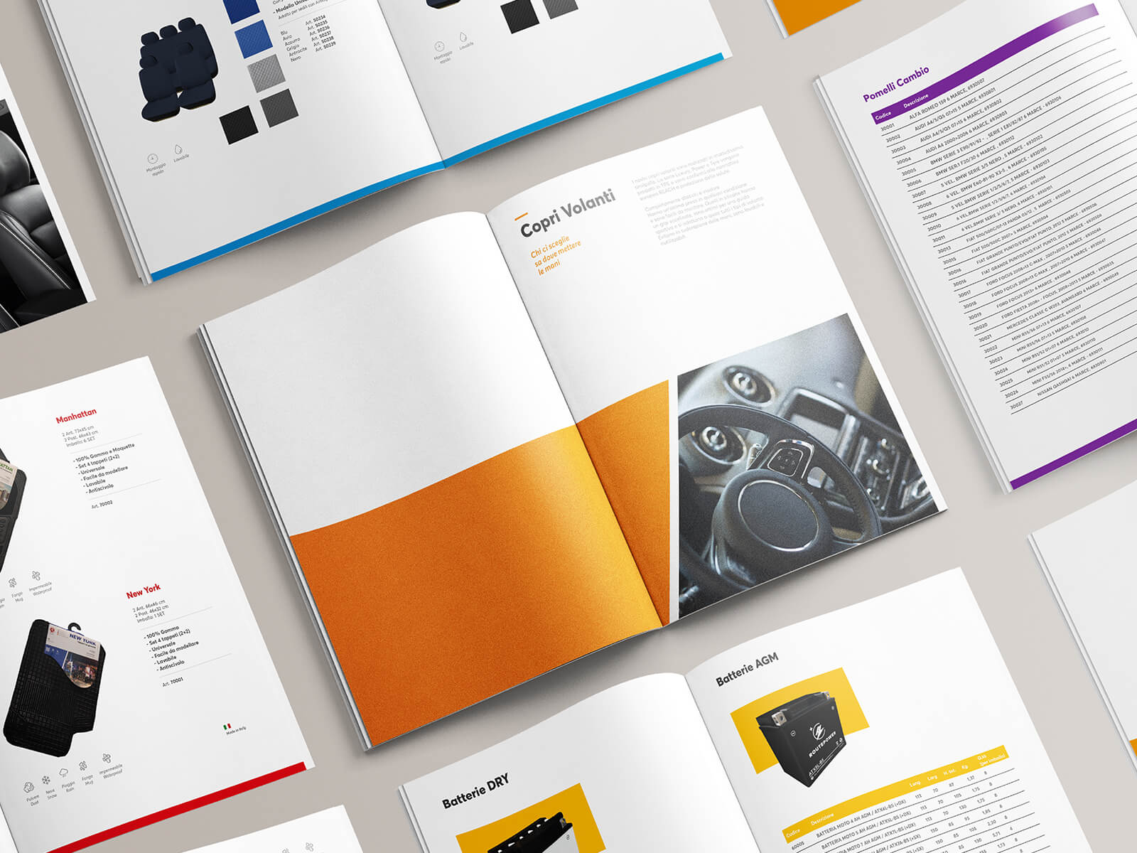
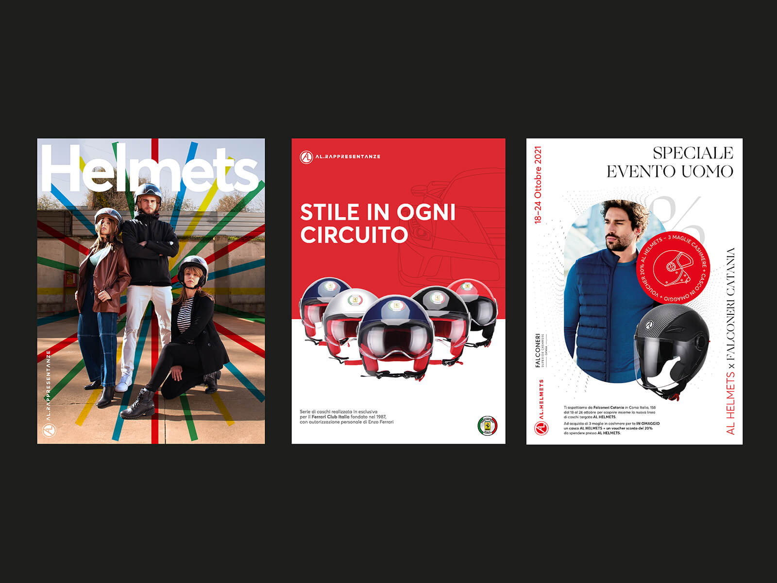
The brand: AL Rappresentanze is an Italian company founded in 2005 that produces and sells spare parts and accessories for cars and motorbikes. Over the years the company has marketed its products using three sub-brands, all of which share the suffix AL: AL Car, AL Helmets, AL Batteries. Research, innovation and creativity are the cornerstones of the company’s philosophy. AL Rappresentanze strives to find the perfect meeting point between quality of materials, design, safety, comfort and practicality of use.
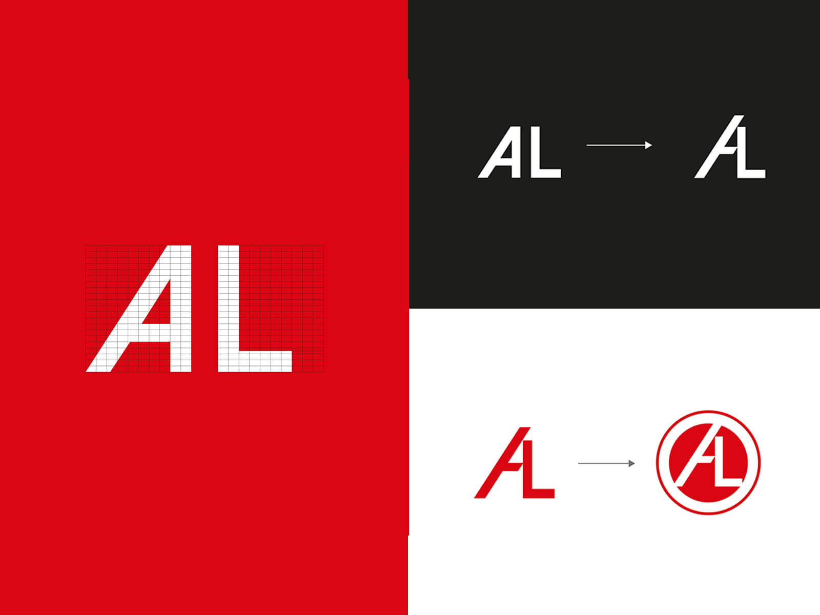
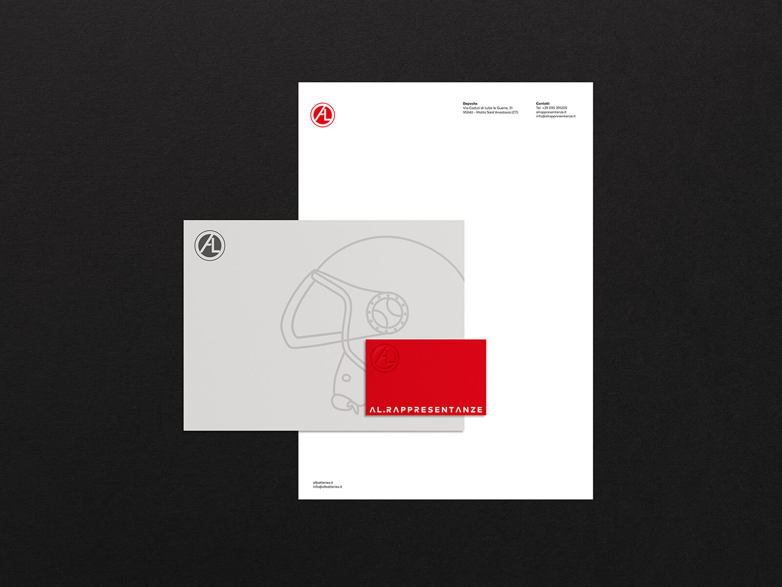
Concept: The client asked us for a rebranding operation that could modernise the old logo, a brand that could take the brand beyond the Italian borders and that could compete with the competition. The old logo, which consisted mainly of the AL monogram and the ‘Rappresentante’ logotype, was full of 3D and decorative elements, was almost illegible when small, and its position within the products and packaging was not easy, considering the absence of a positive and negative version. Our goal was to simplify the logo, to design a symbol that could work even if it was not accompanied by the logotype. We took inspiration from the logos of some famous car and motorbike brands, but especially from the minimal restyling that many of them have had in recent years. We combined the ‘A’ and the ‘L’ so that the result was a modern monogram, enclosing it within the intent of a round emblem. We wanted a base colours that would be reminiscent of the automotive industry and that would set off the entire visual identity, so we opted for a classic red and a metallic version that could be used in specific areas.
Icon Design: We created a set of icons for use in packaging and catalogues and stylised the three main types of motorbike helmets sold by the company. Colors packaging palette
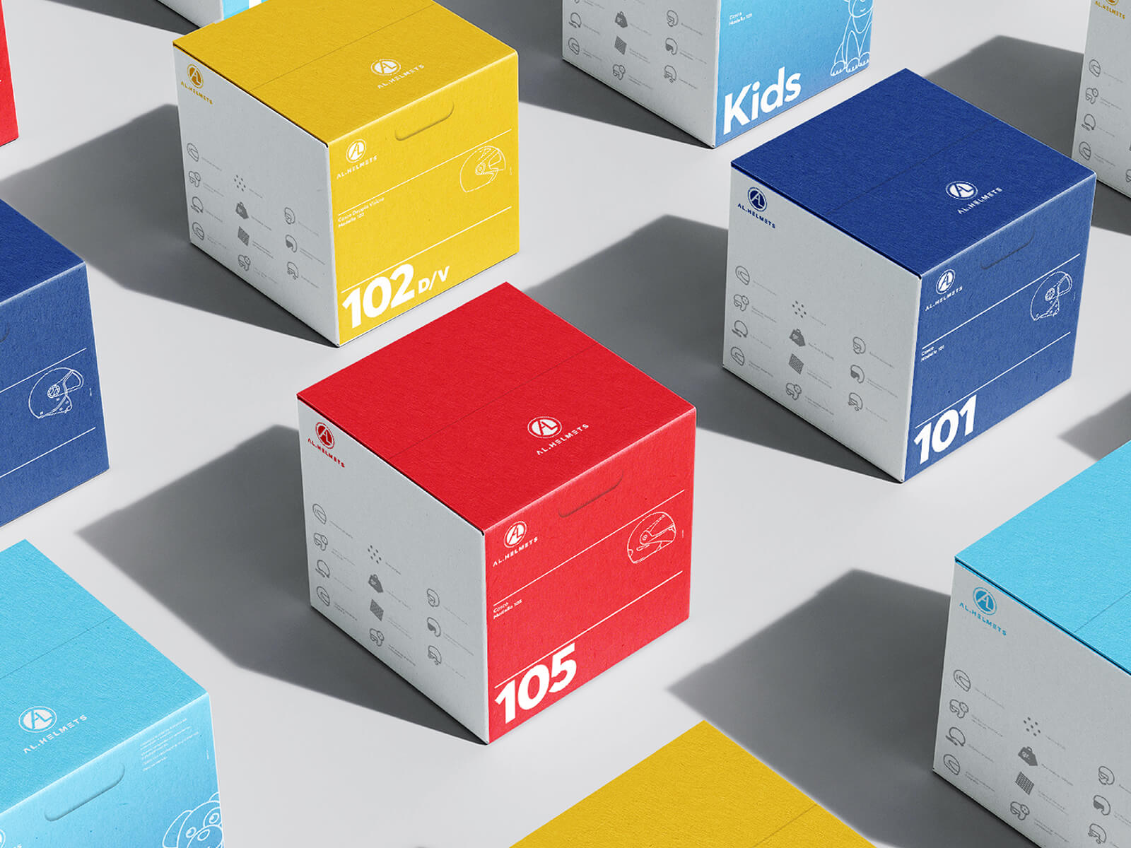
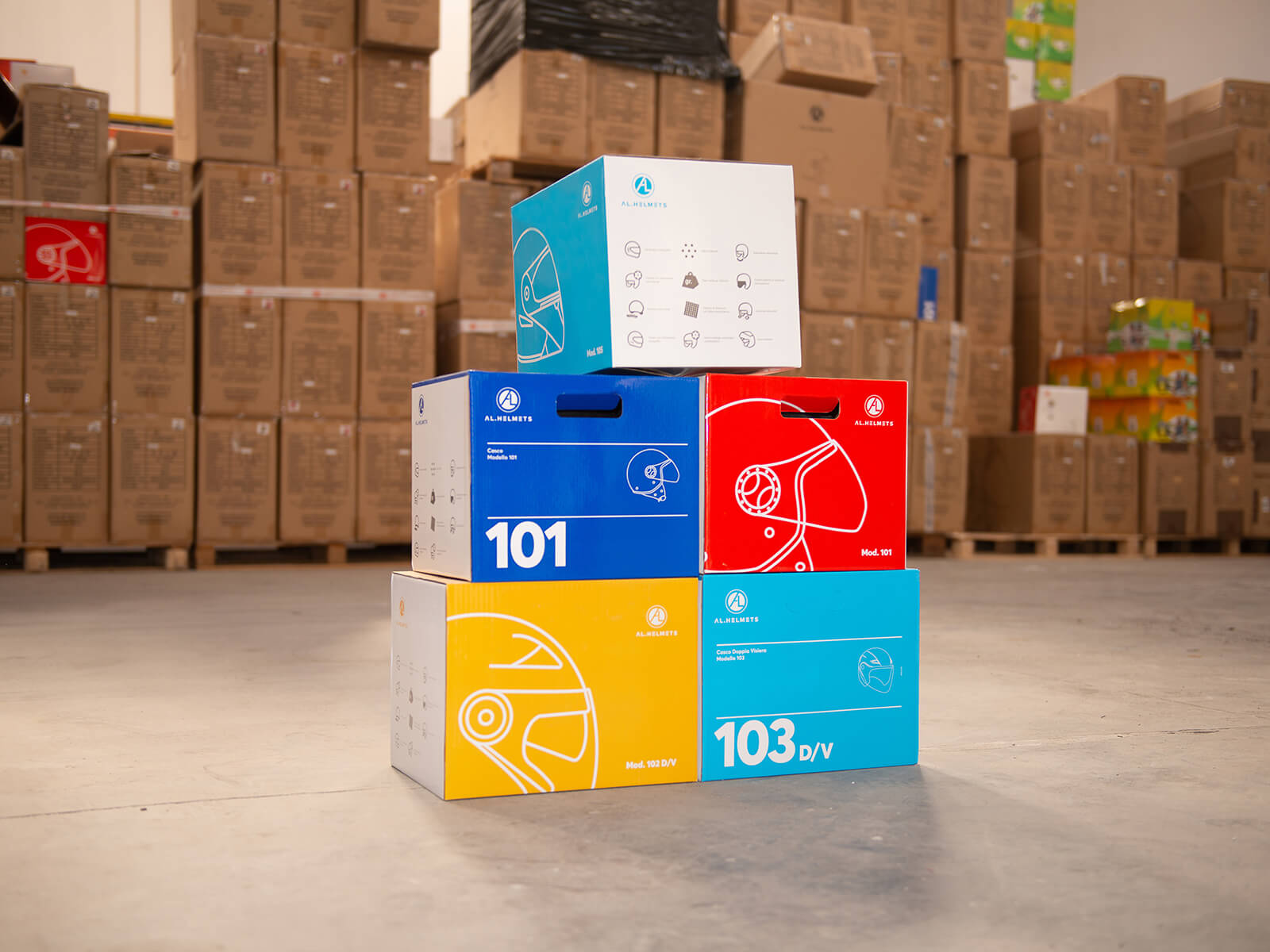
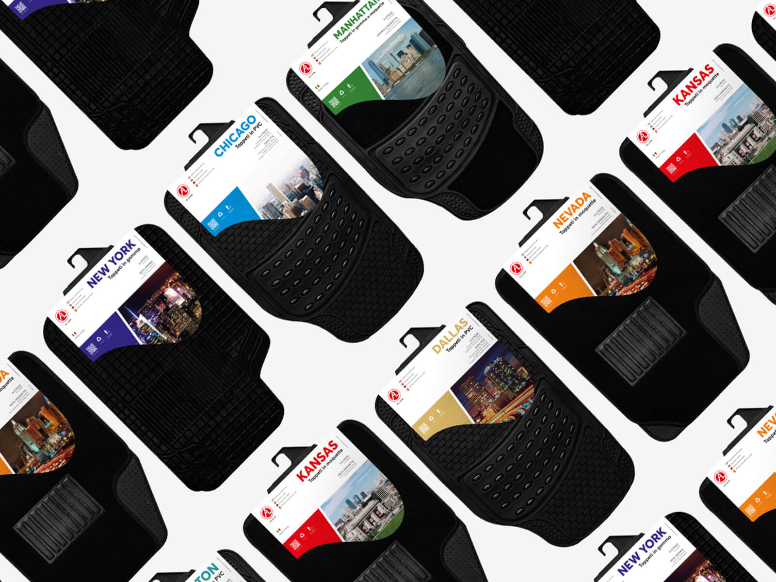
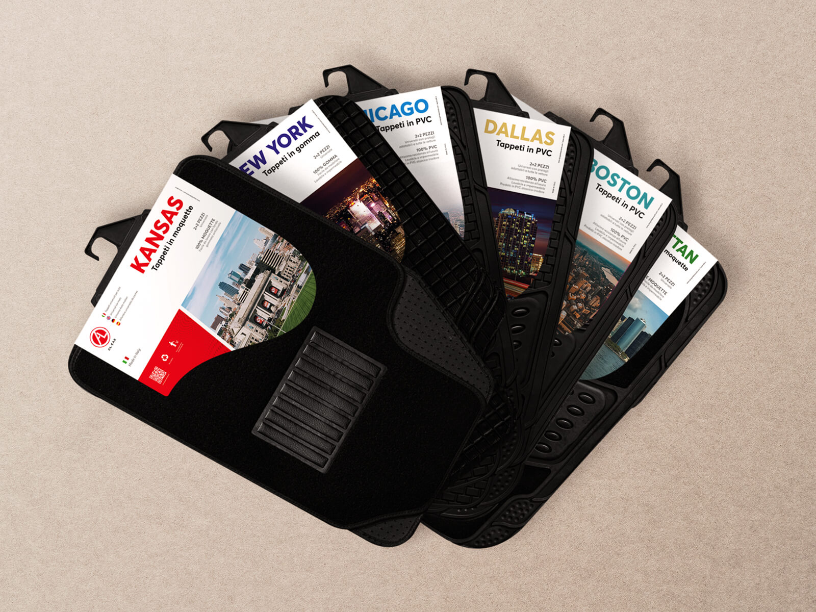
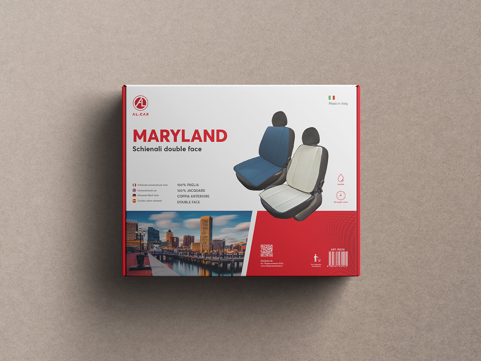
In addition to the base colours, we have provided a palette that can be used to differentiate the packaging, with the possibility of declining the brand colour only when used for the purpose of specific packaging. Helmet Packaging: Over the last three years we have created a lot of different packaging, each one dedicated to a specific product. For motorbike helmets, the aim was to create minimal, multi-coloured packaging. Retailers and hypermarkets usually dedicate an entire wall or shelf to these boxes, placing them next to each other, often in several rows. We wanted any customer entering one of these retailers to be immediately attracted by the coloured boxes. In the months following the sale of the helmets with the new boxes, we received a positive sales response, with an increase of almost 35%.
CREDIT
- Agency/Creative: Studio K95
- Article Title: AL Rappresentanze Branding and Packaging Design by Studio K95
- Organisation/Entity: Agency
- Project Type: Packaging
- Project Status: Published
- Agency/Creative Country: Italy
- Agency/Creative City: Catania
- Market Region: Europe
- Project Deliverables: Advertising, Art Direction, Brand Design, Brand Identity, Branding, Graphic Design, Icon Design, Packaging Design, Poster Design
- Format: Box, Case
- Substrate: Plastic
- Industry: Manufacturing
- Keywords: branding, packaging, logo, visual identity
-
Credits:
Creative Director / Designer: Danilo De Marco
Graphic Designer: Dario Leonardi
Project Manager: Daria Beleykanich
Copywriter: Federica Musumeci


