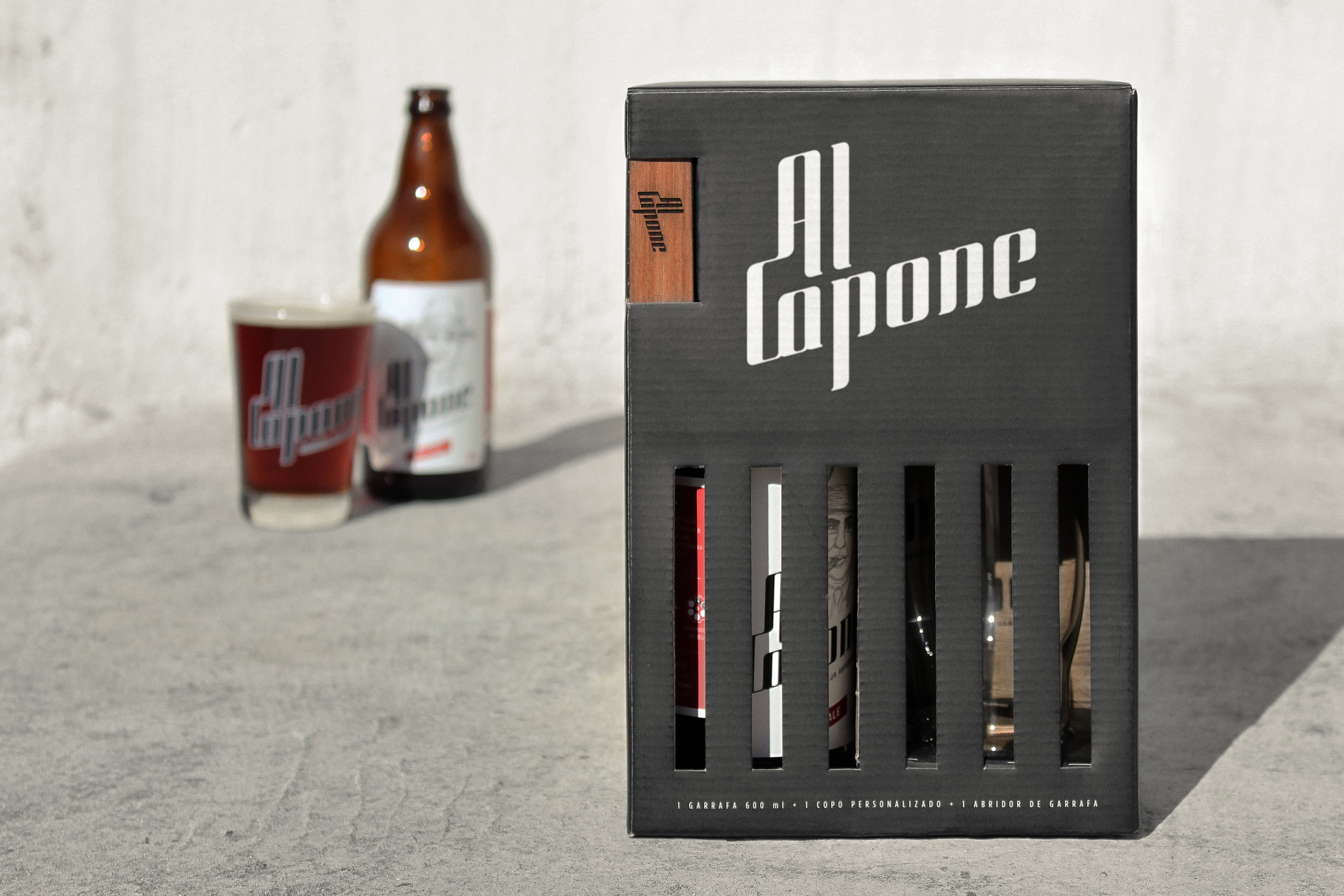
StudioBah Branding & Design – Al Capone Cerveja Artesanal
“ Alphonse Gabriel Capone, also known as “Scarface” was one of the most famous American gangsters. He rose to infamy as the leader of the Chicago Outfit – an Italian-American organized crime syndicate – during the Prohibition era.
In 1931, he was sentenced to 11 years in prison by the US tax court for tax evasion and he was sent to a prison in Atlanta. But Al Capone’s connections ensured he was given top treatment in jail. While other prisoners suffered in bare, concrete cells with a simple slab for a bed, Capone’s cell was adorned with fine furniture, oil paintings, and a radio.
Inspired by the history of Al Capone, Al Capone Cerveja Artesanal appears in Porto Alegre / Brazil. The brand follows some concepts similar to those of Al Capone, such as being an outlaw beer (differing from large breweries and not following their “rules”) and appreciating friendship (one of the mafia’s main commandments).
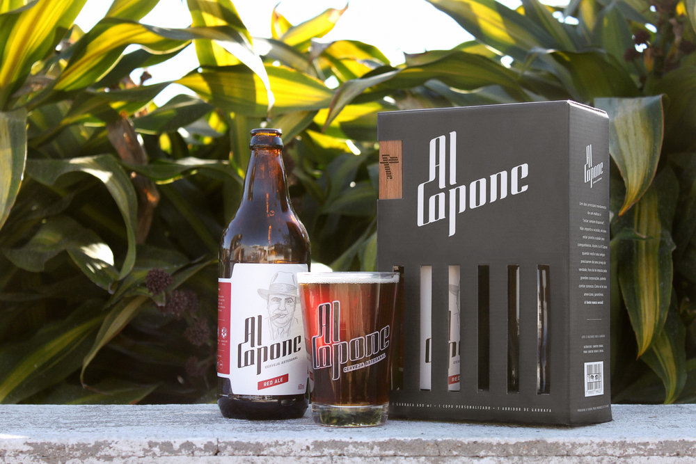
With the business’ expansion and the constant need to bring novelties and diversification of products, the brewery started the production of kits to be sold in supermarkets.
Considering that Brazil is experiencing an exponential growth in the appearance of new breweries, leading to increased competition, differentiation is fundamental to express the essence of the brand and conquer new consumers – considering that most of the buying decisions happen in the gondola. So the new packaging needed to quickly catch the eye of the consumer.
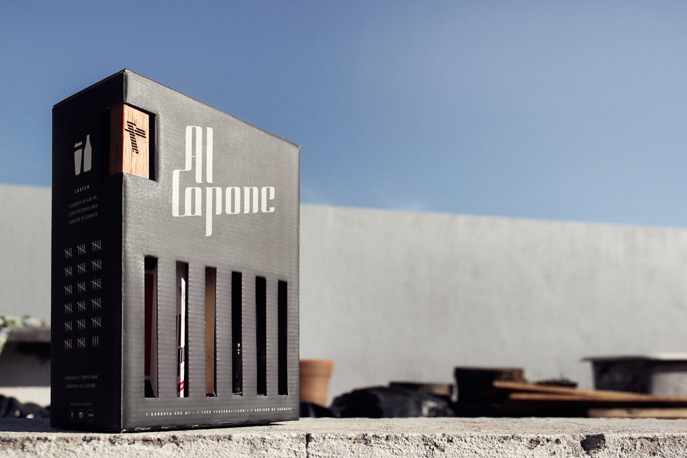
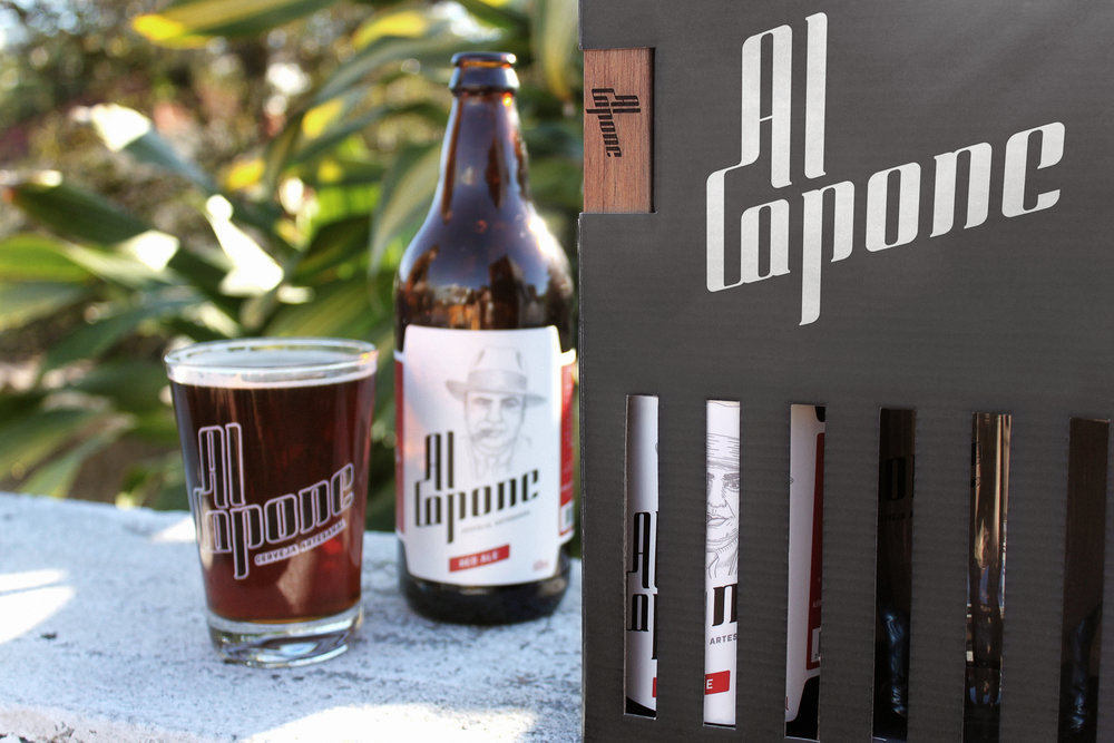
Then comes the central idea of the project: the packaging should be in the context of the character that gives the brand its name. It traps the bottle and the glass in the same way that Al Capone was arrested. However, the character continues with the expression of visible sarcasm, as if he thinks the bars will not stop him from further corrupting the American Prohibition and has everything under his control (just like in his fancy cell in prison).
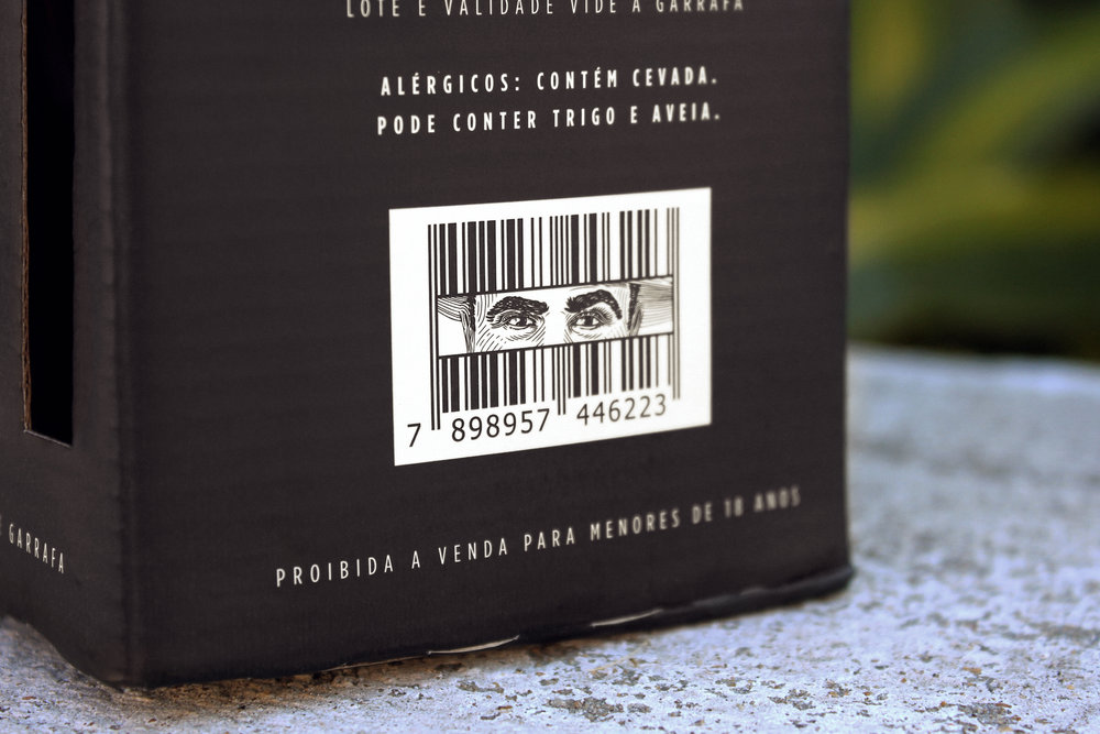
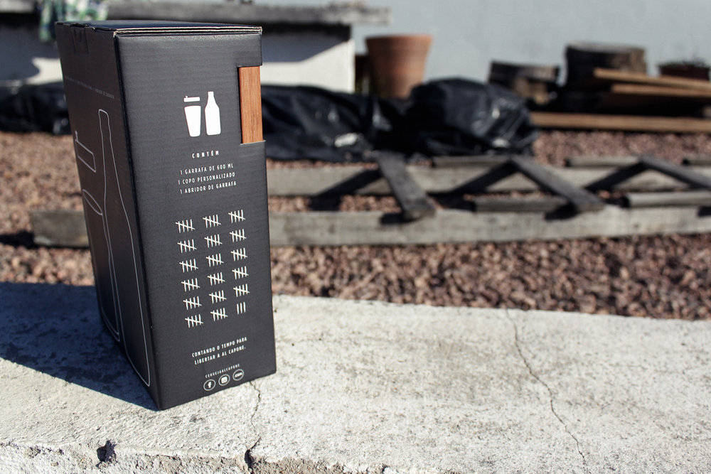
The packaging details follow the same context. The eyes of the character are expressed in the barcode, making another connection with the bars of the prison. And the side of the pack has a days counting, as if it were the count of days to be released and drinked, the same way as the prisoners make the control of their time in jail.
With this packaging, brand recognition expands, reinforcing the association of the Al Capone character more evidently with the beer brand. And yet, with the kit it was possible to reinforce the image of an outlaw beer that don’t follow the rules imposed by large corporations.”
CREDIT
- Agency/Creative: StudioBah Branding & Design
- Article Title: Al Capone’s Prison Packaging Design
- Organisation/Entity: Agency Commercial, Published
- Project Type: Packaging
- Agency/Creative Country: Brazil
- Market Region: South America
- Format: Bottle, Box
- Substrate: Glass, Pulp Paper


