


Introduction: Akera Health, a cutting-edge wellness centre recently established in Bangalore, emerges as a holistic solution for hair, skin, and overall well-being. Boasting a foundation grounded in scientific advancements and the latest technology, Akera Health aims to redefine the skincare and haircare experience. This project synopsis provides an in-depth exploration of Akera Health’s comprehensive brand identity, meticulously crafted to align with its core principles and values.
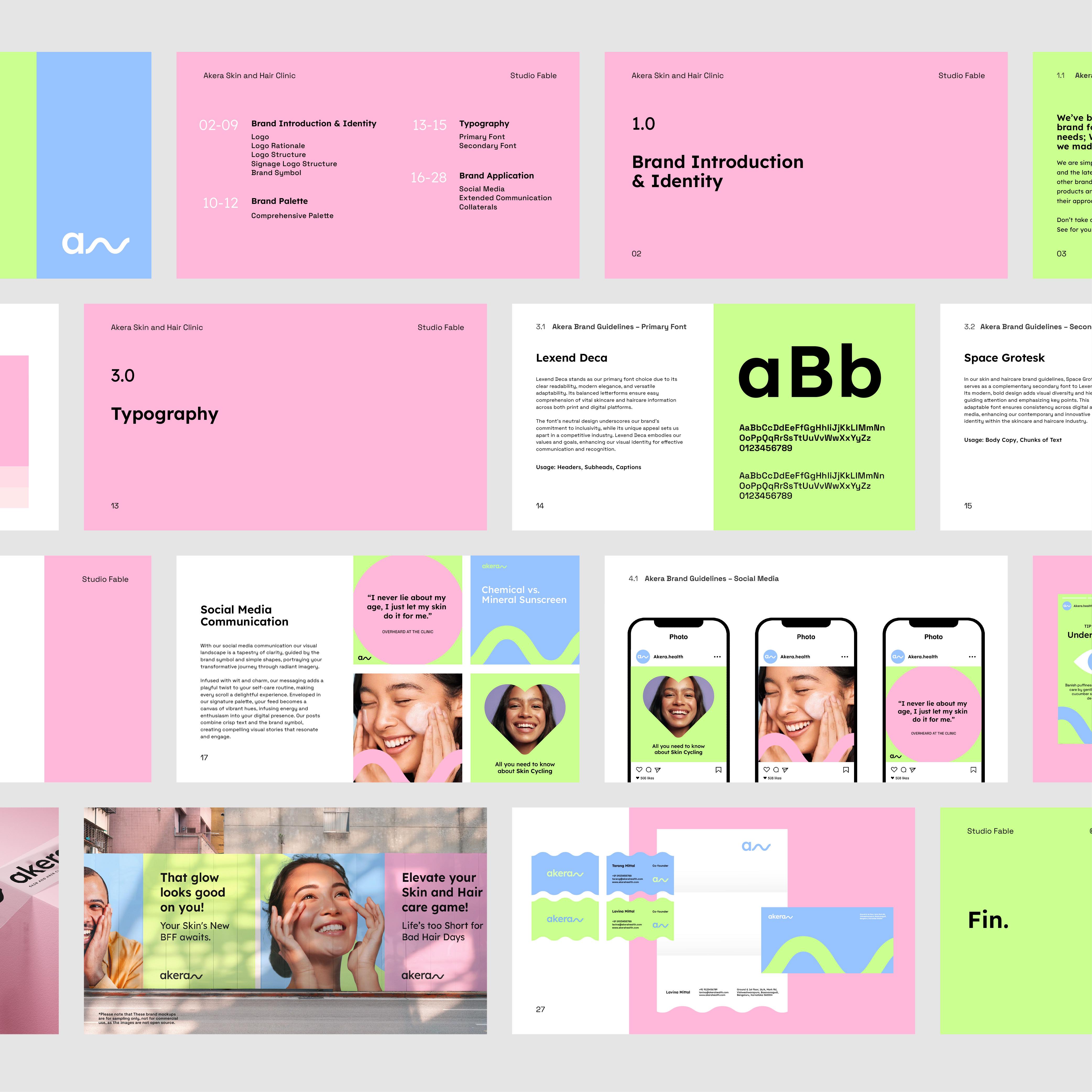
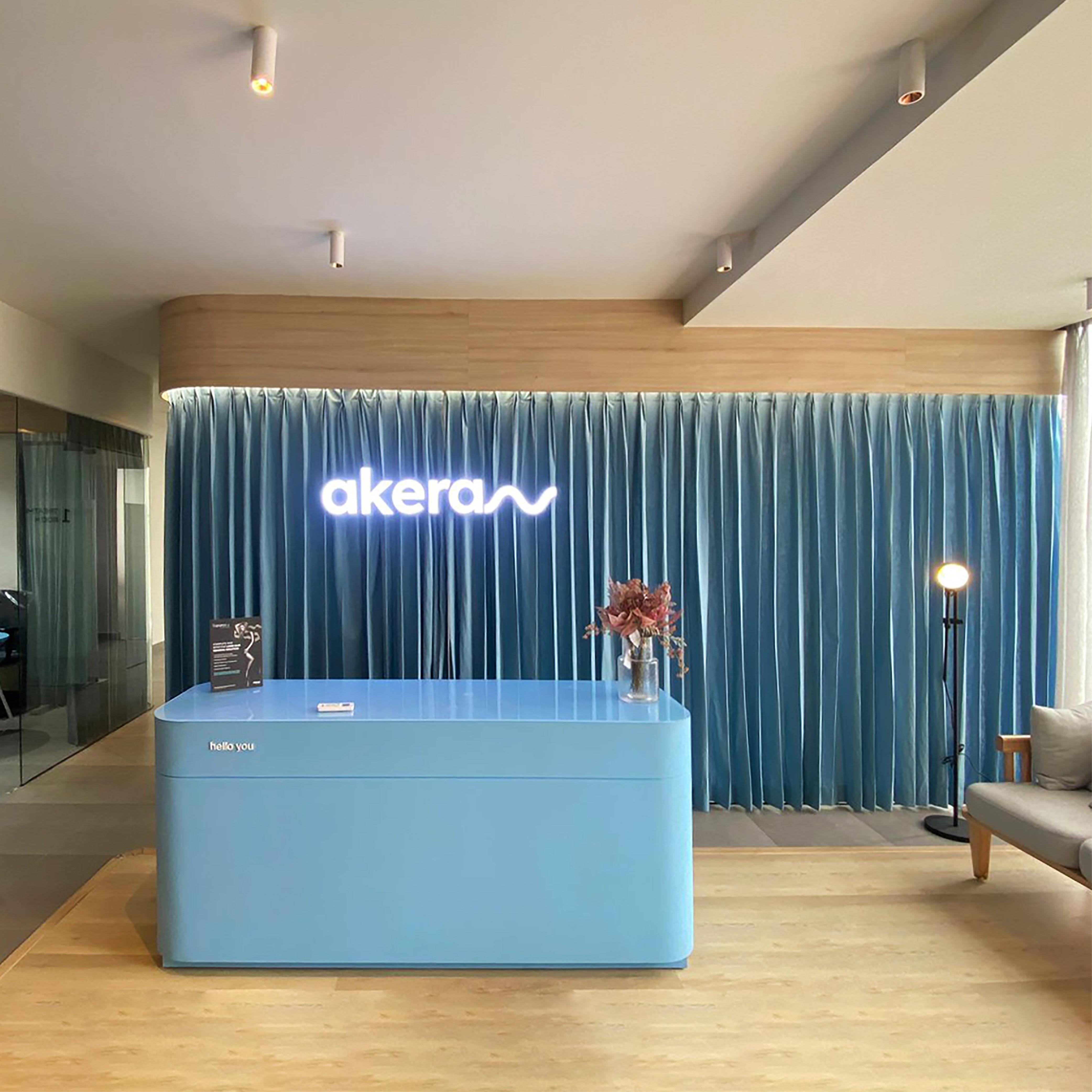
Brand Name and Logo: The brand’s nomenclature, “Akera,” is derived from Alpha-Keratin, the primary building block of skin and hair. This intentional choice establishes a direct connection with the essence of the services offered. The logo, a pivotal component of the brand identity, is designed as a mnemonic for Alpha-Keratin. Its minimalistic and thoughtful design not only symbolizes this fundamental element but also conveys a sense of continuity and an ongoing process, emphasizing the perseverance required for tangible results in skincare and haircare treatments.
The visual element within the logo showcases Alpha-Keratin with simplicity, aligning with the brand’s commitment to a straightforward yet effective approach. This design can also be interpreted as a visual representation of flow or a process, emphasizing the dynamic nature of wellness and beauty treatments.
Color Palette: The colour palette chosen for Akera Health plays a crucial role in defining its unique brand identity. Each color is purposefully selected to capture the distinct essence of the brand and its commitment to quality, authenticity, and inclusivity.
Blue: Symbolising calmness and reliability, the use of blue in the palette establishes a sense of trust and tranquility. This color choice reflects Akera Health’s commitment to providing a serene and dependable environment for its clientele.
Green: Embodied by natural vitality and growth, the inclusion of green signifies Akera Health’s dedication to promoting holistic well-being. It conveys a connection with nature and emphasizes the brand’s focus on fostering vitality in both skin and hair health.
Pink: Representing gentle care and self-renewal, the pink color adds a touch of warmth and nurturing to the palette. This choice aligns with Akera Health’s mission to provide not only effective treatments but also a caring and rejuvenating experience for its customers.
The gender-neutral palette is a deliberate choice, promoting inclusivity within the skincare and haircare category. By avoiding gender-specific colors, Akera Health aims to create a welcoming environment for individuals of all backgrounds and identities.
Conclusion: In conclusion, Akera Health’s brand identity is a carefully curated amalgamation of meaningful elements that reflect its commitment to excellence in skincare, haircare, and overall wellness. From the thoughtfully crafted logo, symbolizing the foundational component of Alpha-Keratin, to the purposeful selection of a gender-neutral color palette, every aspect of the brand identity reinforces Akera Health’s core values.
The simplicity of the design elements mirrors the brand’s promise of an uncomplicated yet effective approach to beauty and wellness. The color palette, with its harmonious blend of blue, green, and pink, not only creates a visually appealing brand identity but also communicates the essence of calmness, vitality, and care.
As Akera Health opens its doors in Bangalore, its comprehensive brand identity serves as a visual testament to the commitment to quality, authenticity, and inclusivity. This one-stop solution for all things skin and hair is poised to make a significant impact in the wellness industry, offering a refreshing and transformative experience for individuals seeking top-notch care for their hair, skin, and overall well-being.

CREDIT
- Agency/Creative: Studio Fable
- Article Title: Akera Health: Elevating Skincare and Haircare Experience with Studio Fable’s Crafted Brand Identity
- Organisation/Entity: In-House
- Project Type: Identity
- Project Status: Published
- Agency/Creative Country: India
- Agency/Creative City: Kolkata
- Market Region: Asia
- Project Deliverables: Brand Identity
- Industry: Beauty/Cosmetics
- Keywords: Personal Care, Wellness, Branding, Identity Design, Beauty, Skin and Hair Clinic
-
Credits:
Animator: Ankit Gajjar
Designer: Sakshi Jalan


