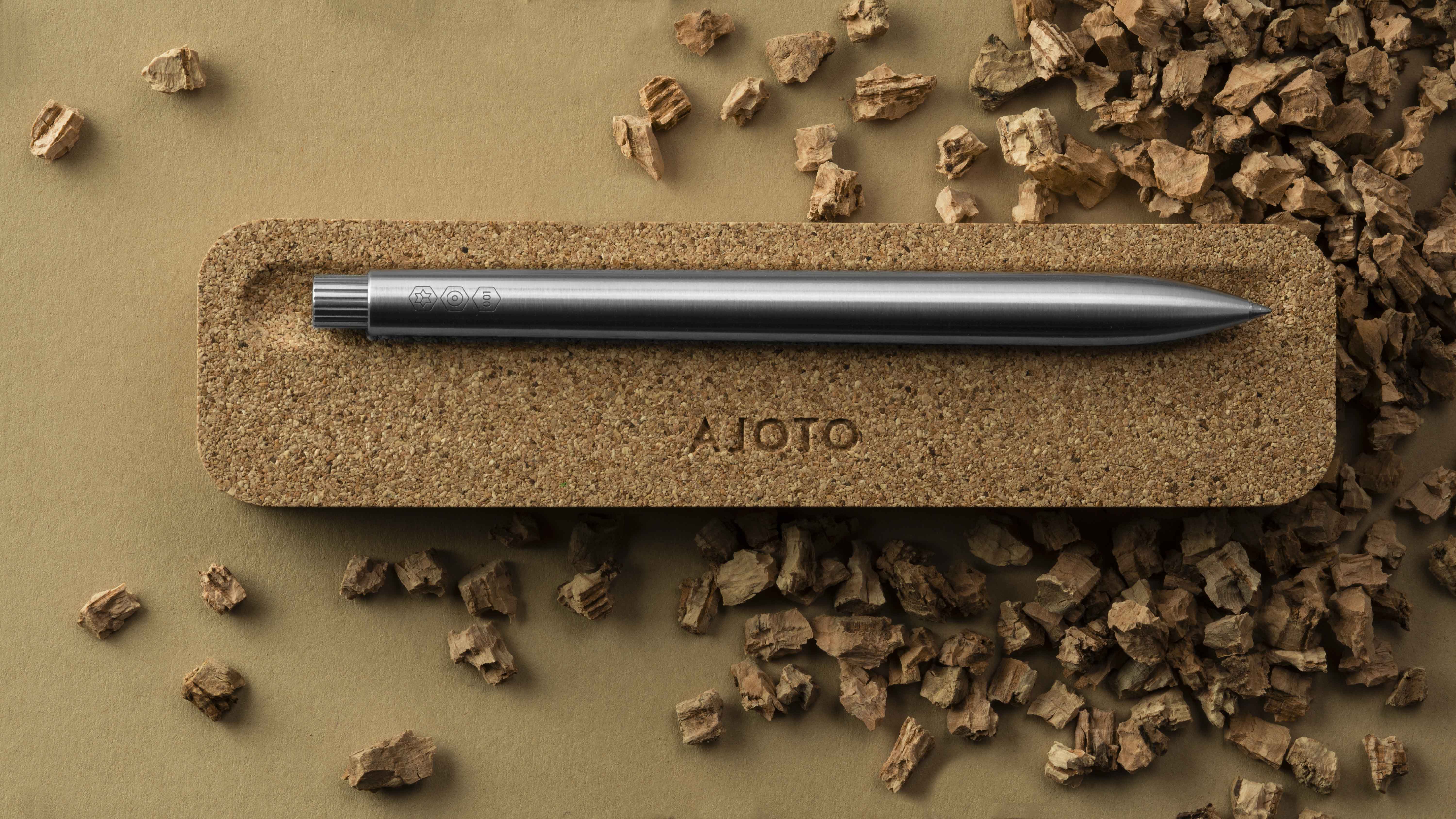
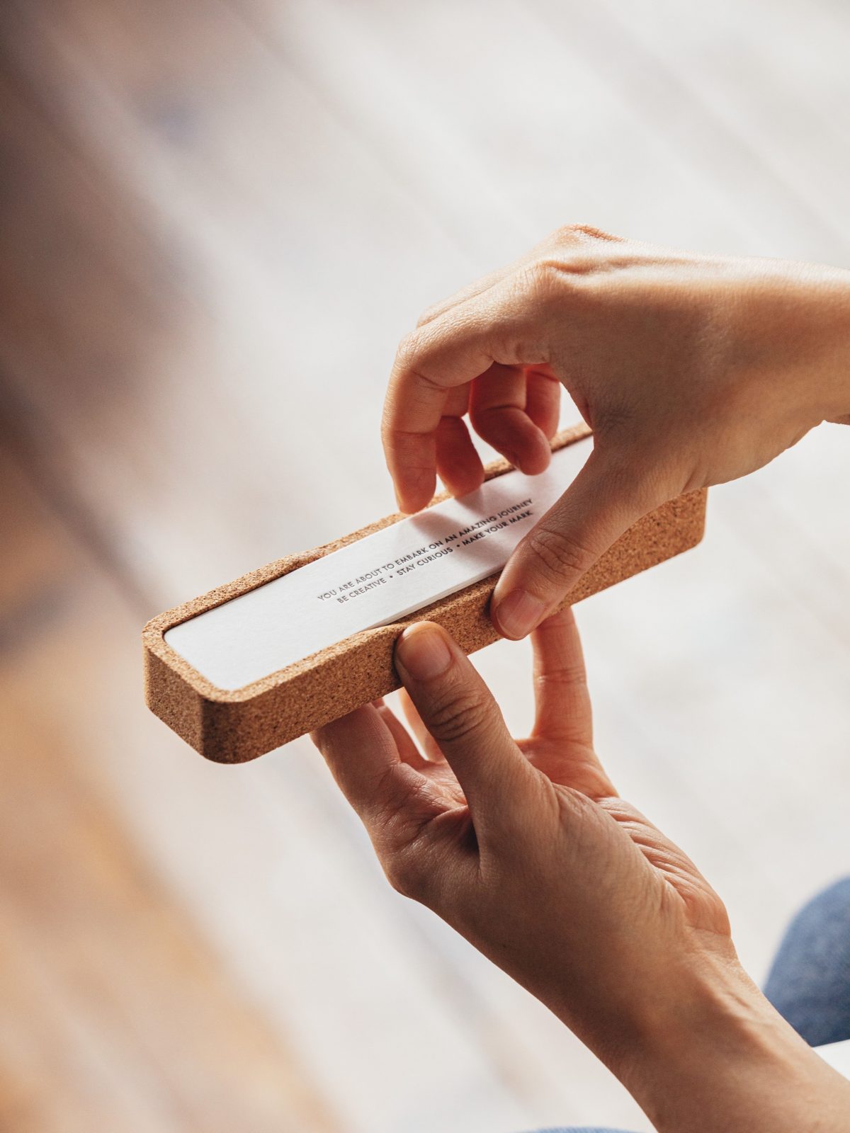
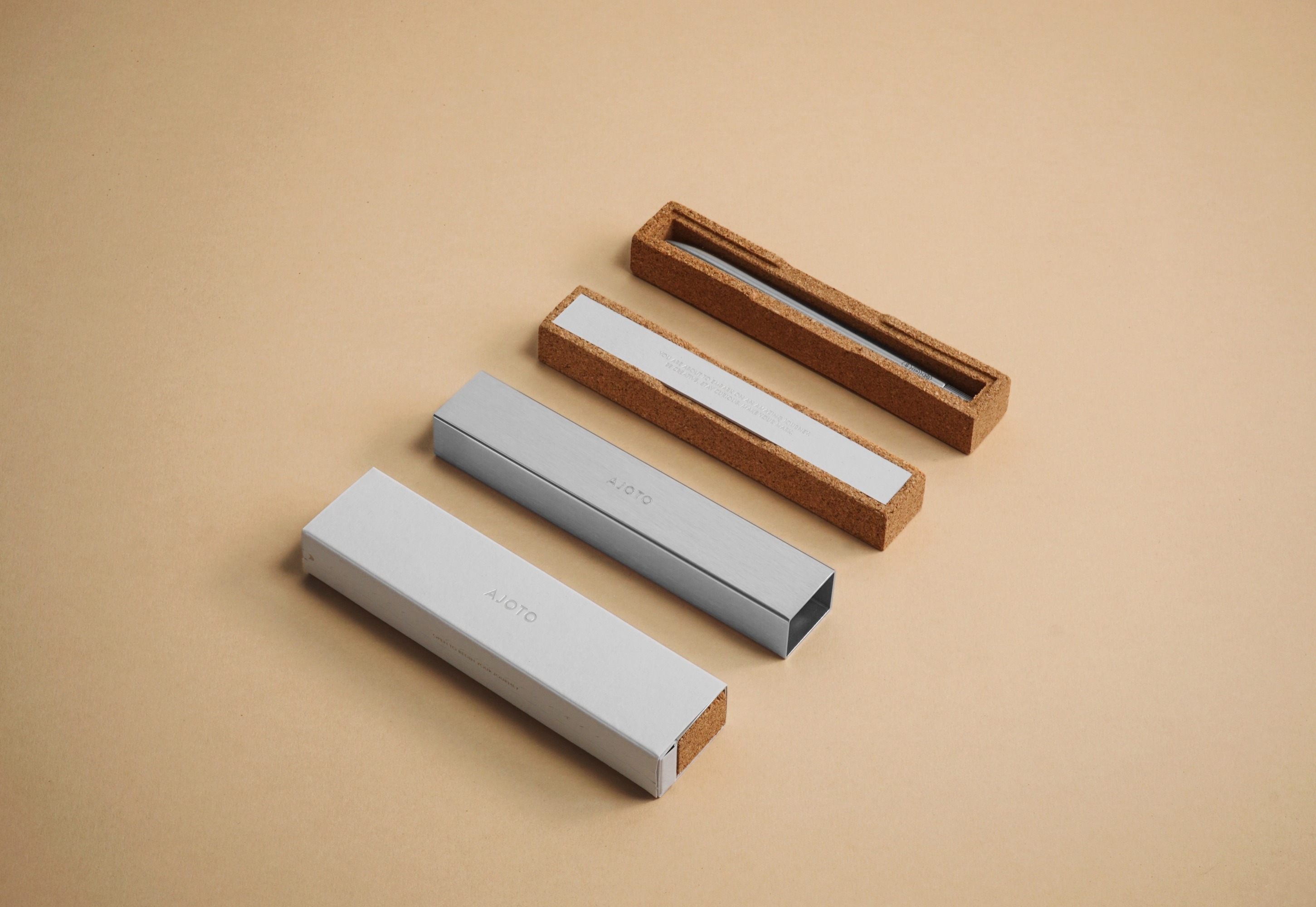
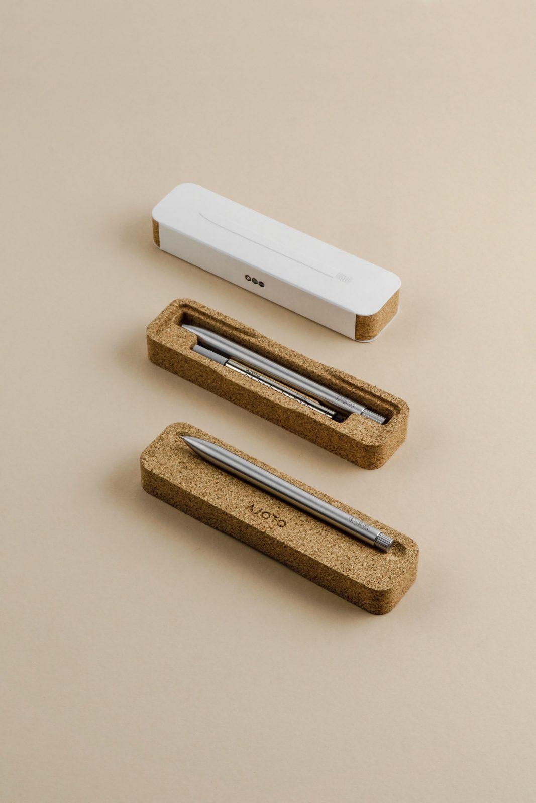
Over the years, we have listened to the feedback of our customers that have challenged us to take our ideas even further and make our packaging even more practical and engaging. Our approach was to combine sustainable materials and processes with thoughtful design to create beautiful yet practical pieces of packaging that had an amazing opening experience.
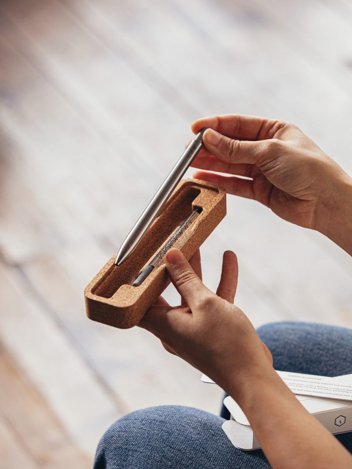
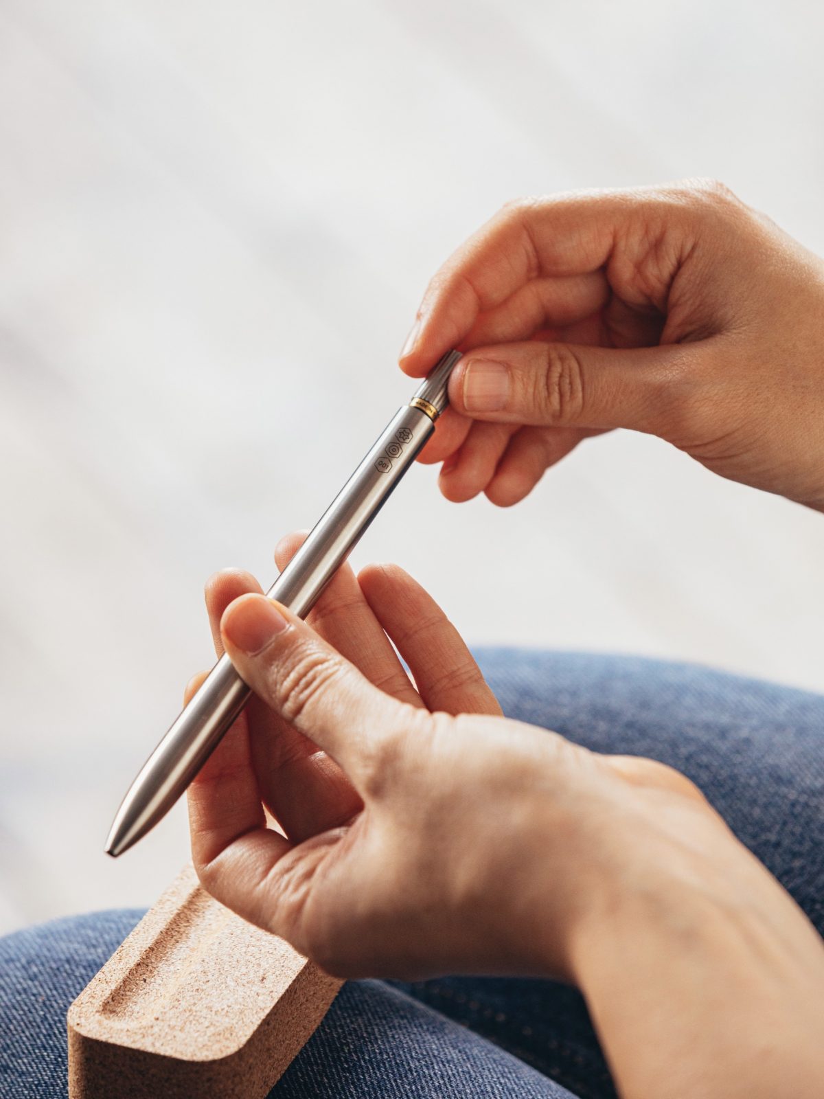
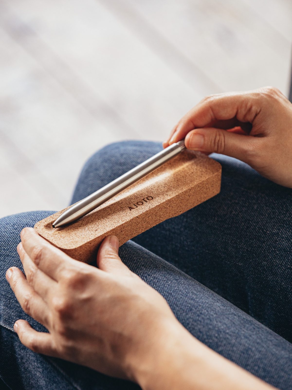
We wanted to make the cork more than a box and make it something you’d want to keep and use. So by introducing additional elements into the mould the box can be turned over once opened to form a Pen rest that would sit beautifully on any desk or table.
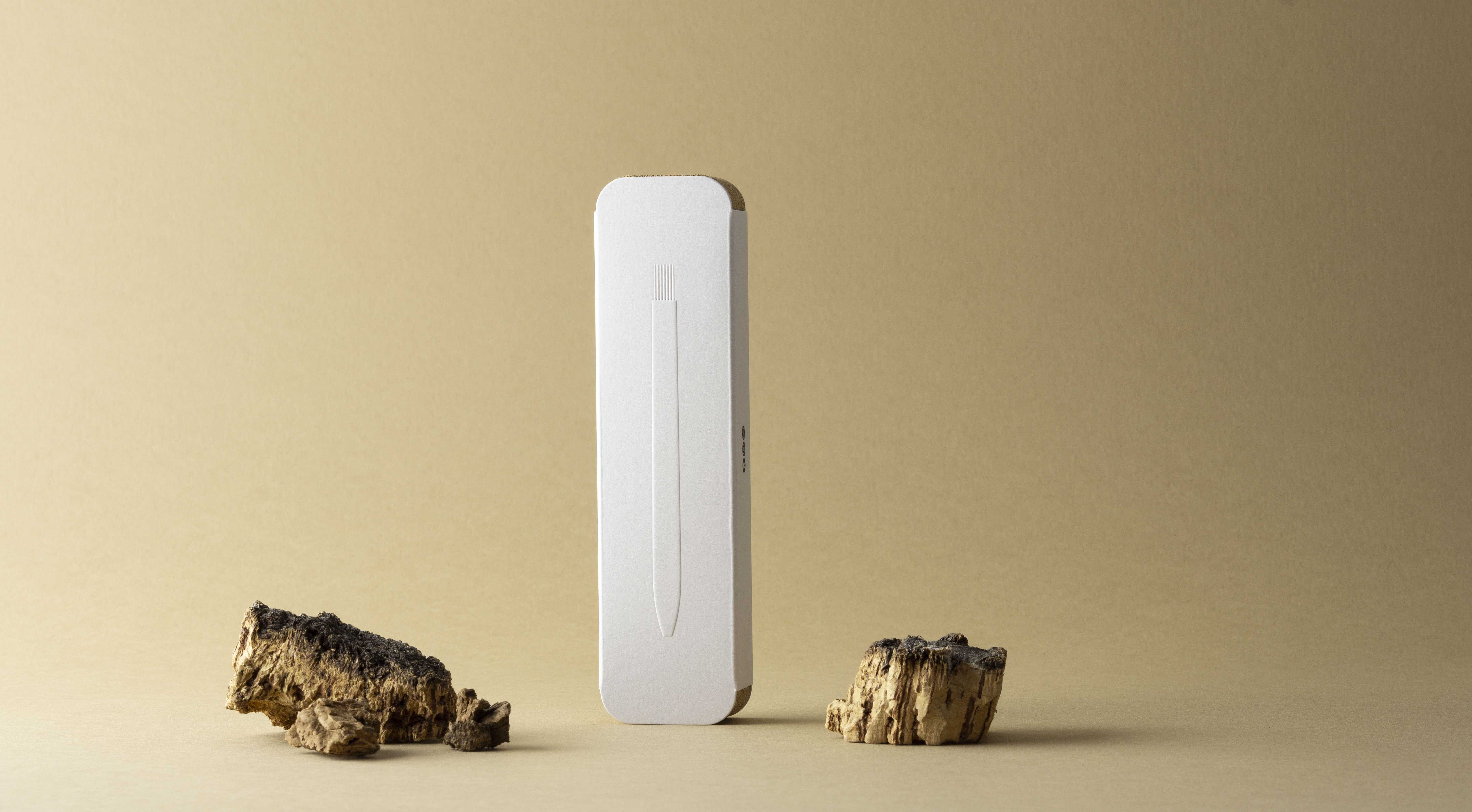
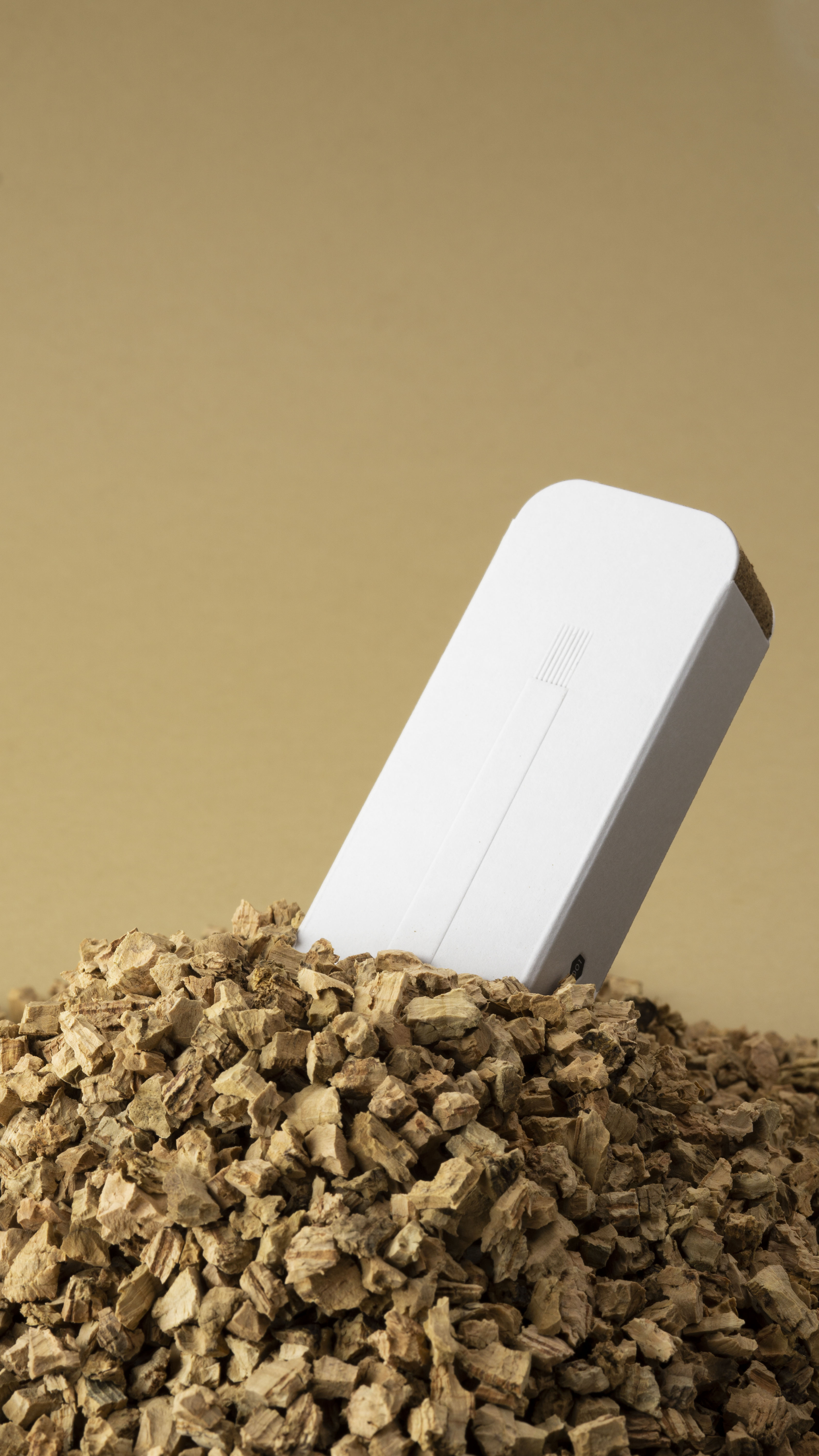
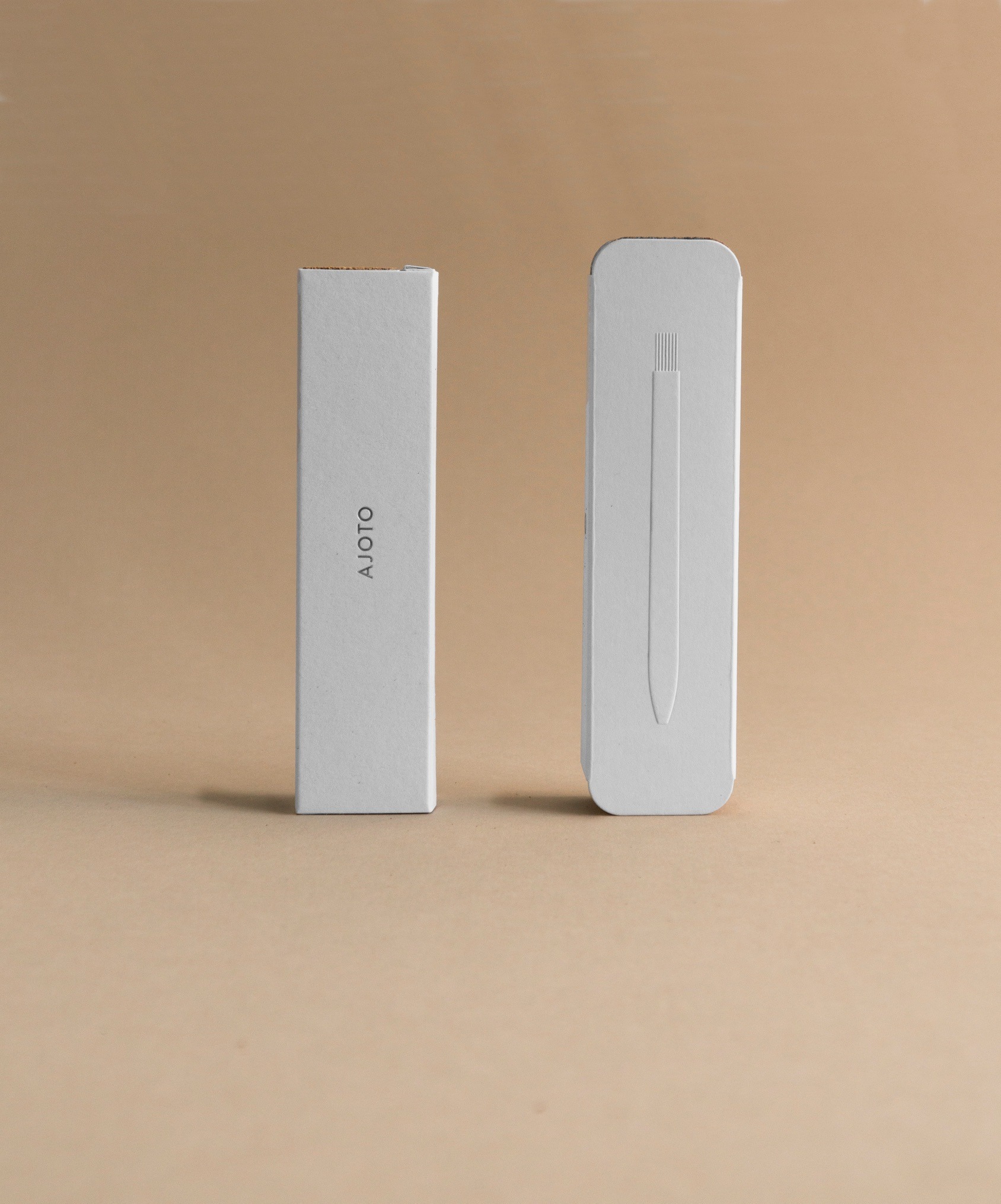
For all of the other elements, we focused our attention on paper and print. We indulged in the world of letterpress and blind embossing. We have created a packaging that brings together precision and craft in equal measures. It’s a simple step but the combination of smooth light grey paper stock and crisp black letterpress is a timeless combination that looks incredible
CREDIT
- Agency/Creative: AJOTO
- Article Title: Ajoto In-House Design Team Create New Upgrade to Their Pen Packaging
- Organisation/Entity: In-house, Published Commercial Design
- Project Type: Packaging
- Project Status: Published
- Agency/Creative Country: United Kingdom
- Market Region: Europe
- Project Deliverables: Brand Architecture, Brand Redesign, Brand Refinement, Packaging Design, Photography, Product Architecture
- Format: Box, Case, Sleeve, Tray, Wrap
- Substrate: Pulp Paper
- Keywords: WBDS In-House Design Awards 2021/22


