


Product: MeltinStrips™ (Oral Nutrition Strips)
Brand: AIM Nutrition (All In a Minute)
We designed the brand identity and packaging for AIM Nutrition, a next-generation American supplement brand that brings wellness to your tongue—literally.
About the brand:
AIM stands for All In a Minute—a name that captures the essence of modern wellness: quick, effortless, and effective. AIM is on a mission to simplify health for today’s fast-moving generation through oral strips that dissolve instantly, delivering essential nutrients in seconds.
As one of the most promising startups in the U.S. health and wellness market, AIM needed a design system that could speak the language of science, but with the energy of pop culture.
About the product:
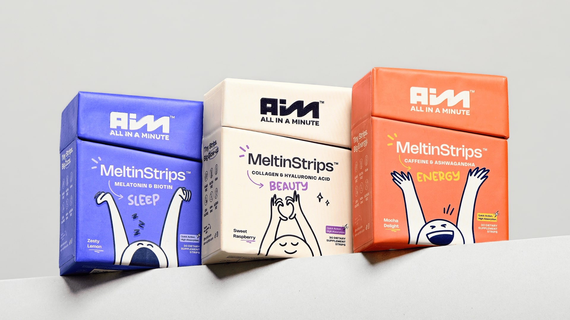
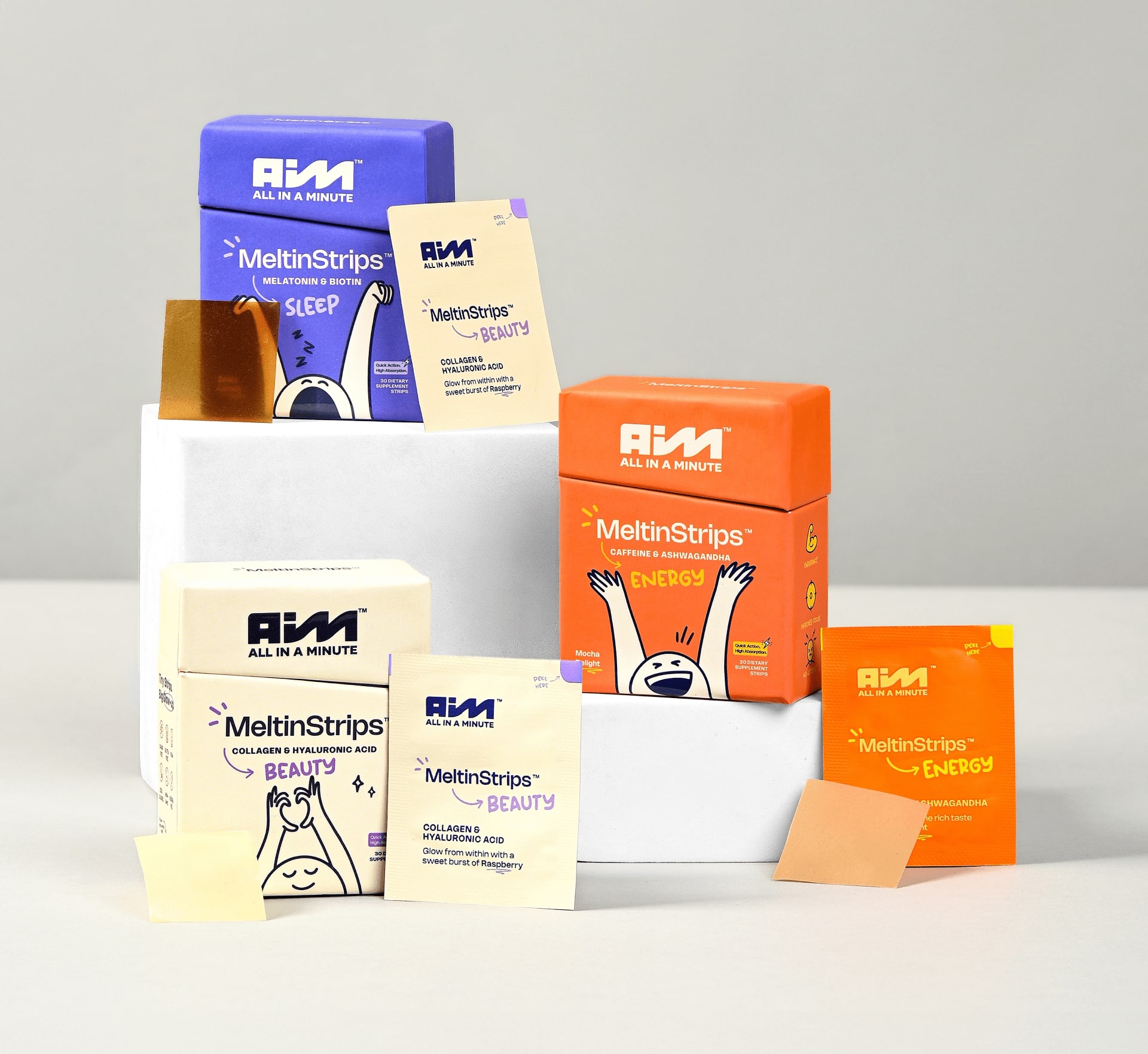
Each MeltinStrip™ is designed to work instantly, transforming everyday wellness routines into micro-moments of self-care. The three variants together cover a full 24-hour cycle of wellbeing:
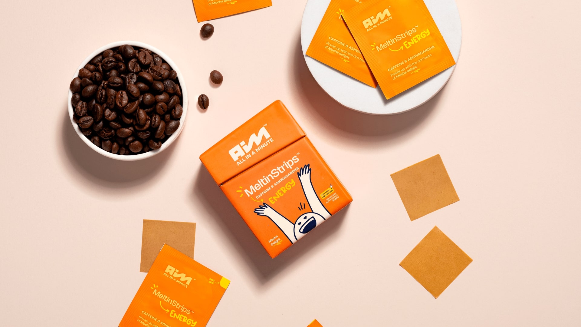
• ENERGY (Caffeine + Ashwagandha) — your morning spark.
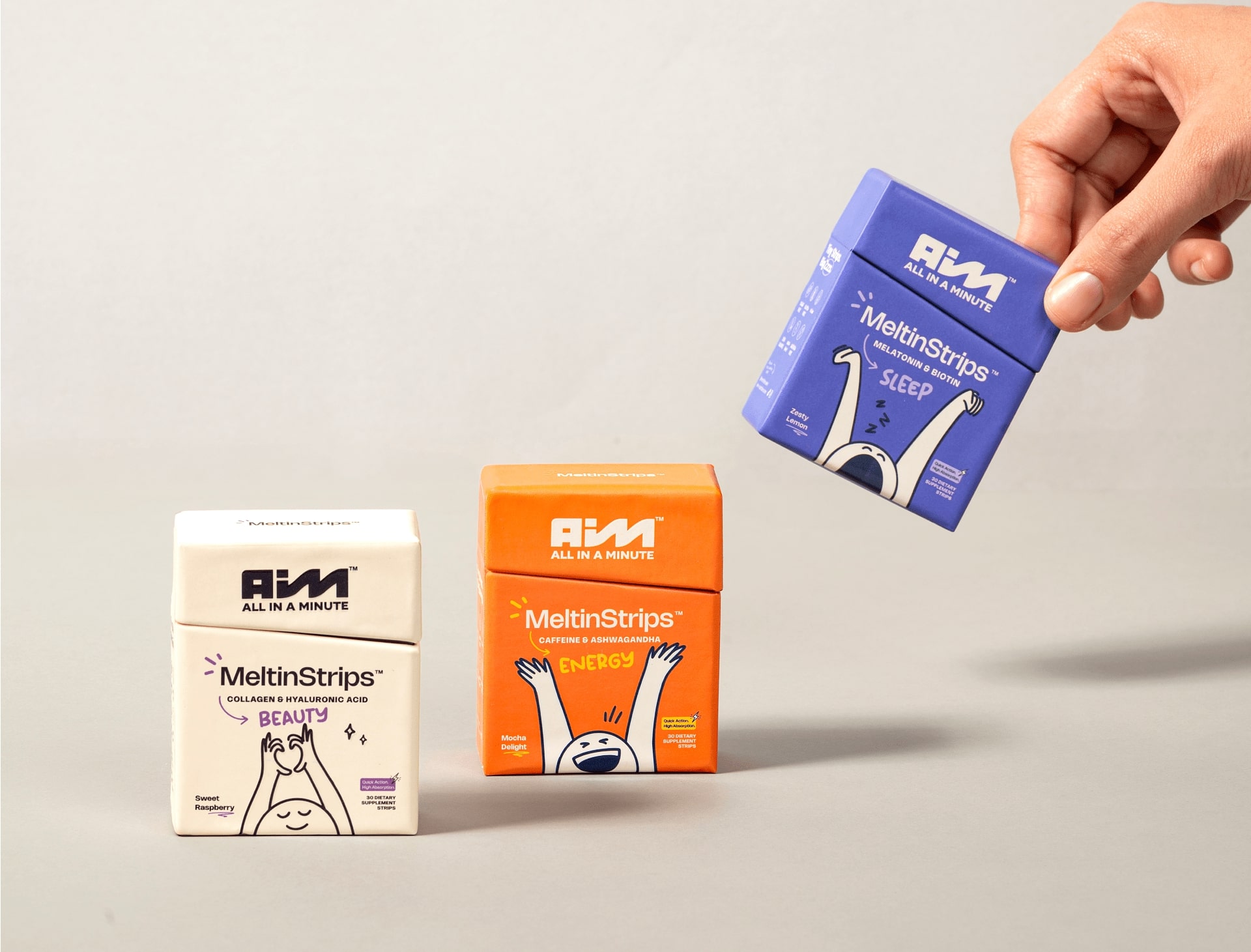
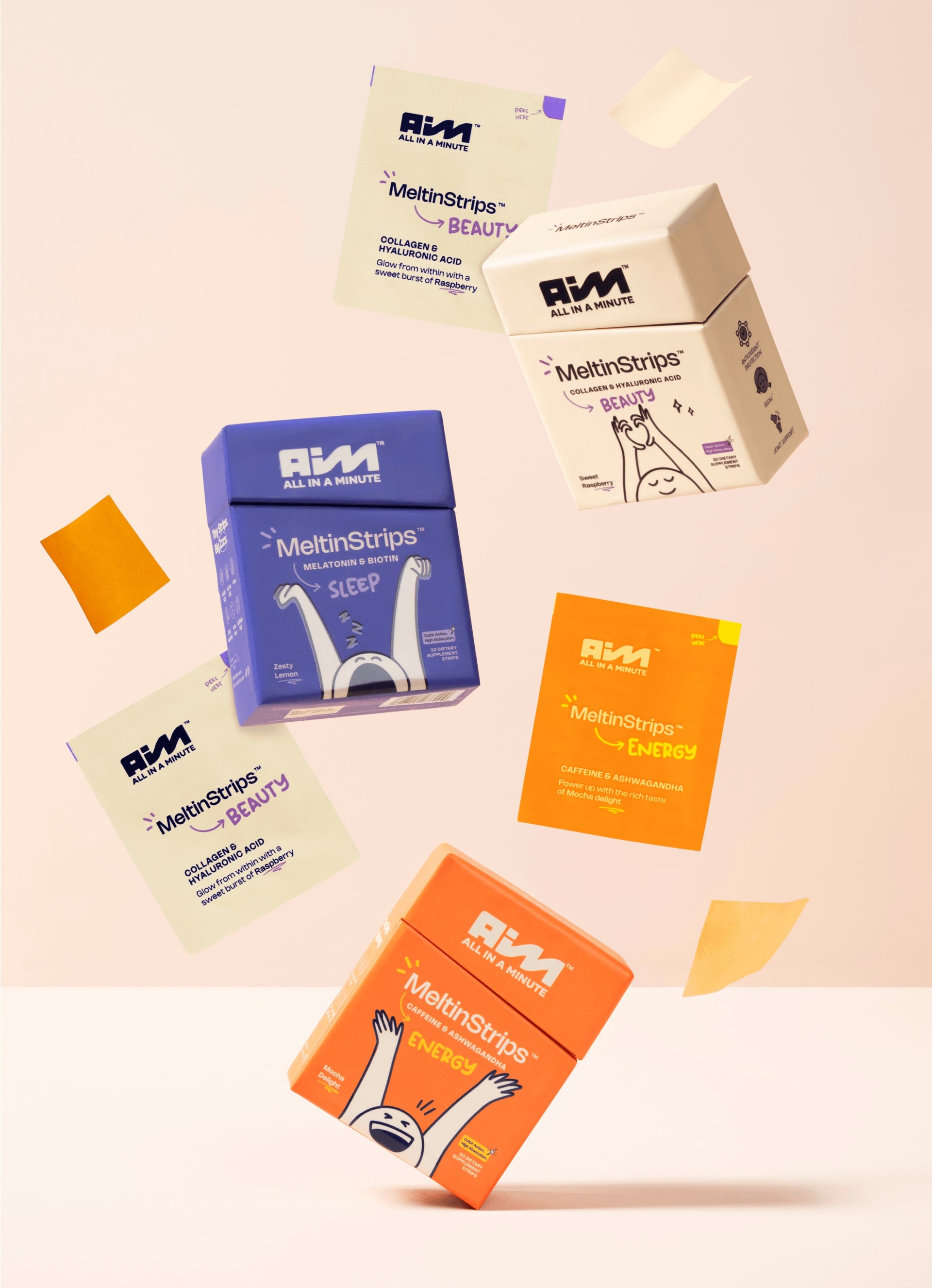
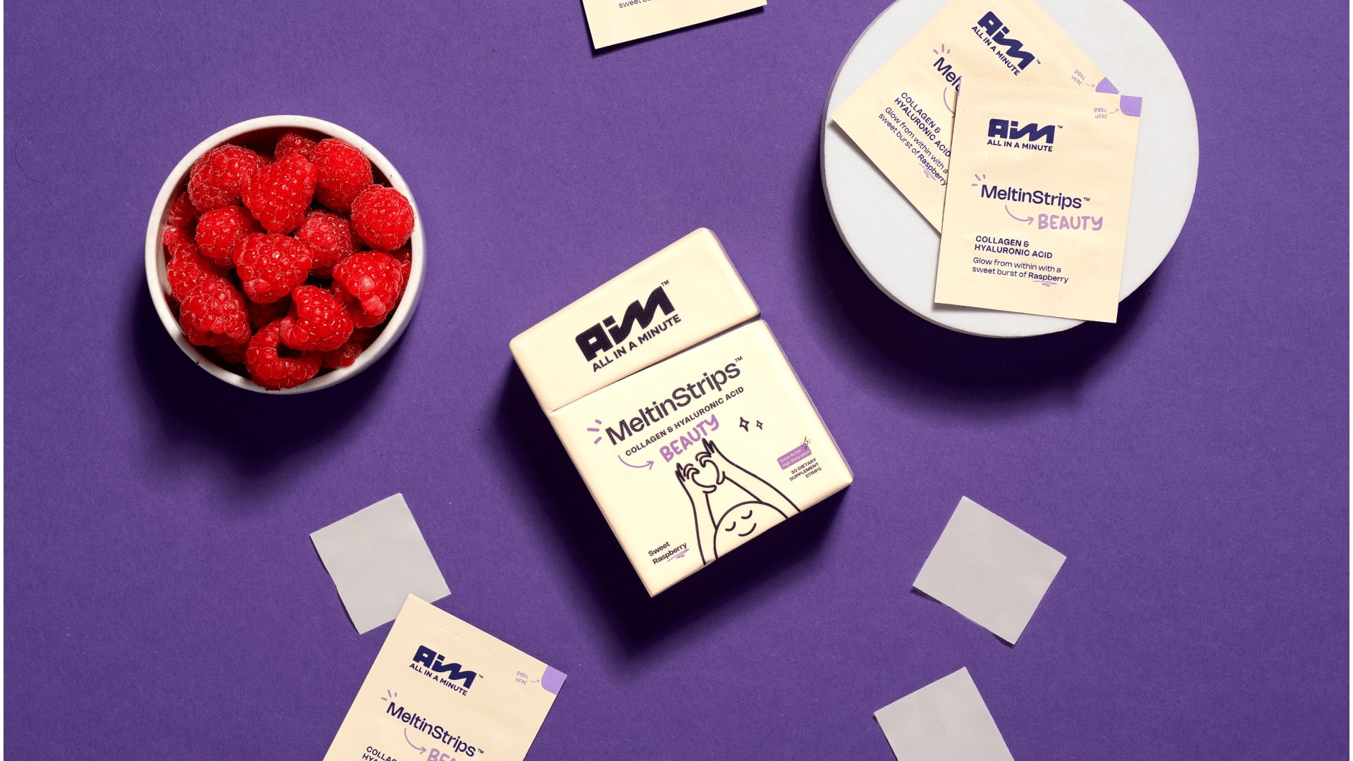
• BEAUTY (Collagen + Hyaluronic Acid) — your mid-day glow.
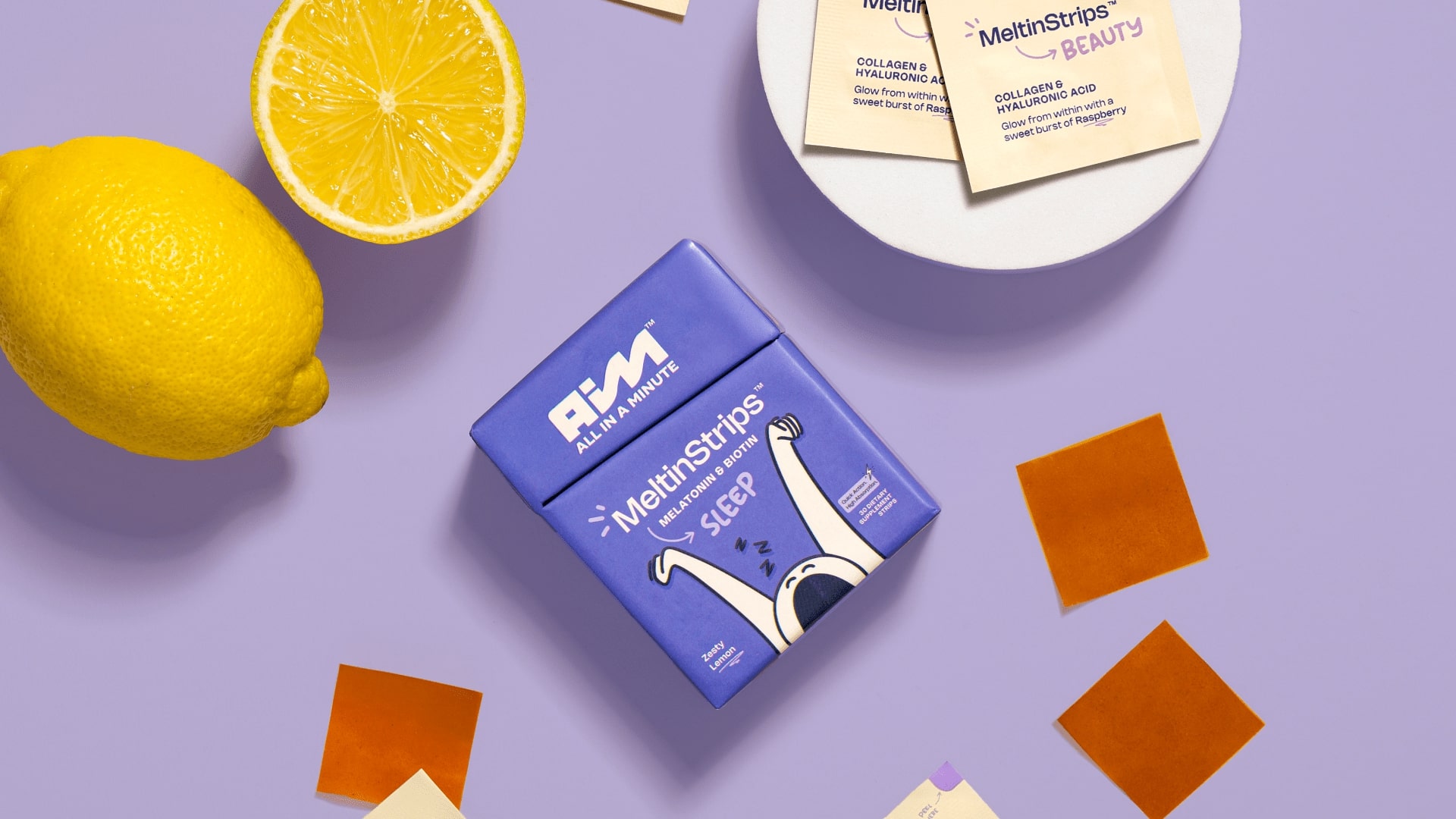
• SLEEP (Melatonin + Biotin) — your night-time calm.
AIM Nutrition, in essence, takes care of your body from sunrise to midnight, turning wellness into a rhythm that fits effortlessly into daily life.
About the design:
Our design philosophy was to build an identity that feels alive—something that radiates joy, health, and accessibility without losing sophistication. We achieved this through three key design choices:
1. Wave-Inspired Logo:
The AIM logo features an energetic, wave-like motion that signifies the natural flow of energy through the day. It reflects both physical rhythm and emotional balance—core to the brand’s message of holistic wellness.
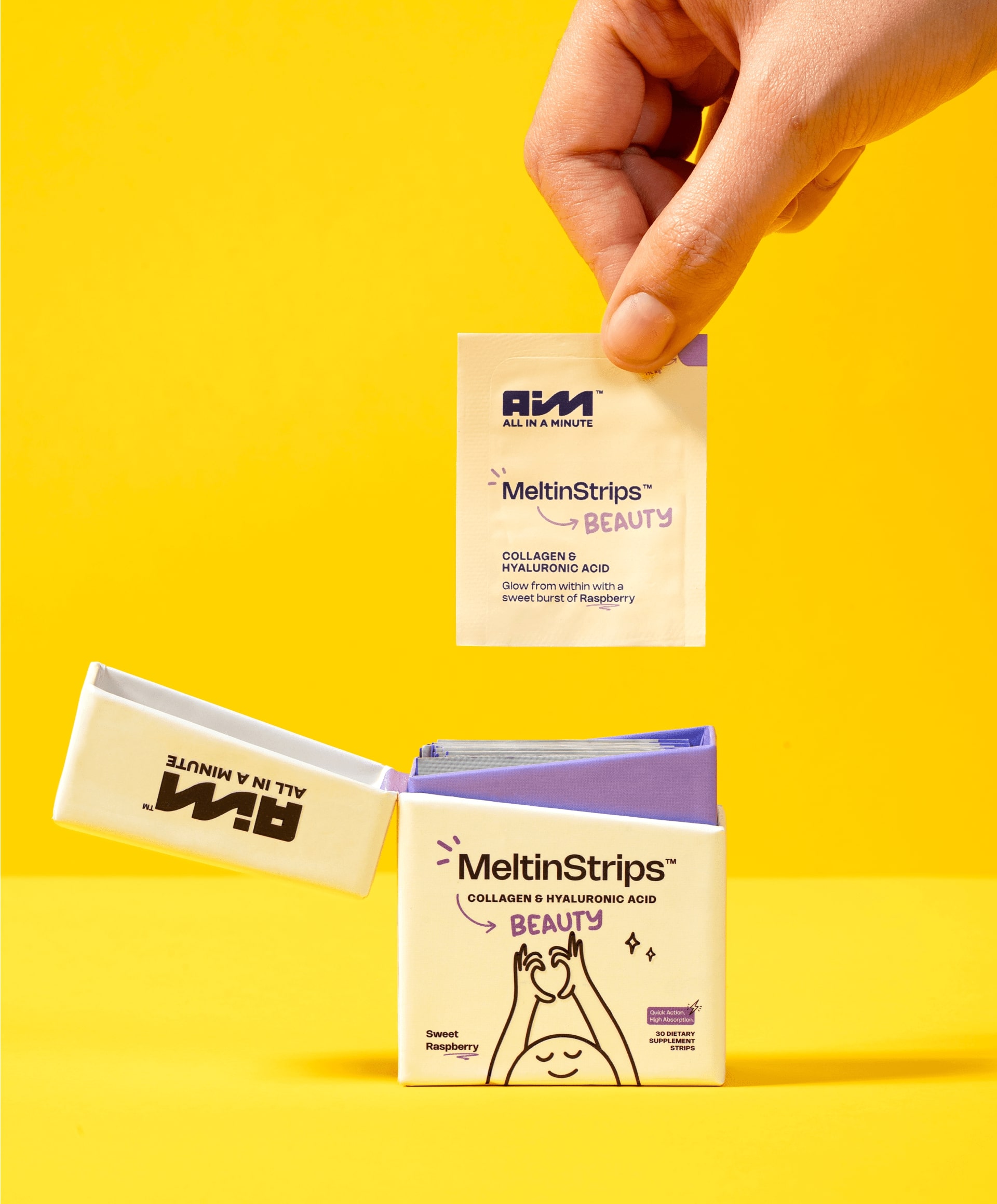
2. Zippo-Inspired Form Factor:
The unique flip-top packaging, inspired by the iconic Zippo lighter, transforms the simple act of taking a supplement into an experience. It’s sleek, collectible, and instantly differentiates AIM from traditional pill or gummy formats—making it feel more like a lifestyle accessory than a medical product.
3. Playful Illustrations & Bold Colors:
Each variant bursts with personality—Orange for Energy, Cream for Beauty, Blue for Sleep. The packaging features minimal, character-driven illustrations that personify the emotion of each variant: stretching wide awake, glowing in self-love, or dozing off in peace. These visual cues make the brand instantly relatable, human, and emotionally charged.
Easter egg:
The little illustrated characters across the packs subtly mirror the time of day—one reaching upward for the morning sun, one basking in mid-day radiance, and one winding down under moonlight. Together, they symbolize the cycle of care that AIM provides, all in a minute.
Brand’s extension:
AIM Nutrition is not just a supplement brand—it’s a daily ritual for the modern generation. The design bridges science with spontaneity, transforming supplements from something clinical to something cool. It positions AIM as a wellness companion that’s as stylish as it is smart.
Current scenario:
Already celebrated for its design innovation, AIM Nutrition has earned multiple design awards and is quickly becoming a cult favorite among young Americans. Its striking, color-coded packaging and signature Zippo form make it one of the most recognizable newcomers in the health and wellness category—proving that wellness can be fun, fast, and All In a Minute.
CREDIT
- Agency/Creative: Confetti Design Studio
- Article Title: AIM Nutrition Shows How to Be a Viral Brand in Personal Wellness!
- Organisation/Entity: Agency
- Project Type: Packaging
- Project Status: Published
- Agency/Creative Country: India
- Agency/Creative City: New Delhi
- Market Region: North America
- Project Deliverables: Brand Design, Packaging Design, Photography
- Format: Box
- Industry: Health Care
- Keywords: supplements, nutraceuticals, personal wellness, melatonin, caffeine, collagen, packaging design, branding, photography
-
Credits:
Director: Rishabh Jain
Creative Director: Himal Hazra
Sr. Graphic Designer: Harkirat Kaur


