


Description:
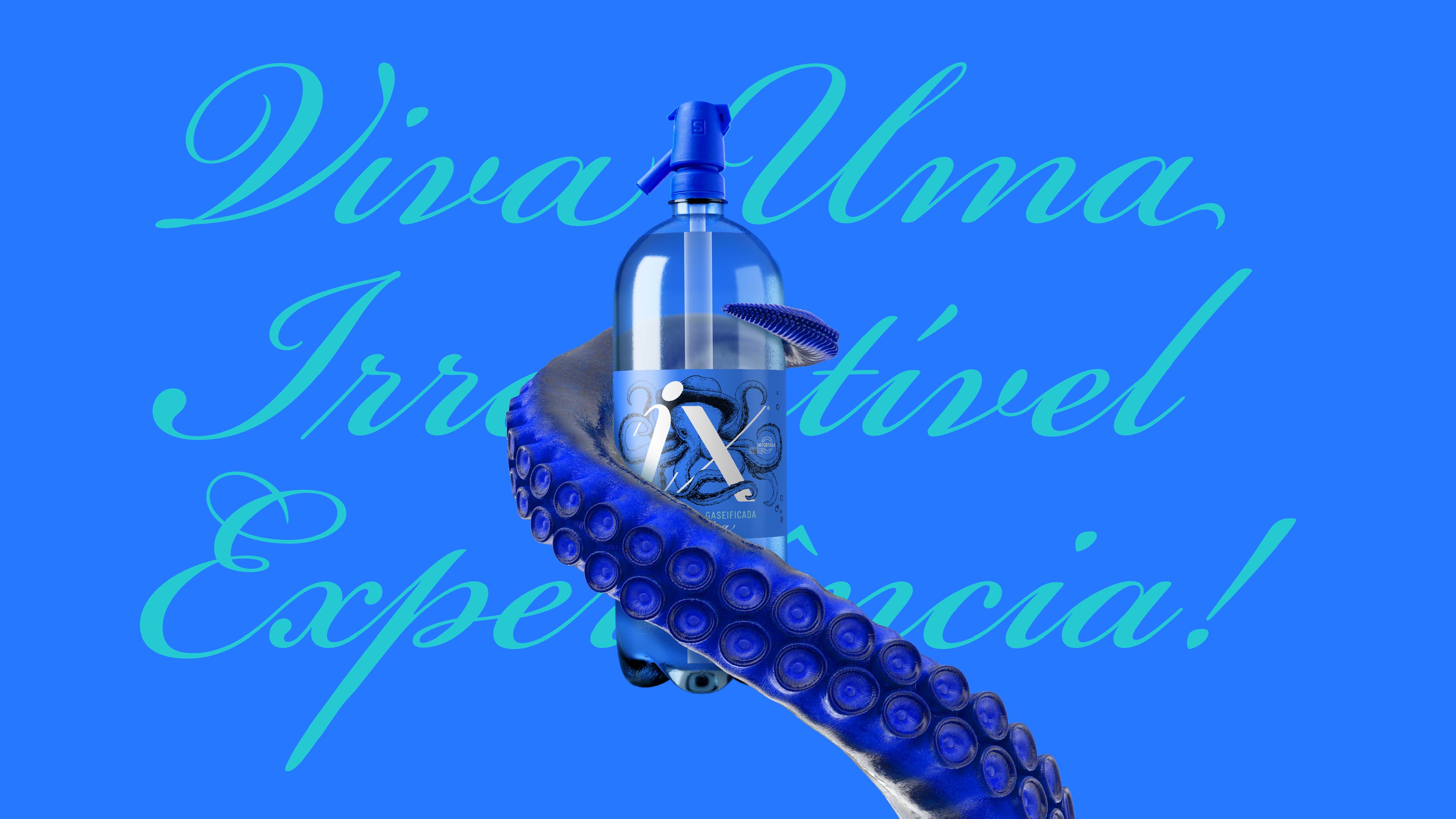
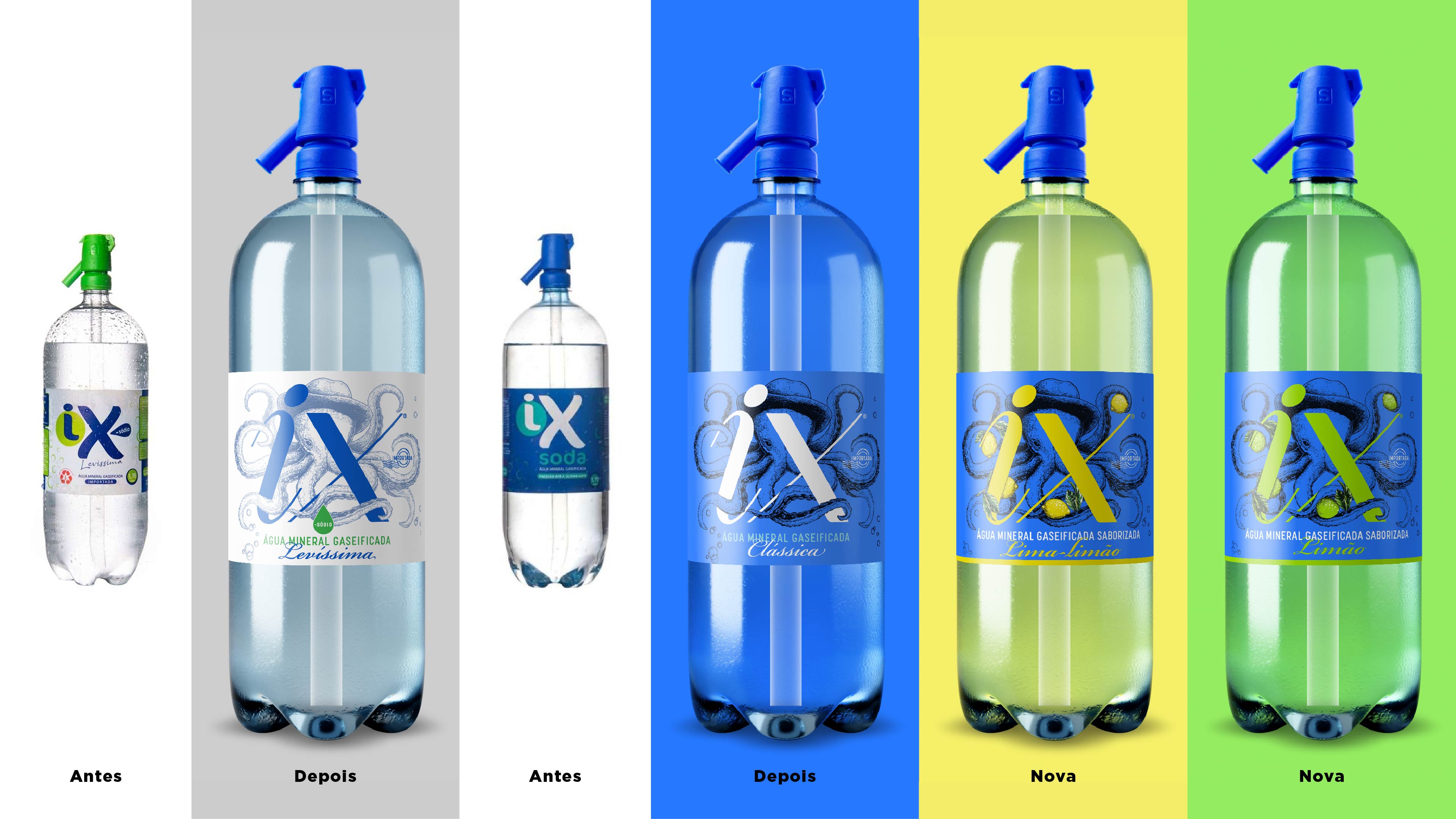
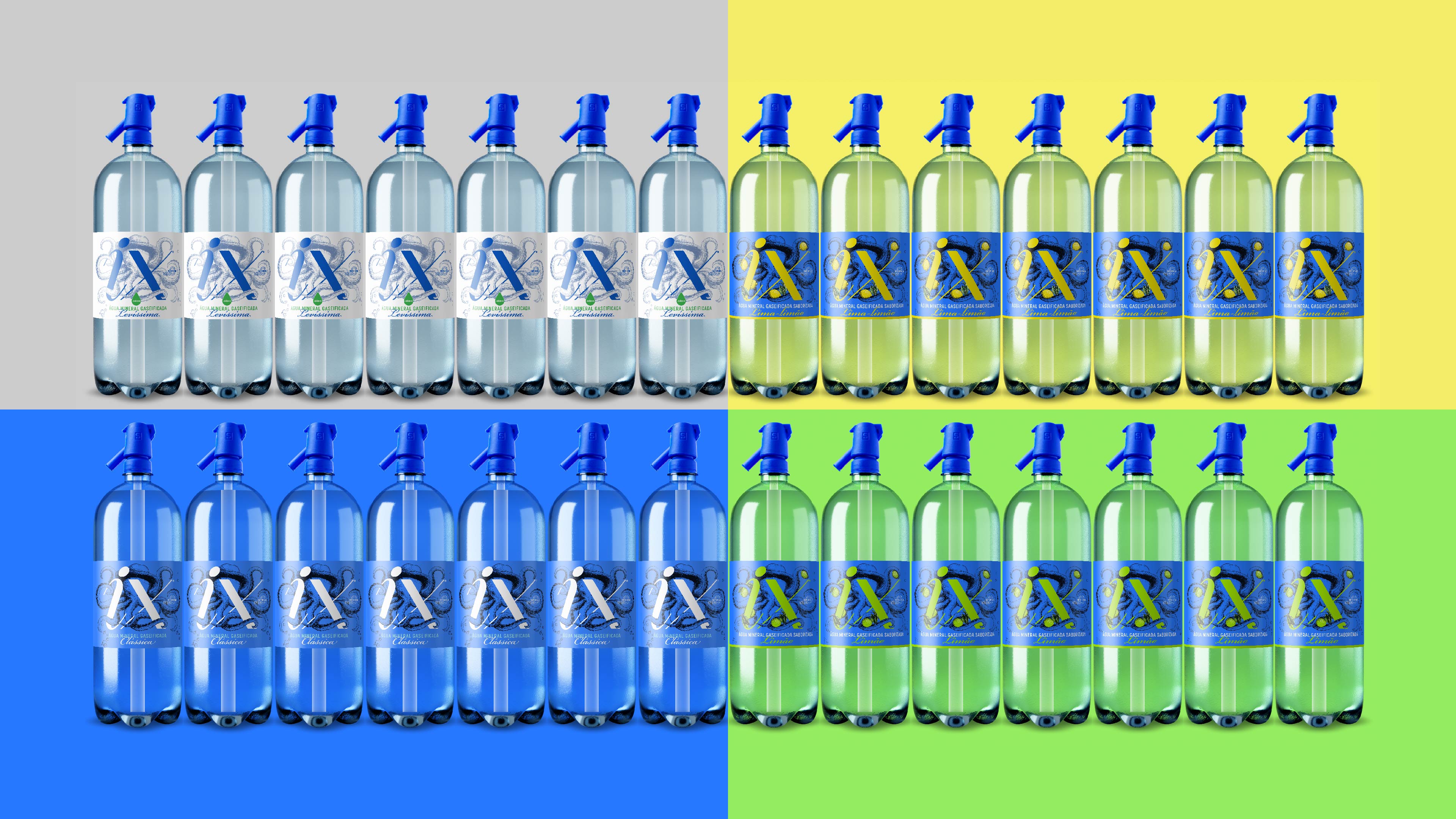
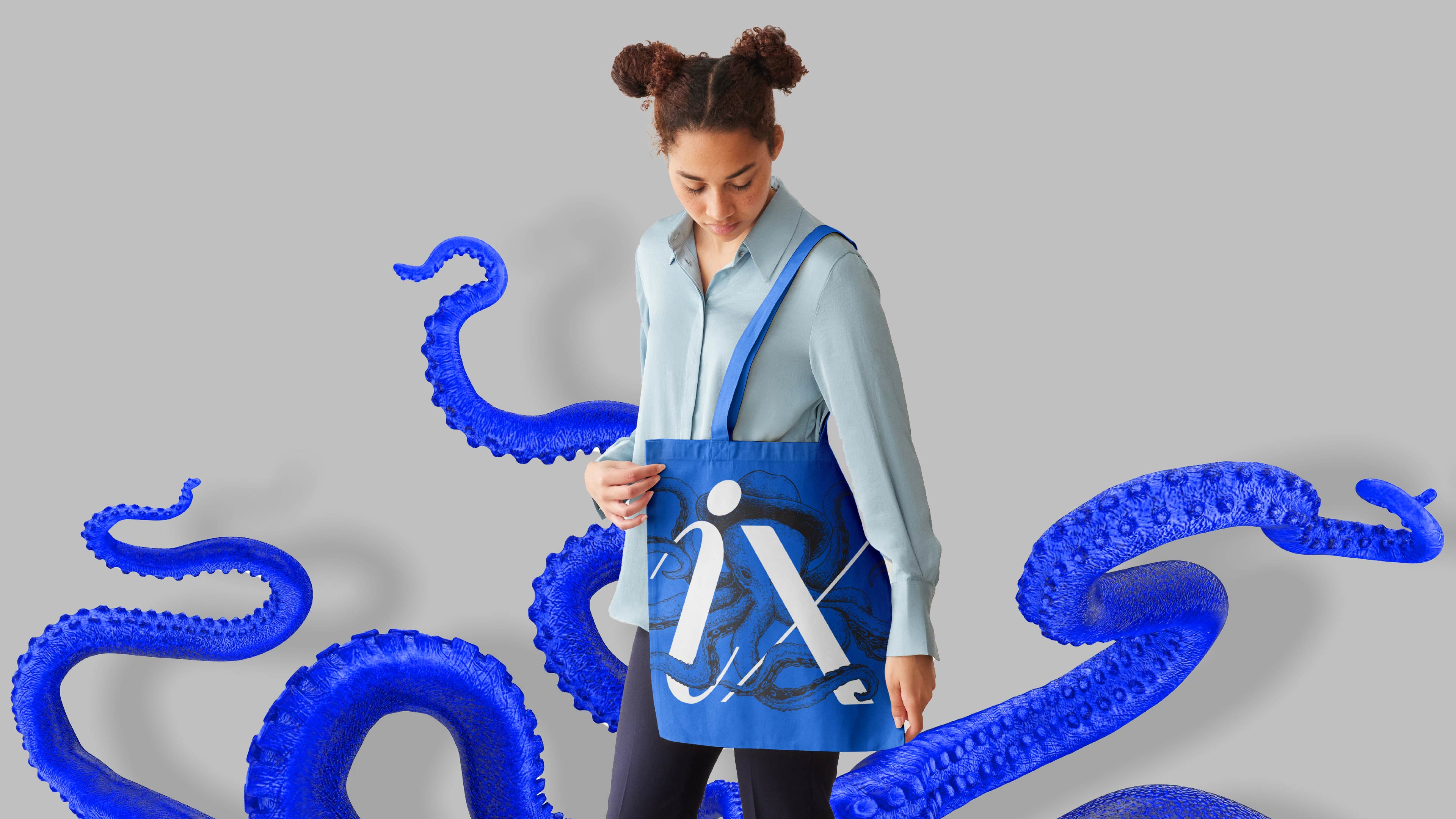
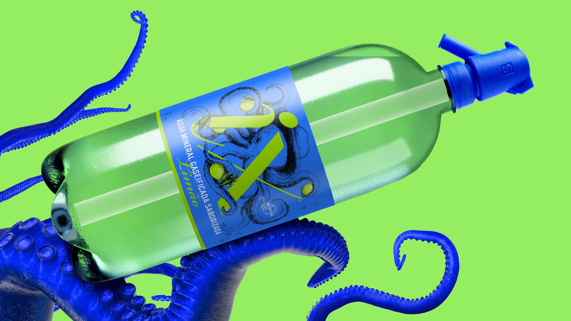
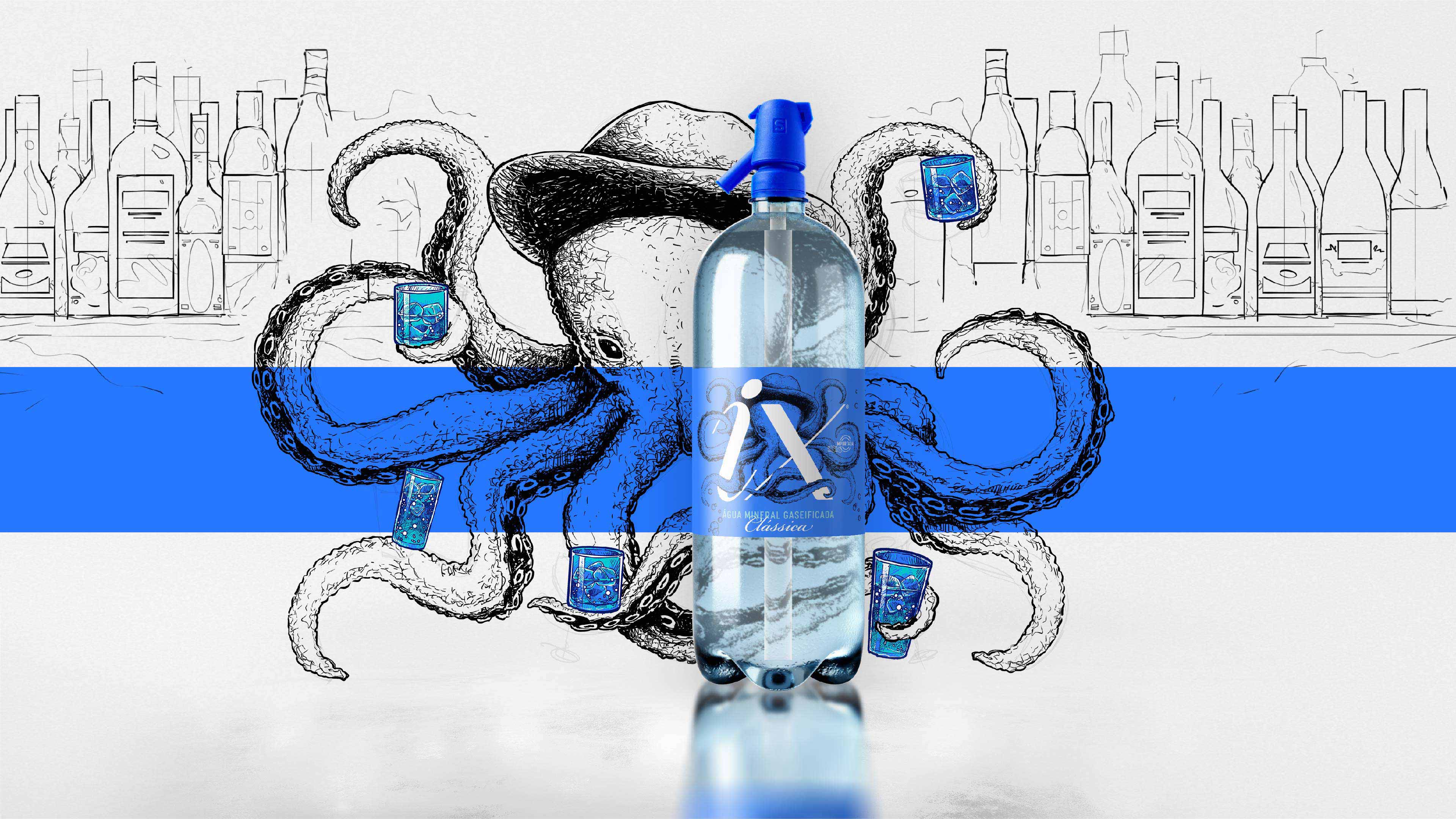
Packaging redesign and line extension to raise the perception of carbonated mineral water quality IX. To generate personality, we created a surprising character, an octopus that takes on the role of a bartender, interacting with the brand and demonstrating the flexibility of the product in preparing drinks. The octopus itself presents the fruits of the flavored versions, which gained vibrant colors to differentiate the labels. For the bottles and siphon, we adopted blue, thus preserving the unity of the line. The logo was redesigned with lightness and sophistication. And the main detail of this project was the creation of a meaning for the brand. IX was re-signified with the tag “Live an Irresistible eXperience!” (IX) as an appeal for the purity and intrinsic freshness of the product.
What Is The Project:
IX carbonated mineral water is highly pure and refreshing, but its visual identity does not transmit the value of a premium product, being very generic. The name had no meaning, and the logo was childish. There was a problem with handling the seal and a need to expand the portfolio, so it was necessary to organize the launch of new flavors. Thus, we redesigned the labels for the Tradicional and Levíssima (light) products and created the labels for two new flavors, lemon and lemon-lime, in addition to solving the problem with the valve and adding a perception of high quality to the entire product line.
What Is The Objective:
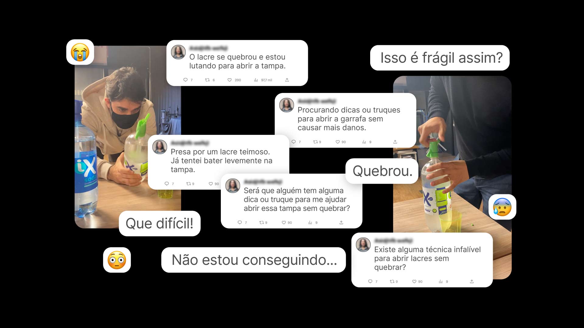
In addition to adding greater value to the brand and developing new flavor variants, there was still a technical problem with the packaging that needed to be resolved. IX has a siphon for pressure control and gas conservation. But many times the siphon valve broke when opening. We did several tests to understand the difficulties and created a more didactic step-by-step approach to solving this problem. In this step-by-step guide, our bartender’s tentacles guide, in a very didactic way, the opening of the siphon, leaving no room for doubt.
Defense:
A premium carbonated water, in packaging that deserved it. The redesign brought identity and refinement to the labels. The extensions came with their own luminosity. The unusual character brought modernity and movement, giving life to the line. Both for domestic use and for use in bars and restaurants for preparing drinks, IX has gained greater relevance and has become the most reliable choice at the POS.

CREDIT
- Agency/Creative: Empathy Company
- Article Title: Água IX by Empathy Company
- Organisation/Entity: Agency
- Project Type: Packaging
- Project Status: Published
- Agency/Creative Country: Brazil
- Agency/Creative City: São Paulo
- Market Region: South America
- Project Deliverables: Label Design, Product Design
- Format: Bottle
- Industry: Food/Beverage
- Keywords: water octopus blue Packaging bottle Label product Água IX grupo ix sparkling
-
Credits:
Agency: Empathy Company
Founder/CEO & CEMO: Gabriel Lopes
Partner/CEEO: Anie Lou Lima
CEDA: Mike Camara
Graphic Designer Coordinator: Igor Su00e1 Fortes


