


The Agile Search brand refresh case study – “Tech recruitment with heart”
When Agile Search, leading tech recruiters in the Nordics, approached us for a brand uplift, the project was simple on paper. A light colour palette refresh and exploration of new typography in the current branding. Nothing more.
However, analysis of the existing brand elements–emblem, colours, and the look/feel of various design components–revealed distinct disparities between their objectives and branding.
The brand’s motto of diverse and inclusive hiring was left out of their brand language. And the team’s youthful friendliness (that left a marked impression on our creative director Alberto Ortega) was at odds with an emblem font face that looked too rigid and serious instead of ‘agile’ and friendly. The all-caps approach also seemed stern for a search function: most users type in lowercase. We realised this was a good opportunity for a brand refresh and got to work familiarising ourselves with the tech industry to strengthen Agile Search’s market differentiation.
In our first workshop, we collected information on the competitor landscape and insights that could be injected into the brand language. Competing brands were analysed for their colour palettes, photography style, and illustration usage or lack thereof. The firm’s authentic community-spirit, passion for diversity in tech recruitment, and their exceptional professionalism were identified as the key pillars to base the branding on. We now had our North Star for Agile search’s brand refresh: showcasing a company that was friendly, inclusive, and diverse, with high operational standards. These distilled ideas were presented to the team for alignment and resolution of potential tensions beforehand.
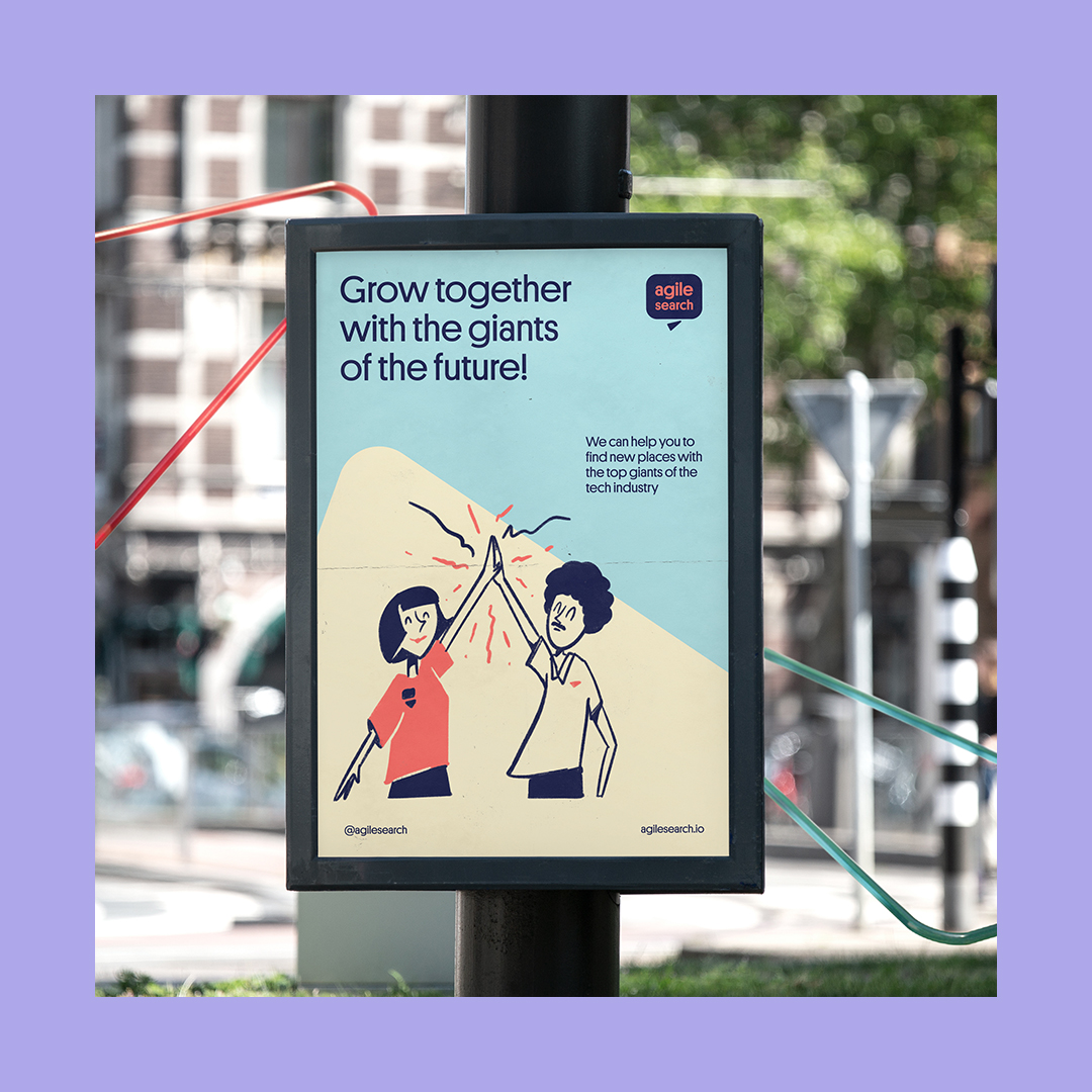
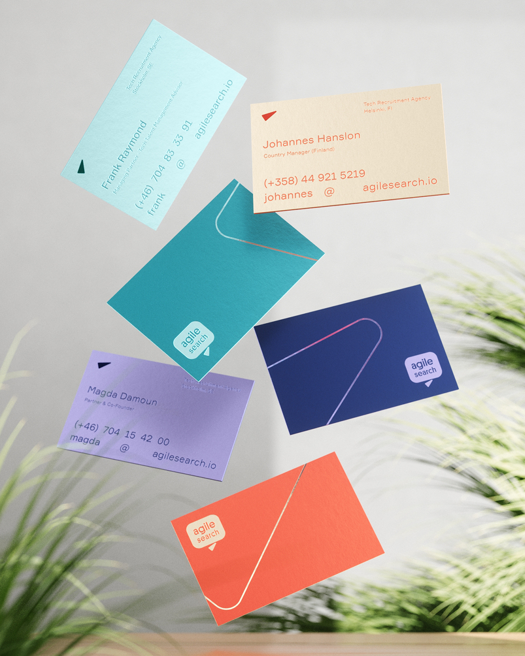
Our challenge now was redesigning the old emblem for improved functionality and an authentic personality. Since the existing speech bubble emblem was conceptually incompatible with a search function, we played around with separating the triangular notch and repurposing it as a cursor. This brought in immediate and better relevance for the brand language.
We created a warmer, friendlier and more functional emblem by finishing off with rounded edges, an asymmetrical font, and lowercase lettering.
Minor changes / big impact.
We next presented a refreshed mood board and variations in the colour palette by tweaking the original brand green for optimal contrast. Besides the classic option, a new diverse palette variation explored dynamism in font pairings and colouring examples to find the best combinations.
By now, the brand was fully on board with our refresh design strategy.
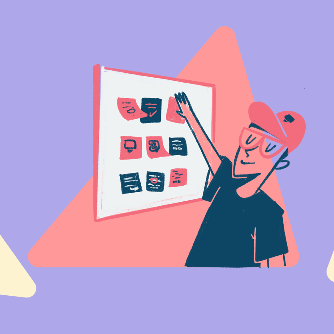
In the third client consult, we showcased illustration as a leading element for the brand refresh strategy, following competitor analysis that highlighted its absence in rival communications. Our art director Franko Rosas created charming hand-drawn sketches in three distinct creative routes to further differentiate the Agile Search brand as a human-first brand, unlike vector-based illustration common to the tech industry.
We also presented three options for the new emblem with mock-ups and concepts.
Based on team feedback and ideas, we expanded the new colour palette to showcase Agile Search’s DEI recruitment policy. Our senior designer Adrià Tañà Ferrer integrated precise and sober colours with quirky and dynamic ones with no single colour dominating the palette. The refined brand green also displayed optimal contrast among various combinations.
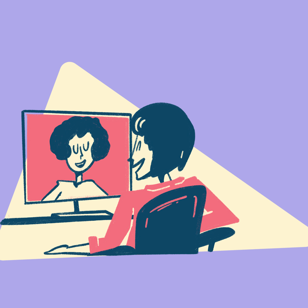
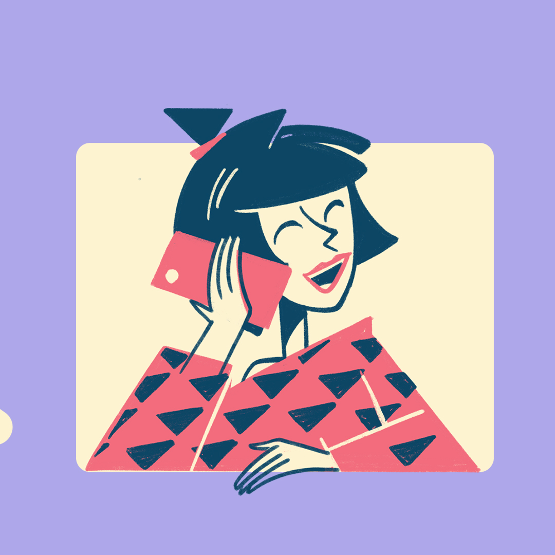
We also determined the final illustration style, quality of lines, stroke textures, and colours by using the Hanna-Barnera and Flintstones cartoons of the 60s as a reference for simple happiness and warmth. Closed eyes were favoured in simple ‘u’ and ‘n’ shapes to convey clear expressions of joy. The triangular aspect of the emblem notch was used to geometrically structure each cameo of the hand-drawn sketches.
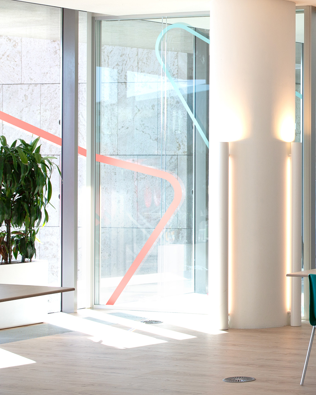
Emblem variations that used the dynamic possibilities of the notch element were also explored, to aid Agile Search’s functionality as a search portal and further develop the brand language.
Finally, we introduced precise photography guidelines to reflect the brand’s commitment towards diversity and people-friendly hiring process: images that focused on the individual with equal representation of race and background.
This concluded the comprehensive brand refresh for our client, Agile Search, through design strategy. We now had a brand language that was cohesive, unique, and impactful for the tech recruitment firm’s mission and corporate policy.
Revitalising the brand was crucial to convey its core values and boost market impact. The redesigned logo, typography, colour palette, and handcrafted illustrations set the tone for inclusivity, warmth, and better functionality. It also turbo-charged brand differentiation, setting Agile Search apart as a trailblazer in the tech recruitment industry.

CREDIT
- Agency/Creative: Oil Studio
- Article Title: Agile Search: Rebrand, Brand Illustration and Iconography by Oil Studio
- Organisation/Entity: Agency
- Project Type: Identity
- Project Status: Published
- Agency/Creative Country: Netherlands
- Agency/Creative City: Amsterdam
- Market Region: Europe
- Project Deliverables: Brand Design
- Industry: Technology
- Keywords: Branding, Redesign, Illustration, Iconography, Design Thinking, Market Differentiation, Logo Design, Graphic Design
-
Credits:
Art Director: Franko Rosas


