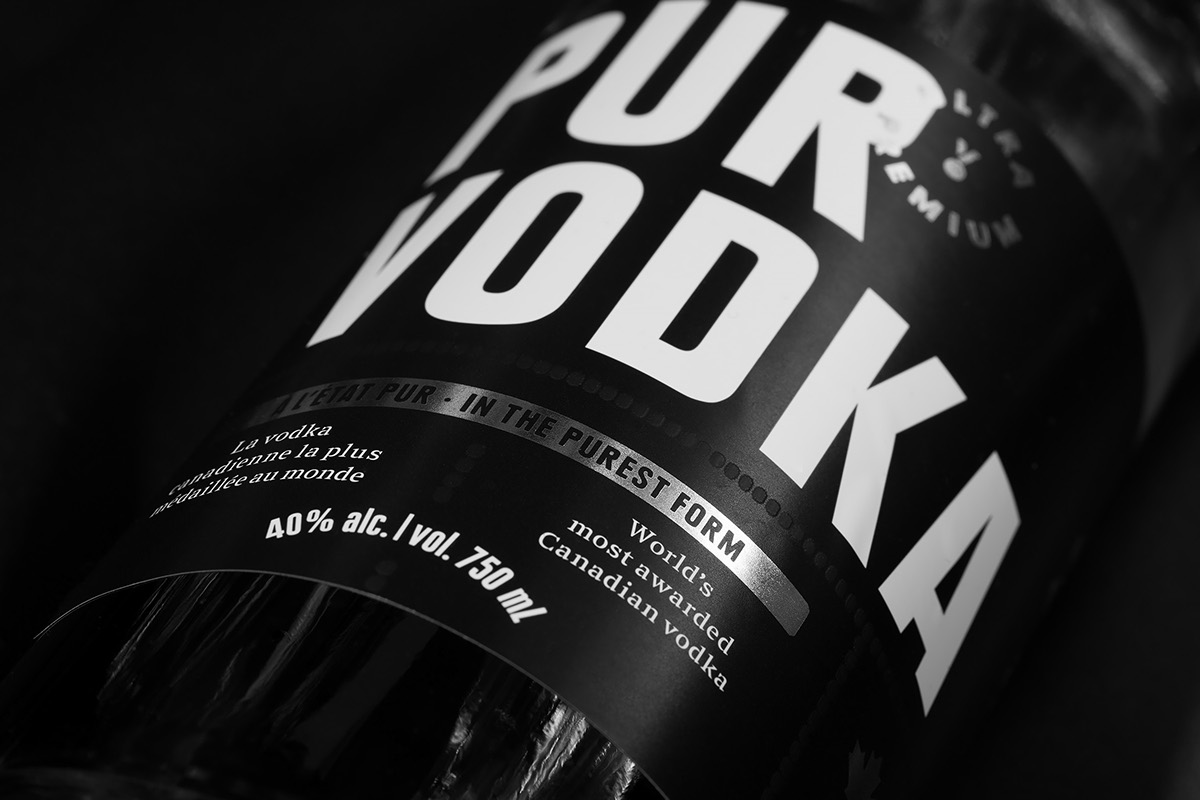
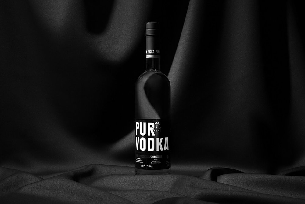
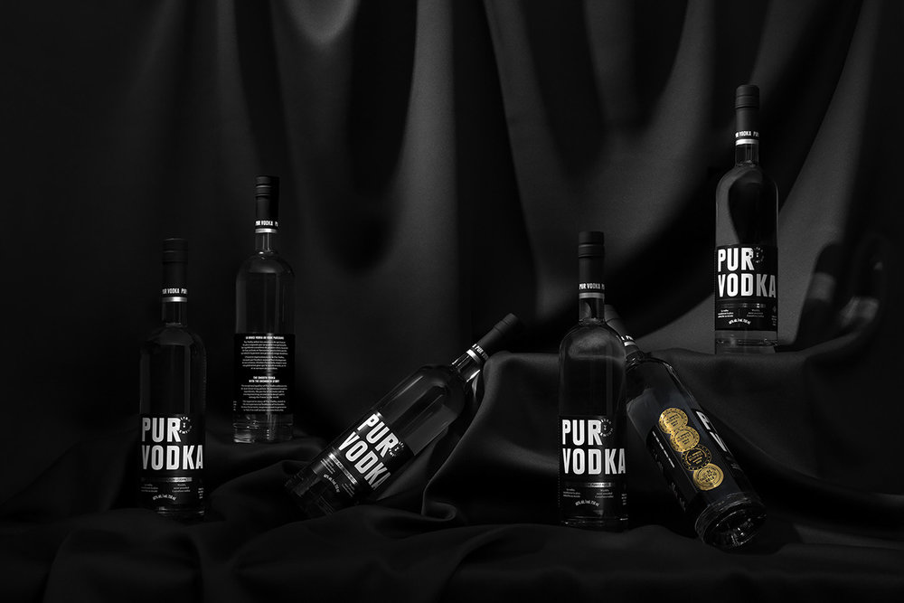
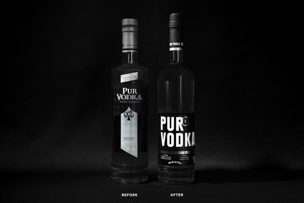
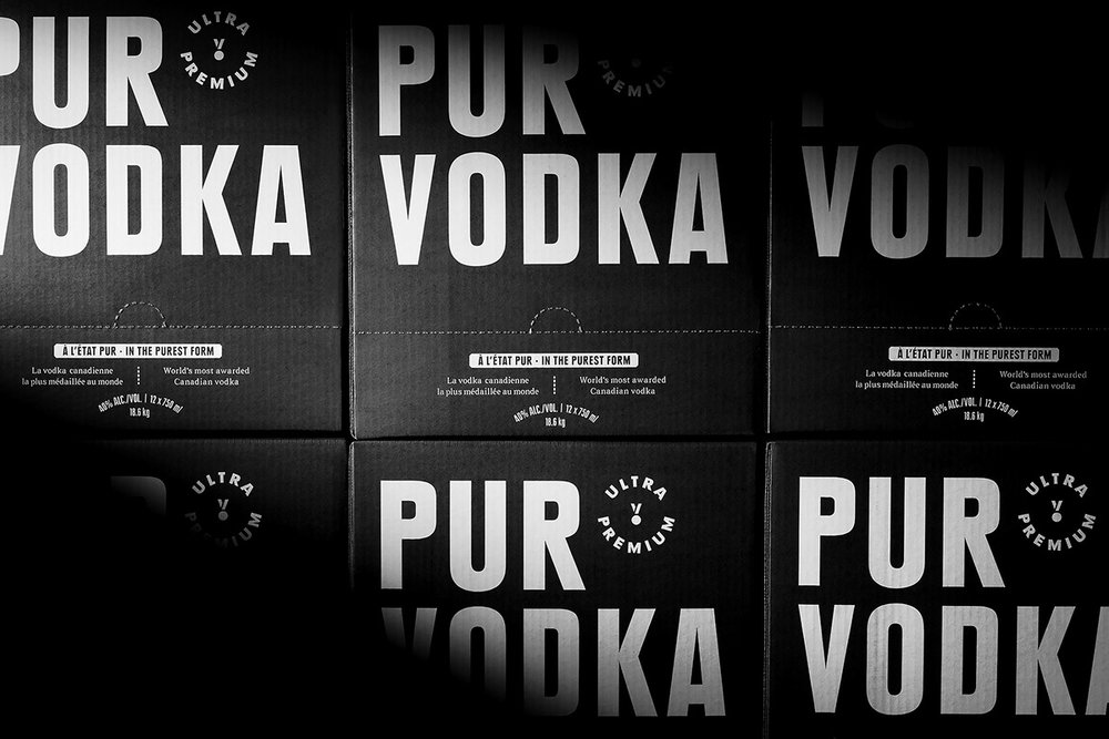
“Revamp of Pur Vodka’s brand identity and packaging, the world’s most awarded Canadian vodka.
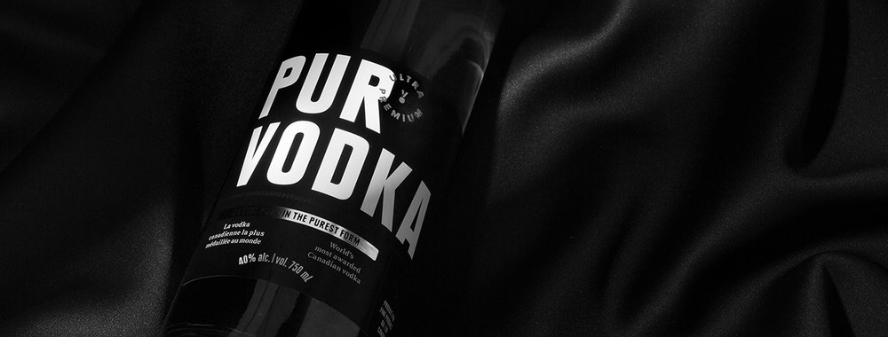
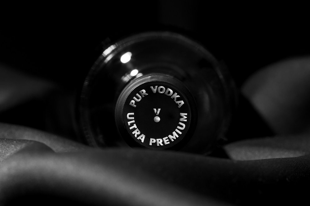
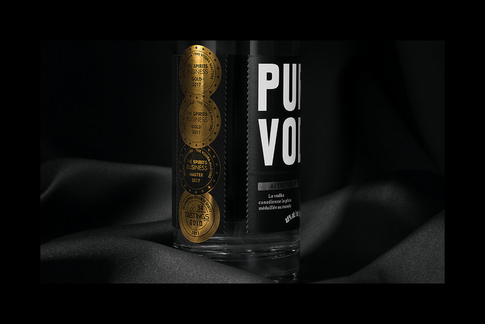
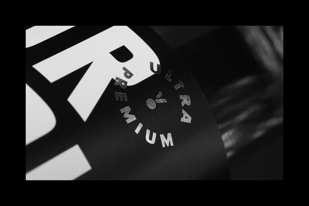
The inspiring entrepreneurial story of Pur Vodka drove the evolution of its brand image. With its elegant and understated new branding, Pur Vodka emerges as the symbol of fierce determination and the fulfillment of dreams. The black background and the subtlety of metallic grey emphasize the embossed metallic medals on the same label. The maple leaf is a nod to the brand’s Canadian provenance. True to the name, the cleaner design of the logo and packaging will evolve more readily in markets outside of Quebec.”
CREDIT
- Agency/Creative: Agency lg2 , Jean-Philippe Dugal
- Article Title: Agency lg2 – Pur Vodka | lg2
- Project Type: Packaging
- Format: Bottle, Box
- Substrate: Glass, Pulp Carton, Pulp Paper
FEEDBACK
Relevance: Solution/idea in relation to brand, product or service
Implementation: Attention, detailing and finishing of final solution
Presentation: Text, visualisation and quality of the presentation


