


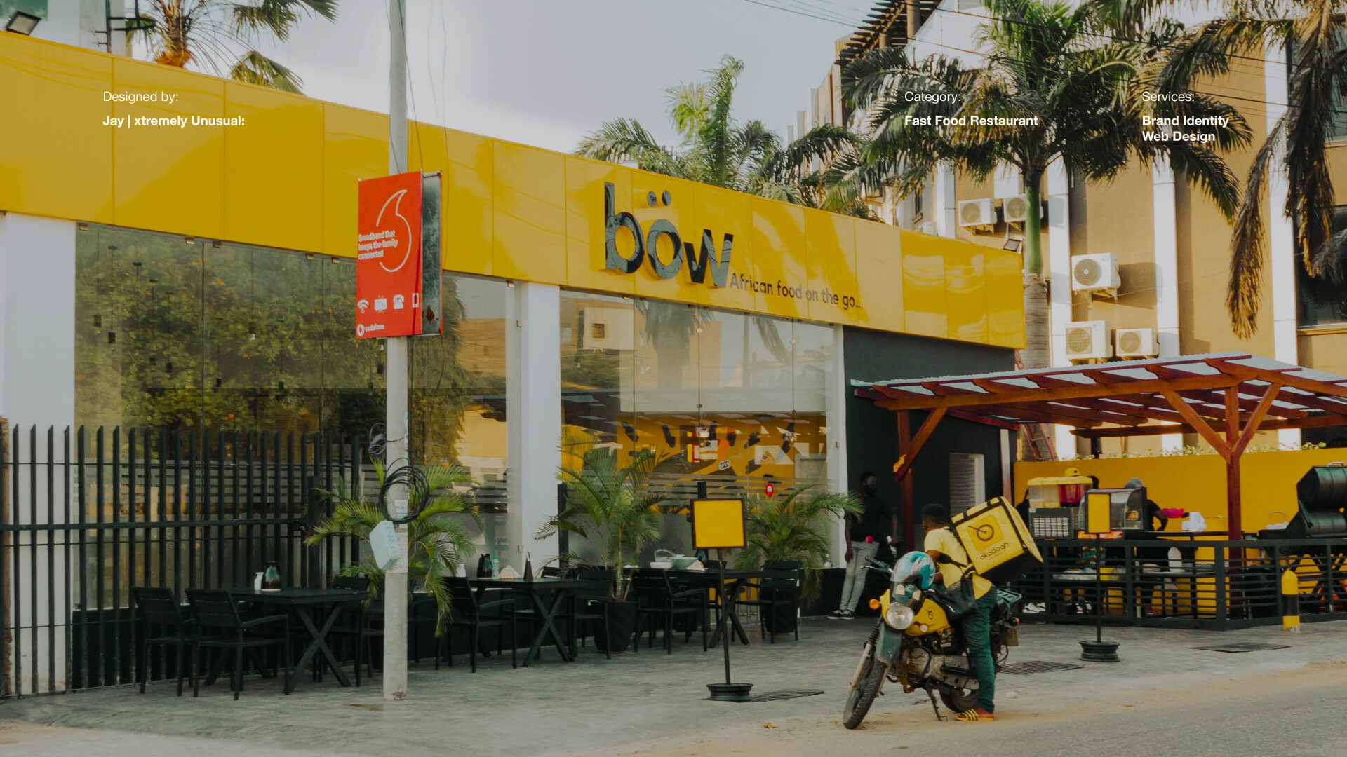
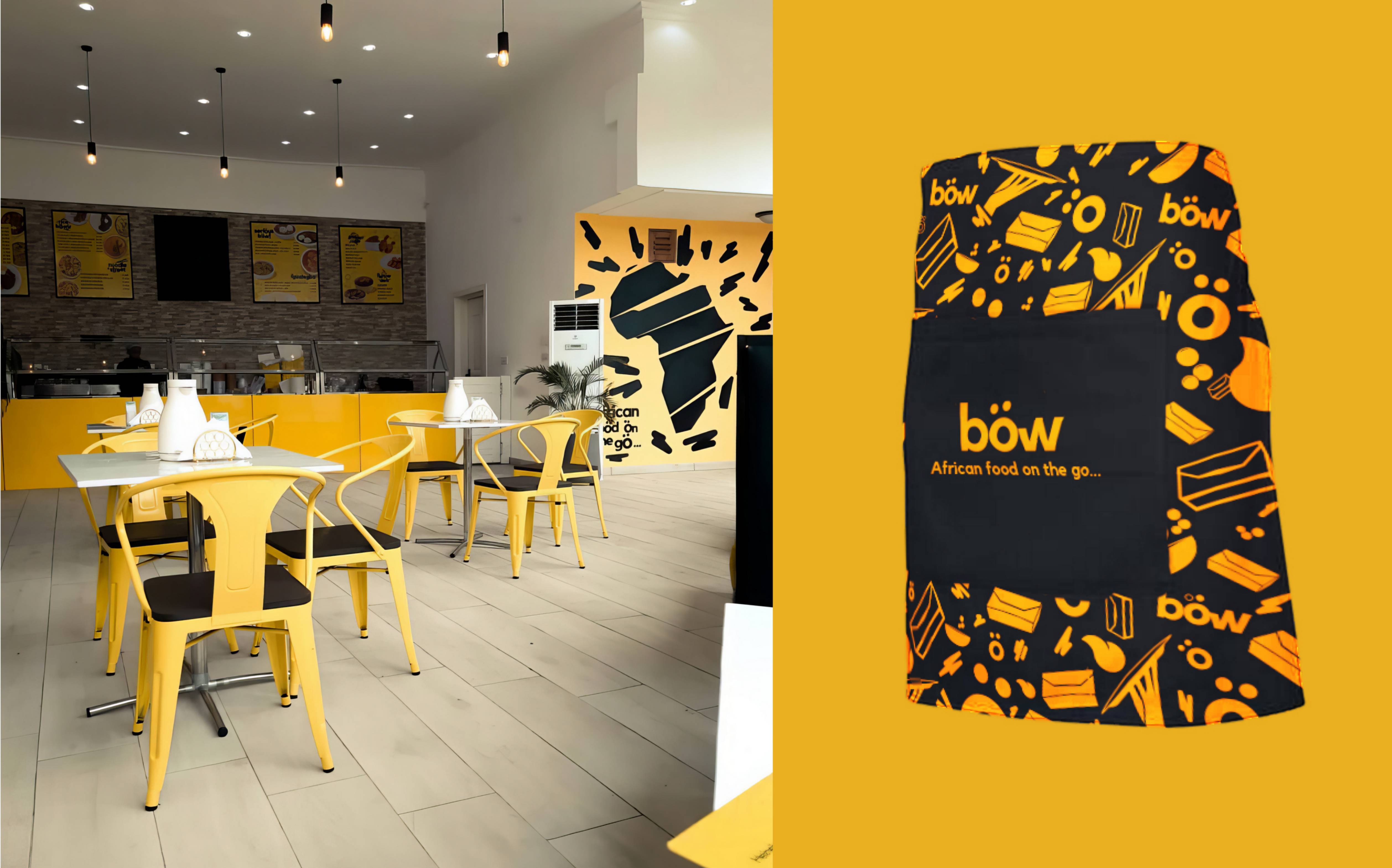
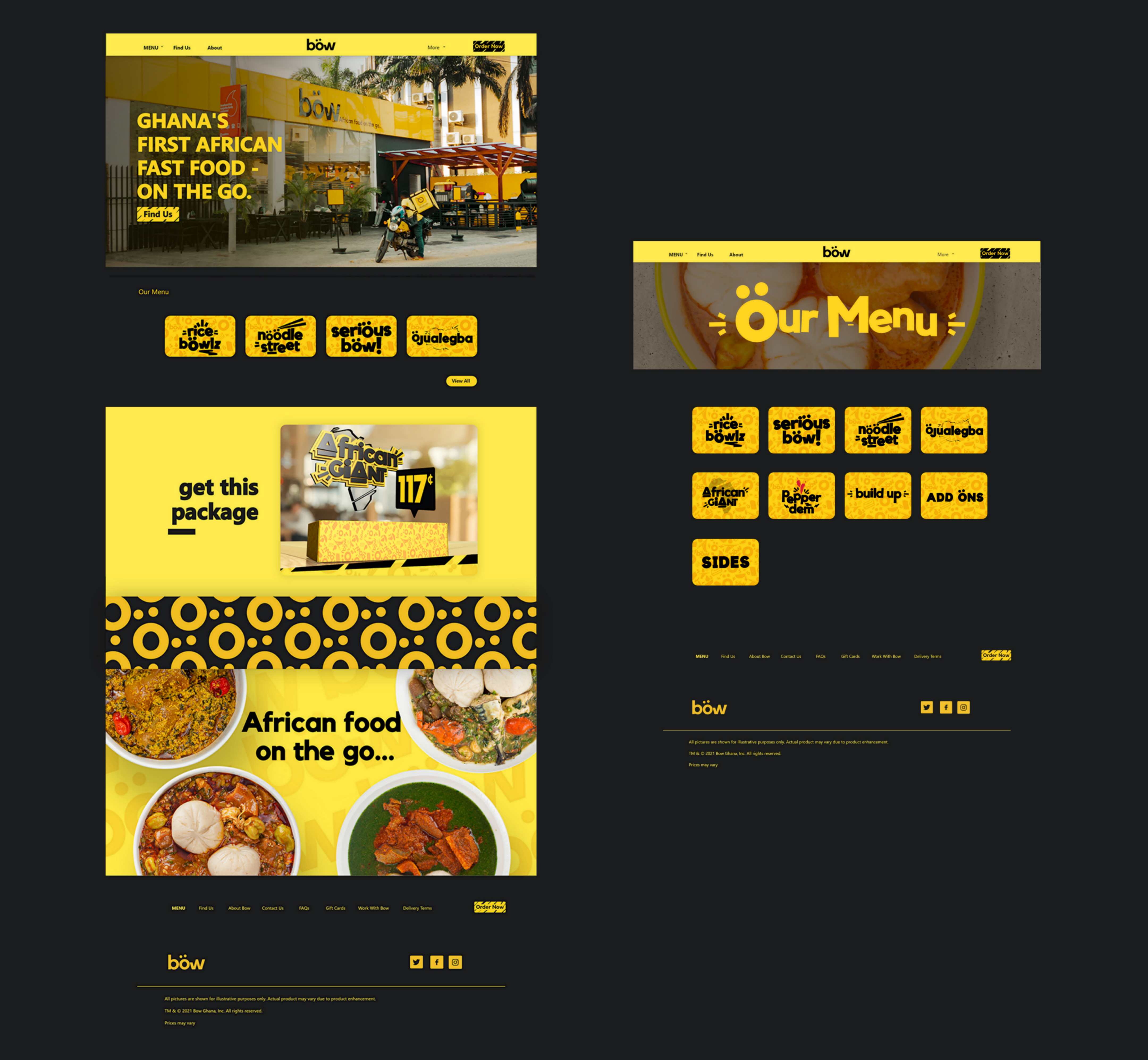
Böw, Ghana’s premier African fast-food restaurant chain, doesn’t profess to have pioneered local cuisine, but it’s committed to presenting it in an unprecedented manner. Inspired by indigenous fast-food culture and influenced by homemade African recipes, Böw aims to offer Ghanaians a fresh choice in their daily routines, set against the vibrant backdrop of Accra’s streets.
xtremely Unusual (xU) was commissioned to craft a distinct identity for Böw that mirrors the brand’s persona, resonates with its values, and resonates with its target demographic. Taking a comprehensive approach, we scrutinised every facet of the brand experience, from the logo to the interior design.
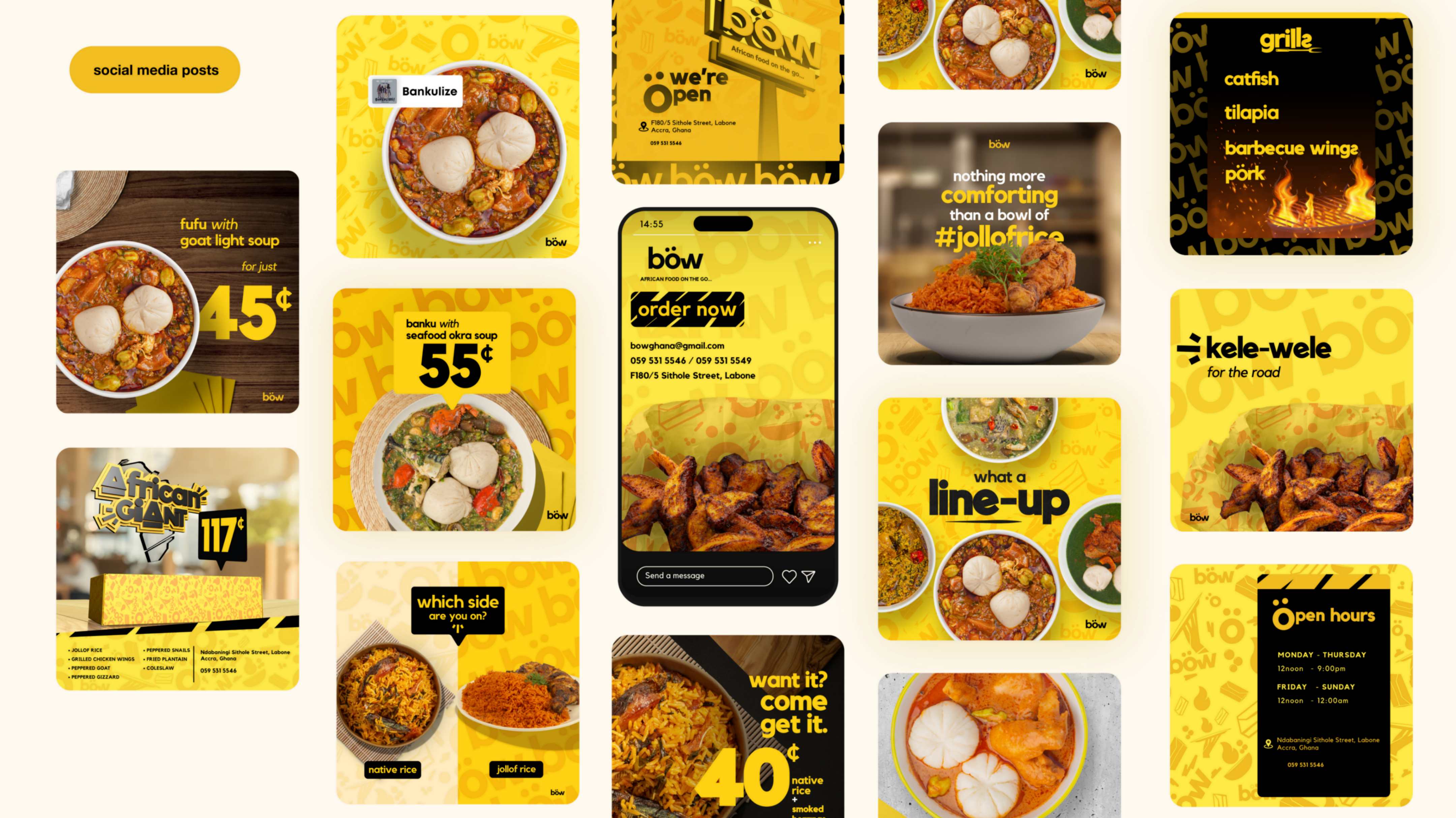
Our exploration commenced with an immersive venture into the bustling streets of Accra—a canvas teeming with pulsating energy and a kaleidoscope of colours. Delving into the rhythm of local markets, the sizzle of street food vendors, and the contagious laughter echoing from every corner, we gleaned inspiration to shape Böw’s visual identity.
The outcome was a harmonious blend of visual, auditory, and gustatory elements—a sensory symphony.
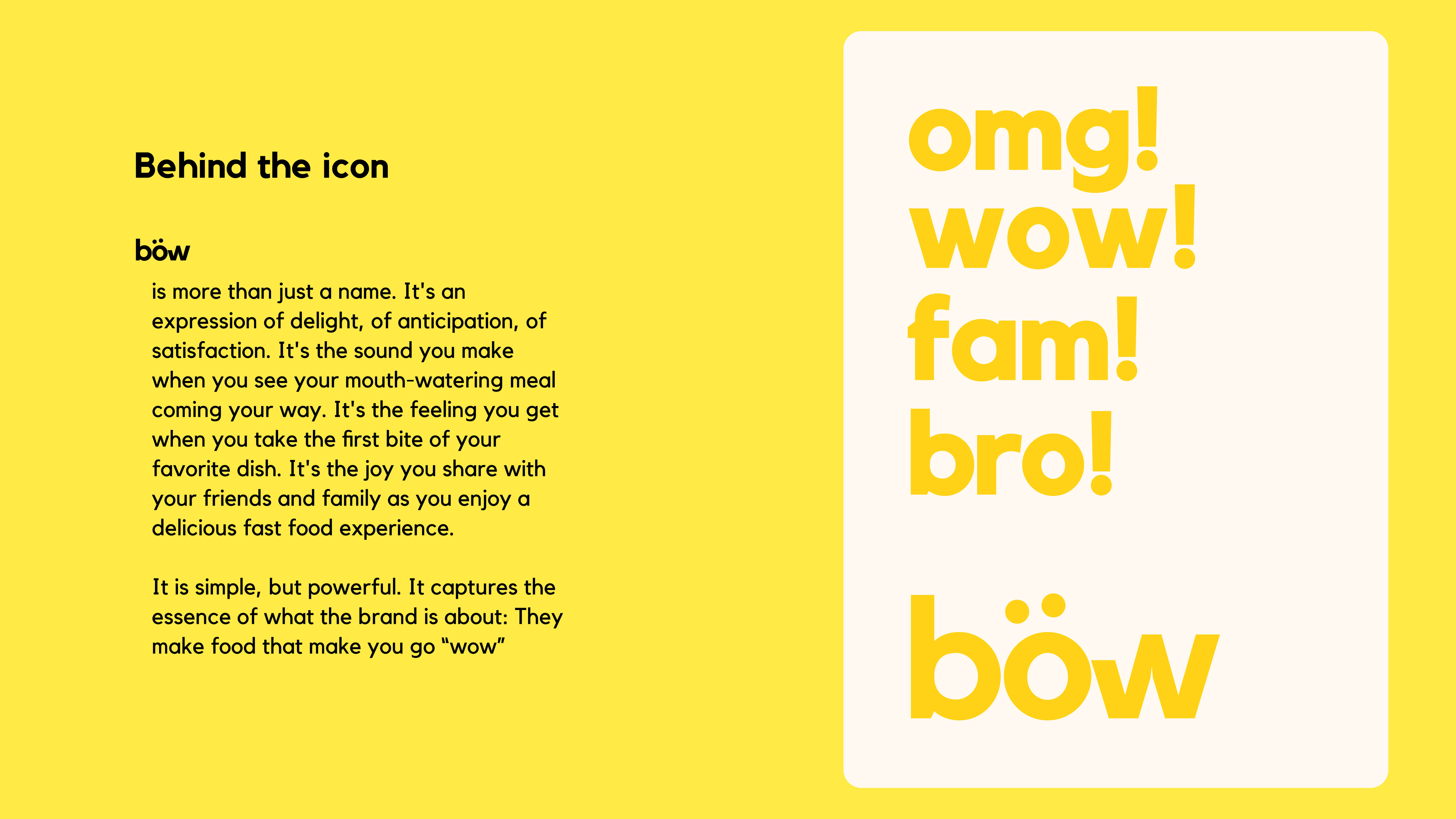
Böw transcends the mere realm of fast-food chains; it epitomises an experience. This experience is distinguished by its unique identity—a fusion of visual, auditory, and gustatory sensations—honouring the very soul of Accra. It serves as an ode to Ghanaians, exalting local flavours, and beckoning patrons to savour the thrill of “wow” with every mouthful.
In fashioning Böw’s brand, xU didn’t merely conceive a logo or devise a colour palette; we wove a cultural tapestry—an invitation to partake in a delectable fast-food revolution. Collaborating closely with the client, we delved into their vision and aspirations, culminating in a design solution that surpassed expectations.
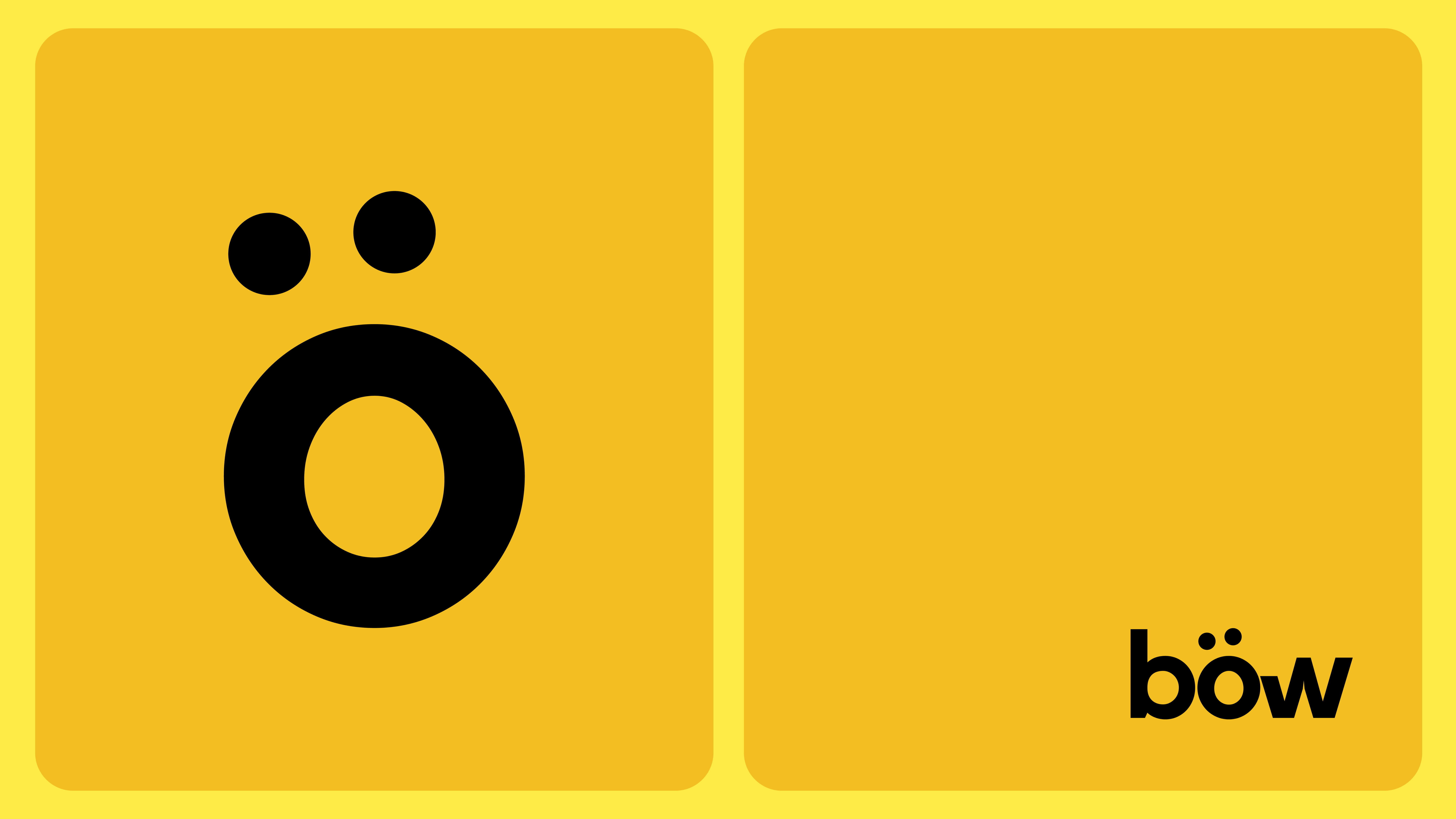
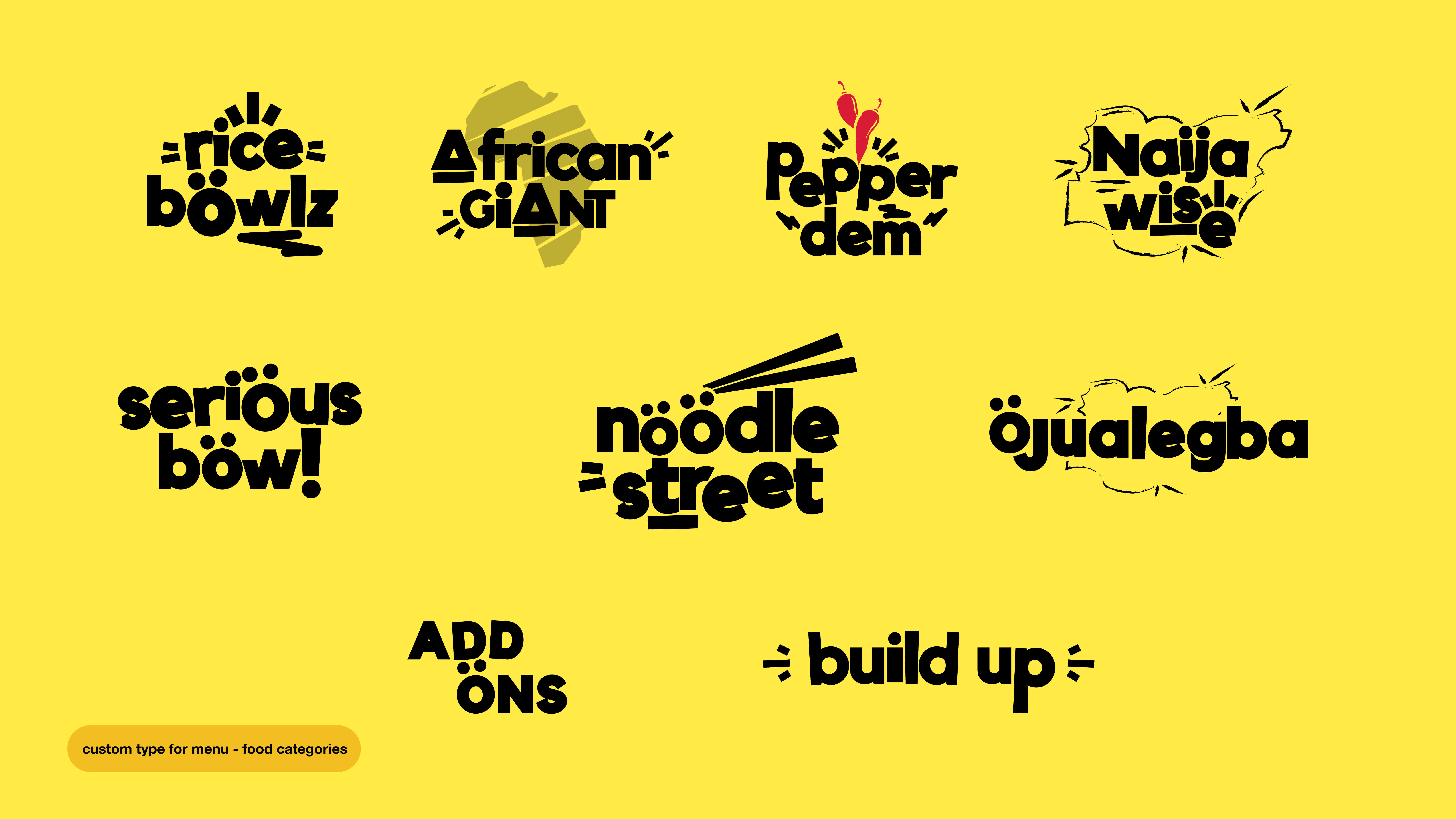
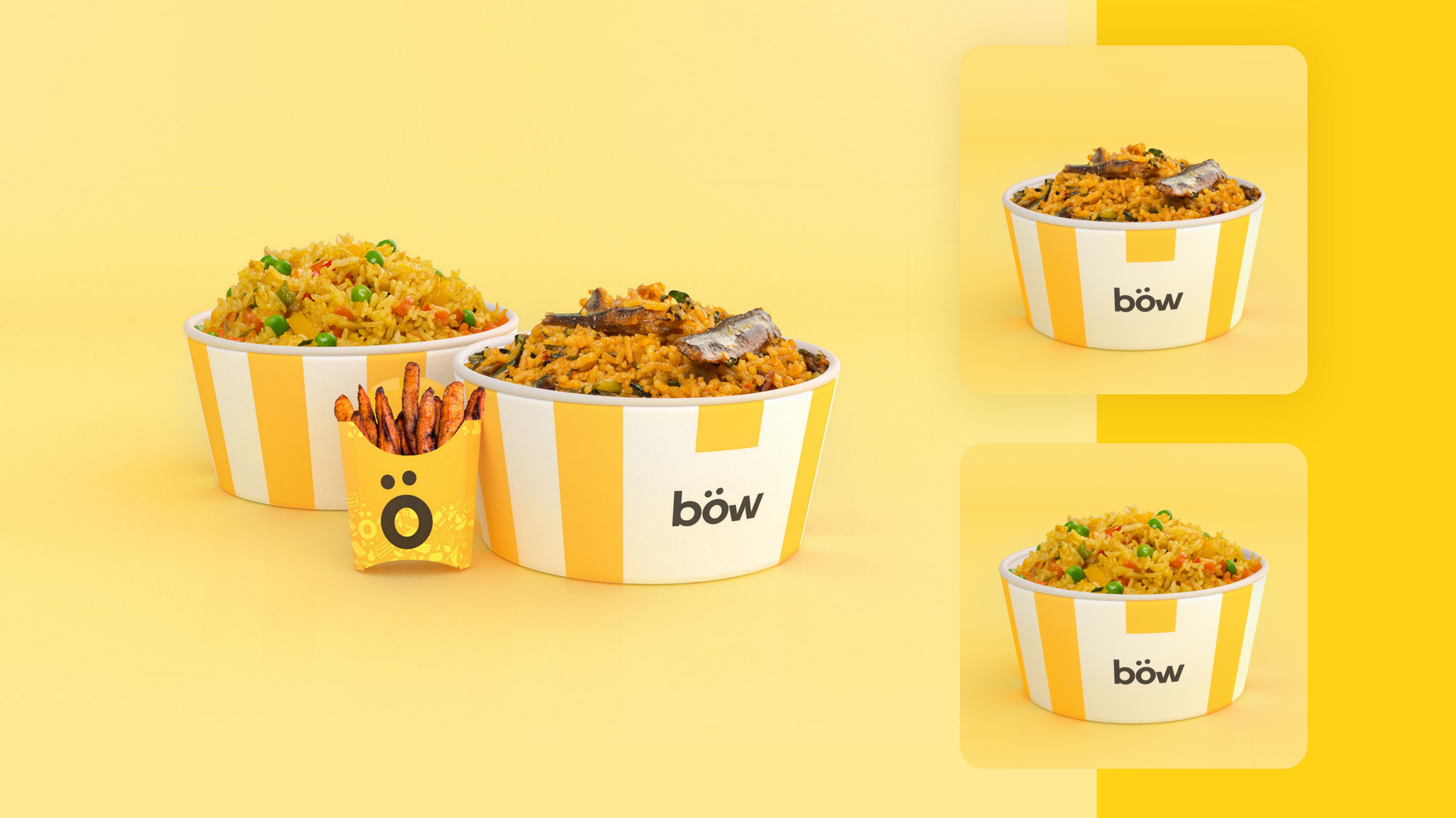
The logo, a vivid embodiment of flavour and delight, embodies the brand’s mission to elicit awe with its culinary creations. A single, bold “ö”—more than a mere vowel, it symbolises an explosion of flavour, a jubilant exclamation. Resembling the curve of a calabash or the swirl of fufu on a plate, it evokes feelings of joy, anticipation, and contentment. It echoes the gratifying sound upon sighting a mouthwatering meal and the sheer satisfaction of the first bite.
Versatile and adaptable, the logo can be resized, recoloured, and recontextualised, either in conjunction with the brand name or as a standalone symbol. A nod to local culture, the letter ö bears resemblance to a calabash—a traditional African vessel for food and beverages.
CREDIT
- Agency/Creative: xtremely Unusual
- Article Title: African Food On The Go Böw Branding and Packaging Design by Xtremely Unusual
- Organisation/Entity: Freelance
- Project Type: Identity
- Project Status: Published
- Agency/Creative Country: Ghana
- Agency/Creative City: Accra
- Market Region: Africa
- Project Deliverables: 3D Design, Brand Guidelines, Brand Identity, Brand Mark, Environmental Graphics, Graphic Design, Icon Design, Logo Design, Motion Graphics, Packaging Design, Poster Design, Typography, Web Design
- Industry: Food/Beverage
- Keywords: Fast Food Restaurant, restaurant, identity design,
-
Credits:
Creative Direction: Jay
Design & Motion: Jay
Client: Kinorah Awini


