


The Aforex spice packaging identity system, developed by Lucky Brand Associates, is conceived as a strategic visual language that reflects the spirit of a new-generation spice brand: naturally pure, modern in mindset, and positive in everyday living. The project goes beyond creating visually appealing packaging to build a cohesive product identity ecosystem—one that is capable of telling the brand story with clarity and emotional resonance directly at the point of sale.
Brand Inspiration
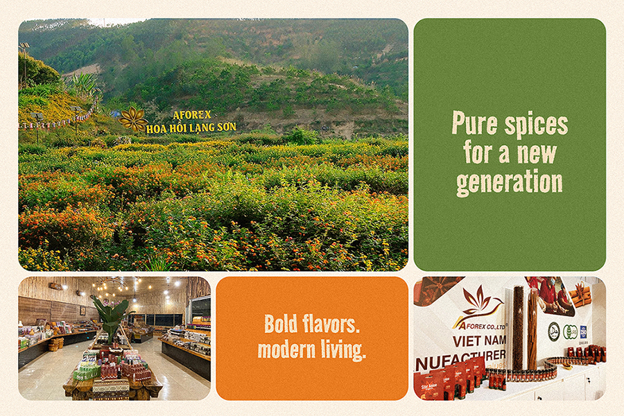
The brand inspiration originates from Aforex’s core values: authentic spices carefully sourced from Vietnam’s natural growing regions. The philosophy “Pure spices for a new generation” speaks not only to product quality, but also to an aspiration to reintroduce traditional spices through a contemporary lens—aligned with modern lifestyles where consumers value purity, transparency, and positive emotional experiences in every meal. Aforex is thus positioned as a brand that is closely connected to nature, while simultaneously capturing the rhythm of a youthful, dynamic, and forward-looking way of life.
Concept Direction
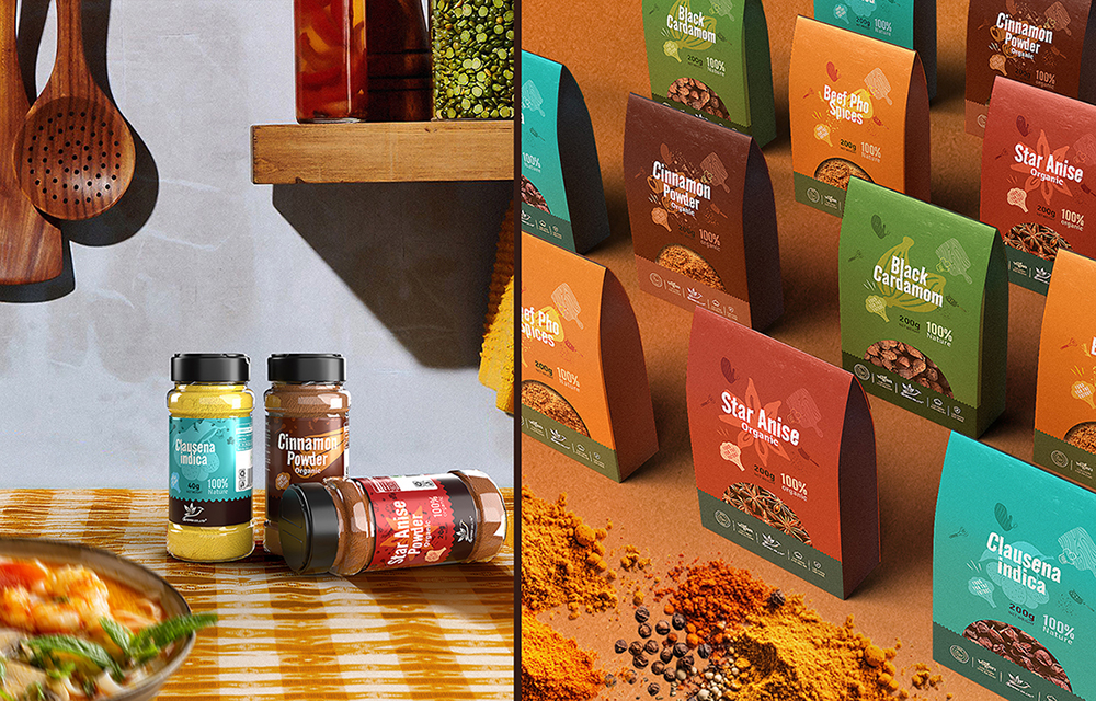
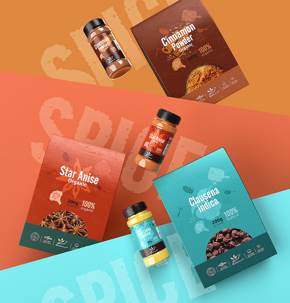
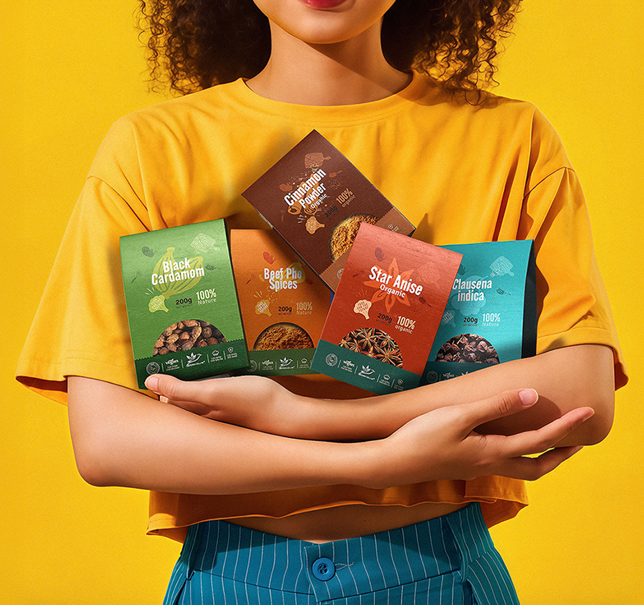
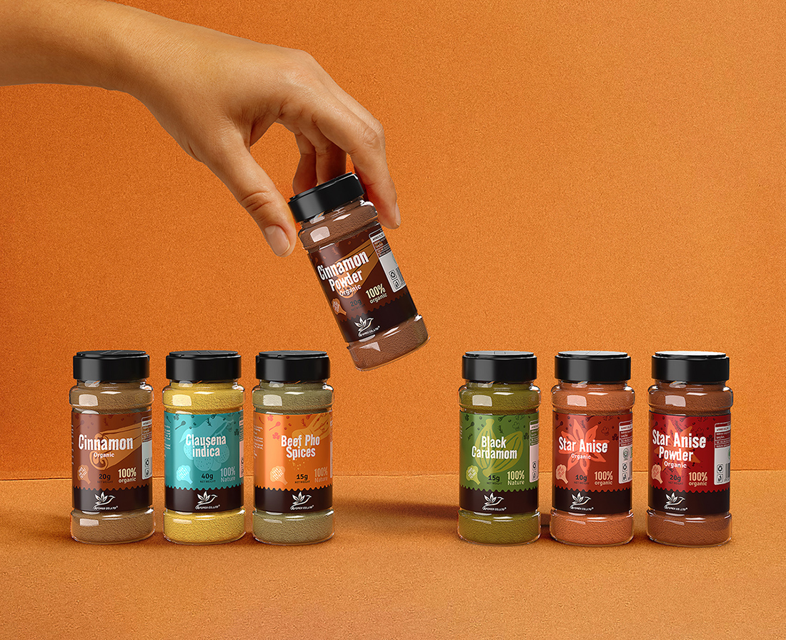
Building on this foundation, the packaging concept is shaped around a fresh and modern spirit, with color and graphics playing a central role. Each spice line is assigned a distinctive color palette that directly reflects its flavor profile and sensory character, enabling clear visual differentiation and fast recognition on the shelf. Color is used not merely as a categorization tool, but as a key element in creating an energetic and vibrant overall brand appearance—true to the identity of a spice brand designed for a new generation of consumers.
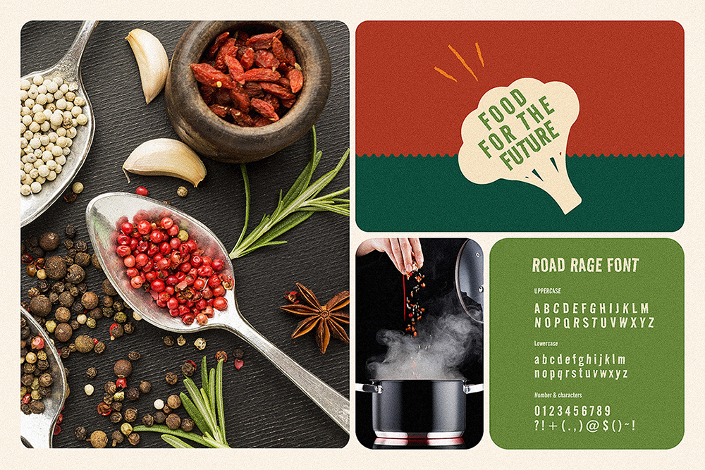
The graphic pattern system is stylized from herbal and spice imagery, interpreted through a minimalist and contemporary aesthetic. Clean visual rhythms and restrained detailing ensure the packaging maintains a refined, premium feel, while remaining approachable and highly adaptable across multiple product lines. At the core Key Visual, Lucky Brand Associates intentionally infuses a sense of joy and happiness in cooking as an emotional touchpoint—where spices are not only about flavor, but also about inspiring creativity, connection, and everyday pleasure in the kitchen.
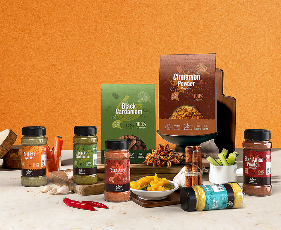
From this concept, the identity system is implemented as a cohesive, highly scalable structure. All elements—from logo, color system, and typography to layout principles—are standardized within a unified visual language, allowing each product to function as a consistent variation within the same brand ecosystem. The modular approach enables Aforex to expand its product portfolio in the future while preserving a strong and recognizable brand DNA. The flexible application across both paper boxes and transparent jars simultaneously highlights the natural quality of the spices inside and reinforces a sense of trust and transparency for consumers. On the shelf, the bold color system combined with a clear visual structure ensures the brand stands out, is instantly recognizable, and remains memorable within seconds of interaction.
Message and Design Solution by Lucky Brand Associates
Running throughout the entire system is the message “Pure spices for modern living”, expressed not only through words, but through the design language itself. It represents a commitment to natural quality, to positive cooking experiences, and to a lifestyle where the kitchen becomes a space of joy, sharing, and daily inspiration. Packaging, therefore, is no longer just a protective layer—it becomes a powerful medium for communicating the brand’s spirit in a direct and emotional way.
With Aforex, Lucky Brand Associates aims to craft a packaging identity system that balances strategic depth with strong aesthetic value—helping the brand establish a confident position in the modern spice market and build lasting connections with consumers. This is where systematic design thinking meets brand emotion, and where every detail serves a shared ambition: positioning Aforex as a symbol of pure spices for a new way of living.

CREDIT
- Agency/Creative: Lucky Brand Associates
- Article Title: Aforex Spice Packaging Identity System by Lucky Brand Associates
- Organisation/Entity: Agency
- Project Type: Packaging
- Project Status: Published
- Agency/Creative Country: Vietnam
- Agency/Creative City: Hanoi, Vietnam
- Market Region: Asia, Global
- Project Deliverables: Identity System, Packaging Design
- Format: Bottle, Box
- Industry: Food/Beverage
- Keywords: Lucky Brand Associates, spice packaging, organic packaging
-
Credits:
https://www.facebook.com/hung.lucky.brand: HungZungManager


