


Born from a brief that asked for softness, joy, and natural nourishment, Beey is a brand designed for those who seek stillness and sweetness in the everyday. From the start, the vision was clear: create a world where design flows like honey—gently, intentionally, and without clutter.
We began by shaping an identity that feels rooted in nature’s rhythm. The visual language borrows from the quiet industry of bees and the unfiltered beauty of the wild. Every detail was considered to reflect the product’s purity and the brand’s calm purpose.
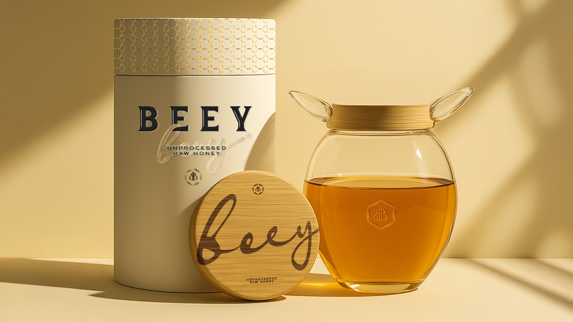
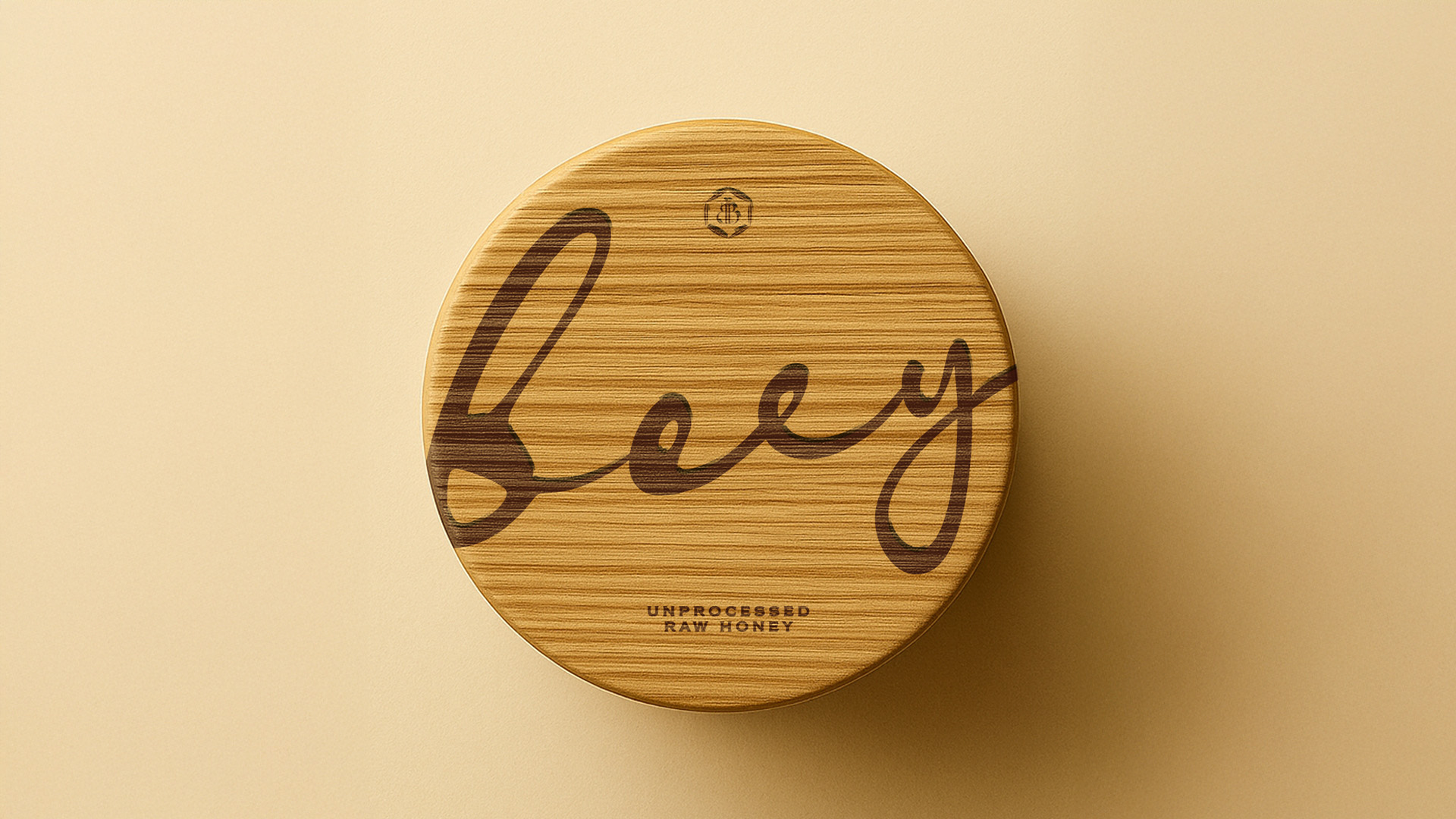
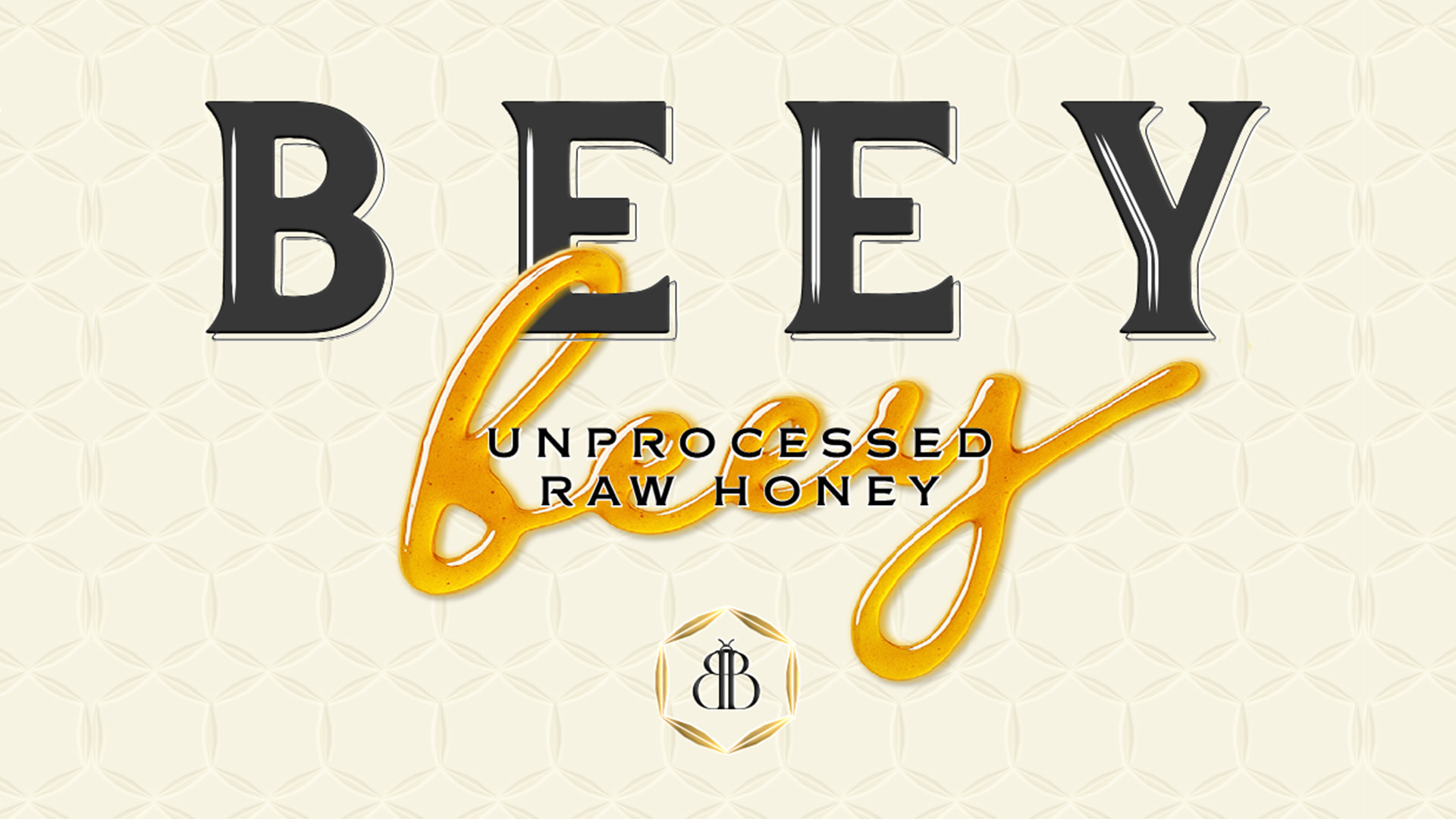
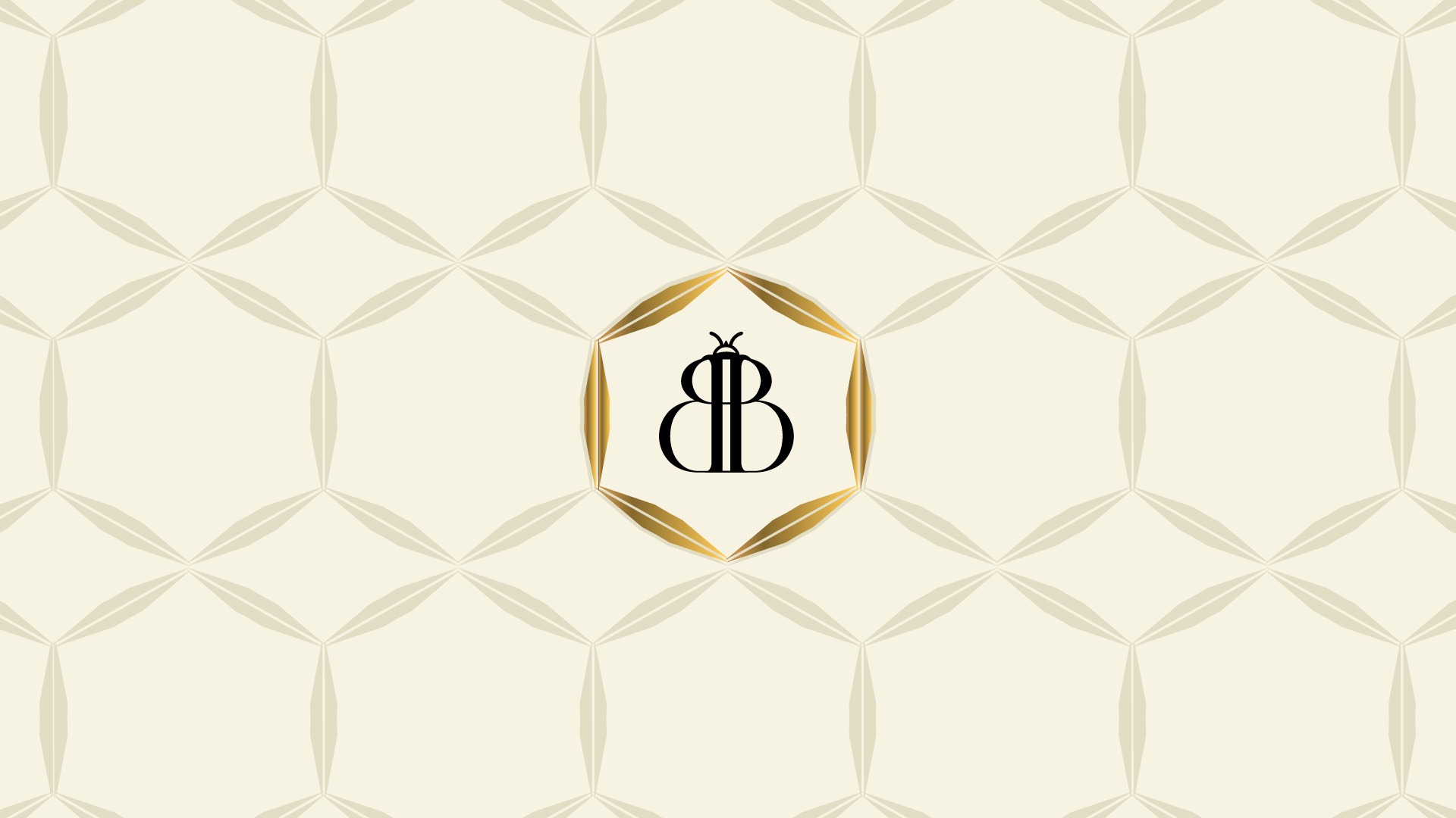
The logo has a hand-drawn elegance, with soft curves and an organic flow—meant to echo the gentle movement of honey from a dipper. The typography across the system is minimal, rounded, and approachable, balancing clarity with warmth. Color became a crucial tool in communicating Beey’s soul. The palette leans into warm neutrals, golden hues, and soft earth tones that feel grounded and nourishing.
Packaging plays a key role in translating this concept. The jar was imagined to feel both tactile and iconic—rounded like a drop of honey, with a lid that hints at natural materials like wood or bamboo. It’s designed to sit proudly on a kitchen shelf, yet invite touch. Texture was subtly integrated to mimic the natural striations of honeycomb—never overpowering, always supportive.
We paid close attention to the pacing of the design: how it reveals itself slowly, encouraging a moment of pause. The label layout is balanced and calm, offering essential information with no unnecessary noise. Gold accents offer a gentle nod to luxury without overshadowing the brand’s humble ethos.
Beey’s tone of voice mirrors its visual identity—calm, thoughtful, and always caring. It speaks with clarity, not authority. Messaging centers around nourishment, nature, and moments of joy found in the ordinary.
Ultimately, Beey is a celebration of the simple and the sincere. It’s for people who appreciate honesty in ingredients and intention in design. The result is a brand that doesn’t rush to impress but lingers gently in memory. It’s not just honey. It’s a little pause in a busy world—a jar full of golden calm.
CREDIT
- Agency/Creative: Affogato Brand Design
- Article Title: Affogato Brand Design Brings Beey to Life – A Soft, Nourishing Brand from the Hive
- Organisation/Entity: Agency
- Project Type: Packaging
- Project Status: Non Published
- Agency/Creative Country: India
- Agency/Creative City: Mumbai
- Market Region: Global
- Project Deliverables: Brand Identity, Logo Design, Packaging Design
- Format: Jar
- Industry: Food/Beverage
- Keywords: Logo Design, Packaging, Jar Design, Honey
-
Credits:
Founder & Creative Director: Chaittali Patel


