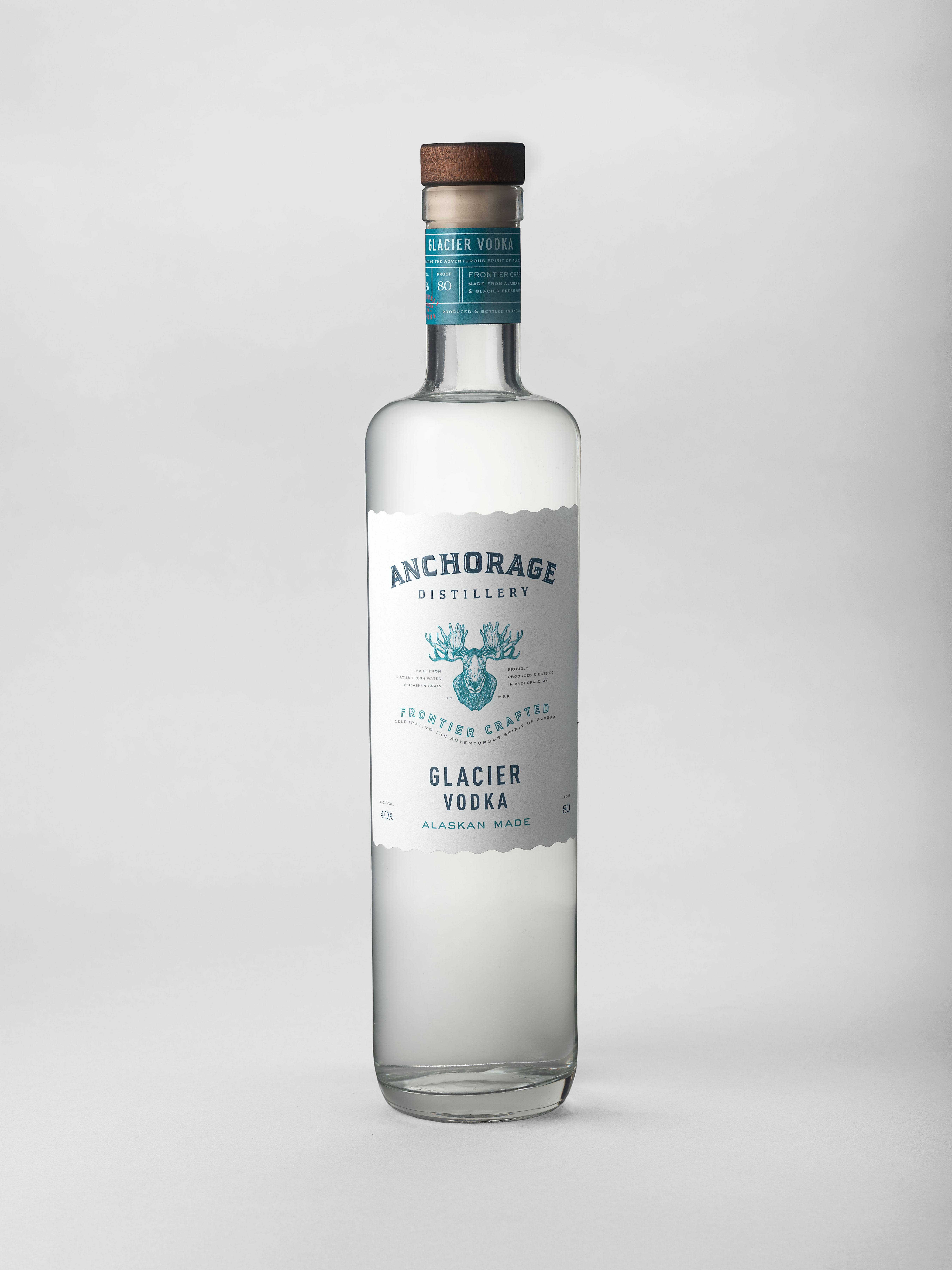
What do you do when your greatest asset is hiding under a glacier? That’s what the management team at Anchorage Distillery wanted to know, so they called Affinity Creative Group to reveal and revitalize their brand.
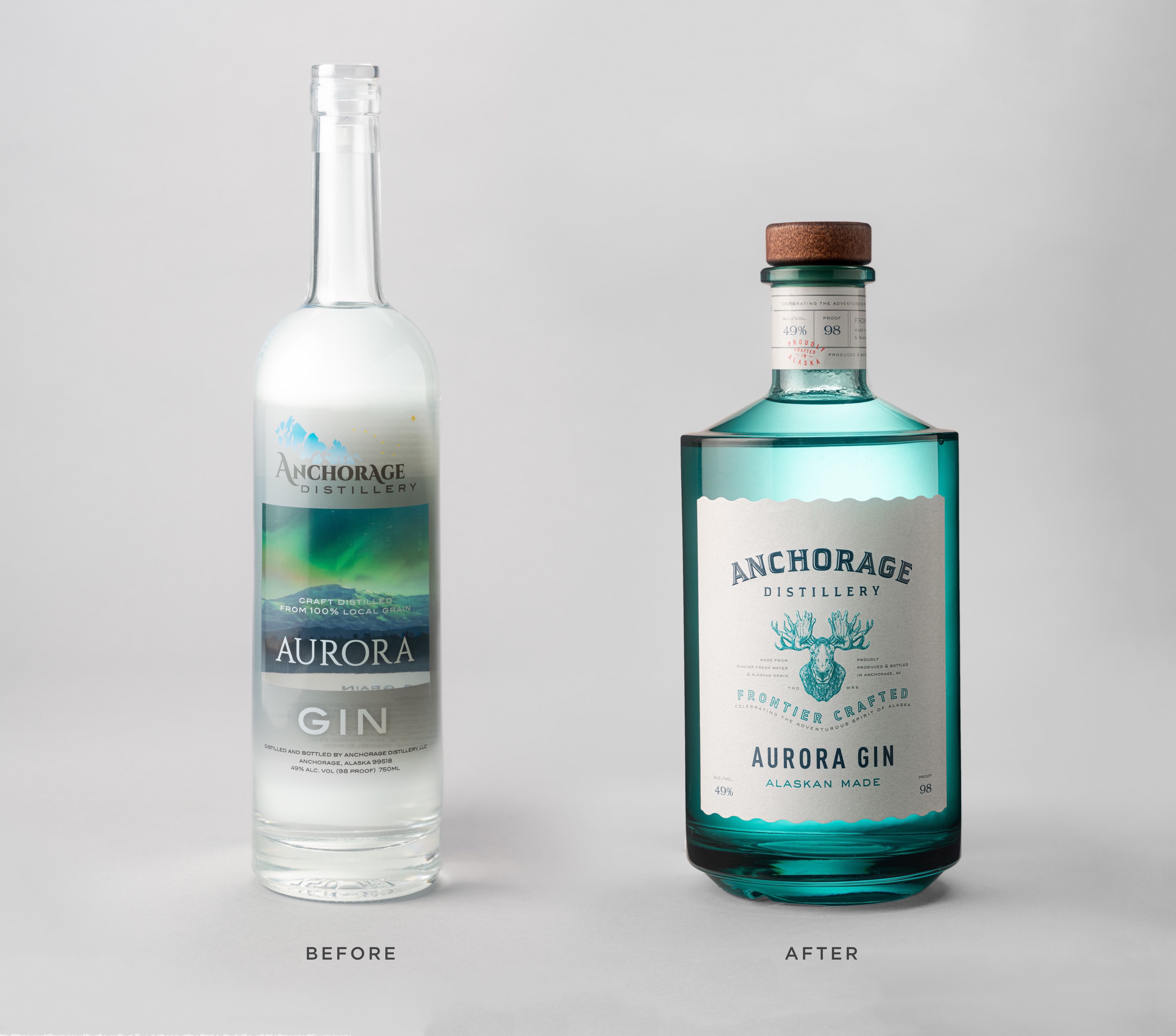
Affinity was retained to completely re-imagine the Anchorage Distillery offering—beginning with re-establishing its brand essence. The teams first assembled to identify the desired brand attributes, personality, and market positioning. With the brand profile in place, Affinity went to work in transforming the dated look of the existing product line.
The goal was to create packaging with a hand-made, customized, and specialty-crafted look and feel that conveys Alaska’s authentic and adventurous spirit.
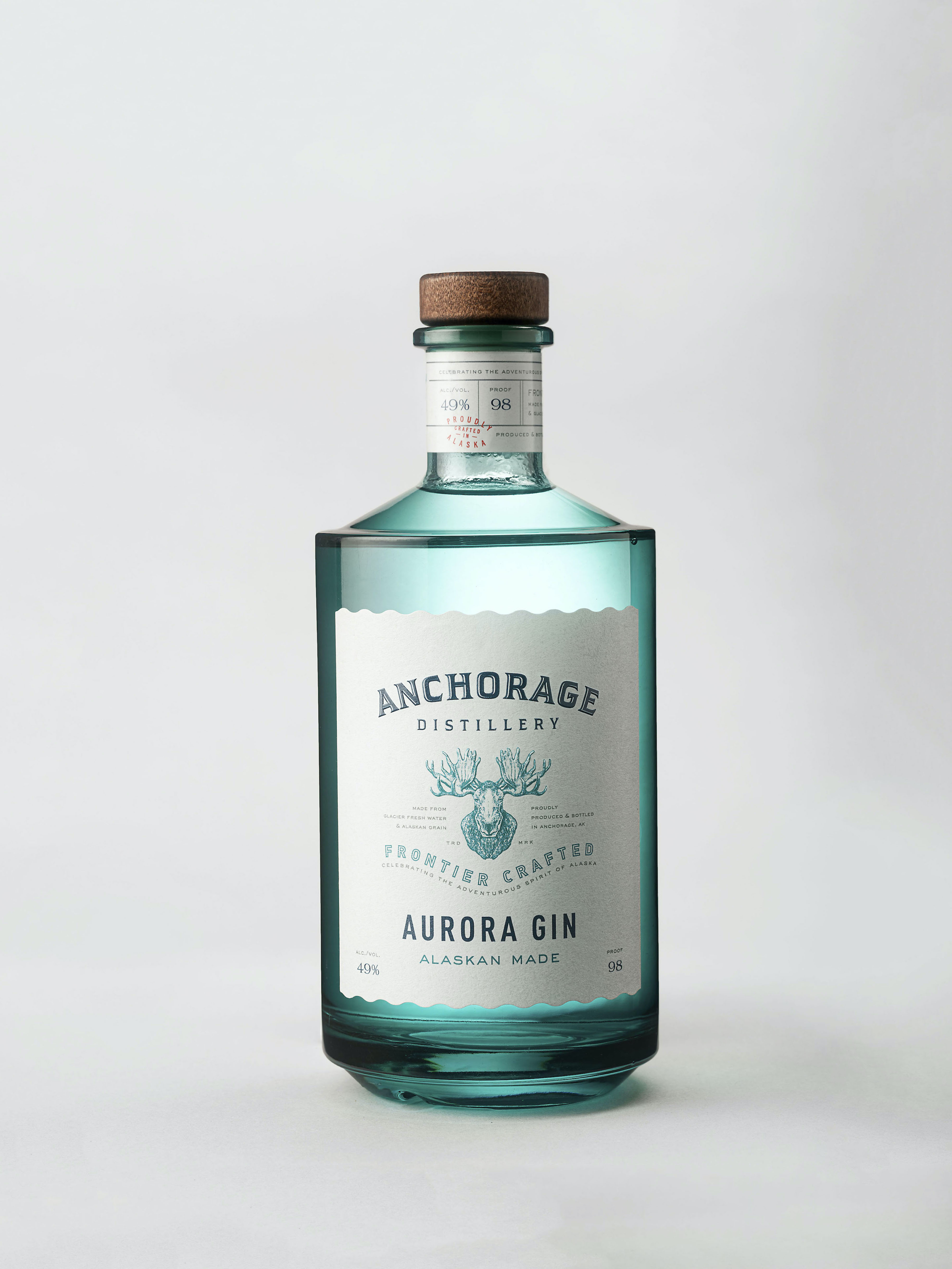
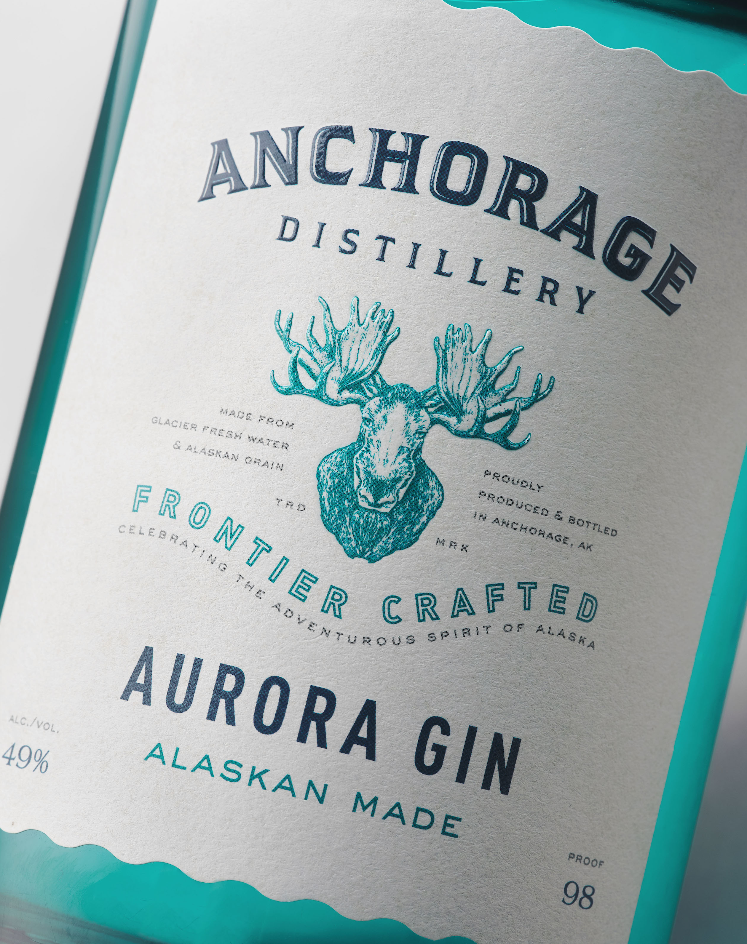
The new Anchorage Distillery logo projects authenticity and achieves strong brand registration on a crisp, white, textured label stock. The additional unique engraving of an Alaskan Moose emphasizes a rugged and robust brand spirit. Every detail imaginable was addressed. From the finely detailed ‘tax-stamp’ look of the neckbands to the rippled, die-cut labels, suggestive of the Alaskan water’s edge.
Affinity’s design solution is a mix of various elements—artisan, organic in feel, and distinctive. We also recommended new glass bottle structures more aligned with the brand’s personality. For instance, The Aurora Gin translucent-colored glass effect is unique. Inspired by the aurora borealis and Alaska’s dramatic, undulating-blue waters, the new bottle structure now underscores the brand’s origin. Additionally, the switch from transparent closures to wood stoppers delivers a sophisticated, yet down to earth, craft vibe for the entire product line.
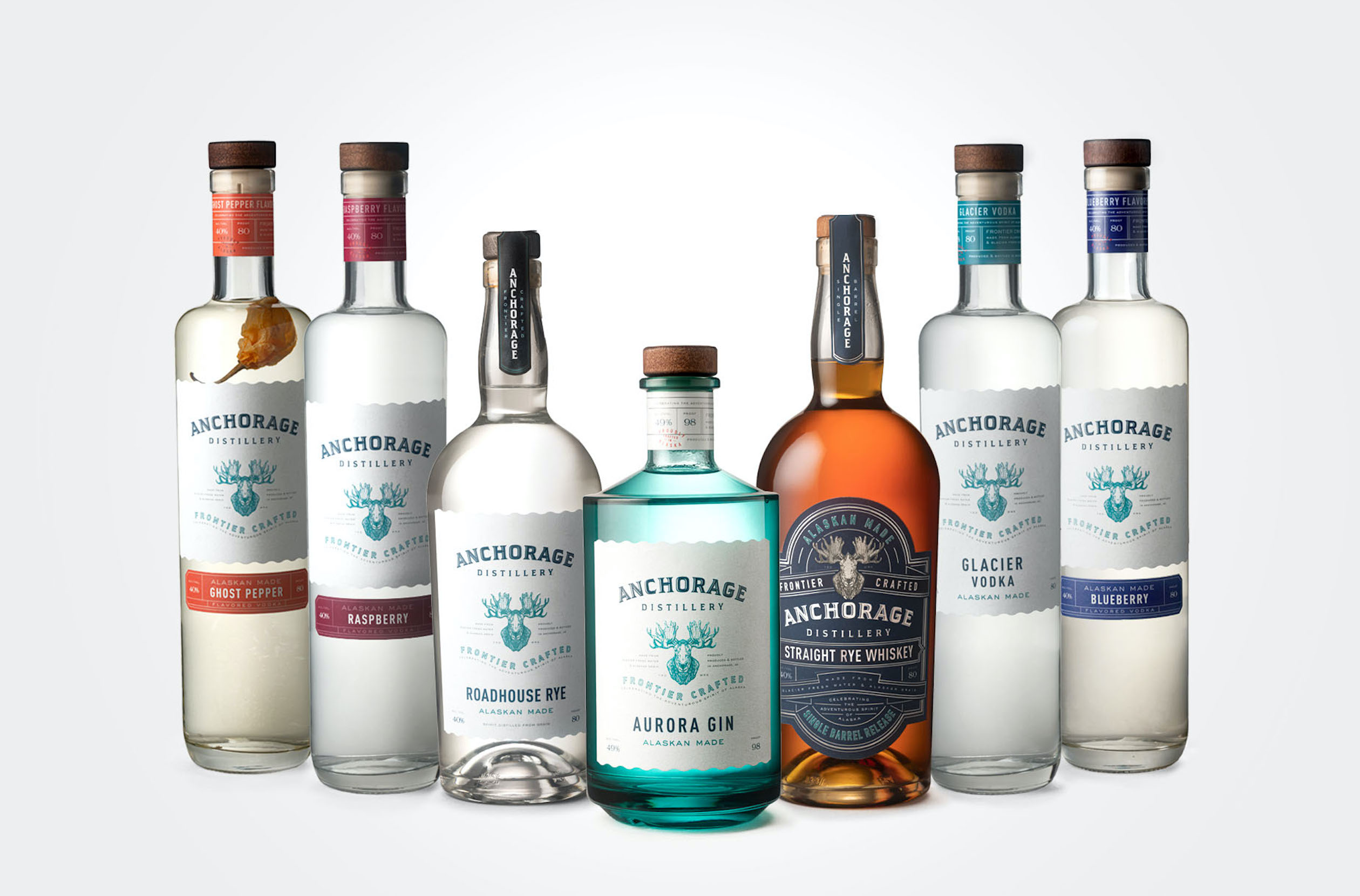
In addition to Aurora Gin, a range of Vodkas, Roadhouse Rye (a clear un-aged whiskey), and a new, Single Barrel Release, Straight Rye Whiskey, round out the re-launched brand family.
This revolutionary redesign for Anchorage Distillery truly captures the spirit of Alaska. Authentic, all-natural, and handcrafted — right on the bottle.
CREDIT
- Agency/Creative: Affinity Creative Group
- Article Title: Affinity Creative Group Awakens The Spirit of Alaska With Anchorage Distillery
- Organisation/Entity: Agency, Published Commercial Design
- Project Type: Packaging
- Project Status: Published
- Agency/Creative Country: United States
- Market Region: North America
- Project Deliverables: Brand Architecture, Brand Experience, Brand Identity, Brand Redesign, Brand Refinement, Brand Rejuvenation, Brand Strategy, Branding, Graphic Design, Packaging Design, Photography, Rebranding, Research, Tone of Voice
- Format: Bottle
- Substrate: Glass Bottle, Pulp Paper
- Keywords: WBDS Agency Design Awards 2020/21


