


Pearlfisher – Æcorn Aperitifs
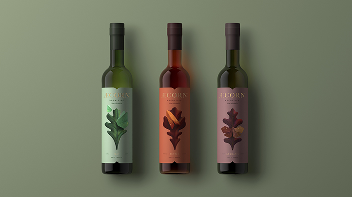
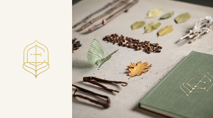
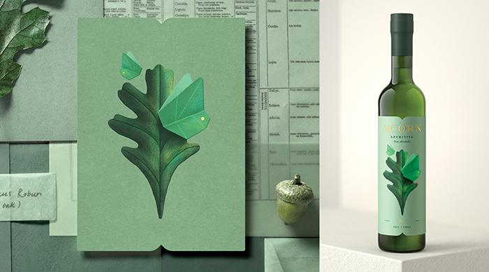
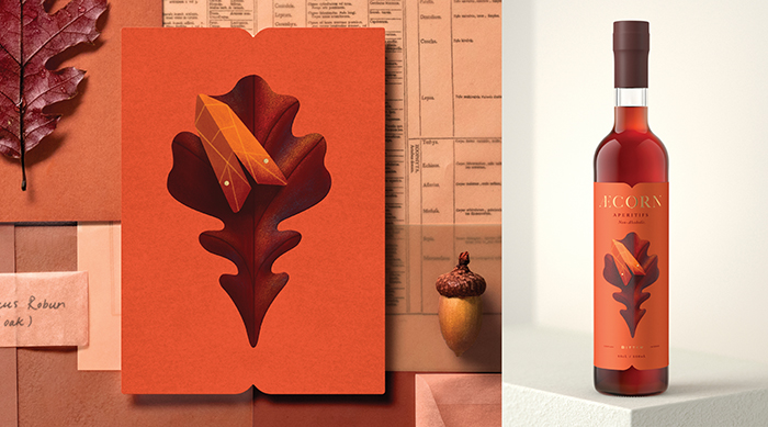
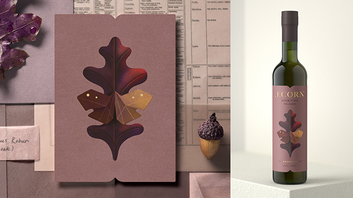
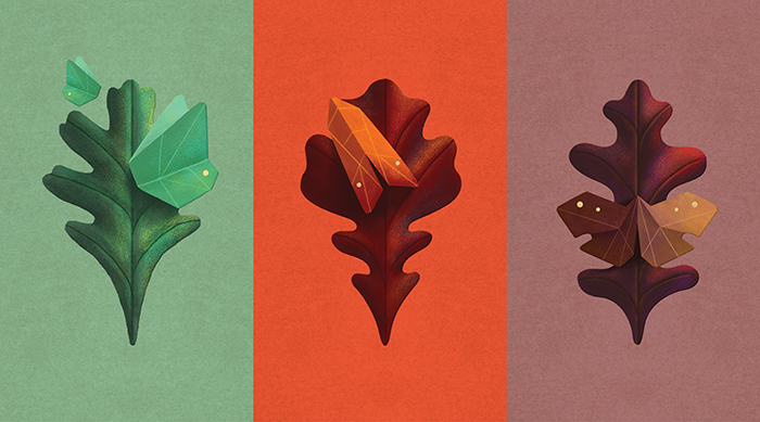
Inspired by 17th-century herbal remedies as well as lepidopterology (the study of moths and butterflies), Pearlfisher built a refined ecosystem for Æcorn Aperitif’s identity, brand world and packaging design to develop within.Traditionally an alcoholic beverage, the before-dinner drink has long been understood to increase our enjoyment of food. Æcorn Aperitifs makes way for exciting, new options and extends the backbar beyond wine, spritzes and vermouth with three varietals – Dry, Bitter and Aromatic.Pearlfisher took all the elements provided by the Æcorn team and wove them into a story of duality – the levity of the butterfly and the foundation of the oak, a key ingredient of each varietal. The team at Æcorn shared an aphorism that says, “From small acorns, mighty oaks grow”. This set us on the path for the brand to cover new territory as a nature company, establish brand world touch-points and breathe new life into the aperitif drinking occasion.
CREDIT
- Agency/Creative: Pearlfisher
- Article Title: Æcorn Aperitifs
- Organisation/Entity: Agency, Published Commercial Design
- Project Type: Packaging
- Agency/Creative Country: United Kingdom
- Market Region: Multiple Regions
- Format: Bottle
- Substrate: Glass


