


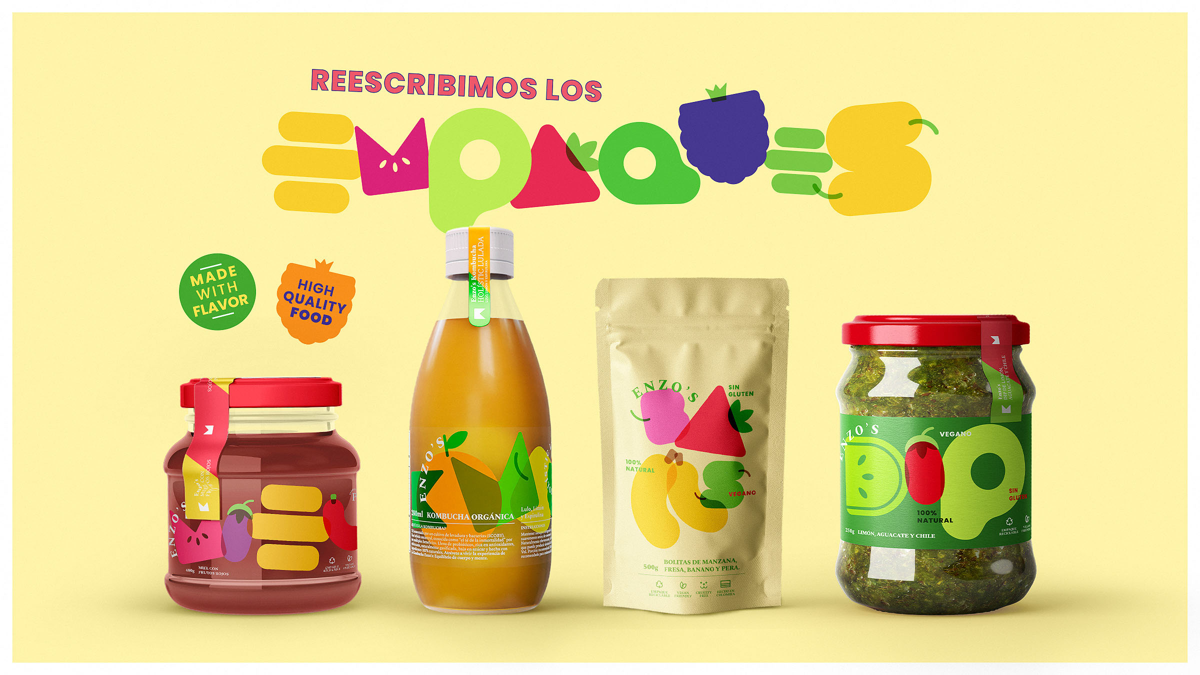
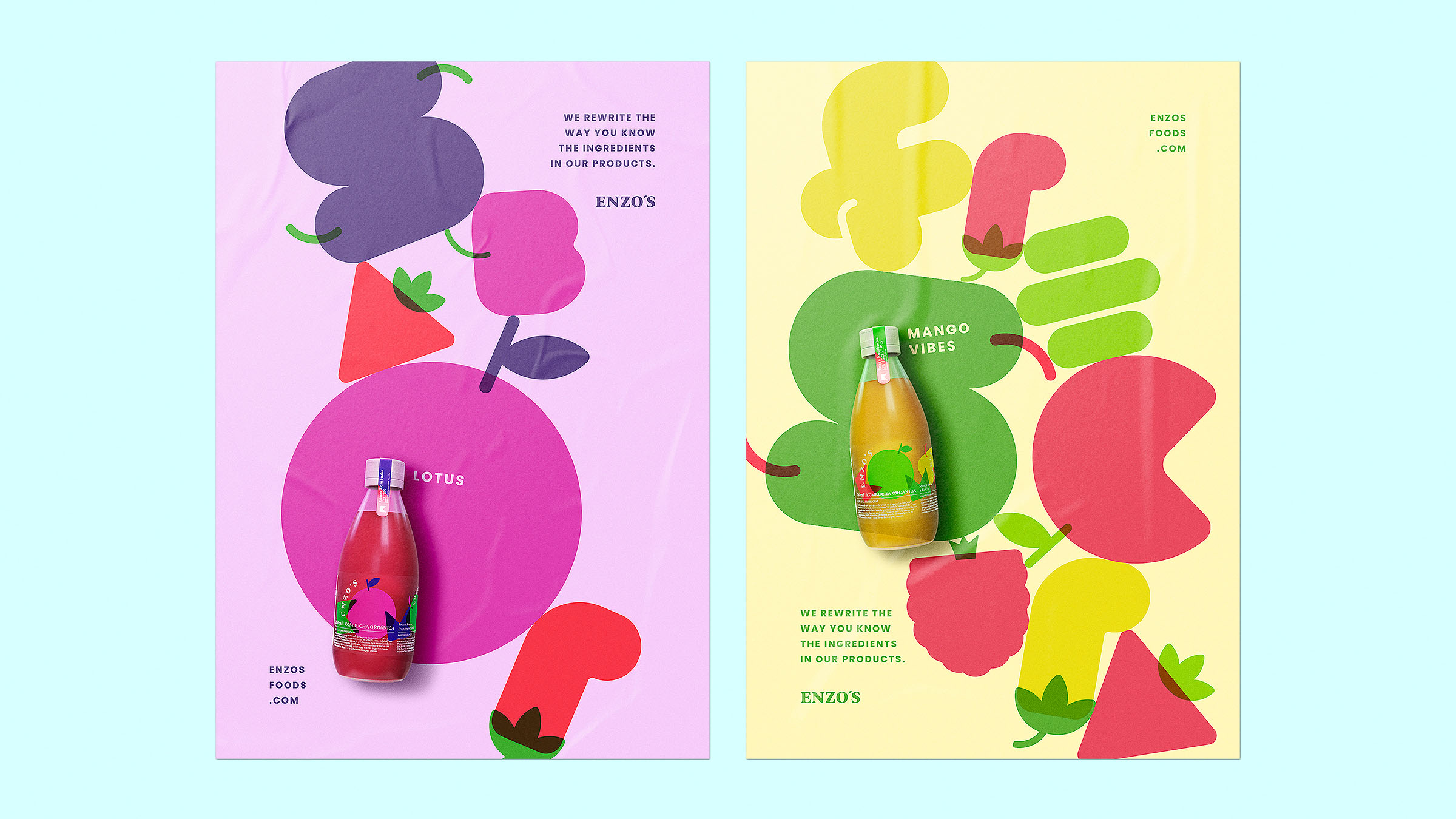
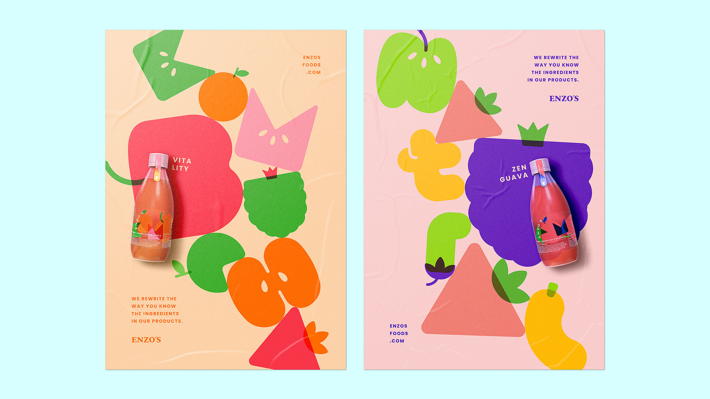
Admixture Sans rewrites the way we know the ingredients of our products. Many studies shows us the importance of clarity for today’s audiences when it comes to buying, and even mor so in the category of healthy products; they want to know in a simple way what the product they are about to consume is made of without having to go to the fine print on the package.
That’s why, with Enzo’s Foods, an organic and healthy food brand from Colombia, we created a typography that would speak for itself about the ingredients in their products.
Objectives: Impact consumers of healthy products with a disruptive idea that provides a solution to the main concern of the target: Knowing what we feed ourselves with and how transparent brands are in relation to their ingredients; which according to The Food Industry Association, today is no longer an option, it is a must.
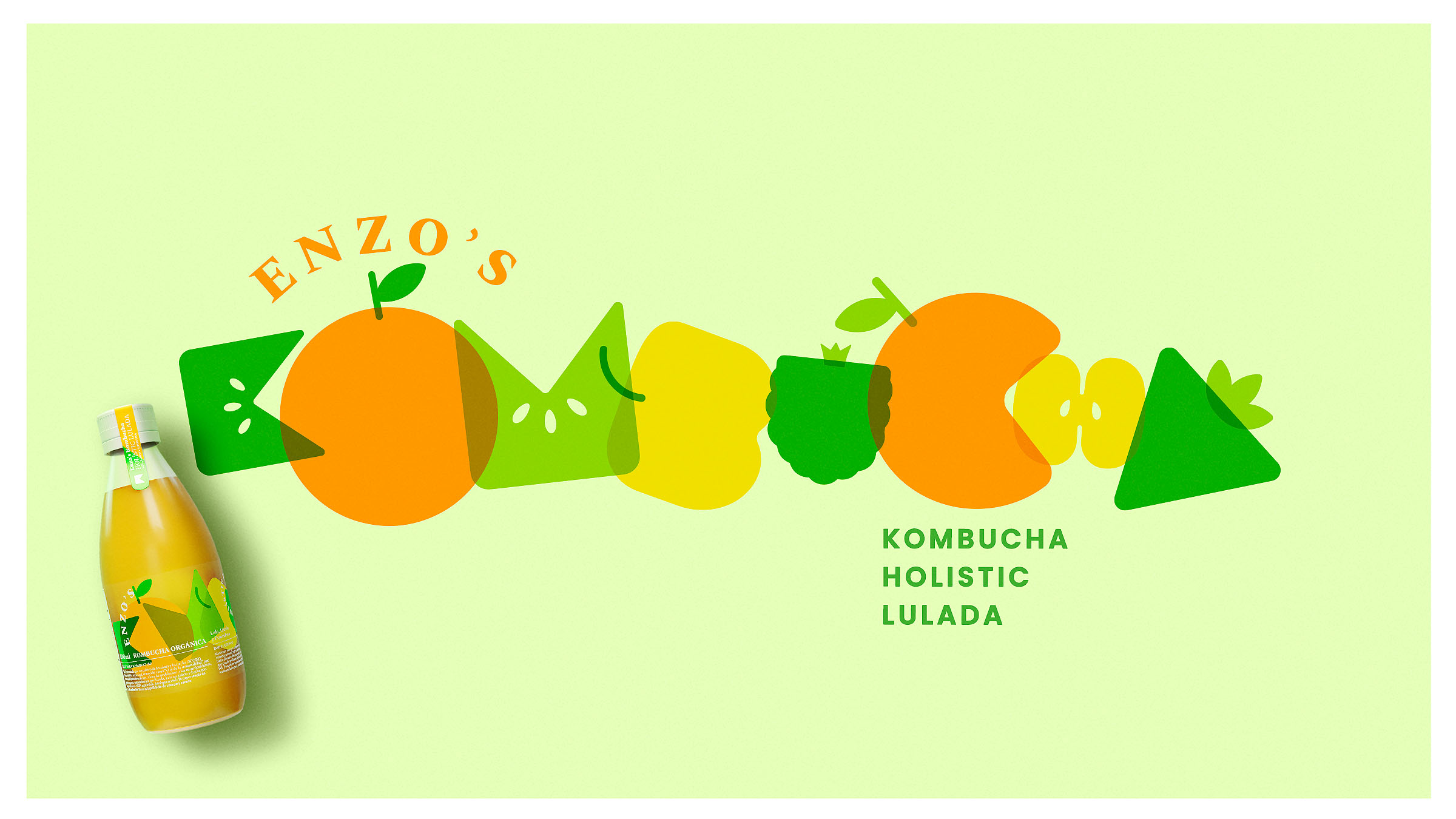
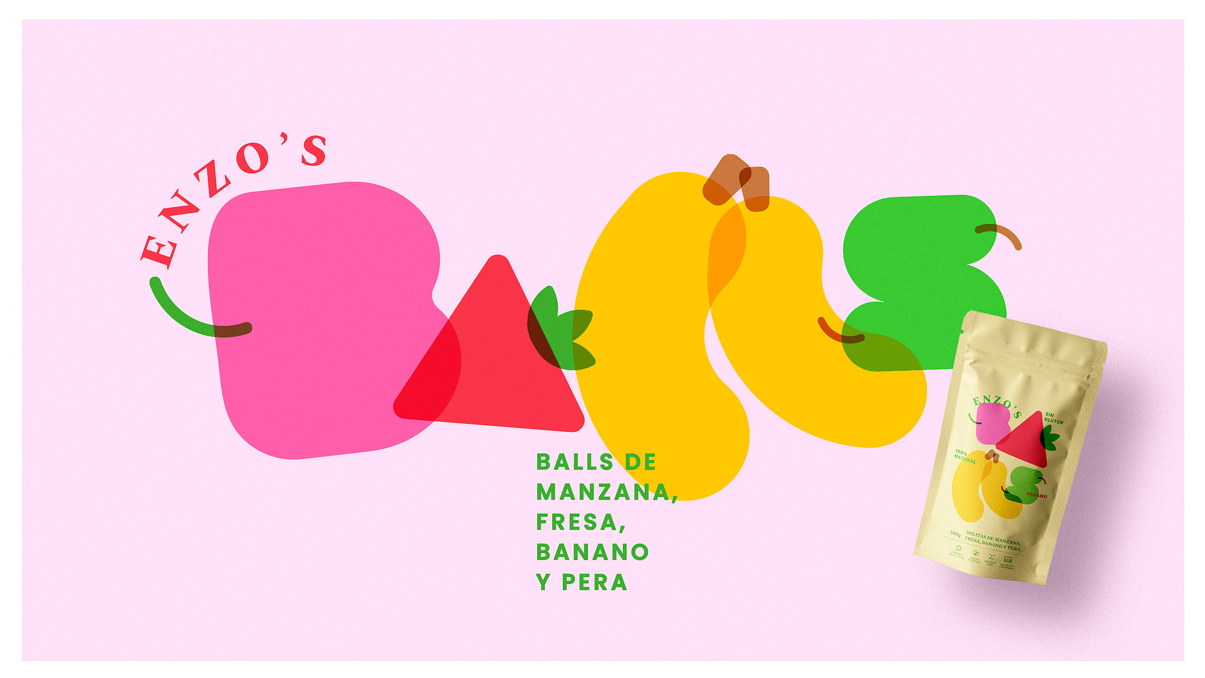
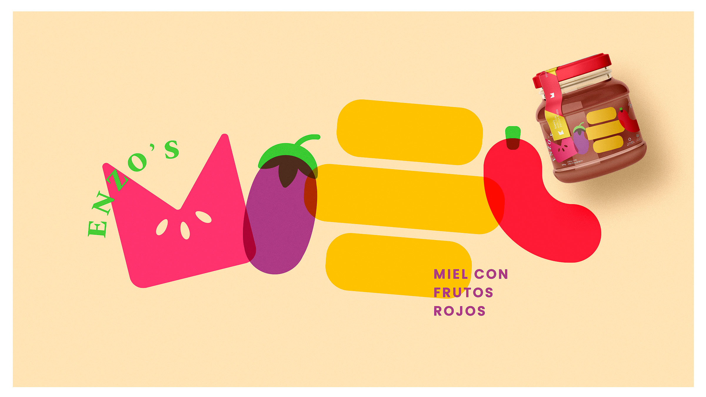
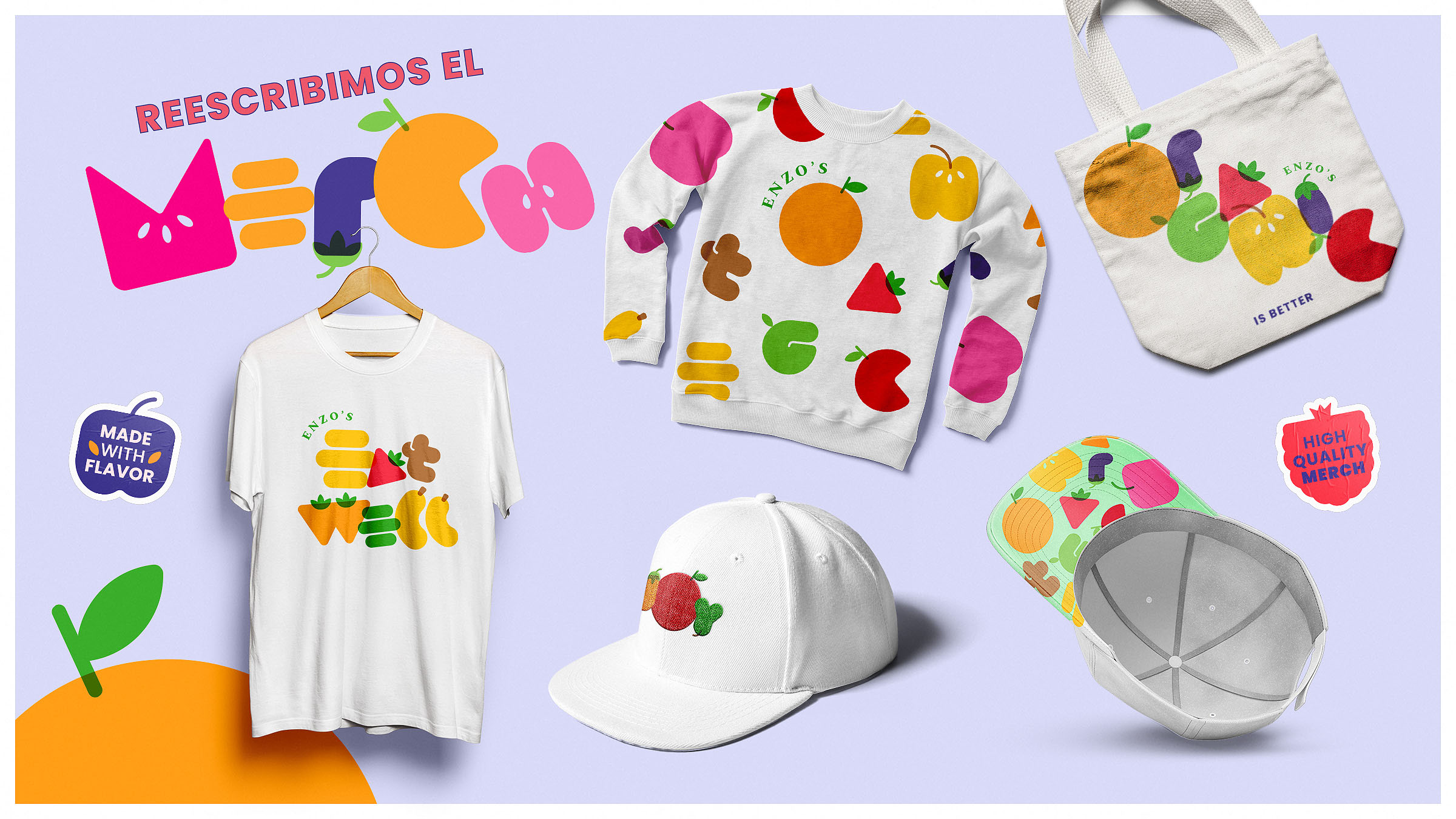
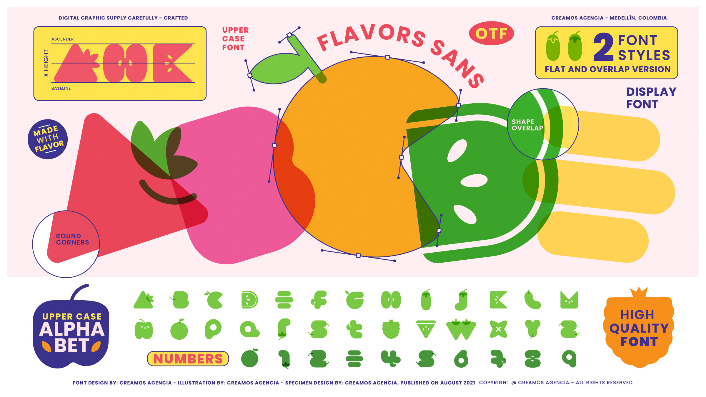
Strategy and Implementation: Admixture sans is a display typeface, created to be used mainly in the packaging of the brand Enzo’s Foods, with 2 versions (flat and superimposed) that just by writing it and choosing the color of the letters, tells us what ingredients it has without having to read much of the label, but when used in other media such as posters or their own merchandising still speaks of how natural and fresh the brand is.
Results and Implications: With this new idea, in addition to the impact generated with this new brand, we also managed to restructure their sales; with a 60% increase in the total of all its products and a 500% growth in sales of Kombucha, the star product of Enzo’s Foods.
This shows us that there is always a different way of doing things, even for those consumers who are wary of what they are going to eat.

CREDIT
- Agency/Creative: Creamos
- Article Title: Admixture Sans Product Range Designed by Creamos
- Organisation/Entity: Agency
- Project Type: Identity
- Project Status: Published
- Agency/Creative Country: Colombia
- Agency/Creative City: Medellín
- Market Region: South America
- Project Deliverables: Branding, Typography
- Industry: Food/Beverage
- Keywords: Food, Beverage, Healthy Food, Typo, Creativity
-
Credits:
CREAMOS: CREAMOS


