Tick Tock is one of the UK’s most iconic and well-known tea brands. Independent and pioneering, the family behind Tick Tock first cultivated rooibos (pronounced roy-boss) in 1903 and over four generations later they continue to champion this variety.
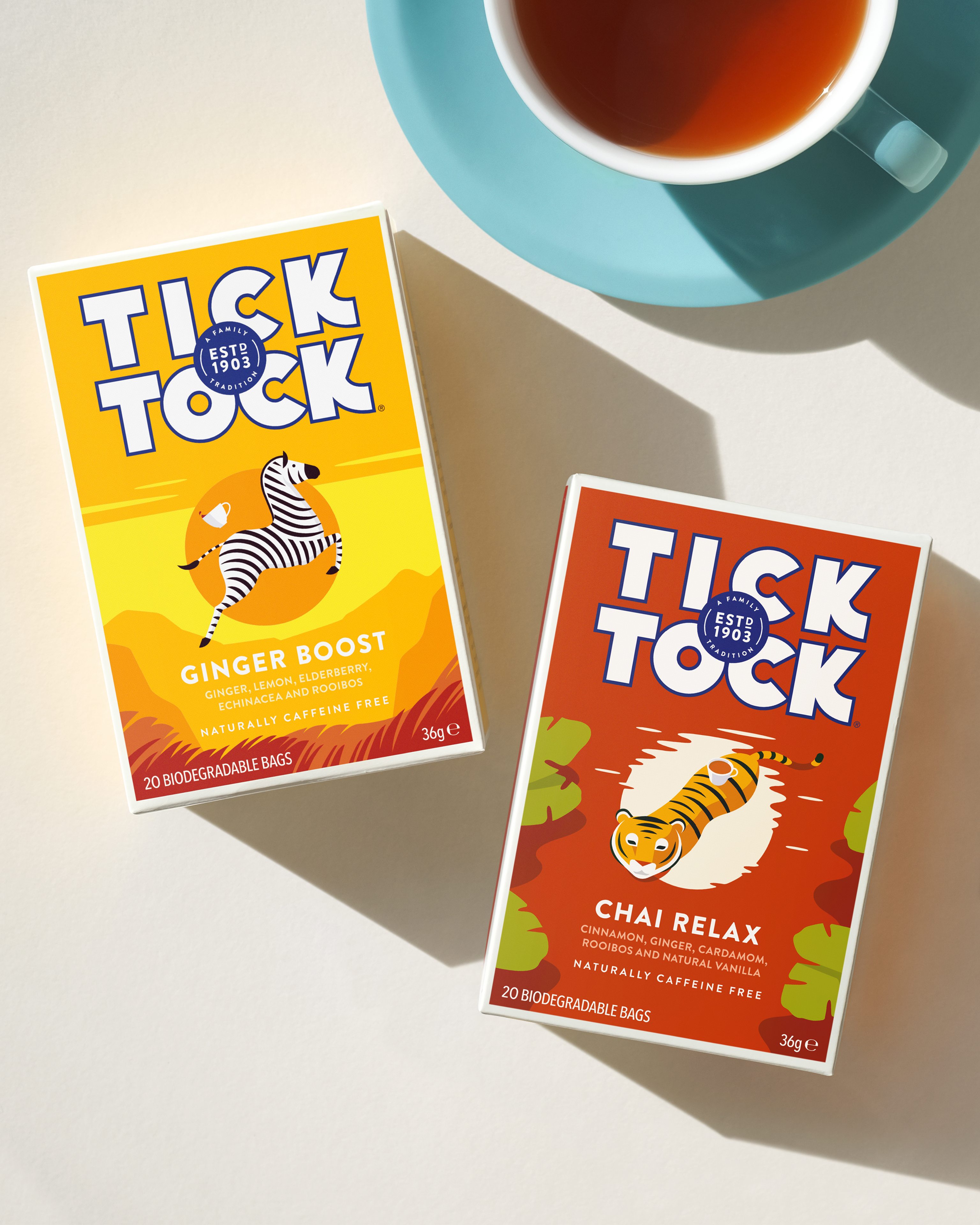
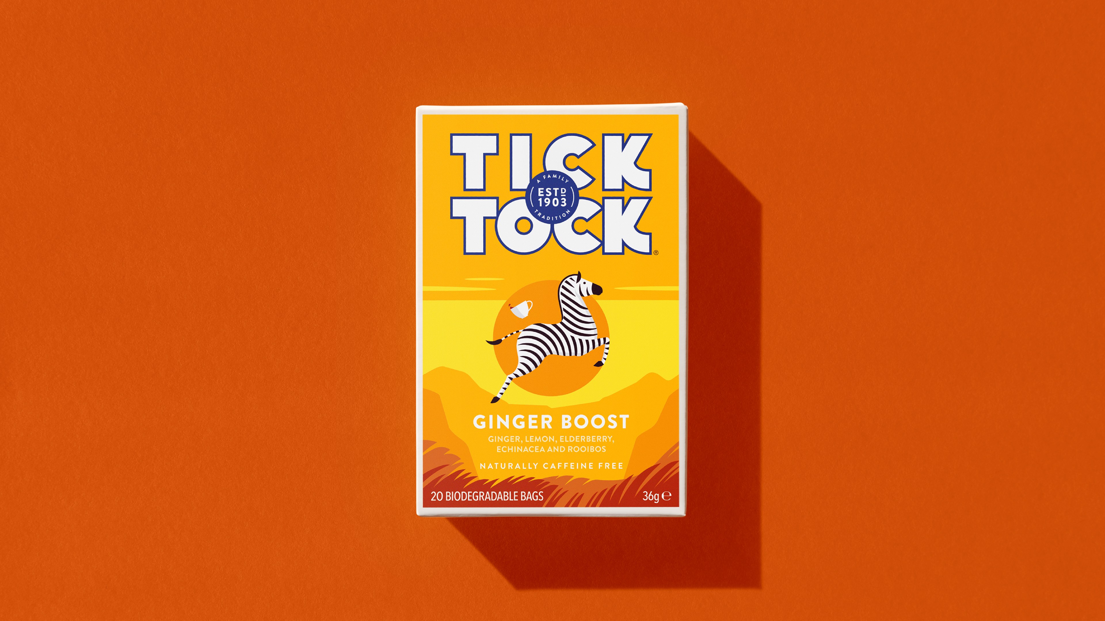
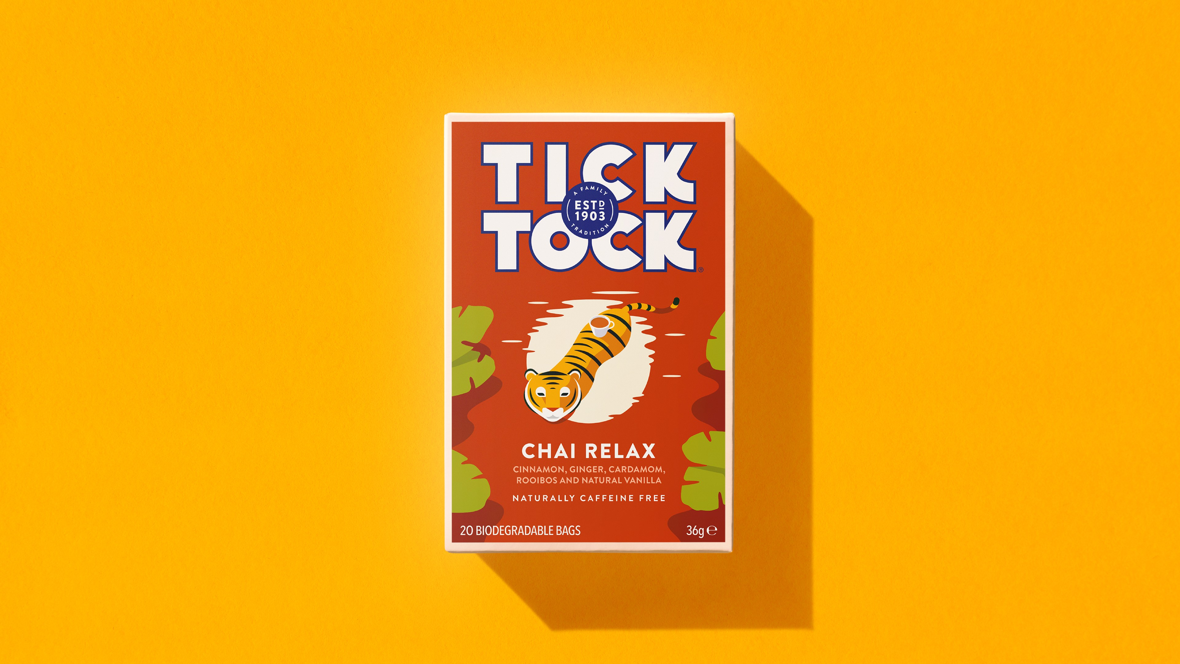
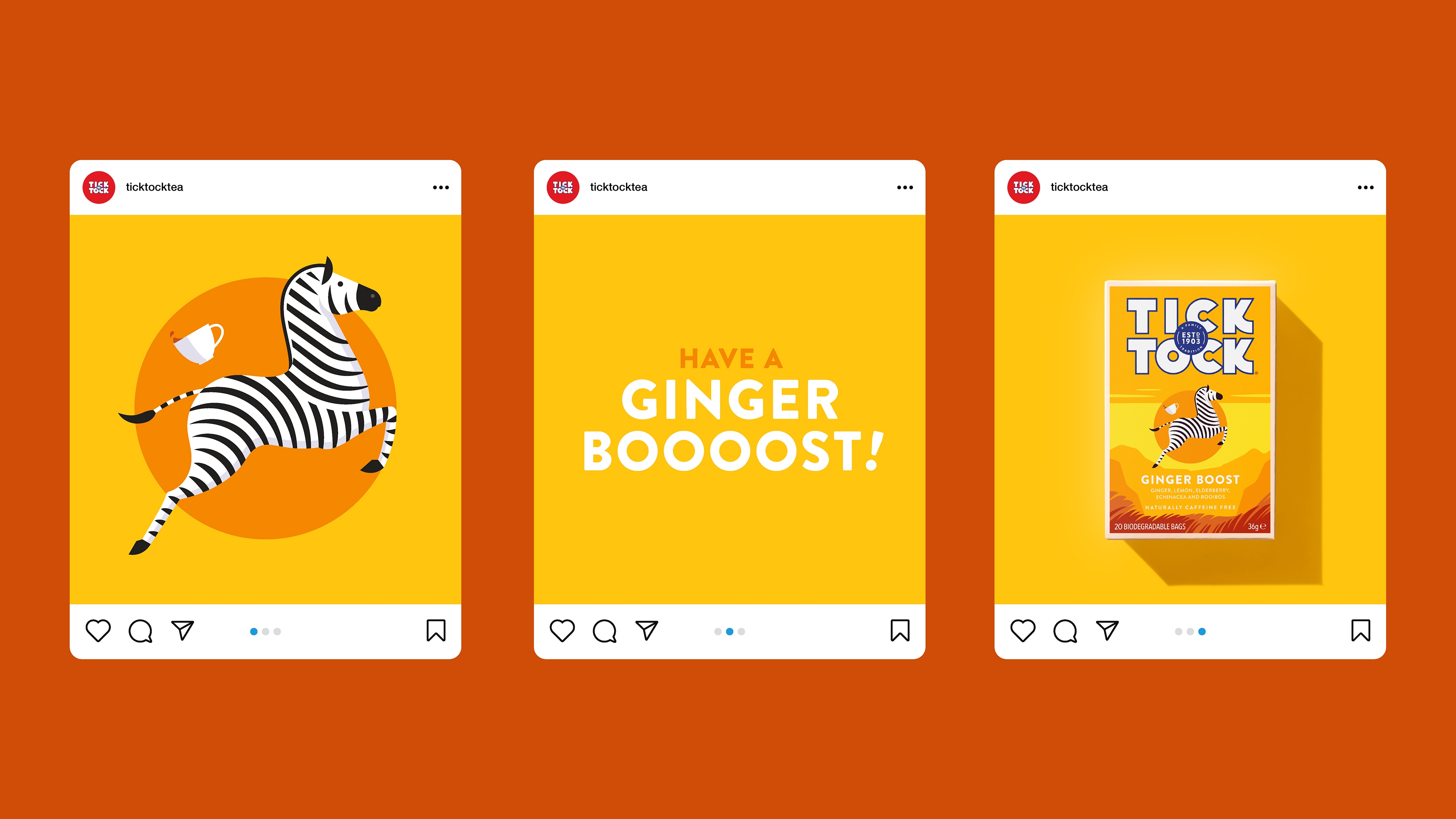
We were approached by Tick Tock to develop their Wellbeing range and create designs for two new flavours, including new illustration, pack design, naming and brand world. Fruit and herbal drinks continue to grow in popularity with health conscious consumers looking for teas that not only offer a unique flavour experience but also promote health and a sense of overall wellbeing. Tick Tock’s Wellbeing range offers this market unique, benefit-led rooibos blends that are all about delivering a specific mood and helping drinkers realise a healthy lifestyle. ‘Ginger Boost’ aids natural defences with ginger, lemon and echinacea while ‘Chai Relax’ offers a warming, spicy treat with cinnamon, ginger and cardamom.
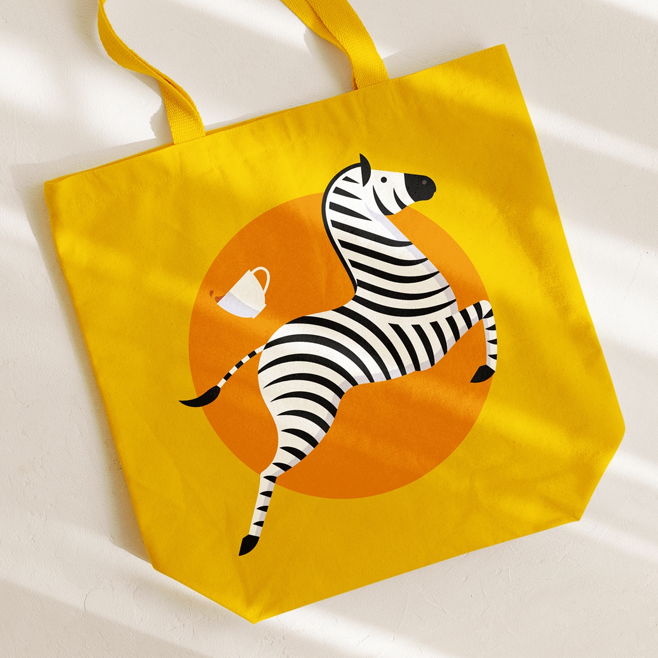
With most competitors illustrating flavour, we wanted to express Tick Tock’s playful personality by conveying the benefits of the tea through animal characters. After presenting a large range of sketches for the potential illustrations, a leaping zebra was chosen to bring a zingy, uplifting mood to Ginger Boost, while a tiger taking a dip in the reflection of a warm sun perfectly captures Chai Relax. These characters become iconic flavour mascots for use across the entire brand world – from marketing collateral to merchandise – playfully bringing to life the spirit of each blend. Supported with Tick Tock’s strongest assets; bold typography, bright colours and playful copy, Tick Tock Wellbeing embodies the brand’s tagline, “A tea for anytime. Morning, noon and night.”
Patrick Busse, the director at Tea Times Trading Ltd., says: “Working with Jamie is always a real pleasure. He is an exceptional designer and illustrator with a deep understanding of brand who — critically— is able to bring his creativity and integrity to bear within the confines of a tightly managed commercial process.”
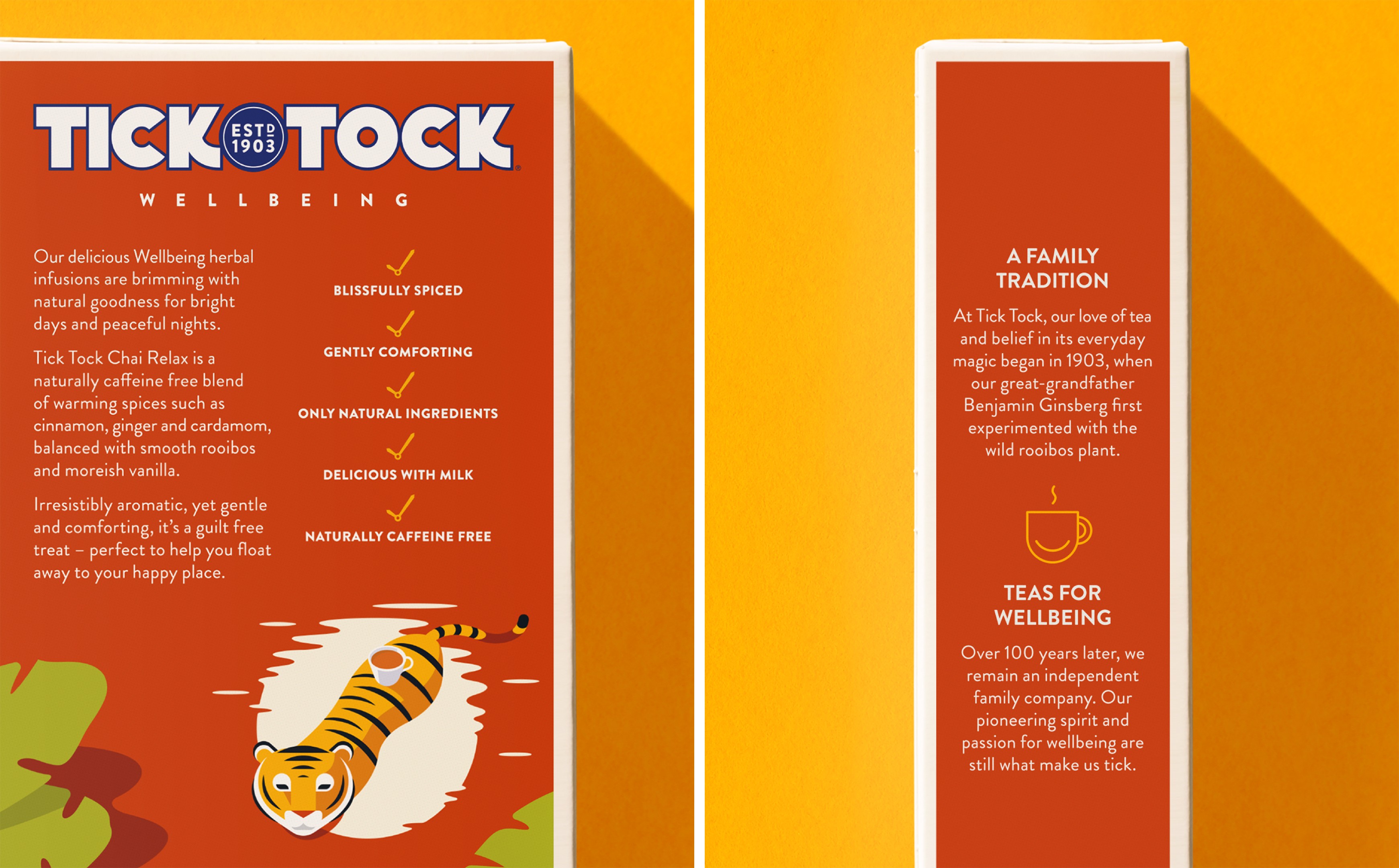
The existing lineup was also updated with new messaging and pack formats that allow Tick Tock to pack in biodegradable teabags. The new flavours are on shelves now, adding to Tick Tock’s range of naturally caffeine free teas that promote “bright days and peaceful nights.”


CREDIT
- Agency/Creative: Jamie Nash Studio
- Article Title: Adding Character and Joy with Tick Tock Wellbeing Tea
- Organisation/Entity: Agency, Published Commercial Design
- Project Type: Packaging
- Project Status: Published
- Agency/Creative Country: United Kingdom
- Market Region: Europe
- Project Deliverables: Brand Advertising, Brand Architecture, Brand World, Branding, Graphic Design, Illustration, Packaging Design, Product Architecture, Product Naming
- Format: Bag, Box
- Substrate: Fabric, Pulp Carton


