Challenge
In India, there’s never been more pressure to have perfect skin, yet it’s never been harder to maintain, with increased pollution, screen-time and climate change creating the perfect storm for acne to thrive. It’s become a demoralising uphill battle for consumers made worse by a confusing and overwhelming category of products that over-promise and underdeliver.
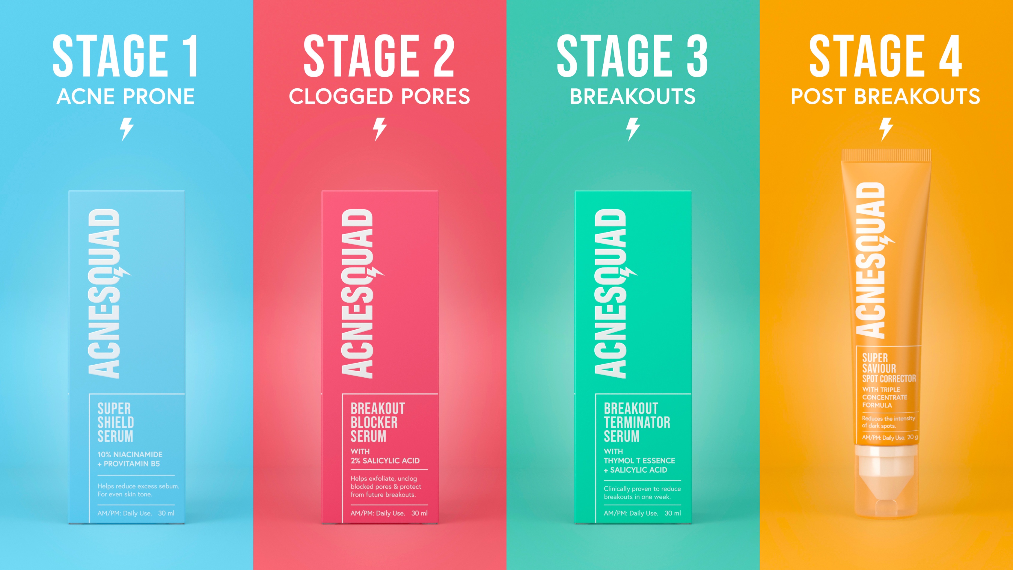
Unilever’s new specialist acne product range, created by an expert team of scientists and dermatologists, breaks down the acne lifecycle into four key, but simple, stages. The brand needed to bring this game-changing proposition to life and make it easy to understand and shop in-store.
Concept
Unilever sought to disrupt the market with a new superior skincare solution; AcneSquad – a brand built to demystify, simplify and empower spot sufferers to take control of their skin.
Acne is the enemy of clear skin, but so often it’s a never-ending uphill battle to manage. Taking this analogy of the battle with acne, we positioned the brand as a ‘supercharged skincare saviour’ – a pioneering partner in crime in the fight against spots.
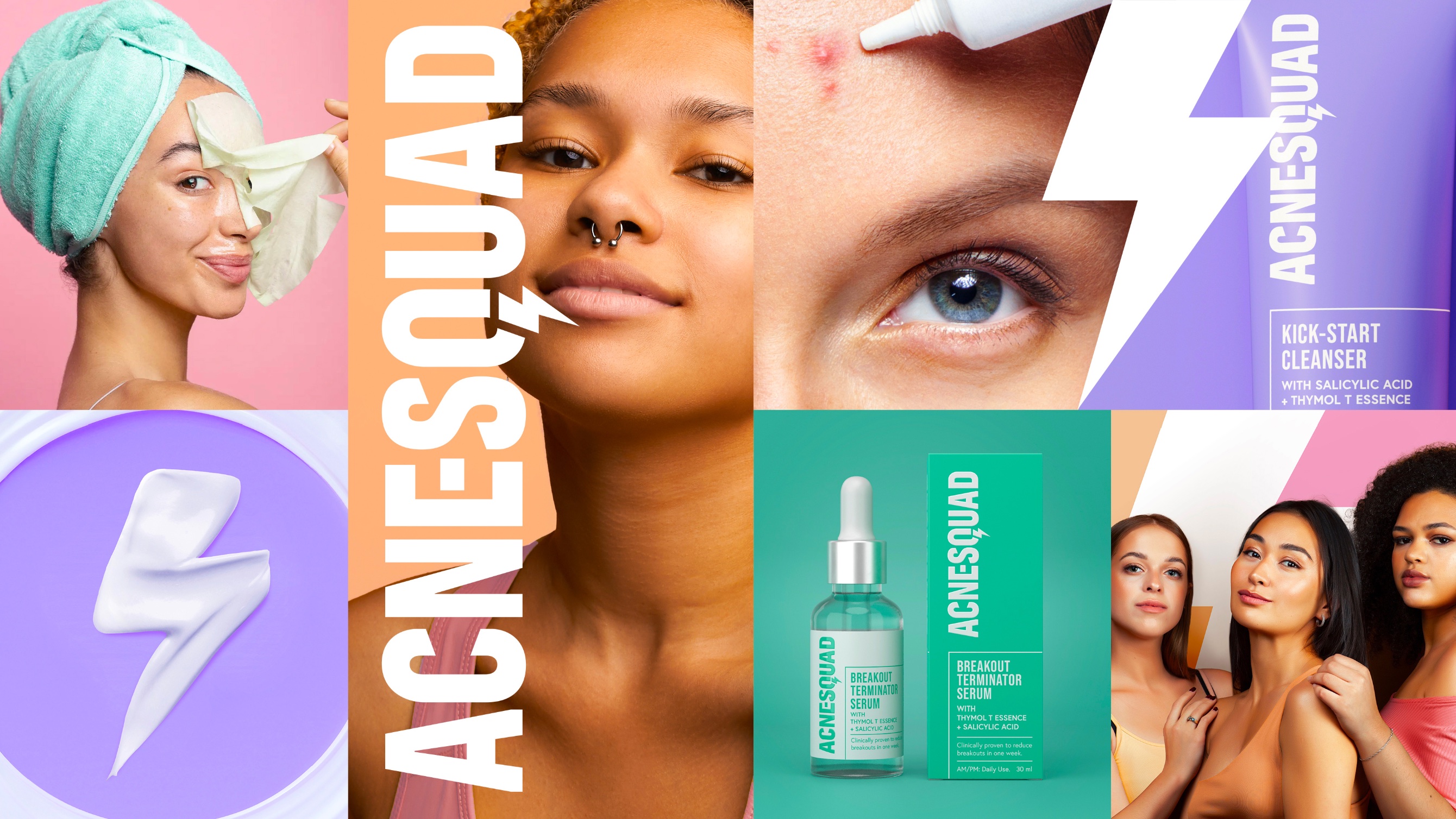
The design brings to life this fun and fearless spirit through the bold brand mark; the lightning bolt in the letter Q a nod to the brand’s superhero inspired personality and super-targeted efficacy. Its more emotive and disruptive expression targeted at GenZ provides stand out in a traditionally cold and serious category. And its positive and powerful tone of voice reinforces its positioning as a skincare saviour.
Execution
The biggest challenge was striking the right balance between being bold and disruptive while being clinical and credible.
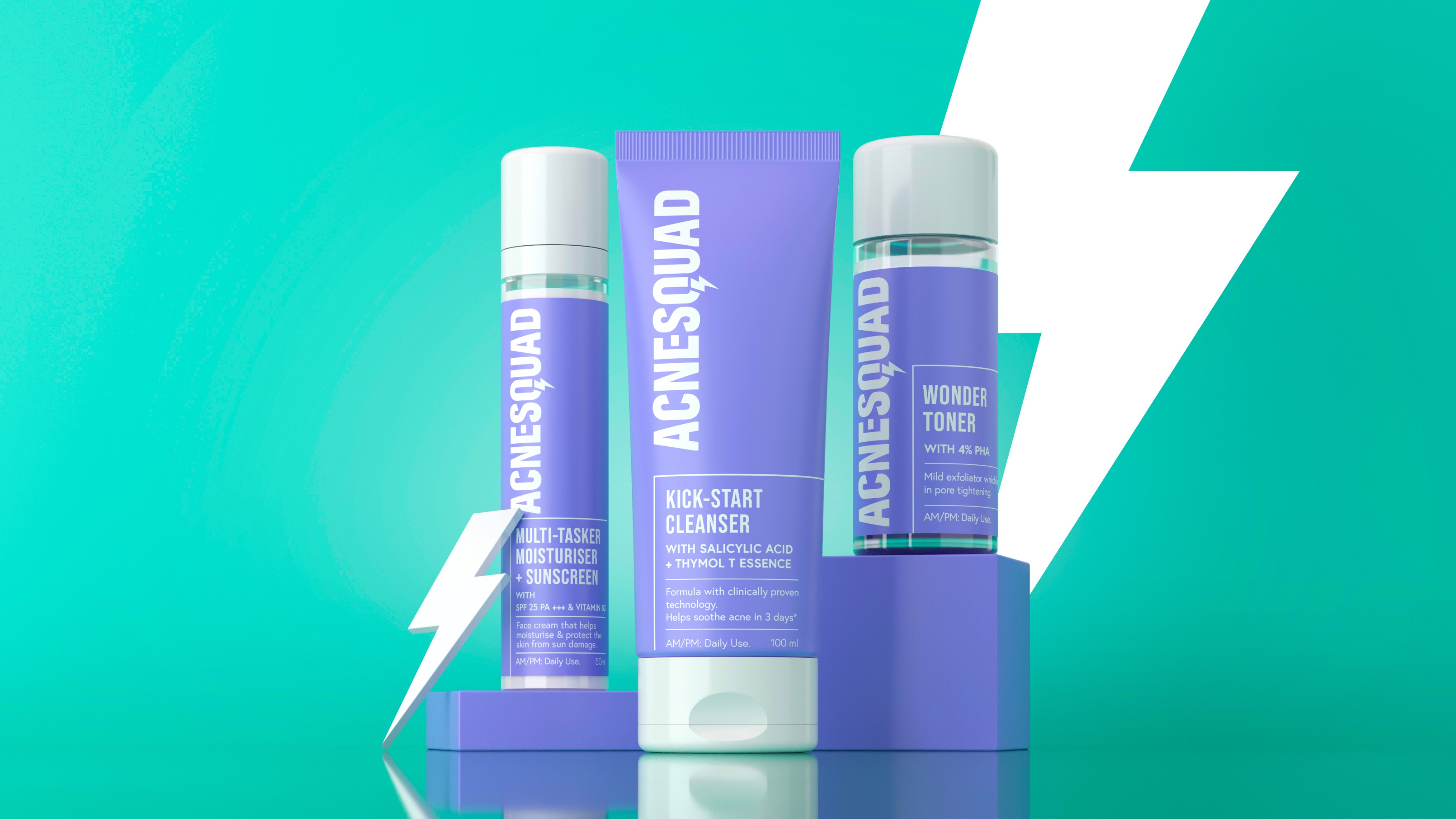
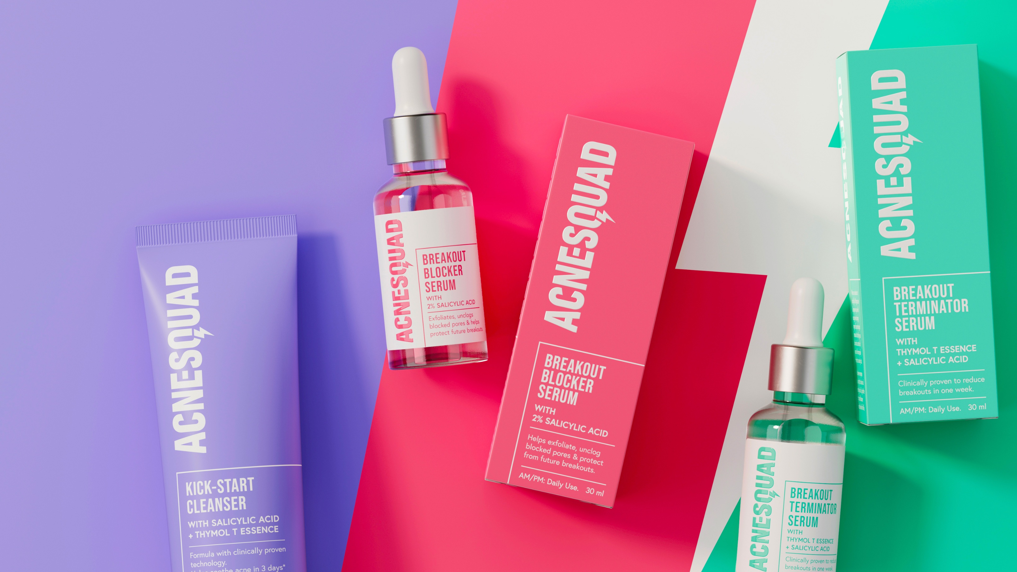
The clean, stripped back packaging reassures on clinical expertise and the suite of bright pastel shades dial up the brand’s playful spirit, a deliberate contrast to its predominantly white and blue competitors.
The range comprises of more than 10 products, each of the four stages, is colour coded to make the range easy to navigate, while the product names, benefits and usage instructions are clearly highlighted on pack.
The identity has been applied across multiple different packaging formats, as well as across Acne Squad’s website, social media and additional DTC assets.
Results
AcneSquad is on the attack! In the six months since it burst on to the scene, buyer offtake has grown considerably across all SKUs, as well as average order value and basket size.
With mega influencers reviewing the range and a rating of 4.7 on online beauty store Nykaa, Acne Squad is fast gaining an army of fans and new skincare recruits. And the brand is forging on with its mission to eliminate acne once and for all
CREDIT
- Agency/Creative: PB Creative
- Article Title: AcneSquad – India’s Pioneering Partner in Crime in the Fight Against Spots
- Organisation/Entity: Agency
- Project Type: Packaging
- Project Status: Published
- Agency/Creative Country: United Kingdom
- Agency/Creative City: London
- Market Region: Asia
- Project Deliverables: Brand Creation, Brand Identity
- Format: Bottle, Box
- Industry: Health Care
- Keywords: WBDS Agency Design Awards 2023/24
- Keywords: Identity, Brand Design Creation
-
Credits:
Design Agency: PB Creative


