


Nikolos Collection Extra Virgin Olive Oil
Nikolos Collection is more than just an olive oil — it is a crafted narrative in liquid form. It begins its story in the mountainous slopes of Kalamata, one of Greece’s most revered olive-growing regions, where the sunlight touches the land with golden persistence and ancient trees root deeply in mineral-rich soil. In this terrain, shaped by centuries of human care and seasonal cycles, grow olives of remarkable quality — fruits of patience, ritual, and heritage.
From this land, the Nikolos Collection is born. Not from factories or high-yield farming, but from small, family-run groves where each olive is hand-harvested at peak ripeness and cold-extracted within hours. The result is an extra virgin olive oil with Protected Designation of Origin (P.D.O.), defined by clarity, low acidity, and aromatic complexity. But beyond its taste, Nikolos aspires to do something rarer: to embody the culture, memory, and identity of the people and land that produce it.
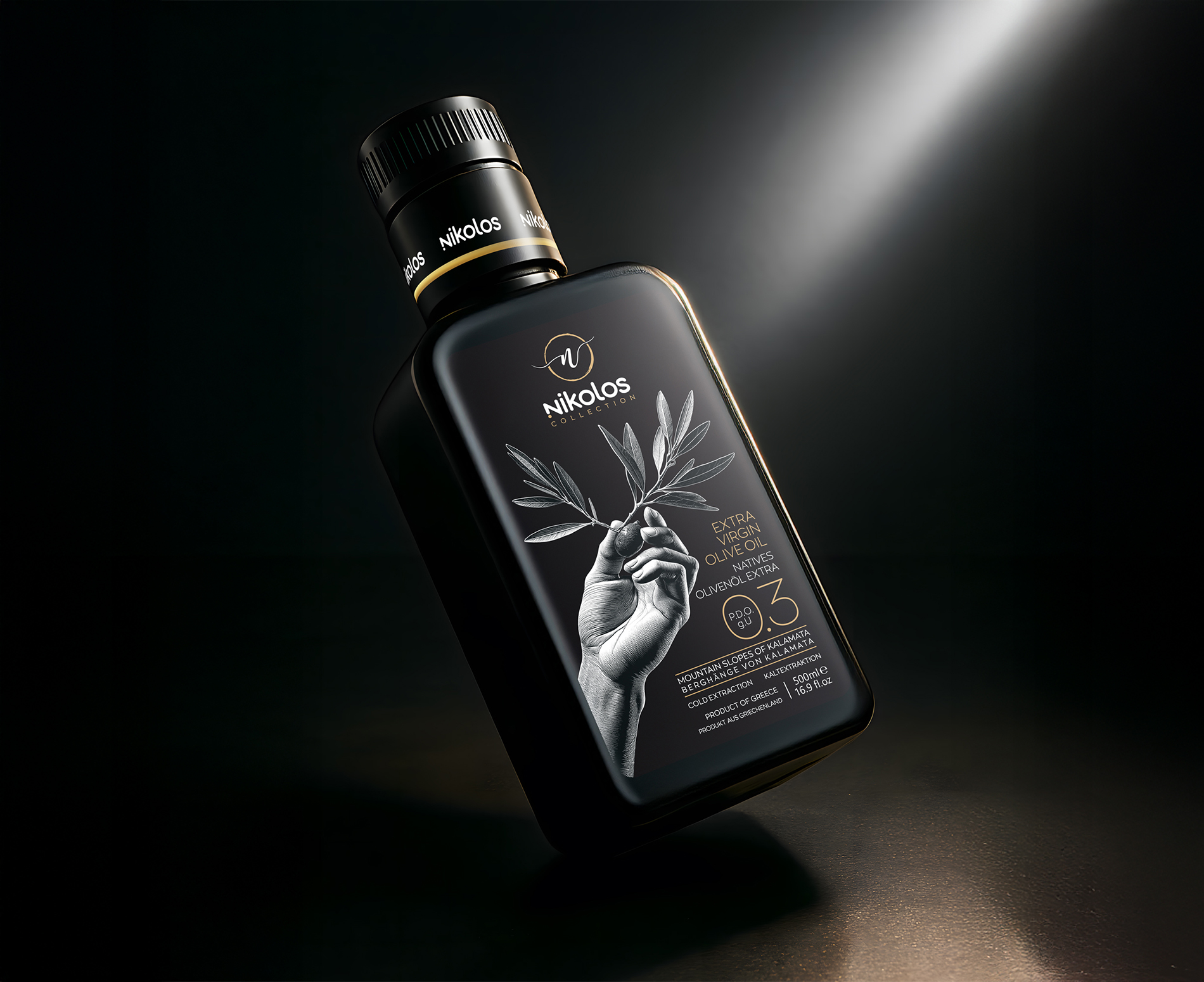
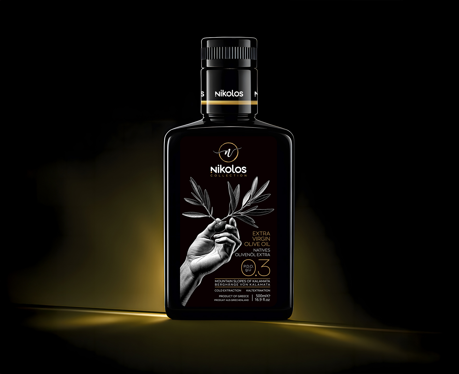
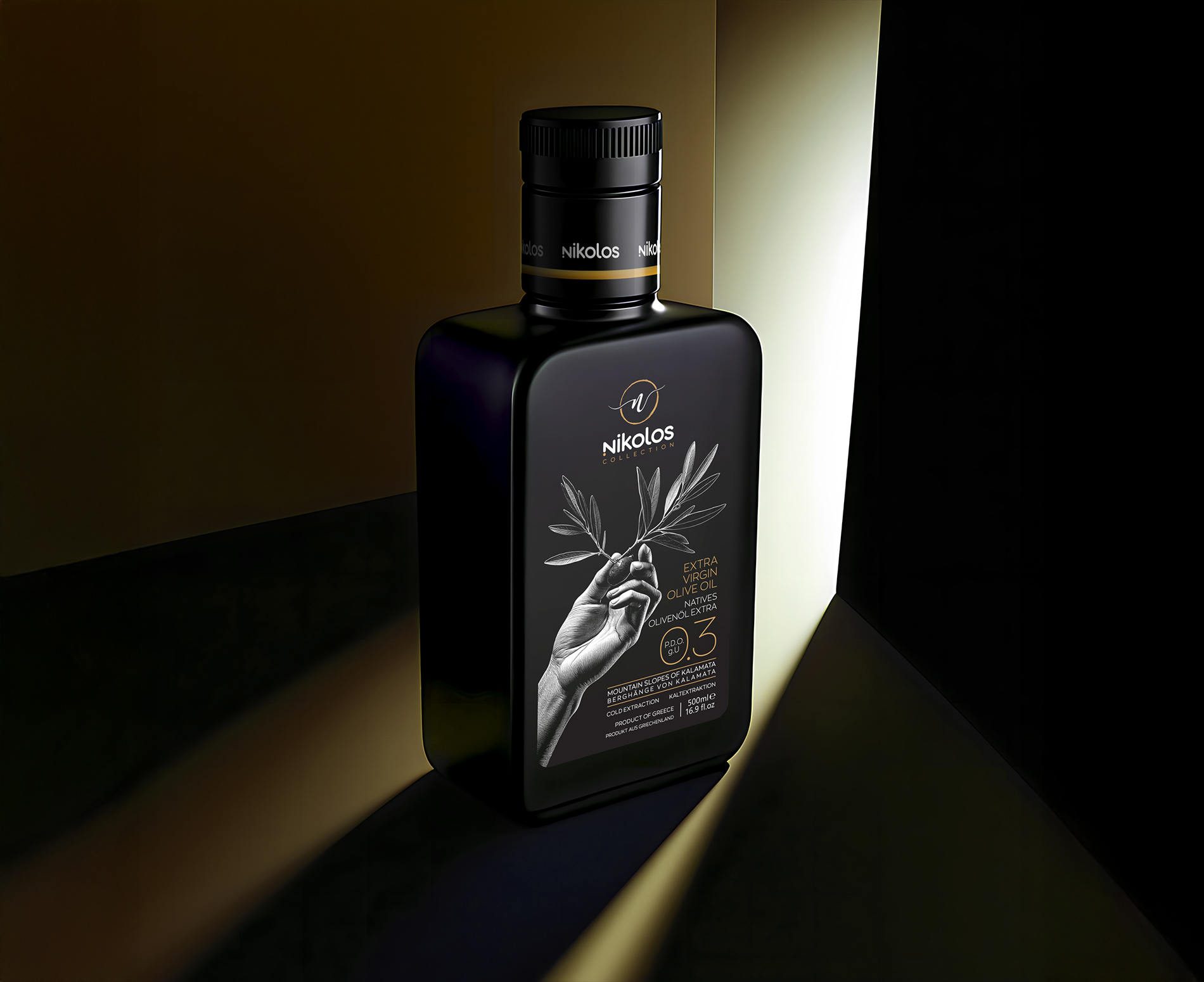
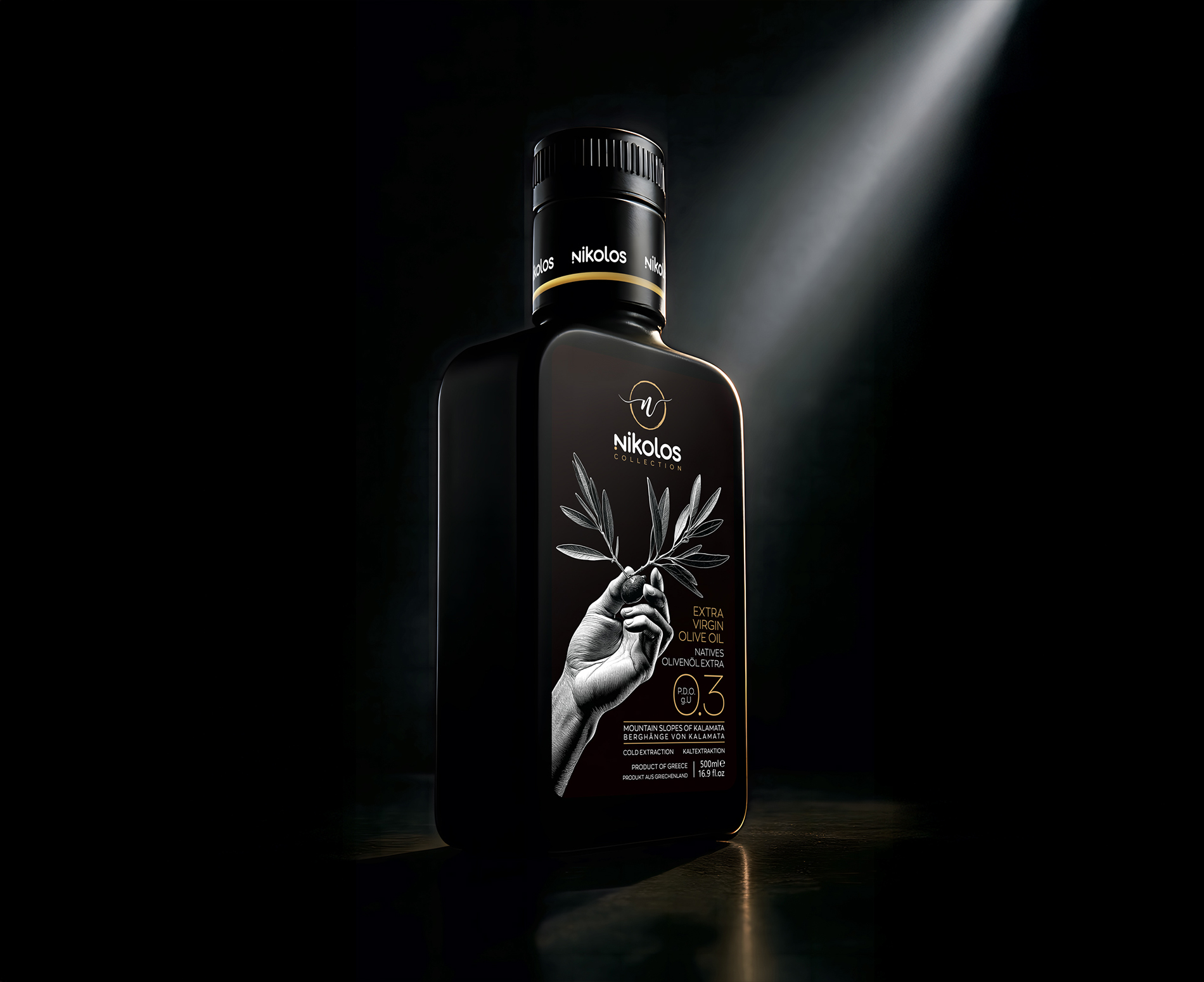
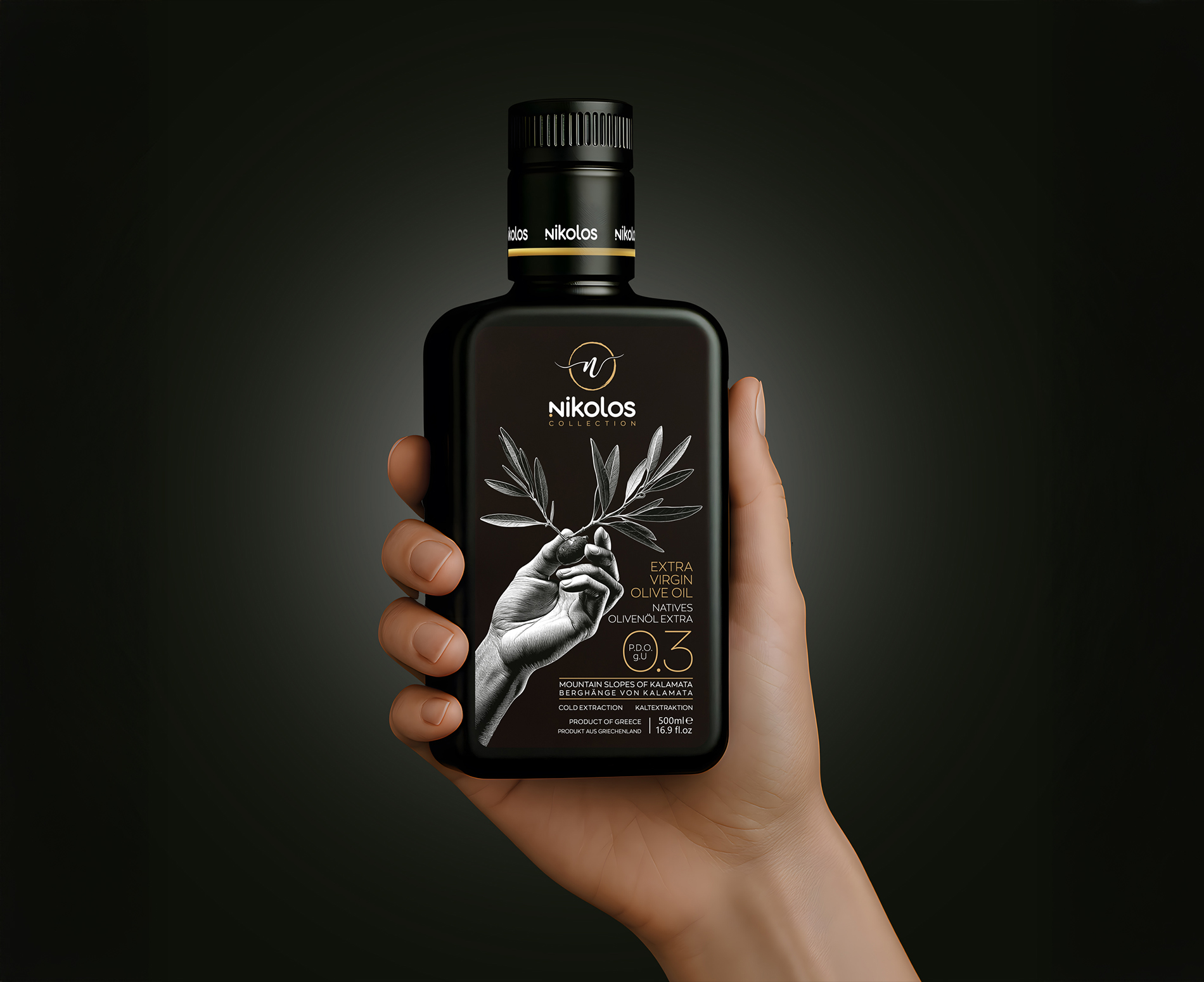
The creative brief was deceptively simple: create a brand that feels honest, rooted, and quietly luxurious. One that honors the product’s humble agricultural beginnings while presenting it in a way that resonates with a contemporary, global audience. With this in mind, the design approach focused not on trends or ornament, but on emotion, symbolism, and storytelling. The result is a strikingly minimalist bottle — matte black, bold in presence, tactile in finish — with a single image commanding attention: a monochrome photograph of a hand gently holding an olive branch.
The hand is more than a visual device. It is a symbol of care, offering, labor, and respect. It speaks of harvest, of tradition passed from one generation to the next, and of the deeply human relationship between people and the land. This single motif becomes the soul of the brand — unspoken, understated, and unforgettable. Complementing it is the delicate use of gold-foil detailing, used sparingly to highlight only essential information: the brand name, the batch edition, and the origin.
Every element of the packaging was considered for its material truth and sensory experience. The bottle, made of dark smoked glass, protects the oil from light exposure while adding weight and gravity to the object. The label is printed on uncoated paper stock with a soft grain, inviting touch and lending an organic texture that aligns with the natural purity of the contents. Together, the materials, finishes, and palette — black, gold, bronze, and olive green — create an aesthetic that is at once rooted and refined, allowing Nikolos to confidently sit on the shelf beside fine wines, artisan spirits, or boutique perfumes.
Beyond packaging, the Nikolos identity expands into a cohesive visual system: a custom serif wordmark, a leaf-like monogram that subtly hints at the letter “N”, a restrained typographic hierarchy, and a voice that is warm, poetic, and deeply respectful of origin. The brand tone speaks not in marketing hyperbole but in intimate truths. It invites the consumer not just to taste, but to feel — to remember sun-warmed hands, meals shared outdoors, olive groves stretching across hills, and the quiet dignity of honest labor.
Since its launch, Nikolos Collection has received enthusiastic reception both from connoisseurs and casual consumers. Its limited first edition sold out within weeks. Boutique retailers in Germany, Sweden, and Japan placed re-orders based on customer demand. A number of chefs and sommeliers praised not only the flavor of the oil — delicate yet grassy, robust but balanced — but the clarity of its brand voice. Social media organically embraced the packaging, with numerous reposts and features in premium food and design blogs. It has already been described by industry professionals as “an instant modern classic in food design.”
What distinguishes Nikolos, however, is not only the precision of its identity, but the depth of its emotion. This is a product born from pride and care, built on the belief that luxury is not about excess — it is about essence. In a world where many products shout, Nikolos whispers. And yet, in that whisper, it speaks volumes: about place, about people, about what it means to craft something true.
Nikolos Collection offers not only a superior olive oil but a cultural artifact — a bottle that tells a story with every drop. A story of Greek sun and soil, of hands that tend trees and pick fruit, of rituals that span generations. A story now carried forward through contemporary design, ready to travel the world while always remaining deeply, unmistakably rooted in home.
CREDIT
- Agency/Creative: ABC Design Communication
- Article Title: ABC Design Communication Creates a Luxurious Identity for Nikolos Collection
- Organisation/Entity: Agency
- Project Type: Packaging
- Project Status: Published
- Agency/Creative Country: Greece
- Agency/Creative City: Athens
- Market Region: Global
- Project Deliverables: Brand Creation, Label Design, Packaging Design
- Format: Bottle
- Industry: Food/Beverage
- Keywords: Extra Virgin Olive Oil
-
Credits:
Creative Designer: Kornilios Nikolaidis


