


AKA Brand Design – Abbott’s Village Bakery
“The challenge:
Consumers were struggling to tell the difference between Abbott’s Village Bakery and other premium brands in the supermarket category. This premium bakery segment was “stale” with competing brands offering like for like products, giving consumers little reason to browse or trial. So how do you convince consumers that Abbott’s Village Bakery delivers the best bread experience?
Our solution:
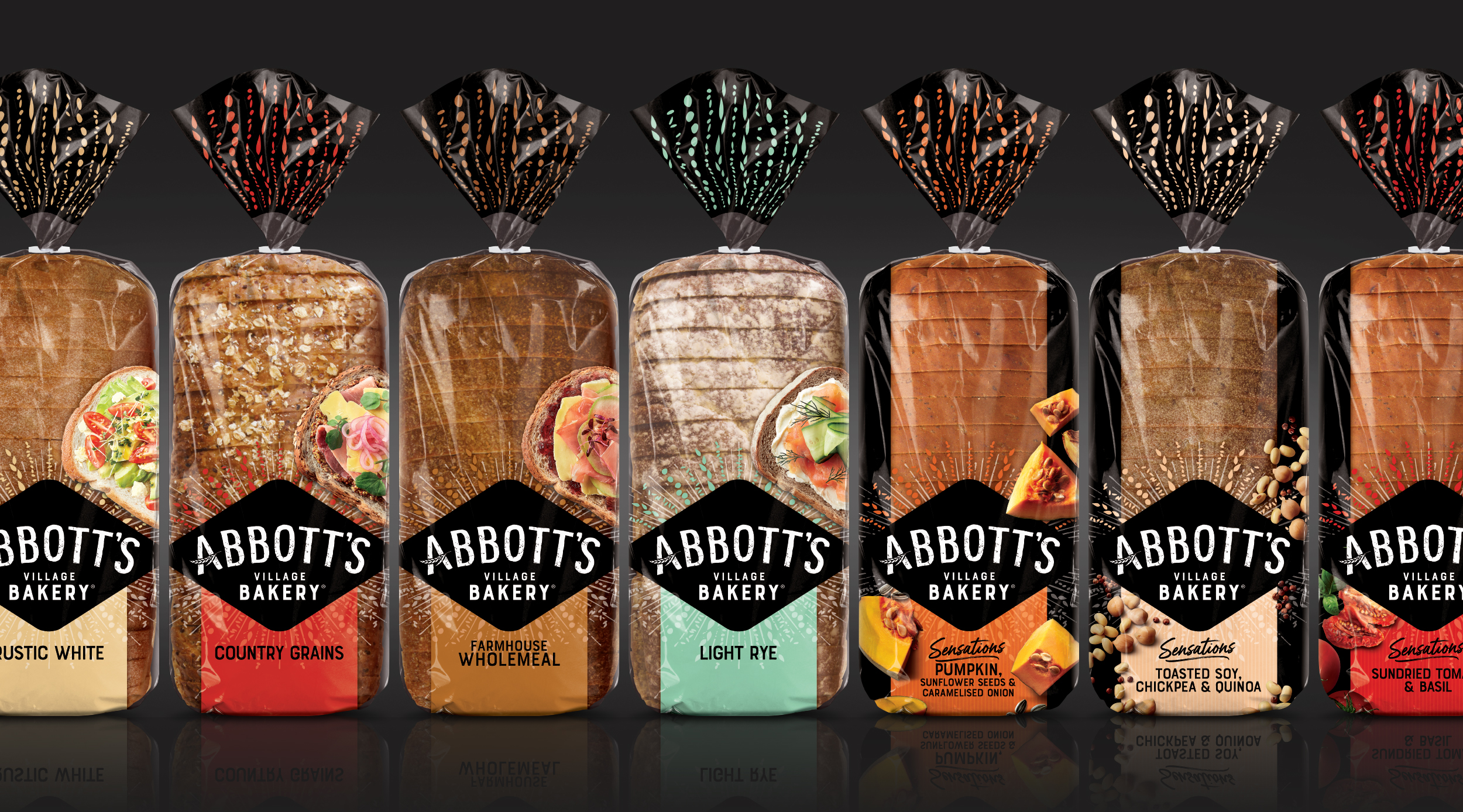
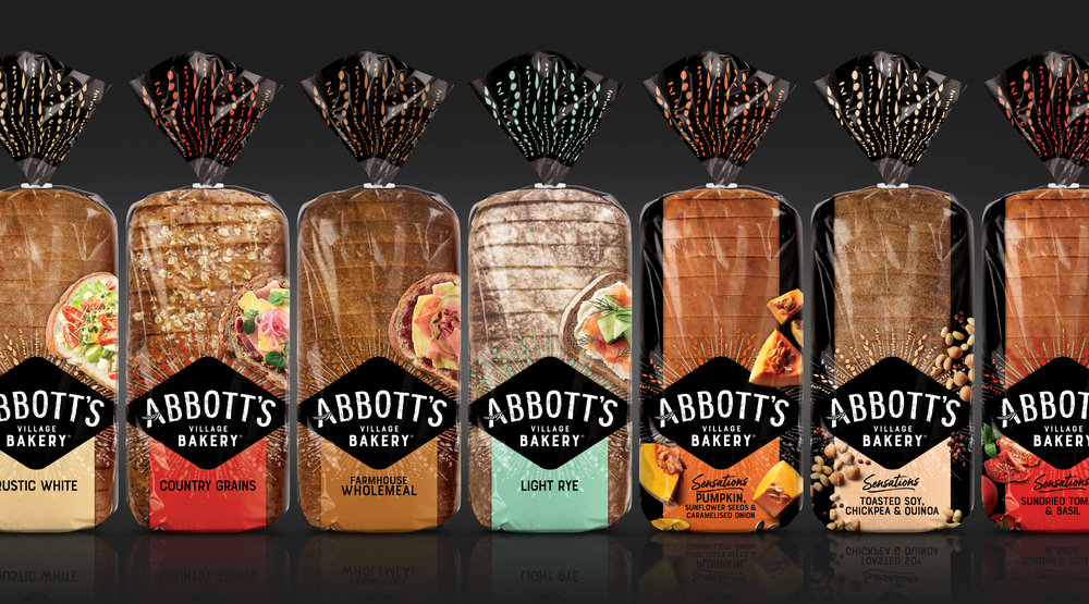
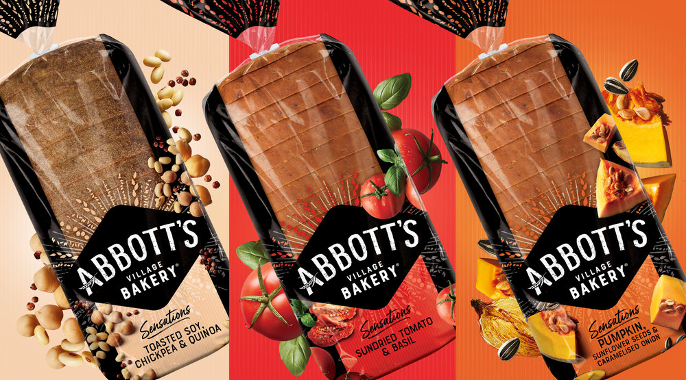
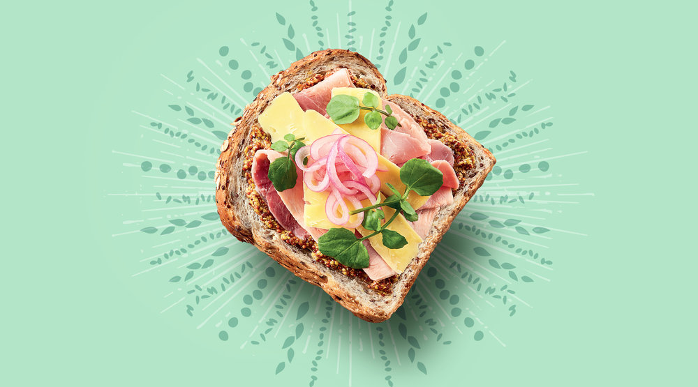
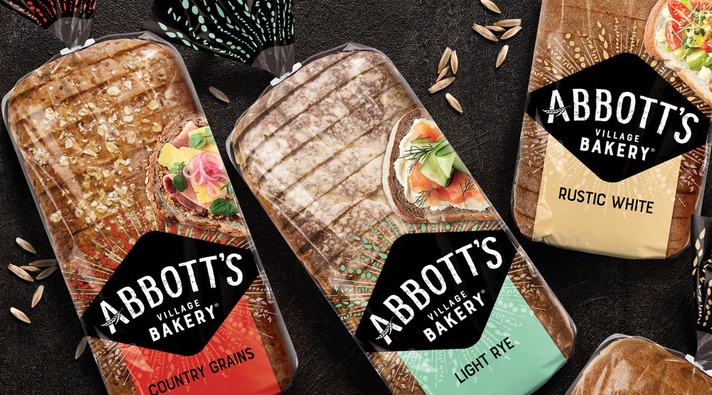
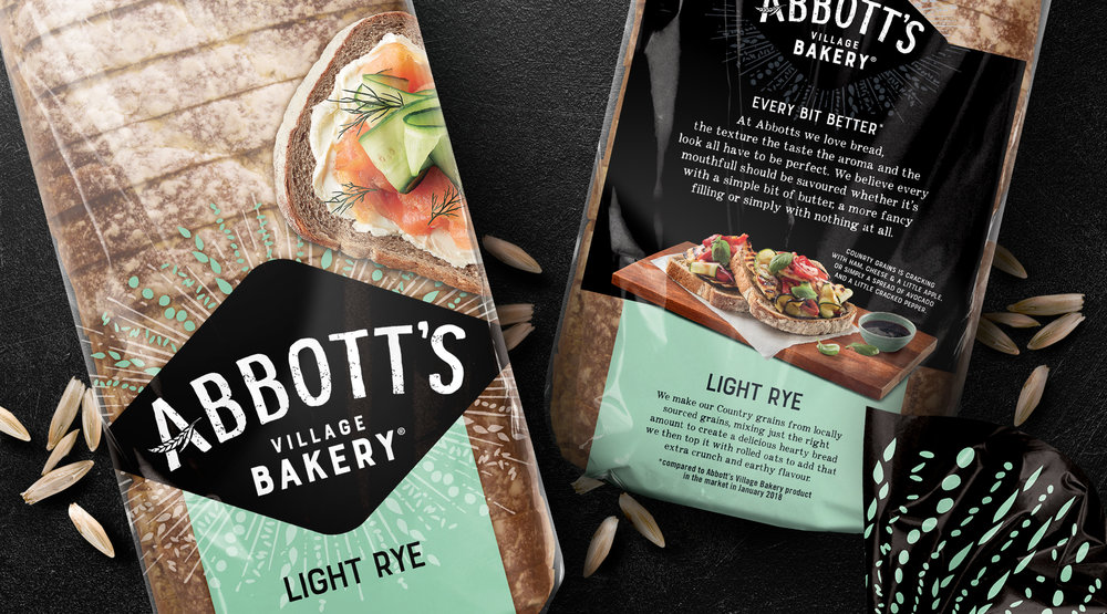
We solved this by creating a new design, that embodies the Abbott’s Village Bakery commitment to innovation and promise of a better bakery experience. A new logo lock up focusing on the Abbott’s Village Bakery name, is proudly front and centre. The experimental nature and excitement of the adventurous foodie consumer, is captured with the excitement of the expressive flare behind the holding shape. Appetite appeal is delivered through real, interesting food imagery and enticing flavour cues. Ease of range navigation between the core and premium flavours was applied. Matched with a fresh colour palette, the packaging creates both modernity and stand out at shelf and a fresh reason to try the wider range.”
CREDIT
- Agency/Creative: AKA Brand Design
- Article Title: Abbott’s Village Bakery Redesign for Premium Supermarket Category, Australia
- Organisation/Entity: Agency Commercial, Published
- Project Type: Packaging
- Agency/Creative Country: Australia
- Market Region: Oceania
- Format: Bag
- Substrate: Plastic


