


Qbooking is a travel agency operating between Iran and the UAE, offering a wide range of flight services and curated travel experiences across multiple destinations. When developing its visual identity, our challenge was to design a visual language that could function seamlessly across digital platforms, promotional materials, and the brand’s growing ecosystem. We needed forms that were both distinctive and adaptable; elements that could evolve, scale, and reappear in new contexts.
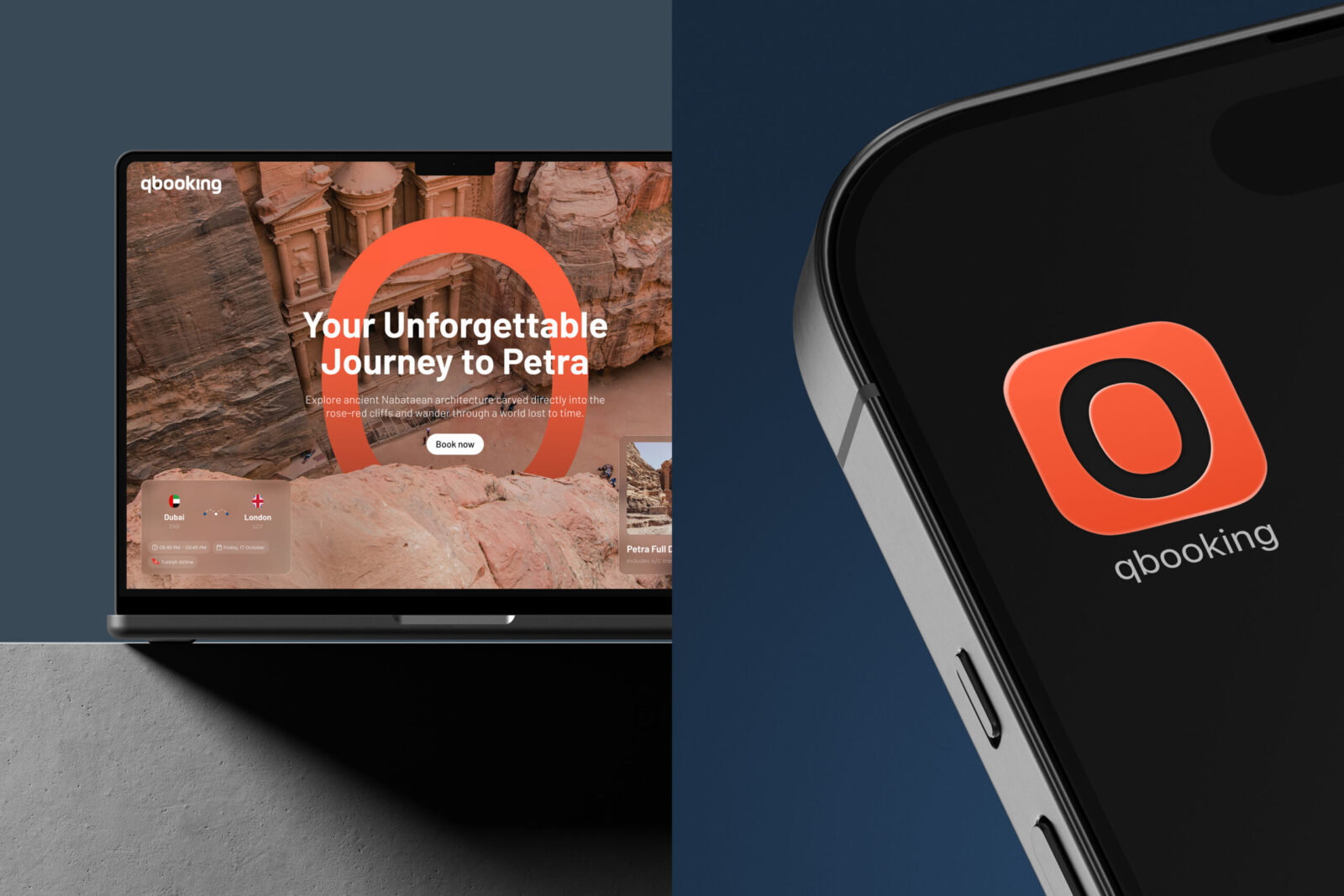
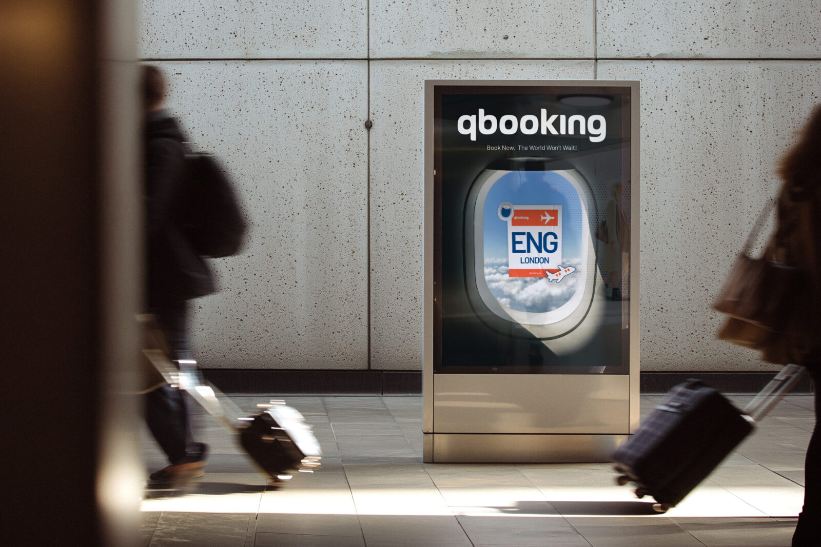
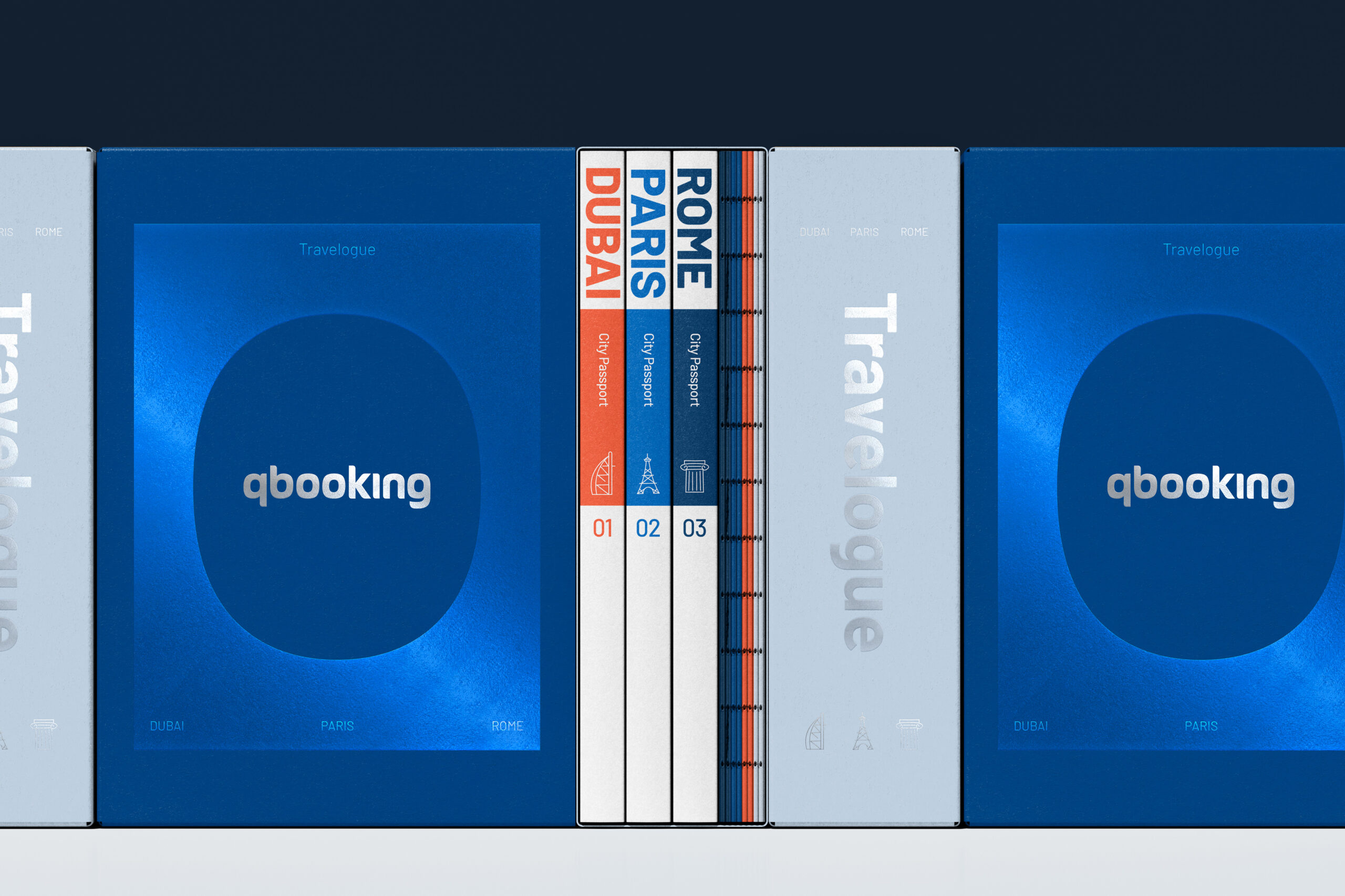
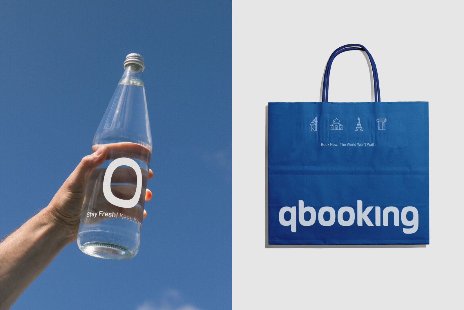
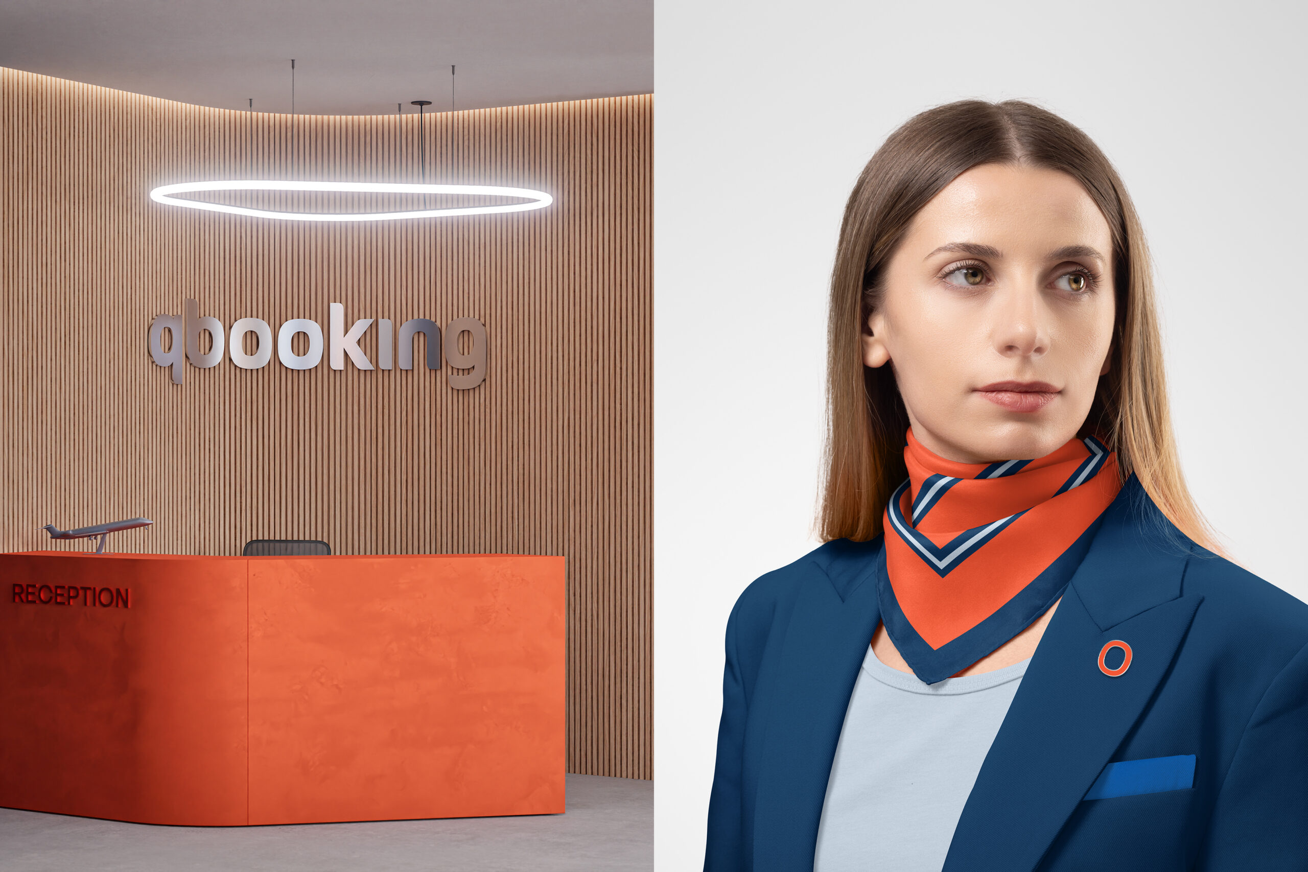
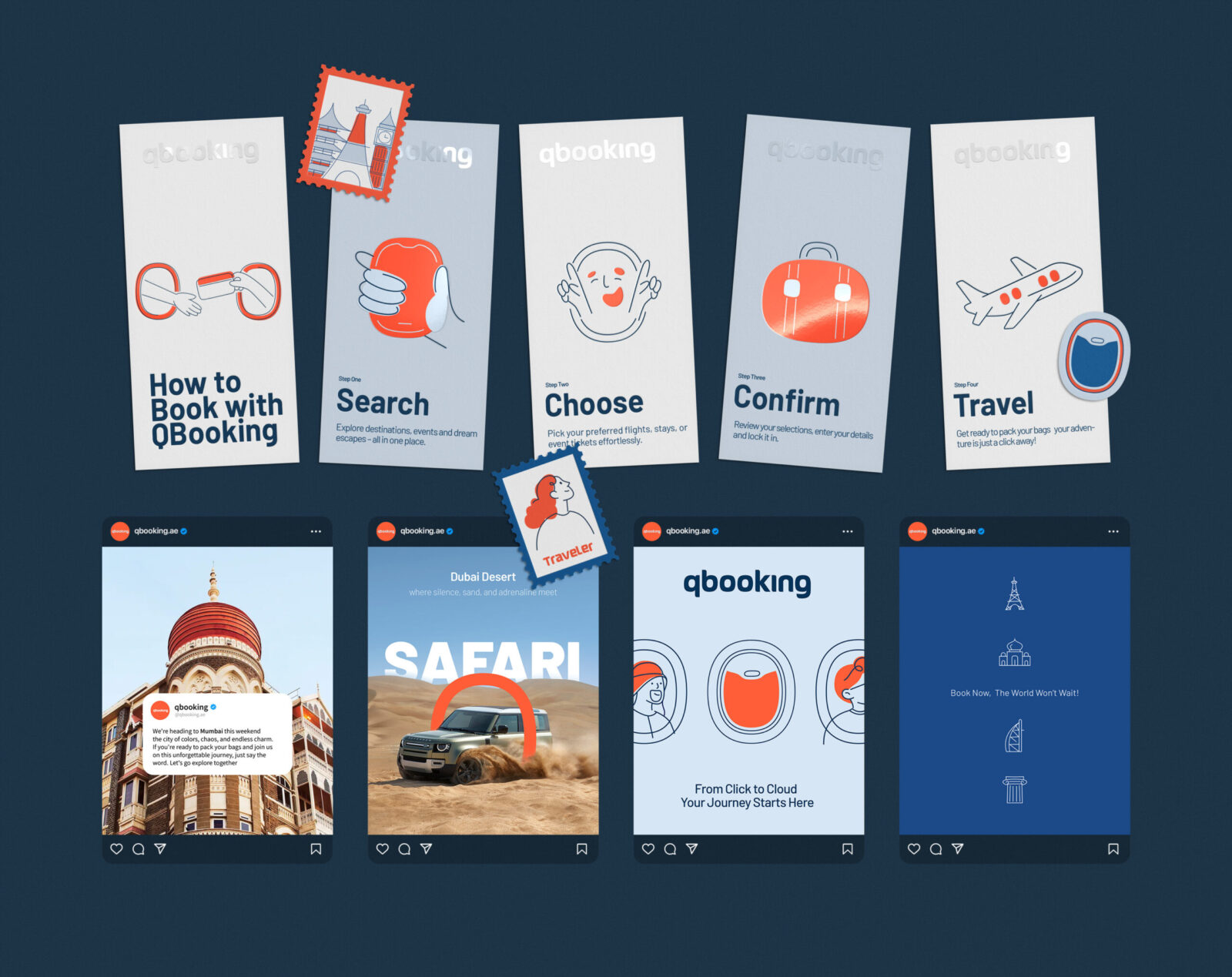
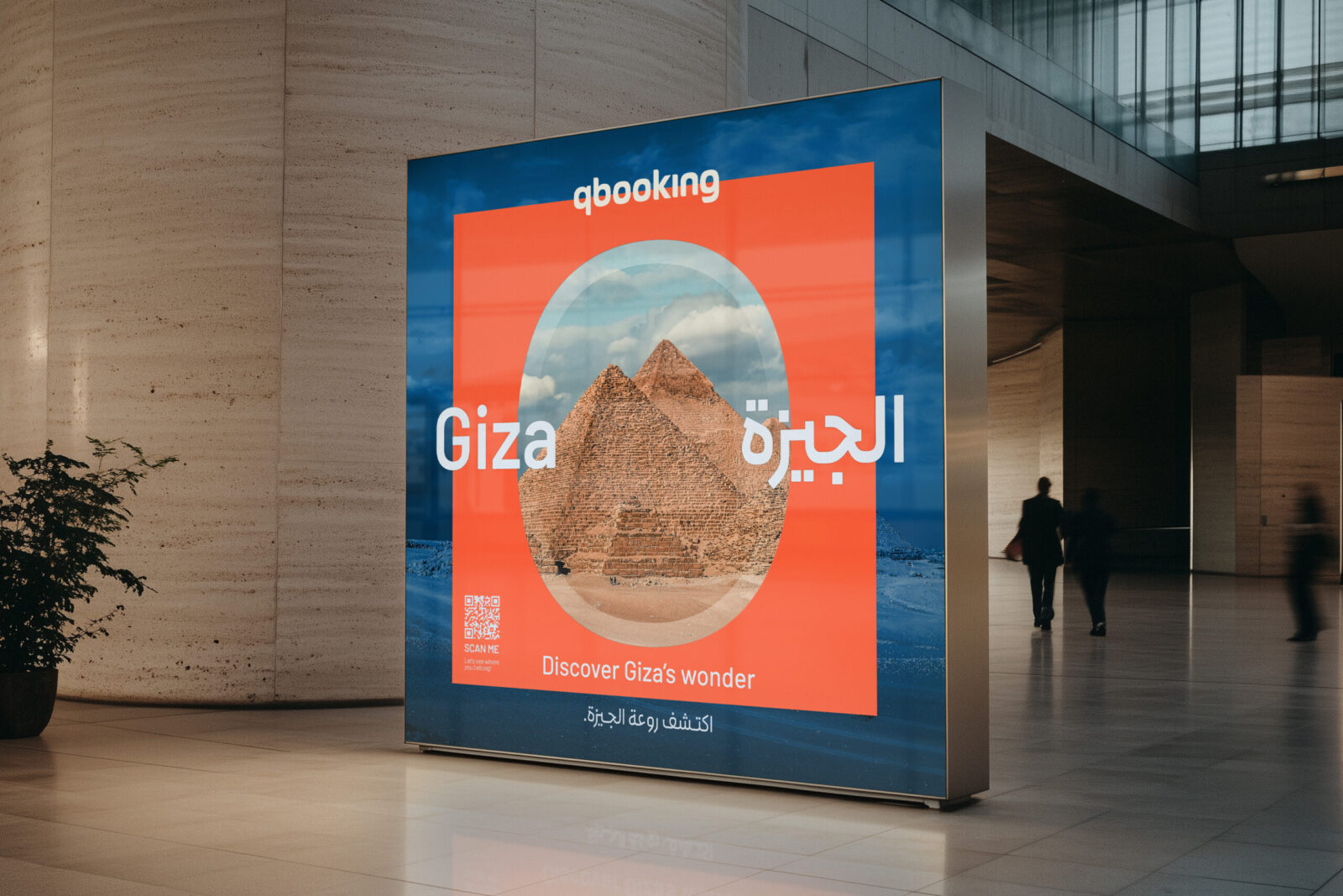
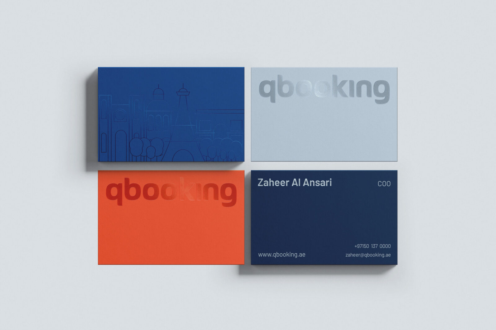
This led us to the core visual concept: the airplane window. It is a universally recognized frame of travel; an icon of anticipation, transition, and perspective. We extended this form into the logotype, the visual language, and an expandable set of icons and signs. The form of airplane windows is echoed in the logotype of Qbooking, appearing as repeating shapes that evoke rows of aircraft windows. This motif is also present in the Perso-Arabic version of the logotype, ensuring cross-cultural parity across languages. Additionally, the initial letter “Q” is pronounced like the English word queue, meaning a line or row, which adds a clever layer of meaning to the brand’s naming. The window later became more than a motif; it became a structural tool that allowed the identity to appear consistently branded across all the touch points the company relies on.
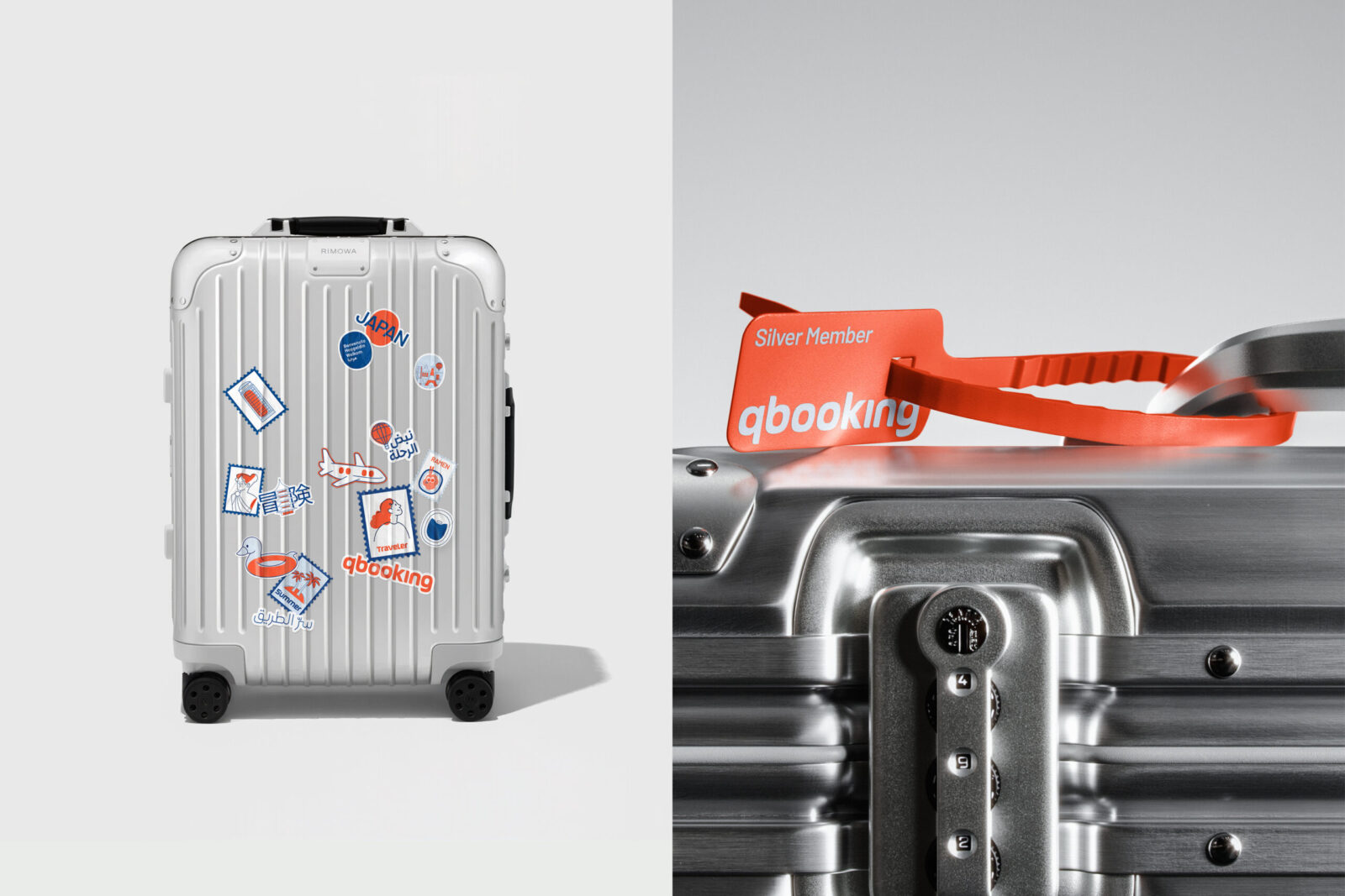
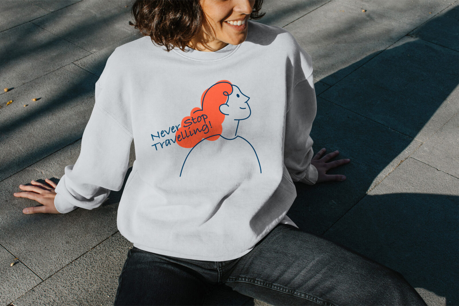
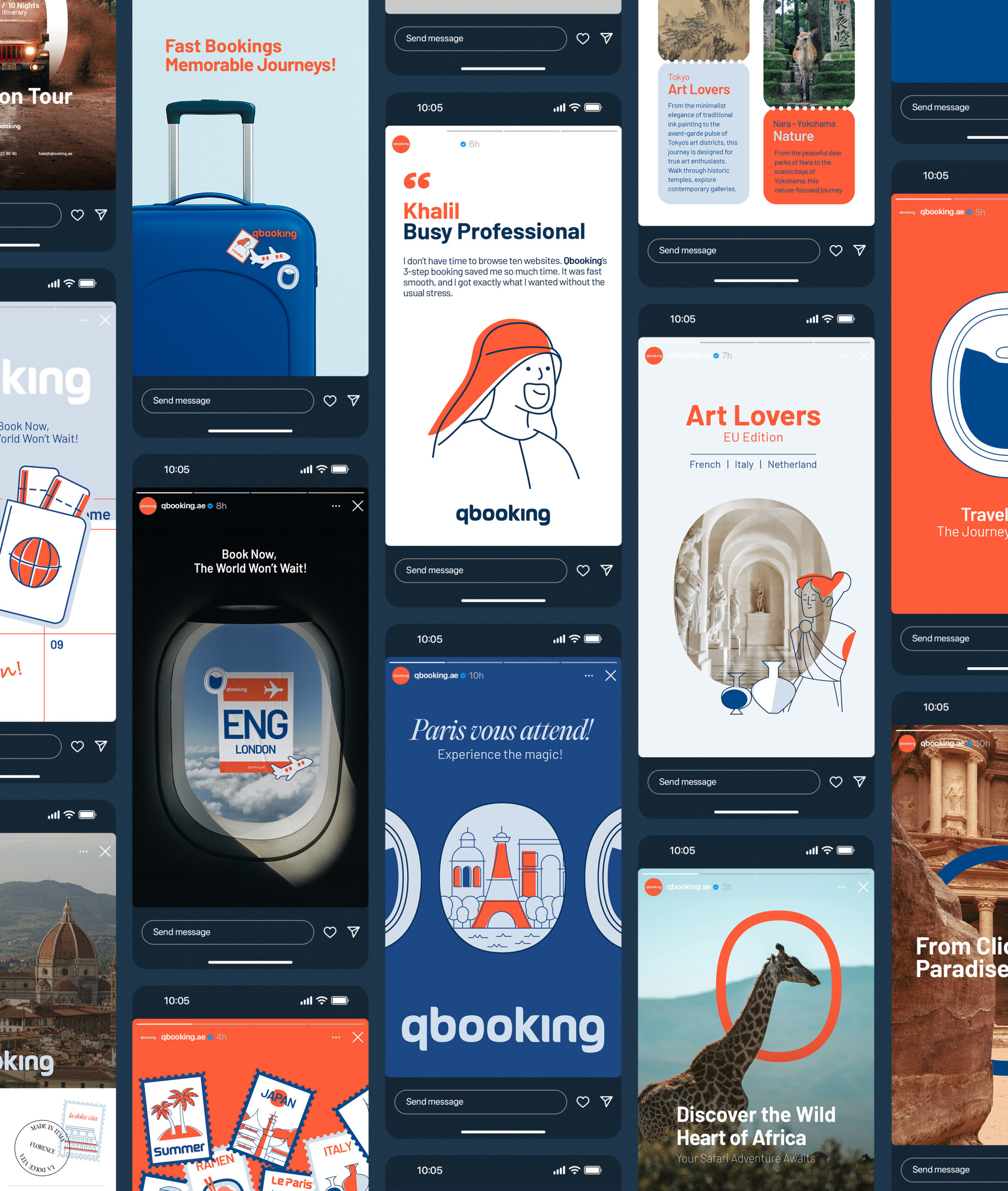
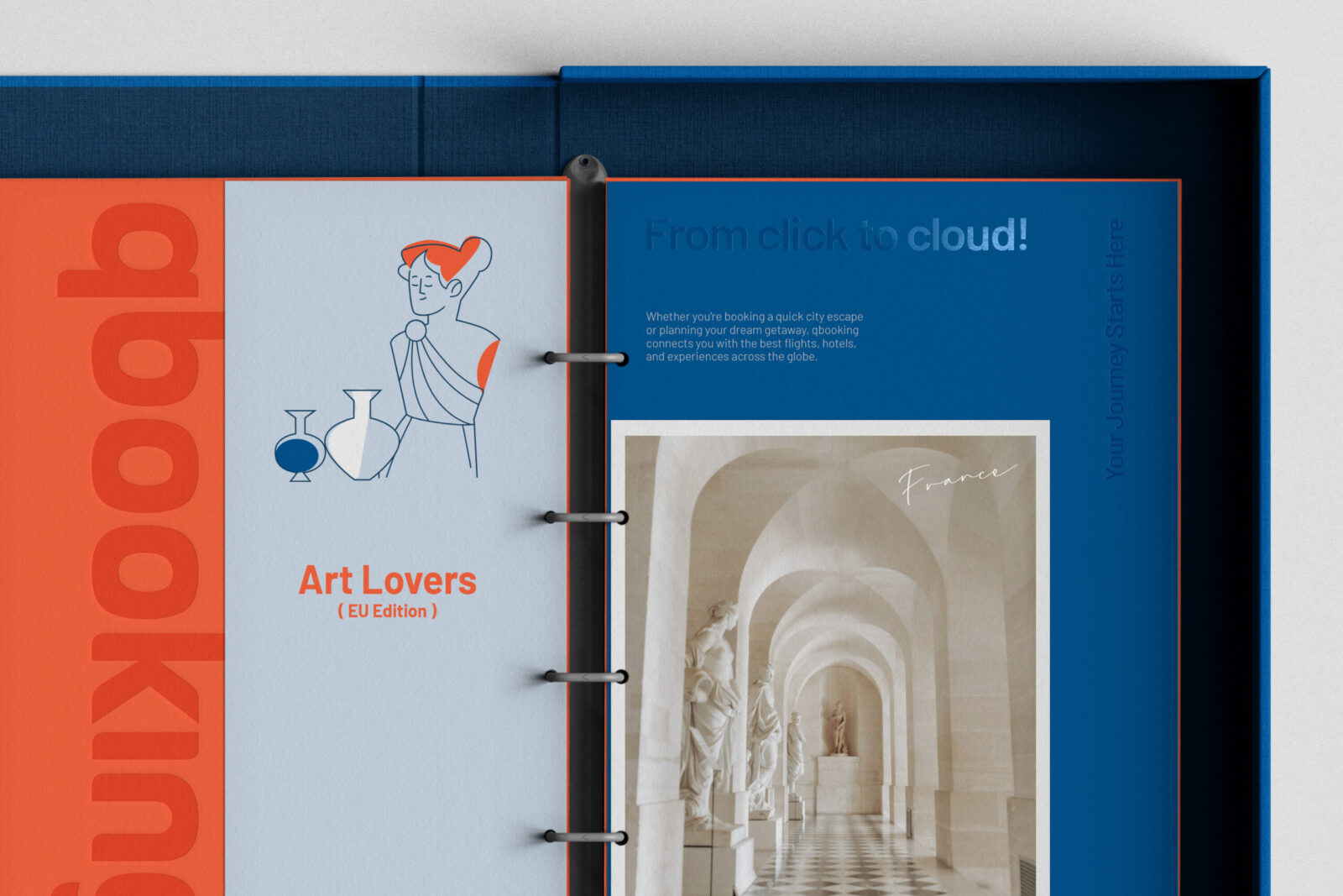
Illustration became another central pillar of the identity system. We created modern, minimal illustrations that reflect modern-day travel sensibilities: clean, optimistic, and easy to interpret within fast digital environments. This illustrative direction helped articulate the character of the brand and the clarity of its services, especially for audiences interacting with the platform at high speed and high frequency.
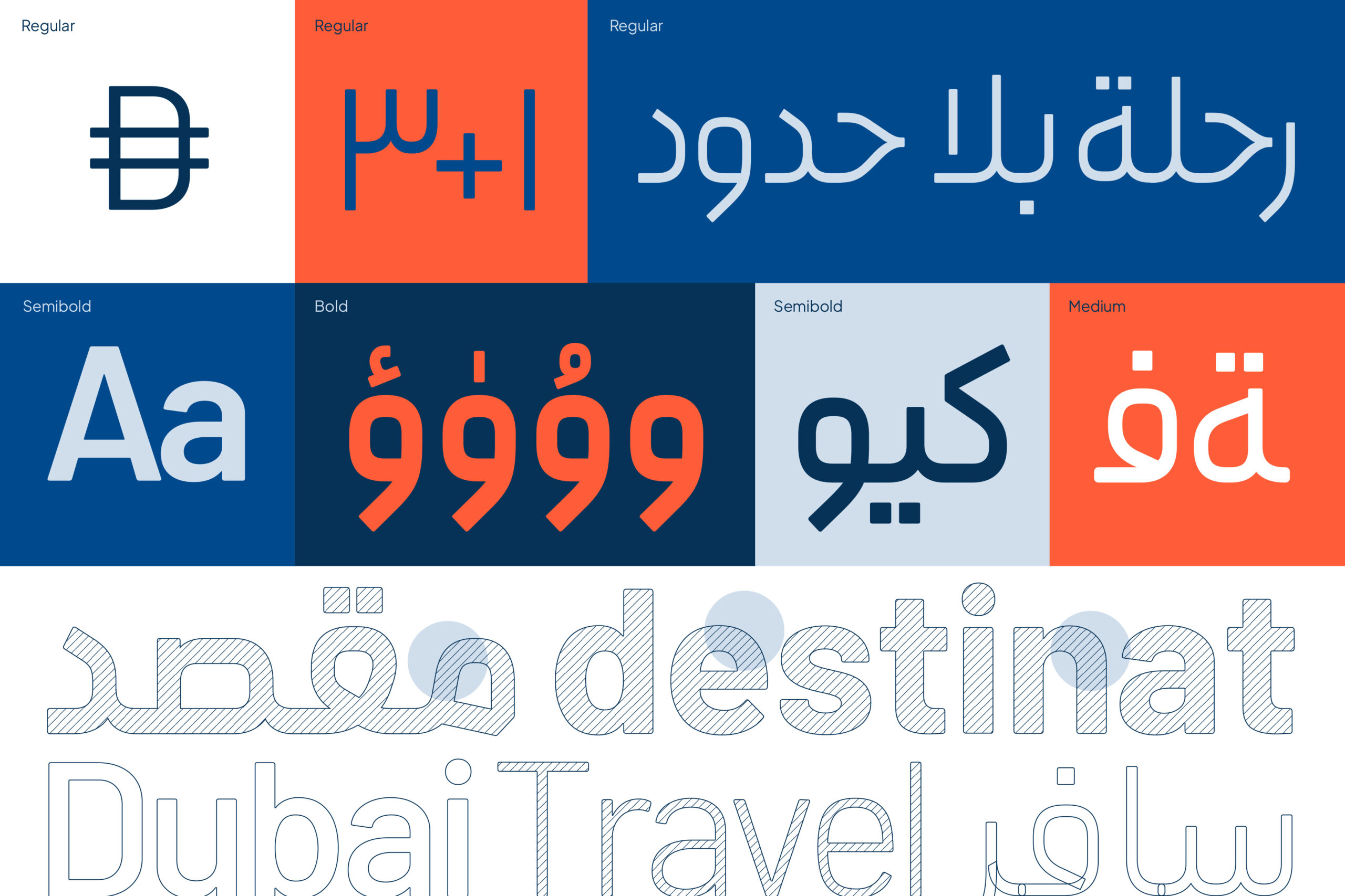
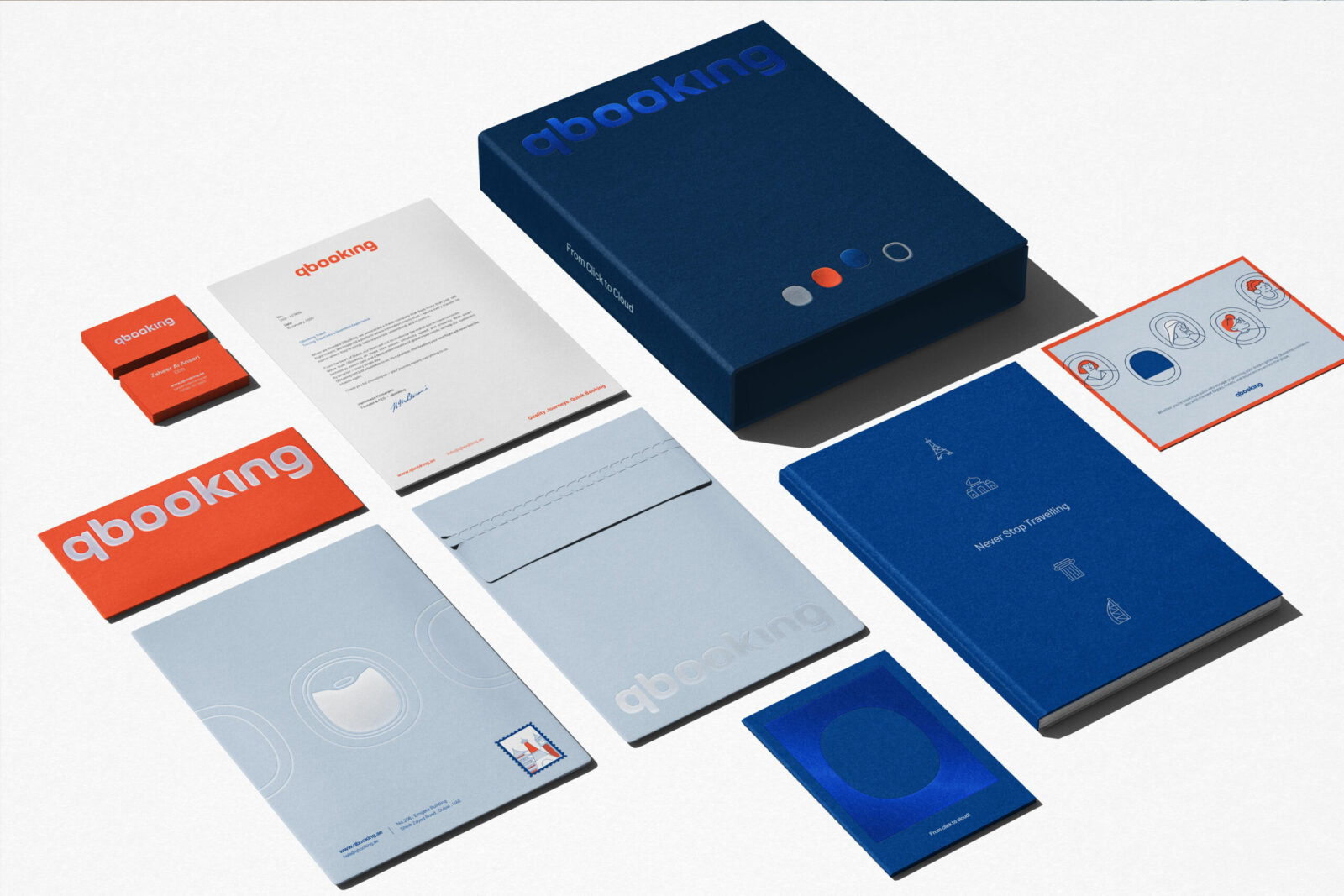
Since a significant portion of Qbooking’s audience is based in the GCC region, we designed an Arabic typeface to ensure linguistic and visual coherence across markets. The color palette, primarily blue and orange, was selected with intention. Blue communicates trust, reliability, and calm, qualities essential for a transport-focused brand. Orange provides balance and energy, supporting the narrative of exploration and the spirit of travel.
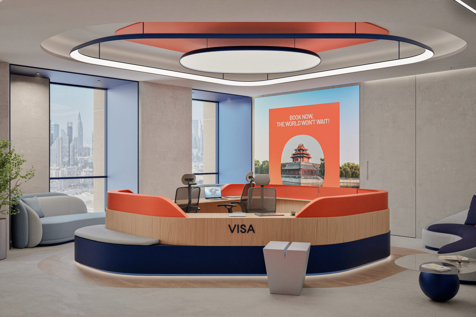
Qbooking was, in every sense, a large-scale project. Beyond the core identity, we designed the interior environment of the UAE office, as well as B2B and B2C interfaces for the brand’s digital platforms. The result is a cohesive identity that extends beautifully across brand merchandise.
With this visual system, Qbooking has built a stronger emotional connection with its audience; particularly younger travelers who value a sense of adventure and has established a more expressive and memorable presence in a competitive market.
CREDIT
- Agency/Creative: A4DH Branding Services
- Article Title: A4DH Branding Services Introduces a Distinctive Window-Led Identity for Qbooking’s Global Travel Experience
- Organisation/Entity: Agency
- Project Status: Published
- Agency/Creative Country: United Arab Emirates
- Agency/Creative City: Dubai
- Market Region: GCC
- Project Deliverables: Art Direction, Brand Creation, Brand Design, Brand Experience, Brand Guidelines, Brand Identity, Brand Strategy, Branding, Design, Graphic Design, Illustration, Interior Design, Logo Design, Motion Graphics, User Experience, Web Design
- Industry: Transport
- Keywords: WBDS Agency Design Awards 2025/26 Brand identity, Branding, Brand Redesign, Creative Design, Visual Identity, Visual Language, Logo Design, Graphic Design, Web Design, Illustration
-
Credits:
Creative Director: Mehdi Javadinasab
Design Director: Amir Asgharzadeh
Designer: Nasrin Dashti
Designer: Mehdi Javadinasab
Designer: Amir Asgharzadeh
Designer: Matin Etedal
Designer: Mohammad Reza Rad
Motion Designer: Pariya Tabrizi
Ui Designers: Fatemeh Abbasi, Mohammad Rajabi
Typeface Designer: Kamyab Jafari
Interior Designers: Taha Mohammadi, Mehdi Javadinasab
Project Manager: Zahra Hashemi
Account Director: Baha Khatambakhsh
Account Manager: Kamand Khorasani
Public Relations: Ghazal Babajani


