


Dero: Harvesting a Fresh Take on Bakeries in Iran
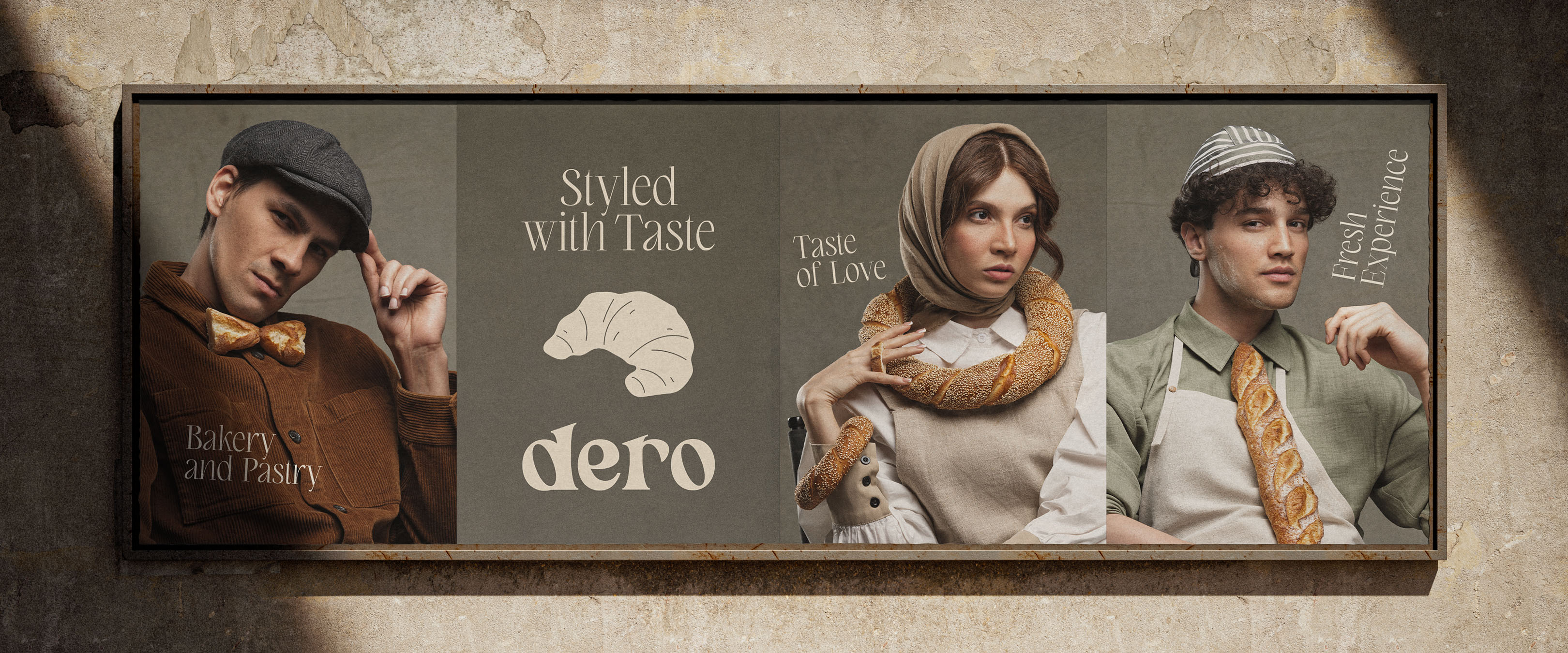
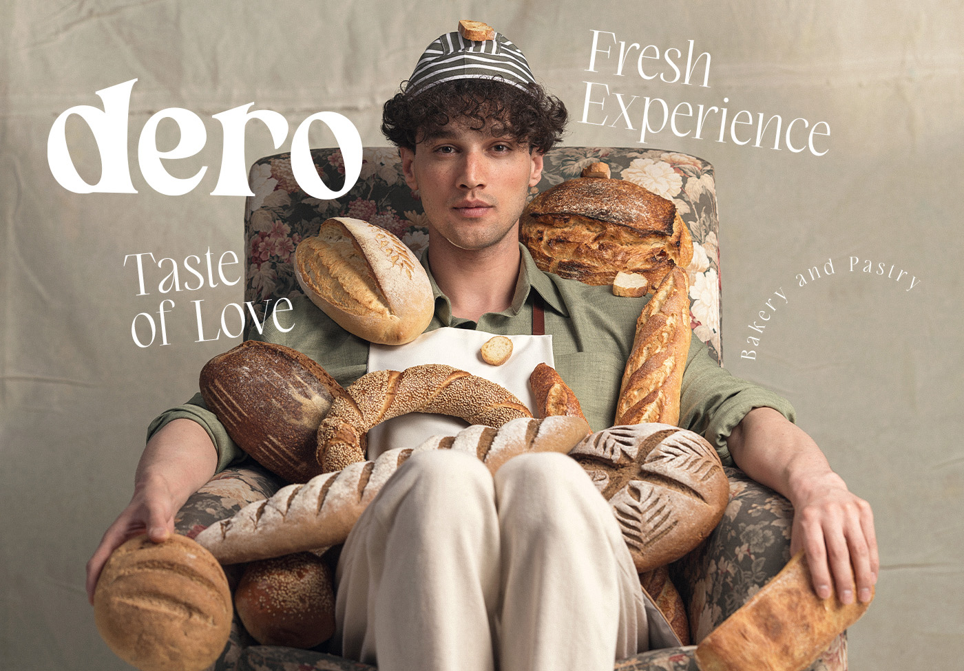
The project’s name means “to harvest” in Persian language. The client wanted to tap into the growing bakery trend in Iran by offering specialty, artisanal bread while maintaining a playful, modern, and approachable image. The goal was to cultivate a space where customers feel at ease, while fostering an atmosphere of warmth, connection, and vibrancy.
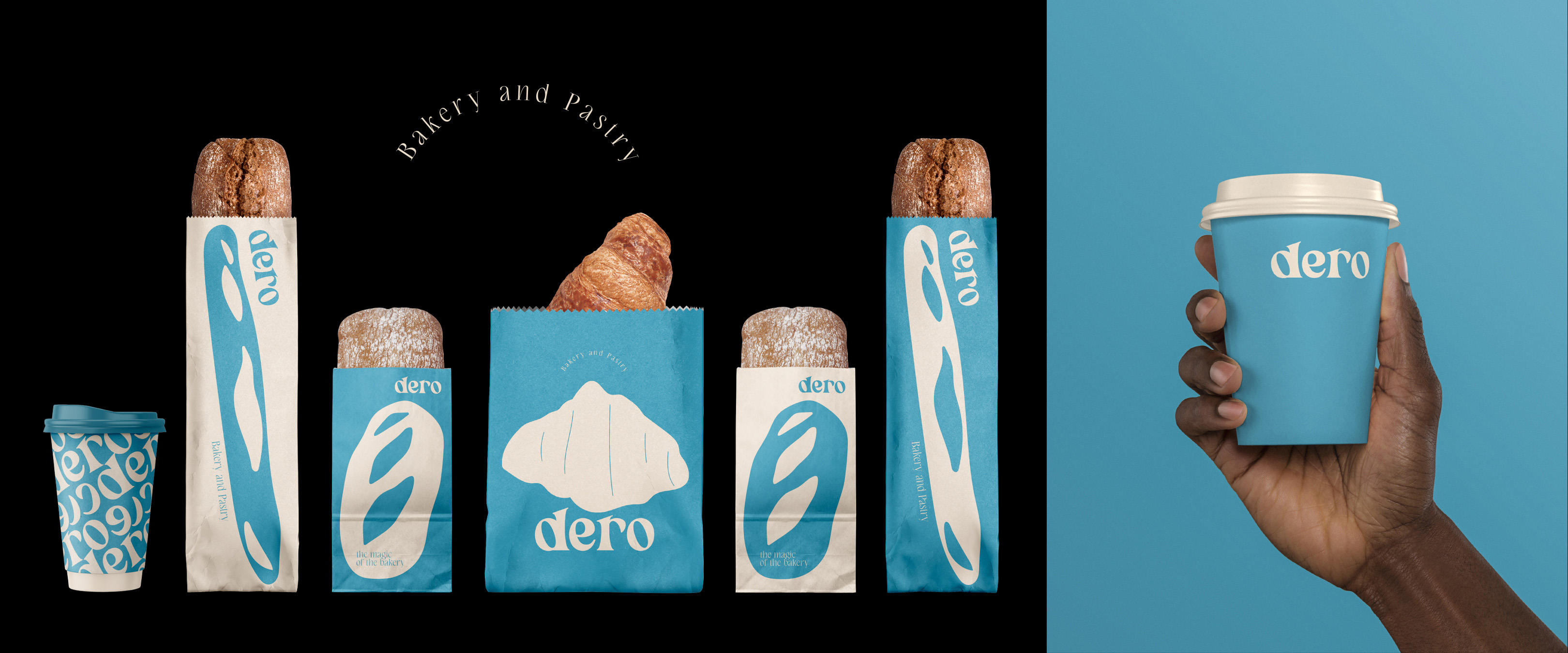
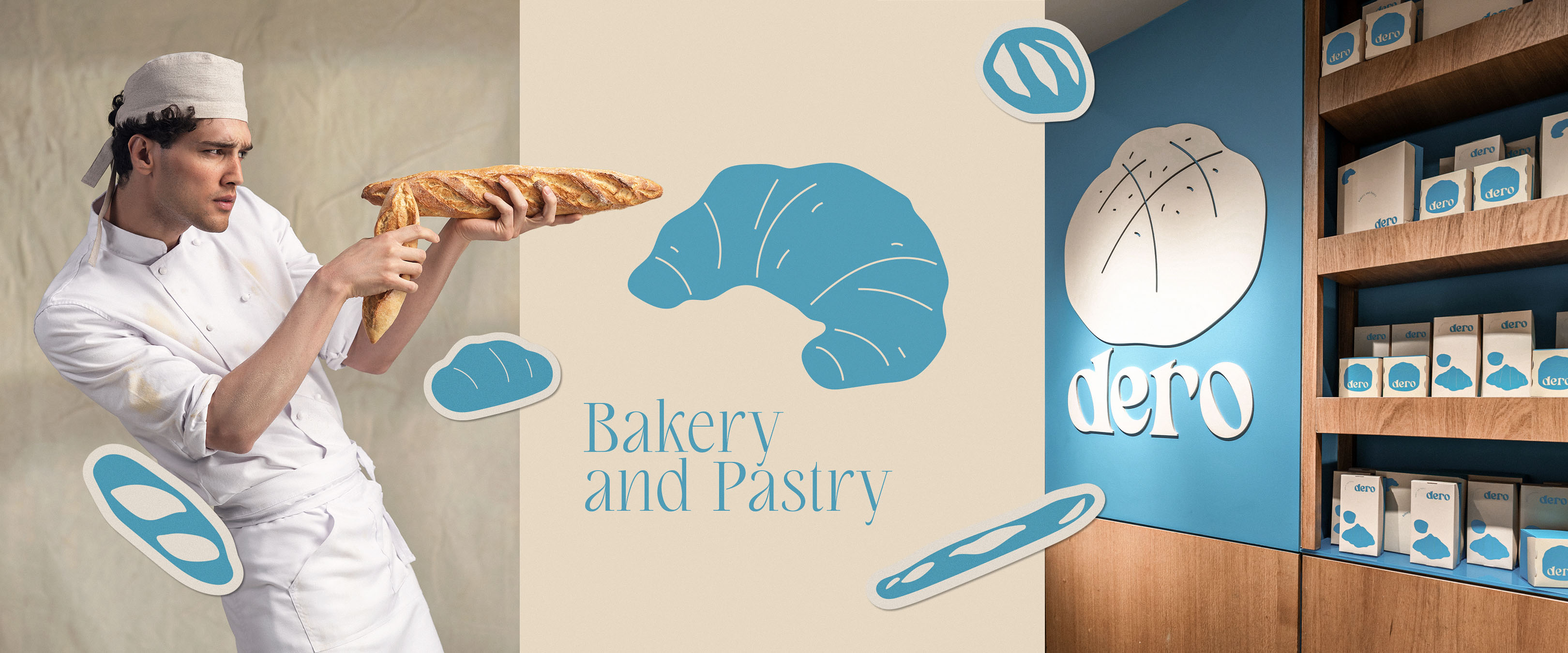
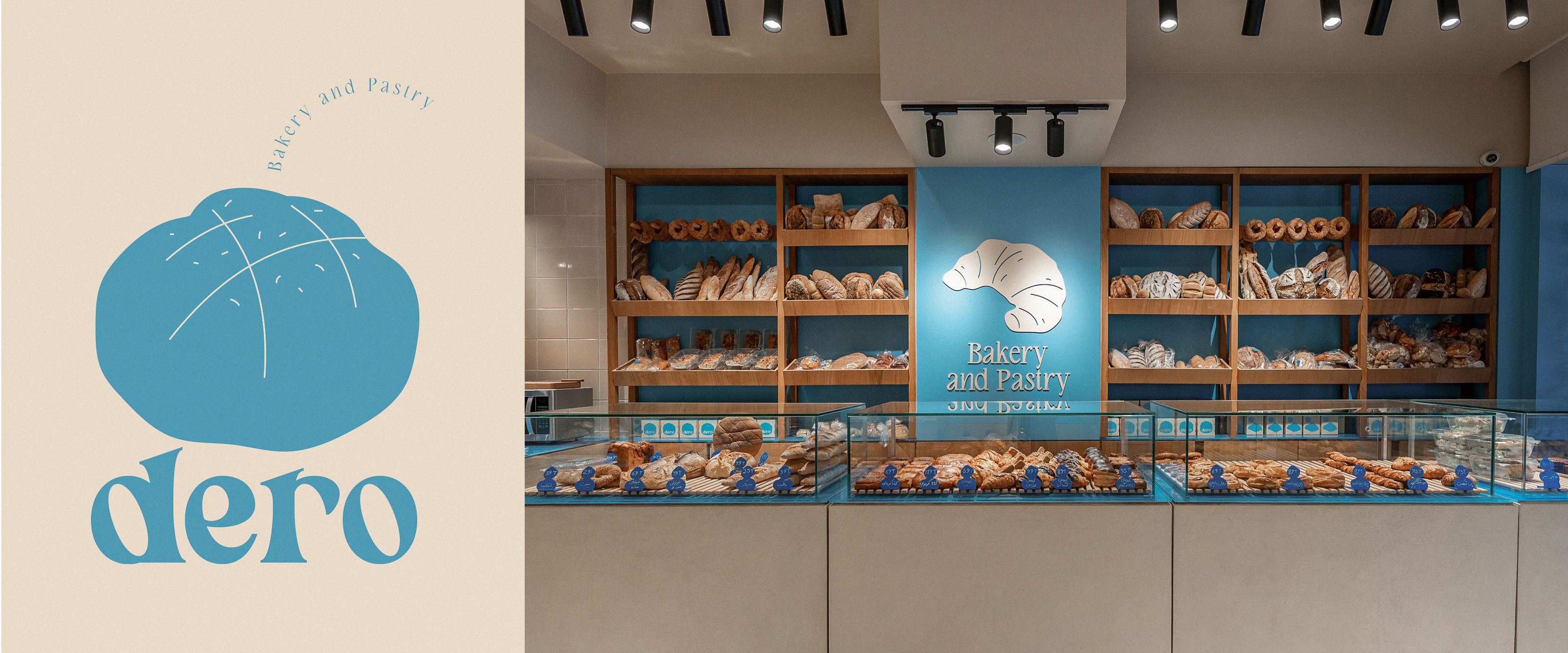
Their vision? To create a simple yet dynamic concept where each branch, while preserving core visual identity elements, has its own distinct color. The flagship store, for instance, adopted blue; a sharp, iconic shade intentionally chosen to break away from the conventional warm, neutral tones often associated with bakeries (think beige, cream, and floury whites).
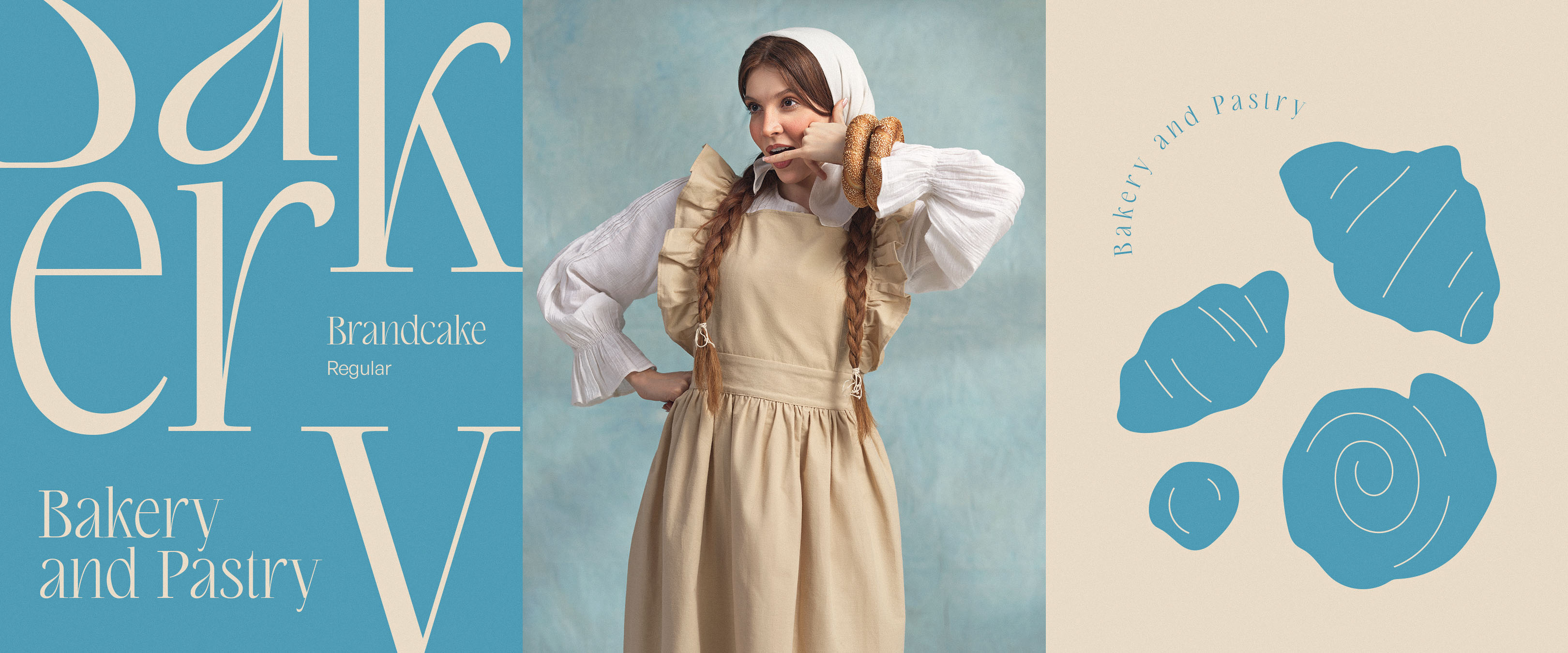
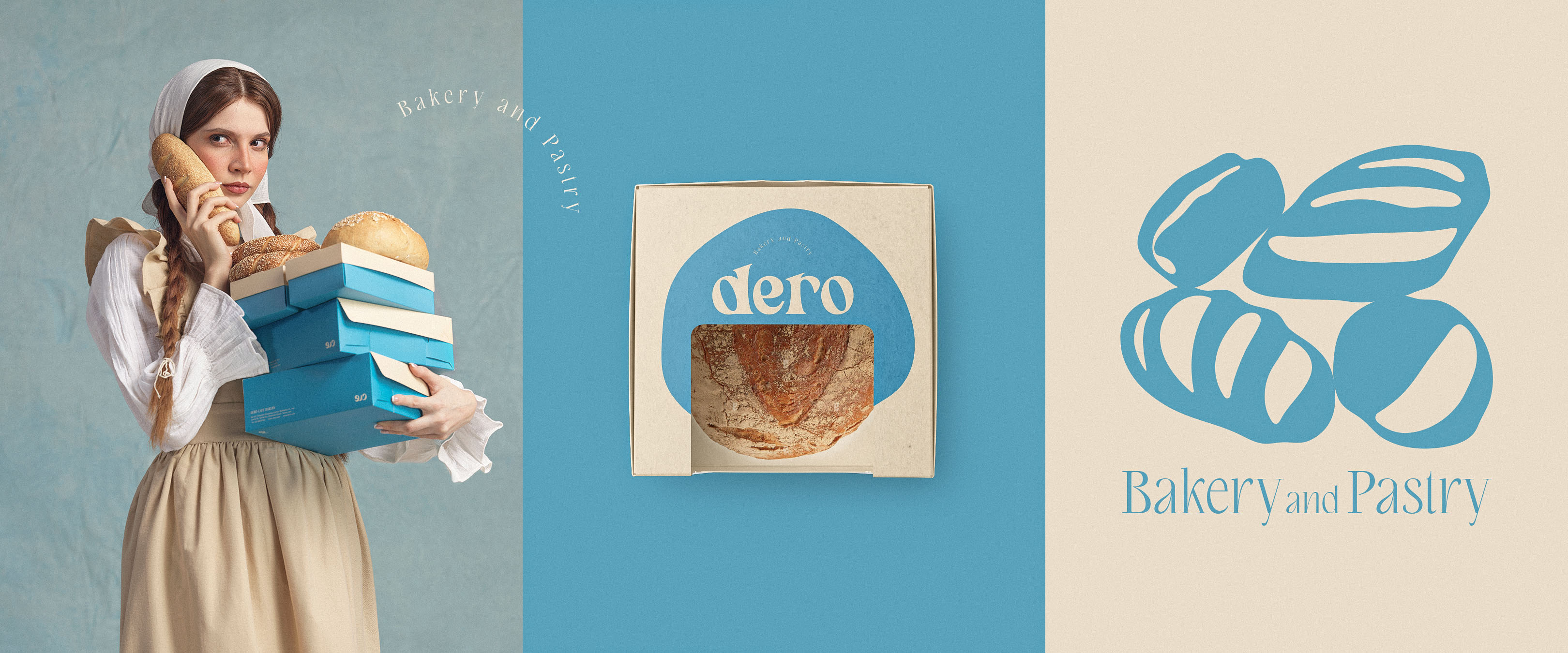
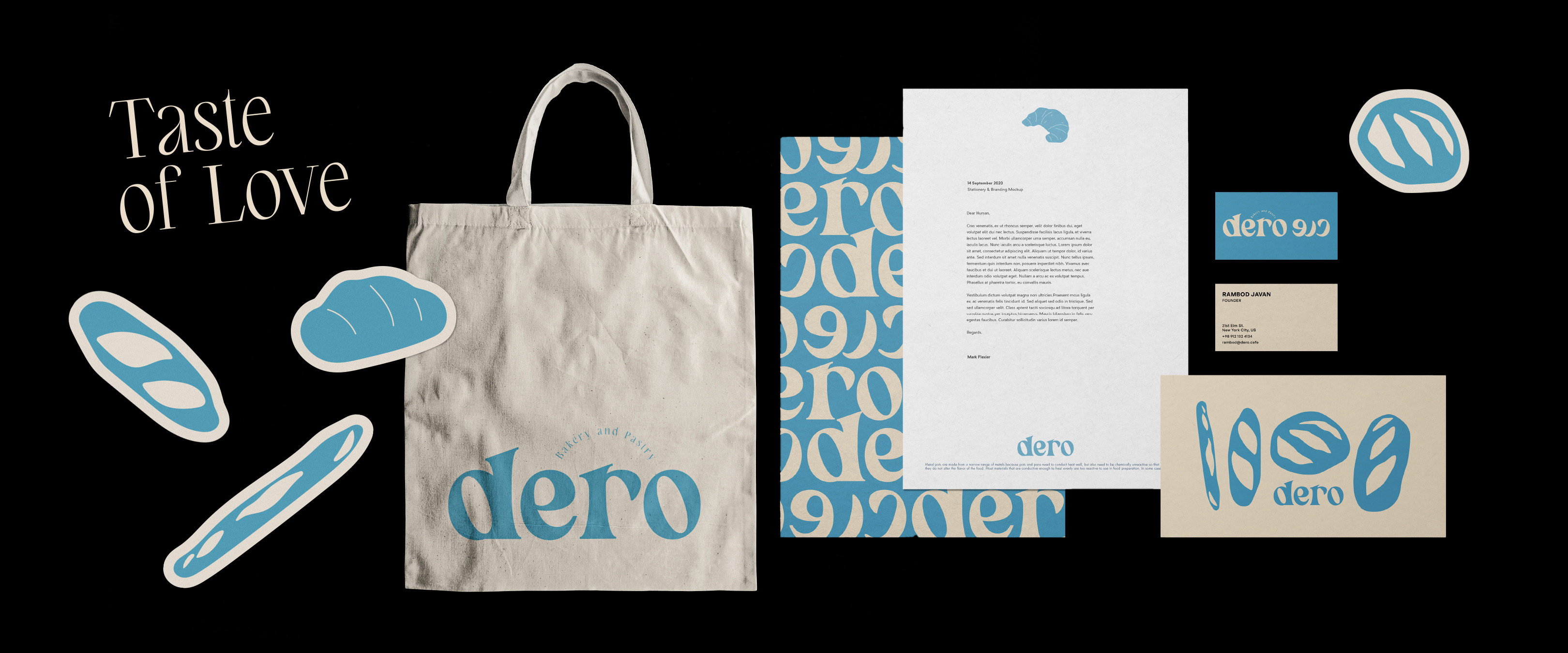
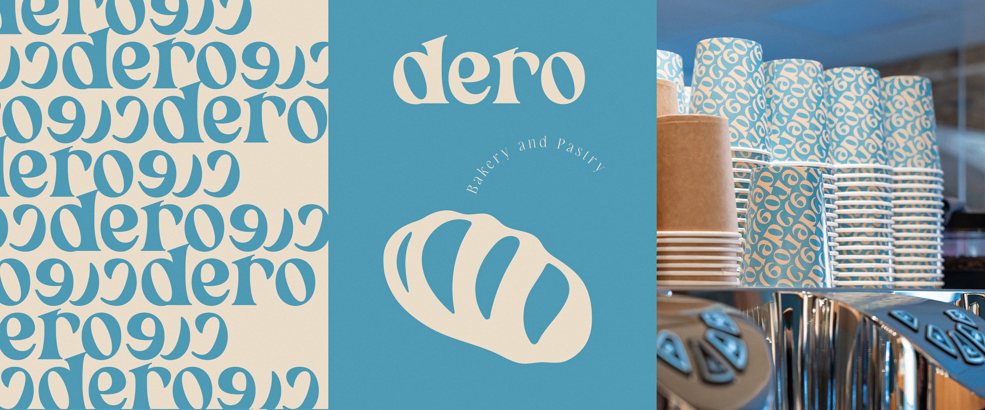
For Dero, we developed a simple, bold logotype paired with a matching Latin typeface. This logotype served as the foundation for creating a versatile pattern, which became a key element in packaging design as well.
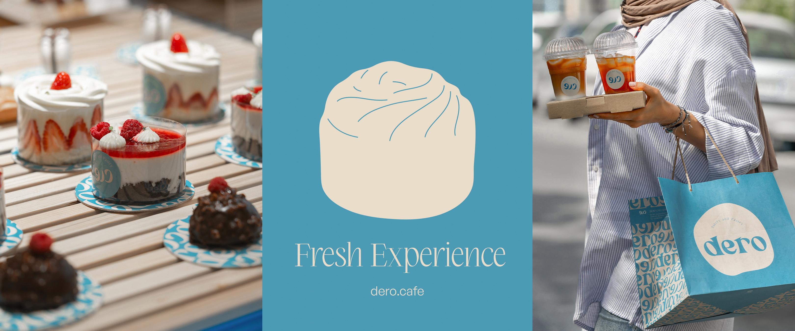
To enhance the playful yet minimalist identity, we also created a series of simple, charming illustrations designed to evoke a sense of temptation and encourage purchases, all while keeping the aesthetic fresh, modern, and minimal to align with the tastes of younger audiences.
To stand out in the market, we incorporated relatively sharp, unconventional colors, an unexpected but intentional choice in the bakery industry.Our strategy extended to creating images and visuals that convey warmth, coolness, and a sense of ease, with a subtle touch of humor. The overarching goal was to craft a clean, understated, yet dynamic brand identity that could flexibly meet the diverse needs of the business while remaining memorable and engaging.
In less than a year, Dero successfully opened its second branch, this time in a larger space, while maintaining the core identity. To keep the dynamic, adaptable visual concept alive, the new location was distinguished by a fresh pink color scheme.
Dero also quickly established a strong presence on online sales platforms, efficiently reaching and engaging its target audience.
CREDIT
- Agency/Creative: A4DH Branding Services
- Article Title: A4DH Branding Services Breaks Bakery Stereotypes with Dero’s Vibrant Identity
- Organisation/Entity: Agency
- Project Type: Identity
- Project Status: Published
- Agency/Creative Country: United Arab Emirates
- Agency/Creative City: Dubai
- Market Region: Asia
- Project Deliverables: Brand Design, Brand Identity, Branding, Design, Graphic Design, Identity System
- Industry: Food/Beverage
- Keywords: DERO Bakery & Pastry
-
Credits:
Creative Director: Mehdi Javadinasab
Graphic Designers: Mehdi Javadinasab, Vida Valizadeh, Mohammad Rajabi, Nasrin Dashti, Mohammadreza Rad, Sepideh Chamani, Hosna Khakifehlou , Matin Etedal
Design QC: Vida Valizadeh
Motion Designer: Pariya Tabrizi
Ui/Ux Designer: Fatemeh Abbasi
Interior Designer: Mohammadreza Mobini
Project Manager: Zahra Hashemi
Account Director: Baha Khatambakhsh
Account Executive: Hana Khademi
Photography: Elect Studio, Hooman Naffat, Saeed Jafari


