


In the spring of 2022, the design studio Bedow secured the prestigious assignment of redesigning all packaging for the Coop brand across four markets. Now, the first products featuring the new designs are beginning to appear on Coop shelves in Sweden, Denmark, Norway, and Finland.
When the Danish trading company Coop Trading—owned by the four Nordic cooperatives—decided to consolidate four markets and update its packaging design, four Nordic agencies were invited to compete. The Swedish design studio Bedow emerged as the winner. After more than two years of work, an increasing number of store shelves are being filled with the new designs every week.
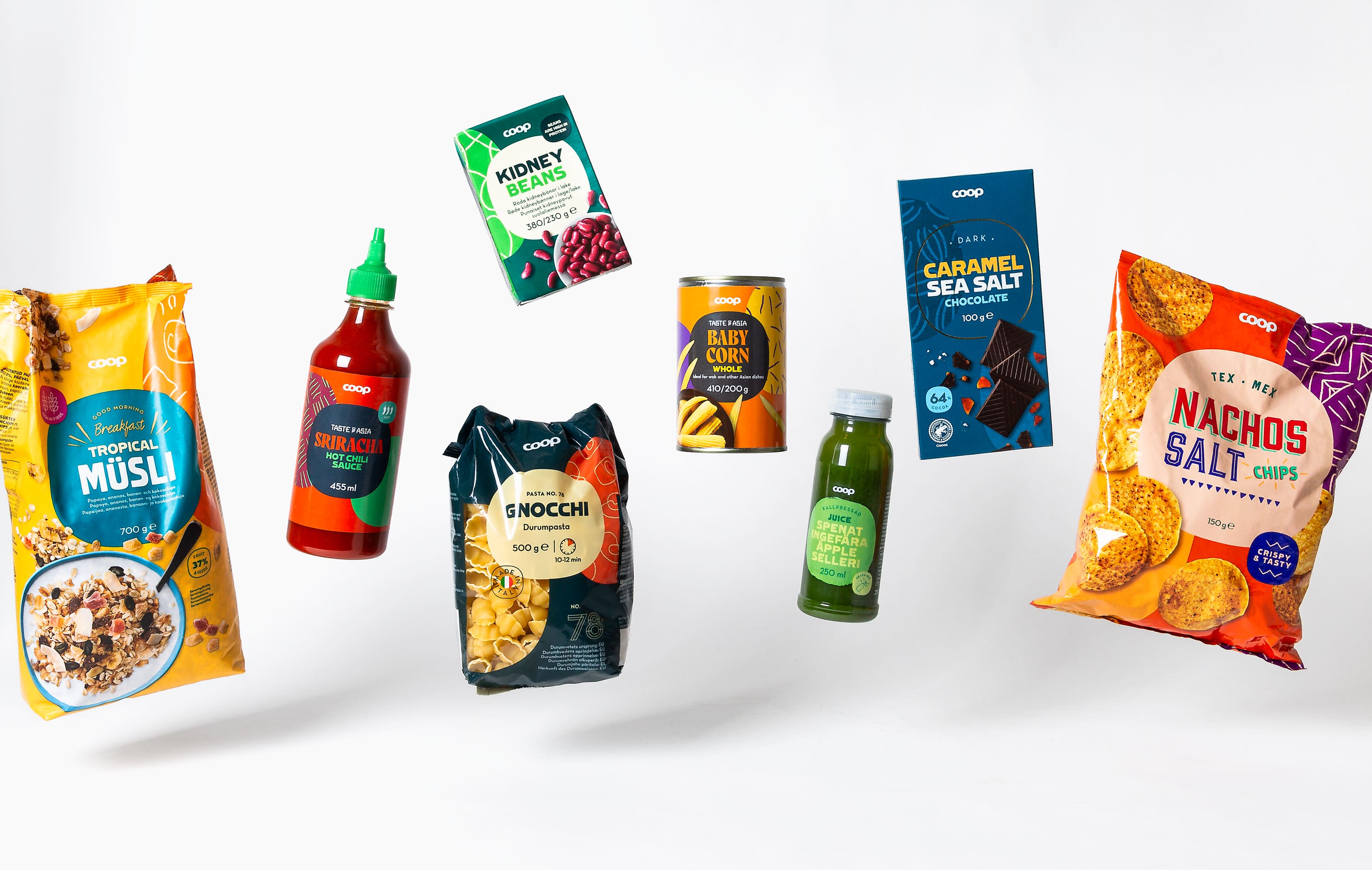
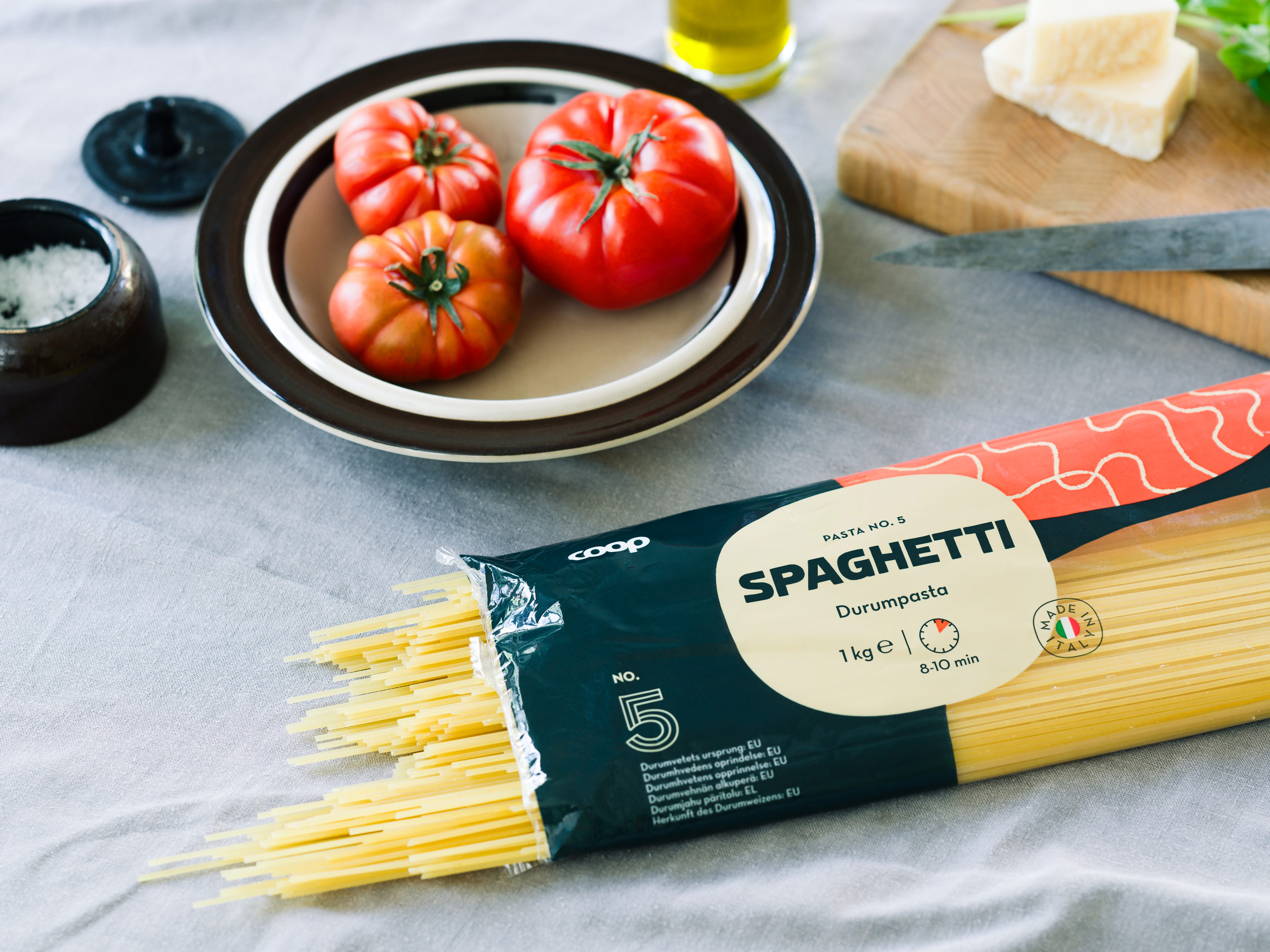
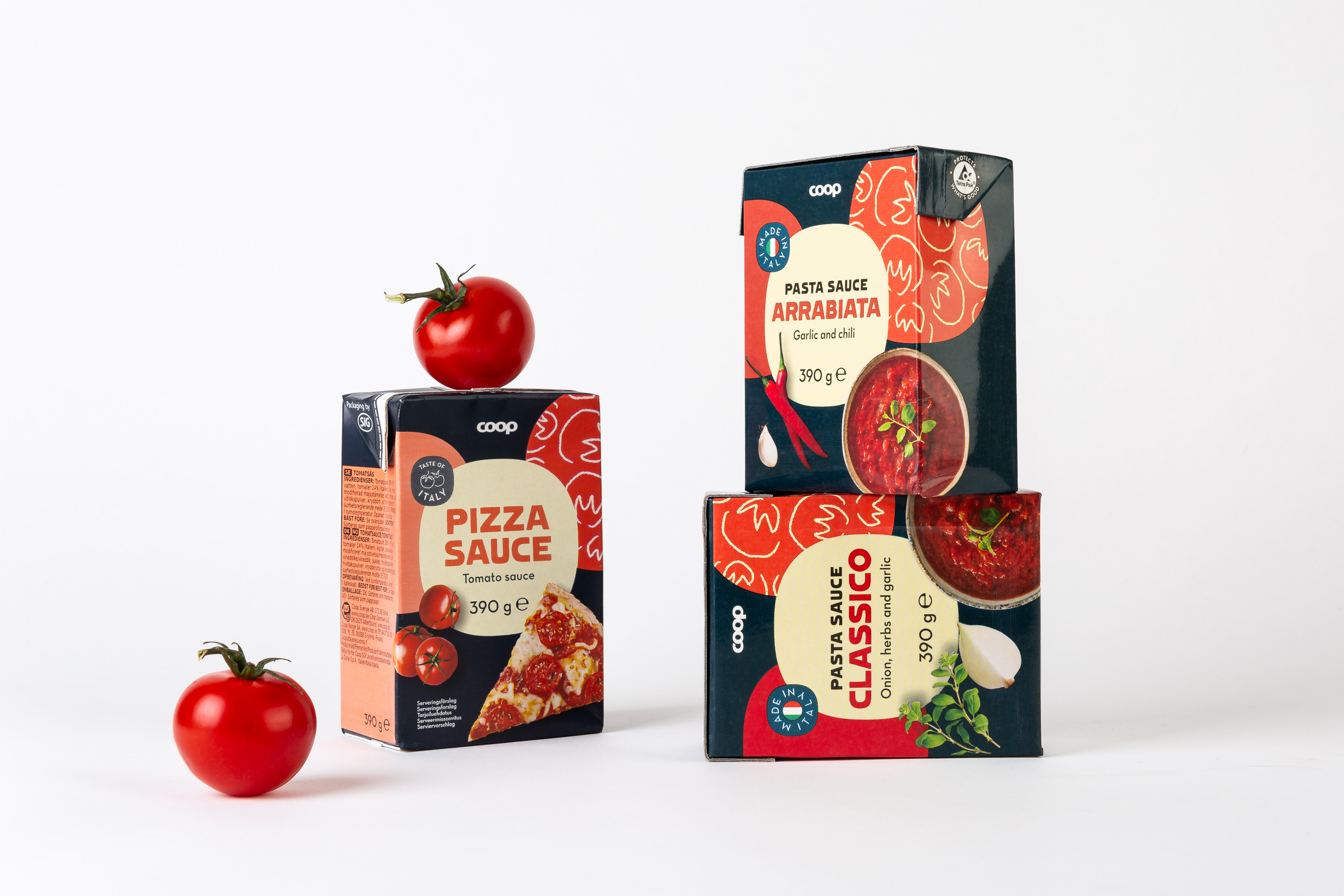
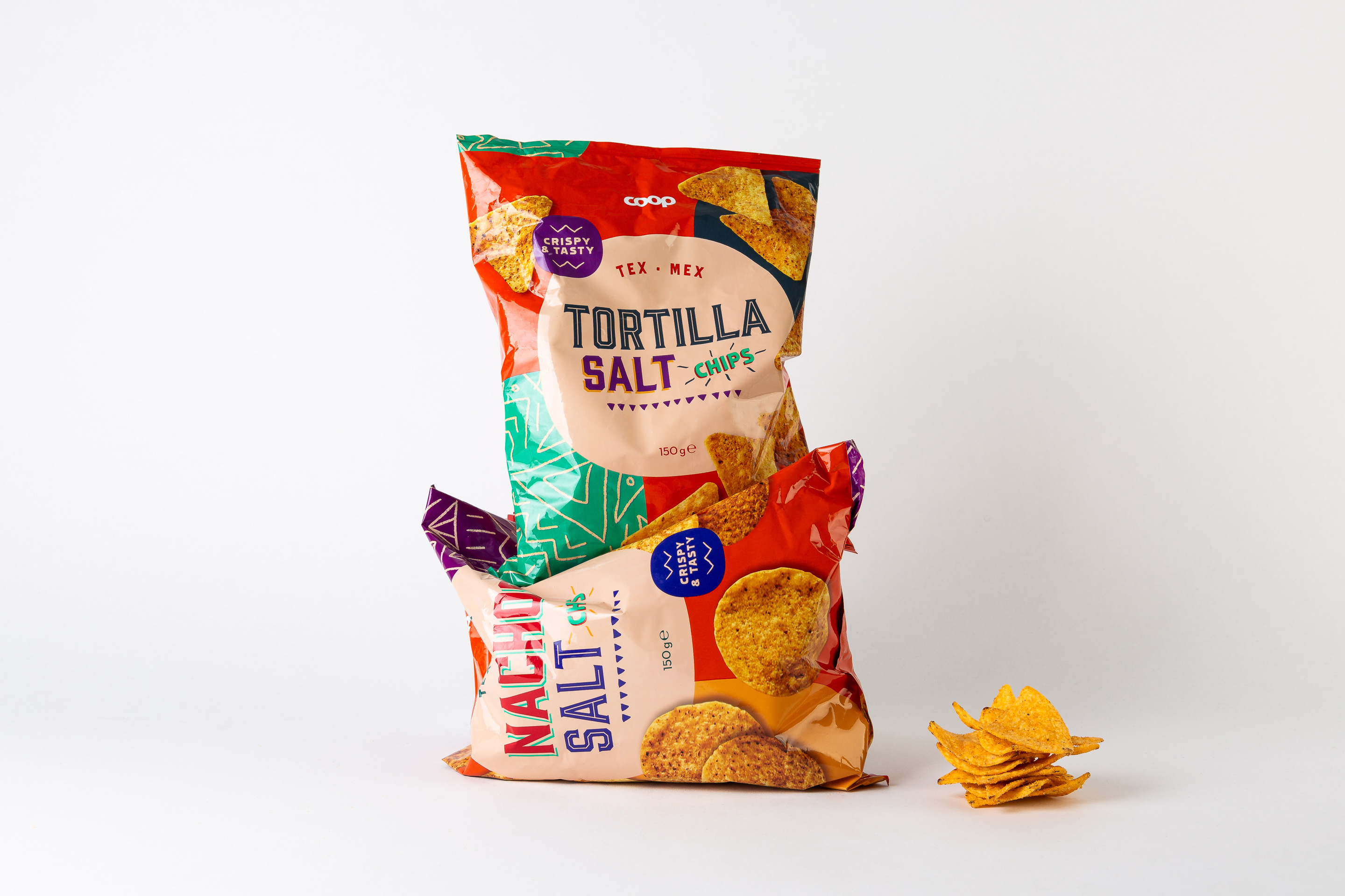
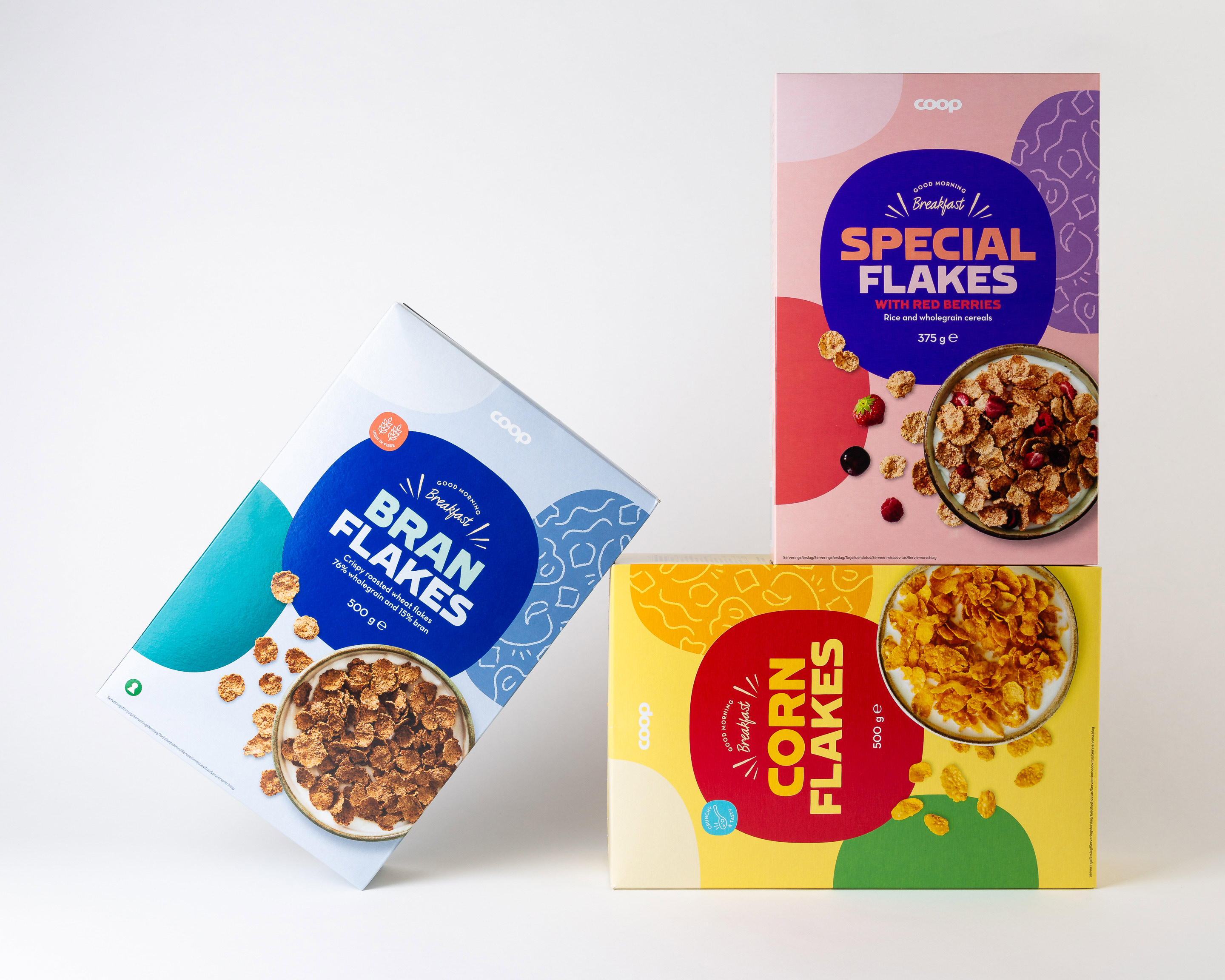
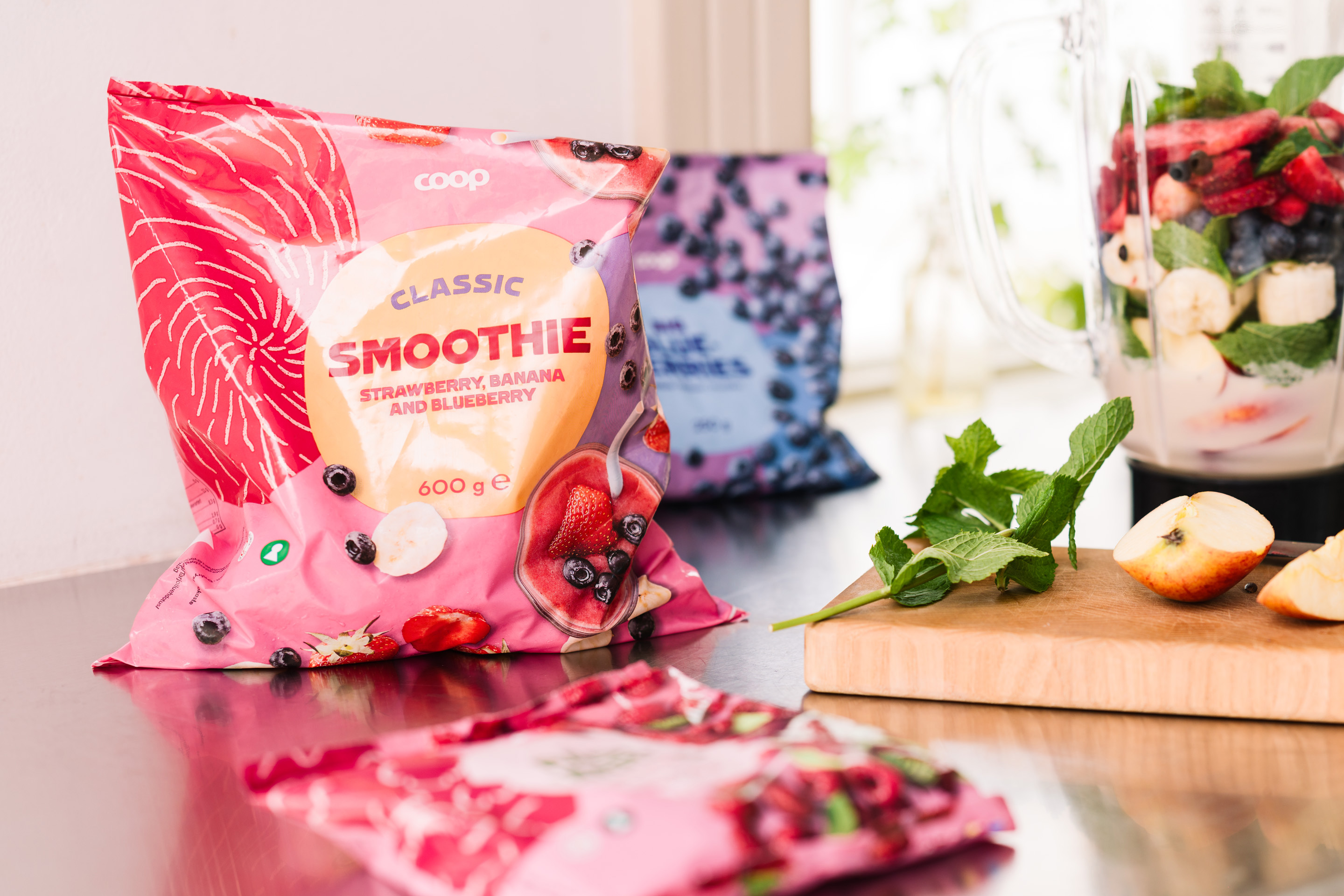
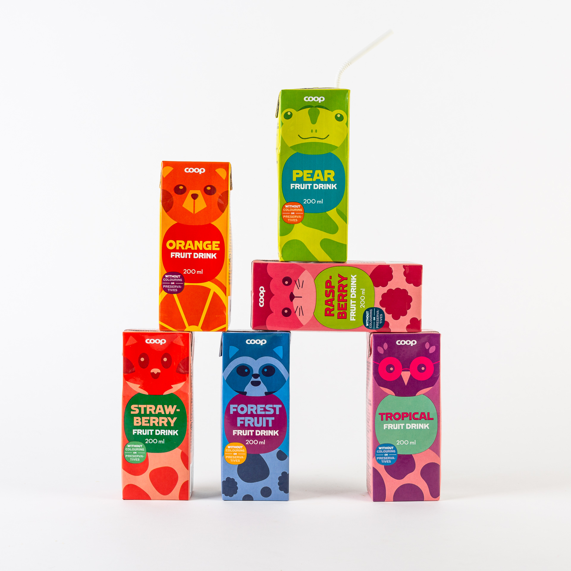
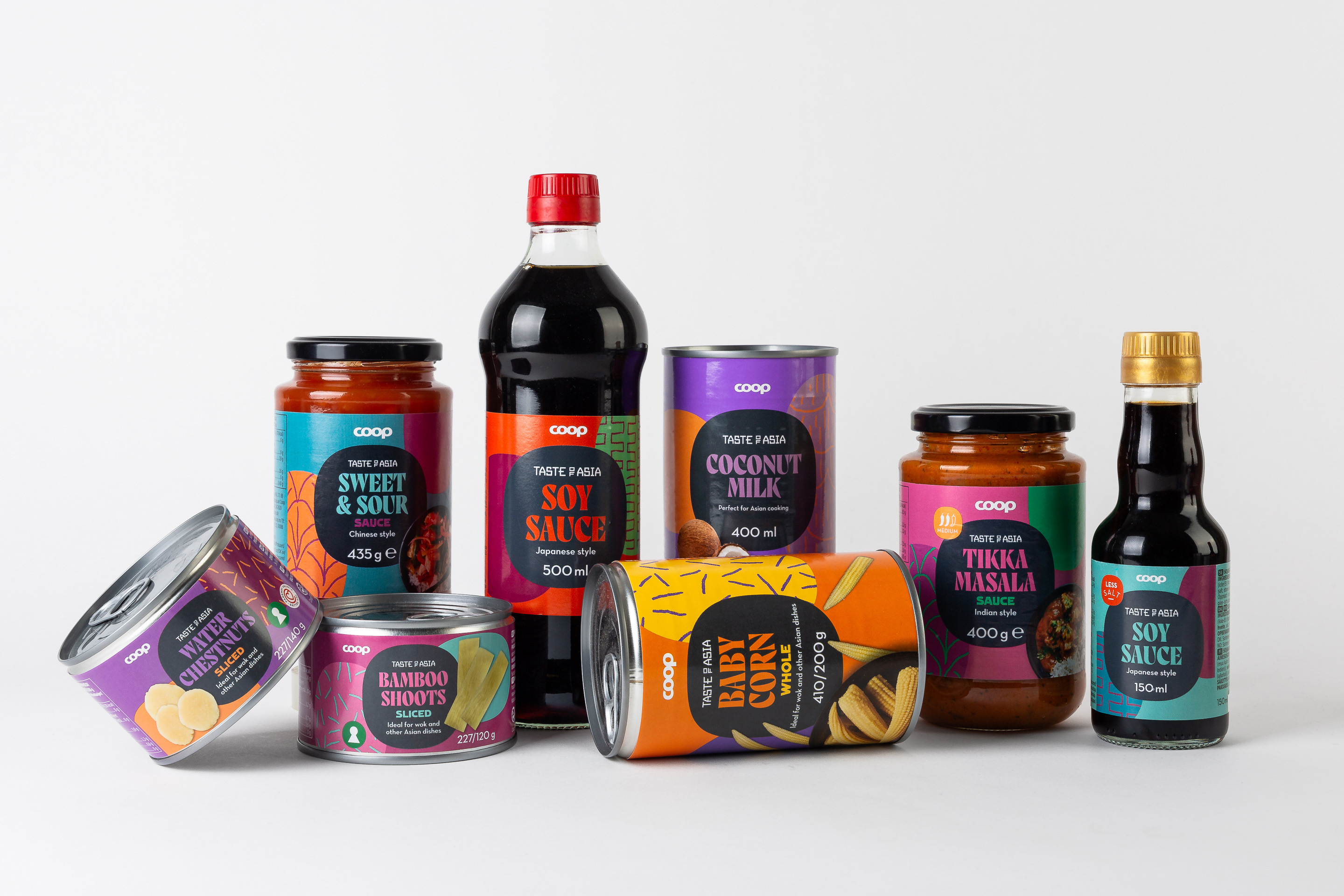
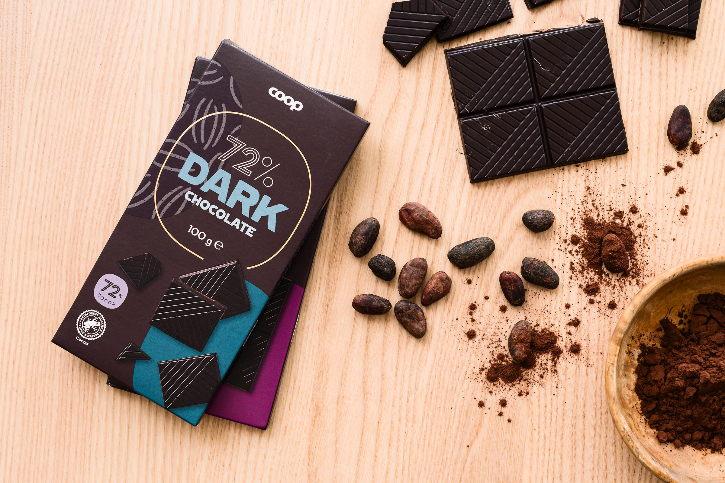
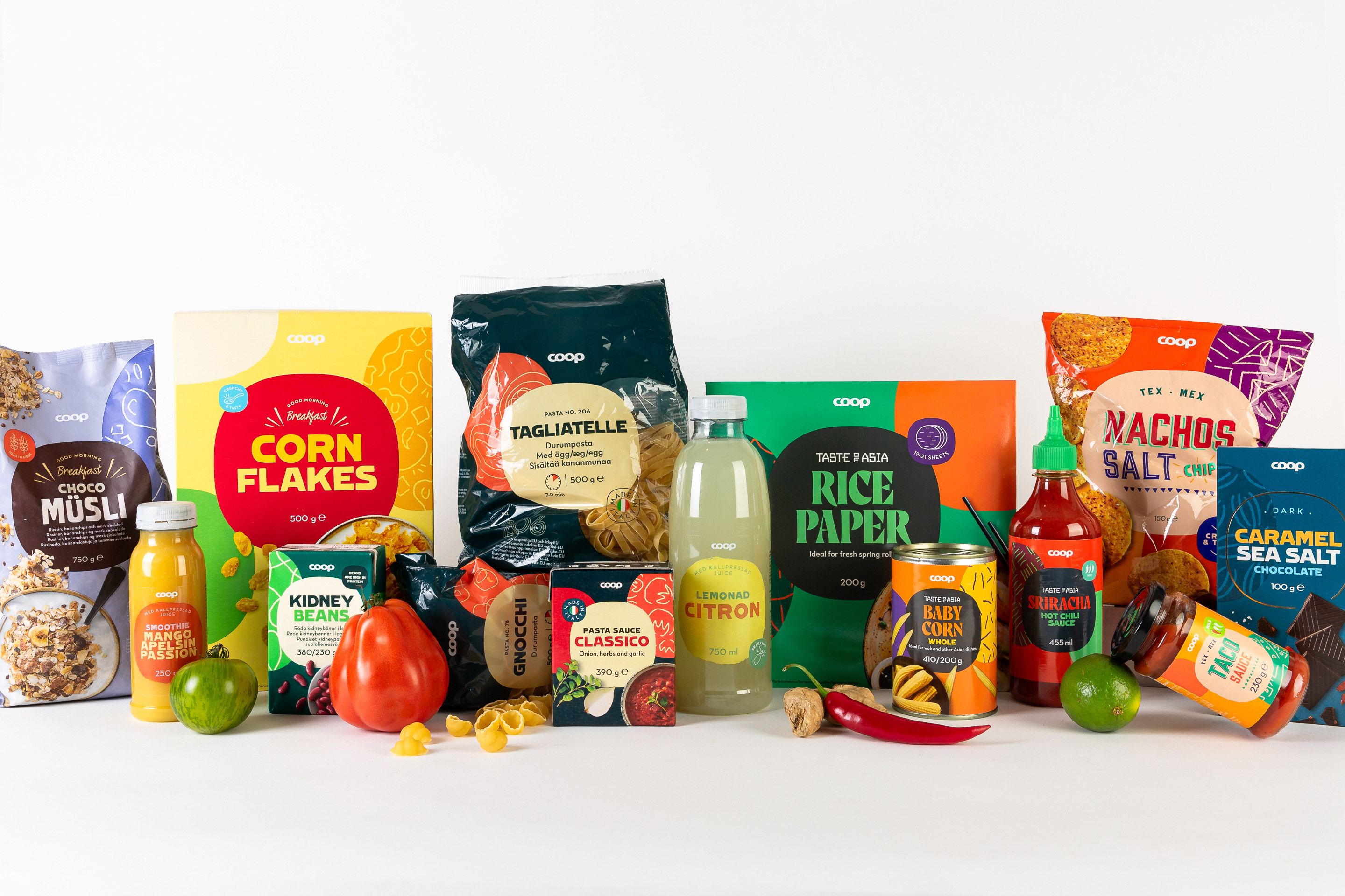
There are a total of over 3,500 products across the four Nordic markets, though a few hundred will be phased out after the consolidation. Colours, typography, illustrations, photographs, and variations in layout allow different categories to vary significantly. Perniclas Bedow, Creative Director at Bedow, speaks for the first time about the two-year-long process.
“It has been two intense and enormously enjoyable years, and now it feels fantastic to see the products rolling out in stores. I’m very pleased that we managed to create a design system that can handle so many units while still varying across a multitude of categories,” he said.
Coop’s logo is used differently in the four countries, and in addition to the packaging design, part of the task was to find a way to handle the logo on the packaging. Swedish Coop uses a green circle with a white wordmark, Denmark and Norway use a red square with a white wordmark, and in Finland, the brand was previously known as Rainbow, using a blue square with rounded corners. This meant that the three colors and shapes had to be avoided, and instead, a new way to apply the logo had to be presented. The solution was to free the white wordmark from the background shapes and combine the circle and square into a graphic element—Gabriel Lamé’s superellipse—that became a cornerstone of the identity.
“The superellipse has been a frequently used shape over the years, but it has its own expression and isn’t as generic as a square or circle. And the best part is that its mathematical formula allows it to scale seamlessly without losing its integrity. This means it can be adapted to both narrow and wide packaging,” Bedow explained.
What has been the most challenging aspect of such a comprehensive project?
“We’ve faced two major challenges. Firstly, it’s a complex setup where four countries must agree on a design—whether you want it or not, many insights and opinions need to be considered. But I think it has gone unexpectedly well, and Coop Trading has done an enormous job coordinating the countries. The second challenge was finding a design system that can be recognized as Coop throughout the store, but also allows each category to stand on its own and compete with the category leader. In private labels, there’s talk of horizontal and vertical design, and I think we’ve found a very good balance between the two strategies.”
What does the collaboration look like moving forward? “To date, we estimate that around 1,400 units are ready, and by the end of the year, about 1,700 will be completed, so we’re working according to plan. We typically receive a brief each week and then deliver design and guidelines for five to ten units per category, which Coop Trading’s design team then takes forward. It’s a very fun and rewarding collaboration!”
CREDIT
- Agency/Creative: Bedow
- Article Title: A Unified Packaging Design for Coop Across Four Nordic Markets Implemented by Bedow
- Organisation/Entity: Agency
- Project Type: Packaging
- Project Status: Published
- Agency/Creative Country: Sweden
- Agency/Creative City: Stockholm
- Market Region: Europe
- Project Deliverables: Packaging Design
- Format: Bag, Bottle, Box, Can, Jar, Pouch, Tin
- Industry: Retail
- Keywords: packaging design, unified wordmark, 3500 products, superellipse
-
Credits:
CEO and Creative Director: Perniclas Bedow


