Longview Vista – Longview Vista
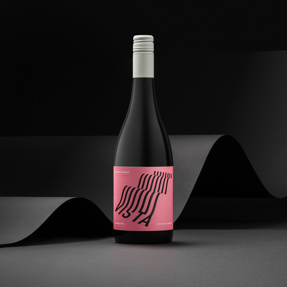
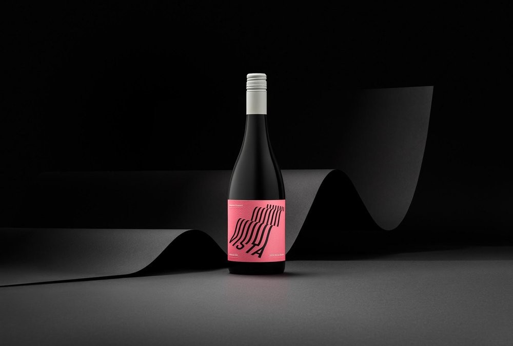
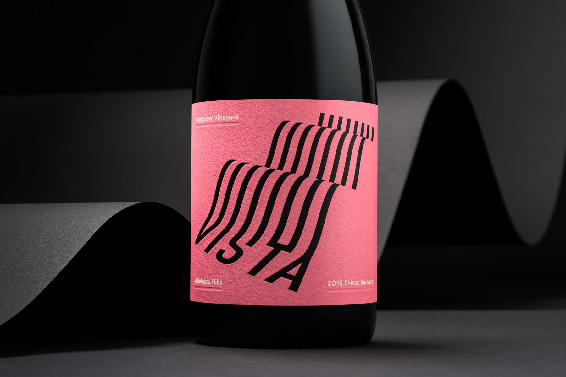
“Longview Vineyard is nestled high in the Adelaide Hills. As its name suggests, the site offers expansive and dramatic views of the rolling landscape, graphically contoured with rows of vines. Capitalising on its cool-climate high-altitude similarities to mediterranean wine regions, Vista is a young, drink-now Shiraz Barbera. Intended to be enjoyed with food and friends rather than cellared and fussed-over, the packaging required a balance of sophistication and fresh, iconic memorability.
Responding to the product’s name and focus on its scenic origin, a typographic portrait of the Longview landscape was created. This attempts to convey the vineyard’s steep inclines and vast panoramic views, whilst establishing ‘Vista’ as the focus of the design. Bold and uncomplicated, the illustration is presented in black foil with heavily debossed finishing to add tactility, reminiscent of rows and rows of vines. The palette is intentionally light and bright for both pickup appeal and memorability, and in response to the young and fresh profile of the wine.”