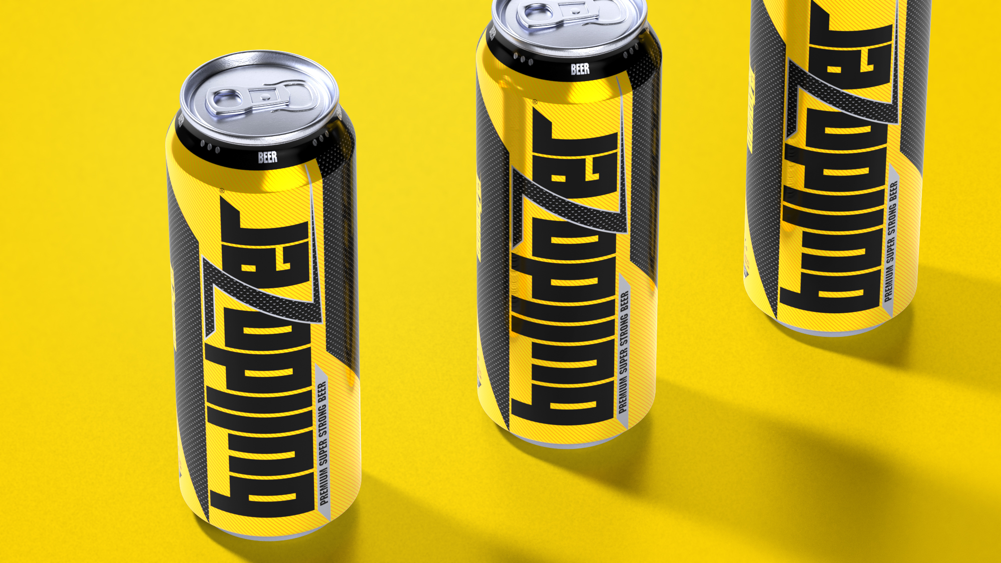
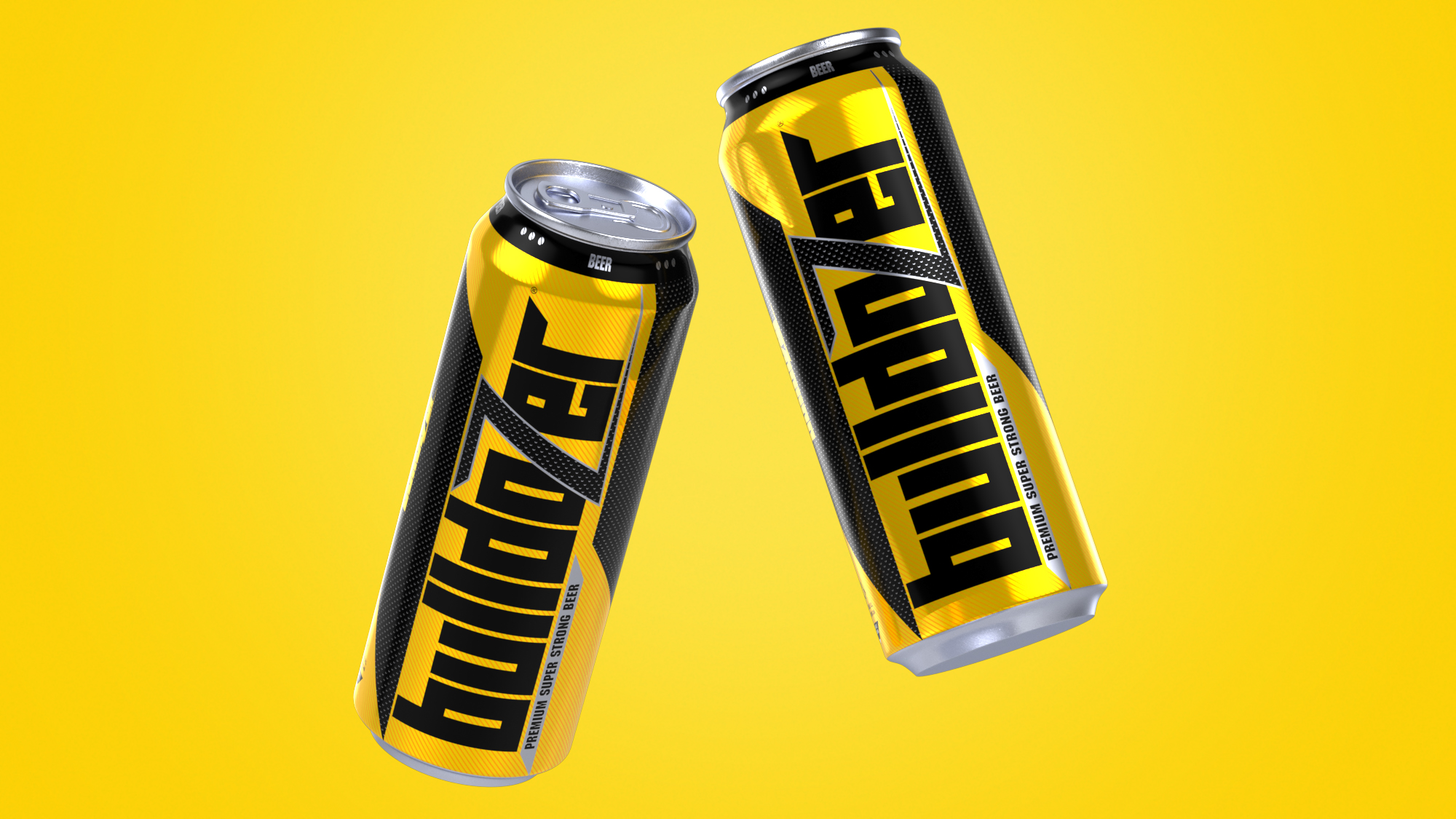
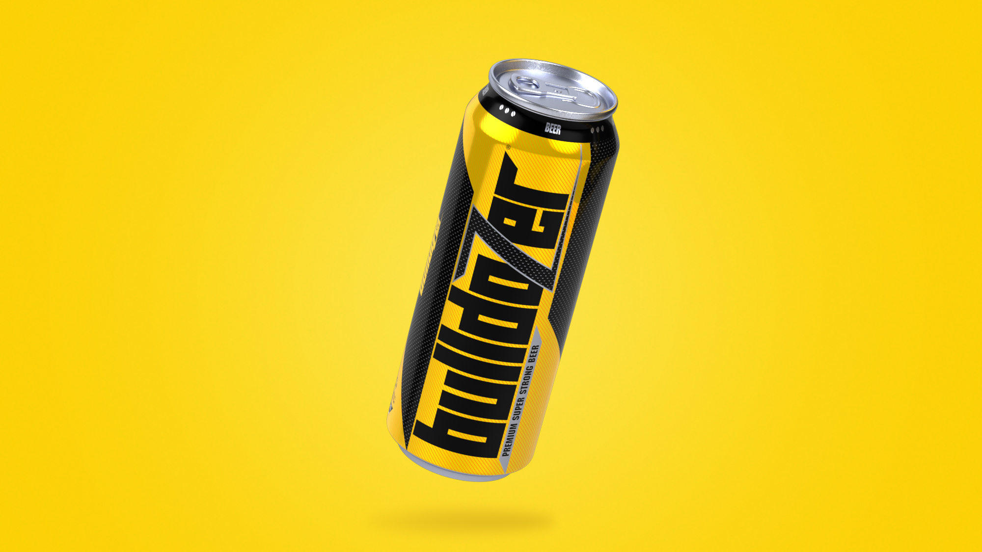
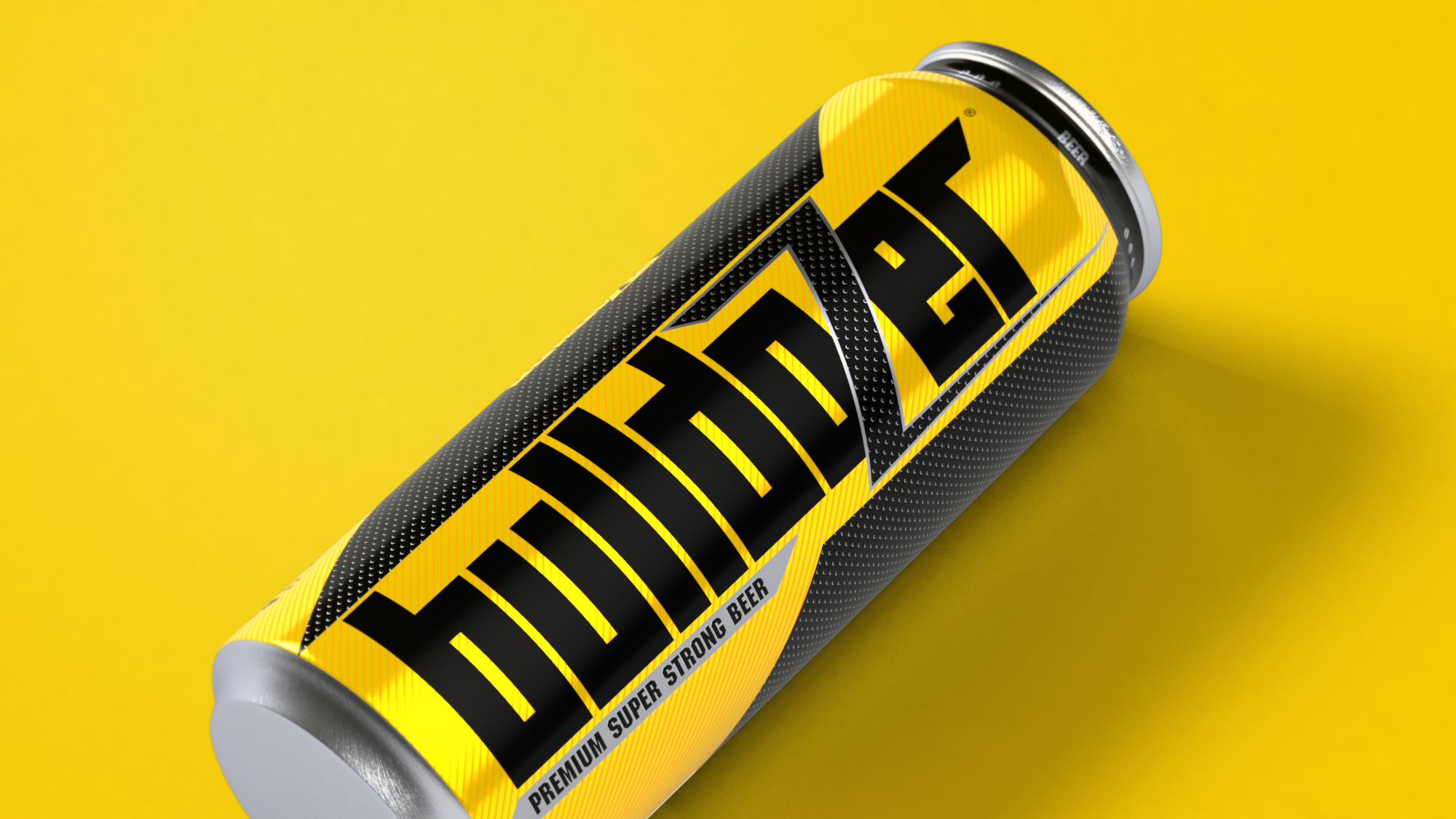
Bulldozer is a bold take on Super strong beer. The vision was to create a design that projects and reflects the name the brand carries! The task was also to give it a very fresh and out of the box look that has never been tried for in the beer category.
We focussed on the 2 basic colors of an actual bulldozer – yellow and black and kept the colors to minimal so the throw of the packaging can such that it shouts out from the shelves and from the refrigerators.
Our design team resisted all the temptations of adding a lot more to the design and kept it to bare minimum with the right amount of details where needed.
The small little details made the big difference in the packaging design of Bulldozer Beer.


CREDIT
- Agency/Creative: Firstbase
- Article Title: A Stunning New Packaging Design of Bulldozer Beer by Firstbase
- Organisation/Entity: Agency, Published Commercial Design
- Project Type: Packaging
- Agency/Creative Country: India
- Market Region: Multiple Regions
- Project Deliverables: Brand Strategy, Branding, Packaging Design, Product Naming, Research, Tone of Voice
- Format: Can
- Substrate: Metal
FEEDBACK
Relevance: Solution/idea in relation to brand, product or service
Implementation: Attention, detailing and finishing of final solution
Presentation: Text, visualisation and quality of the presentation


