


DAIS is a company specialising in stainless steel equipment for yachts and boats. Their work is defined by precision, durability and elegance, qualities we set out to distil into a coherent and enduring corporate identity.
Our approach was guided by the same principles that govern both marine engineering and design: light, movement, geometry and material integrity. The identity is not decorative, but constructed. Like the parts DAIS manufactures, it exists to perform.
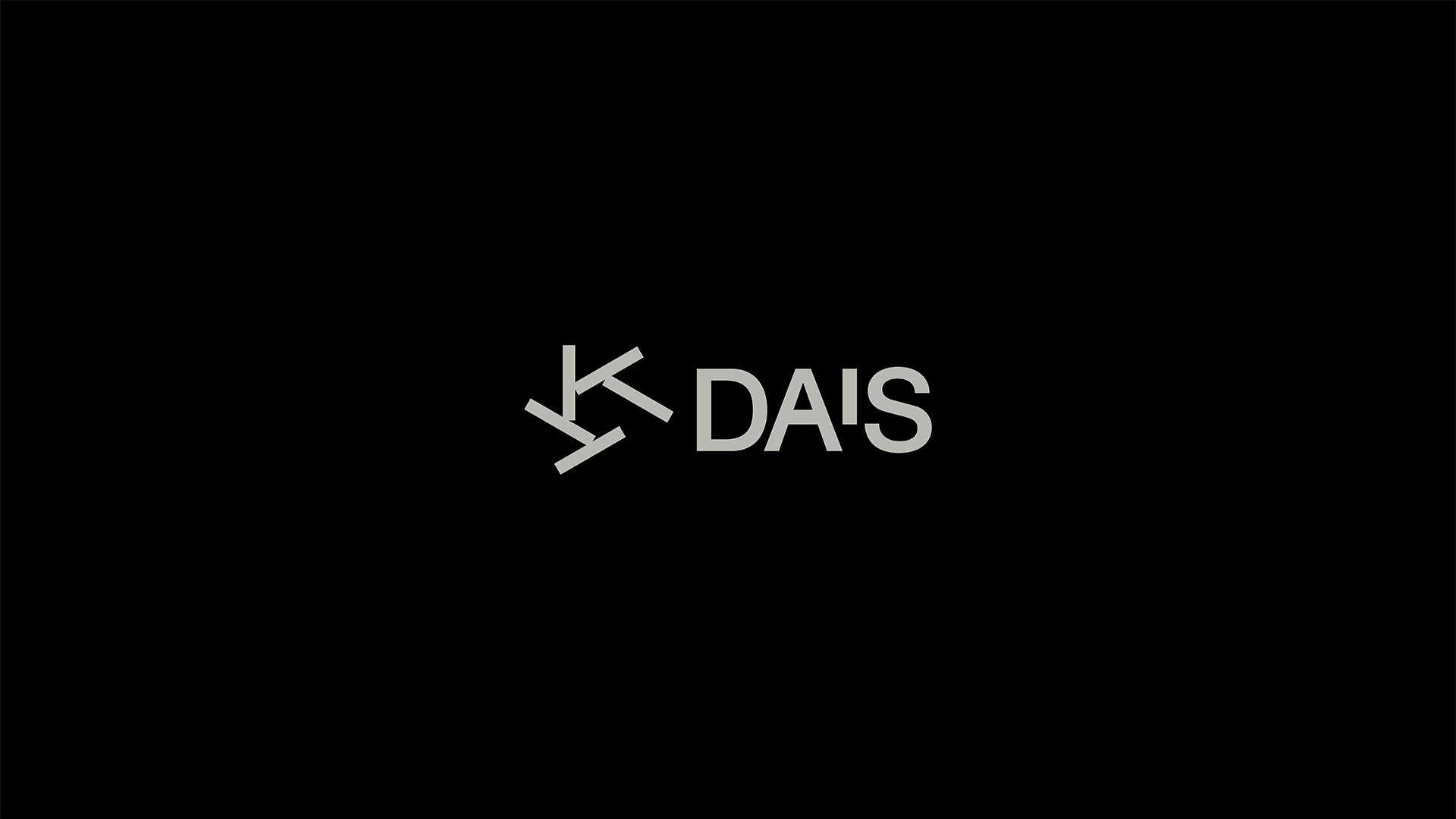
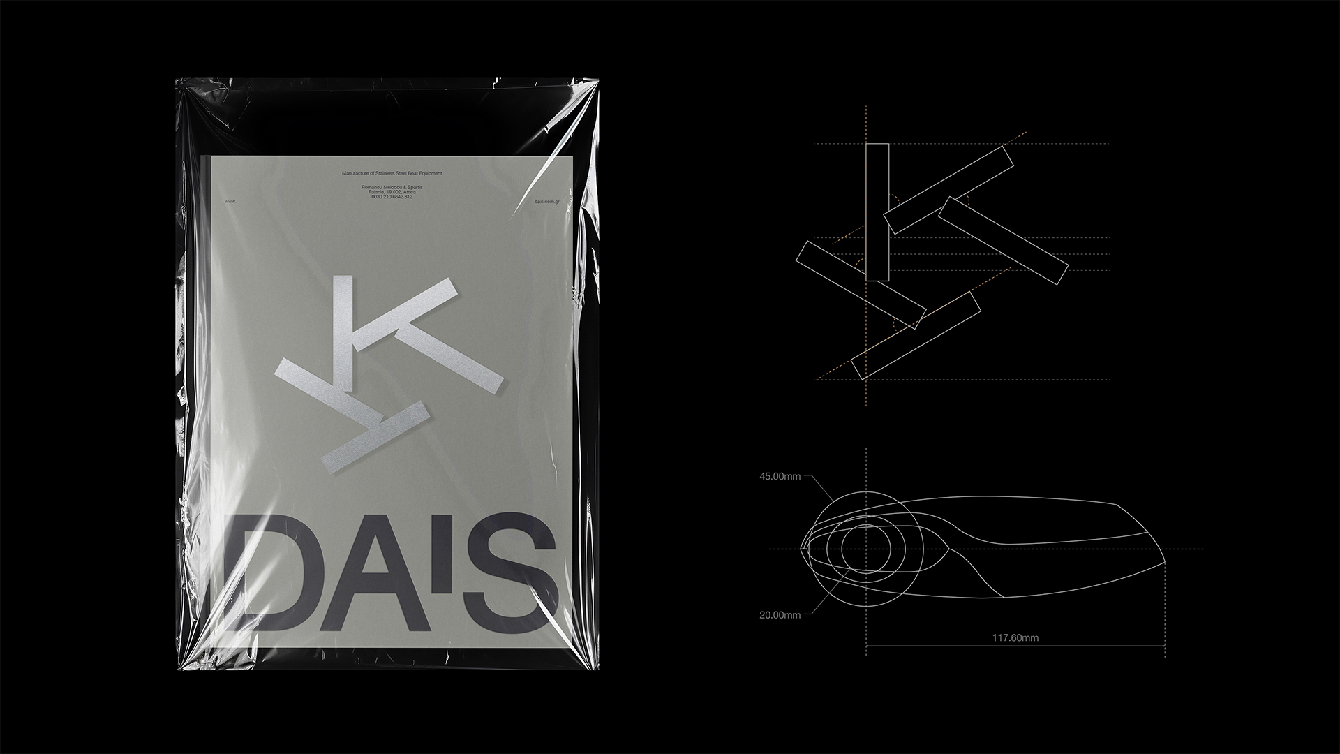
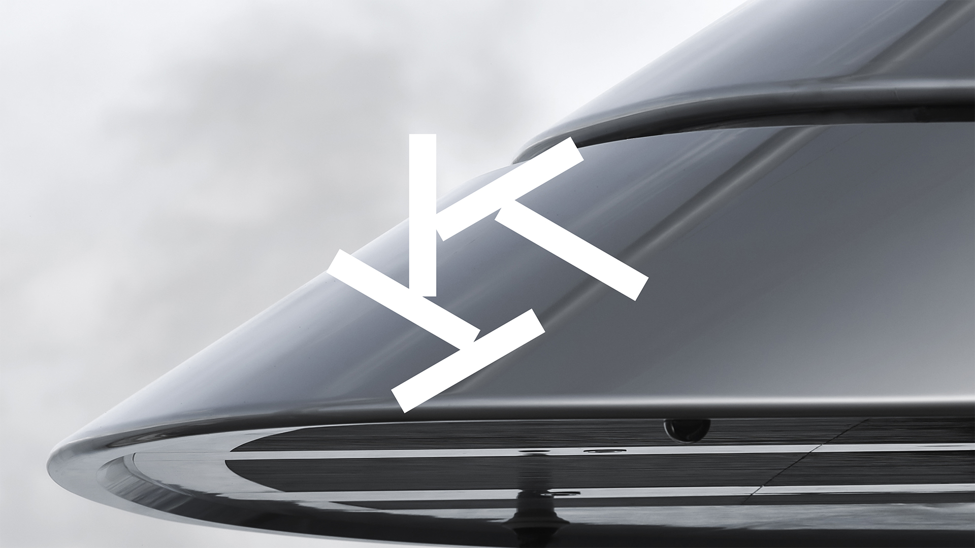
The symbol was designed as a modular form, abstract and dynamic, built from intersecting linear elements that suggest motion and directional flow. It recalls maritime navigation and engineered functionality, echoing a cog, a propeller, the circular movement of a compass, the whirl of water stirred as a boat turns, and natural forces like the sun, a spiral of wind, or currents. This convergence of meanings, mechanical and natural, engineered and elemental, makes the symbol both monogram and metaphor.
Paired with a bold, contemporary wordmark, the symbol gains clarity and stability. A typographic gesture within the “A” introduces rhythm and distinction, without compromising legibility or structural balance.
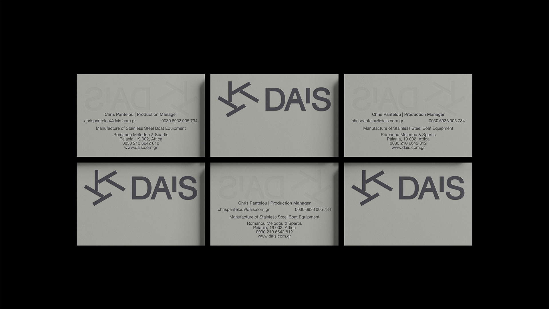
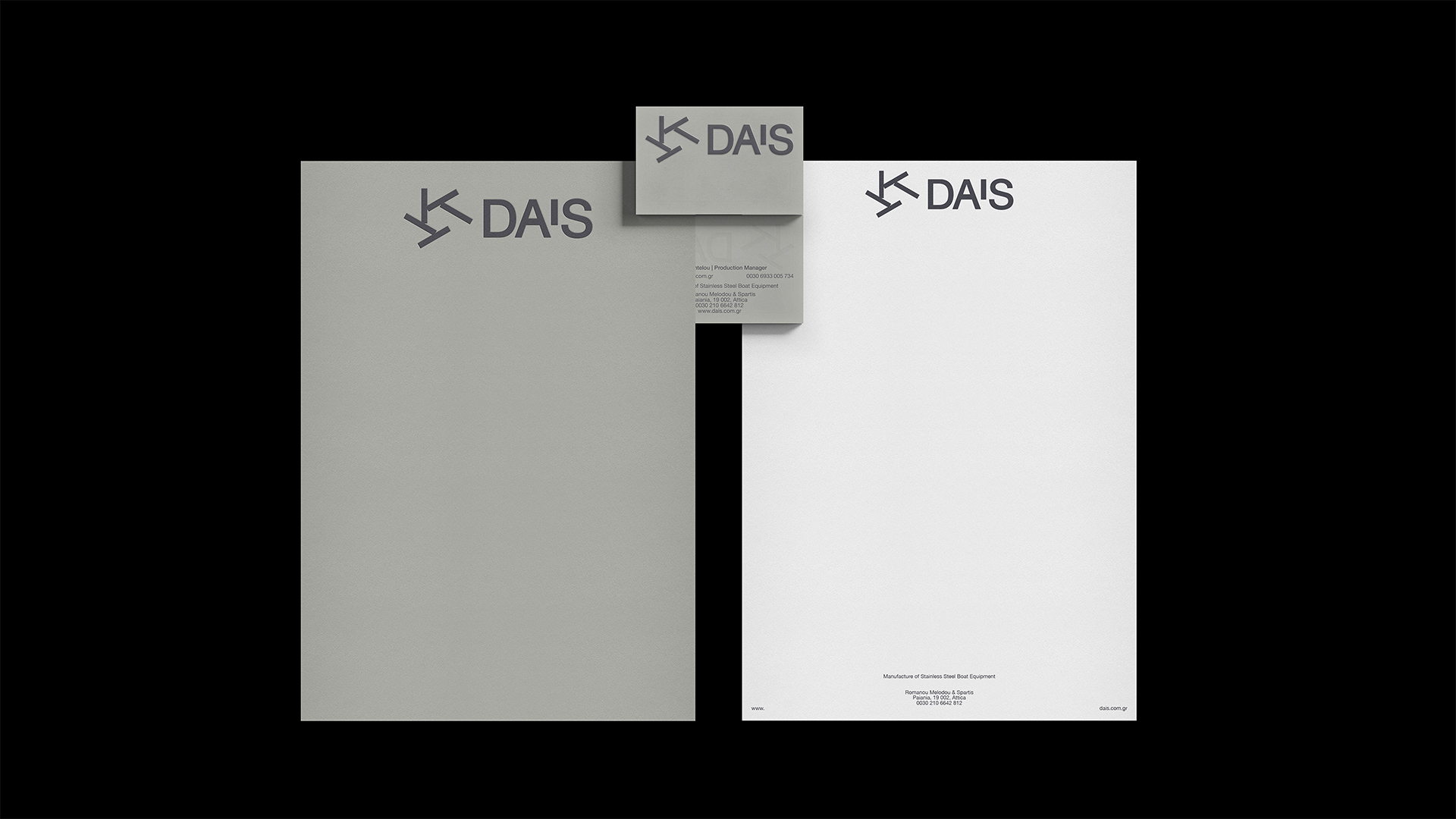
The colour palette is drawn from material references: soft greys and steel tones inspired by brushed metal surfaces. Applied across print, digital and physical materials, the restrained palette gives the brand a quiet confidence. This comes from clarity of form and a sense that everything has been engineered to follow a logic of function and precision.
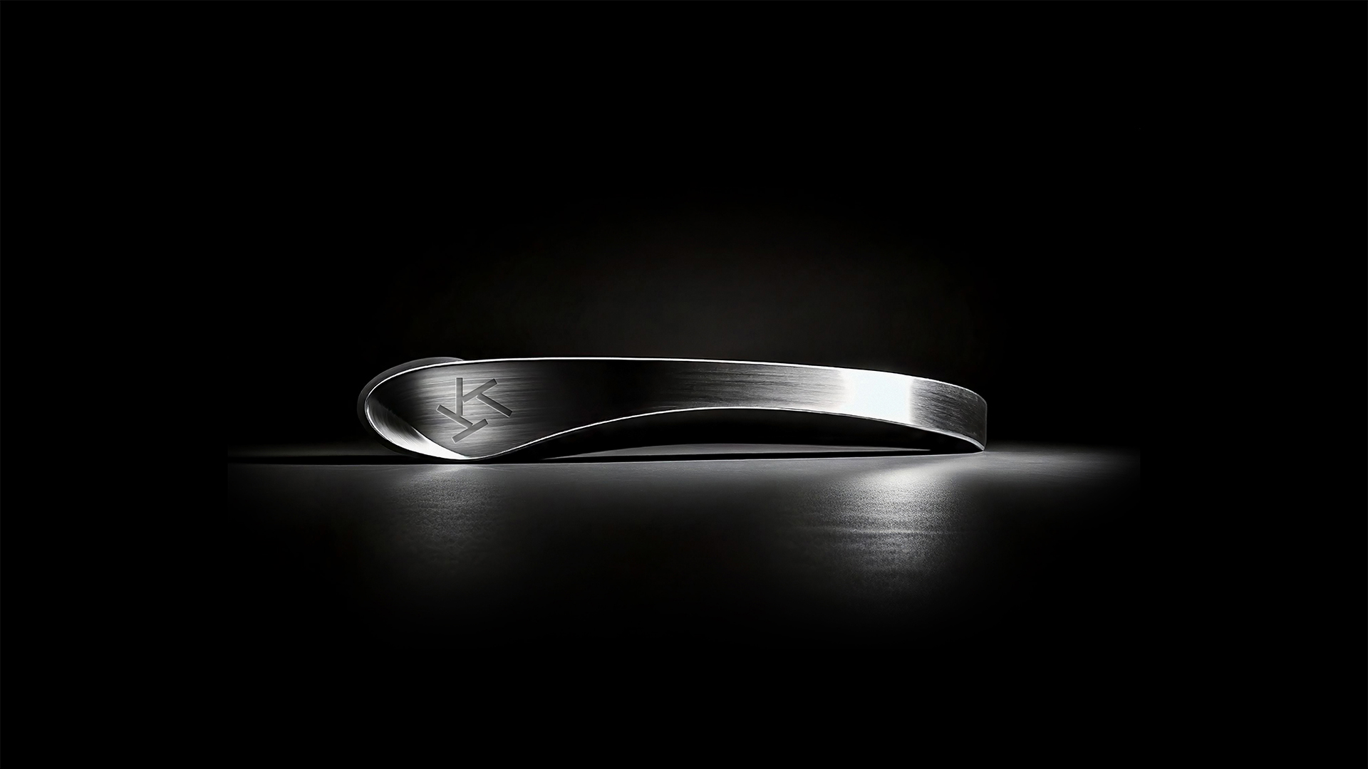
Equally important is the tactile relationship between brand and material. The mark isn’t simply printed. It is engraved, embossed, etched into metal. It becomes part of the object, a gesture of permanence and craftsmanship that mirrors the values of DAIS itself.
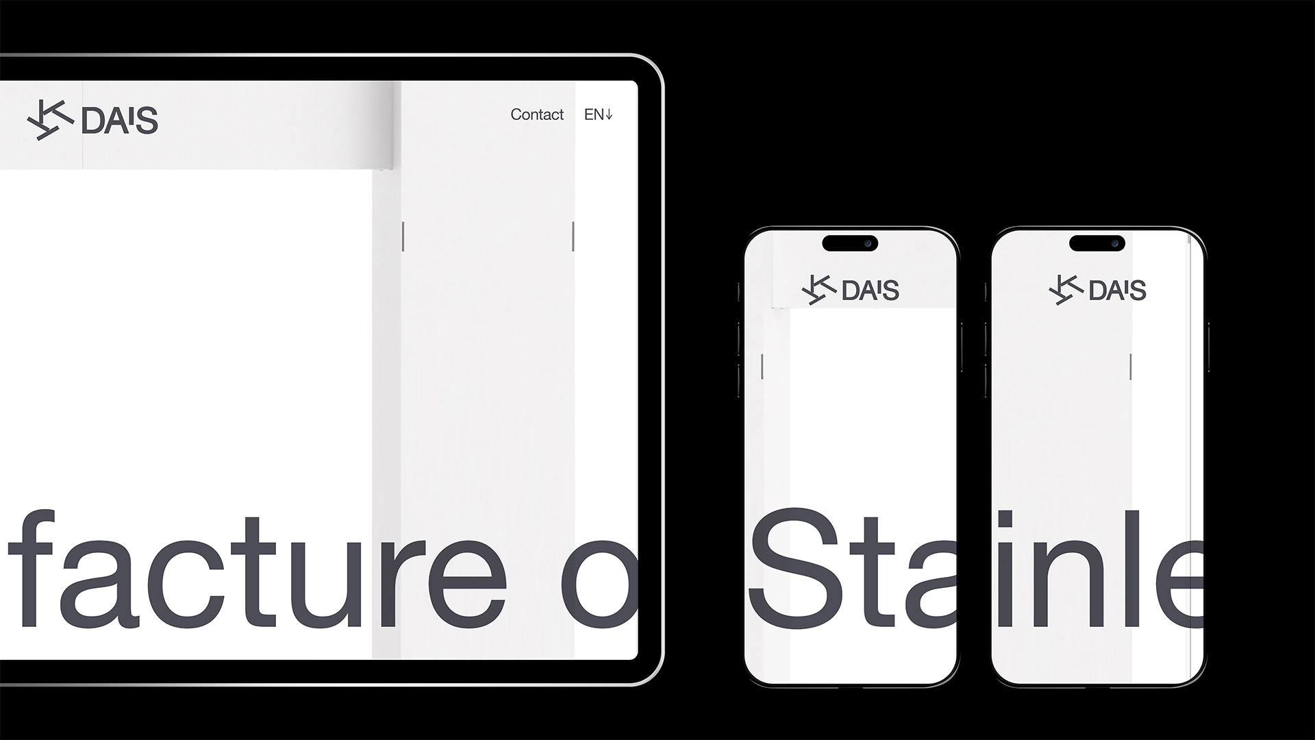
On screen, the identity is crisp and responsive. In print, it is structured and tactile. On steel, it becomes a signature of trust. Technical, minimal, enduring.
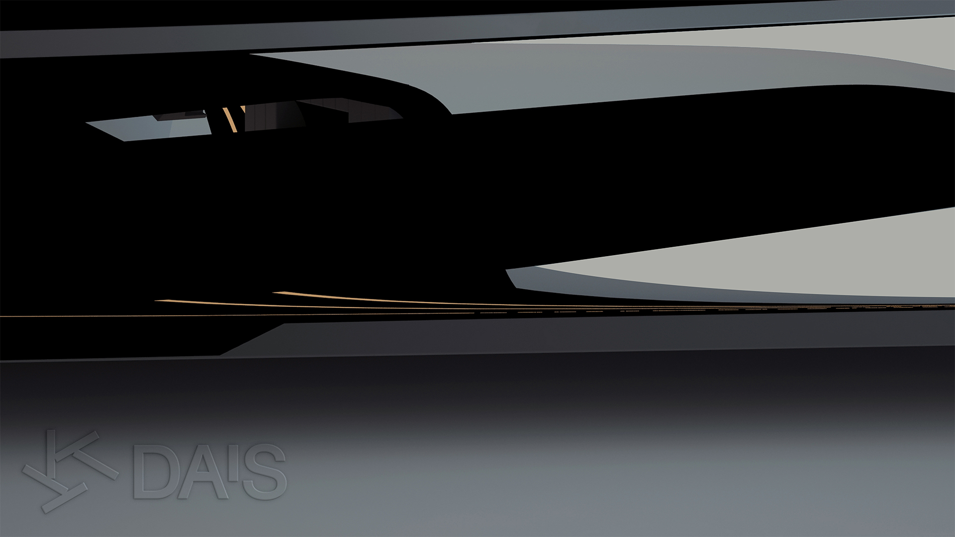
DAIS operates in a world of movement: boats in motion, wind in the sails, light on polished metal, water cut by hulls. So is the design: precise, resilient and alive with intent.
CREDIT
- Agency/Creative: A.S. Strategy Branding & Communication
- Article Title: A.S. Strategy Shapes a Precision-Driven Identity for DAIS Marine Equipment
- Organisation/Entity: Agency
- Project Type: Identity
- Project Status: Published
- Agency/Creative Country: Greece
- Agency/Creative City: Athens
- Market Region: Europe
- Project Deliverables: Brand Design, Brand Identity, Identity System, Logo Design
- Industry: Manufacturing
- Keywords: Corporate Identity Brand Strategy Brand Definition Brand Development Brand Identity Naming & Nomeclature Systems Design Strategy Typography Visual Identity Image Language Illustration Language Brand Guidelines
-
Credits:
Creative Director: Antonia Skaraki


