


When tasked with designing the corporate identity of Πyrá, a contemporary pie shop with recipes rooted in Cretan tradition, we turned to the elemental force that has defined cooking since the beginning of time: fire.
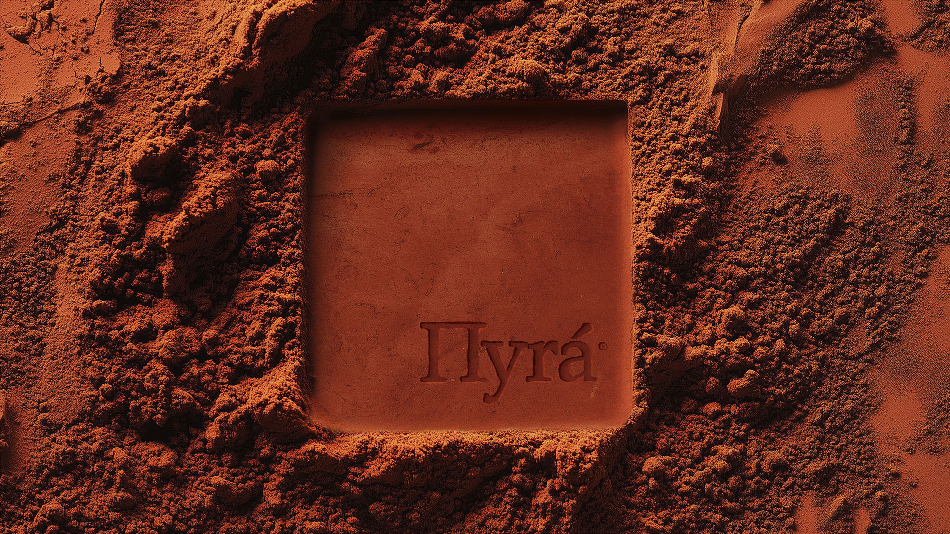
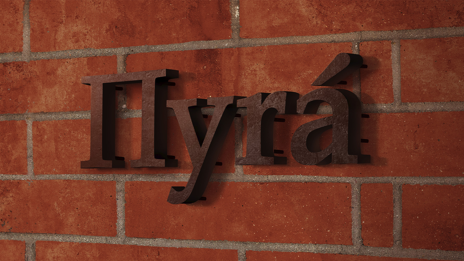
The name Πyrá (Πυρά = fire in Greek) evokes not only the literal fire of the wood-burning oven in which every pie is baked, but also the symbolic fire of heritage, memory, and craft. We wanted the identity to embody this primal energy—stripped of ornament, but rich in warmth.
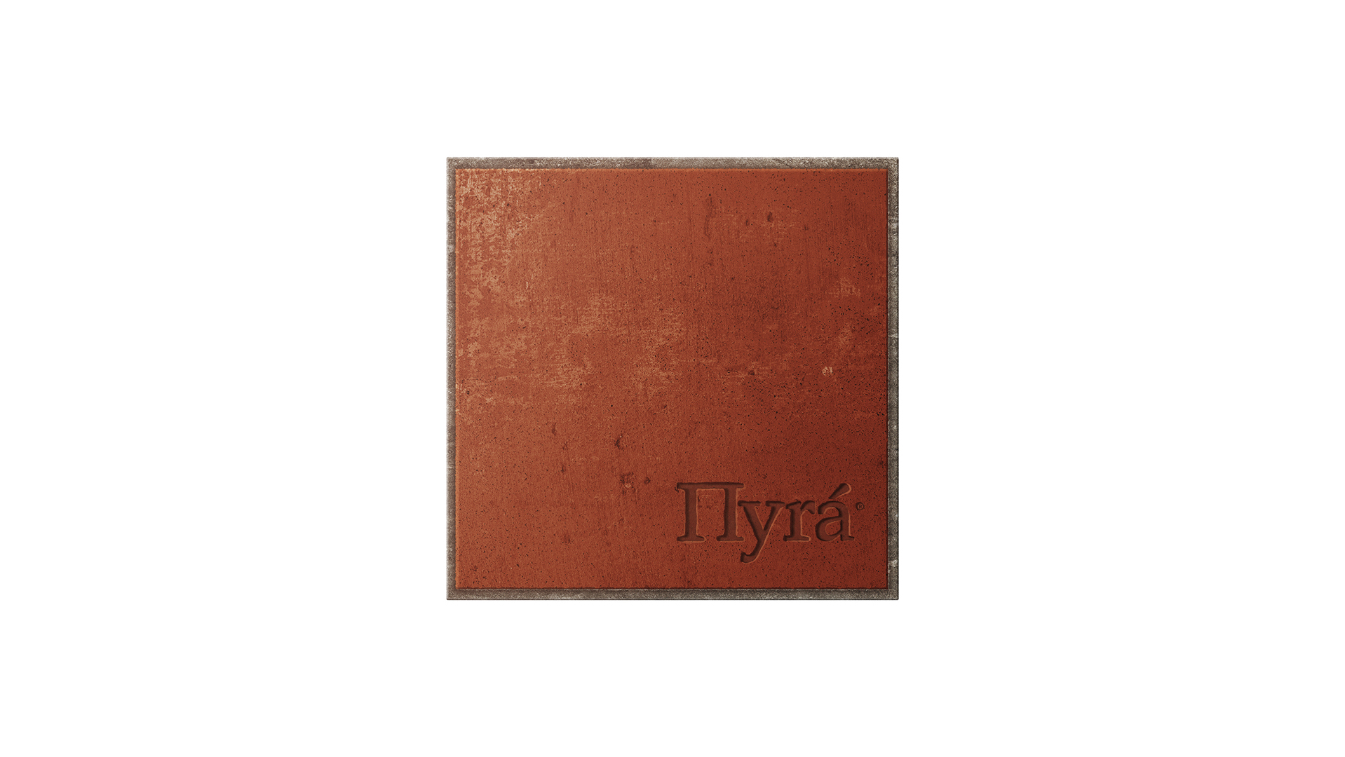
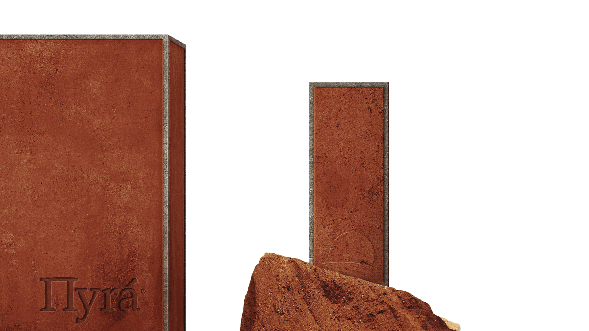
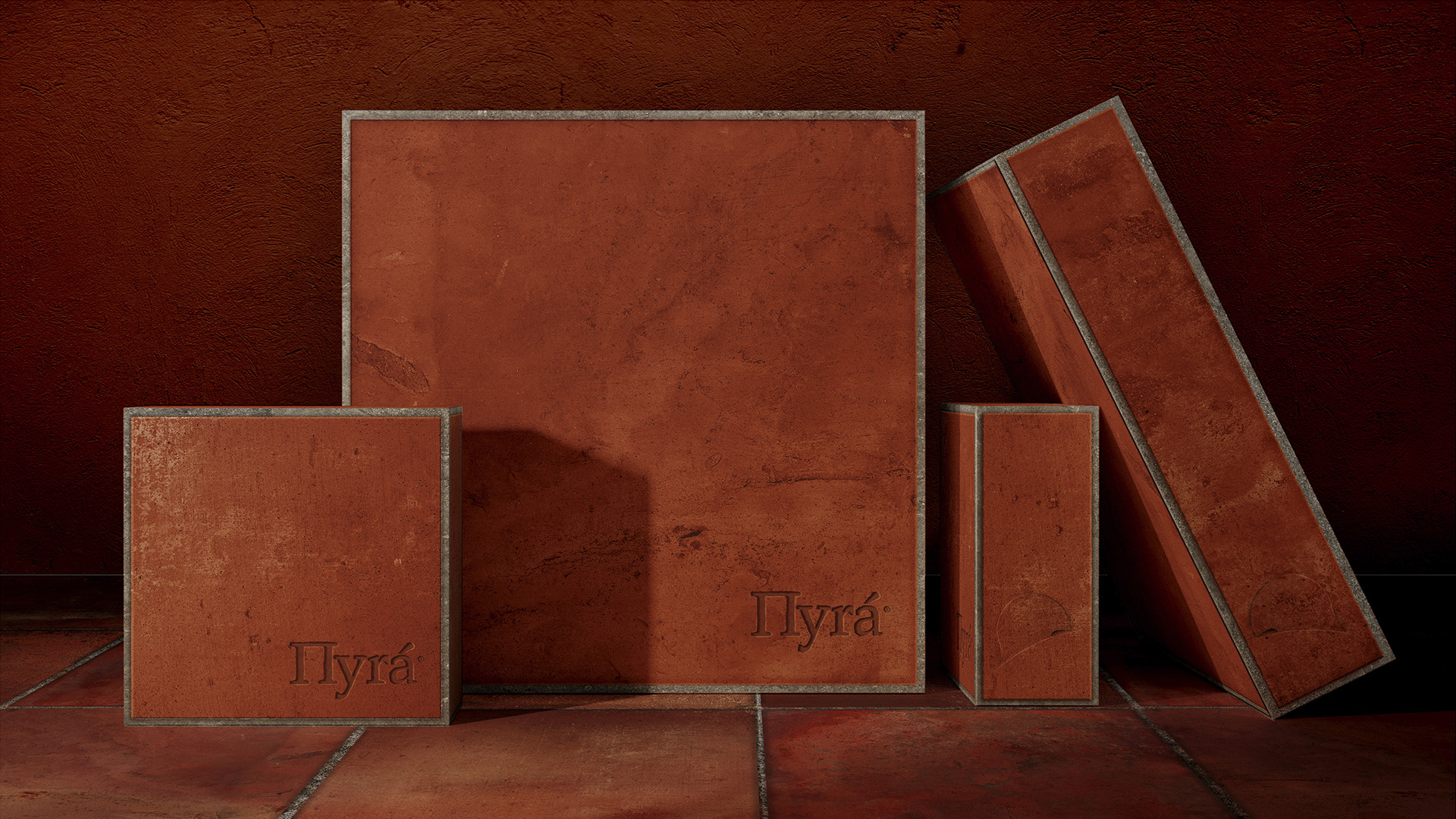
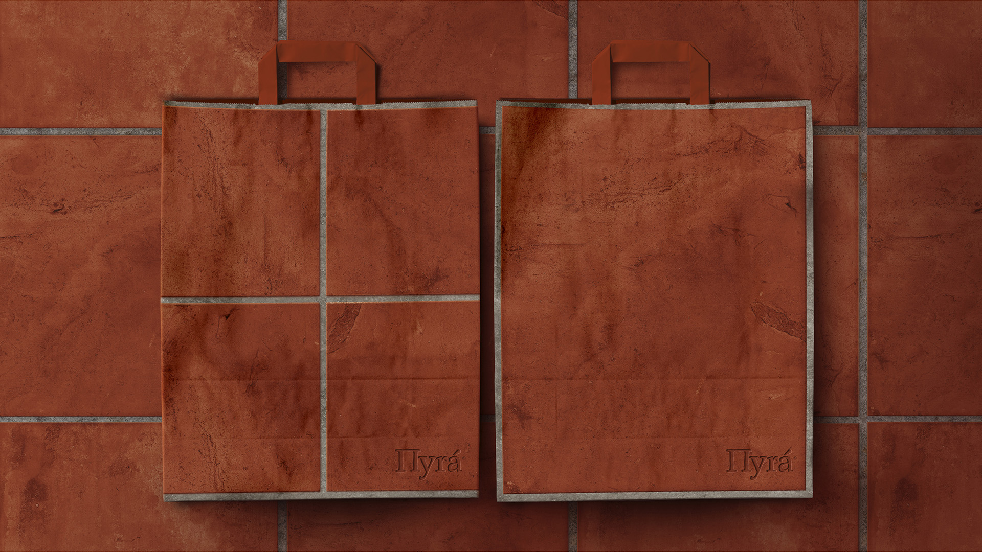
We developed a minimal design system that allows the product and its story to take centre stage. The core colour palette revolves around terracotta, directly inspired by the firebrick of traditional ovens. Terracotta is textural, earthen, and honest—like the pies themselves. Paired with off-white and black, it forms a grounded, tactile environment that feels both rooted and contemporary.
The logotype is a bespoke wordmark referencing carved signage and hot-iron branding. Its soft curves echo the roundness of a pie, while its weight and sharpness suggest fire-stamped initials on aged wooden tools. Applied subtly across packaging, signage, and printed matter, the logo doesn’t seek to dominate. It leaves its mark quietly, like fire does.
The materials selected for physical applications are deliberately unrefined: uncoated papers, kraft textures, and heat-embossed details reflect the handmade nature of the product. Bags and boxes are treated not as luxury packaging, but as functional, tactile objects—rooted in a culture where nothing is wasted, and everything is crafted with care.
The retail space carries this philosophy forward. Restrained forms and muted surfaces create a clear visual hierarchy, allowing the terracotta elements to act as focal points. Typography is contemporary yet approachable, while the layout system draws from the logic of repetition and structure—much like the layering of pie dough, where each tier adds coherence and rhythm.
At the heart of this brand lies the contrast between intensity and simplicity. Between the heat of the oven and the stillness of a minimal form. Πyrá isn’t about nostalgia. It honours the past through clarity and restraint. By avoiding clichés of “Greekness” or visual folklore, we allowed the true character of the product—its craftsmanship, its integrity, and its unmistakable crunch—to emerge.
This is a brand designed to be felt before it is analysed. To stir memory. And, like the oven itself, to leave behind the lingering trace of something timeless.
CREDIT
- Agency/Creative: A.S. Strategy Branding & Communication
- Article Title: A.S. Strategy Reignites Greek Tradition with a Minimalist Identity for Πyrá
- Organisation/Entity: Agency
- Project Type: Packaging
- Project Status: Non Published
- Agency/Creative Country: Greece
- Agency/Creative City: Athens
- Market Region: Europe
- Project Deliverables: Brand Identity, Branding, Identity System, Logo Design, Packaging Design
- Format: Bag, Wrap
- Industry: Food/Beverage
- Keywords: bakery, branding, packaging, brand identity, identity design
-
Credits:
Creative Direction: Antonia Skaraki


