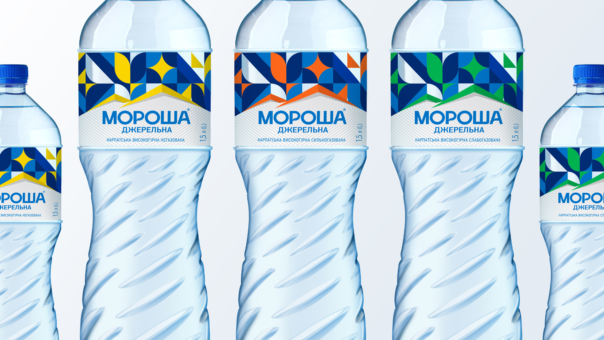
Morosha Dzherelna is a still mountain water sourced from the Carpathians, an emblem of purity and strength deeply rooted in Ukrainian nature and spirit. The new identity and packaging design reinterpret this heritage through a bold, modern visual system that draws from the country’s cultural DNA.
The label’s graphic pattern is inspired by a rich tapestry of Ukrainian symbolism: national embroidery, ethnic motifs, and the blue-and-yellow flag. These geometric elements—circles, stars, diagonals—are arranged in a rhythmic, modular grid that evokes both movement and harmony. Each colour combination reflects a different natural contrast: sun and sky, forest and spring, earth and energy. Together, they form a vibrant, abstract homage to the land Morosha comes from and the soul of the Ukrainian people.
The bottle itself has also been redesigned to enhance both recognition and usability. Its new spiral structure echoes the motion of water, while offering better grip and functionality. Diagonal grooves wrap around the form like flowing currents, subtle but distinctive cues that connect the tactile experience to the source.
Typography plays a key supporting role. The logotype is clean, assertive, and legible, leaving space for the richly patterned label to take centre stage. Each type of water is colour-coded using different combinations within the same visual language, allowing instant differentiation without compromising the integrity of the design.
At a time when water brands often rely on generic images of purity, Morosha’s visual identity chooses a more rooted approach—celebrating culture, geography, and symbolism. It is a proud expression of origin, distilled into a modern, functional, and emotionally resonant design.
Morosha Dzherelna’s bottle design—like the water itself—restores body and soul, whispering a message of perseverance with every drop. It’s “The Water of the Next Day,” a testament to Ukraine’s brave soul and the boundless possibilities of its future.


CREDIT
- Agency/Creative: A.S. Strategy Branding & Communication
- Article Title: A.S. Strategy Designs Morosha Dzherelna with Tactile Cues and Ethnic Geometry for Global Impact
- Organisation/Entity: Agency
- Project Type: Packaging
- Project Status: Published
- Agency/Creative Country: Ukraine
- Agency/Creative City: Athens
- Market Region: Europe
- Project Deliverables: Brand Creation, Packaging Design
- Format: Bottle
- Industry: Food/Beverage
- Keywords: packaging, branding, identity design, packaging design
-
Credits:
Creative Director: Antonia Skaraki


