


Founded in October 2024, REPETE is a design studio based in Thessaloniki, working across material, space, and experience. Drawing from everyday life and traditional ways of making, the studio approaches design as a process shaped by use, time, and the relationship between objects and the spaces they inhabit.
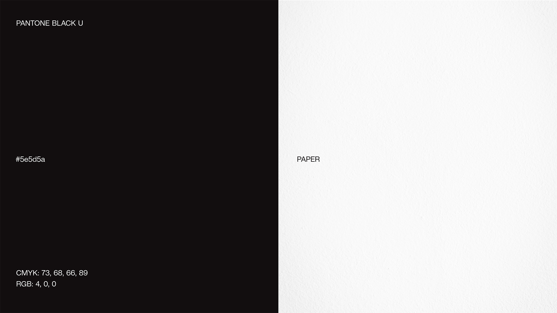
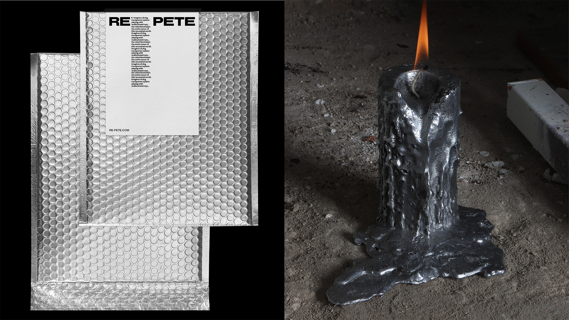
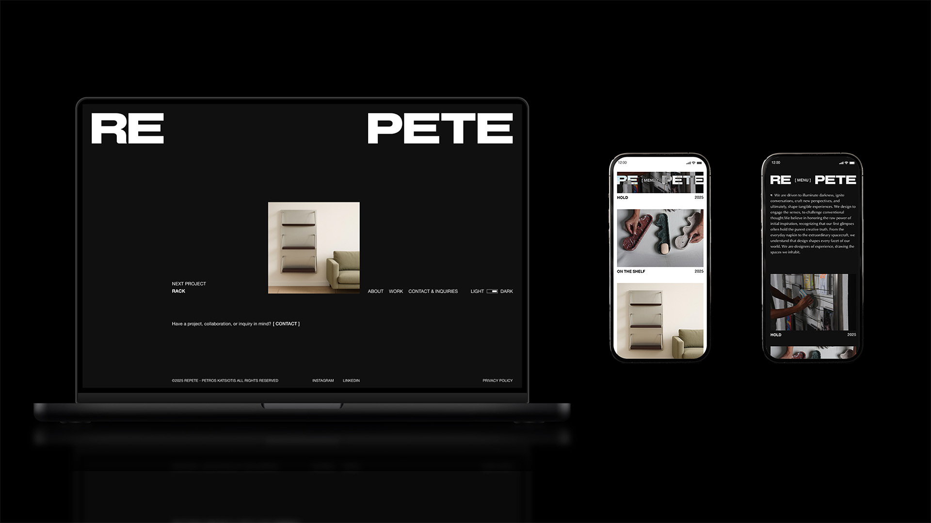
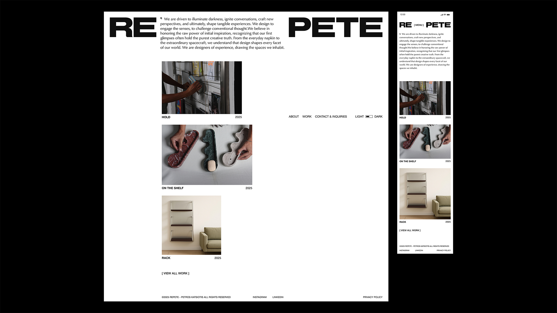
The owner’s background is closely connected to lighting design, therefore REPETE’s identity is built around a fundamental visual and conceptual contrast: light and darkness. This duality forms the foundation of the studio’s graphic language and is expressed through a strict black-and-white typographic system. Contrast functions as a material in itself, revealing form through shadow, presence through absence.
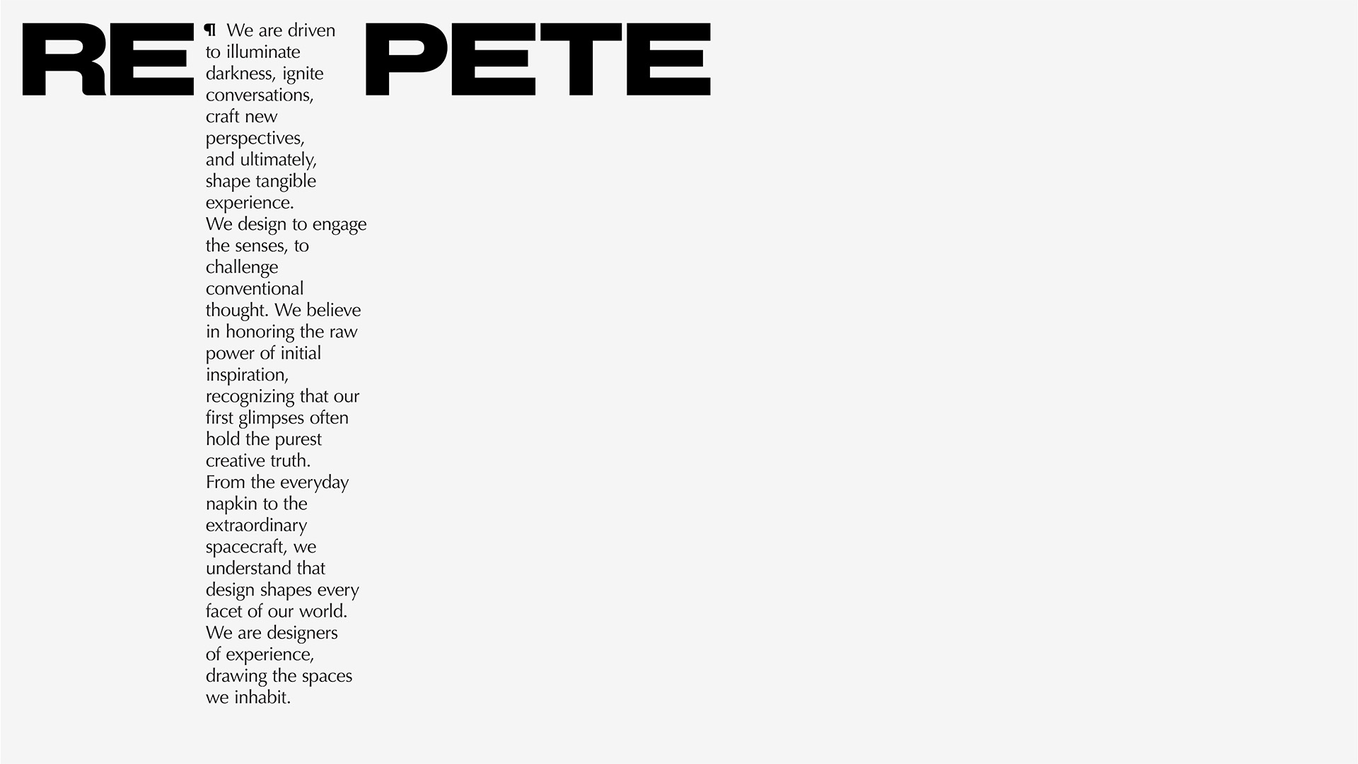
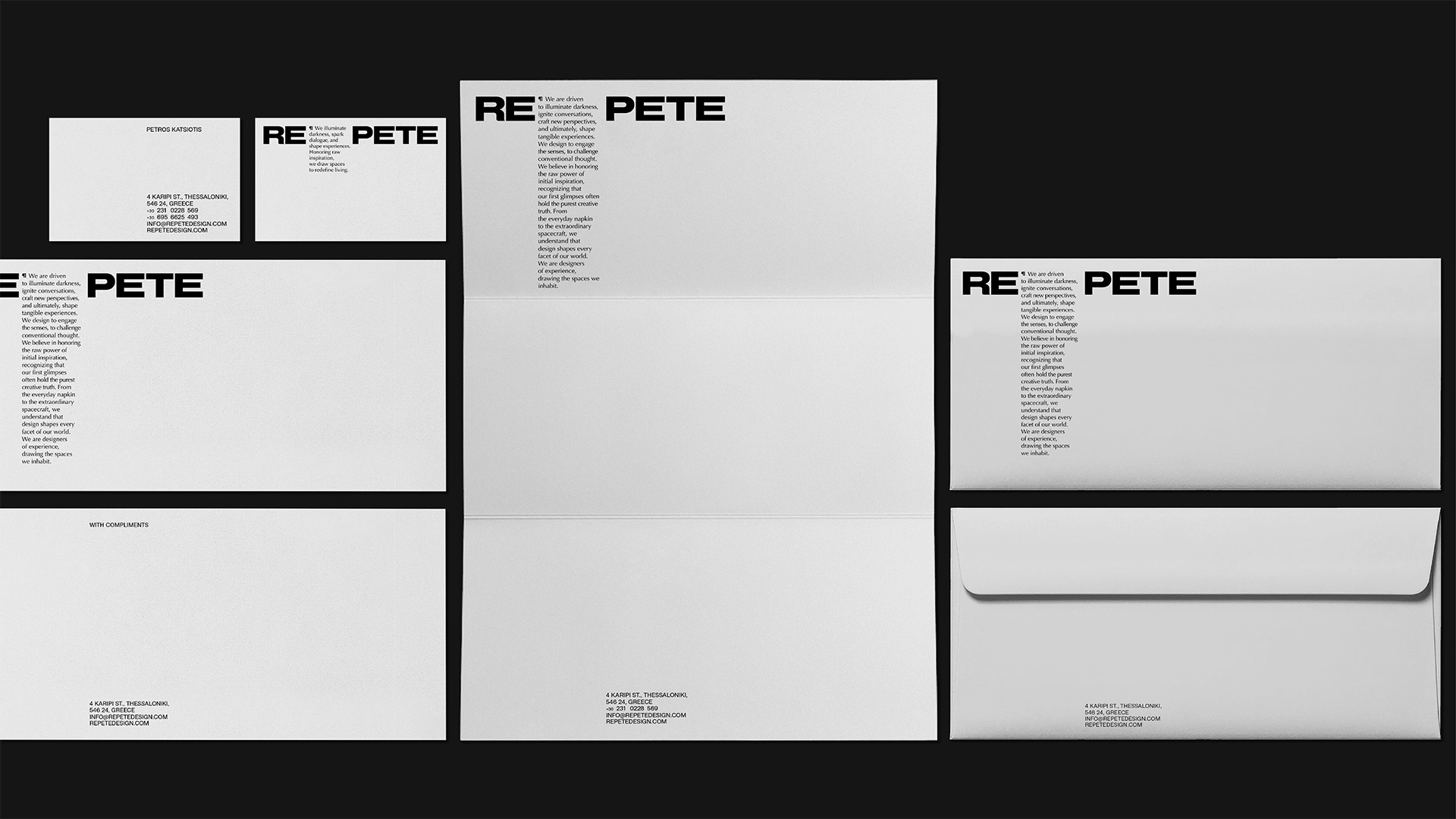
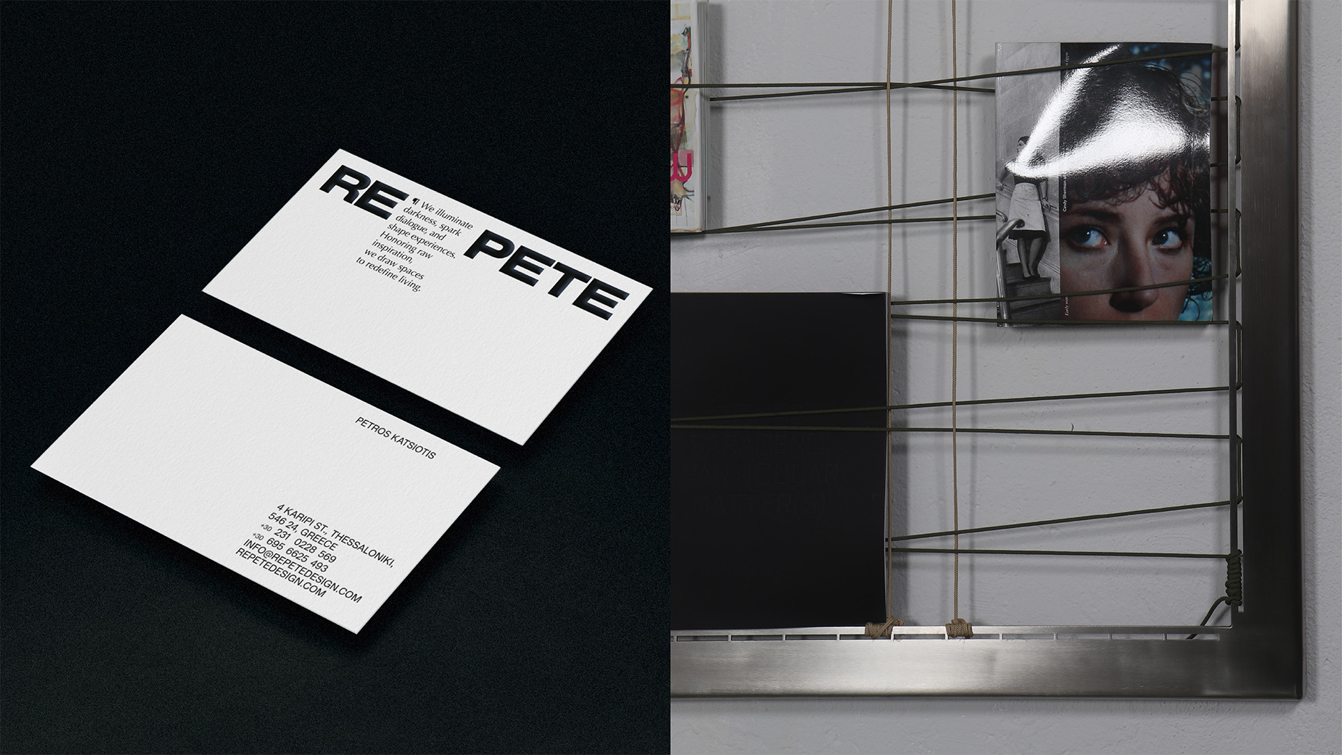
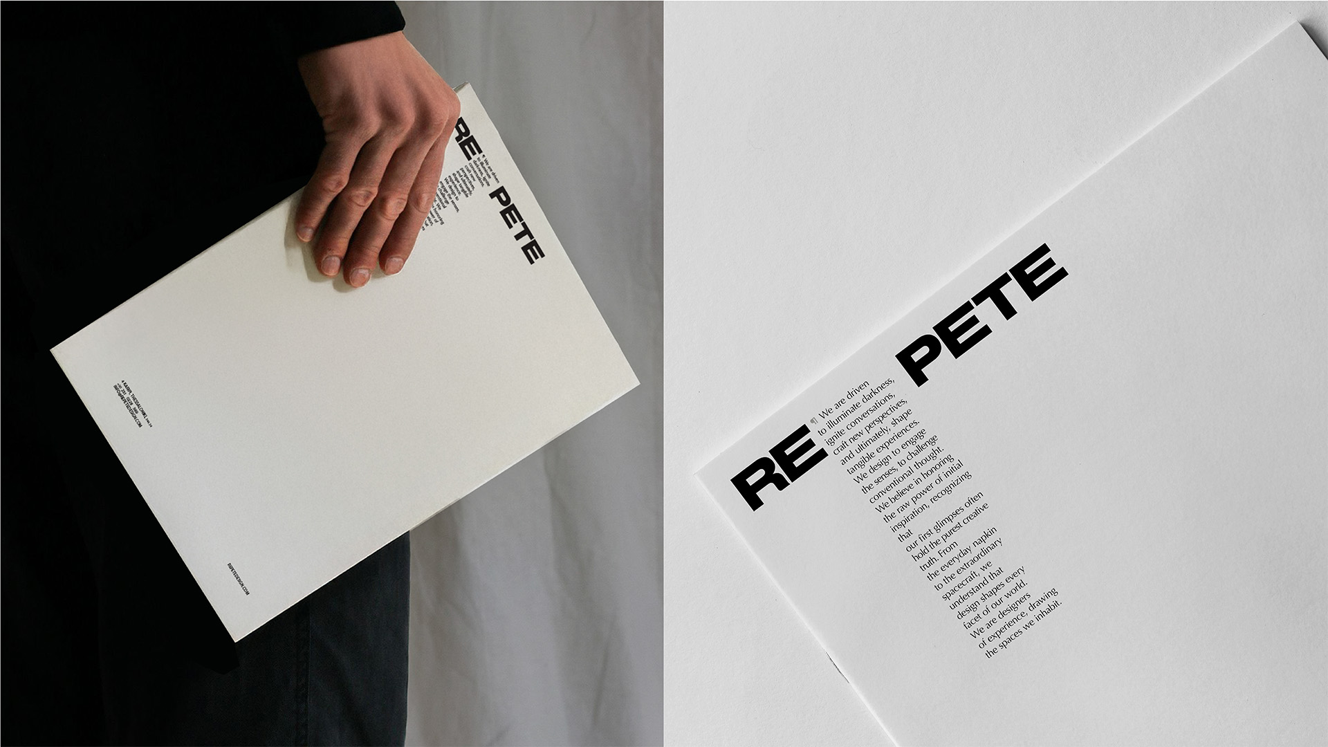
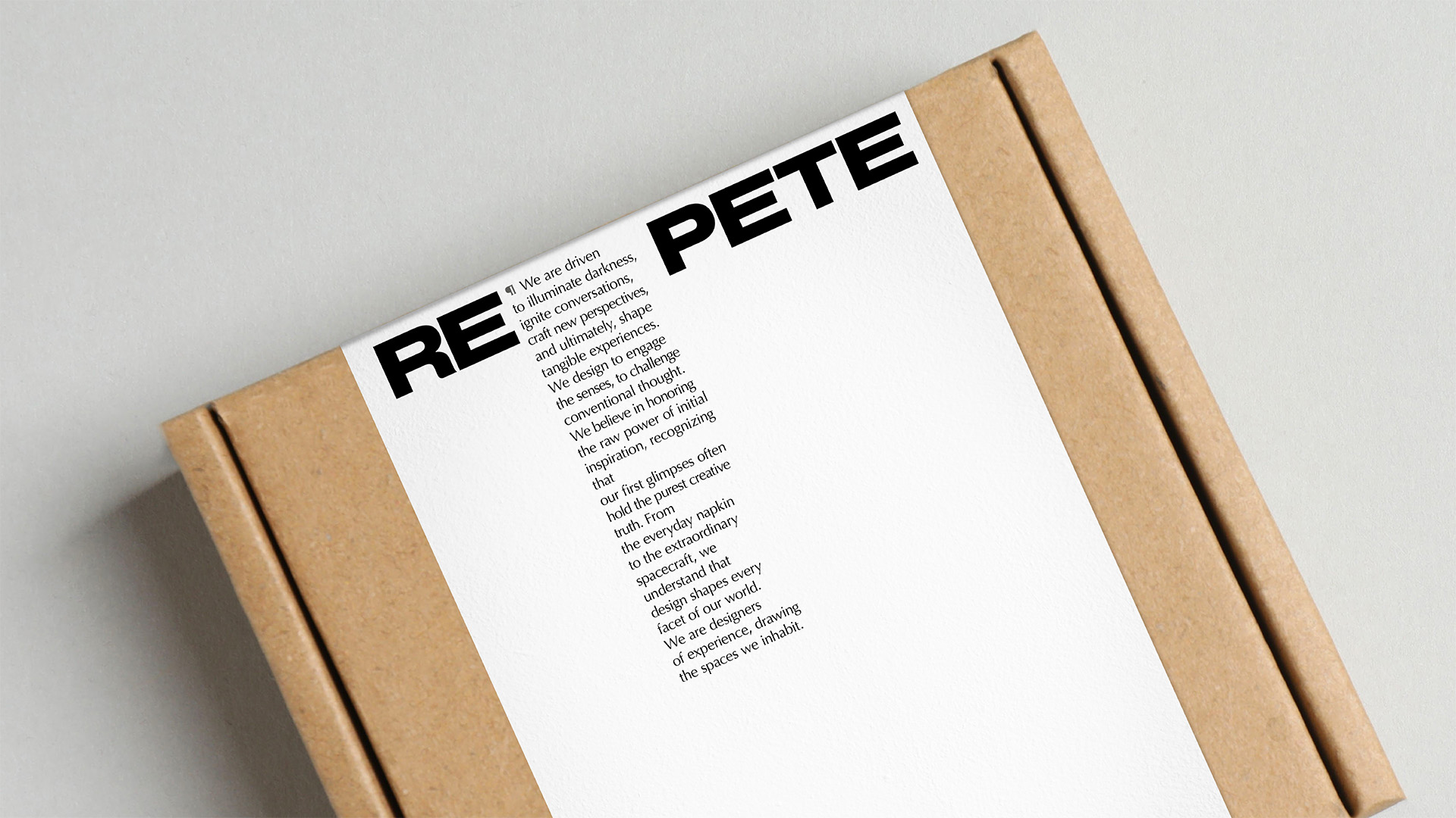
At the core of the identity lies the studio’s manifesto, which frames design as an act of illumination: igniting conversations, shaping perspectives, and creating tangible experiences. This philosophy directly informs the construction of the logo. The name REPETE is intentionally divided. After the prefix “re,” a paragraph symbol is introduced, marking the presence of the manifesto and acknowledging text as a structural element of the brand. The second part, “pete,” derives from the founder’s name, grounding the identity in authorship without turning it into a personal signature.
The gap between the two parts of the name functions as more than a typographic separation. It becomes a pause for reflection, symbolising the time required to think, observe, and allow ideas to mature. This moment of suspension reflects the studio’s belief that meaningful design is not rushed, but formed through consideration and intention. Thought precedes action, and space is given for ideas to settle before taking form.
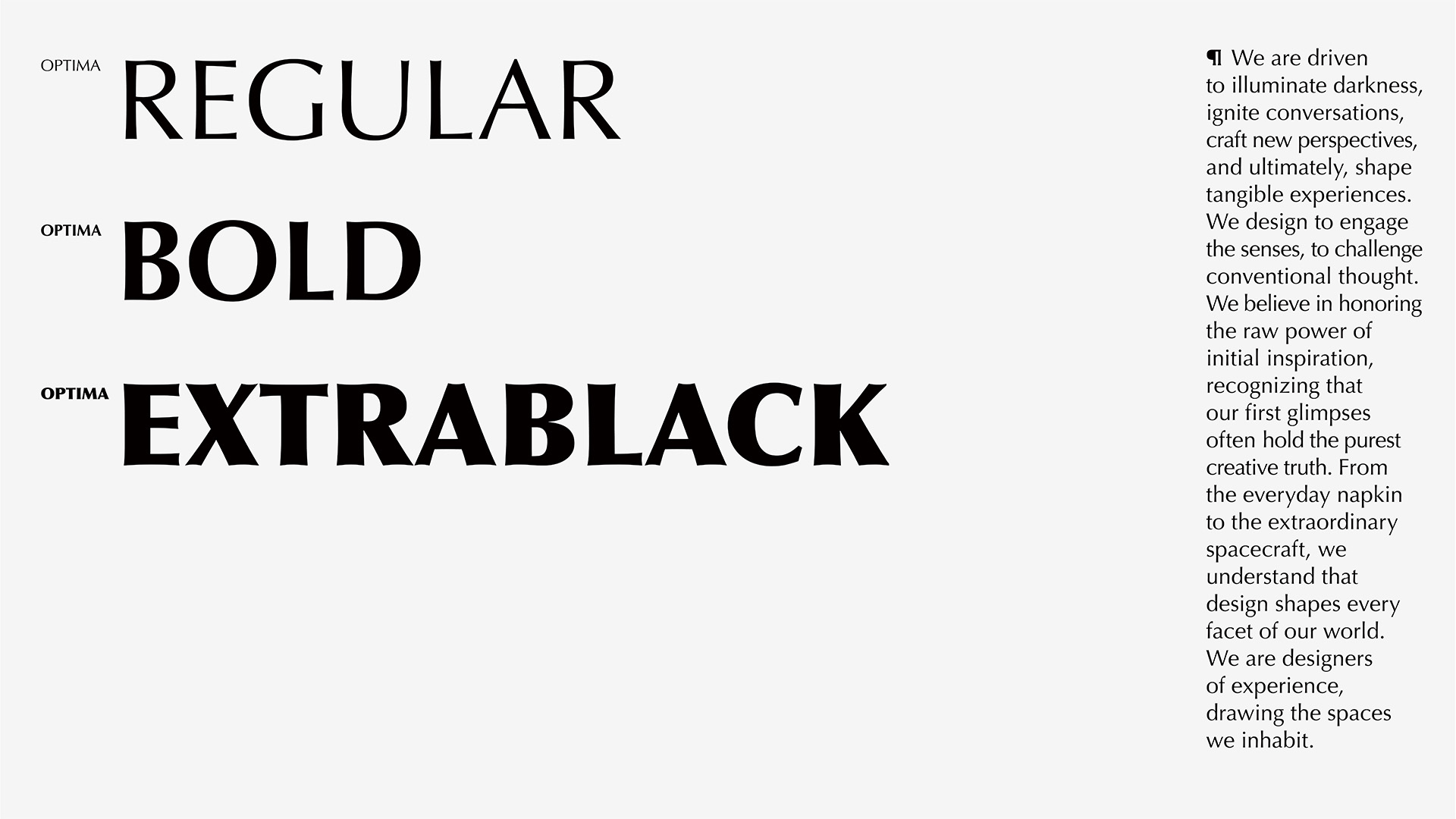
The typographic system reinforces this idea of pause and materiality. The font treats letters as surfaces rather than symbols — solid, planar forms that interact with light and shadow. Typography behaves spatially, echoing the studio’s roots in light design and its focus on how form is revealed, perceived, or concealed.
The wider identity system follows the same logic. Typography takes a central role and is treated as architectural. Layouts rely on controlled spacing and generous negative space, allowing black and white areas to interact with clarity and tension. The result is a visual environment that feels deliberate and precise, leaving room for materials, objects, and environments to speak.
RE PETE’s visual language reflects a design philosophy centred on durability, presence, and continuity. Objects and systems are conceived to remain relevant through use and time, becoming part of lived spaces rather than fleeting statements.
Ultimately, RE PETE’s identity operates as an extension of its practice. Restrained, conceptual, and precise, it represents a studio that designs experiences shaped by contrast, care, and conscious intent.
CREDIT
- Agency/Creative: A.S. Strategy Branding & Communication
- Article Title: A.S. Strategy Branding & Communication Shapes Repete Into a Studio Identity Built on Light and Contrast
- Organisation/Entity: Agency
- Project Type: Identity
- Project Status: Published
- Agency/Creative Country: Greece
- Agency/Creative City: Athens
- Market Region: Europe
- Project Deliverables: Brand Design, Brand Identity, Identity System, Logo Design, Typography, Web Design
- Industry: Retail
- Keywords: branding, brand, logotype, logo, typography, identity, website, brand identity
-
Credits:
Creative Director: Antonia Skaraki
Art Director: Laios Papazoglou


