


Marina Sfakianaki, a high-end interior design brand supplying designers and architects with carefully curated design materials, has built its reputation on discernment, consistency, and long-term relationships with the design community.
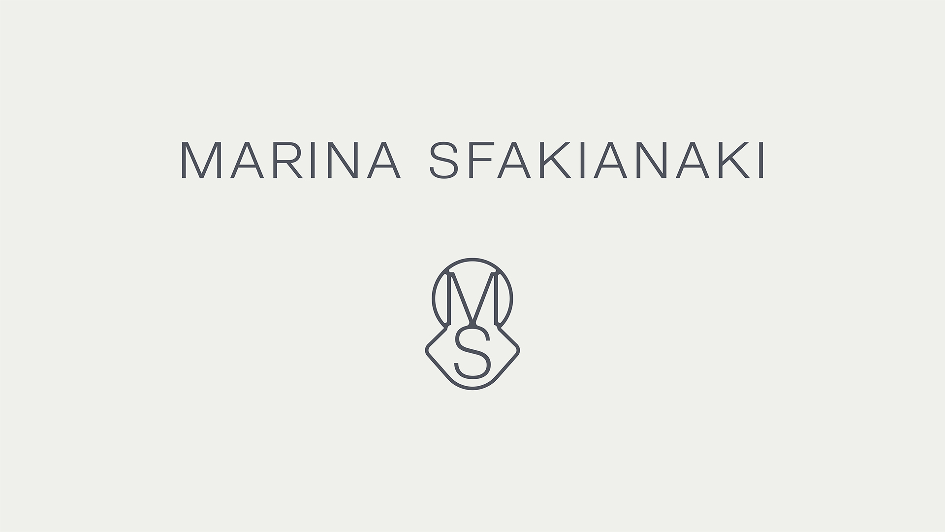
The challenge was to translate this rich, multifaceted universe into a visual language that feels elegant and timeless. We endeavoured to develop a design system that communicates luxury without stating it explicitly, and adaptability without imposing itself on space. A custom-designed typeface forms the backbone of the identity. Its proportions are architectural and refined, designed to function equally well across printed matter, packaging, and architectural-scale applications. Typography is treated as a structural element, reinforcing the brand’s sense of artistic elegance, professionalism, and quiet authority.
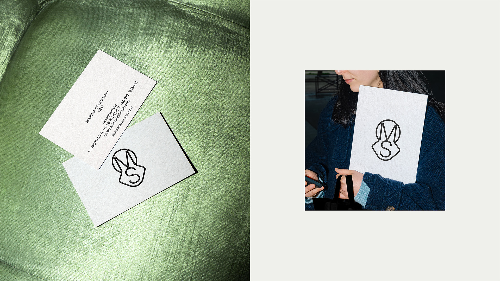
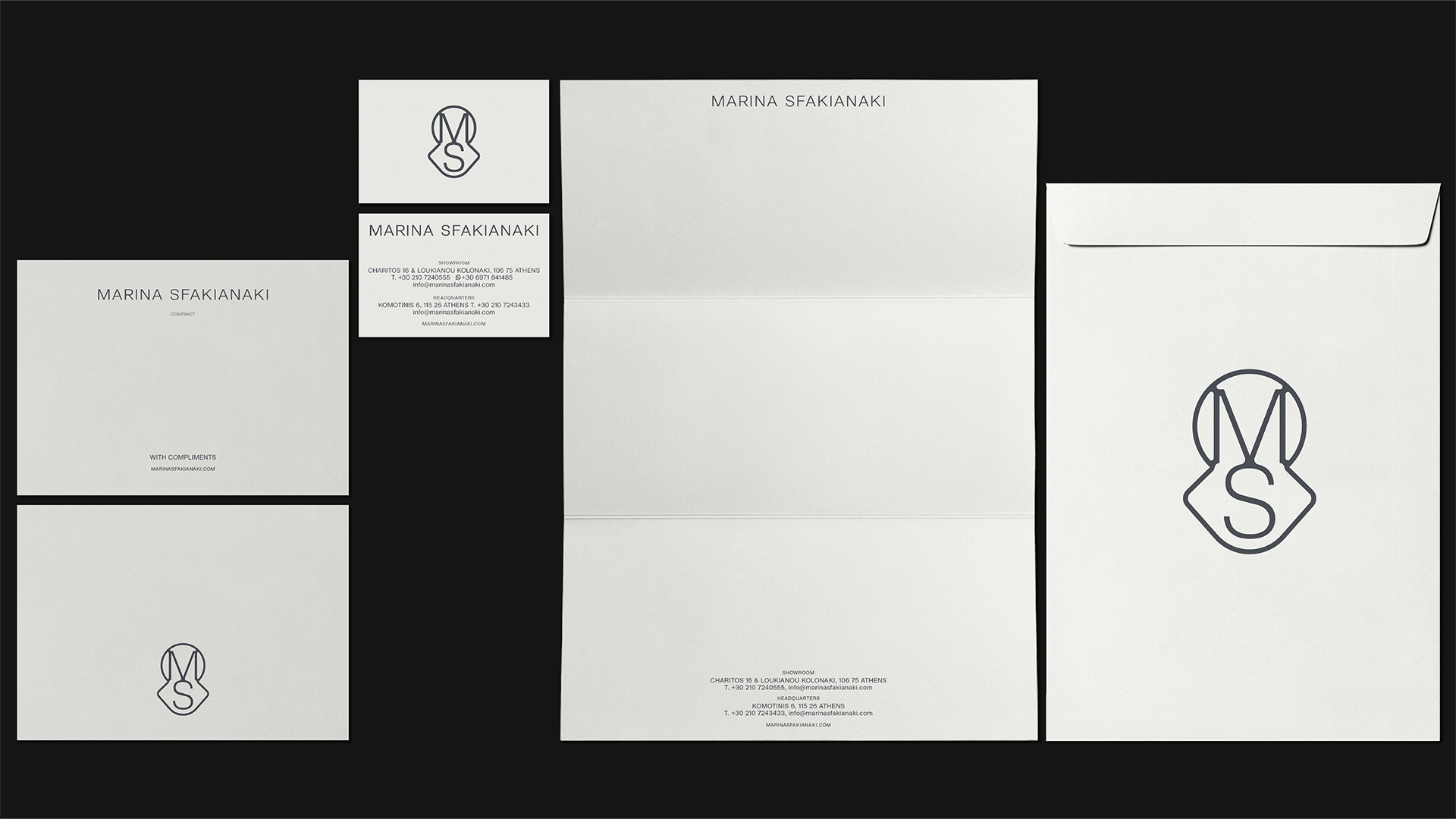
The symbol brings together a circle and a square into a single mark. The square is softened, losing its sharp edges, and introduces a tactile quality that reflects the brand’s focus on materiality and touch. The circle adds continuity, harmony, and flow. Together, they form a mark that feels both architectural and human—rigorous yet approachable. It functions as a contemporary coat of arms: artistic, restrained, and grounded in geometry, with shape as the starting point of everything. The symbol operates confidently as a standalone emblem while integrating seamlessly with the typographic system.
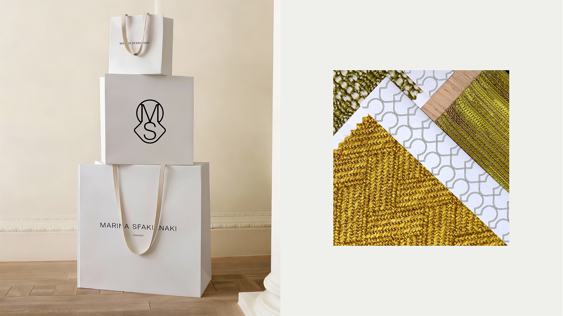
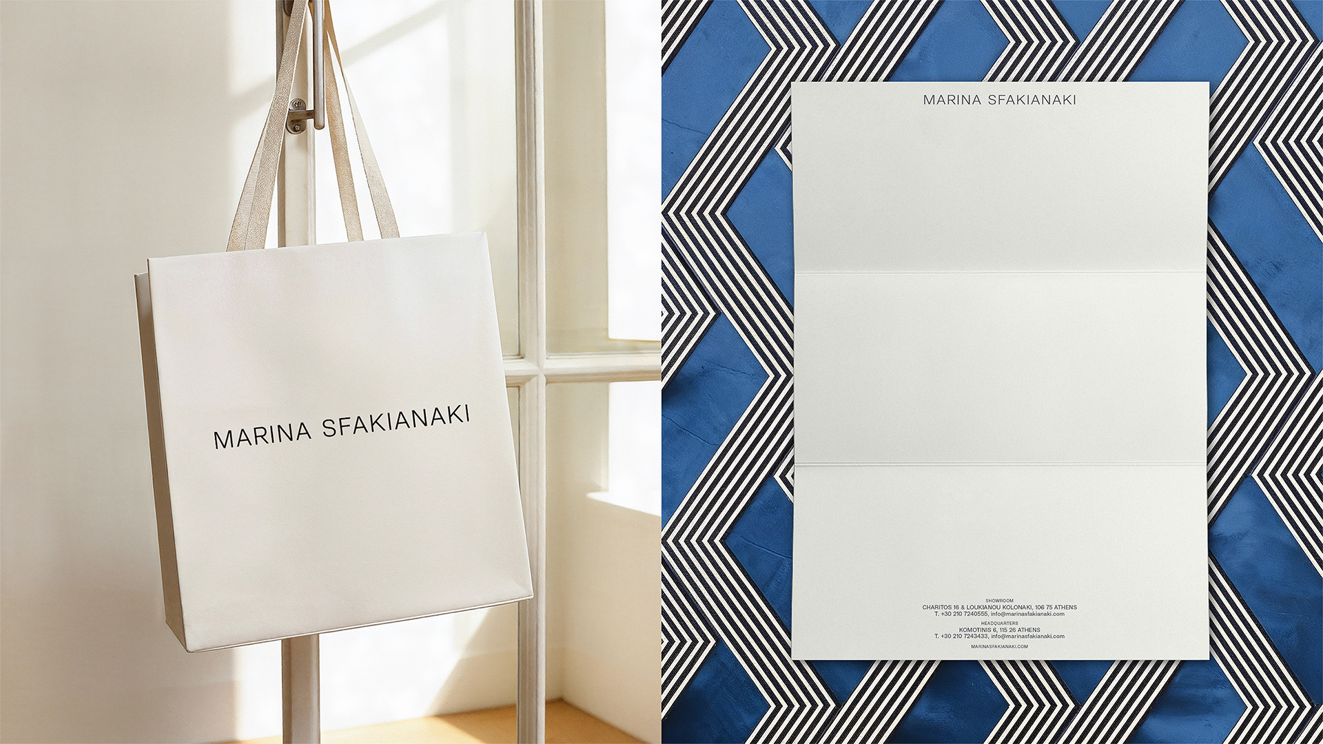
Colour and materials are handled with equal restraint. Soft neutrals and off-whites dominate the palette, creating a calm backdrop that allows textures, fabrics, and finishes to speak for themselves. Paper choices and print finishes emphasise tactility and precision, reflecting the same care found in the brand’s physical collections. From stationery and shopping bags to envelopes and presentation materials, every application follows a clear logic of hierarchy, spacing, and balance.
Beyond aesthetics, the identity reflects the brand’s philosophy of service. Marina Sfakianaki is associated not only with exceptional products, but also with attentive after-sales care and enduring client relationships. This ethos is embedded in the design through clarity, consistency, and the absence of visual noise. Nothing is excessive. Everything has a purpose.
The result is a corporate identity that functions as a quiet framework for excellence—timeless, confident, and adaptable. It positions Marina Sfakianaki not simply as a supplier, but as a long-term partner in the creative process, supporting designers and architects with substance and sensibility.
CREDIT
- Agency/Creative: A.S. Strategy Branding & Communication
- Article Title: A.S. Strategy Branding & Communication Gives Marina Sfakianaki a Timeless Identity Defined by Quiet Luxury
- Organisation/Entity: Agency
- Project Type: Identity
- Project Status: Published
- Agency/Creative Country: Greece
- Agency/Creative City: Athens
- Market Region: Europe
- Project Deliverables: Brand Design, Brand Identity, Branding, Identity System, Logo Design
- Industry: Retail
- Keywords: fabric, branding, identity
-
Credits:
Antonia Skaraki: Creative Director
Laios Papazoglou: Art Director


