


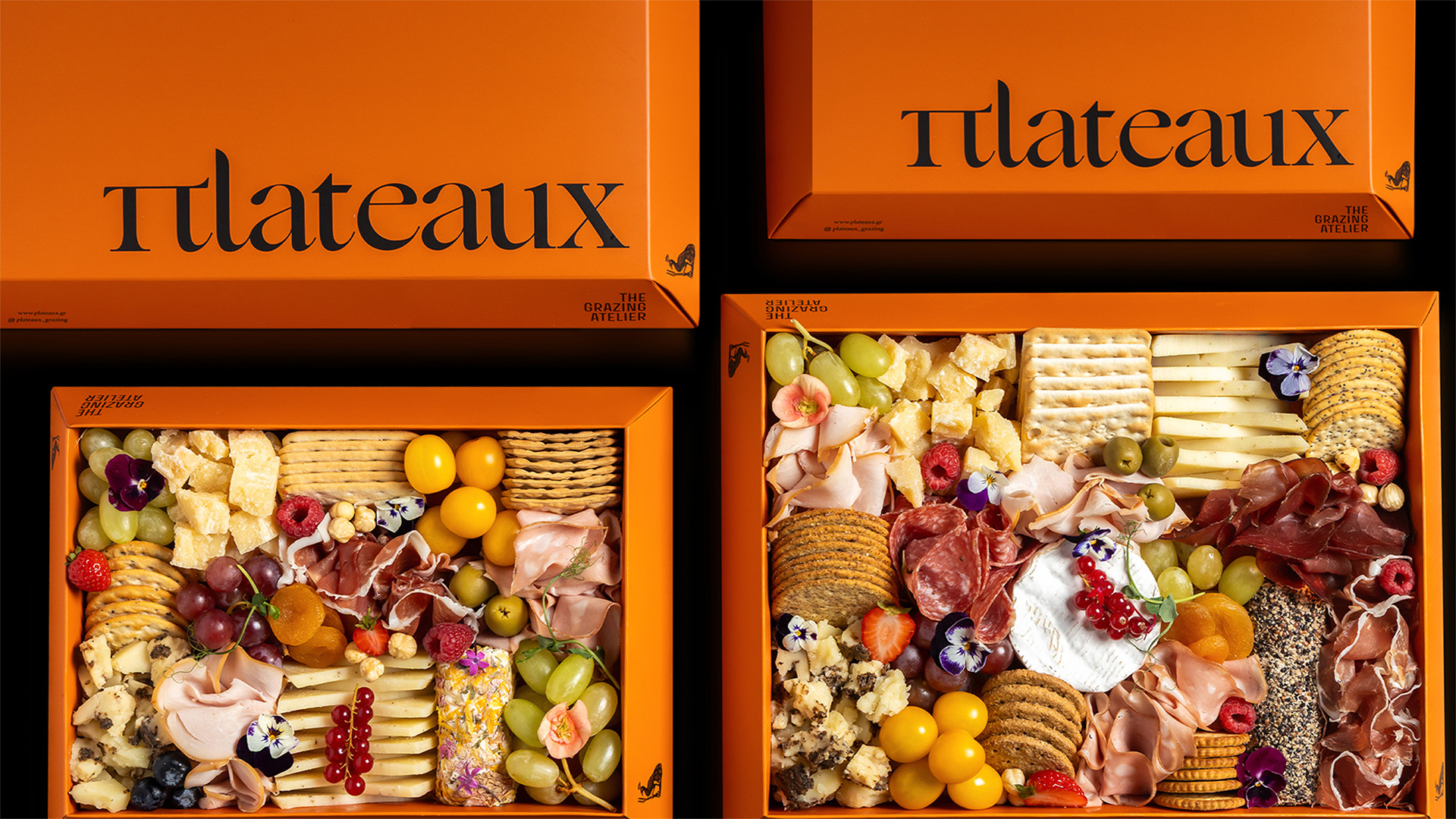
Plateaux is a grazing company that approaches food as composition. Its ready-made grazing dishes are designed for gatherings, celebrations and shared moments, where food becomes a visual and social experience. Historically, shared tables were scenes of abundance and intention, where food was arranged to be seen, admired and then enjoyed together. Plateaux translates this sensibility into a contemporary grazing format through its design.
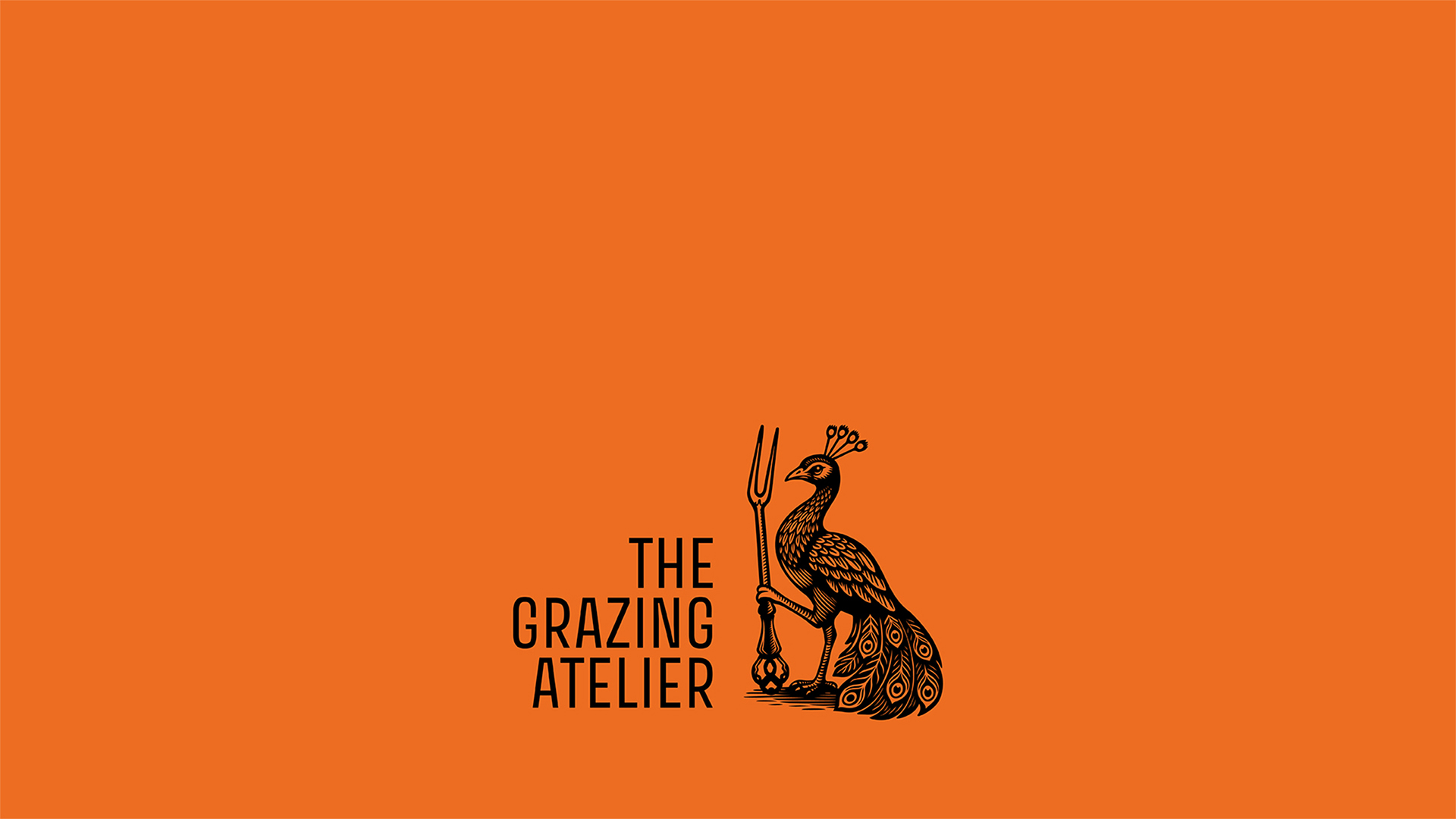
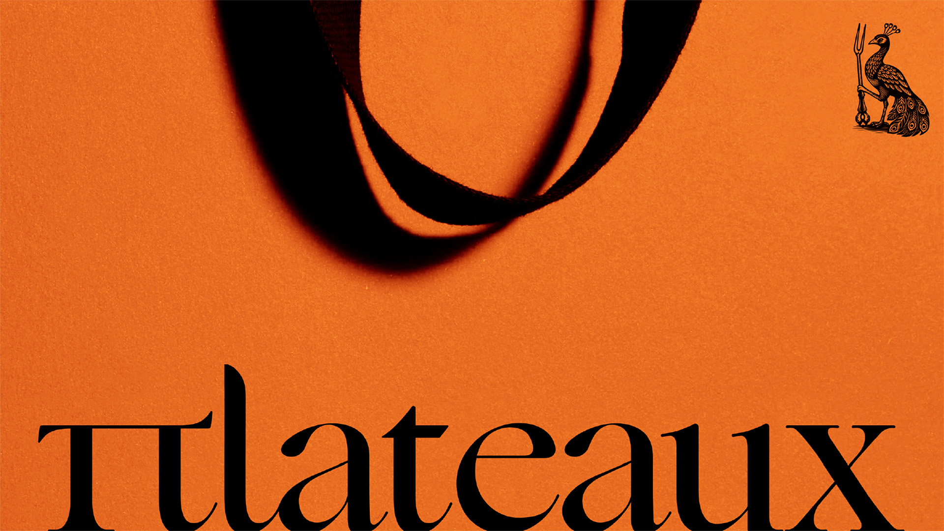
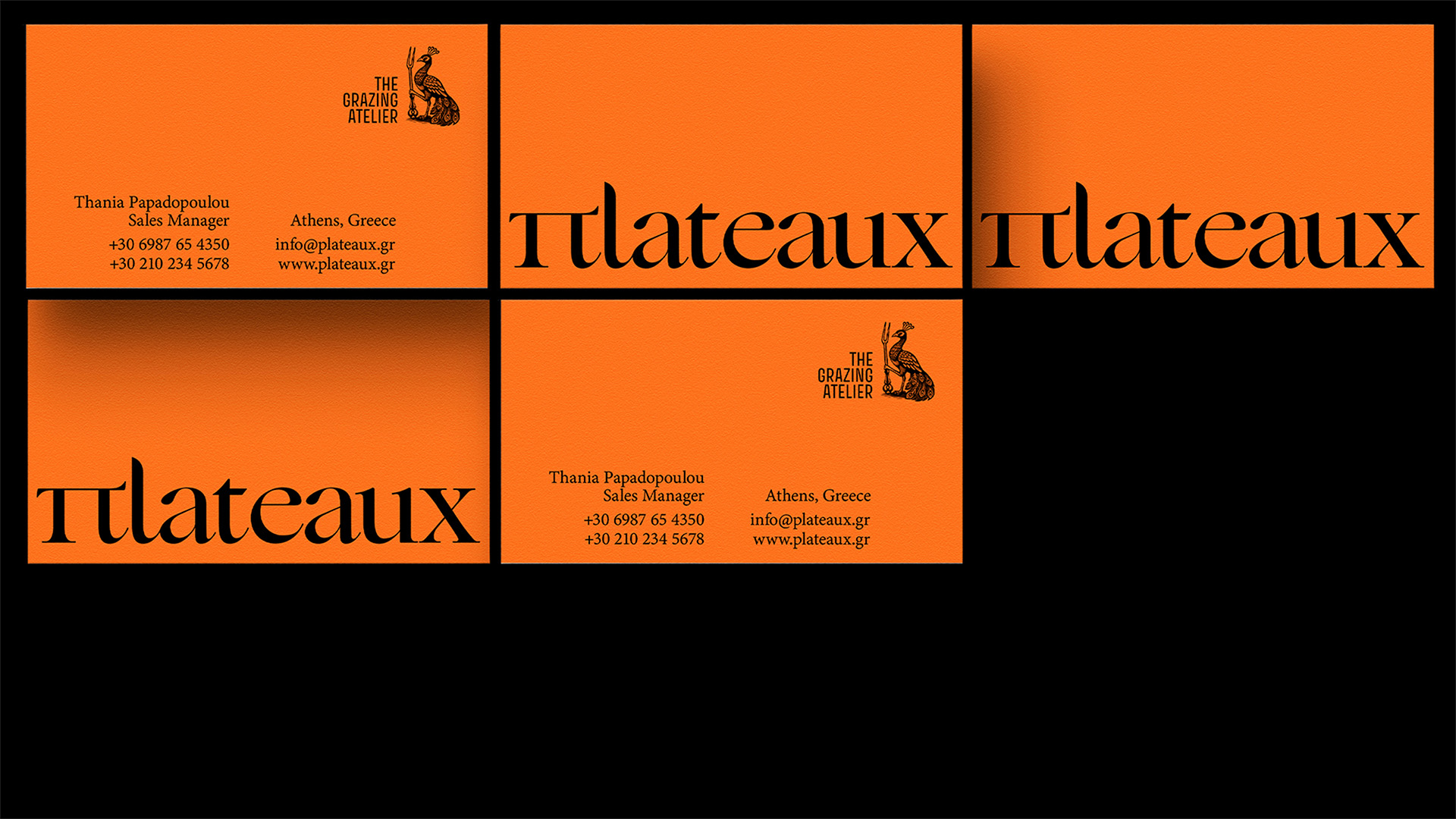
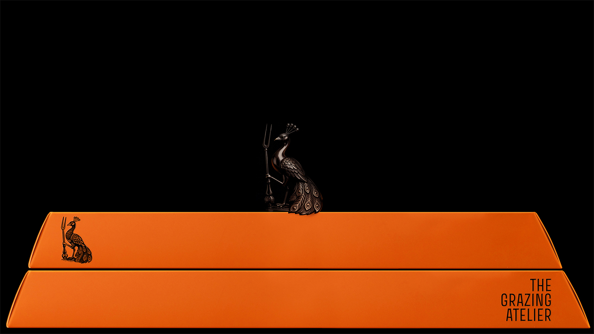
“The Grazing Atelier” defines the brand’s philosophy of treating presentation as an art form. The symbol of the peacock paired with an ornamented fork conveys the abundance once encountered at the lavish tables of the French court under Louis XIV. This reference sets a maximalist and expressive tone for the brand, confident and unapologetically showy in its celebration of food and sharing.
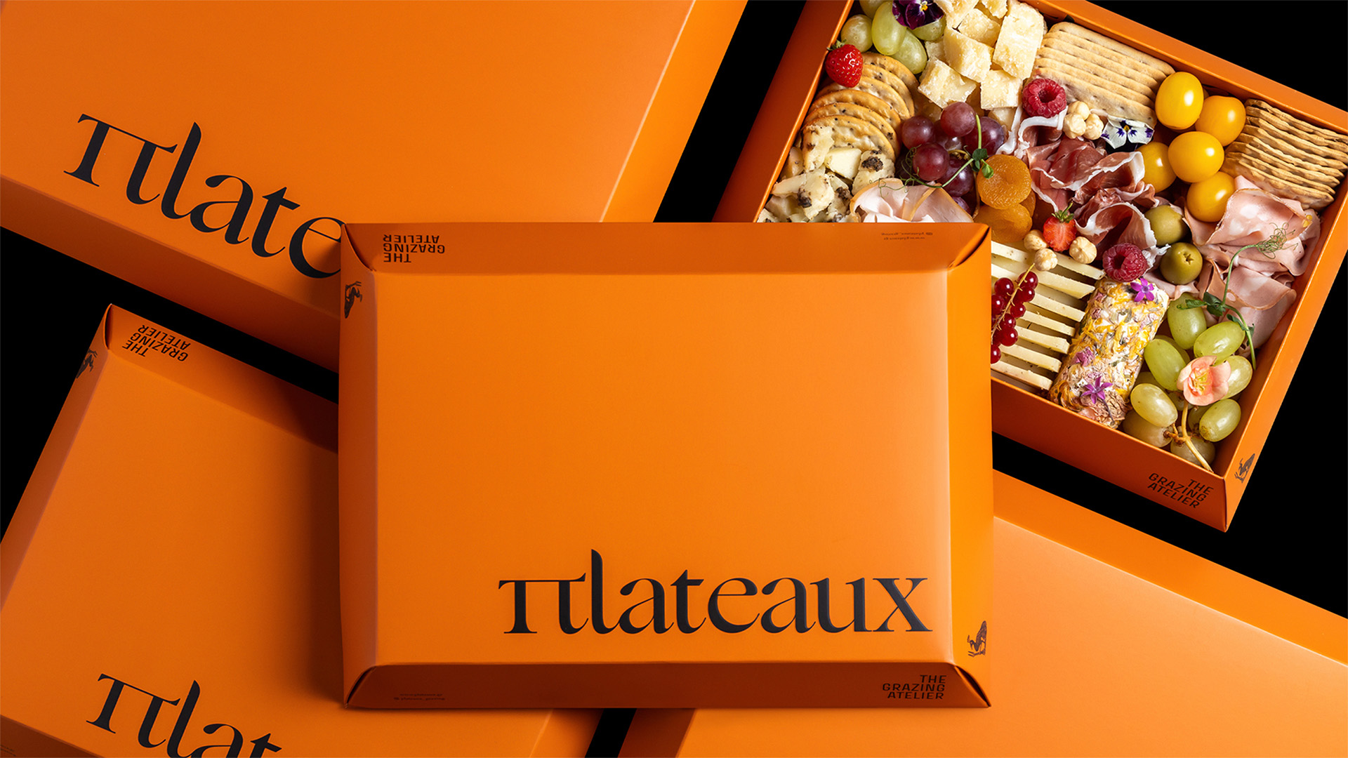
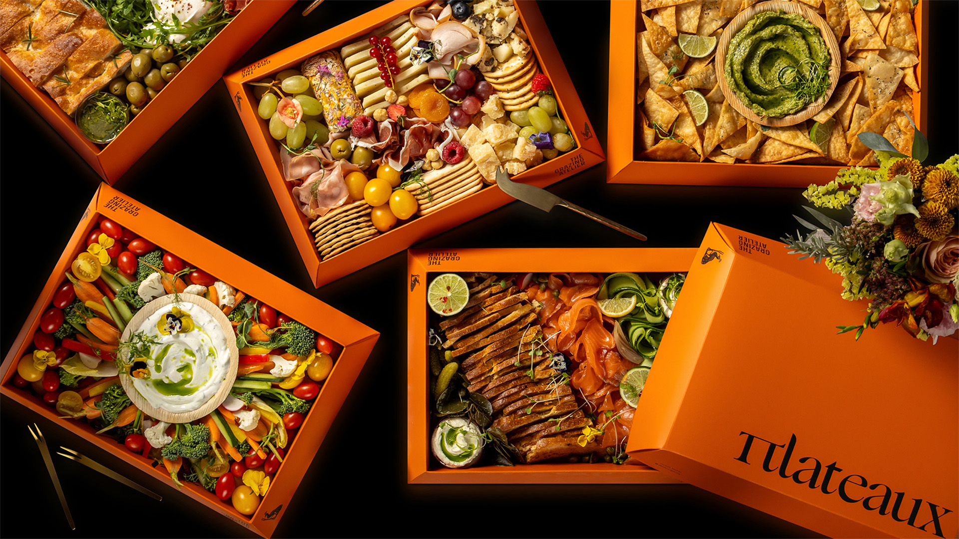
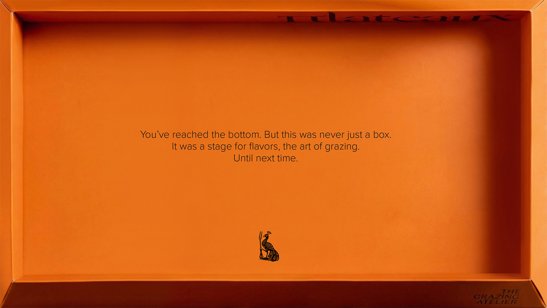
Packaging is conceived as a central part of this experience, functioning as a framing device. Each box operates as a visual field, holding a curated composition of colour, texture and detail. The contents are not concealed but displayed, allowing the ingredients themselves to become the protagonists of the composition. Colour is bold and confident, used as a statement in its own right.
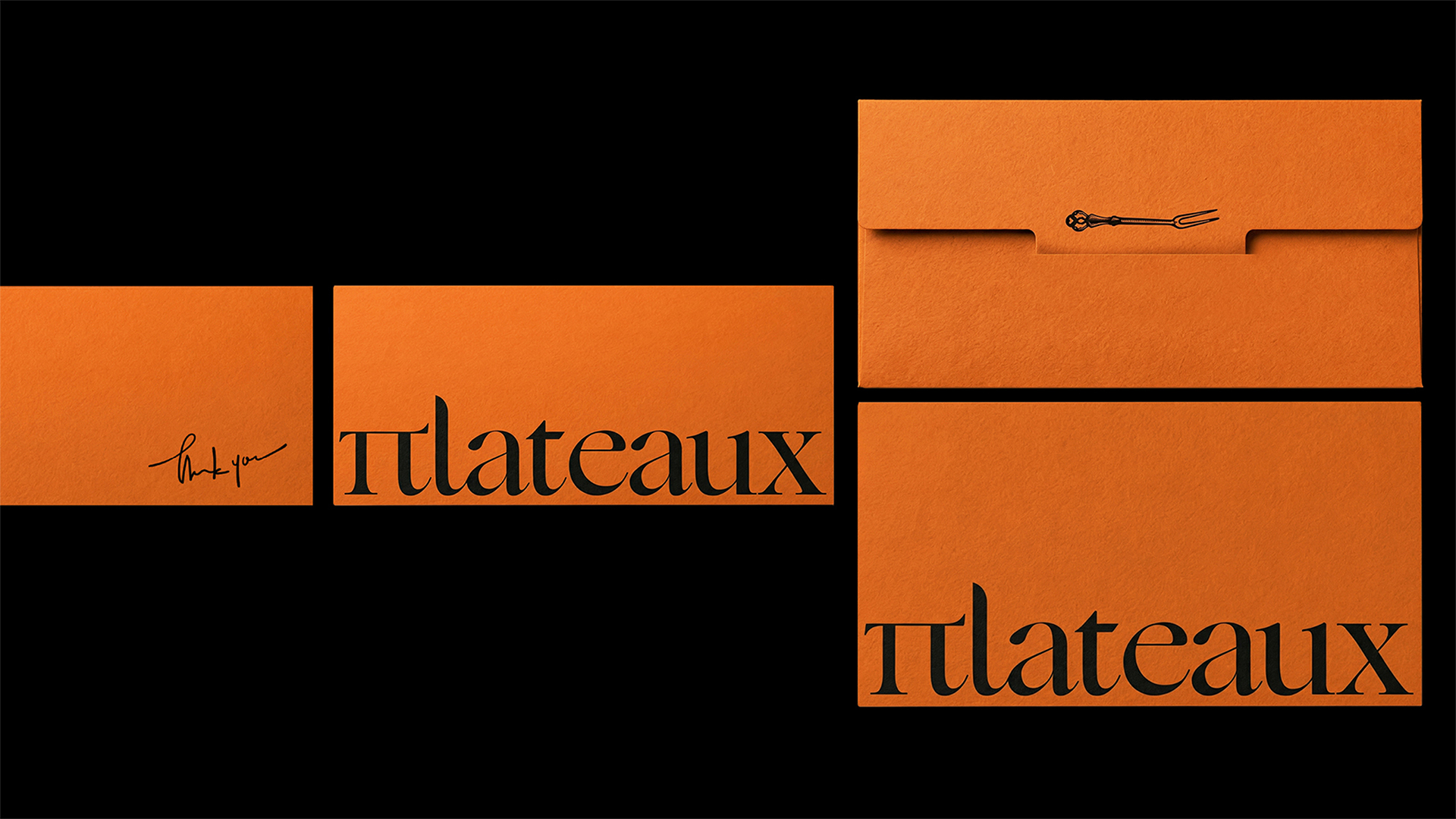
The fork emerges as a recurring visual and symbolic element throughout the system. Beyond its ornamental presence in the brand mark, it also appears on a series of cards that accompany each box. These cards are bound to the packaging with a ribbon and identify the theme of each grazing selection based on its contents. The fork becomes a signifier of what lies inside, linking the act of eating with the act of presentation, and reinforcing the idea of grazing as a curated experience.
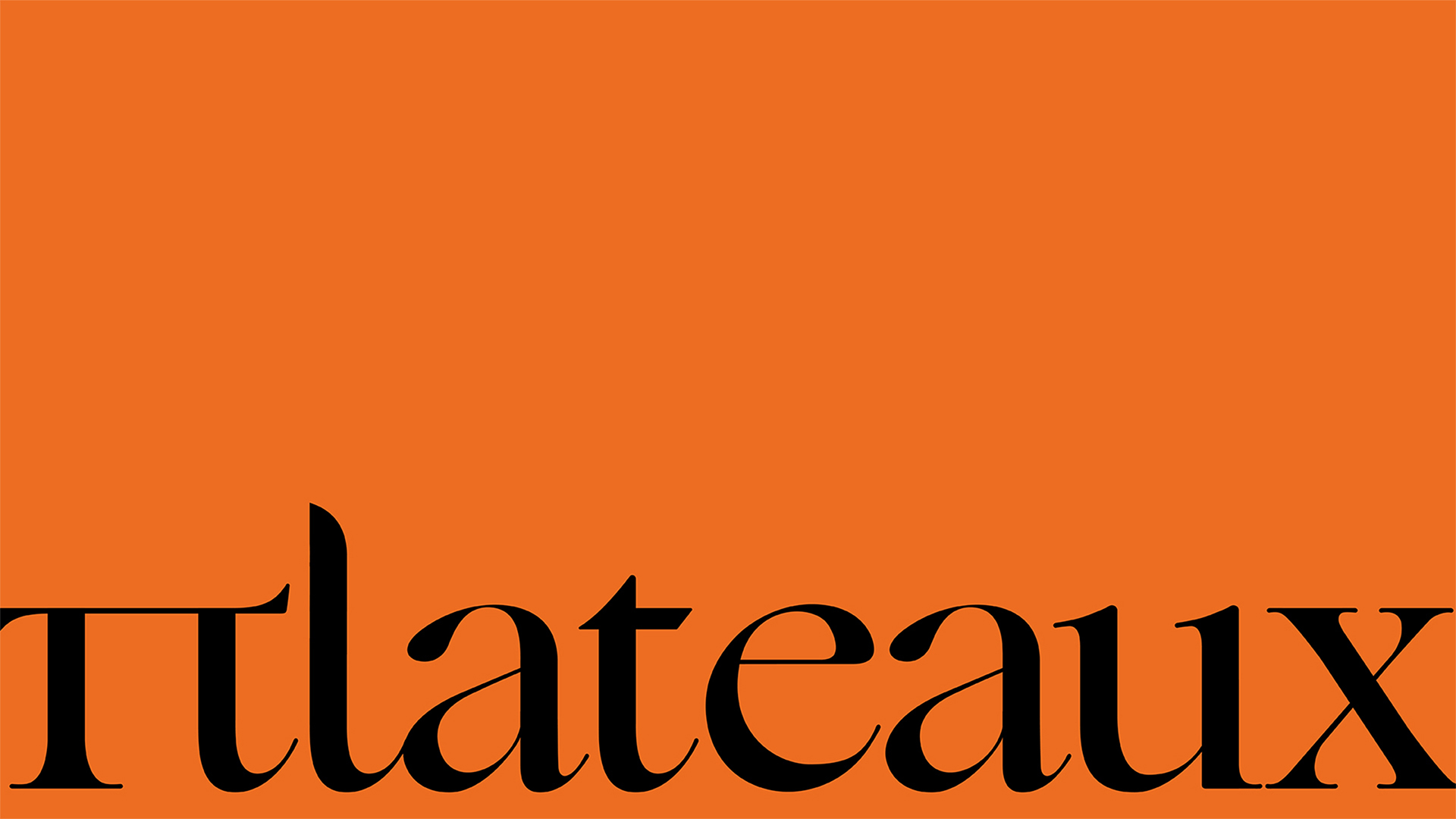
Typography plays a defining role in establishing the brand’s identity. The name Plateaux is written using the Greek character Π in place of the Latin P. This typographic choice introduces a sense of structure and presence, referencing the idea of a plateau as a surface, a base, a place where things are laid out. The Π also adds a distinct cultural and visual character to the logo, making it immediately recognisable.
Through typography, symbolism and composition, Plateaux frames food as it would frame an objet d’art. The result is a packaging system that transforms grazing into a ritual and sharing into an experience, where each box exists briefly, but leaves a lasting impression.
CREDIT
- Agency/Creative: A.S. Strategy Branding & Communication
- Article Title: A.S. Strategy Branding & Communication Designs Plateaux With Maximalist Symbolism and Court-Inspired Abundance
- Organisation/Entity: Agency
- Project Type: Identity
- Project Status: Published
- Agency/Creative Country: Greece
- Agency/Creative City: Athens
- Market Region: Europe
- Project Deliverables: Brand Design, Packaging Design
- Industry: Food/Beverage
- Keywords: food, branding, packaging
-
Credits:
Creative Director: Antonia Skaraki
Art Director: andreas Deskas


