Yebuna coffee draws its inspiration from the authenticity and deep cultural heritage of coffee. Its philosophy is rooted in the origins and traditions of coffee, offering a taste experience that embraces quality and legacy. The story of coffee begins in Ethiopia, where it is not just a drink but a centuries-old tradition woven into the fabric of everyday life. Coffee ceremonies, a cornerstone of Ethiopian culture, symbolise community, hospitality, and connection. These gatherings are more than just the preparation of a beverage—they are rituals where coffee is roasted, brewed, and shared in a process that honours both the bean and the bonds between people.
The aim was to create a brand that celebrates the importance of coffee’s provenance and flavour, inspired by Ethiopian culture.
In Amharic, “Yebuna” means “of coffee.” The soul of coffee. The taste of coffee. The quality of coffee. On a second reading, the prefix “ye” encapsulates the positive energy of “yes” — “ye” — promising the satisfaction that every sip brings. Meanwhile, the root “buna,” reminiscent of the Italian “good” (buona), evokes the essence of something inherently good and pure. Together, the name embodies the soul of coffee, offering not just its taste, but also the joy, the moments, and the energy it creates around us. Yebuna draws from this cultural richness, infusing its brand with the spirit of these ceremonies, where every cup tells a story.
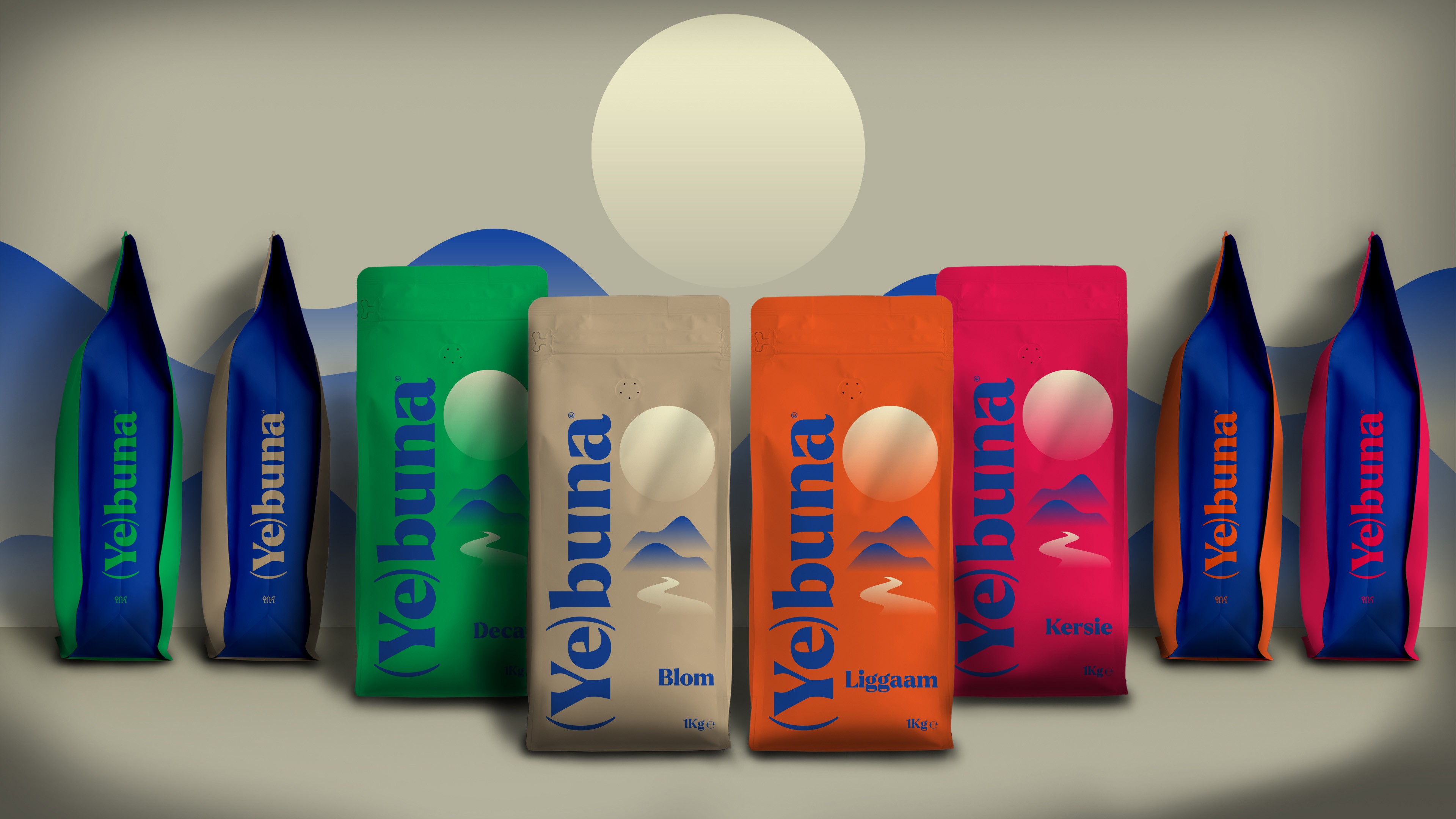
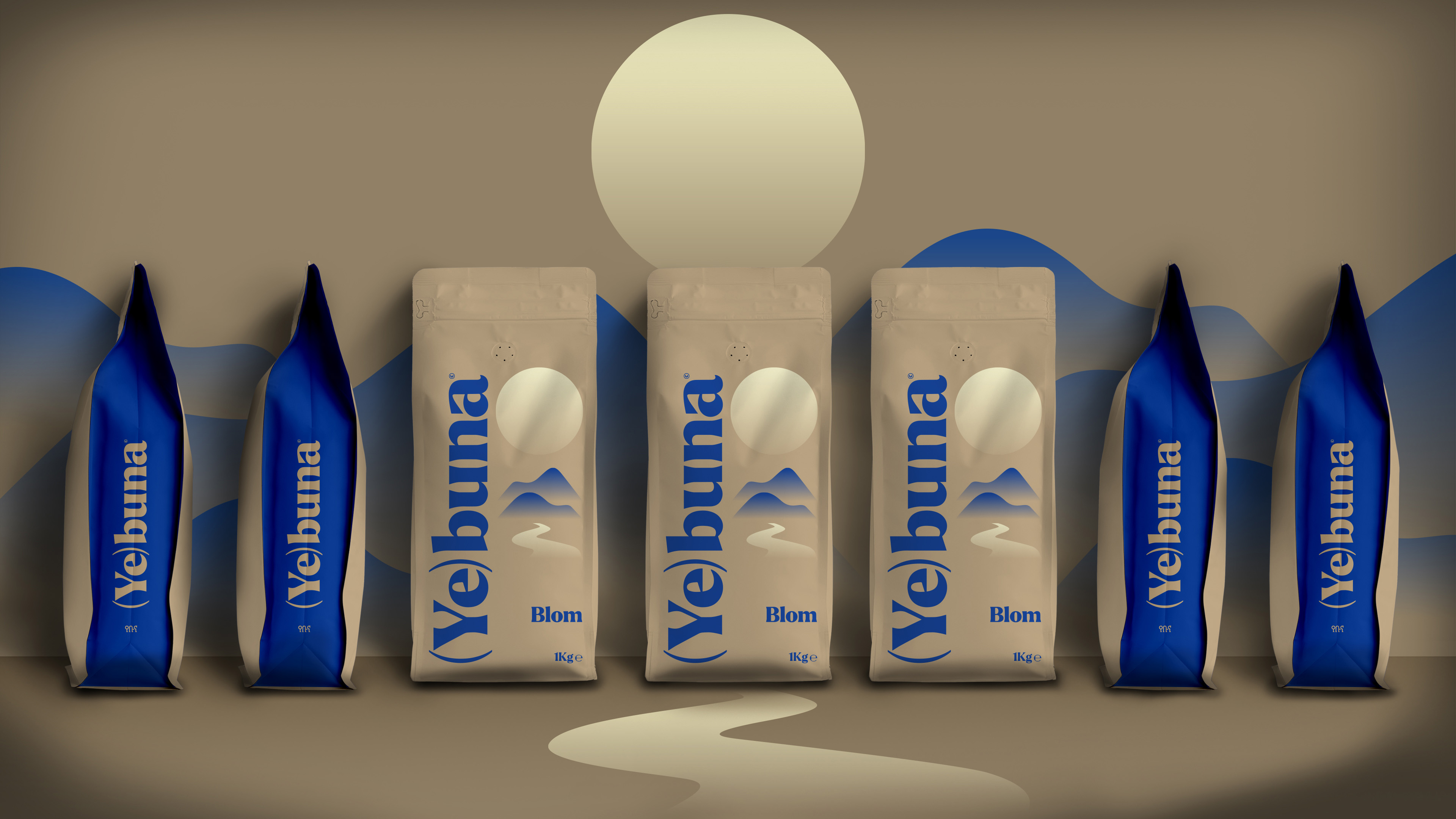
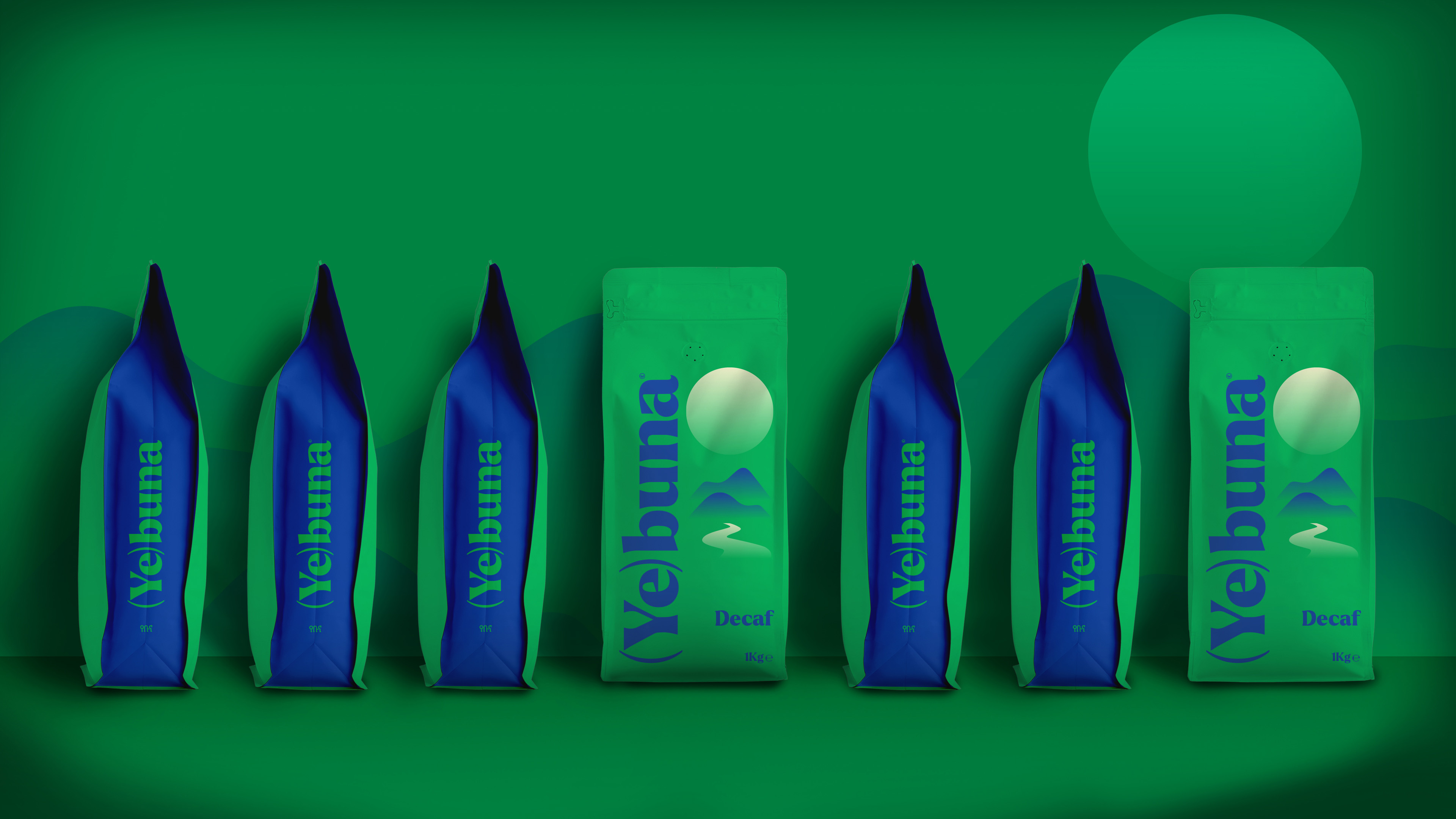
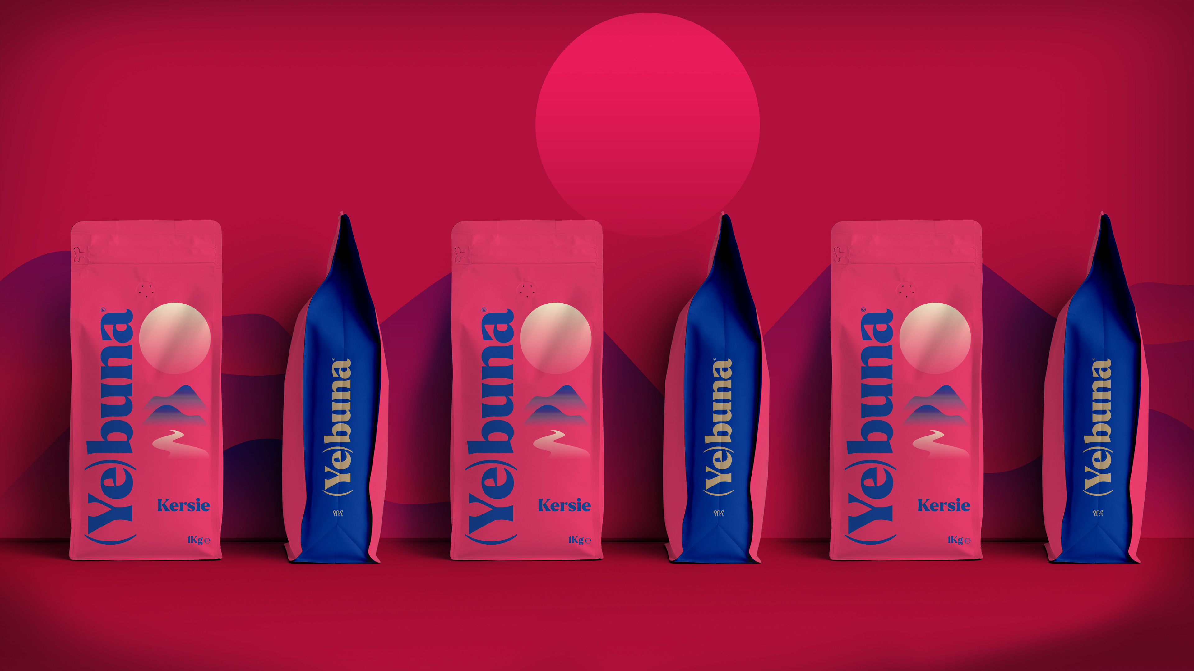
The logo’s design focuses on the clarity of the font, reflecting the purity of Yebuna’s flavour. Parentheses work as a capsule transferring actions and reactions. Transferring the different meanings coffee has for different coffee lovers. It’s an open vessel activating the senses in a postmodern experience of taste and pleasure.
Colour plays a central role in the design, with the vibrant, lively hues of Africa bringing to life the coffee’s origins. The vivid hues of Africa paint the landscape from which the coffee originates—the magical sunset, the sun illuminating the mountains and water. The water is a path—the journey the coffee takes to travel closer to us. Coffee flows. Nothing is static: time, sensations, and pleasure follow this endless road, guided by our mood and constant desire for delight. The only thing solid, built to last through time unchanged, is the logo itself. It stands tall, almost like a pyramid—a symbol of value, excellence, and promise. This concept is a journey, immersing us in something mysterious and wonderfully enjoyable.



CREDIT
- Agency/Creative: A.S. Strategy Branding & Communication
- Article Title: A.S. Strategy Branding & Communication Celebrates Ethiopian Heritage in Yebuna Coffee Identity
- Organisation/Entity: Agency
- Project Type: Packaging
- Project Status: Published
- Agency/Creative Country: Greece
- Agency/Creative City: Athens
- Market Region: Europe
- Project Deliverables: Packaging Design
- Format: Pouch
- Industry: Food/Beverage
- Keywords: branding, packaging, identity design, coffee, typography
-
Credits:
Creative Director: Antonia Skaraki
Art Director:: Andreas Deskas


