


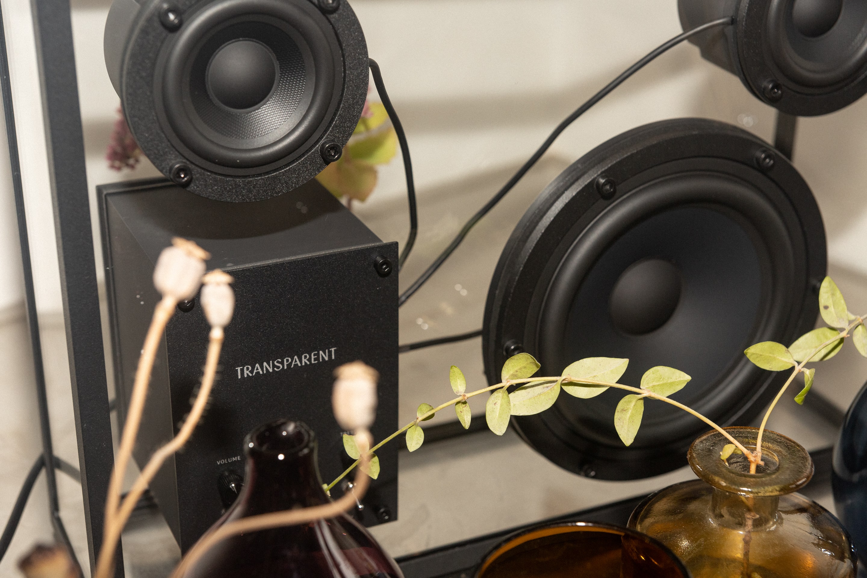
Transparent creates timeless modular speakers for the home. The company’s mission is to create a circular system of beautiful and repairable products that are future-proofed for new technologies. A refined identity, by design studio Bedow, captures the craft and clarity at the brand’s core.
In a world of complicated electronics that swiftly become obsolete, Transparent takes a more sustainable approach. The company makes striking products by stripping away complexity, considering every detail, and using fewer and better materials. The result is a product that is refined and purposeful: a speaker housed in aluminium and tempered glass, designed to last a lifetime.
Transparent partnered with design studio Bedow to give its brand the simplicity and elegance to match its products. The name was refined from ‘Transparent Speaker’ to the more powerful and suggestive ‘Transparent’, while a design strategy, ‘Timeless, modular electronics’, gives the company a new guiding light. And the concept of shadows – things that are both there and not there – unlocks new ways to express the brand.
A new brand symbol uses the shadow of a T to visualise the idea of transparency – one of the hardest challenges of the project. Choosing a calligraphic typeface for the word mark brings a hand-crafted element to an otherwise clean and modern brand.
“It was important not to interfere with the product,” says Perniclas Bedow, creative director of Bedow. “So we used a subtle contrast of elements that play on the boundary of visible and invisible. The symbol is a classic piece of graphic design: the word mark says transparent, and the symbol shows transparent.”
“Design is often used to put a fancy surface onto something,” says Per Brickstad, one of the founders of Transparent. “We want to do the exact opposite. We want to show products as they really are. The new logo is as powerful and balanced as our tech – and it’s all part of the evolution of Transparent.”
![]()
![]()
![]()
![]()
![]()
![]()
![]()
![]()
CREDIT
- Agency/Creative: Bedow
- Article Title: A Refined Identity Designed by Studio Bedow for Modular Electronics Brand Transparent
- Organisation/Entity: Agency, Published Commercial Design
- Project Type: Identity
- Agency/Creative Country: Sweden
- Market Region: Europe
- Project Deliverables: Brand Identity, Brand Strategy, Graphic Design, Packaging Design, Tone of Voice
- Industry: Technology
- Keywords: Electronics, Music, Sustainable, Technology, Transparent, Bedow, Timeless, Shadow


