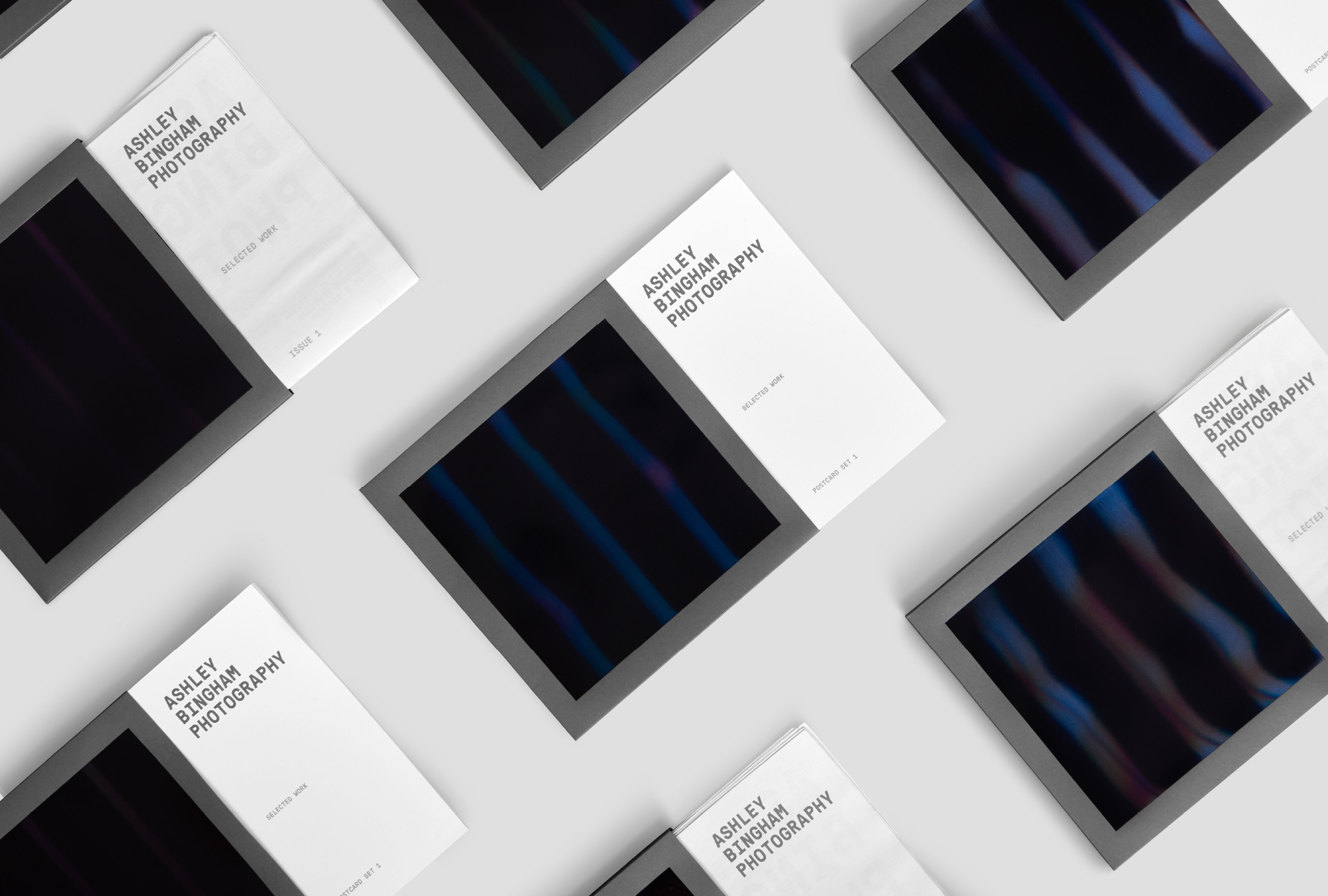
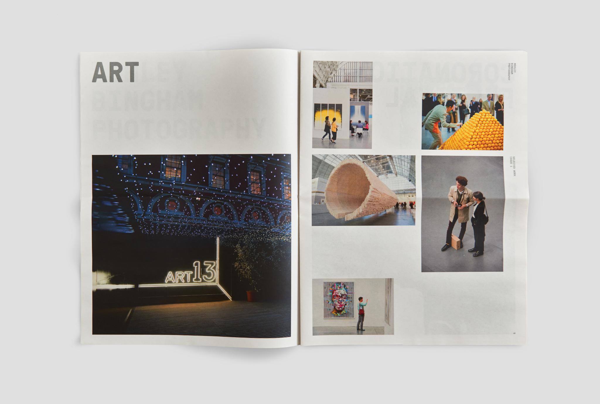
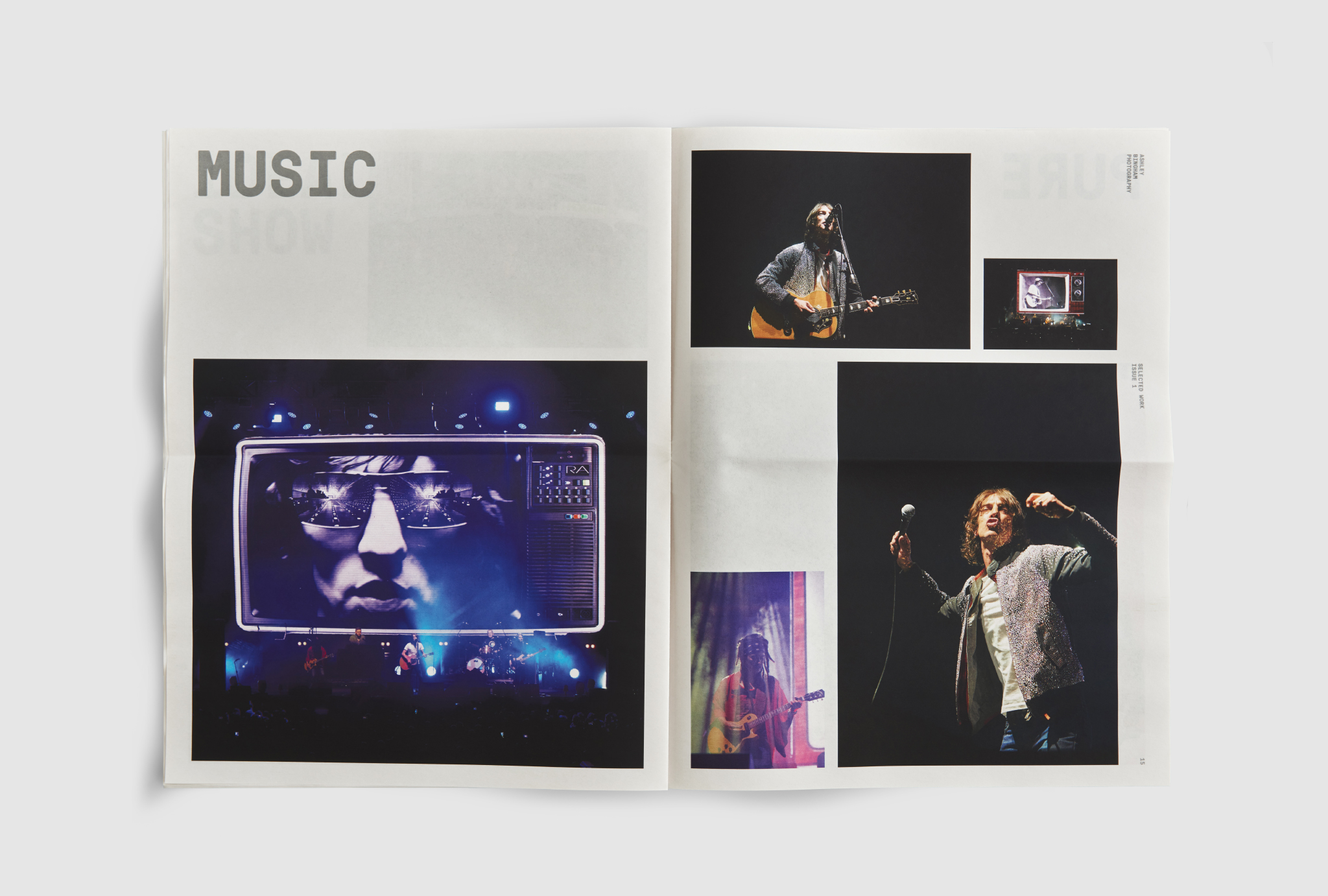
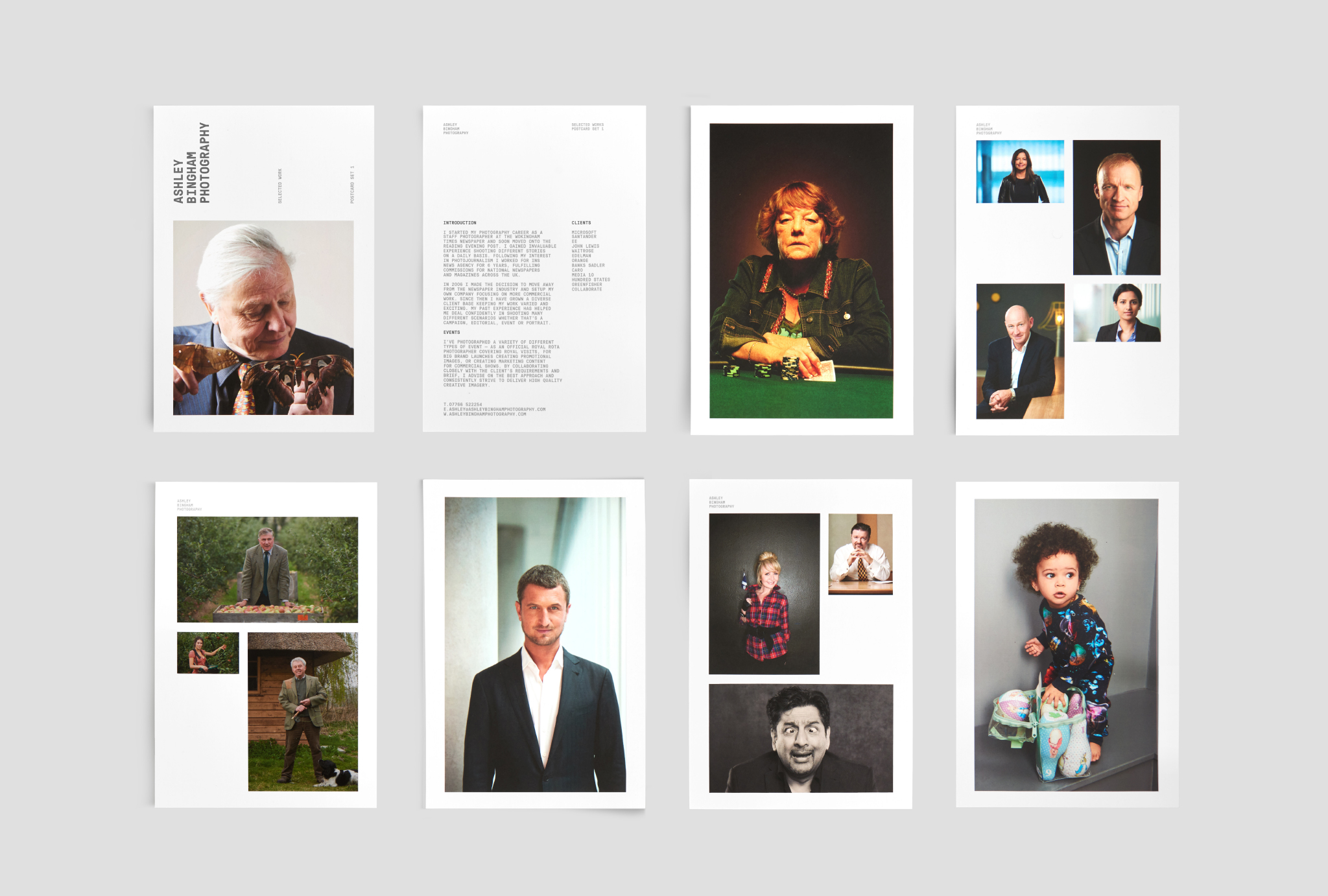
As a commercial, editorial and advertising photographer, Ashley’s work yields a constantly growing and evolving body of work. To help showcase this work to a new targeted audience, we developed a printed promotional portfolio.
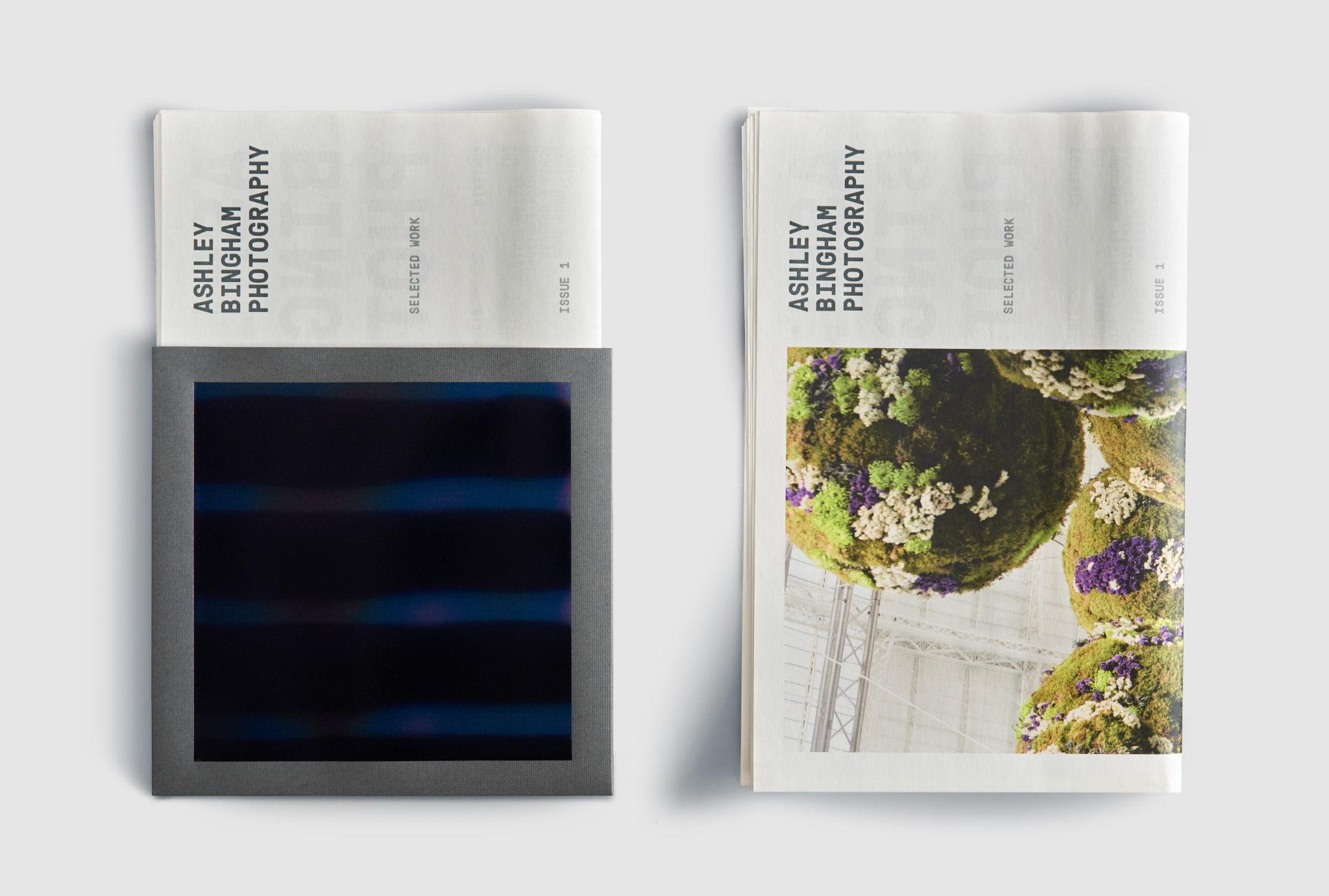
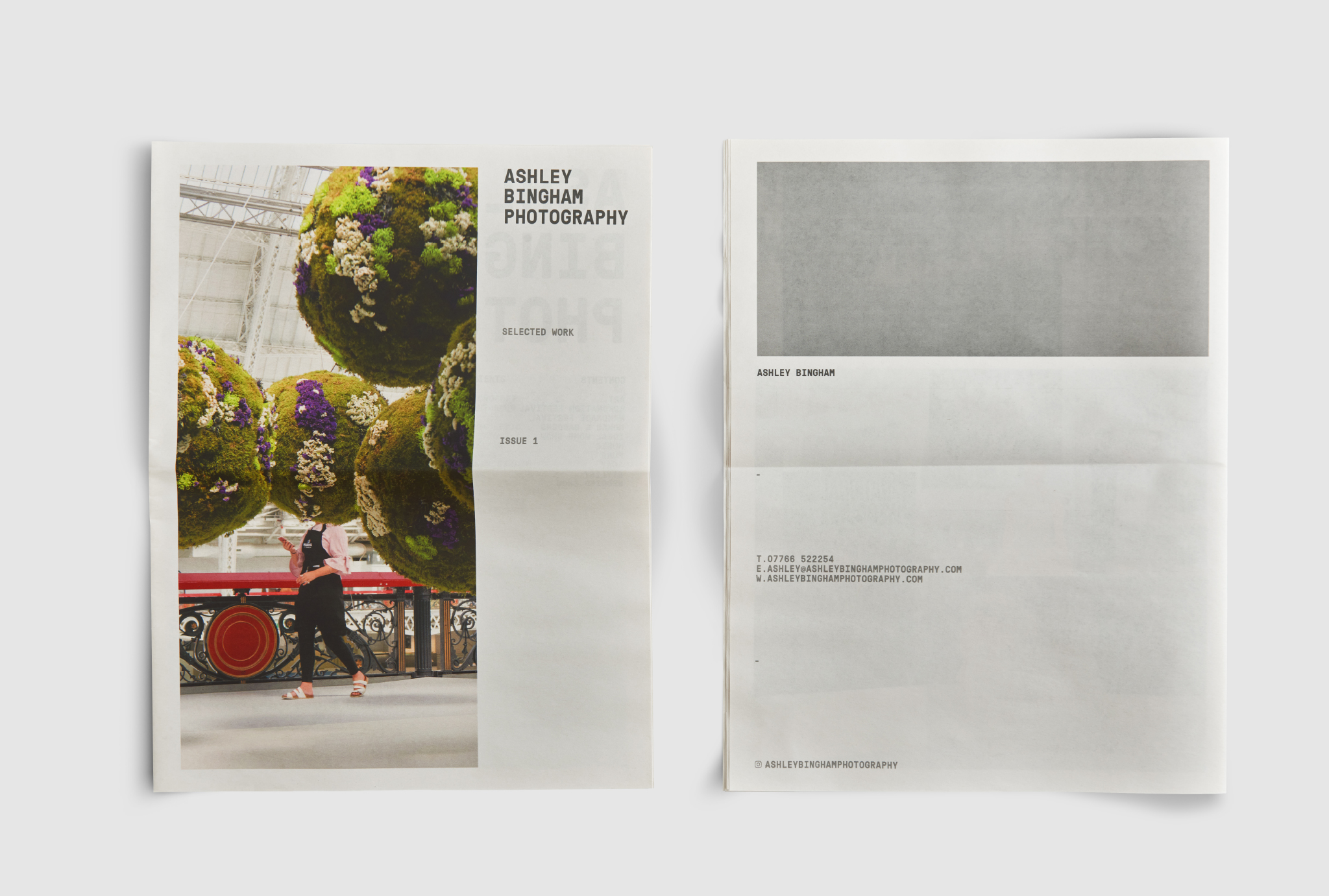
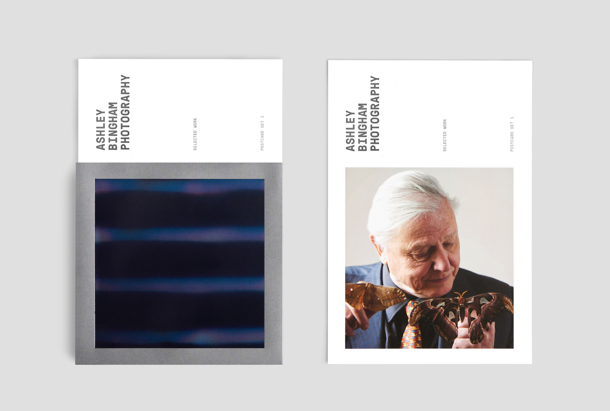
Understanding Ashley’s broad appeal was key to finding the right solution, and led us to settle on a two-tiered system — a newspaper and postcard set, with which to engage new clients within the events, and corporate and editorial spheres, respectively.
Both the design of the newspaper and the postcards reference the rule of thirds, a fundamental rule in photograph, and the main source of inspiration for the identity we originally created for Ashley Bingham.
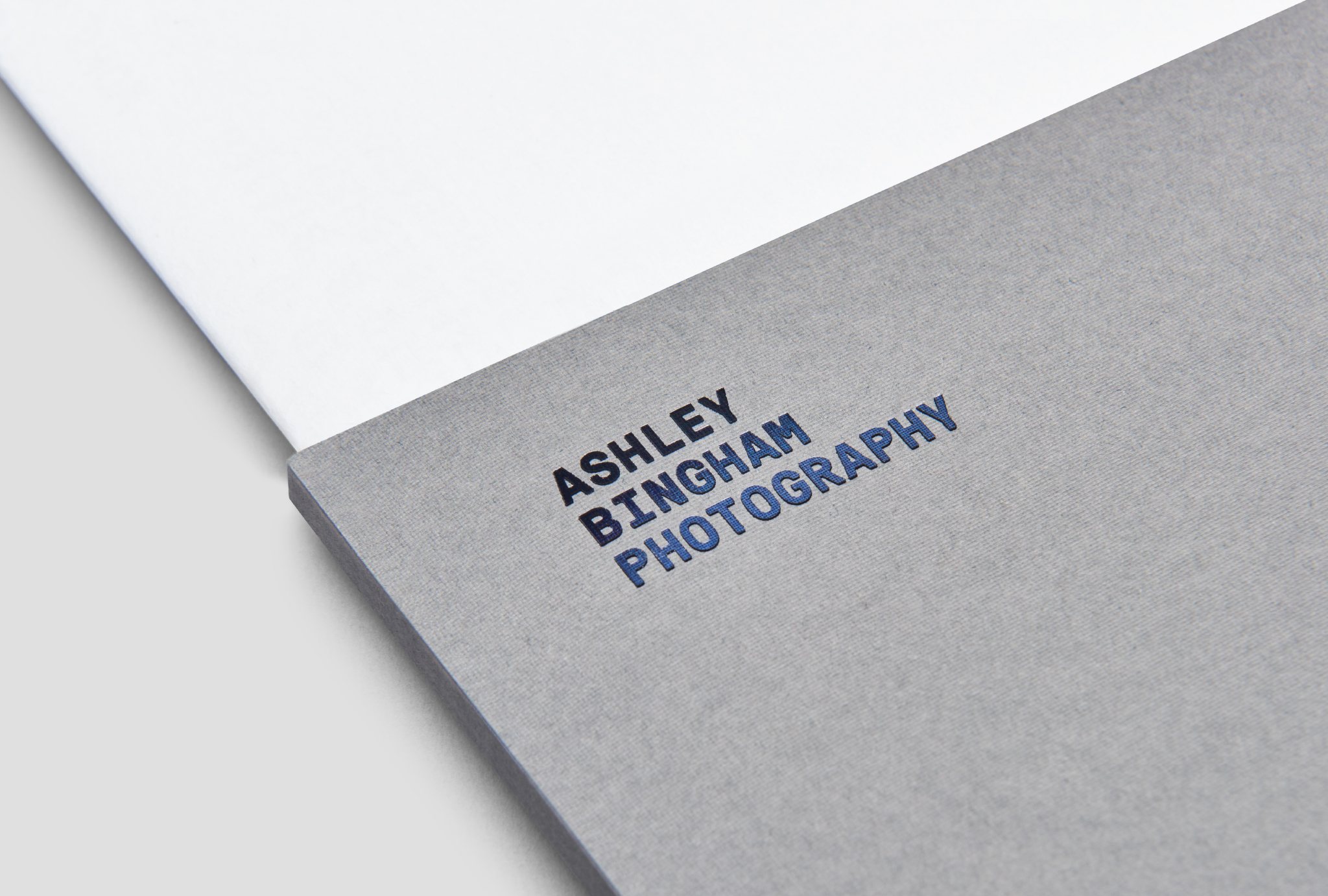
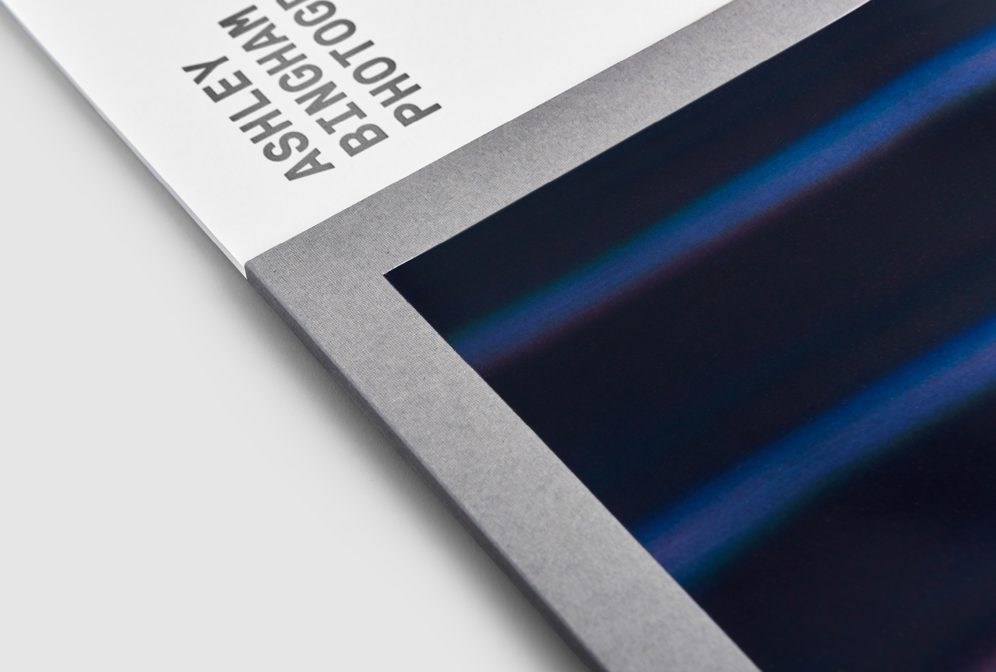
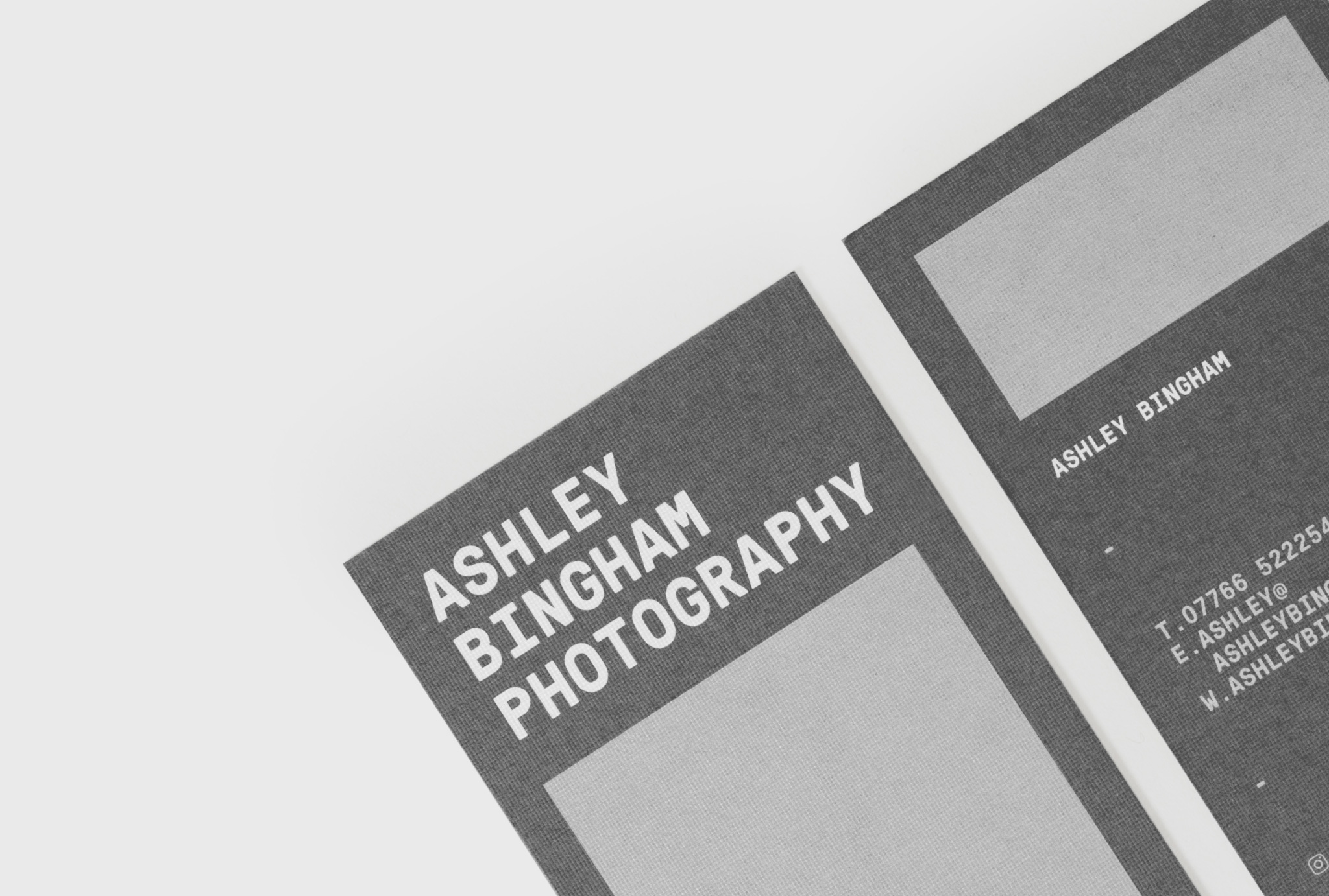
To unify the offering within a common enclosure, a custom wallet was created to house both the promotional newspaper and postcards. The wallet is designed for maximum visual impact, presenting itself as an intriguing proposition for the viewer upon first inspection, simultaneously offering an intimation of quality of work contained within.
Finally, branded envelopes and labels make for a great first impression upon presentation.
CREDIT
- Agency/Creative: Collaborate
- Article Title: A Promotional Portfolio for London Based Photographer Ashley Bingham
- Organisation/Entity: Agency, Published Commercial Design
- Project Type: Identity
- Agency/Creative Country: United Kingdom
- Market Region: Europe
- Project Deliverables: Brand Strategy, Branding, Graphic Design, Packaging Design
- Industry: Mass Media


