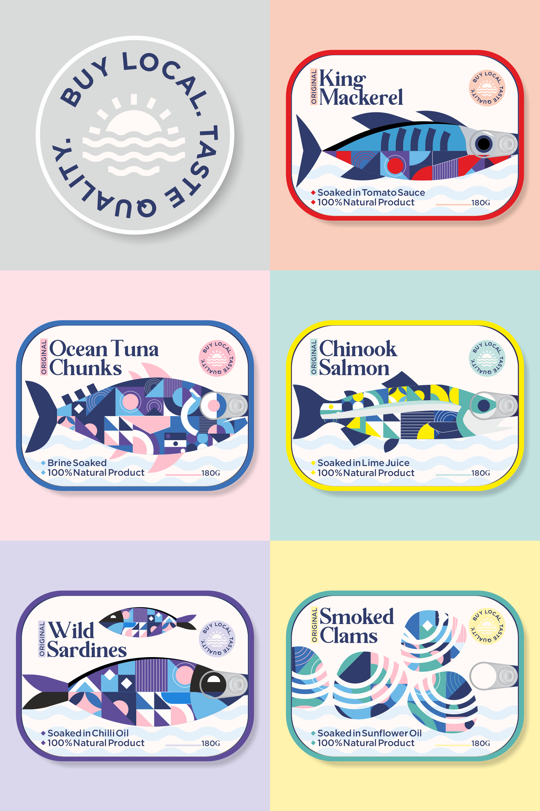
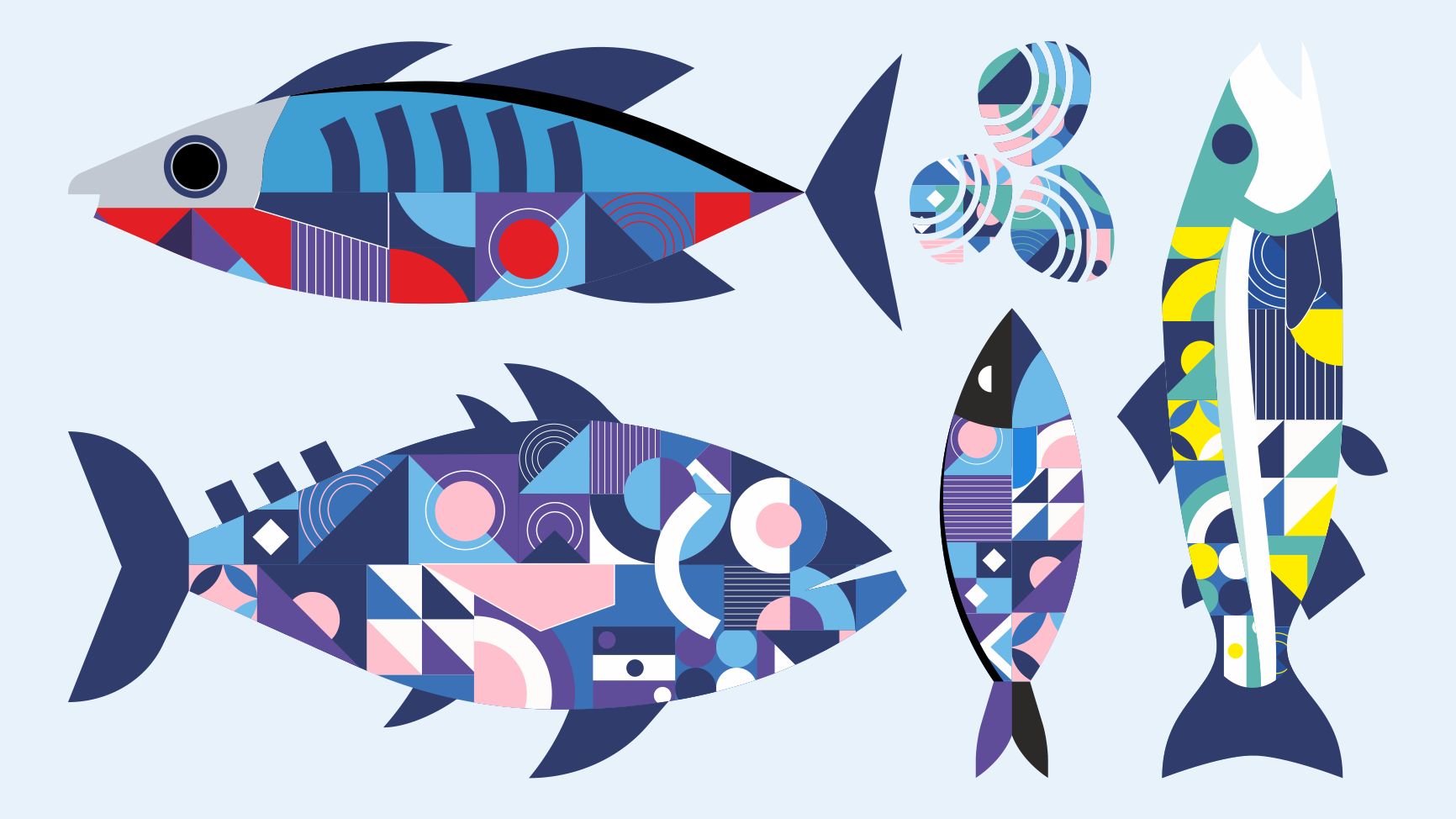
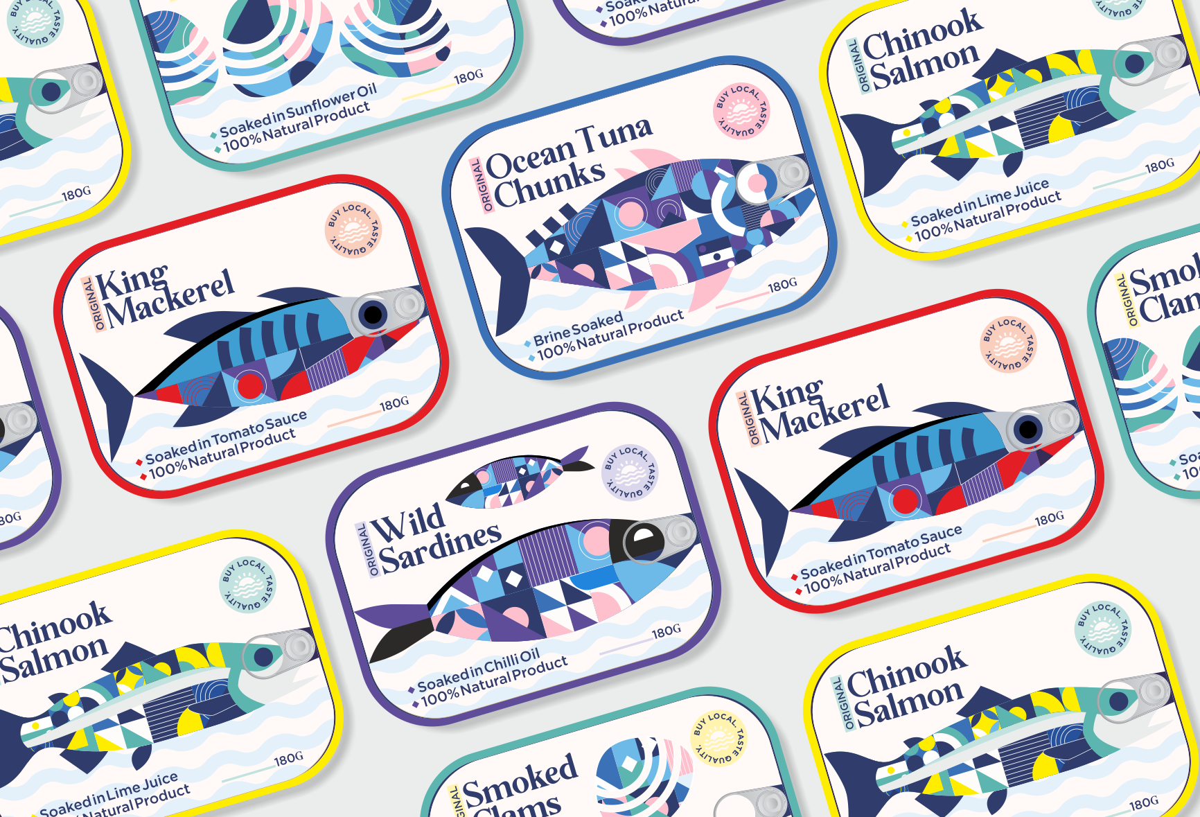
Supporting local fisheries with premium branding, using minimal yet striking visuals. We went against all packaging and labeling norms in this usually traditional industry to appeal to today’s quarantined customer that relies on canned food solutions. The unique specialty of these designs is that the ring-pull of the tin sits well on the eye of the fish on all the variants.


CREDIT
- Agency/Creative: Linsanity Design
- Article Title: A Premium Branding Concept for Supporting Local Fisheries
- Organisation/Entity: Freelance, Non Published Concept Design
- Project Type: Packaging
- Agency/Creative Country: India
- Market Region: Asia
- Project Deliverables: Brand Identity, Brand Naming, Brand Strategy, Branding, Packaging Design, Product Naming, Tone of Voice
- Format: Tin
- Substrate: Metal
FEEDBACK
Relevance: Solution/idea in relation to brand, product or service
Implementation: Attention, detailing and finishing of final solution
Presentation: Text, visualisation and quality of the presentation


