


In a world perpetually in motion, Tram Cream Coffee emerges as a gentle whisper amidst the rush: “Pause for a moment.” Not to interrupt, but to recharge — to gather inspiration for the road that lies ahead.
Tram is not just a coffee brand. It is a philosophy, a space, and an experience built upon the powerful and poetic notion of a “station.” In its simplest form, a station is a place of transit. But at Tram, the station is a sanctuary. It is where people come not merely to wait, but to transform waiting into reflection. It is a place where strangers become fellow travelers, where lives intersect, if only briefly, and where the ordinary act of sipping coffee becomes a ceremony of presence.
Rooted in the cultural soul of Vietnam, Tram draws inspiration from the everyday rituals of the Vietnamese people, particularly the act of making and drinking coffee with a phin — a small, humble brewing tool that drips slowly, deliberately. The phin is more than a device; it is a metaphor for mindfulness. It insists on slowness in a time of speed. This very spirit is what Tram seeks to distill, amplify, and share with the world through a holistic brand experience that blends emotional depth, visual poetry, and strategic clarity.
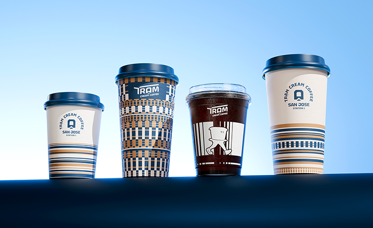
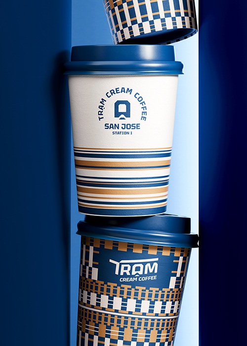
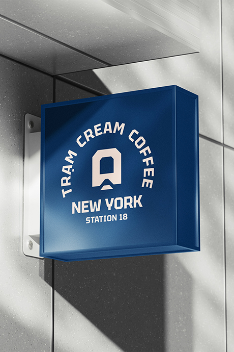
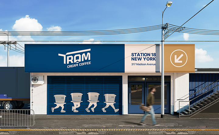
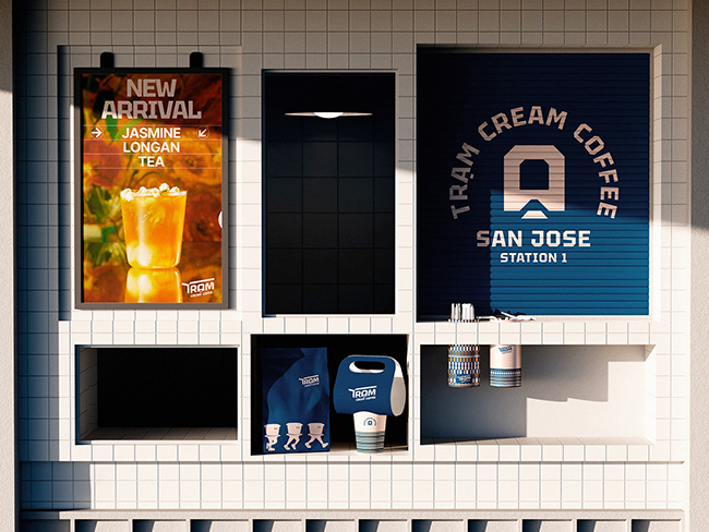
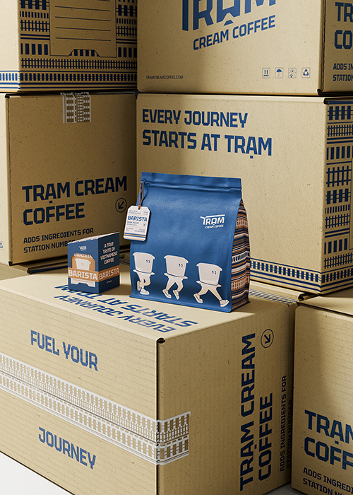
The core visual language of Tram was crafted from a constellation of highly evocative symbols. First, the arched roof of a train station, an image that evokes both shelter and departure, became the basis of the logo — a unifying motif that speaks to movement and stillness in the same breath. Then, the intertwining train tracks emerged as a metaphor for interconnectedness, for the many paths that converge and diverge in the stories of our lives. These tracks were reinterpreted into graphic patterns, subtly layered into packaging, signage, uniforms, and even wall textures to create an environment that is not just aesthetically coherent, but emotionally resonant.
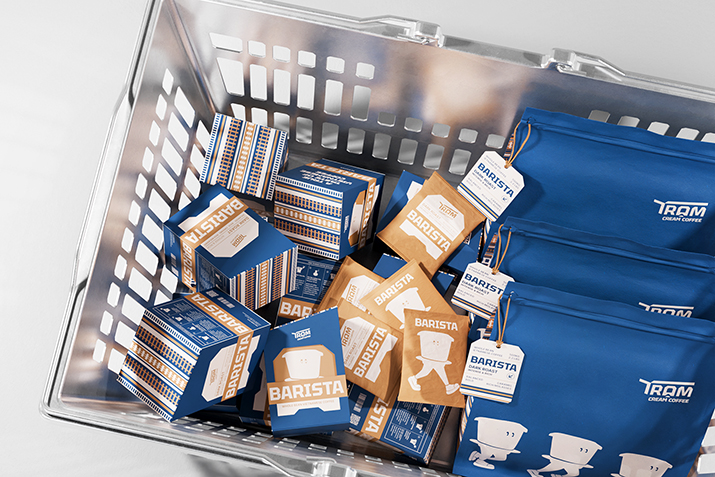
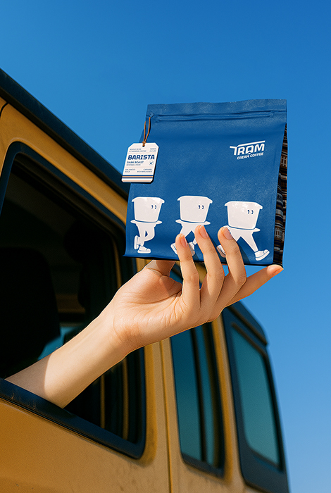
At the heart of Tram’s identity lies its most delightful and unexpected character: the walking phin filter mascot. Tiny, determined, and whimsical, the mascot embodies the Vietnamese spirit of quiet resilience and cultural pride. With legs in motion and a phin as its body, it is both humorous and profound, an emblem of a journey that never ends — and a reminder that even the smallest object can carry the weight of tradition and innovation.
Bracom’s role in this project was not confined to design execution; we took on the mantle of storytellers, interpreters of culture, and curators of experience. Our process began with deep cultural research and competitor analysis, ensuring that the brand’s foundations were grounded not only in aesthetic trends but also in market insight and behavioral truths. We worked closely with the client to unearth the essence of Tram: not just what it looks like, but what it feels like to enter one of its spaces, to hold a cup with the Tram logo, to interact with its staff, and to become part of its narrative.
The challenges were multi-layered. How do we build a brand that is both distinctly Vietnamese yet universally relevant? How do we maintain consistency across future franchises while allowing for localized expression? And how do we create a design system that is immediately recognizable yet flexible enough to evolve over time?
Our answers lay in the synthesis of clarity and creativity. The identity system was meticulously developed to be modular, scalable, and easy to implement — whether in bustling urban locations or quaint neighborhood corners. From menu boards inspired by old railway departure signs, to uniform aprons featuring geometric rail patterns, every element was designed to be both practical and poetic. Typography choices reflected a blend of modern sans-serifs with subtle nods to vintage signage, while iconography was simplified to support intuitive navigation without losing character.
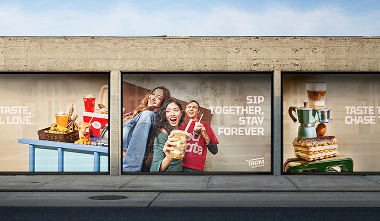
Color, too, played a vital role in defining the emotional tone of the brand. The deep navy blue serves as a grounding presence — sophisticated, stable, and enduring — while the creamy beige brings softness and warmth. This pairing evokes trust and comfort, but also quiet sophistication. It’s a palette that encourages lingering, invites conversation, and feels just as appropriate at 8 a.m. as it does at 8 p.m.
Pattern played an essential role in carrying cultural motifs into a contemporary context. We drew visual cues from traditional Vietnamese brocade — the intricate woven textures seen in ethnic textiles — and translated them into streamlined, grid-based layouts that feel rhythmic and refined. These patterns are versatile: used subtly in print and boldly on merchandise such as tote bags, cups, and staff uniforms. They carry the rhythm of tradition in the cadence of modern design.
Perhaps most notably, Tram is a brand that understands time. Not just the passing of it, but the savoring of it. That is why everything about Tram moves at a different pace. From the slow drip of the phin, to the thoughtful cadence of its visual language, to the intentional design of its spaces, the brand encourages people to unplug, unwind, and unfold — not through grand gestures, but through thoughtful pauses.
In essence, Tram Cream Coffee is more than a destination. It is a philosophy rendered in texture, typography, color, and character. It invites us to look again at the act of stopping — not as delay, but as momentum regained. As the world hurtles forward, Tram gently reminds us: a pause is not an end. It is a beginning in disguise.
Hop on the next train to Tram — and rediscover your journey, one inspired pause at a time.
Let’s go.

CREDIT
- Agency/Creative: Bracom Agency
- Article Title: A Pause in Motion, a Spark in the Cup — Tram Begins Where Time Slows by Bracom Agency
- Organisation/Entity: Agency
- Project Type: Identity
- Project Status: Published
- Agency/Creative Country: Vietnam
- Agency/Creative City: HOCHIMINH CITY
- Market Region: North America
- Project Deliverables: 3D Design, Brand Guidelines, Brand Identity, Illustration, Packaging Design, Photography, Web Design
- Industry: Food/Beverage
- Keywords: bracom, bracomagency, creative, agency, branding, brandingdesign, brandingagency, design, identitydesign, brandidentity, packaging, brandingagency, tramcreamcoffee, vietnamcoffee, coffeebranding, cafeviet
-
Credits:
Creative Director: Andy Ho
Executive Creative Director: Duc Bui
Project Manager: Van Duc Hoa
Lead Designer: Do Thanh Tung
Brand Designer: Tan Le
Brand Designer: Tuan Dinh
Brand Designer: Huy Nguyen
Motion Designer: Trung Tran
3D Visualizer: Dat Vu


