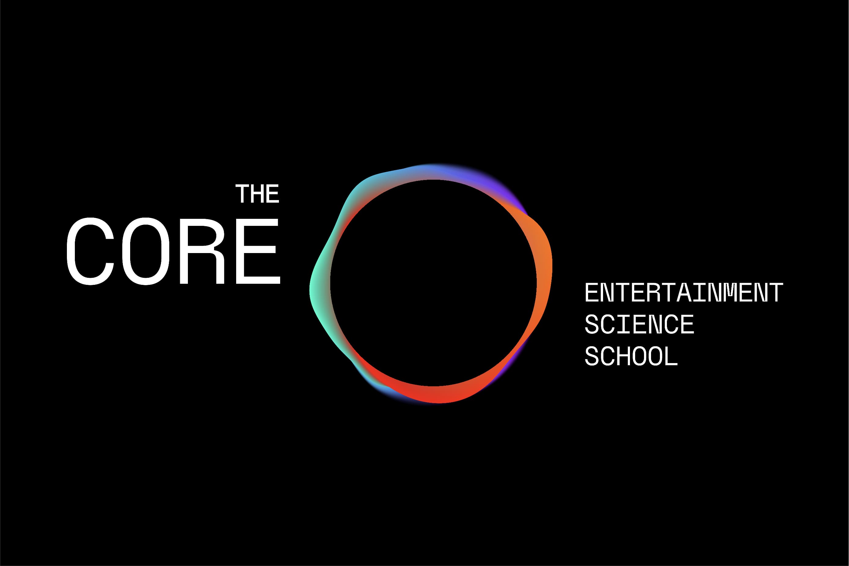
The Core is a brand created from scratch for an entertainment high education institution based in Madrid Content City, Europe’s largest audiovisual hub: an innovative and challenging school where imagining, creating, and producing worlds that don’t exist is completely possible.
Morillas’ challenge was to capture the disruptive essence of the school and embody it in an integral branding project, defining the brand’s positioning and identity and its visual language.
To do so, we crafted a stimulating, expert, passionate and innovative brand that believes in nurturing the future of knowledge. A brand that exists to help find the place in the entertainment industry because The Core is the heartbeat that drives the sector.
On our way to developing a consistent proposal, we searched for a naming that reflected the true essence of the brand. That is how The Core was born, the place where amazing things can take place; a campus created to connect newcomers, life-learners, and ongoing students with the entertainment industry at its core. To land its concept in a verbal construction, we also created “Entertainment Science School” as their brand descriptor, a manner to elevate Entertainment to the category
of a Science, as an academic field of studies, hence reflecting the quality of the institution. This way we managed to create a solid and expert positioning through a bold personality.
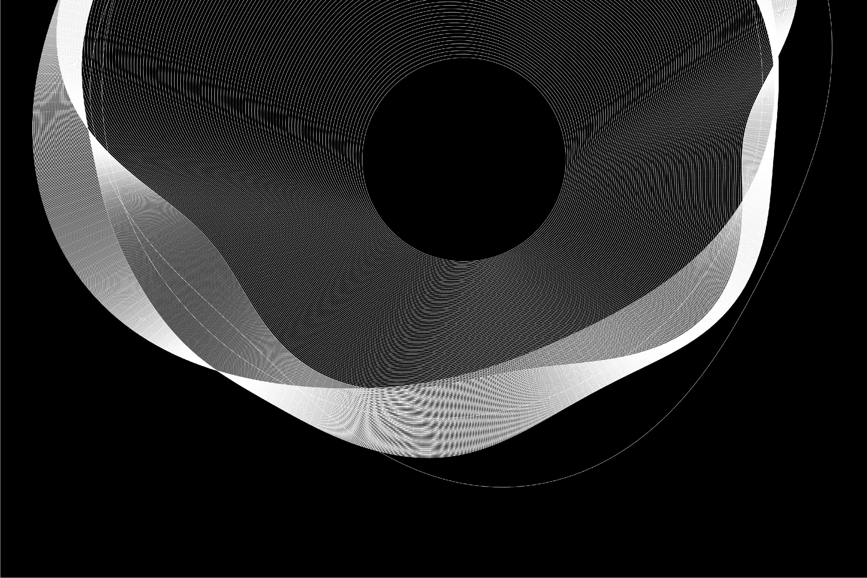
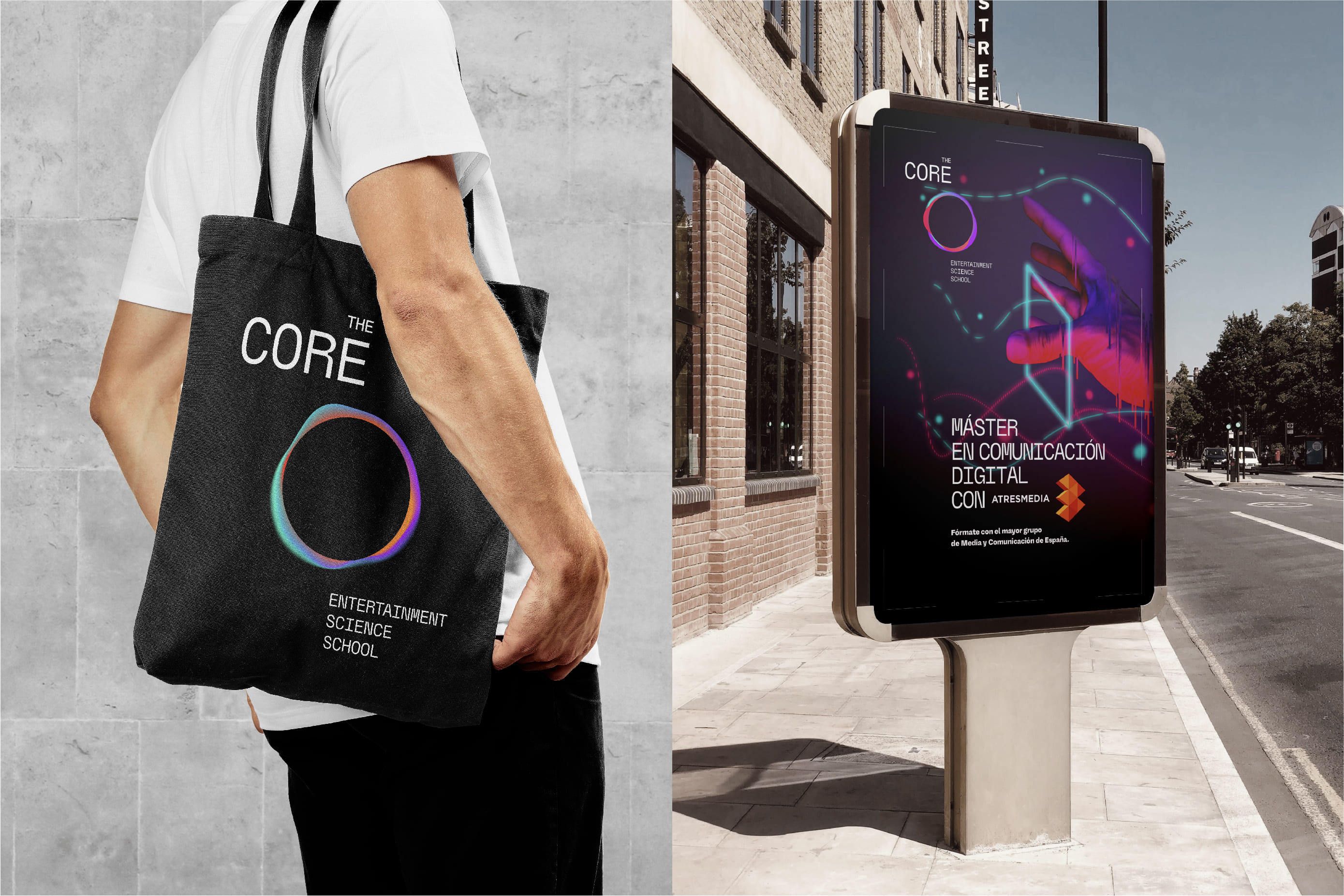
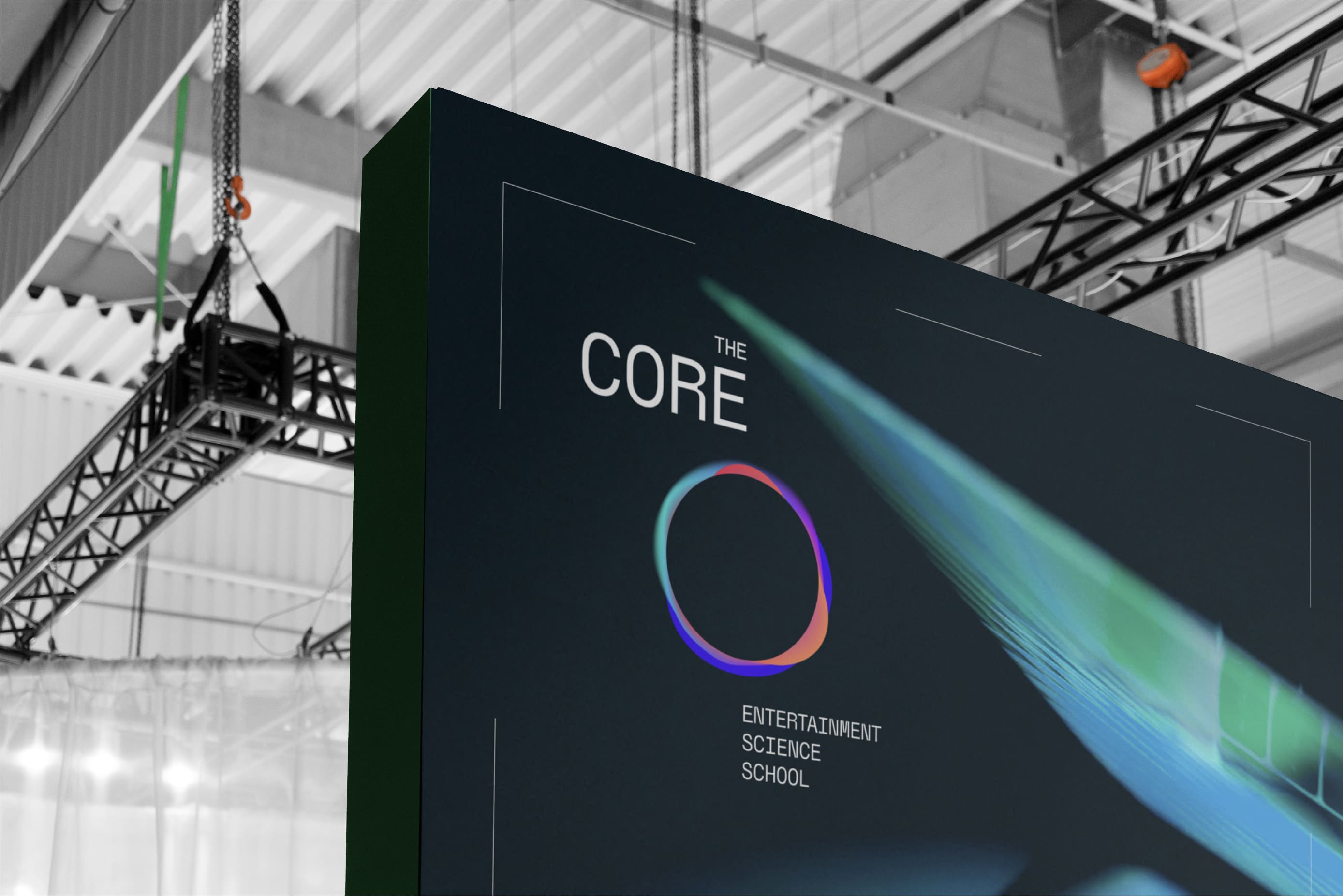
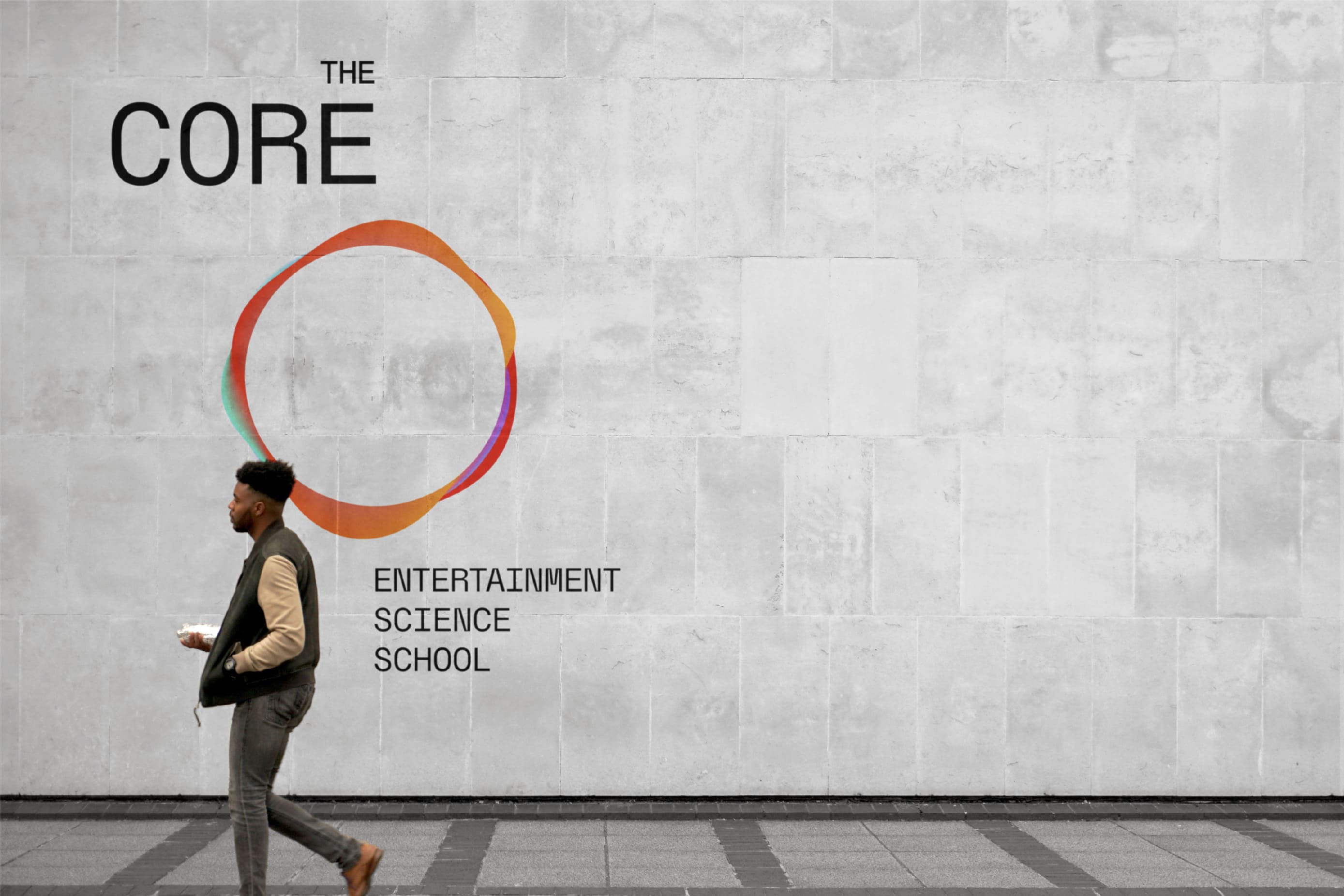
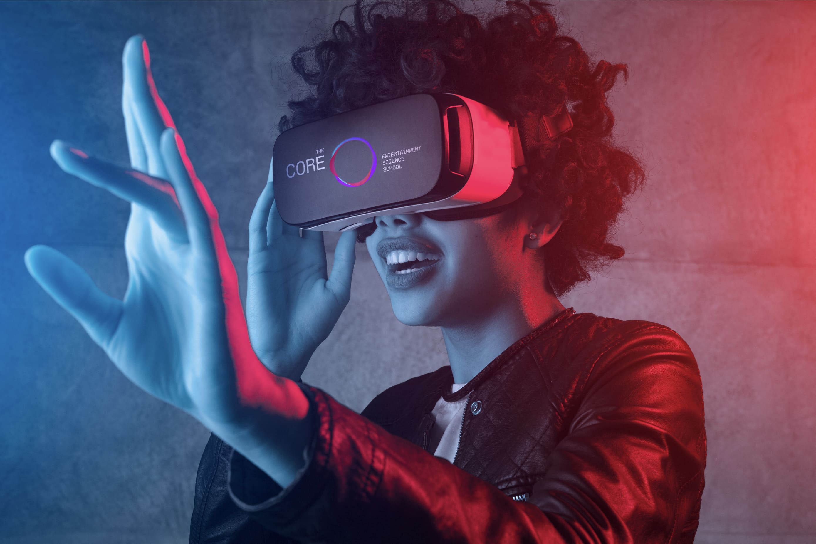
We continued developing The Core by constructing its visual identity. Although it was quite a challenge to express the dynamic and lively essence through static applications, we shaped an innovative visual identity that brought the brand concept to life with the help of media artist Santi Grau. To do so, we developed a circular and living figure that represents an abstract nucleus reflecting the idea of the brand as the epicenter of the audiovisuals, as the heartbeat that drives the entertainment
industry. This living circle was created through a coding processor, a way of creating a unique configuration, color leading to an energetic, bright, and colorful symbol that changes its color and shape on the rhythm of a beat that can be used digitally and on any surface.
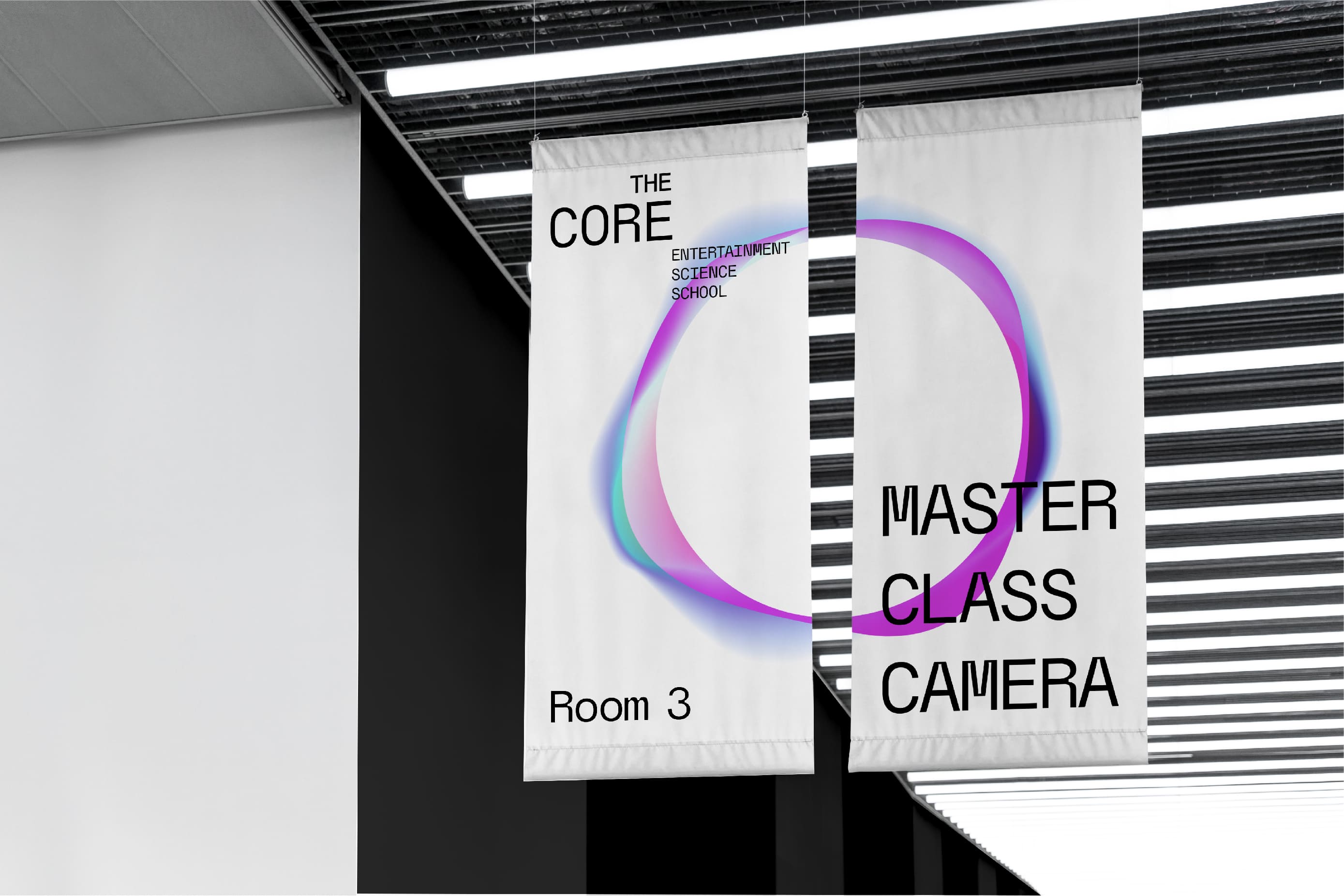
The Core has a wide academic range, from a master of Video Games Programming to an Entertainment Management one, so our challenge was to build an owner system that allowed us to separate every field of studies.
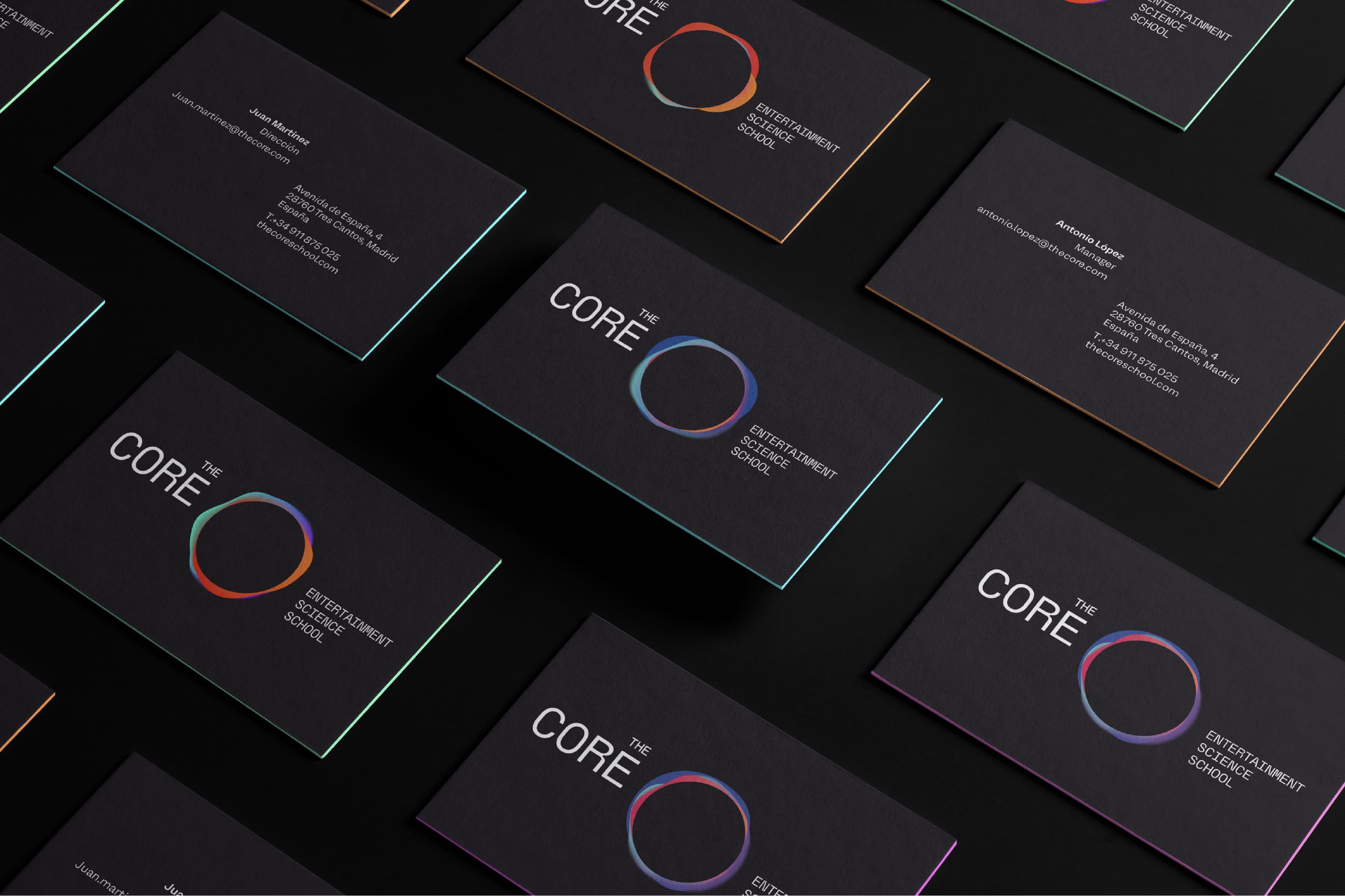
Colors communicate further than words, they imply emotion, this is why this living brand gets 4 variable color ranges harmonized by mixing gradients with a dominant base color, to communicate the soul of each master. We believe in the power of visuals, and this visual resource helped us to give an independent identity to the different range of the academic offer.
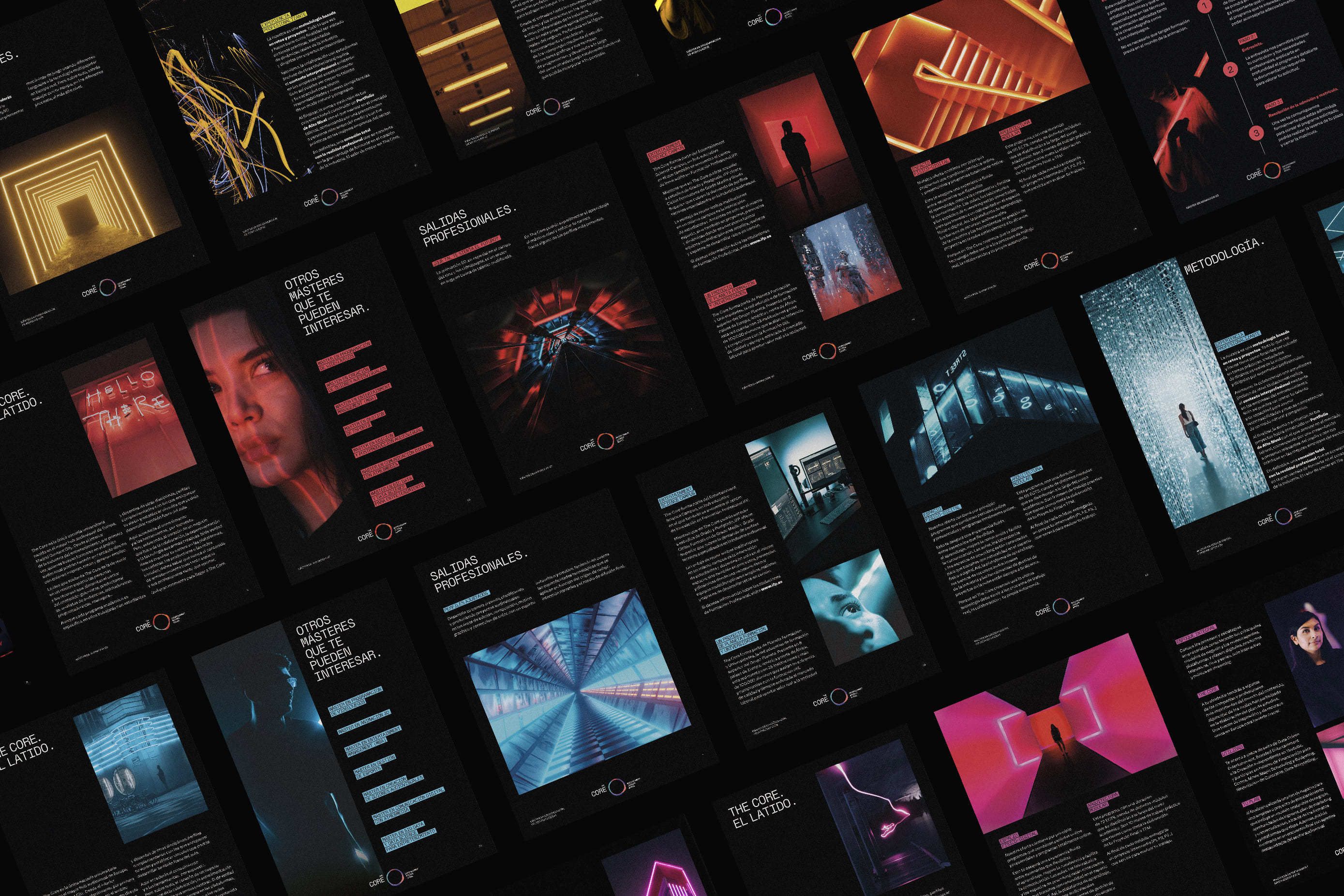
This unified proposal was collected in a brand book. The place where the brand strategy and visual language are explained to have a guide to follow. A tool made to understand the brand and develop it globally, a set of useful guidelines for every creative profile that wants to create something unique.
The work for The Core is a true example of creating brands consistently. A relevant and bold proposal that puts the target and its needs at the center, achieving in this way an emotional connection with it.

CREDIT
- Agency/Creative: Morillas
- Article Title: A Notorious Education Brand for a Vibrant Sector Designed by Morillas
- Organisation/Entity: Agency
- Project Type: Identity
- Project Status: Published
- Agency/Creative Country: Spain
- Agency/Creative City: Spain
- Market Region: Europe
- Project Deliverables: 2D Design, Art Direction, Brand Design, Brand Guidelines, Brand Identity, Branding, Creative Direction, Logo Design
- Industry: Education
- Keywords: Identity, Graphic Design, Brand Identity, Branding, Creative Direction
-
Credits:
Visualiser: Santi Grau


