


Created by blenders at Beam Suntory, Ardray® is a new blended Scotch which seeks to drive a reappraisal of the category. As a whisky of exquisite balance, Ardray combines the bold characteristics and heritage of Scotch whiskies with the precise craftsmanship of Japanese blending.
Built on the premise that blended whisky is an art form that deserves both respect and reappraisal, Beam Suntory approached design agency Here to create a new brand, positioning, visual identity, packaging and tone of voice to do justice to the new blend.
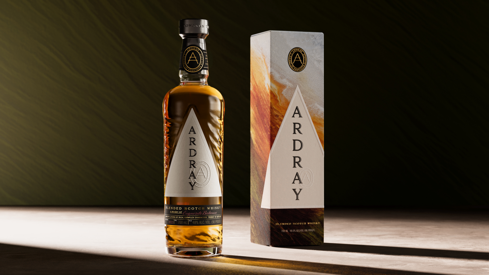
Wild Precision was the creative strategy behind Here’s work which, like the liquid, sought to balance the best of Japanese and Scottish design traditions. The result is an identity and bottle that balances the wild and precise, referencing the beautifully rugged landscape of Scotland and the meticulous attention to detail of the Japanese arts.
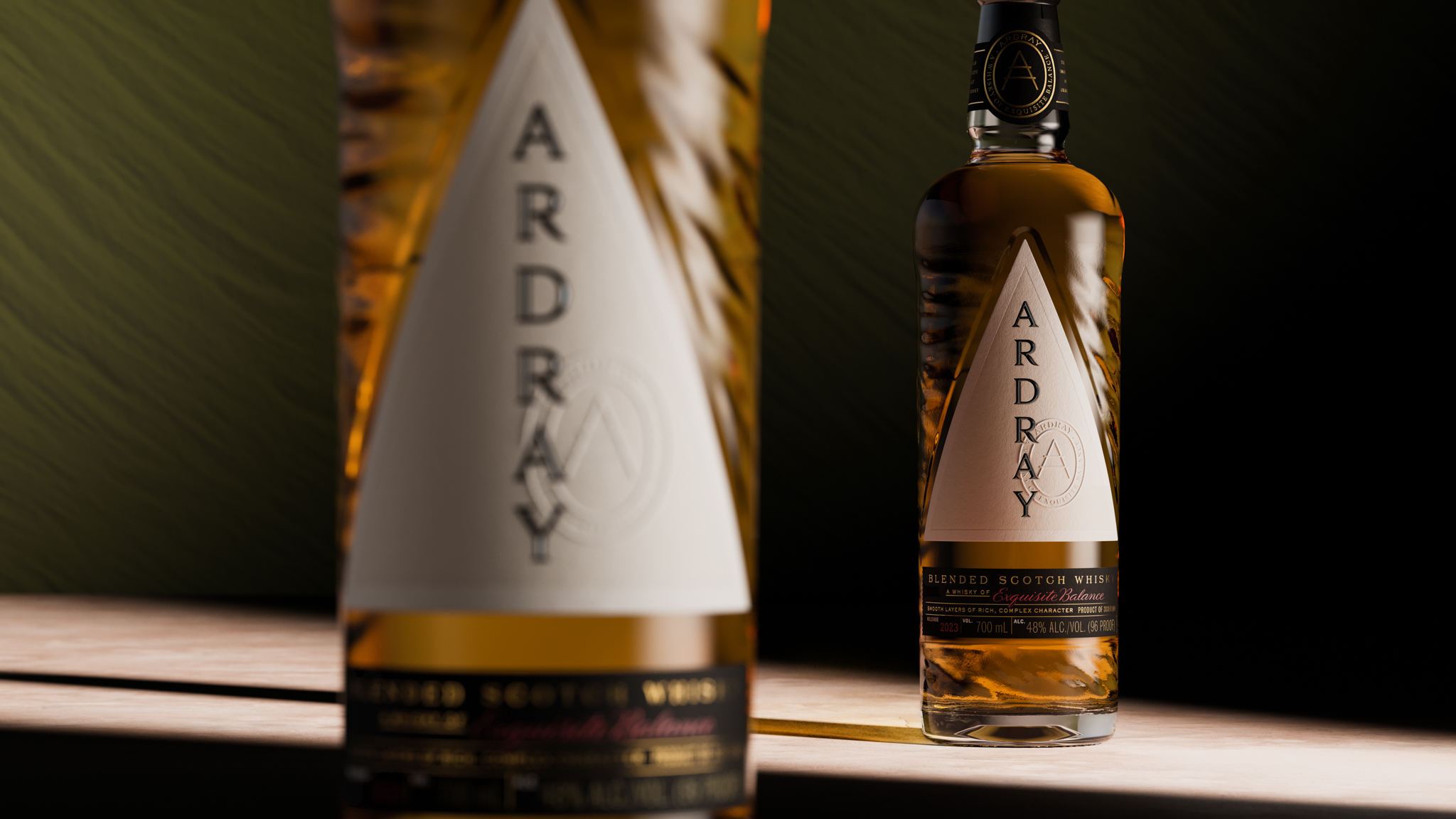
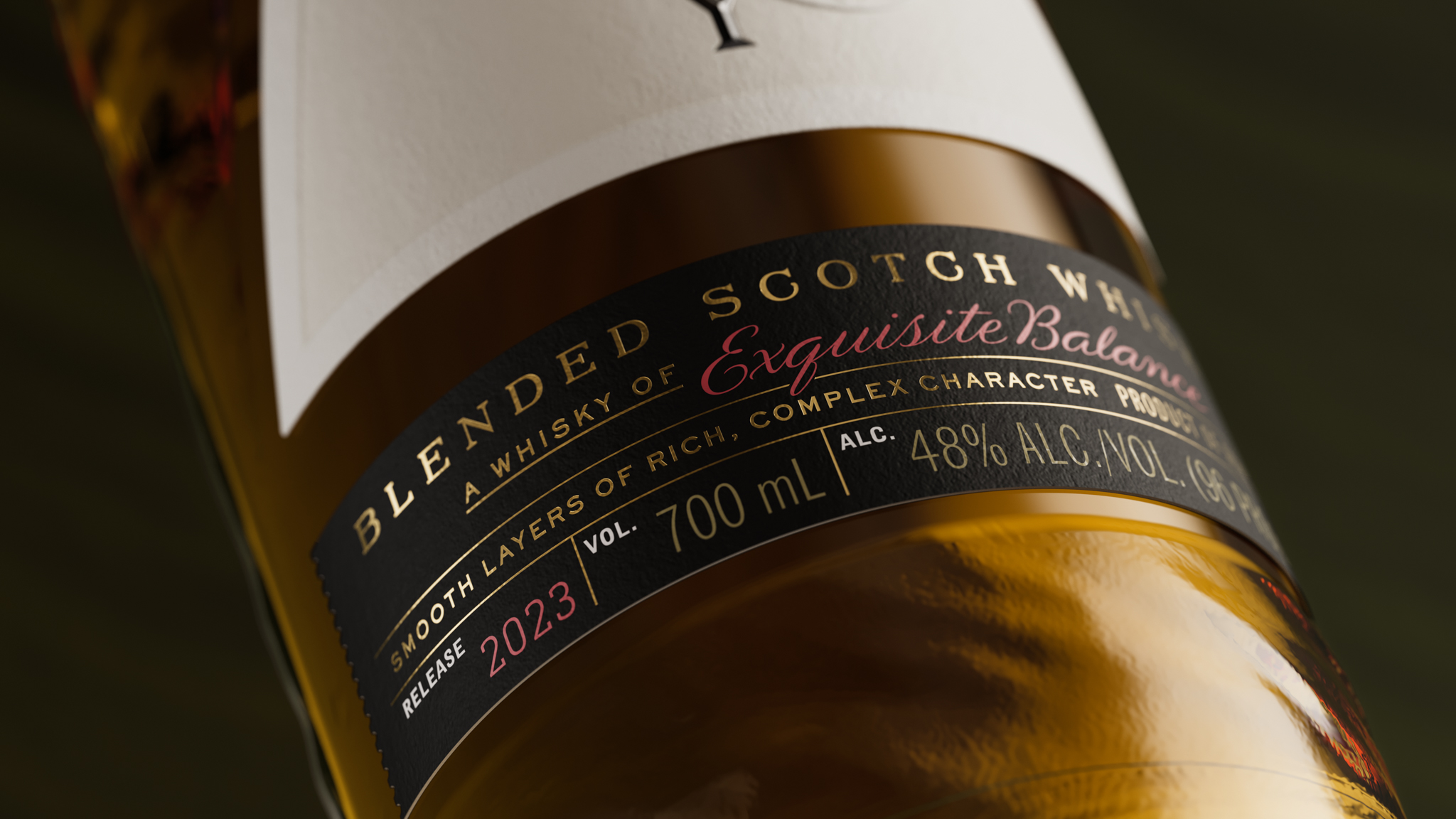
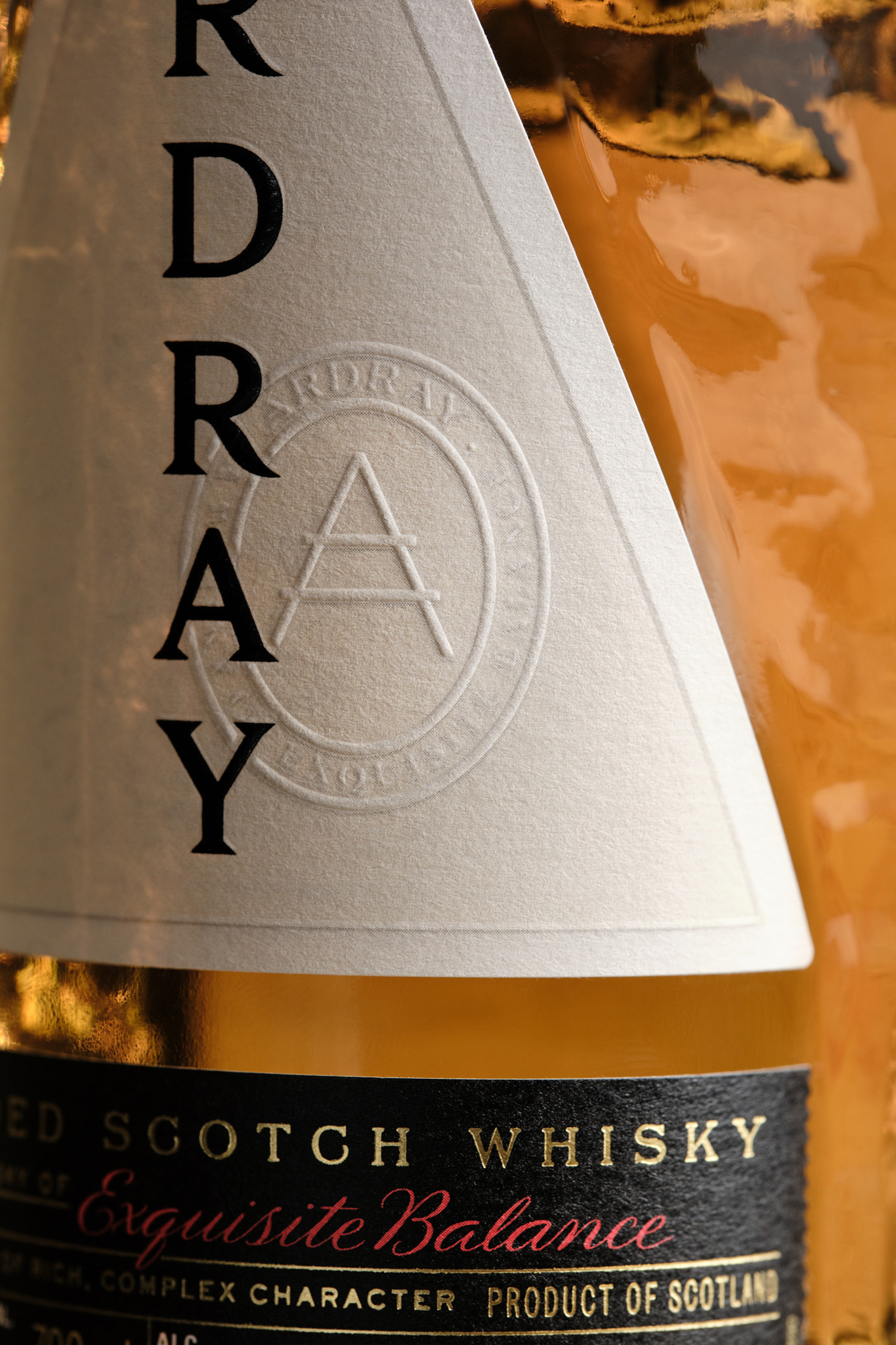
The bottle is richly textured with an organic rippling pattern, inspired by the Scottish Highlands and the two fundamental ingredients in Scotch malt whisky: the free-flowing water of streams and rivers, and the fields of barley, gently blowing in the wind. By contrast the label on every bottle is a precise triangle — to strike the right balance between clarity and roundness. It points to the future, as Ardray seeks to advance the traditions of blending within Scotch whisky.
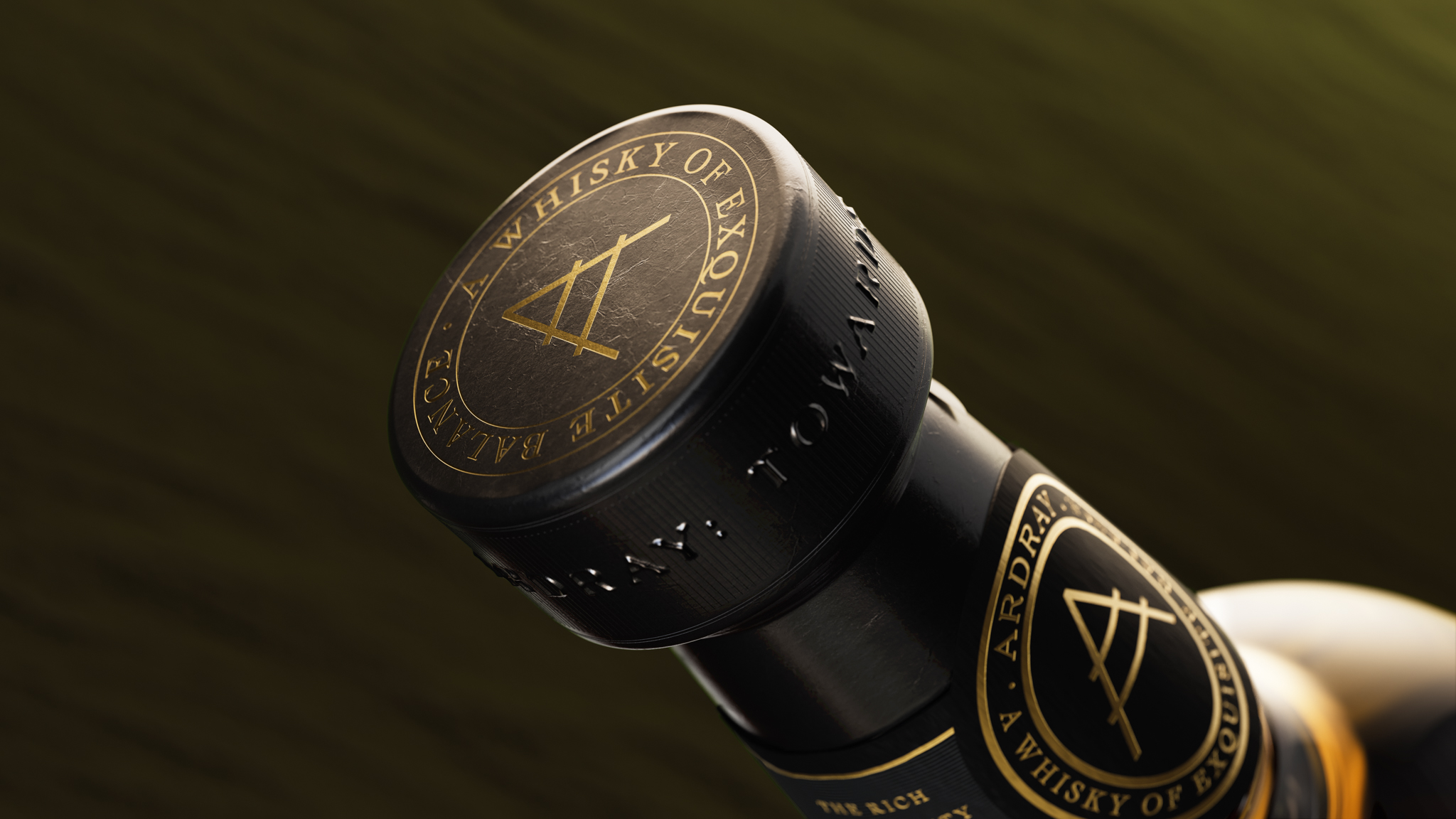
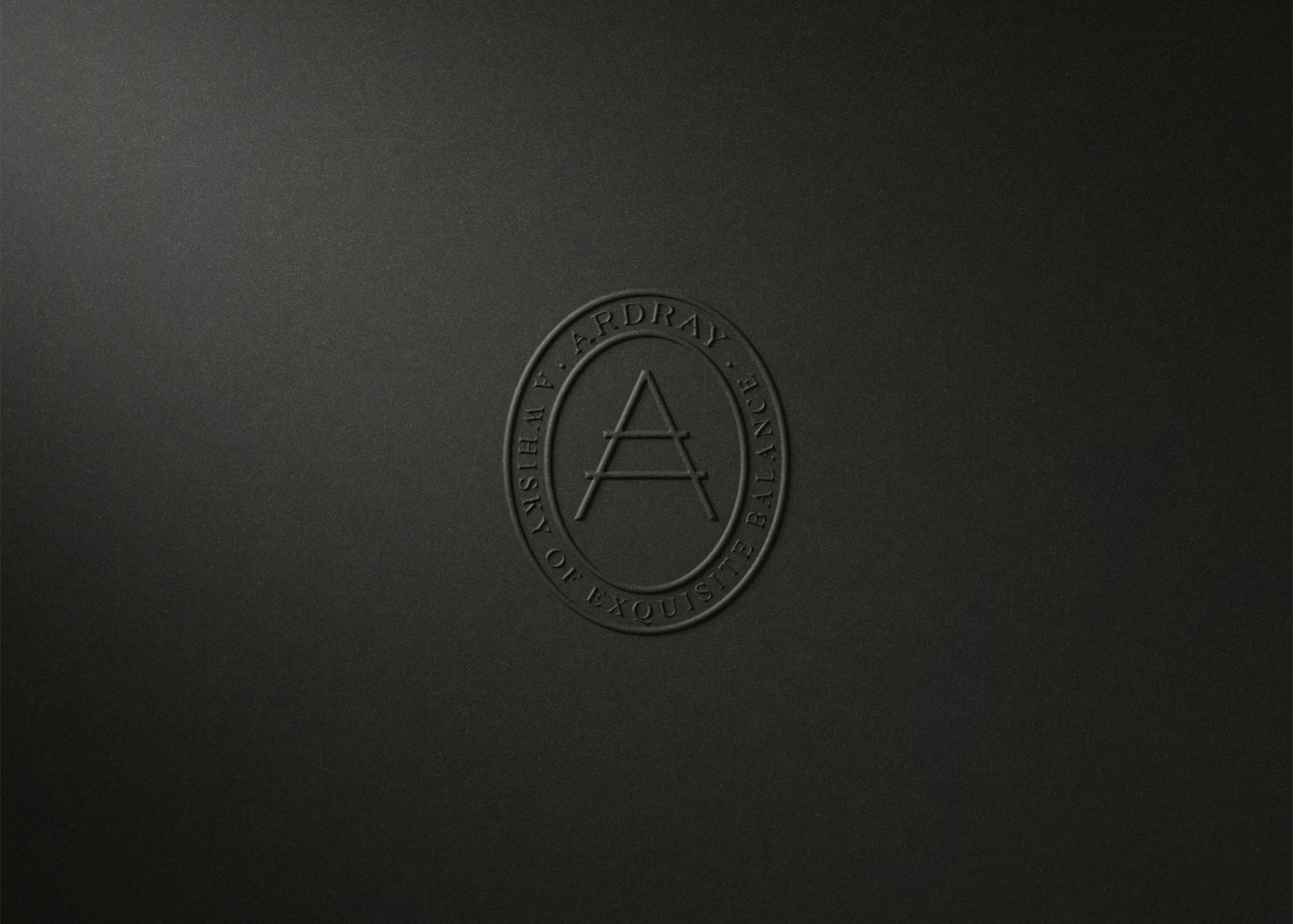
The Ardray wordmark slices vertically through the bottle. A bold nod to the craft of Japanese typography. The serif typeface speaks to the rich history of Japan and is carefully balanced with other typography on the pack. Inspired by a sketch found in Shinjiro’s sketch book, Here have also designed an icon that balances the two cultures across the entire brand world – acting as a harmonious stamp.
To capture the spirit of Ardray Here worked with artist Lia Melia to create an abstract artwork that references the wild terroir of Scotland. The warm tones not only evoke the dramatic sunlit colours of the heathland but also cue the inherent warmth and flavour of the liquid. The artwork is applied to the exterior packaging and incorporated across digital collateral.
Here have carefully balanced each aspect of the brand and the bottle’s packaging, never allowing one aspect to outweigh the other. Rather, a crafted combination of elements and cultures that create a balanced whole.
Harry Bingham – Design Associate at Here said “The myriad truths and dualities that form Ardray’s foundation provided fertile ground from which to create a brand. Our challenge was, appropriately, one of distillation. How to; pay homage to the history of blended scotch, marry wild with precision, and blend together two significant whisky cultures. The resultant brand marries a purposeful design language with artistic expression to engage the viewer and encourage an attitude of reappraisal.”
Alastair Cliff – Strategy Associate at Here said: “We know our whisky well at Here, but our focus has mainly been on Single Malts rather than Blends, which have often been wrongly seen as Single Malt’s less glamorous cousin. Ardray was a chance to change that, encouraging whisky drinkers to look at blends in a whole new light ‘to spark new delight in the familiar’.
Our Design idea – Wild Precision – is a blend of Japanese and Scottish design traditions. Both have a deep respect for, and are profoundly influenced by the wildness of their natural environments. Both also share an elegant minimalism; born of Scottish Presbyterian restraint and the Japanese embrace of ma – negative space. This blending of the wild and precise became the key directive for our creative work.”
CREDIT
- Agency/Creative: Here Design
- Article Title: A New Whisky of Exquisite Balance, Ardray Invites You to Forget Everything You Know About Blended Scotch
- Organisation/Entity: Agency
- Project Type: Graphic
- Project Status: Published
- Agency/Creative Country: United Kingdom
- Agency/Creative City: London
- Market Region: Europe
- Project Deliverables: Brand Creation, Brand Strategy, Brand Tone of Voice, Packaging Design
- Industry: Food/Beverage
- Keywords: Whisky, Scotch Whisky, Luxury packaging, design
-
Credits:
Visualisations: Where Giants Roam


