


Punch Design Co. – Bearded Iris Brewing’s Homestyle Can Redesign
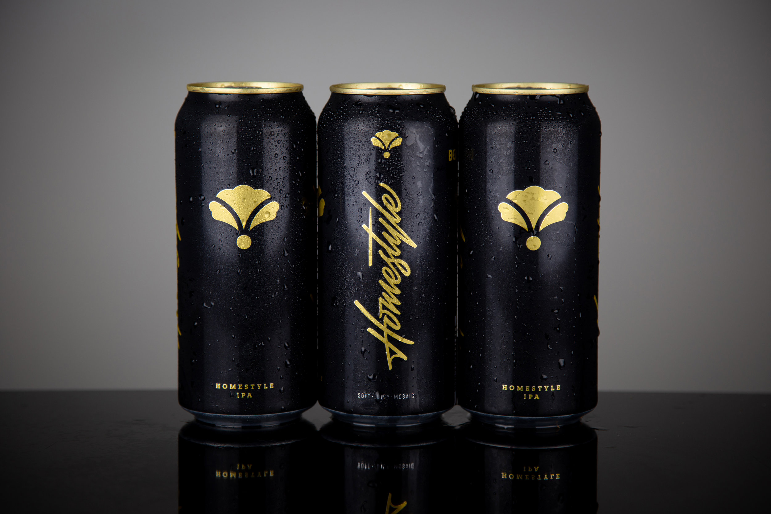
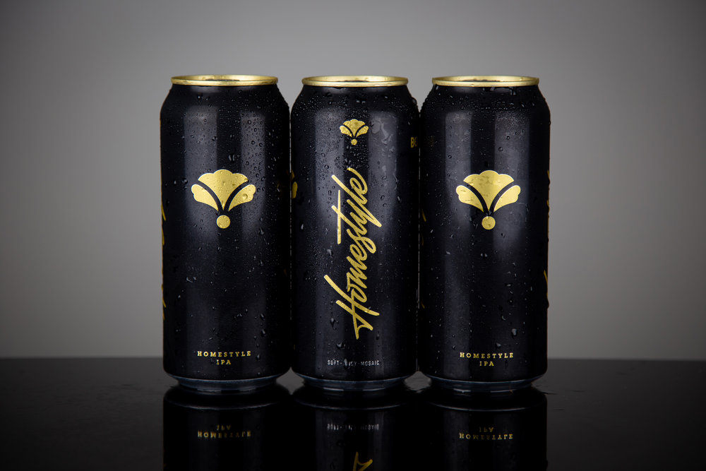
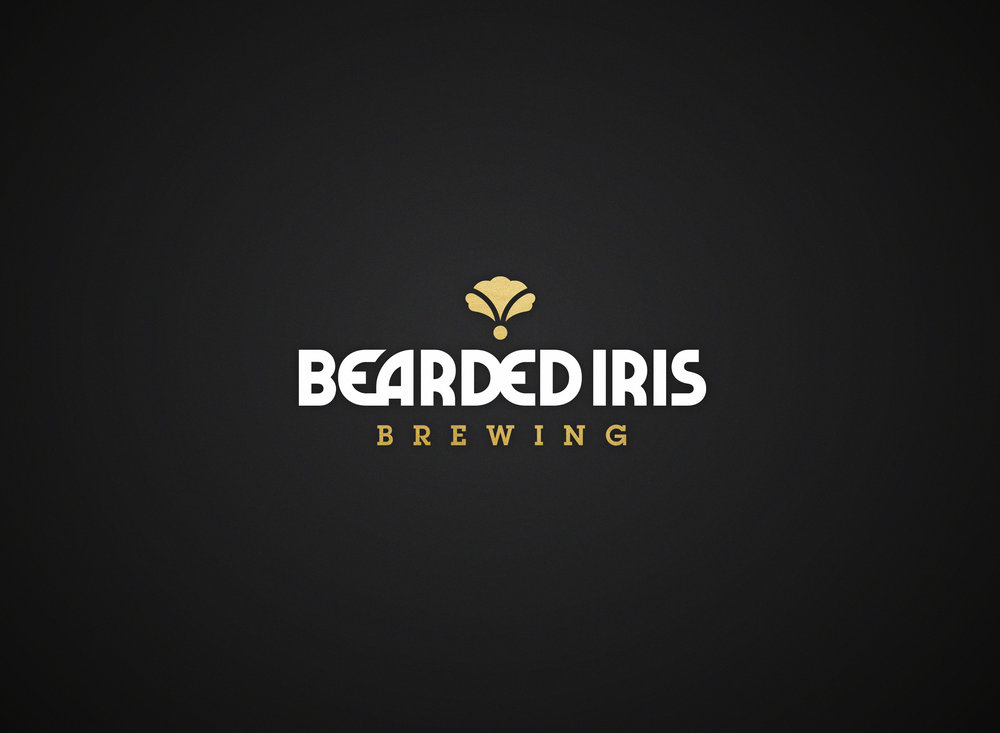
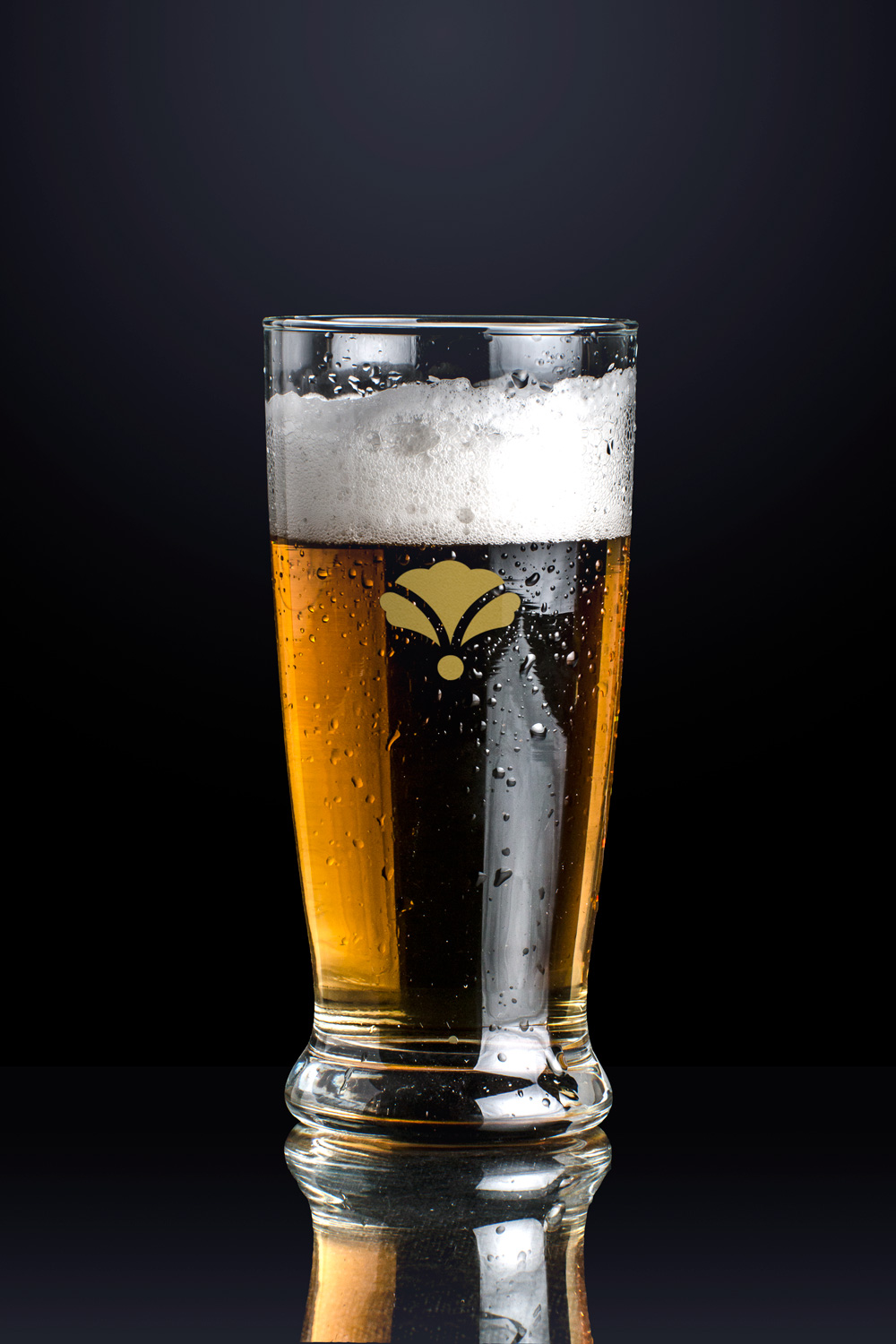
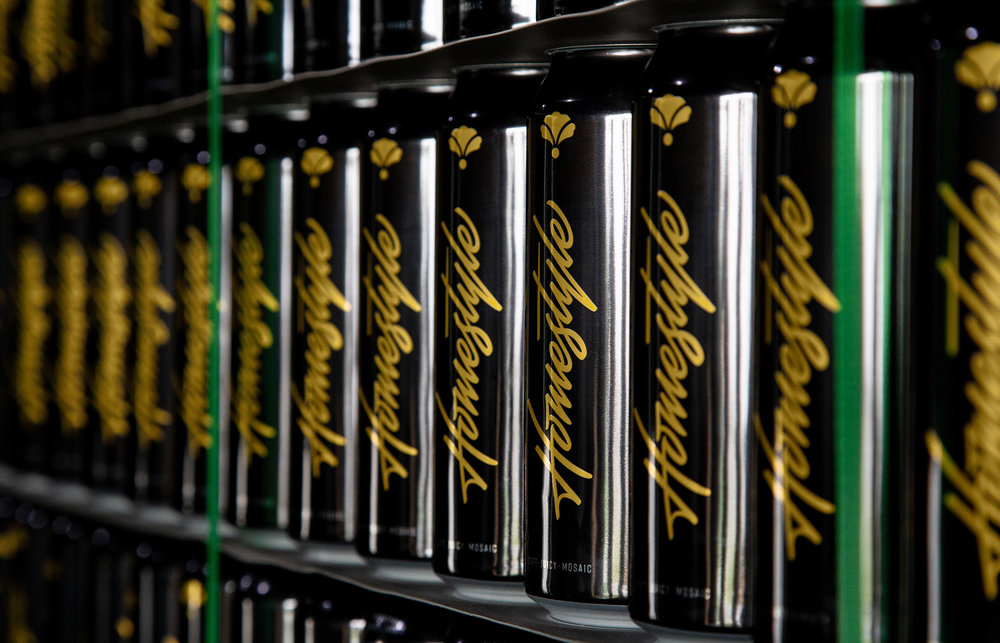
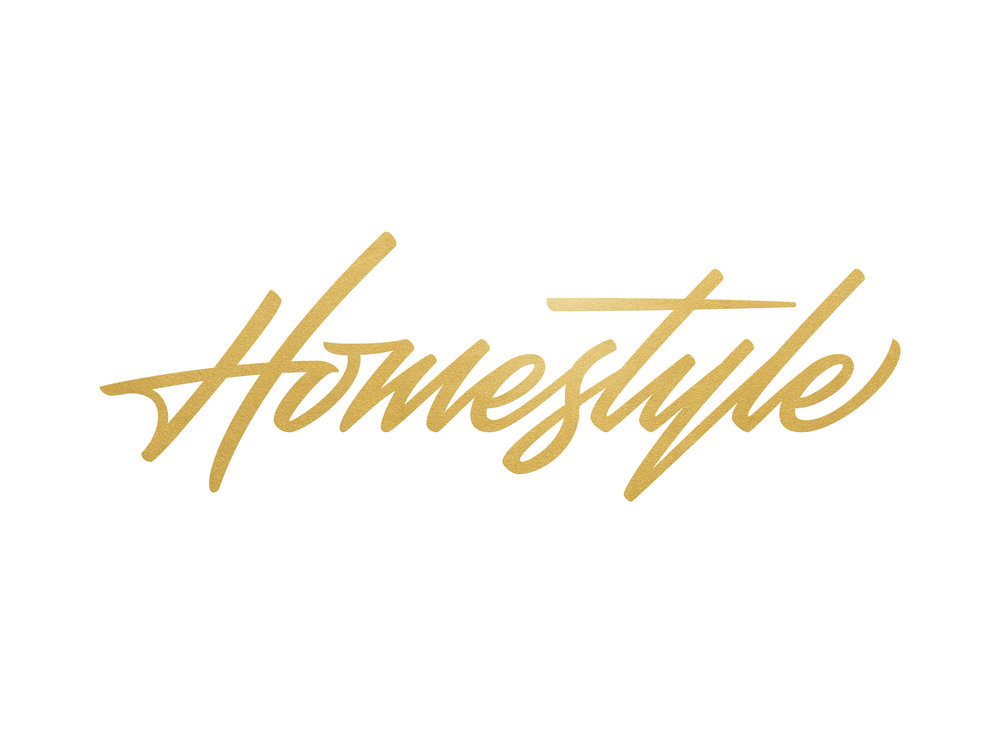
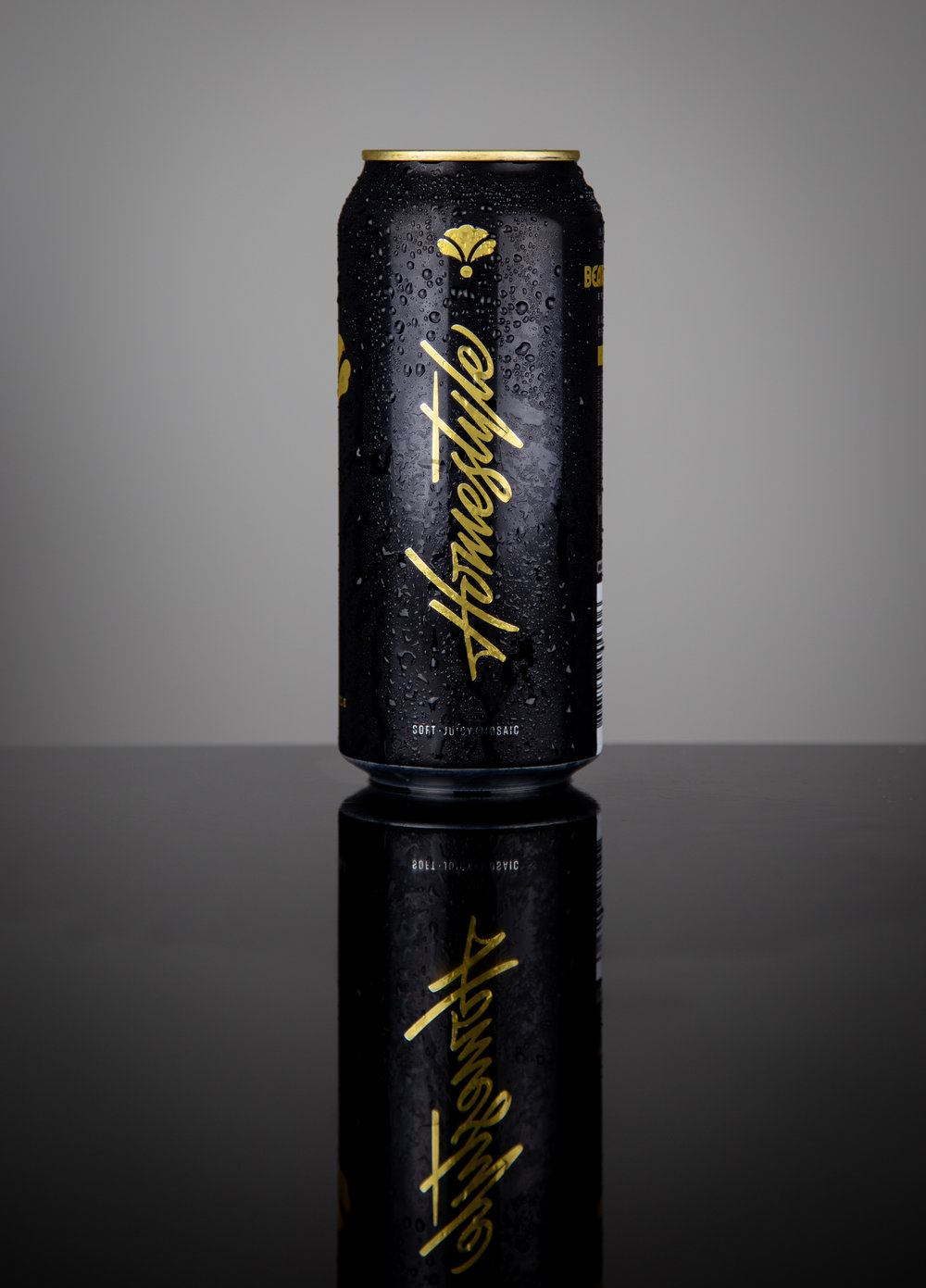
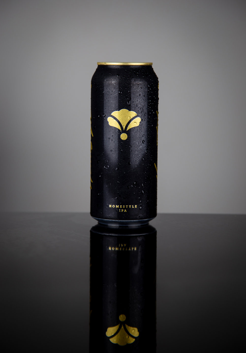
“ Founded by longtime friends, Kavon Togrye and Matt Miller, Bearded Iris Brewing Co. has carved out both a local and national reputation. Locally, they are known as the brewers of Homestyle – a welcoming 6% oated Mosaic IPA so pervasive in the bluegrass state, it can be seen from the lakeside to the finest steak houses in the state’s capitol. Nationally, their hazy IPAs are in high demand. Modern hop fans from both coasts swap their own iconic favorites by mail with residents of Tennessee to get their tastebuds on BIBCO’s cutting edge flavors and premium ingredients.We began the process by leading a strategic survey of Bearded Iris’ history, story and identity. But even more crucial was where they wanted to go. With their eyes on apparel and international taprooms in the future, Kavon and Matt take most of their inspiration from the lifestyle brands of which they are fans: Asics and Addidas, Beats by Dre and Supreme. The existing, roughly-sketched iris mark did not convey anything about who they were, and didn’t serve the iconic function that marks from other lifestyle brands do. Their loosely-nouveau typefaces weren’t setting the right tone, either. The watchwords we used throughout the whole project were “Less is way, way more.” – evidenced by the streamlined packaging for Homestyle, the first of several year-round products BIBCO will be releasing in the coming years. Herb Lubalin, designer of the famed Asics Tiger logo we all loved so much, designed almost all of the typefaces we elected to use for the brand. Staying true to style was key.In addition to a freshly realized brand mark and custom logotype developed by Joshua Berman, the art director of the project, he also designed what looks to become the most signature addition to the brand – the packaging for their flagship product Homestyle. Exemplifying their new, minimal ethos, the sleek design cuts through an illustration-and-filigree-heavy southern beer scene, and the gold top reinforces the premium nature of the product. They are currently the most expensive 16oz 4-pack in their local market, and sales are increasing 25% month-over-month.”
CREDIT
- Agency/Creative: Punch Design Co.
- Article Title: A Nashville’s Premium Homestyle IPA Gets a Brand and Packaging Design Facelift
- Organisation/Entity: Agency Commercial / Published
- Project Type: Packaging
- Agency/Creative Country: United States America
- Market Region: North America
- Format: Can
- Substrate: Metal


