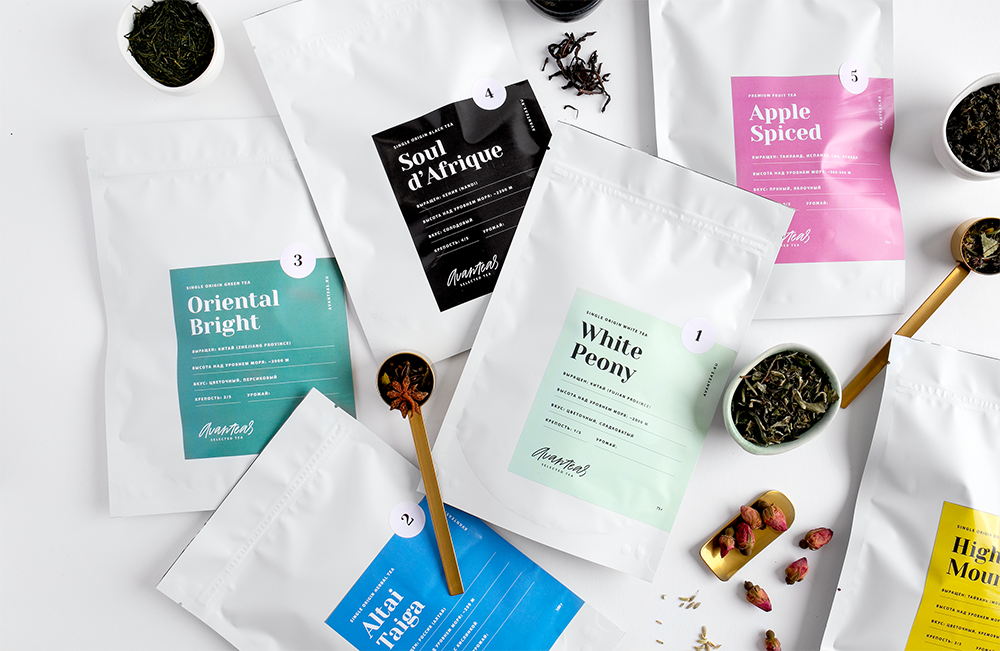
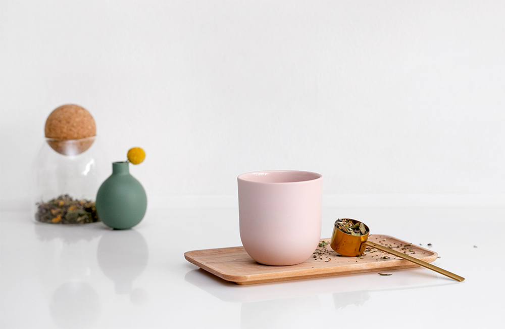
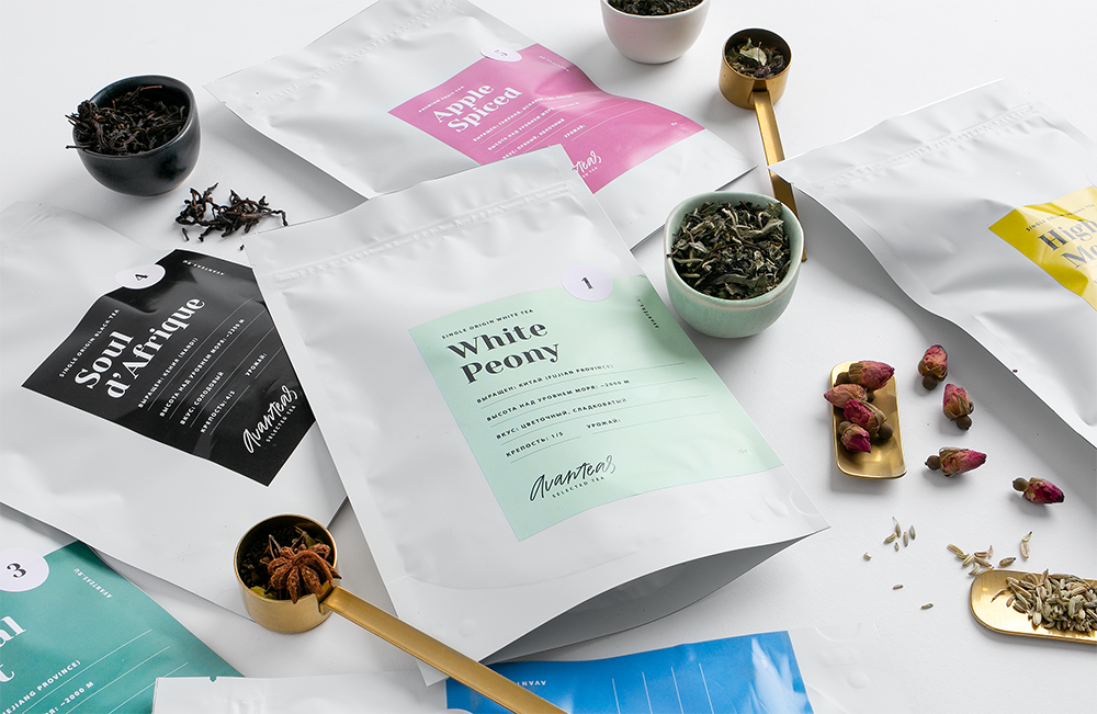
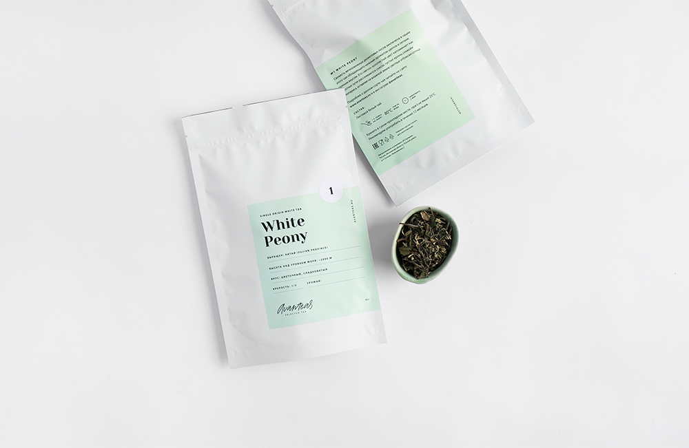
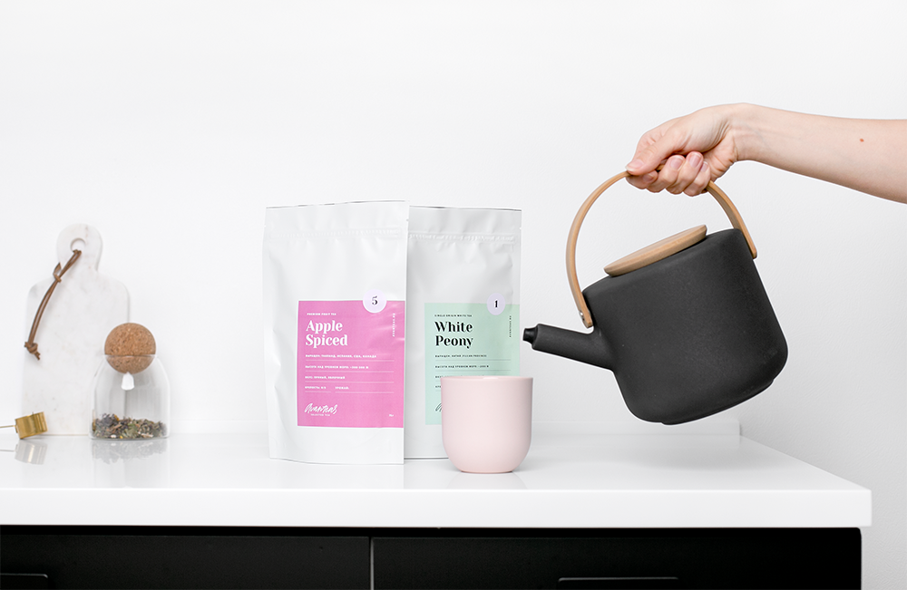
Avanteas is a Russian tea company, they select the most tasty tea around the Globe. A visual identity, packaging and styling-photography has been created for this client. The main idea is to create a minimalistic felling, but at the same time alive and natural. We wanted to create a package that would fit well in any kitchen and did not create a lot of visual noise.
The logo is based on handwritten calligraphy. We believe it is reflects the author’s approach in the selection of varieties of tea.
At the moment there are 6 types of tea, green, white, black, oolong, herbal, fruit. Each type of tea was assigned its own color. The number on the package indicates the ordinal number of a particular grade in this group of teas.
CREDIT
- Agency/Creative: Daria Kwon
- Article Title: A Minimalistic Packaging for a Russian Tea Company Avanteas
- Organisation/Entity: Freelance, Published Commercial Design
- Project Type: Packaging
- Agency/Creative Country: Russia
- Market Region: Europe
- Project Deliverables: Branding, Packaging Design, Photography, Research, Tone of Voice
- Format: Pouch
- Substrate: Plastic
FEEDBACK
Relevance: Solution/idea in relation to brand, product or service
Implementation: Attention, detailing and finishing of final solution
Presentation: Text, visualisation and quality of the presentation


